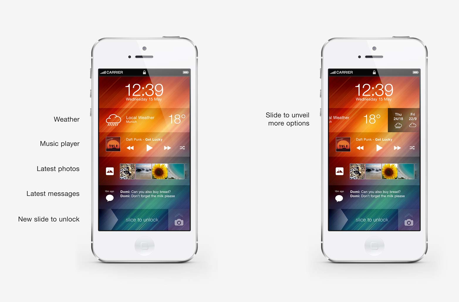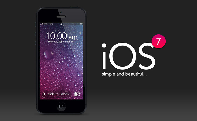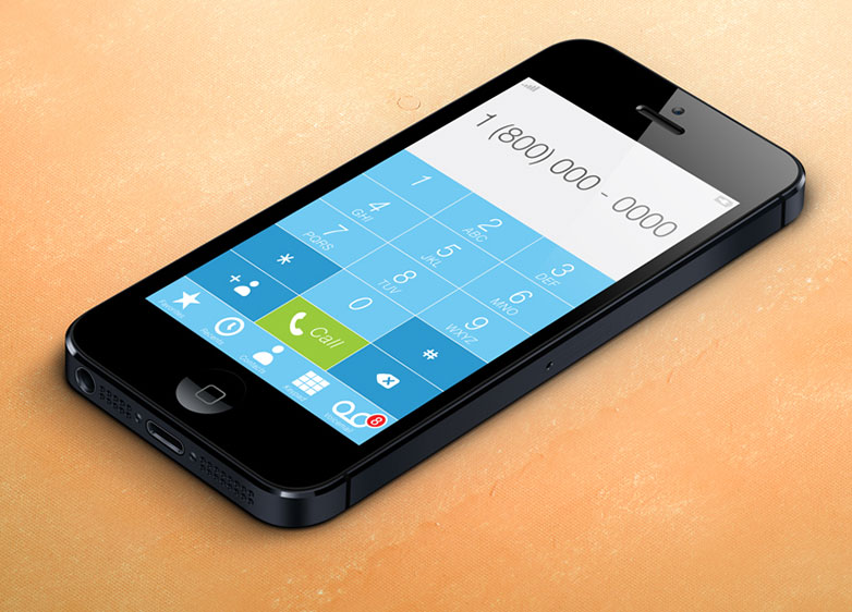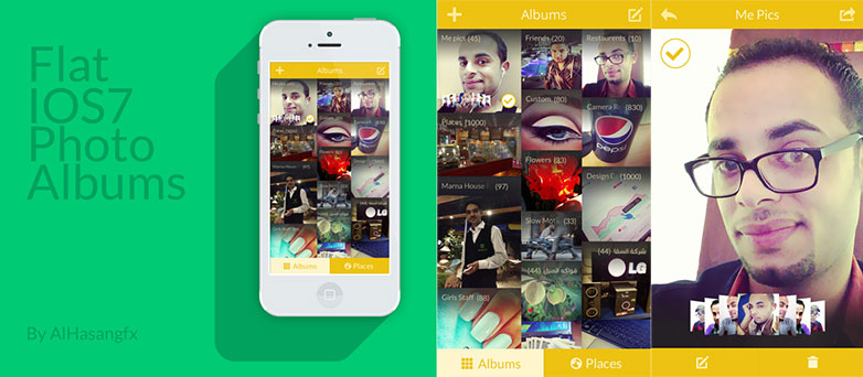
 The last great bastion of skeuomorphic design, Apple Inc., is rumored to be completely revamping its mobile OS, ahead of a relaunch at the Apple WDDC on June 10th. Speculation is that the next version of iOS, which powers Apple's mobile devices, will both adopt a predominantly monotone look and abandon the textures associated with it for the last six years.
Whilst there are plenty of designers who still advocate skeuomorphic design, many more are embracing flat design. Flat design proposes that faux-3D effects, drop shadows, and anything else that imitates real-world objects in a screen-based environment is essentially deceitful. Proponents of flat design believe that simplifying, minifying and 'flattening' designs produces user interfaces that are easier to understand, easier to use and more suitable for the contemporary landscape.
The legions of web designers adopting flat design increased ten-fold when it was realised how simple flat design makes responsive design; a flat responsive design can produced in a fraction of the time of a skeuomorphic version. Increasingly it seems that the era of the mobile web is becoming synonymous with flat design.
Apple have a reputation for innovation: the mouse is one of theirs, as is the folder > file graphic interface. However, in recent years Apple have taken a back seat in innovative areas, preferring to adopt technology once it had proven valuable. In fact, you could argue that the most innovative thing Apple have produced since the first iMac has been their corporate branding: iPods were not the first MP3 players, the iPhone was not the first smart phone; they were simply the most well rounded, well branded and commercially appealing versions.
It would be a huge coup for flat design advocates therefore, if this barometer of commercial design abandoned its flagship look in favor of flat design.
Following a larger trend for reducing the number of executives and expanding the remit of those at the top, iOS7 is receiving its overhaul curtesy of Jonathan Ive — Apple's Vice President of Industrial Design, who is responsible for the iPhone, iPad and iPod touch hardware. Ive is reported to hold a certain distain for skeomorphism — preferred by both Steve Jobs and former iOS chief Scott Forstall — stating that software design based on physical metaphors does not stand the test of time.
Oft-repeated rumors currently circulating include a change to the current glossy lock screen, making it flat and black; a change to the pin-code entry, with the addition of round buttons; app icons losing their gloss; and alerts losing their texture to become white on black.
Counter rumors suggest that this is simply a clever marketing exercise by Apple to raise interest in iOS7, and like the hardware designed by Ive, any actual changes will be slow and incremental.
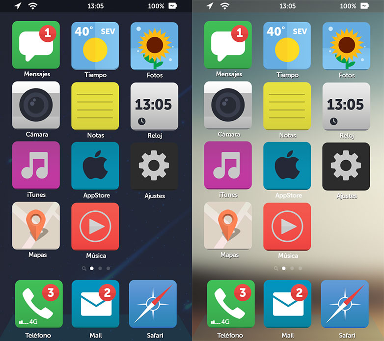
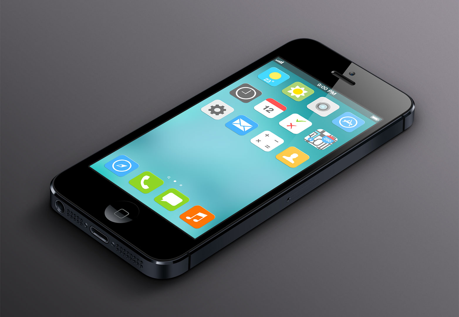
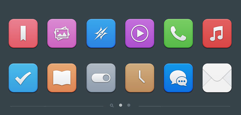
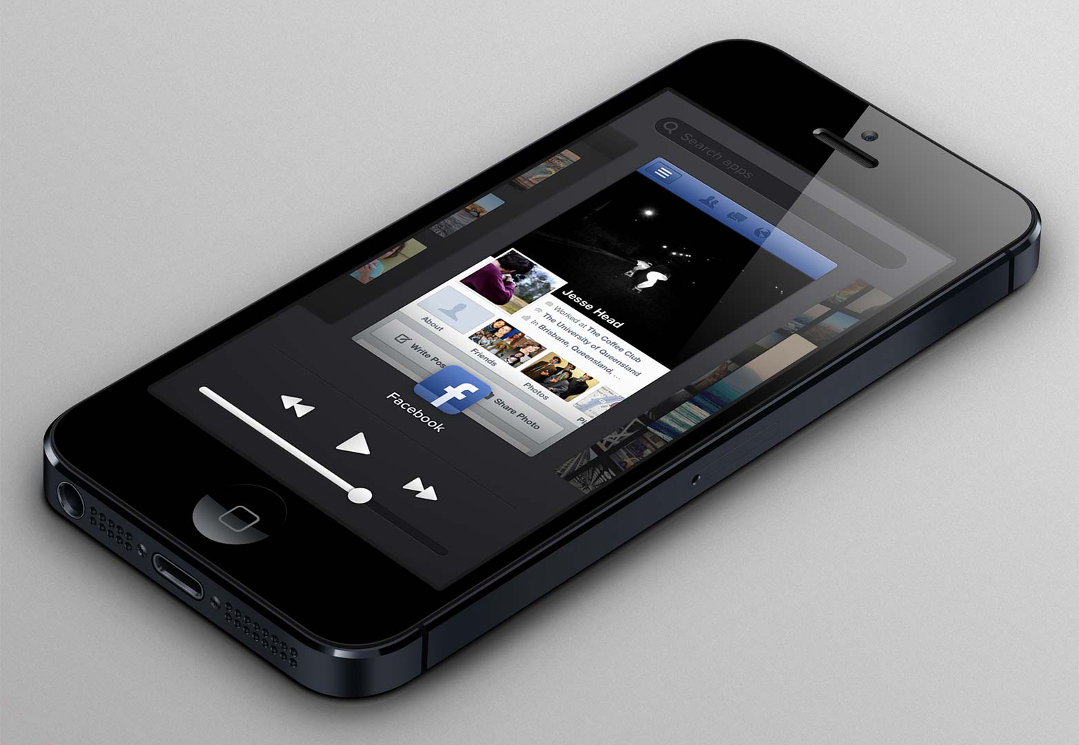
Will Apple switch to flat design for iOS7? Will a similar change to MacOS follow soon after? How will a non-skeuomorphic approach maintain a consistent iOS feel? As you might expect, designers have been publishing their ideas for some time, and we've included our favourites below.
iOS7 concept by Andre Almeida
iOS7 concept by Zikkzak
iOS7 concept by Nandor Tomas
iOS7 concept by AlHasan AlDasooqi
iOS7 concept by SimplyZesty
iOS7 concept by Peyman Eskandari
iOS7 concept by Dámaso Benítez
iOS7 concept by Alex Iv
iOS7 concept by Apfelpage
iOS7 concept by Oleg Turbaba
iOS7 concept by Agente Apple
iOS7 concept by Manu Gamero
iOS7 concept by Pieter Goris
iOS7 concept by Jesse Head
Which of these designs is your favorite? Should Apple adopt flat design? Let us know your thoughts in the comments.
Ben Moss
Ben Moss has designed and coded work for award-winning startups, and global names including IBM, UBS, and the FBI. When he’s not in front of a screen he’s probably out trail-running.

