When I was first introduced to graphic design, I was extremely young and a member of a pretty popular message board. Posters showed respect for other members by presenting them with these things called "sigs" — they were little rectangular graphics that fit in the reserved area for a person's signature. If you're familiar with message boards and forums, you know exactly what I mean. If not, it was just an image that showed up at the bottom of someone's message. This wasn't an exclusive concept for these message boards, as many did use this feature.
Back then, I downloaded either Adobe Photoshop 4 or 5 (it was so long ago, I can't recall the version). I went to work and eventually taught myself how to do many of the things these other designers were doing.
The designs we made were elaborate and colorful. They were fantastical and made people feel like they were mystical creatures hidden by the cloud of reality. These sigs were nothing but decoration and the more fun you had, the more the receiving member loved it.
This is now

Fast forward to now and if I showed you all some of the graphics I made during this time, you'd critique me harshly and probably continue by laughing at some of the choices I made. I would (and have) too.
We've strayed away from formerly learned concepts and there's two reasons why: 1) Design doesn't rest upon the favor of decorations and unnecessary aesthetics and 2) It's just not cool anymore.
Times change and trends do as well. In 2013, what we seem to value is flat design.
As we progress, so do our trends and our taste in creative things. That's an understandable concept, but it's gotten to the point where we just don't do lots of designing at all. We don't rarely make any of our design elements design heavy, even when they can be tasteful. We tend to opt for the flat, minimalist look. But when is enough enough?
Predictability and creativity

Lots of us preach creativity and urge others to think outside the box. I'm one of those people, but every so often it seems like we forget this concept and create graphics that are the norm or that are the trend. Sure, some of the things we do now just happen to work, but where's the creativity? Isn't there a way to use a trend but make it work for a certain person or brand. Have we become a little too predictable?
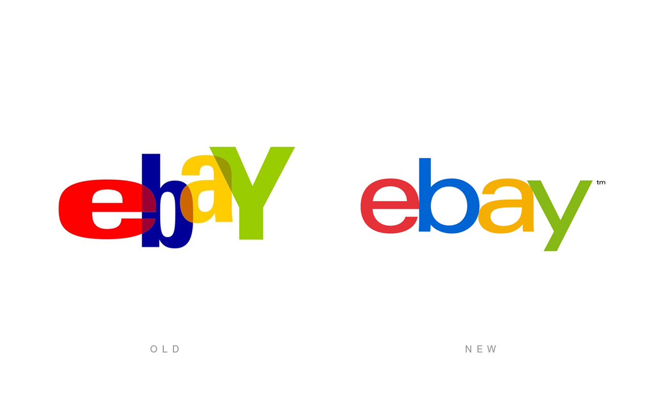
A while back, I touched on the idea that minimalism could be killing creativity after I saw redesigns for USA Today and eBay logos. There are obviously standards in design, whether it be logo design or web design, but everything seems to be so...regular. These logos weren't bad logos, but there were very simple and the rest of the branding seemed to fall into that category. There wasn't much character (especially with eBay) or style and I'm pretty sure I could open Photoshop or Illustrator now and make exact replicas of these two logos.
It seems that we've decided that the cleaner our graphics are, then the better they are. And this makes some sense — we are designing now for people to use things. The less clutter it has, the easier it is to use, but there's a very fine line between simple and plain. There's certainly an air of beauty that comes from simplicity, but we've got to do a better job of learning when that's necessary and when that's not.
Again, I like to think of the eBay logo as a prime example. The former logo stood for fun, but that idea has kind of been taken away. Simplicity is not just stripping the character of an element, but about taking away what doesn't need to be there, it's a very fine line. But distinguishing the line shouldn't be rocket science. What needs to be there and what doesn't? Not just from an aesthetics point of view but also from a branding point of view as well.
What we do with Photoshop

Adobe Photoshop is still the standard for web design. If you think about this, it's somewhat baffling because Photoshop was created to be an image editing application for photographers. As we continue to make it the go-to app for everything else, Adobe expands our capabilities and what we can actually create with Photoshop.
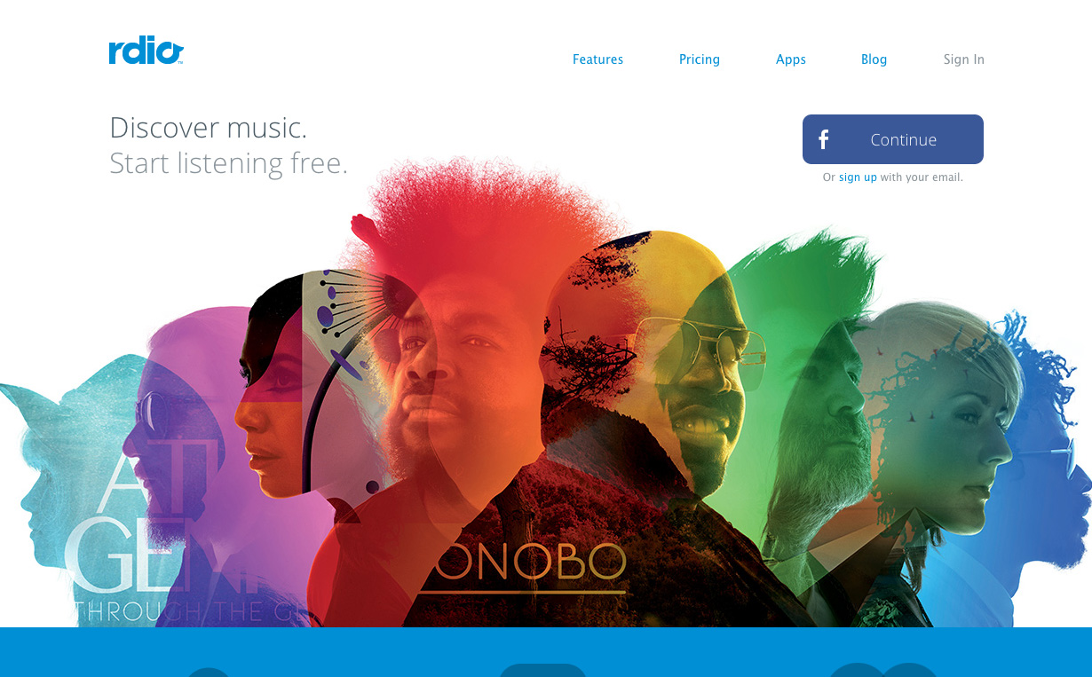
Unlike any other programs in Creative Cloud, Photoshop really allows you to do some extremely creative things. We can change and add the lighting in a photograph, add motion and different types of blurs, create glowing edges, warp shapes and so much more. It's great for graphical elements as well as light and heavy adjustments to photographs. You can literally create a new world and new feel just by messing with images and filters in Photoshop.
All these filters and all this ability to be extremely creative in Photoshop (and other programs), begs the question of why or why don't we utilize these effects more? Why are we so fond of solid color backgrounds and flat design? Why don't we create these new worlds for our audiences when they visit us online? Why don't we do more creatively?
Images and excuses

It's common to keep our designs fairly simple in print because not all printers and all colors are created equal. We try to control this with Pantone colors, but even still, bad things can happen after you ship a job off to print. This is a concept many who are familiar with print design are familiar with and understand: don't do a lot of gradients, fine details or crazy colors in print because you may end up very disappointed when your print is in your hand. It seems as if this mentality has crept into our website designs.
We know what Photoshop is capable of. And we know we can see the fine details, wonderous gradients, blurs and bright colors online. All screens aren't created equal (thanks to developments in retina screens and the like) but there's a standard that makes so many things viewable, so what's the excuse?
Many will point to image loading times as more complex designs will typically load slower than usual. And this is definitely the most valid concern, but there are various solutions. In Photoshop, we're able to splice large images and put them together with code. We can also find different ways and formats to save images so they don't take as long. There are hacks in web development that help sites load faster and so many other solutions to help out.
Another excuse is the ease of converting a flat design into a responsive site; but whoever said that easy was good?
When are we going to get back to being a bit more creative?
We are minimalist
We've been there before, that one website that has so much going on you don't know where to go or what to do. But that's not what needs to come back. No one is saying you have to design every piece of your web site, but perhaps create a more intricate background or other elements for your design.
Making everything so clean and simple is nice and it works many times. But we have to think of different ways to be creative and to utilize all the capabilities possible in our applications to really bring forth our creativity.
We aren't artists, but we are designers, and it's truly okay to design a little more.
Has the pursuit of flat design stifled our creativity? Is minimalism dull? Let us know your thoughts in the comments.


