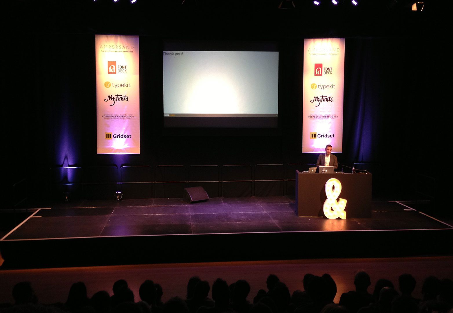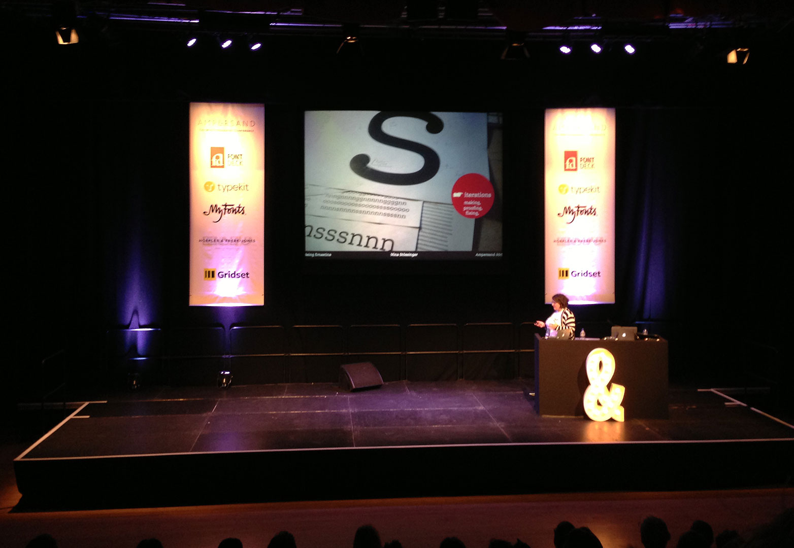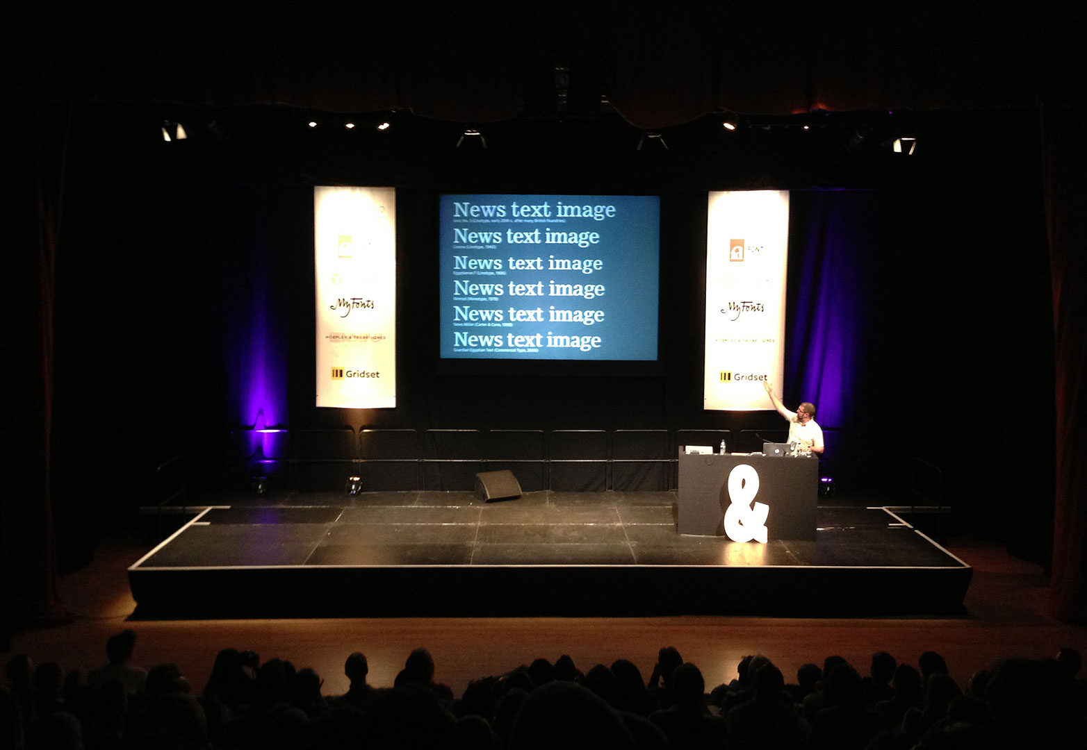
 Ampersand 2013 — held today in Brighton, UK — was the third iteration of the popular web typography conference.
Describing itself as "an affordable one-day event for knowledgeable web designers and type enthusiasts", the event is increasing in popularity year on year, and several people I spoke to today felt that this year's was the best so far.
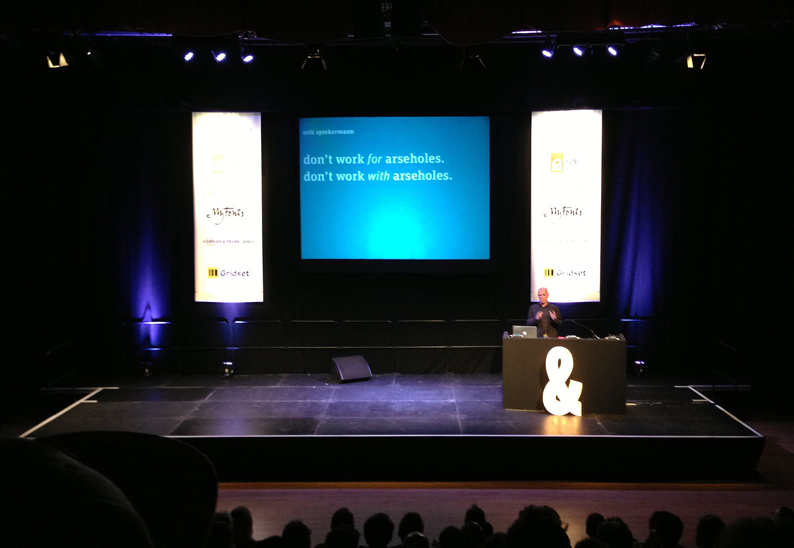
The sessions kicked off with the keynote, presented by Erik Spiekermann. Prof. Spiekermann is one of the preeminent identity designers working today. Responsible for both FF Meta and ITC Officina typefaces, he has launched several design businesses, but will be most familiar to many for his book "Stop Stealing Sheep and Find Out How Type Works".
Erik Spiekermann offers advice for a happy and productive work-life.
Spiekermann gave an entertaining talk, in which he played to British stereotypes of Germans. He recounted trying to persuade a Portuguese employee of Mozilla to change the name of a typeface Spiekermann had designed for them from "Feura". His concern he joked, was that whilst the name might work well on the Iberian peninsula, in English its pronunciation was a little too close to "Fuhrer".
The keynote was sprinkled with great information, tips — Spiekermann likes to compare type using words that end with an 'a' — and plenty of opinions too — he likes Georgia for body text, loathes Arial, dislikes Helvetica for the screen and can't understand why Apple aren't using Lucida for iOS.
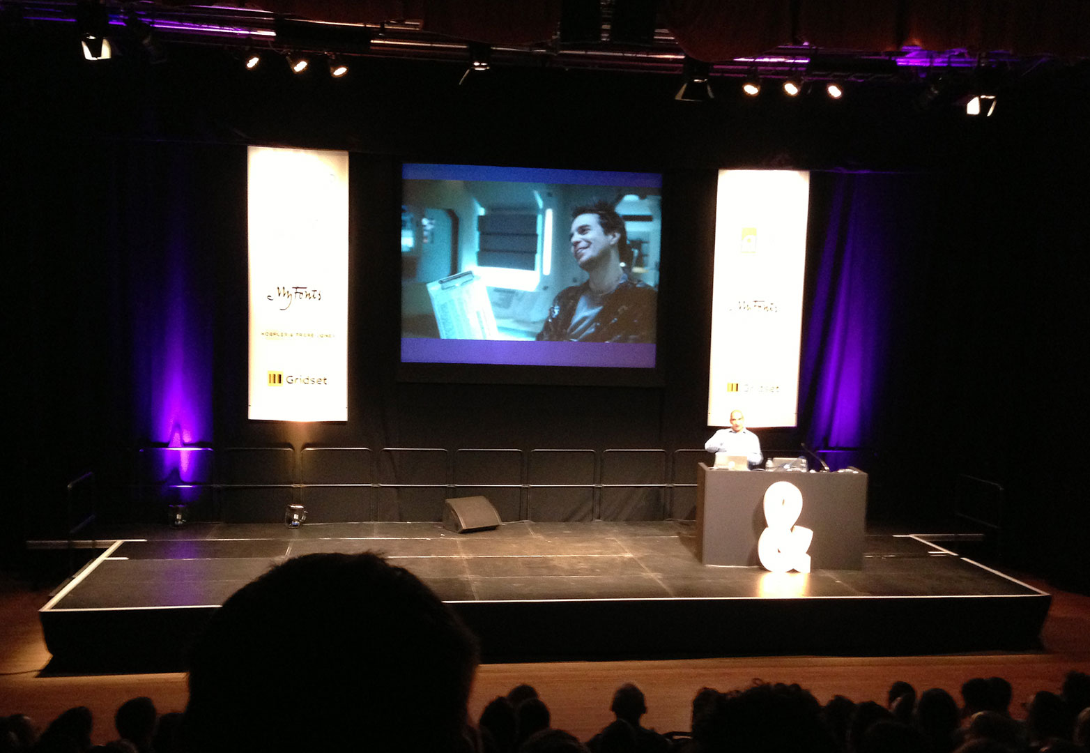
Gerry Leonidas discusses the incongruities of type in Sci-Fi films.
The following session was presented by Gerry Leonidas, senior lecturer in typography at the renowned course at the University of Reading. Leonidas focussed on the problems of truly complex typography, laying out Shakespeare for example, and on the need for a more contextual markup.
In addition to hierarchy, Leonidas would like to see a way of contextualizing each element on a page. His proposed solution was to add chainbefore and chainafter attributes to to HTML elements, allowing content authors to specify where in the context of the document an element fits. He believes this will enable far more complex layouts than are possible with nested <div>s and would be particularly useful in responsive design where rearranging pages as a result of browser shifts can break not just hierarchy but context.
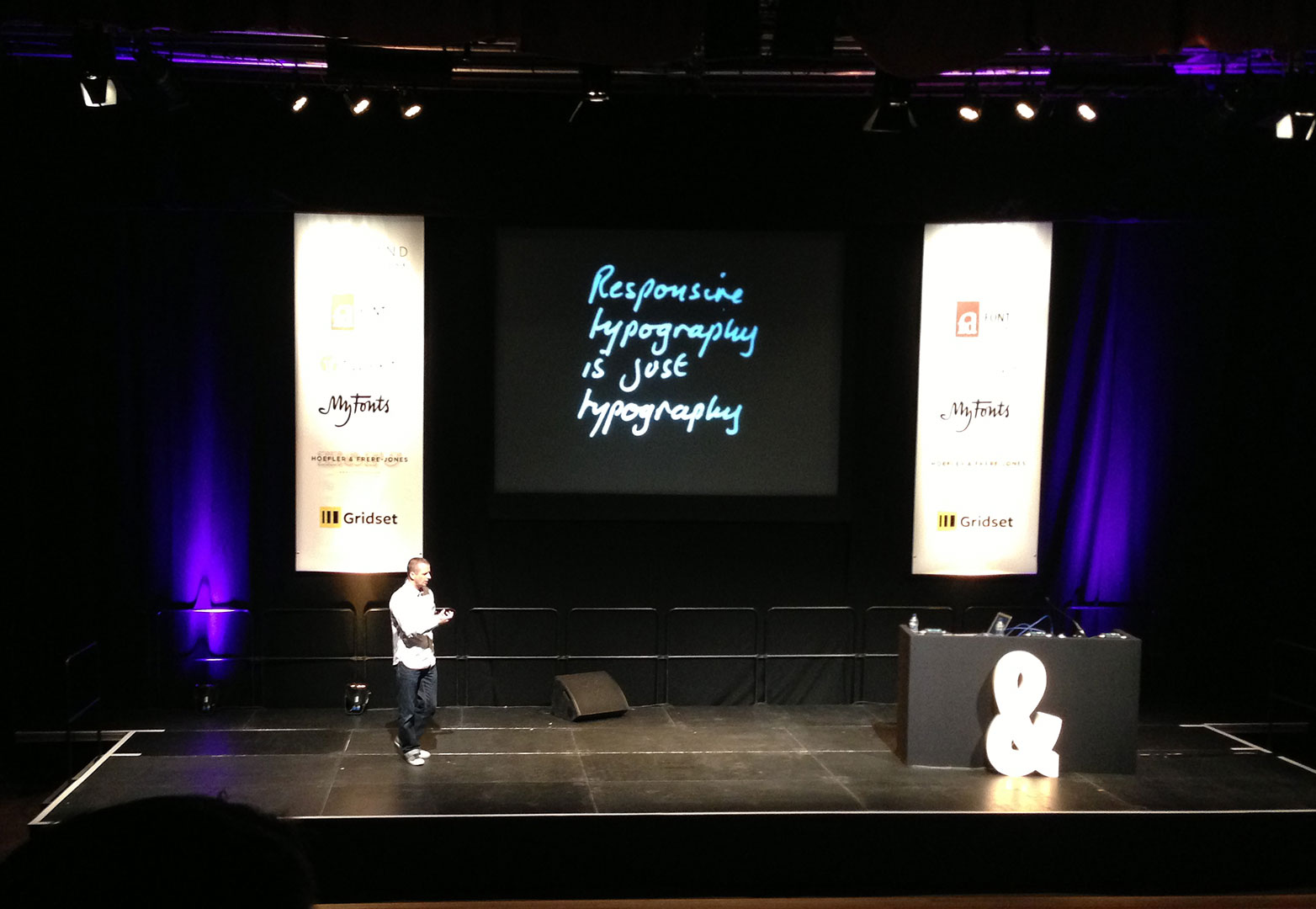
Mark Boulton argues the case for traditional typographic qualities in responsive design.
Inevitably responsive design was a theme carried throughout the day and the most interesting presentation was made by Mark Boulton. The title of his segment was "Typography in Responsive Design", but he actually argued, very persuasively, that "Responsive typography is just typography".
In discussing his own methodology, Boulton talked about a realistic approach to responsive type which he likened to the British Olympic Cycling team's famous mantra "Marginal Gains", in which emphasis is placed on improving every small detail that you can, trusting that the cumulative effect will produce a significant result.
Ben Terrett (right) and Chris Heathcote impart some of the problems hosting your own webfonts after their experience with gov.uk
Kutlu Çanlıoğlu discusses the complexities of adding arabic type to the BBC World Service websites.
Nina Stössinger presents the finer points of type design.
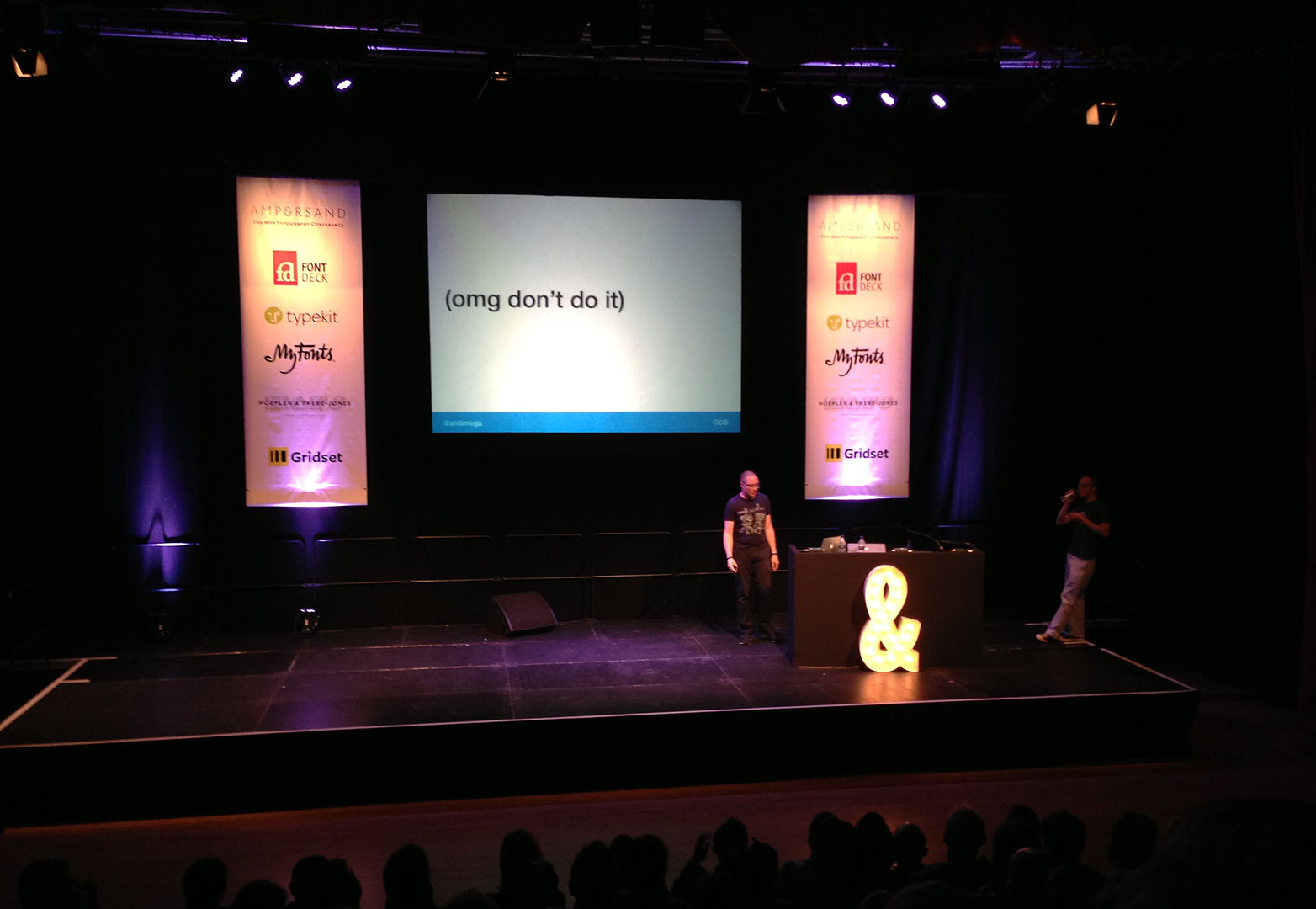
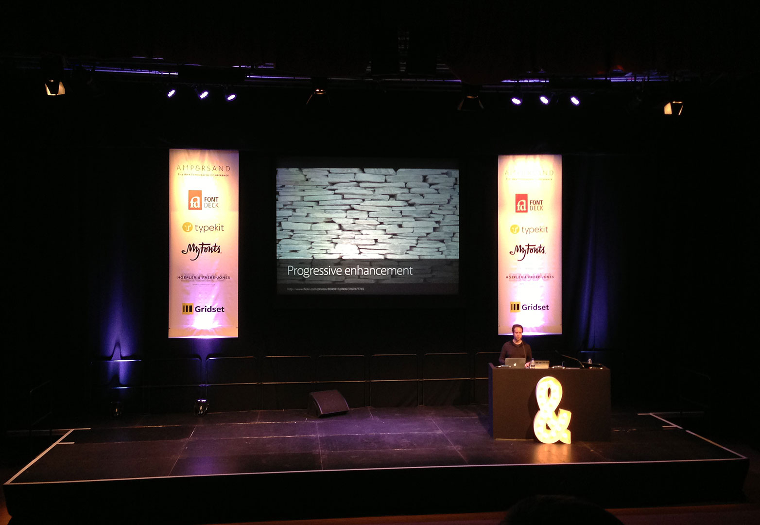
Andy Hume argues for webfonts to be treated as a progressive enhancement so that they don't risk blocking content.
The talk of the day went to Jenn Lukas of Happy Cog, who focussed on how designers and developers can work together to ensure typographic decisions aren't lost in translation. Her energetic and enjoyable presentation did a great job of lifting the room after the final break of the day and umpteenth complimentary coffee.
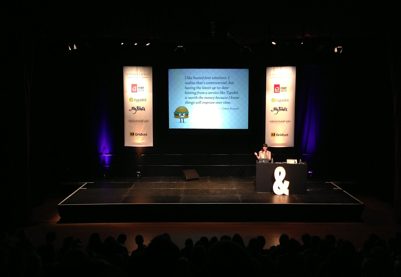
Jenn Lukas argues the case for third-party hosted webfonts.
Christian Schwartz identifies the key characteristics of type used for newspapers.
There were dozens of great ideas, insights and hopes for the future, presented at Ampersand 2013, many of which we'll be sharing on WDD in the coming weeks.
However those of you in North America have something more to look forward to: previously only ever held in Brighton, Ampersand NYC will take the typography conference to New York City on the 2nd November. The schedule for the day is yet to be announced, but the increasing reputation of the event on this side of the Atlantic means that the early bird tickets, currently available on ampersandconf.com won't last long.
Were you at Ampersand 2013? What topics do you hope are covered at Ampersand NYC? Let us know in the comments.
Ben Moss
Ben Moss has designed and coded work for award-winning startups, and global names including IBM, UBS, and the FBI. When he’s not in front of a screen he’s probably out trail-running.

