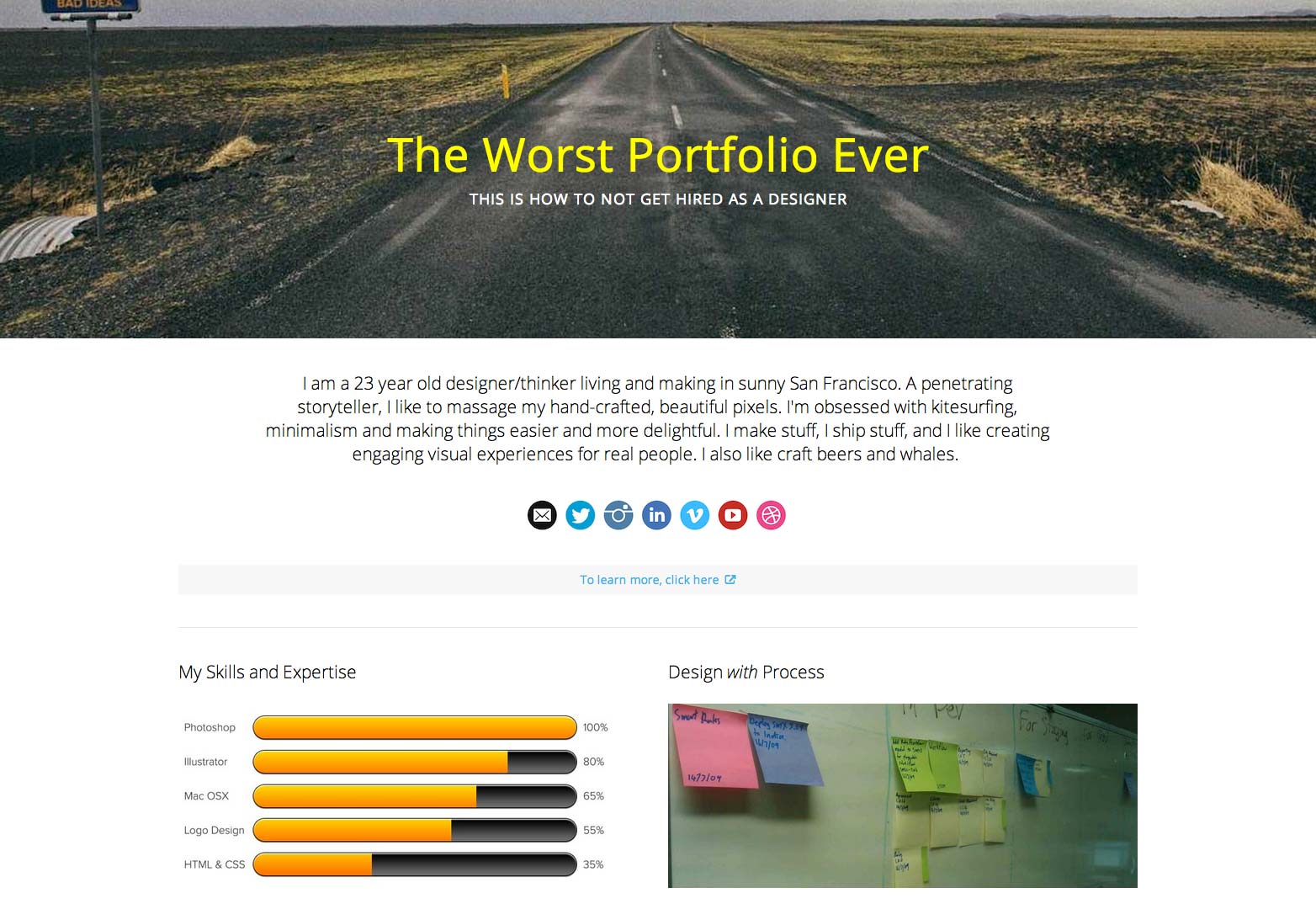
 A few weeks ago Alex Cornell, posted what he describes as "The Worst Portfolio Ever" a page of clichés, overused trends and boring copy.
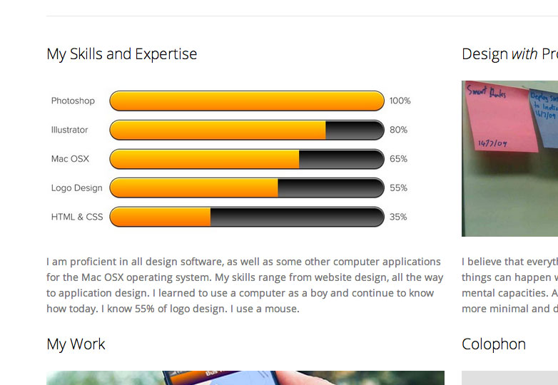
His motivation was presumably to educate the masses as to how a portfolio should look. Cornell's amusing spoof features such gems as the obligatory "road to nowhere" photograph, pretentious biography and a skills chart listing expertise as percentages.
The sub-heading on Cornell's mock site is "This is how not to get hired as a designer". However, the fact of the matter is that many designers with promo pages — let's not call this a portfolio, good or bad, because it isn't one — do get hired.
What's good about "The Worst Portfolio Ever"?
Well, the key to this page's value is the first line of the biography; the designer says she is 23 and living in San Francisco. That means that if I'm looking for a junior designer for an agency based in San Francisco, our fictional designer passed my first criteria.
What's more, our fictional designer has a life and interests outside of the office. That makes her the kind of person I'd like to spend 60+ hours per week with.
Cornell's own critique of the page is most scathing on the lack of work, but in my experience, junior designers very often have limited input in large projects. If you've spent a couple of years after college working as a glorified tea boy/girl, then there's not much I'll learn from reviewing your portfolio.
The reality of this industry is that some very competent juniors put in very long hours on large-scale projects from which it is impossible to present an honest reflection of work. How exactly should our fictional designer caption her work, "Here is a site I worked on, the typography, branding, layout, photography and code were all handed to me, but you see that rounded rectangle? I changed that from 8px to 9px"?
If I want to grasp the level of her ability, I'll check out this designer's LinkedIn page, which is linked conveniently enough.
Who is the "The Worst Portfolio Ever" for?
I've been involved in several recruitment processes over the last few years and in each case one thing was true: every design vacancy is massively over-subscribed. As a result job vacancies are rarely handled by designers; they're handled by HR managers, or even recruitment consultants. A page of world-class work is of no use to these people, they rarely have design qualifications; there's a list of requirements and if you can tick off 75% of the boxes — that's right, you don't need 100% — then you're probably in line for an interview.
Naturally Cornell views the page from his own position, it's a spoof based on his experience of recruitment. One of his central bugbears is the focus on presenting skills as percentages. And yes, of course it's true that no one knows 55% of logo design. But what these skill charts tell me is firstly what skills our designer possesses and secondly where she views her strengths and weaknesses, for example it's clear from the chart that whilst our designer has spent around half her time on logo designs, she's spent a little less on coding; that bias tells me if she'll be a good fit for the vacancy I'm recruiting for.
Imagine for a moment that a leading San Francisco agency is in need of a junior designer. Here's a list of requirements they'll typically ask for:
- recent graduate or 1–2 years of agency experience;
- resident in, or willing to relocate to the Bay area;
- experience of Adobe CS/CC, Photoshop, Illustrator, InDesign, etc;
- knowledge of Mac OSX beneficial;
- experience of brand development;
- knowledge of HTML & CSS (not WYSIWYG) a bonus.
Guess who's getting an interview… yep, you got it, our fictional designer.
Will "The Worst Portfolio Ever" land you a job?
No. But neither will the best portfolio in the world. What this promo site will do is get you in the door, add you to the shortlist and give you a chance to impress at interview.
Cornell's example isn't particularly well designed, the copy is awful and the photos used are terrible clichés. But for junior designers this is closer to a design solution than many work-centric portfolios that at best obscure a junior designer's abilities, and at worst exaggerate them.
The lesson we take away from Cornell's amusing spoof has to be: when we design, target audience has to be central to every consideration. On that basis, "The Worst Portfolio Ever" isn't the best portfolio ever, but it's a long way shy of the worst.
Is "The Worst Portfolio Ever" the worst portfolio ever? What's the worst thing you see in portfolios? Let us know in the comments.


