 There's a good chance you're intimately acquainted with the work of Steve Matteson, it's probably right in front of you for much of the day.
Arguably one of the most influential designers of the 21st century; his most famous achievement is the acclaimed Open Sans, originally designed as Google's corporate face it's now also the chosen typeface of the WordPress dashboard.
Graduating from the Rochester Institute of Technology in the late 80s Matteson moved on to Monotype via QMS, went on to found Ascender Corporation and then returned to Monotype in 2010 as Creative Type Director. Along the way he has designed dozens of brand-specific typefaces for clients such as Google Android, Microsoft Windows, Microsoft Xbox and Xbox 360, John Deere, and Hilton Brands.
Much in demand by companies and conferences worldwide, Steve was kind enough to take time out of his busy schedule to answer some questions for us:
WebdesignerDepot: You're frequently described as an 'American' type designer. Do you feel there is a distinct 'American style' of type design? And if so, how would you characterize it?
Steve Matteson: My particular interest (historically) is in typefaces designed prior to WW II — the private press movement was a venerable heyday of beautifully rich typography. Perhaps my association with this period in time — and Goudy in particular — adds to my being categorized as 'American'.
WD: You've spent a lot of time immersed in the work of Frederic Goudy, including reviving his Truesdell typeface back in the 90s. What's the most challenging aspect of digitizing typefaces originally designed for printing?
SM: There are numerous challenges — not the least of which is the lack of ink squeeze in today's reproduction processes. Also there is an unfortunate 'one size fits all' mentality of today's graphic designers who assume a typeface will always look good at any size they choose. So many digital types look awkward or uncomfortable at sizes they weren't intended to be used for. Some of the revivals I have done have included some ink squeeze so appear a bit 'soft' compared to digitizing actual drawings. The two different approaches will give very different results in the end.
Truesdell was digitized from kiss impression repro-proofs and looks very clumsy above 16pt. It needs a version adapted for large sizes that Goudy never imagined Truesdell might be used. Some day I hope to finally make this happen.
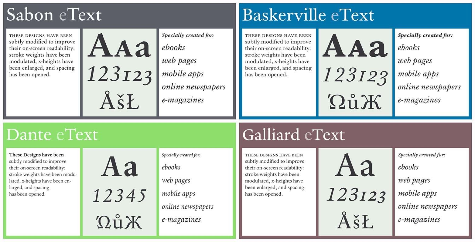
WD: Your team at Monotype recently released a series of eText fonts, bringing typefaces such as Sabon and Baskerville to the screen. Are there any other classic faces that your team hopes to revive?
SM: We've recently released Dante and ITC Galliard re-tooled for eText. We have new designs coming soon like one called Halesworth (by Carl Crossgrove) which is particularly nice for screen reading. We are committed to refining book types for reading devices in order to provide a more comfortable reading experience. It is truly remarkable how different typefaces look on various hardware devices — the variables of technology and resolution require a lot of careful fine tuning. Many great print typefaces simply don't work at all.
WD: You graduated from RIT just as Macs were taking hold of the design industry, how influential was that wave of technology on your career to date?
SM: Well the timing couldn't have been better. Every aspect of the digital typography business took off while the business of printing began to wane or change in unpredictable ways. Mastery of the Macintosh played an important role in my career but ultimately so did UNIX and Windows. I think the Macintosh offered a softer landing into working with computers full time. Prior to it I had a hard time warming up to code — I've forgotten probably more than I ever learned about Fortran, Basic and PostScript.
WD: You once said that Curlz wasn't one of your most proud moments, but that it answered the client's brief. How often have you had to compromise your creative sensibilities to satisfy a client?
SM: Well I'm not sure I'm alone in this matter. Designers often have to give in to what the clients want and I don't think that's necessarily always a bad thing. Sometimes there are instances where technological limitations (such as pre-defined vertical dimensions of a user interface) lead to unavoidable aesthetic compromises. Fitting Thai or Arabic scripts within a vertical space designed for Latin letterforms is a common example of this. There are also times when a client might have a certain style in mind and can't let go of that aesthetic no matter how much you try to convince them otherwise. Type, being quite a subjective matter, will always be at risk for this kind of friction.
WD: Your client list is filled with household names: Google, Microsoft, Apple, Barnes and Noble. What is it about working with large corporations that inspires you, and do you ever work with small startups?
SM: I've done work for a really wide range of clients from underwear to software. The larger companies are particularly fun because there is usually a very important technological element to the project. Designing a typeface for a new screen is something I love to sink my teeth into. It means taking into account all the things I've learned about making type and putting it into practice for the benefit of the reader. More often than not these are the companies that really care about the reading experience and will work hard to get it right. That said, I recently received a hand made book from a private press set in my Bertham Pro typefaces. There's a lot of reward in that tactile experience because usually I'm faced with pixels behind glass.
WD: Some of your best known work — I'm thinking specifically of Droid Sans and Segoe — has focussed on making corporate faces friendly. Is that a key request from corporations, to make them appear more human?
SM: I think the corporate world struggles with being more human now more than ever. There is an emphasis on getting away from requiring customers to talk to robots, corporations buy local goods and implement green policies. All these things add up to wanting to put a recognizably warmer face on the brand. Typefaces and typography are key to good messaging and should be a part of this shift. Of course the challenge is to not go too far and look so casual that elements like 'trust' or 'commitment to excellence' are lost in the brand promise.
WD: Corporate work has meant you've designed for a number of non-latin alphabets including Cyrillic and Greek. How do you judge legibility when you're working with letterforms that aren't native to you?
SM: Working with non-native letterforms requires a great deal of study, familiarization and sensitivity to type trends in the region you are designing for. I'm lucky to have worked with linguists from around the world to help tune the right letterform structures and proportions for scripts beyond Latin.
WD: You've said one of the ways you blow off steam is by carving letters into stone. Does this process inform the way you construct letterforms when you're back at your desk?
SM: I don't think it does. The tools are so different and I'm not accomplished enough with carving to really draw upon those skills back in the office. I think the visual perception of letterforms is enhanced when working in stone (just as it is with calligraphy or hand lettering). The nice thing about stone is you can run your finger around a curve and get a sense of whether it's awkward or not. I think most of my designs have had capitals with classic titling proportions. I tend to more rounded O's and narrower E, F, L for instance, rather than homogenized widths.
WD: Droid Sans had a lengthy consultation process. During the early meetings were you ever tempted to wave your hand in the air and say "These aren't the droids you're looking for"?
SM: Ha! Actually not at all. In fact the process was fairly typical of productive design collaborations. I had very quick feedback from Android designers as they tried various versions of the typefaces in pre-alpha products. The only hard part was waiting for a commercial device to be released to the public so long after the designs were complete.
WD: Open Sans is very similar to Droid Sans, why did Google ask for a whole new typeface rather than a 'Droid Sans Extended'?
SM: Typeface naming is never a very pretty process. In this case I'd have to defer to the branding team at Google for this answer. Chrome branding vs. Android branding etc. Droid was intentionally narrow for mobile screens but it didn't have 'narrow' in the name. Open Sans isn't really 'extended' so that wasn't really an option either. A new family name is the direction they chose.
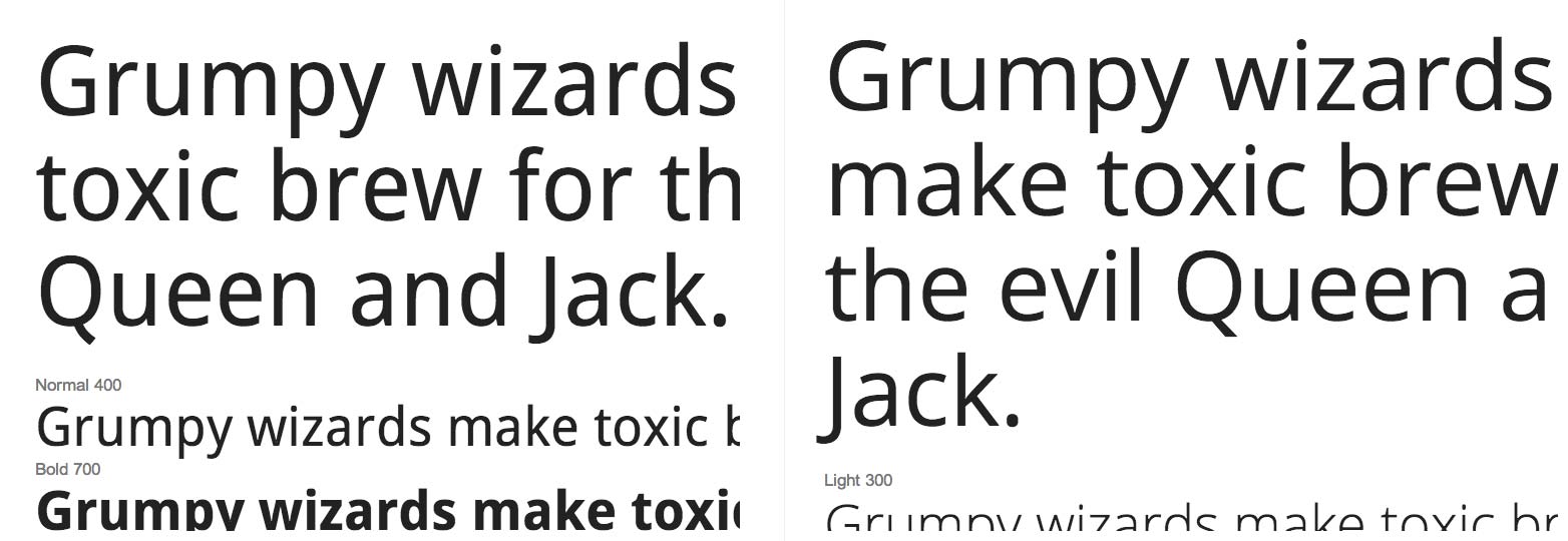
Droid Sans (left) and Open Sans (right).
WD: Does Open Sans have a sweet spot? Are there sizes outside of which it doesn't work?
SM: I've seen a lot of blog templates using the Light weight at too small a point size. I think it's tempting to make type small and leave a lot of white space but there is a balance that isn't always kept between usability/readability and white space.
WD: Droid Sans has an accompanying serif, and even a mono-spaced variation. Why isn't there an Open Serif?
SM: Droid Serif was deemed adequate to accompany Open Sans. I would like to make a variant for print at some point that has a smaller xheight.
WD: Are there any existing typefaces, serif or otherwise, that you like to see paired with Open Sans?
SM: Open Sans is a rather contemporary humanist design with upright stress. As such it works well with sturdy serif designs like Georgia, Ysobel and PMN Caecilia. I personally haven't experimented much with it but I would like to see how it behaves with Old Style book faces like Dante or even Sabon. I know it contrasts nicely with Bertham Pro because I set them together a long time ago.
WD: Web designers often use media queries to refine designs for different devices, for example you might use Open Sans for desktops and switch to Droid Sans for mobile experiences. Could this herald a return to single-size fonts, or do you think scaleability is essential?
SM: There is a lot of work going on in this area and I absolutely think it is essential. Any device over 240 dpi causes designs originally intended for print to look anemic in text. Those same typefaces might look relatively decent on the desktop. The techniques for adjusting types for optical sizing should be practiced either through adjustments in the rasterizers or in new outline designs. The hardest part is educating a design community that these kinds of nuanced things are important for the reader.
WD: As well as designing type, you've also designed websites. How does your experience of building type influence your website designs?
SM: My web design is probably not worth discussing — I've only learned how to do it to understand how type works in this medium.
WD: You've been involved in legibility testing for both automotive and aviation industries. Is more legible type potentially life-saving? Conversely, does bad type kill?
SM: Through our research with MIT we've concluded that legible typefaces decrease glance time and therefore help reduce driver distraction. But we know that so many factors come into play with regard to safety — typographic layout, color, contrast, glare, brightness to name a few. We certainly hope that we can contribute to driving safety by making information more clear to the driver.
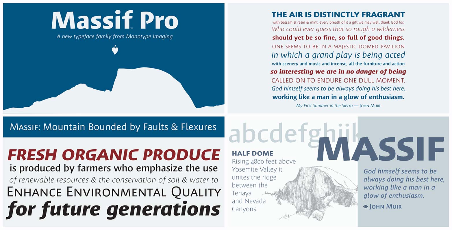
WD: Your type designs are normally a response to a technical, or branding problem. More recently you designed Massif, reportedly not as a specific design solution but rather, inspired by your love of the Sierra Nevada. How has that process differed from your usual practice and is it a path you intend to follow in the future?
SM: Inspiration comes from many sources and Massif just happened to be an itch I had to scratch. No customer. No brief. The revivals I've done have been for the same reason — just wanting to see if something works. It's very different from having a customer with a brief in mind. It's kind of like a studio musician playing a certain style or dynamic for a guest performer — then wanting to explore his or her own sources of inspiration and expression when they're not on the clock.
WD: As technology moves on, the demands on type will inevitably change. Do you think we'll see a young designer reviving any of your designs in 2093?
SM: That's such a great question I've never thought about. Certainly I think many types we see today are going to have to be revisited throughout changes in technology and fashion. New weights, additional languages and OpenType features could certainly be among many treatments given to my existing work. Heck I'd like to retouch everything I've done thus far. But if reviving any of my work becomes necessary when I'm dead and gone I hope my designs provide a good foundation for further exploration.
We'd like to thank Steve for taking the time to answer our questions.
Featured image/thumbnail, uses Steve Matteson image via Doug Haslam


