 When Google acquired YouTube back in 2006, most people expected to see a rebrand to pull the video sharing site closer to its parent company's corporate style.
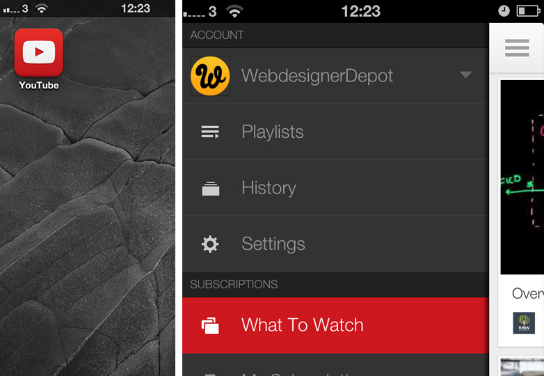
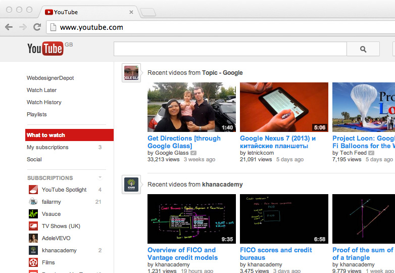
That anticipated rebrand may finally be on the cards 7 years later as YouTube rolled out updates to its apps at the end of August, featuring a swanky new logo. Strange then, that the new branding has thus far failed to appear on YouTube's web sites.
Questions are being asked, particularly in the light of Yahoo!'s disasterous rebrand, if Google has had a change of heart.

The new YouTube app.
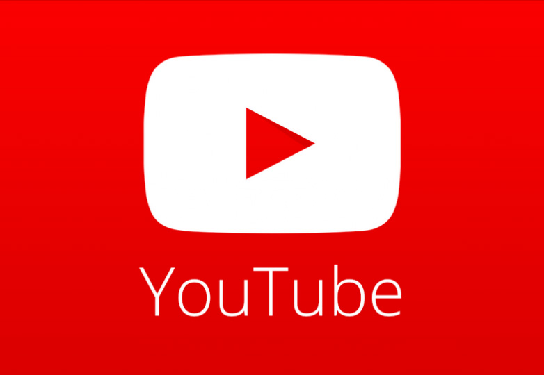
The new logo features a red square, the famous YouTube TV shape imposed on it, this time in white, and a generic play icon — not too dissimilar to the favicon YouTube use. The new logo also features Google's corporate face, Open Sans. And whilst I'm a big fan of the typeface, I do question the wisdom of using the lightest weight for a logo that will need to reproduce very small. Especially in the context of the impending iOS7 release and the light Helvetica the early designs used.

The new YouTube logo.
Given the relative complexities of updating a website and updating and distributing an app, you have to wonder, what's the delay?

YouTube.com on September 10th 2013.
It seems there are two possibilities: Either google has done a complete about-face and having launched the app with a new brand will be reverting to the Trade Gothic logo shortly; or a full redesign of the YouTube site is imminent.
Either way, the branding would have far more impact if launched across all fronts simultaneously.
What do you think of the new YouTube logo? Should YouTube switch to the new branding or stick with their old? Let us know your views in the comments.


