 Recently, a friend suggested that I write an analysis of news websites: what they're doing right, and what they're doing wrong. He suggested that the online news experience was too backward, and maybe a bit boring, and figured that they could make better use of AJAX and similar technologies to streamline content delivery and site navigation.
I was inclined to agree at first. I feel that, in many cases, newspapers are still trying too hard to maintain the physical newspaper experience, but with a sliding images approach. In doing this, they often restrict themselves to a familiar but somewhat limiting visual format. This trend also shows itself in some very poor UX decisions, such as almost illegibly small body text.
I know it's been said before, but the web, as a visual medium, is fluid. It's complex. It's beautiful. And perhaps most importantly, it's capable of so much more than many people realize.
So when we see how many major news outlets limit themselves, it's disappointing in the light of what could be done by making more use of AJAX.
Or maybe not…
It all comes down to the mobile experience
More specifically, it all comes down to the mobile experience of the majority of mobile users. It would appear that many news sources are not taking these users into account yet. Sure, lots of news sources have put out a native app for Android and iOS, but lots of mobile users tend to download these apps, and then never, ever touch them again.
Many of us don't go browsing the news sites for the sake of it on a regular basis. Most of us will probably click on a link provided to us by a friend, relative, or internet personality whose taste we trust. We'll click, or tap, on links provided to us via social networks, e-mail, RSS feeds, or links inside other articles. These links will not take us to a given app, but to a website. Therefore, every news website should be mobile-ready.
So what's the problem? Why couldn't we upgrade these news sites with tons of cool stuff? iPads and the Galaxy Tablets have fully-functional web browsers, and decent processors, after all.
Even so, there are two big arguments for keeping news websites as minimal and technologically simple as possible…
Bandwidth
News websites, as a general rule, display lots of information on each page. The home page tends to be the worst offender, with the 3-5 most recent articles from each different topic vying for the users' attention, complete with pictures and sometimes multiple carousels. Add extra JavaScript on top of that, and you've got a mobile browser that's downloading a comparatively large amount of information.
Many mobile users browse these websites in places where there is no free wi-fi, and many cell-phone data plans have limited bandwidth caps. Add to this the fact that even on wi-fi, many tablets and smartphones seem to browse the web pretty slowly, and you've got a strong case for cutting down on the fancy stuff.
Not everyone has a fast mobile device
When my friend suggested that news websites could be made more UX-friendly with more AJAX love, I had to remind myself that he has an iPad. iPads are fast and smooth.
I was recently given my first tablet. It's a Hipstreet Titan. I'll give my fellow technophiles a moment to digest that fact, and maybe Google it, because that model is pretty obscure.
Being a cheaper tablet, it's slower than the high-end tablets that everybody is drooling over these days. That's just a fact. Another fact is that people who can afford cheap tablets and smartphones greatly outnumber those who can afford the drool-worthy tablets and smartphones.
Generic brands, knock-offs, and slow processors: this is what the vast majority of us will be using until mobile hardware gets cheaper.
On devices like mine, it's not just the wi-fi that's slow. Page rendering is slow, and JavaScript animations are choppy at best. Sometimes it's a battle just to scroll up and down. Incidentally, news sites that are heavy on the carousel effects and myriad images are the worst offenders.
Some of the pain can be offset by finding the right browser for your device. On my tablet, that's Opera Mobile. Even so, sites that are not optimized in any way for mobile devices will be irritating for the owners of cheaper models, and that's not how you keep readers coming back for more.
So is there anyone doing it right?
Of course there is. While it would seem that most of the major news outlets are relying on native apps, a few brave souls made proper responsive websites.
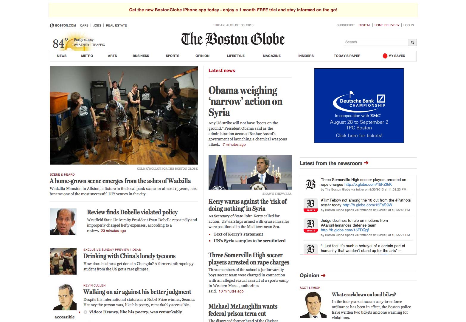
The Boston Globe
This example is probably the obvious one due to its popularity. The unveiling of the Globe's responsive design was much publicized and lauded within the design community, and for good reason.
Despite the sheer amount of information on the page, the design remains comparatively clean and uncluttered, with links big enough to tap on. Images are kept small and used almost sparingly.
The overall effect is that they've managed to make it look a bit like a newspaper and still make it work as a website. Their focus on typography and design clean of clutter and imagery makes the website a breeze to navigate through on my tablet, and yes, I can scroll up and down when I'm using my tablet.
The Onion
Although actually a pretend news site, the Onion's layout looks very, very similar to the Boston Globe's in some ways: three columns that shrink down to two, then one, etc.. Still, the approach works, and that's what counts. My tablet can handle it. As of now, that's the big selling point for any website.
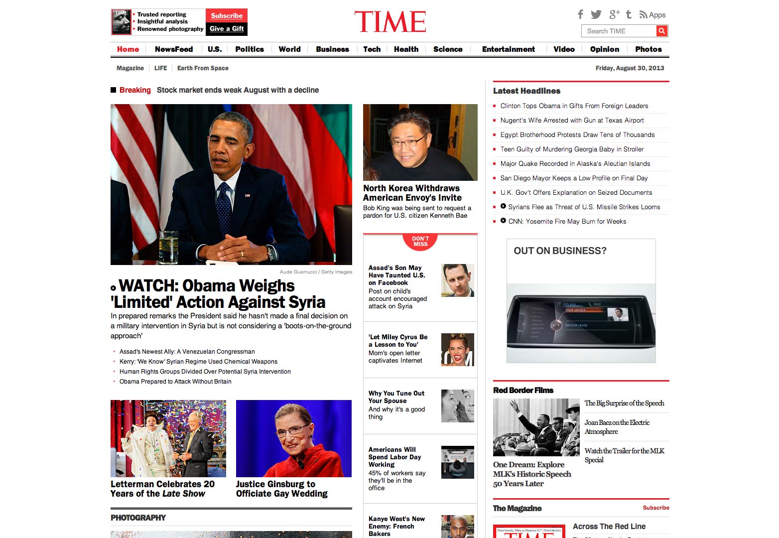
Time Magazine
Time Magazine is not technically a news site so I'm not going to give it its own set of screenshots, but if you want to see another excellent use of the responsive three-column classic news layout, check it out here.
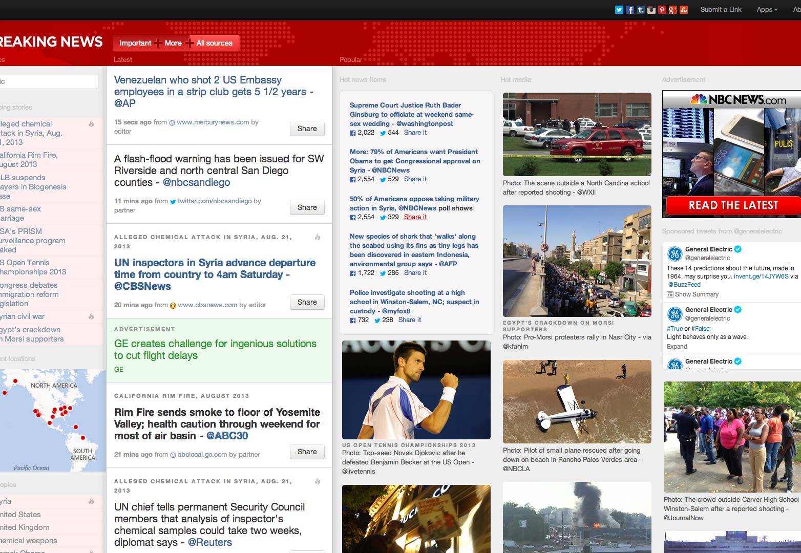
Breaking News
Breaking News completely abandons the newspaper visual metaphor in favor of an app-like approach. It's essentially a fancy RSS feed reader, and the article titles link to other news sites, but their approach to responsive design could easily be adapted to any news organization.
I especially like the fact that, while they cater to mobile devices, they have not left desktop users out in the cold. On my 1600x900 pixel monitor, the design stretches from edge to edge without breaking.
So how do we make better news sites?
We start by taking better care of mobile users. It bears repeating that many people who read the news are brought to individual articles by external links. You cannot rely on native apps to provide a mobile experience for the casual reader. It just doesn't work like that.
That's not even mentioning the fact that while iOS and Android are currently the two most popular mobile platforms, they are not the only ones out there. People on somewhat older smartphones, or those who only have access to more obscure brands are largely left unserved.
If your service is about making information publicly available, then that information should be as platform agnostic as possible. Enough said. Once we've done that, we can talk about other kinds of innovation and improvement.
What do you consider vital for news sites? What's your favorite news site, and why? Let us know in the comments.

