
 Logos are a different kind of design. They're tricky. They have to encompass an entire company, brand and attitude in one image.
Sometimes that image is iconic – the NBC peacock, the Verizon red checkmark, the Mercedes-Benz pointed star. Other times it's, well. . .not.
Even iconic brands can get it wrong – especially when they trade in a tried-and-true logo for something "new and fresh." Yahoo is hoping to get it right with its new logo, which they revealed this month, and Google are about to revamp theirs.
In honor of all the hype, we've put together some terrible logo fails. These companies all had great, recognizable logos and tried to upgrade — but what they really got was a downgrade (and some backlash). Let's take a look at where they went wrong…
USA Today
Stephen Colbert summed up USA Today's new logo in one simple statement:
Ladies and gentlemen, did (USA Today) deliver! ... Boom! A blue circle!
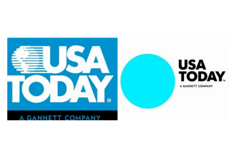
The media magnate had a logo that was incredibly well known (remember, it's a daily paper) and was also timeless. The new logo didn't make any dramatic typographical changes, but it did try a new, simple and detached style.
This detached logo separated itself from its former image, which represented fast-paced reporting across the globe. Instead, they gave us a static, blue circle. Not the most exciting — especially in the media world.
Pepsi
One million dollars. That's how much Pepsi paid for its redesigned logo. Unfortunately for Pepsi, $1 million wasn't enough to buy success.
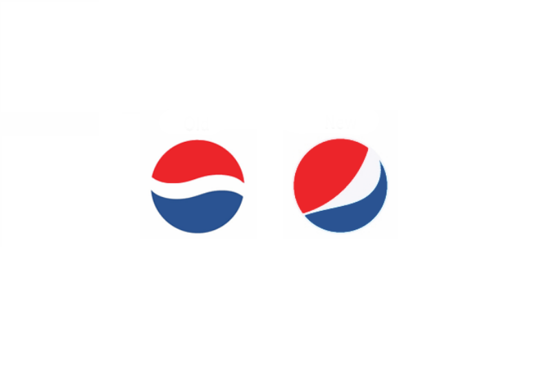
The slight tilt upward meant to mimic forward progress. However, to many it ended up looking like this:
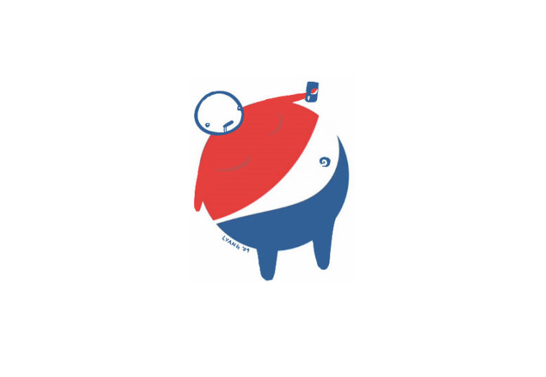
Definitely not the look Pepsi was going for.
Gap
Back in 2010, Gap tried to trade in their trademark logo for something sleeker and lighter. What they actually got?
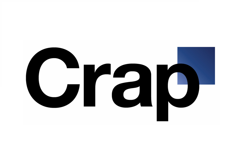
Well, that's what people thought of it anyway.
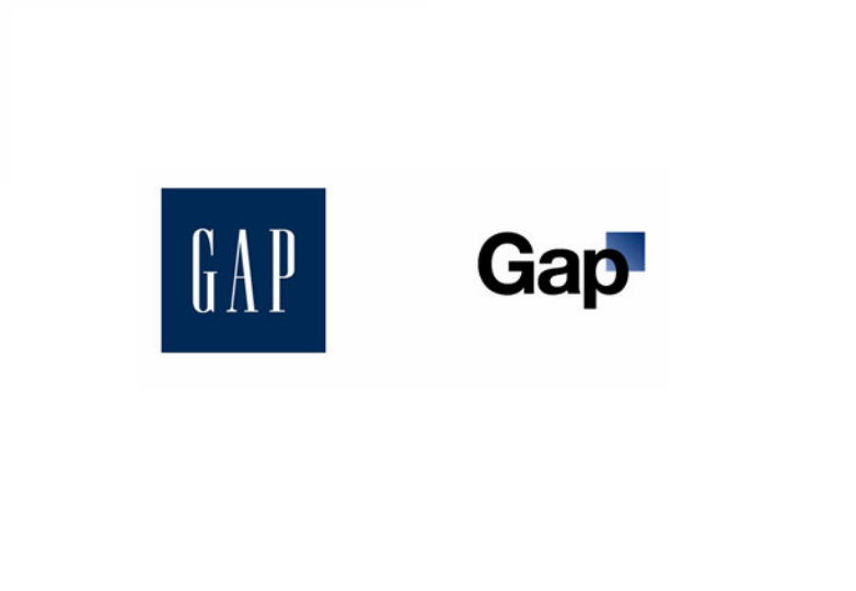
The old logo design was simple, an all-caps type set against a dark blue background. It was on every bag and box to leave a Gap store.
After the rebranding, the backlash was so intense that they abandoned the new logo after a week. Their attempted redesign actually cheapened the brand. Gap learned that instead of thinking outside the box, they should've kept its logo inside the blue one.
Kraft
One of the biggest design faux pas is crowding. Busy, overdesigned logos turn customers off. Also, the more "stuff" in your logo, the harder it is for consumers to identify with. Kraft's redesigned logo was a victim of overdesign.
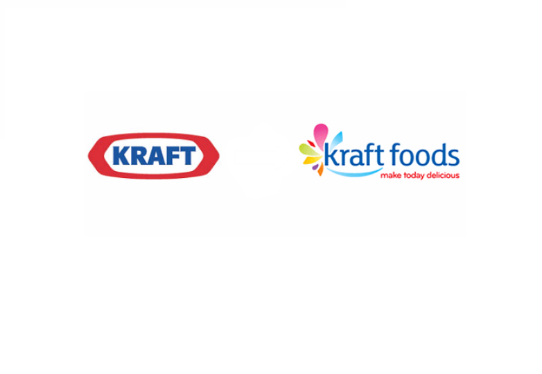
Put simply, it's just too much. The color explosion surrounding the K, the "smile" underneath Kraft, the slogan underneath "foods."
The previous logo was easily identifiable, simple and solid. Kraft's new logo however, is pretty unappetizing.
Animal Planet
Animal Planet has been around since 1996, along with its friendly logo featuring an elephant and globe. Makes sense, seeing as the channel is called Animal Planet after all. But in 2010, the Discovery-owned channel decided to ditch its family-friendly persona in favor of a design that felt more powerful and less soft.

Something was so powerful that it knocked the "m" on its side. Why? The cramped and "powerful" typography fails to portray the channel's true nature.
AOL
America Online. The AOL brand might not have the staying power it had when dial-up was the be-all and end-all, but it did have a logo everyone knew. For fifteen years, you couldn't escape this:
Now the company has rebranded, dropping the all-caps type in favor of 'Aol'. It also went with not just one logo, but six:
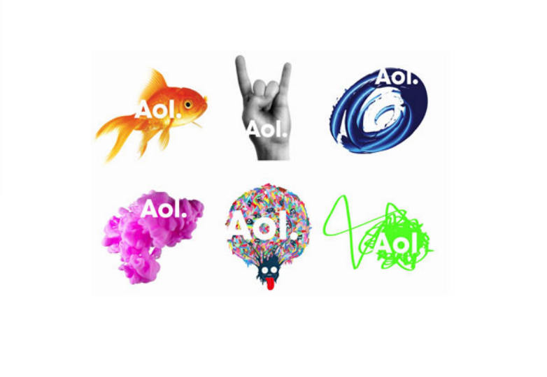
They're scattered without cohesion. Irrelevant to the Internet. Really, irrelevant to any product. AOL might've been trying to update its look, trying to make itself a media magnate, you divide the amount of people who can recognize you, the outcome is never going to be pretty.
Tropicana
We already went over how Pepsi managed to spend a fortune to mess up their iconic logo — and Pepsico managed to do the same with Tropicana.
Tropicana is known for its logo of an orange with a straw in it. It was cheeky and fresh (literally).
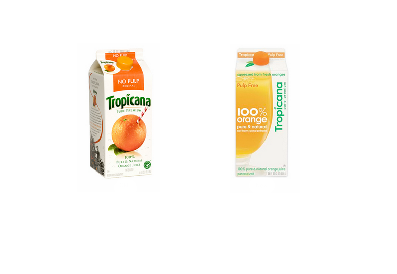
They swapped the old logo for one that's incredibly hard for customers to recognize in stores. You take away your signature image, replace it with a generic glass of orange juice and flip your name on its side. It's hard to identify with and hard to read.
It would've been nice if Tropicana had left the saturation in their new image. The new washed out look doesn't make anyone thirsty for OJ.
One positive that the new design had that the other didn't? The rounded cap. The way it mimicked an actual orange was pretty clever.
What brands do you think should have stuck with their original branding? Do you prefer any of these redesigns? Let us know in the comments.
Featured image/thumbnail, vintage Pepsi image via Matt.


