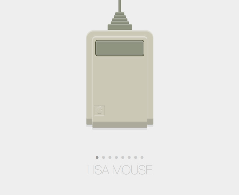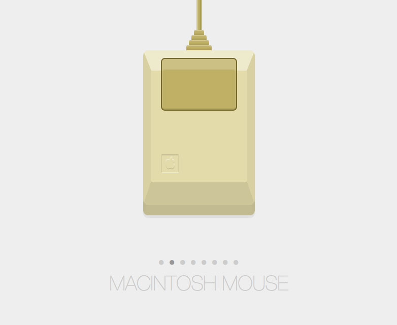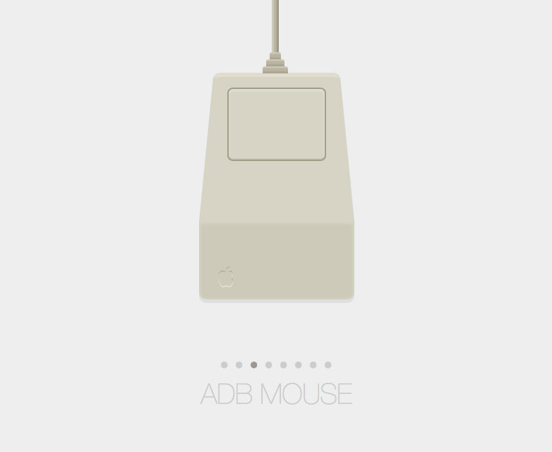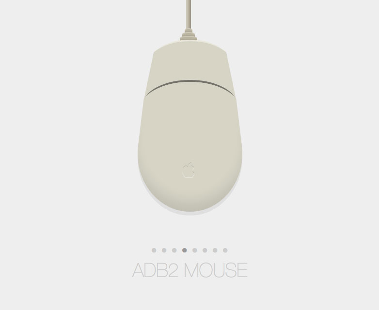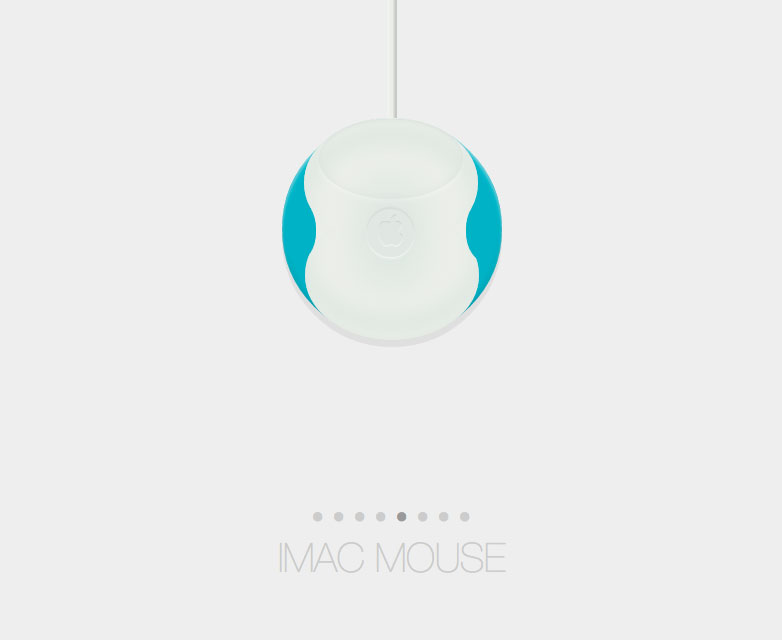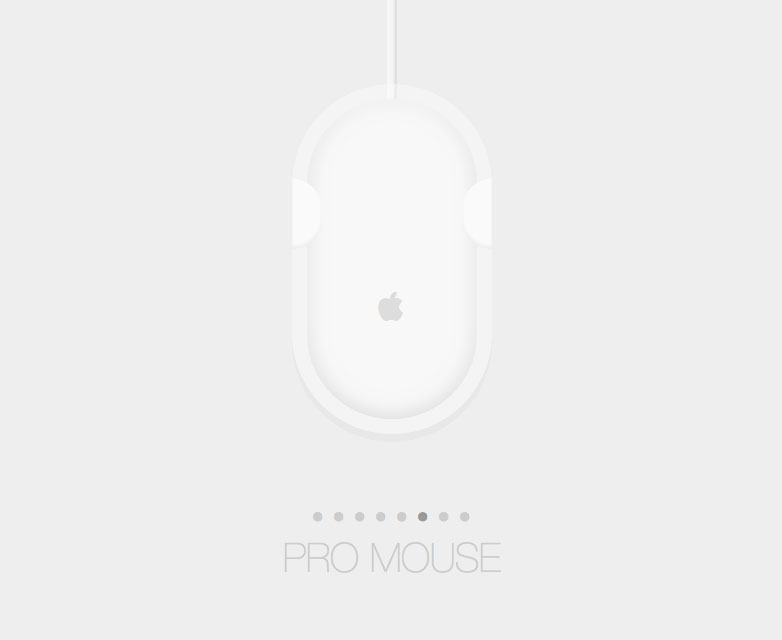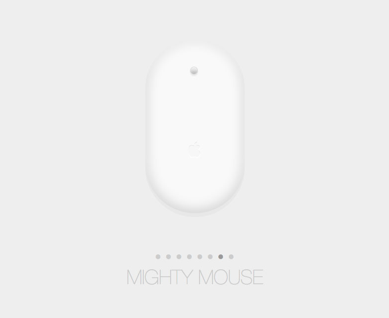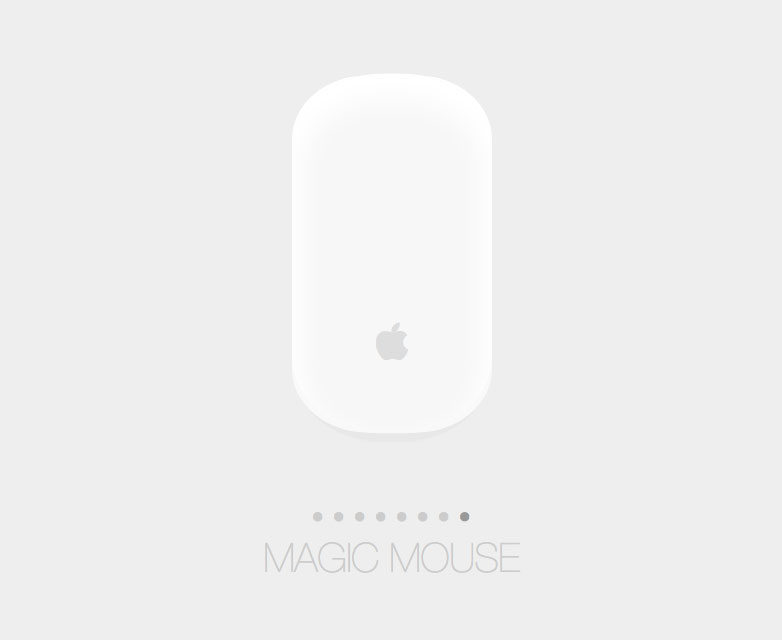
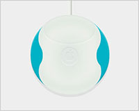
 Take a look at this incredible Pen, it's an homage to how radically the Apple mouse has evolved over the years. Using a clever blend of CSS drawing and transitions, Josh Bader illustrates the beautiful simplicity of a device that — without giving a second glance — we use every single day.
Clicking through the different mice (how meta!) is nostalgic. It is reminiscent of a time when what was possible to accomplish with the peripheral was nowhere near as impressive as it is today. With apps like BetterTouchTool and Apple’s own operating system, we can interact with the mouse in ways that Doug Engelbart could never have imagined in 1963 (twenty years before the original Lisa Mouse).
Watching the seamless transitions between the different models reveals some peculiar similarities in the mice, and gives a sense of the mouse evolving. The apple logo, while not always given the same emphasis, is present in all of the designs. We begin to see the slow disappearance of the standard single-click interface in 1998 with the release of Apple’s USB Mouse (iMac Mouse in the pen).
By reusing all of the same basic elements, and applying transitioning styles to each one, the code is, like the subject matter, elegant and simple. Using just a handful of <i> elements with mouse-specific styles applied to each of them, Bader has created a unique work of art that can be appreciated by even those who may be less CSS-savvy.
How's it done?
As previously stated, each mouse reuses some of the same components. This allows the markup to be concise and the CSS to be structured in a logical way that is easy to read. Each mouse is represented by its own block similar to what is displayed below:
/* Name */
/* Shapes and Colors */
.name.mouse, .lisa.mouse .top { }
.name.mouse { }
.name.mouse .top { }
.name .cable, .lisa .cable i, .lisa .button { }
.name .cable { }

/* Common styles for all “cable” elements like side buttons or cable protectors */
.name .cable i { }

/* Handles size and positioning of “cable” elements */
.name .cable i:nth-child(1) { }
.name .cable i:nth-child(2) { width: 60px; height: 10px; top: 90px; left: -25px; }
.name .cable i:nth-child(3) { }
.name .cable i:nth-child(4) { }
.name .cable i:nth-child(5) { }

/* These are self-explanatory */
.name .button { }
.name .logo { }
I’ve stripped out the actual styles so that we can focus on the actual structure of the CSS. It’s actually not as complicated as one might think. If you’d like to dig into what styles are applied where, refer to the original source.
The shapes and colors are mostly accomplished using the border-radius property with Multiple Box-Shadows, while the actual size and placement of the mouse-specific elements is handled by the cable’s child elements.
Finally, with some clever Javascript, Bader updates the parent mouse class based on the list-item that the user clicks on:
$('li').on('click', function() {
 var self = $(this);
 $('.active').removeClass('active');
 self.addClass('active');
 self.closest('ul').attr('data-mouse', self.data('mouse') + ' mouse');
 $('.mouse').removeAttr('class').addClass('mouse ' + self.data('mouse'));
});
Overall, this is very fun bit of code to play around with, even if just for the nostalgia. The patterns used here could easily be applied to other projects. It’s fascinating to see these projects come alive on a site like Codepen, and the open nature of the site means that anyone is able to fork this pen and change it in any way they see fit.
Have you tried drawing in just CSS? Which is your favorite Apple mouse? Let us know in the comments.

