 Let me start by saying this, I will not be including any point-and-click design tools in this list (think Adobe Edge Reflow). The reason is simple enough, I believe that they’re bad for everyone; designers, clients, coders… everyone suffers.
It’s not a question of the quality of code output by these programs. It’s not because it makes design “too easy”. It’s because no matter how good these programs are, they will always limit the people who use them.
They will be limited, not even by what the program can accomplish, but by what they think it can accomplish. If they think about it, the average user will likely compare it to tools like PowerPoint and/or any number of print design programs, falling once again into old mindsets. Therein lies the problem. Visual web publishing tools will always try to apply old processes to new technologies.
A truly web-oriented workflow is one that embraces the underlying concepts and technologies upon which the web is built. Sure, you can use any number of visual tools to create websites that are technically responsive, but you’d be missing the point.
It’s not about an adaptable layout. It’s about making information accessible to as many people as possible. There are some things a program like Edge Reflow just can’t do. In short, you need to write code.
Therefore, the best tools to aid you in responsive design are those tools that help you to understand and make use of web technologies, plan your website thoroughly, write better code more efficiently, and test/present your responsive designs to clients in context.
Let’s start with the obvious:
1) Your browser
No. I’m not kidding. This is quite literally the most important tool you have, because it shows you exactly what your website looks like under your specific conditions.
There has been much debate about whether or not designing in the browser is better than designing in an image editor like Photoshop or GIMP. Allow me to resolve this for you…
Are your website’s users going to do their browsing in Photoshop? Image editors can make pretty pictures, not emulate actual experiences. Use image editors for editing images. Use your browser to design websites.
It’s time to wean our clients off the hyper-detailed mockups that they’ve gotten used to. As the web changes, and our processes become more fluid and iterative, we must move on.
Install at least one browser with every major rendering engine, and get some developer extensions. Get used to looking at your source code the way your browser sees it, because you’re going to be here a while.
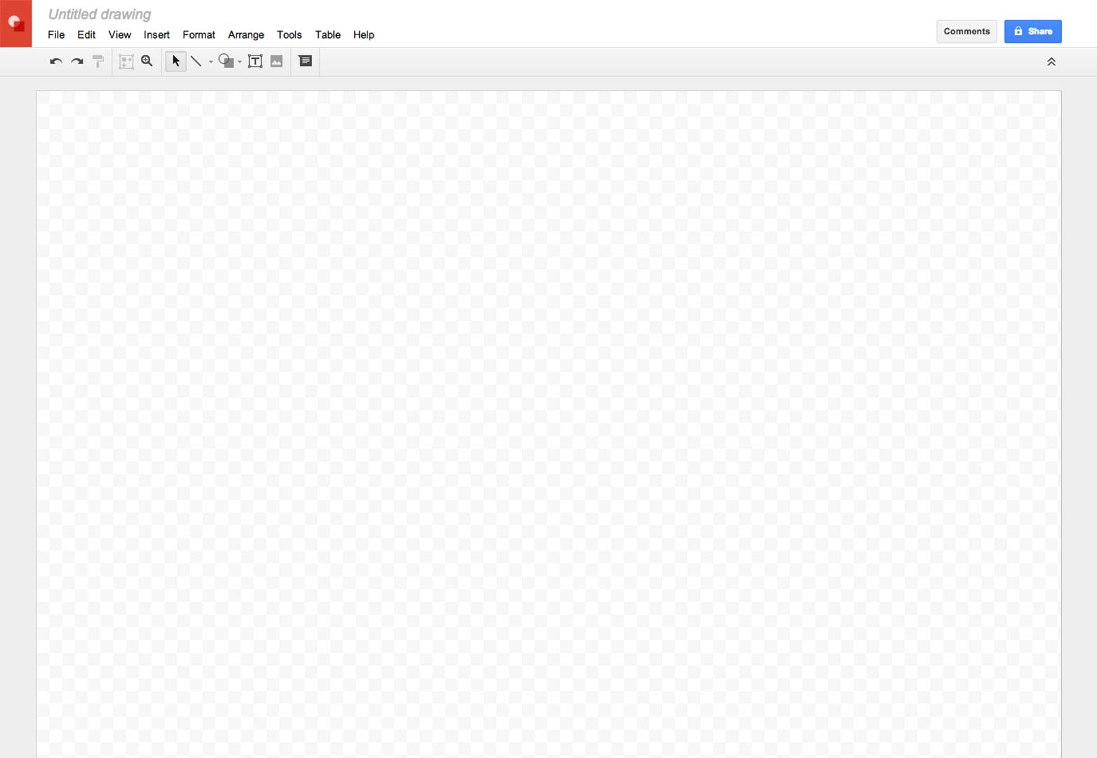
2) Google Drive’s drawing app
Technically, just about any vector-based image editor could do the job when wire-framing your websites and apps. I tend to wire-frame the desktop version of my site first, create a copy of the file, resize the canvas, and go from there. Using vectors makes it easy to quickly resize and rearrange your elements while you’re still in the planning stage.
I prefer the drawing app on Google Drive for a couple of reasons:
Sharing and collaboration features: Google does information sharing better than just about everyone else. With in-context commenting, simultaneous editing, and Hangout integration, I’m in love.
Automatic guides: In each drawing document, guides are automatically created based on the dimensions of each object you put into the document. This makes it easy to depict consistently-sized elements in the document, which is great for grid-obsessed designers like me.
As I share these wireframes with clients, that professional-looking consistency is a big plus. And yet, I’m not constrained to those guides. I see it as a good alternative to mockup apps that try to constrain you to a grid.
Oh, and it’s free. Need I say more?
3) Style Prototypes
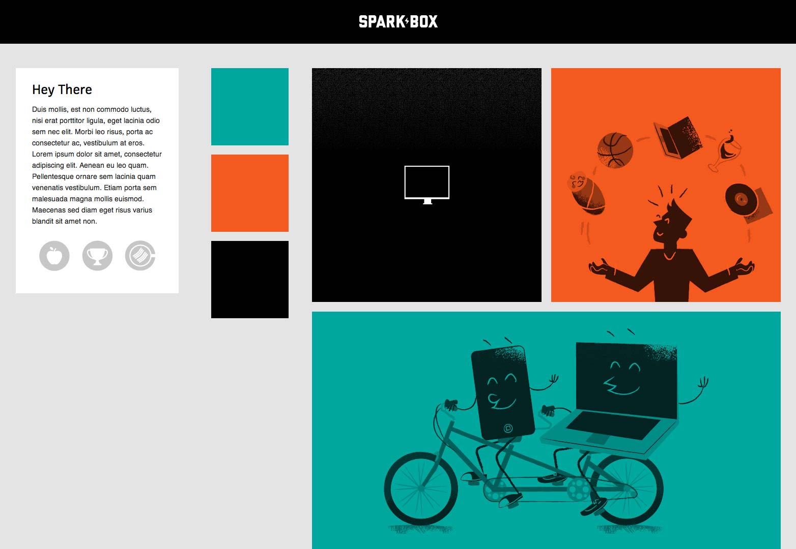
Based on Style Tiles, Style Prototypes are an in-browser deliverable designed to help you give your clients an idea of how their website’s typography, color, and UI elements will look. Since it is meant to be viewed in the browser, there will be fewer inconsistencies once the website is built.
Furthermore, I would posit that Style Prototypes could help our clients to mentally separate the concepts of UX and aesthetics. And really, anything that helps our clients to better understand the web design process can only be a good thing.
4) Responsinator
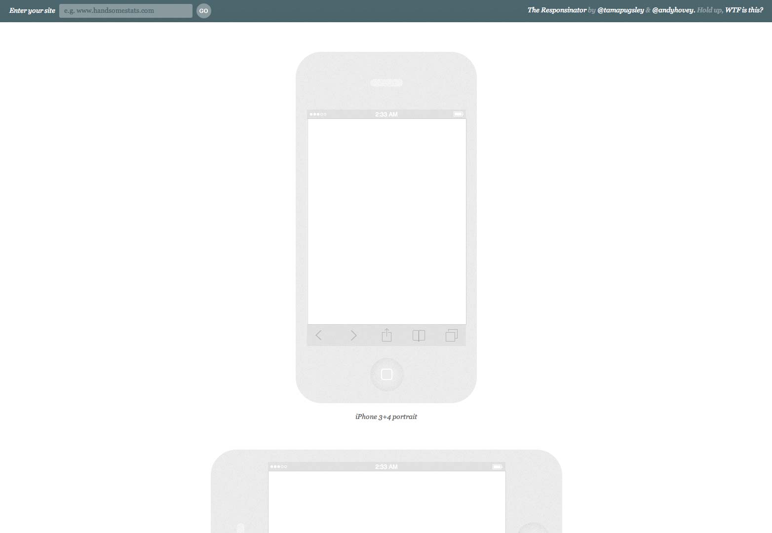
Responsinator is a simple tool that shows your website at different sizes. It imitates, in a very basic way, several different device sizes and contexts. This tool is not for your benefit. You want to see what your website looks like at smaller sizes? Resize your browser window. Better yet, get some actual mobile devices and do some real testing.
This web app is best used to show your clients a quick approximation of what their website will look like in contexts other than a desktop or laptop monitor.
Again, there are many tools that could do the same job as Responsinator, and just as effectively, I suppose. I chose this one because it presents several device silhouettes one after the other, for easy perusal.
5) Adobe Edge Inspect
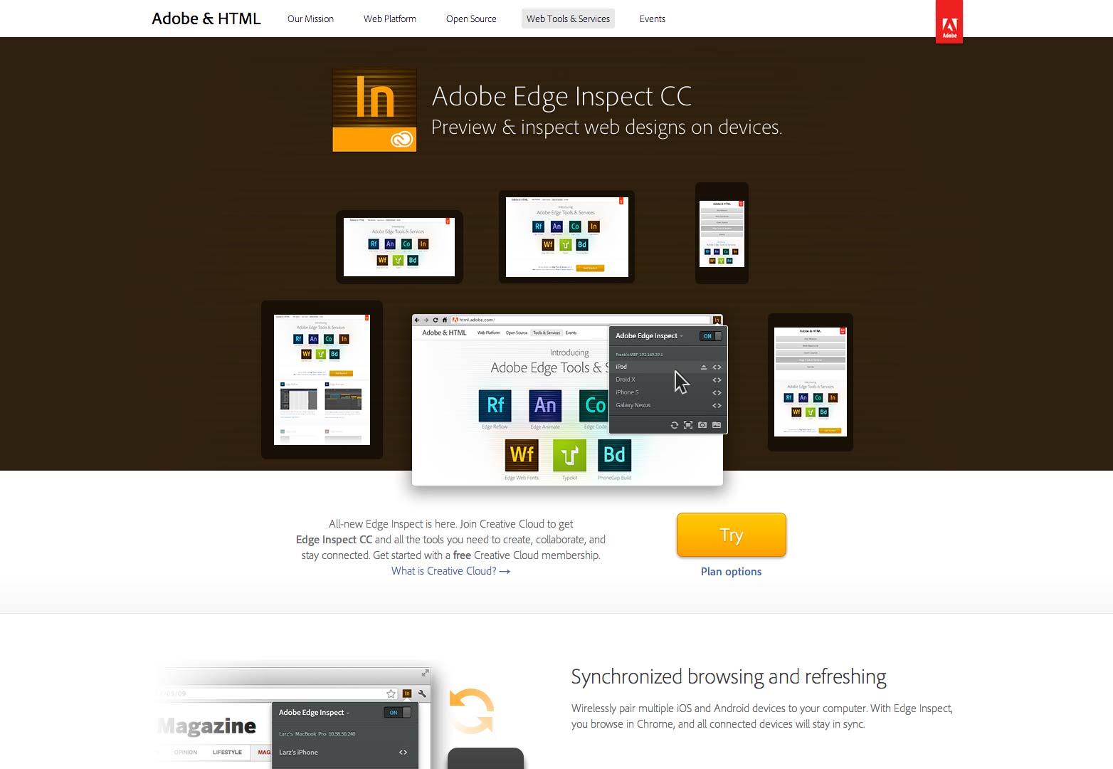
Now this one is for you. If you have a mobile testing lab (and the sooner you can make one, the better) Edge Inspect will synchronize all of your devices to view the same page at once. Refresh the page on one device, and you refresh them all.
Unlike the others on this list, this one’s not free. However, if you can afford enough mobile devices to need a solution like this, it’s probably worth the money.
Conclusion
As always, your most important asset is your brain. These tools, and others like them, can only help you on your way. I chose these because they perform very specific functions that aid me in designing responsive sites. They don’t limit what I can do.
The best tools are really the ones that stay out of the way.
Do you use these tools? What are your top 5 tools for responsive design? Let us know in the comments.
Featured image/thumbnail, tools image via Shutterstock.


