
 The old saying is that the optimist sees the glass as half full, while the pessimist sees the glass as half empty. It is, however, the opportunist who drinks the water while the other two argue about the amount of liquid in the glass.
The term, "negative space" is akin to that old saying because there is always something in the space. It may not be type or color or an image, but the space has purpose and function. How can that be "negative"?
Most definitions of "negative space" are that it is the empty space around and between the subject(s) of an image. Negative space may be most evident when the space around a subject, and not the subject itself, forms an interesting or artistically relevant shape, and such space is occasionally used as an artistic effect to enhance or draw attention to the focal subject of an image.
The use of negative space is a key element of artistic composition. It is the glue that holds all of the elements together. It may be vast, or just a few pixels between an overload of elements, but it is always there.
"There is no such thing as negative space. Only shape and counter shape." - Charles Goslin
This has been a misnomer in design for generations. No one knows who started it, just like why so many prospective clients all know the line, "this is a great opportunity to have your work seen," when they want free work from a designer. It just keeps popping up. The problem is, when explaining design decisions, using the term, "negative space" gives off negative and confusing connotations.
It is a confusing term that should be replaced in our vocabulary as designers, along with other misnomers for design that only we understand. Communication with clients, and the masses.
Negative space examples
Negative space, is, in fact, that illusion between the eye and the brain. You've seen the chalice that becomes two faces, and other such optical illusions? Does it have to be black and white? How do colors register on the brain?
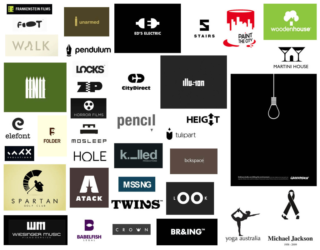
The examples above are what most people think of with "negative space." It's the use of stark contrasts to reveal a complete or hidden image or message. As Goslin said, "only shape and counter shape."
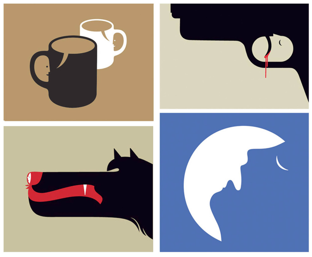
Even a mix of colors works when the shapes play upon the contrasting colors. It is not an easy thing and the simplicity demands brilliant thinking, and the ability to see quickly how shapes form an image. ©Noma Bar

The FedEx logo was a brilliant use of a negative shape... or was it just an accident that the type formed, and someone saw the arrow at the meeting of the E and X?
There is, however, more to the building of an optical illusion with those shapes. This is where most of the confusion of negative space arises. Is it so cut and dried? Does it have to be like the assortment of logos above? Does a straight line have to be straight or can it use shapes to give the illusion of it being a straight line?
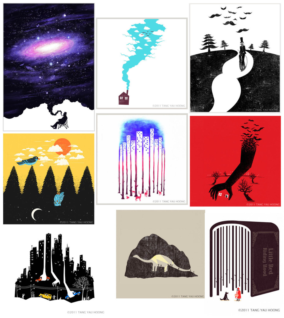
Some samples from the website of Illustrator Tang Yau Hoong that are entitled, "The art of negative space. An attempt to tell a story through illustration." Unfortunately, while they are all well-executed pieces of art, with fun, and creative twists, the shapes don't interact with each other to the point where they can truly be called, "negative space". What the empty or space shapes do, is draw attention to other shapes and elements. It is a clever use of minimalist design, rather than a use of negative space.
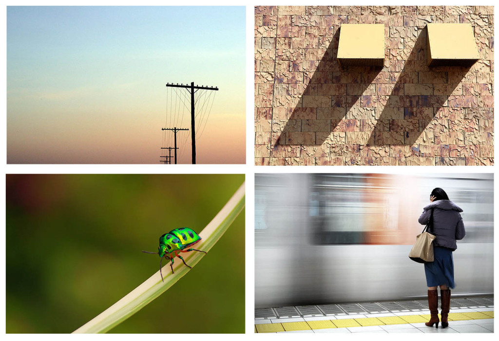
On the website, Photography Mad, the article, "Understanding and Using "Negative Space" in Photography," the examples shown are NOT negative space. They are beautiful compositions, but it harkens back to the glass being full with water, and air. The space draws attention to the focal point. Negative space can be used effectively in photography, as it can be in illustration, design, and video. In this case, however, the backgrounds are not shapes that define, or work with the objects in the foreground. They are colors and blurs that emphasize another element to be more important and pop against it.
Minimalist design
Often minimalist design is confused with negative space, as with the photographs above and Hoong's illustrations. Minimalist ads have been around for decades. Even some of the greatest painters in history have used minimalist approaches in their portraiture to emphasize the subject figure.
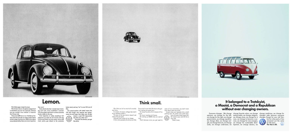
Volkswagen was known for their minimalist ads, showing just the product, and not their vehicles driving on the Pacific Coast Highway, or lonely roads. The focus was simply on the cars and the space in these print ads drew the eye of the viewer right to the product.
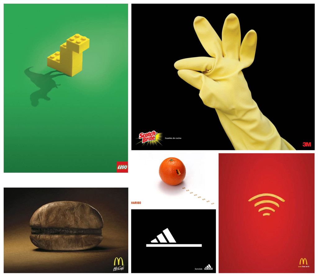
Other minimalist ads that use space and simplicity to spotlight their message. It's easy to tell the difference between negative space, and minimal elements, which are shapes against blank space, as opposed to shapes working against, and in tandem with other shapes.
Why drop the term, "negative space"?
Whenever you see the hilarious examples of odd client statements that dot sites across the web, it usually includes the client throwing out words they believe to be standard design terms that will communicate what they want for their design project.
So, what does "negative space" mean to different people? Obviously different things. The important thing to remember is that when a client sees space in a design, there will no doubt be a request to make a logo bigger, throw in ten pounds of type into the five pound bag, or fill the space because they feel they are not getting their money's worth if all of the space isn't used. Even using the term, "minimalist" has its dangers. In the end, every designer must know these rules of design, how and when to break them, and when to just tell the client, "here's your design," and smile, then hope it's not changed.
What are your thoughts about the examples used in this article? Do you have a take on the terms and design executions? Let us know in the comments.
Featured image/thumbnail, negative space image via Noma Bar.


