 Web designers use a lot of tools to make the sites they design the best possible for site visitors; one of the best ways of achieving this is incorporating actual science and research into design to maximize user satisfaction.
Eye-tracking research provides designers with a blueprint of sorts to guide them on the priorities with which site visitors generally absorb the information on any given site.
Eye-tracking research also tells us a good deal about the way in which site visitors read websites. This information can be used by savvy web designers to tailor-make a site to the average person. When users get a great experience from visiting your site, they'll be back, and chances are good that they'll even turn into regular site visitors. This has implications no matter what type of site you're designing.
So just what does this insightful research tell us about the average site visitor? How can designers harness this very powerful information to create sites that are nothing short of excellent? You'll be surprised at what the research has uncovered.
Draw visitors' eyes with gripping headlines—not pictures!
Contrary to popular belief, it is in fact gripping headlines that catch the attention of site visitors and not eye-popping pictures. This finding is applicable to homepage layouts, especially if you're working on the layout of a news site. This also explains why so many news sites frequently use sensationalistic to shocking headlines all in the effort to grab site visitors' precious attention.
In one well-known study from a few years back, dubbed the Eyetrack III study, it was discovered that site visitors have a penchant for gawking at headlines, particularly if they're dominant. Further, the specific placement of these headlines on the homepage has an effect on the speed with which a site visitor homes in on them. Place your headlines on the upper left part of the homepage, and you'll get more site visitors paying attention to your content than if you positioned the headlines anywhere else on the homepage.
So if you're a designer working for a news site, keep this in mind. Text draws the eye quicker on a computer screen than does a picture—again, contrary to what one might call conventional wisdom. The designers at Fox News, 173rd-most popular site in the world and 36th-most popular in the U.S., know this reality well. Observe how the main headline on its homepage is precisely situated in the upper-left section of the page, noticeably off-center.
Design your site in an F-shaped pattern
A few years ago, there was a very revealing web-user study that was put out by the Nielsen Norman Group. The study found that everyday site visitors usually read any given webpage in a so-called F-shaped pattern.
In essence, site visitors typically absorb the information on a webpage by an initial horizontal movement, over the page's upper part. This is referred to as the top bar of the F. Then, visitors usually move their eyes down the page a little bit before reading across in another horizontal movement that's shorter than the initial one. This accounts for the second and shorter bar on the F. Lastly, they look at the page's content on the left-hand side in a vertical manner, thereby forming the stem of the F.
Knowing this constant reading pattern of the average web user, it should motivate you to design a site that's geared to how visitors read web content. Doing so will improve their user experience vastly and give you more loyal site visitors.
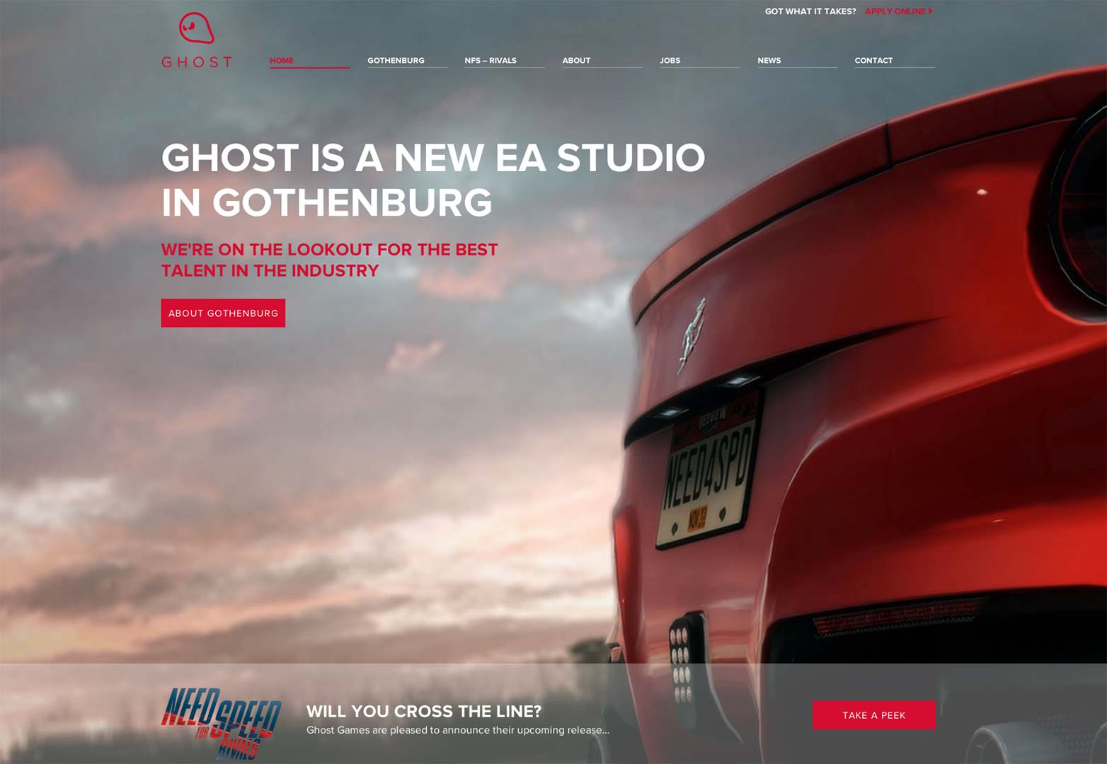
Some websites already put this research into good practice. Ghost Games is one of EA's new studios on Sweden's west coast. Note how its homepage mimics the F-shaped pattern perfectly. This improves the user experience and makes for easier navigation, especially since the stem of the F in the pattern links to information about the site of the studio.
Don't waste time with ads — your site visitors sure won't!
Many people find display ads annoying, which helps to explain why many site visitors just ignore them and instead focus on a webpage's useful content. The alliterative and technical term for this is banner blindness. Another study from the Nielsen Norman Group demonstrated that most web users simply don't fixate on any ads when they're absorbing web content.
Know that it's simply a waste of time if you're designing a site that relies primarily on display ads to generate money. In light of the study, you should reevaluate your primary means of earning money on your site. Do away with ads and switch to a subscription-based model that charges site visitors a membership fee. Some sites are already implementing this strategy in acknowledgment of the weakness of display ads.
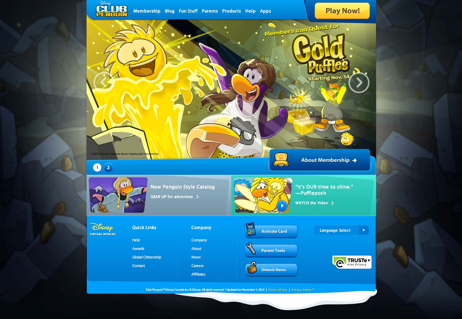
A great example of this is Club Penguin, which is an MMO (massively multiplayer online game) that is owned by Disney. The site is absolutely free of any annoying display ads, which is why visitors are encouraged to purchase memberships to play the game.
Avoid fancy words and formatting
Again, minimalism rules the day, especially if you want site visitors who are able to find the information on your site efficiently. According to the U.S. Department of Health and Human Services' Usability blog, the fancier (read: elaborate) a webpage's formatting and words are, the more site visitors will be confused and fail basic navigation tests. The blog refers to a Nielsen study from a few years ago that asked test subjects to find a basic piece of information from the U.S. Census Bureau's website. Most failed the test spectacularly.
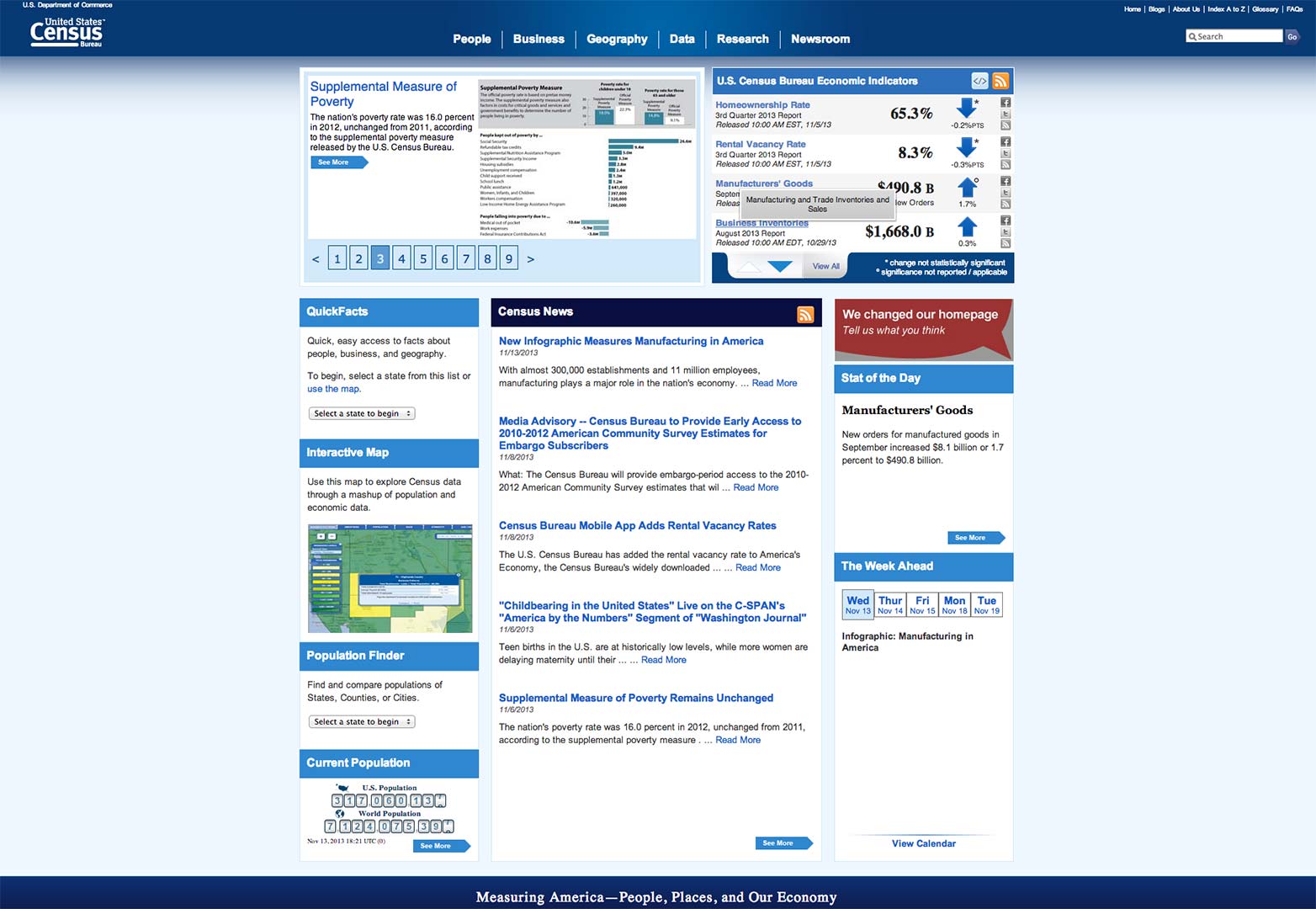
Participants were asked to find the then-current population of the U.S., which was found on the Census Bureau's homepage. Startlingly, just a pathetic 14 percent of participants were able to locate this information on the page, even though it was literally staring at them in huge, red letters on the right side of the page. It was suspected that this abysmally low success rate was due to the presence of the information on the page's right side, in direct contravention of the F-shaped reading pattern so well established.
However, further examination revealed that the vast majority of study participants simply ignored the information although it was in big, red and not-easy-to-miss appearance. They ignored it because its fancy formatting and presentation made it look like a promotion or ad of some sort! Since many web users already don't pay attention to display ads in the first place, this conclusion should come as no surprise to anyone in light of what we know.
This Nielsen study was 6 years ago, so it would be interesting to see if the U.S. federal government learned something in that time and improved its homepage for usability! We are talking about the federal government here, so efficiency isn't its forté. However, looking at its current Census site, we see that it has made at least a significant change in that the population number doesn't look like a glaring promotion anymore with fancy formatting. Still, the population number has been moved all the way down to the bottom left of the homepage, forcing site visitors to actually scroll down to the bottom to see it. This is not a good alternative either!
Understand eye tracking, understand effective web design
Eye-tracking studies exist for a reason: They virtually lay out a blueprint of what web users like and don't like on any given site, based on their behavior. Web designers who ignore this copious research are doing so at their own peril. Why wouldn't you want to design a site that your visitors found easy to navigate? Make smart use of this research, and web users will find your site extremely pleasing to navigate...which will only lead to more visitors and greater popularity.
Remember that, on any given site, it's always headlines that draw the eyes of the user and, thus, their attention, not pictures. Always keep in mind the notorious F-shaped pattern that represents the general viewing pattern of many site visitors. It would do you good to design at least a homepage layout that mimics this pattern in some respect.
Finally, steer clear of display ads. Not only do they look bad, but many site visitors don't even pay them mind and ignore them completely. Explore other ways to get revenue for your site, perhaps through membership fees and other approaches. And whatever you do, don't make useful web content look like a promotion or ad because site visitors tend to ignore that too. Keep all this in mind, and you'll design a site in harmony with your visitors' behavior.
Do you design to the 'F' pattern? What other usability tips would you share? Let us know in the comments.
Featured image/thumbnail, eyes image via Shutterstock.


