 One of the most important things about creating a brand is making sure everything is cohesive. Once a brand pinpoints their values and how they'd like to be perceived, they have to make sure all their touchpoints refer back to these values.
What's of extreme importance is the look of a brand. In order to make sure this stays fairly consistent, brands should have corporate identity guides or brand style guides. These typically go over the do's and don'ts of using a logo and also shares the colors of the brand as well as other things.
Why are these important? Think of a world where the Target bullseye is purple; you'd be very confused. What if McDonald's Golden Arches were even just a pale yellow? Brand style guides help to maintain a consistent look so that consumers and employees understand the brand. These guides help create uniformity and take a business from being just a company, to becoming a brand.
Today, we are going to show you some identity guides from the past and present that really show how important it is to be precise and clear and in your brand's look. Many of these go over more than just the visuals and include the values of the brand. This is important because you'll notice how many of them relate their values back to their logo and colors. Identity guides are truly important when brand building, so let's jump right in and see some great examples.
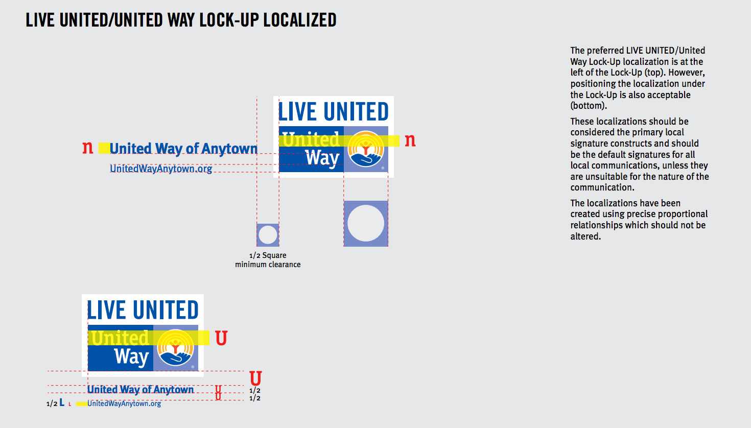
United Way
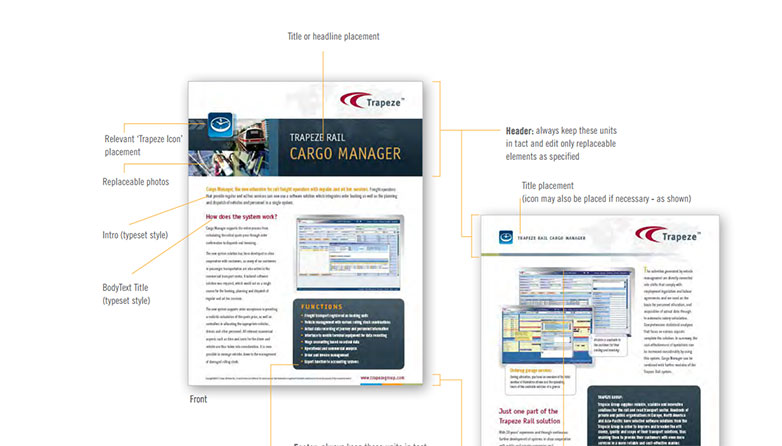
Trapeze
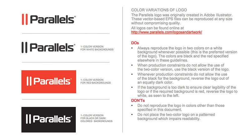
Parallels
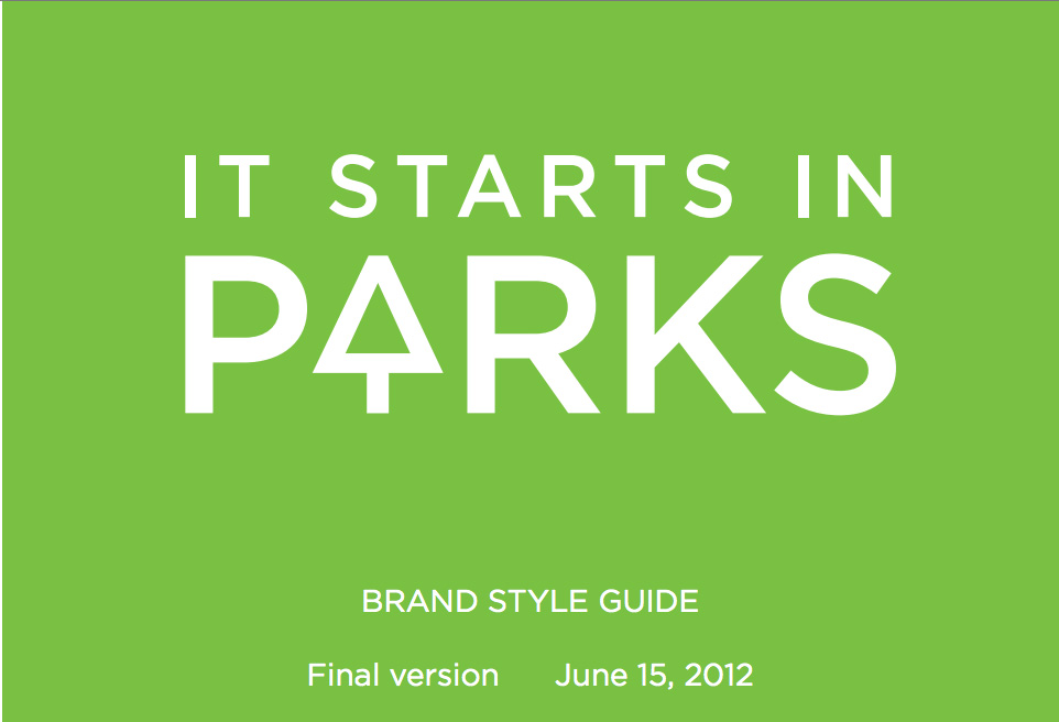
It Starts in Parks
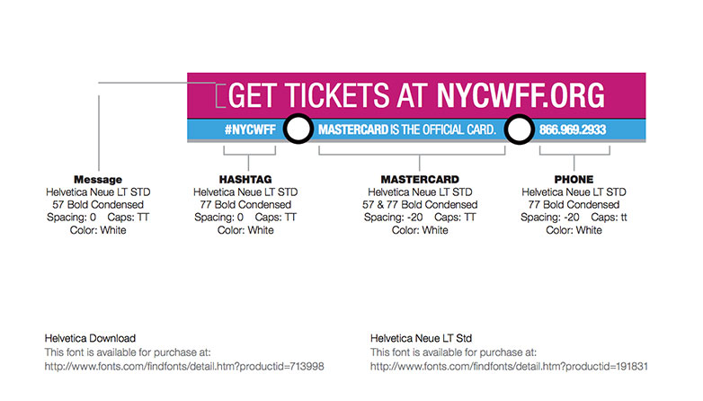
NYC Food and Wine Festival
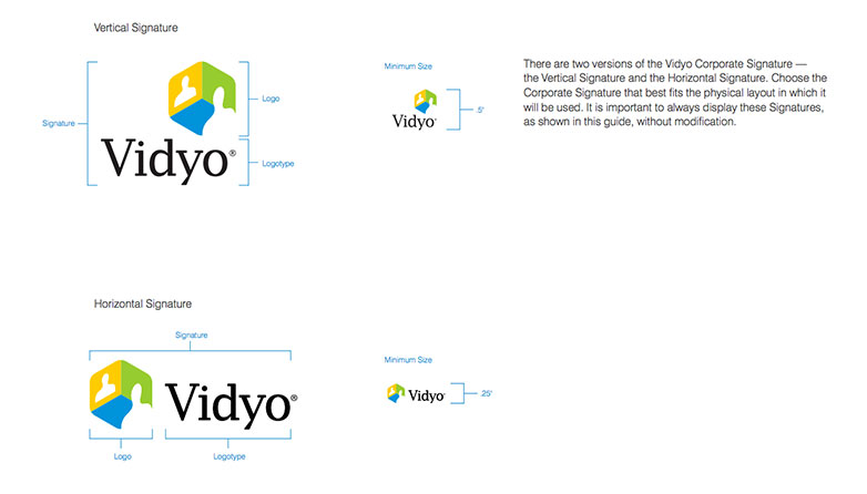
Vidyo
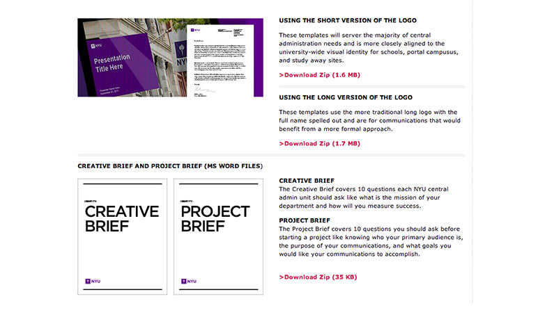
New York University
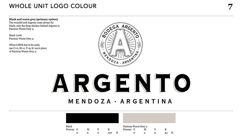
Argento
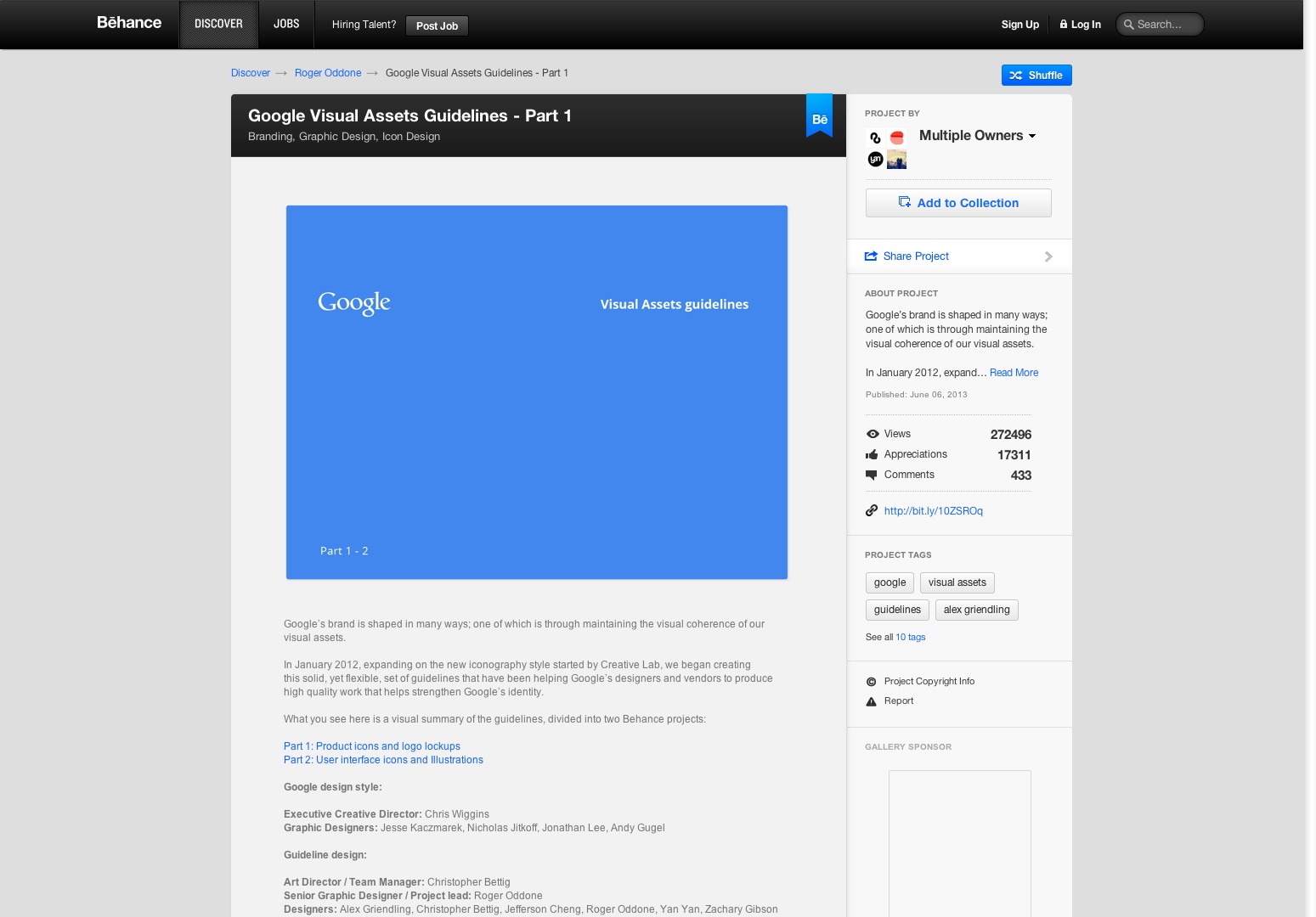
Google Visual Assets Guidelines
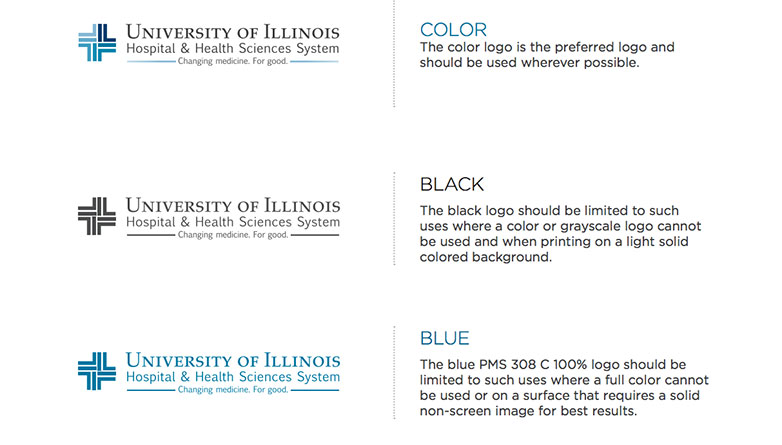
University of Illinois
Hanes Corporation Brand Identity Manual
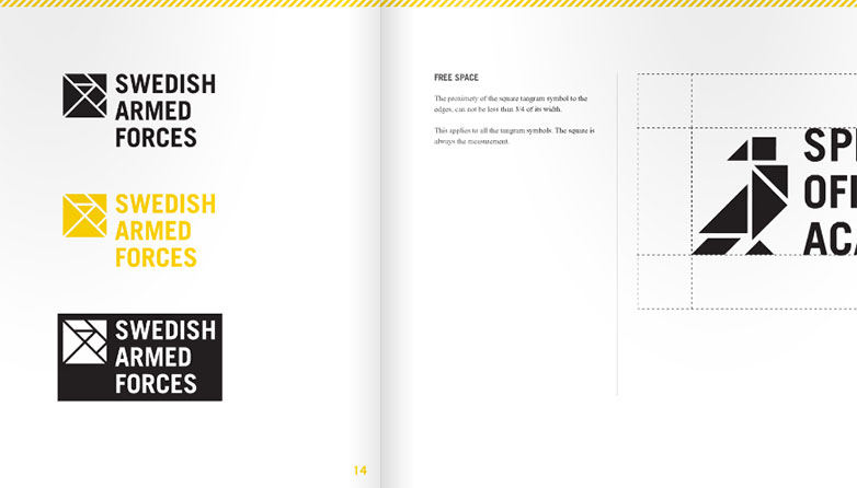
Swedish Armed Forces Brand Manual
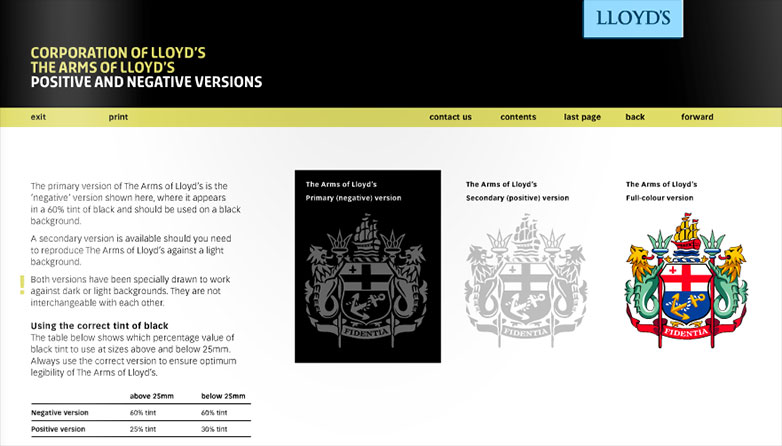
Lloyd's Brand Manual
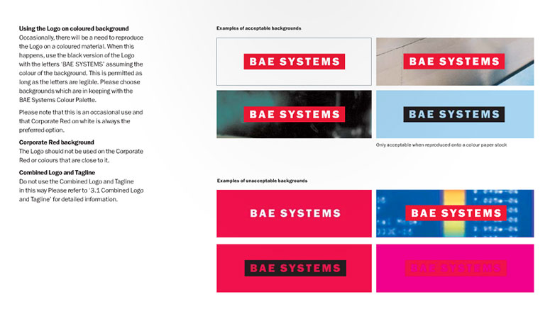
BAE Systems Brand Identity Manual
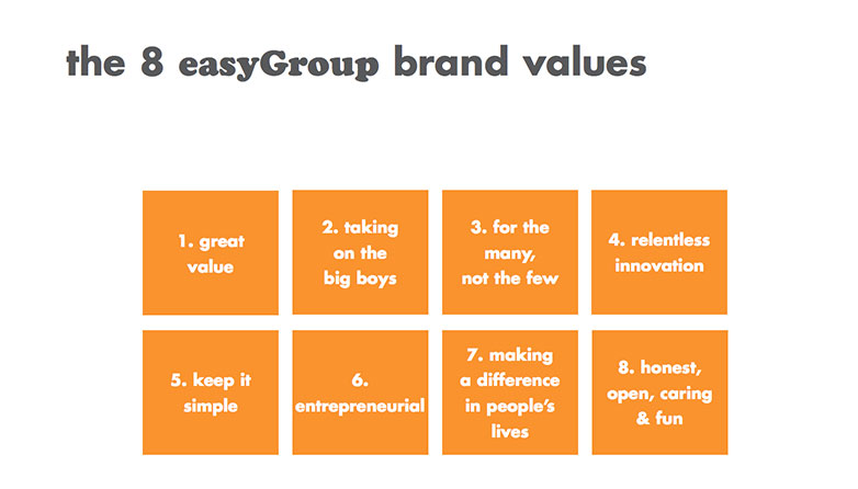
Easy.com
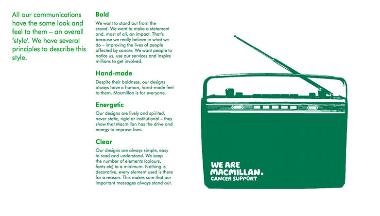
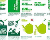
Macmillian Cancer Support
Channel 4 Identity Style Guide
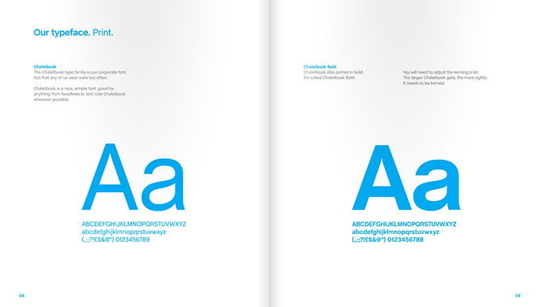
Skype Brand Book
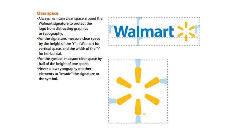
Walmart Brand Guidelines
How important do you think it is to have a style guideline?

