 It's Black Friday, a day when all sensible Americans stay home eating leftovers and doing their shopping online. In honor of the almost-holiday, today we're going to take a look at some of the techniques store managers use to sell to us, and how we can apply them to our sites to take them from profitable to sensational.
The simple rule for improving the profitability of a site is to find a way of converting casual browsers into actual paying customers. When you start to offer your site visitors a very comfortable, enjoyable and efficient shopping process, then you can count on improved conversions. After all, your customers will reward you for what it feels like from their perspective to peruse the goods and services on your ecommerce site. To make the best ecommerce site around, it must be designed from the point of view of your target shopper.
Just remember this: give them what they want, and you'll enjoy a healthy increase in profits year on year. Ignore their needs, and you'll not only struggle to make money, you'll be out of business soon.
1) Know your shopper
This seems like such a no-brainer, but the number of ecommerce sites out there that forget this is disturbingly high. One thing to know intimately well is what sorts of user emotions will end up stimulating an actual purchase decision. It's also a smart move to understand the users' shopping behaviors as well as the different factors that they look at in an ecommerce site to justify a purchase decision.
The decision to buy the products and services on your site will be in part based on the product information and visuals that they see. If you fail to give them the information you want, it will end in a lost sale.
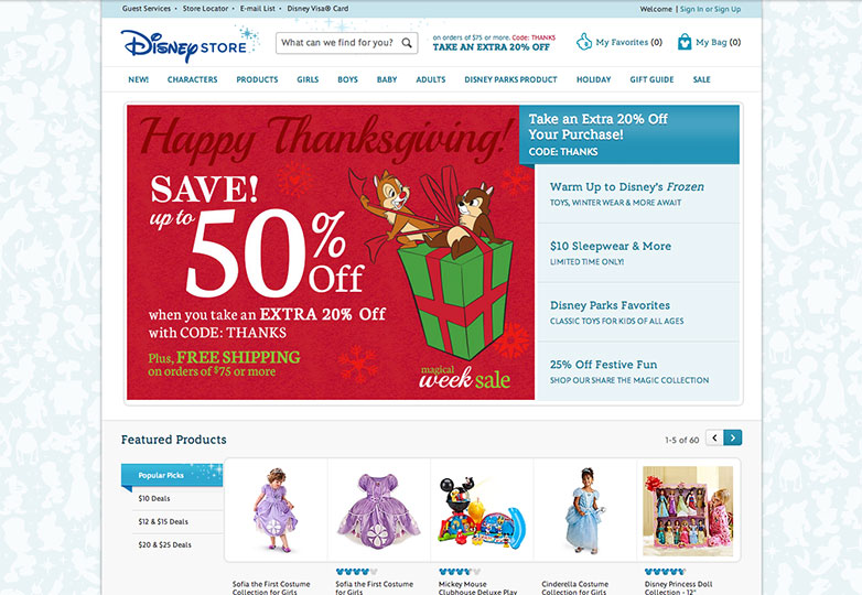
The Disney Store is just such an example. Its designers know that the site's audience is female and very young, so what do they do? They prominently display dolls of Disney characters and other Disney merchandise so that they jump out at the site visitor. This helps to create the emotional response of desire in young girls.
2) Use product information to grab attention
It's a well-known fact that advertising helps to move products. People are less willing to buy something if it's not hyped to the high heavens. The product information on ecommerce sites must be written in such a way that it's basically an advertisement masquerading as plain, old product details. This is what makes for truly effective copy when it comes to product information.
As such, product information isn't about dryly describing the product or service you want site visitors to purchase. It's more about how this information is presented, which should be in a persuasive and catchy way. This is what makes for engaging and, ultimately, successful copy that increases conversions.
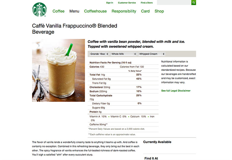
The flavor of vanilla lends a wonderfully creamy taste to anything it teams up with. And coffee is certainly no exception. Combined in this refreshing beverage, they only bring out the best in each other. The spicy fragrance of vanilla enhances the full-bodied richness of dark-roasted coffee. You'll sigh a satisfied "ahh" after every succulent slurp.
An example of engaging copy comes straight from Starbucks' Caffe Vanilla Frappuccino Blended Beverage page. Note how the copy touches on all the different, rich flavors of this Frappuccino and ends with the assurance that customers will be very satisfied. While you can't, naturally, put one of these babies into your online shopping cart, you'll likely head to your nearest Starbucks to guzzle down one of these bad boys.
3) Use video to replace touch
When you're shopping online for a product, you're deprived of one of the most critical ways that you can normally evaluate whether or not you want to buy it: touching it. Shopping online stops you to examining the product in your hands, something you'd normally do in a regular bricks-and-mortar store.
That's why your ecommerce site has to be chock full of product videos since they are the next best thing to letting customers examine products in their hands, up close and personal. Product videos offer customers something of an interactive element that lets them see the product more intimately than mere pictures. This, in turn, helps to drive conversions as it elicits more enthusiasm and excitement in shoppers.
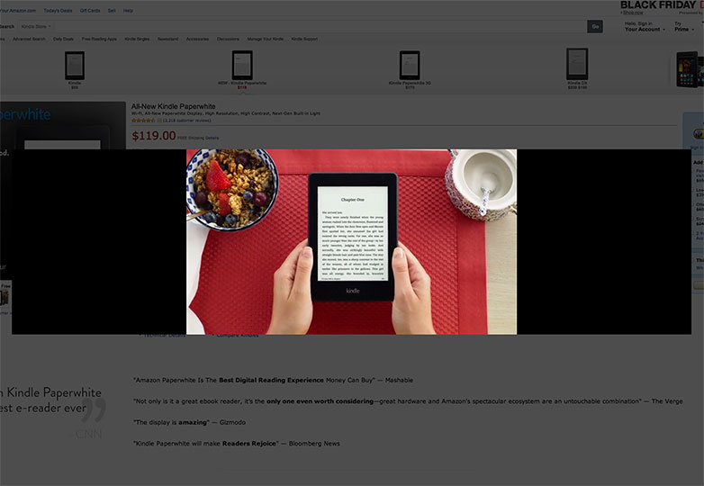
One website that utterly gets this tactic is Amazon, which shouldn't be surprising since it's the most successful ecommerce site ever! Brilliantly illustrating this feature of a conversion-rich site is its page for the All-New Kindle Paperwhite, one of the most popular products on the site. From the moment a browser gets on this page, they're able to take a "product tour" that immediately shows them a two-and-a-half minute video on the Kindle, complete with audio.
4) Always offer free shipping
Free shipping is an ideal way to boost your site's conversions. Think of it this way: Your browser has become an actual customer and is ready to pay for a product. Then, when he's entering his credit card information, shipping address and about to press the "purchase" button, he learns that there will be shipping charges at the very end. This can be a massive conversion destroyer for so many potential customers because it simply takes the wind out of their sails!
Free shipping is the antidote to this. Some are of the opinion that it doesn't make sense to offer free shipping on items that are already sold at a discount. While this philosophy can be viewed as making sense to some, know that not offering unlimited free shipping is a business model that can be a loser since a huge shopping site already offers unlimited free shipping.
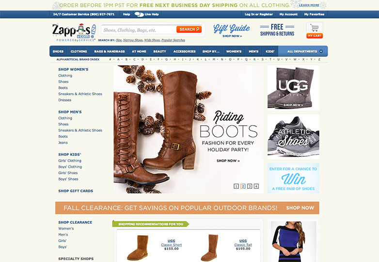
Zappos is the world's biggest online shoe store that's also owned by Amazon. It sells clothing, too. Unlike lots of other ecommerce sites, Zappos offers customers free shipping on all domestic orders without any exception—guaranteed. Talk about a super-effective way of conversion boosting.
5) Brag about your discounts
One of the most important rules of successfully selling anything is grabbing the all-important, though elusive, attention of your prospects. Any good ecommerce site must always highlight and draw attention to any discounts and specials it's running, preferably right on the homepage so that it's less likely visitors will miss it.
After all, the whole point of any discounts and specials is, essentially, a shameless attempt to boost your conversions, right there, right then. So don't even think twice about grabbing the attention of your site visitors for all that it's worth. Your conversion rates depend on it.
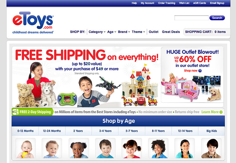
Look at the homepage of eToys.com for the epitome of this strategy. At the time of this writing, there's a huge, hard-to-miss notice about a 60%-off sale at the website's outlet store. It's located just to the right of center near the top of the homepage, virtually guaranteeing it can't be overlooked.
6) Provide as many different payment methods as you can
If there's one thing that customers really hate, it's being restricted in the types of payments that they can make for the purchase of your products. If your customers are already good enough to want to pay you money for your products, then you, at the very least, should be good enough to give them a plethora of payment options.
This doesn't mean just offering various kinds of credit cards with which customers can pay. Sure, it helps to offer American Express, Mastercard and Visa, but some of your customers may be unsure about parting with their credit card information on your site. These people have to be accommodated, so remember to at least offer PayPal as a payment alternative.
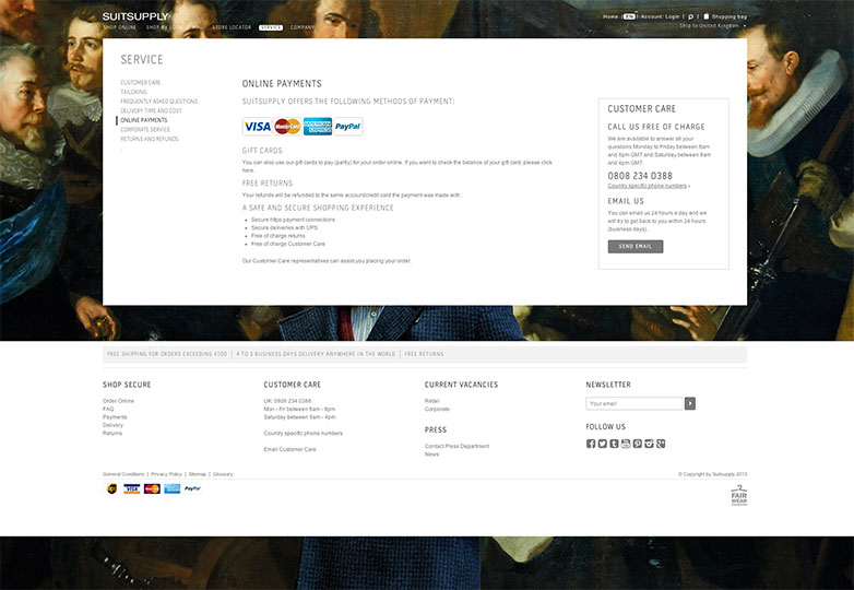
Check out the secure-payment page of SuitSupply, which is a men's fashion retailer. You'll note that they provide customers with the option to pay via PayPal if they are uncomfortable with payment by credit card. As a result, you can bet that SuitSupply's customers will be likelier to actually purchase a suit from that site when they see that the site addresses their potential concerns over giving out their credit card information over the Internet.
7) Conversions are all that matter
Designers who don't design an ecommerce site with the most vital objective being increased conversions are not doing businesses any favors. In an industry where selling is what matters most and where profit is king, conversions are all that matter. Web designers building ecommerce websites have to understand this more than anything because, once you lose prospects due to a bad site experience, you lose them for good, and they're never coming back.
That's why it's so important to really get inside the heads of your target audience when you're designing an ecommerce site. What kind of a shopping experience are they searching for? What demographics are most likely to buy your products or services? What emotions are they feeling as they navigate the site? All these questions have to be answered to design the best possible ecommerce shopping experience.
What rules do you follow to maximize ecommerce site profits? Are conversions all that matter? Let us know your thoughts in the comments.
Featured image/thumbnail, sales image via Shutterstock.

