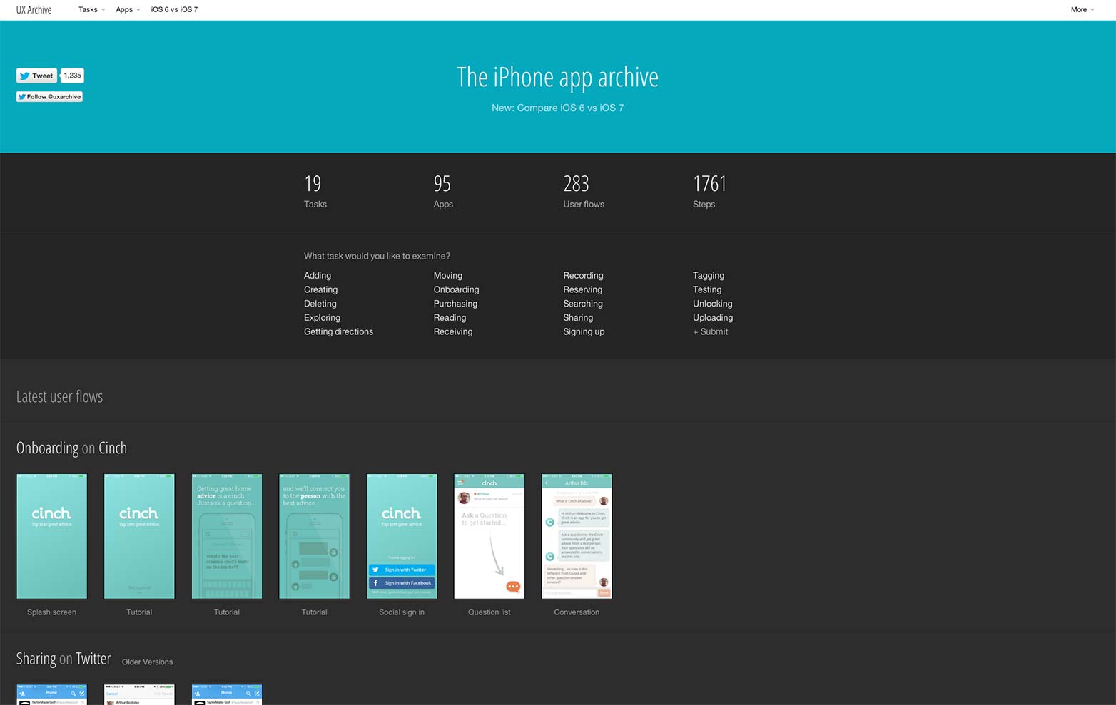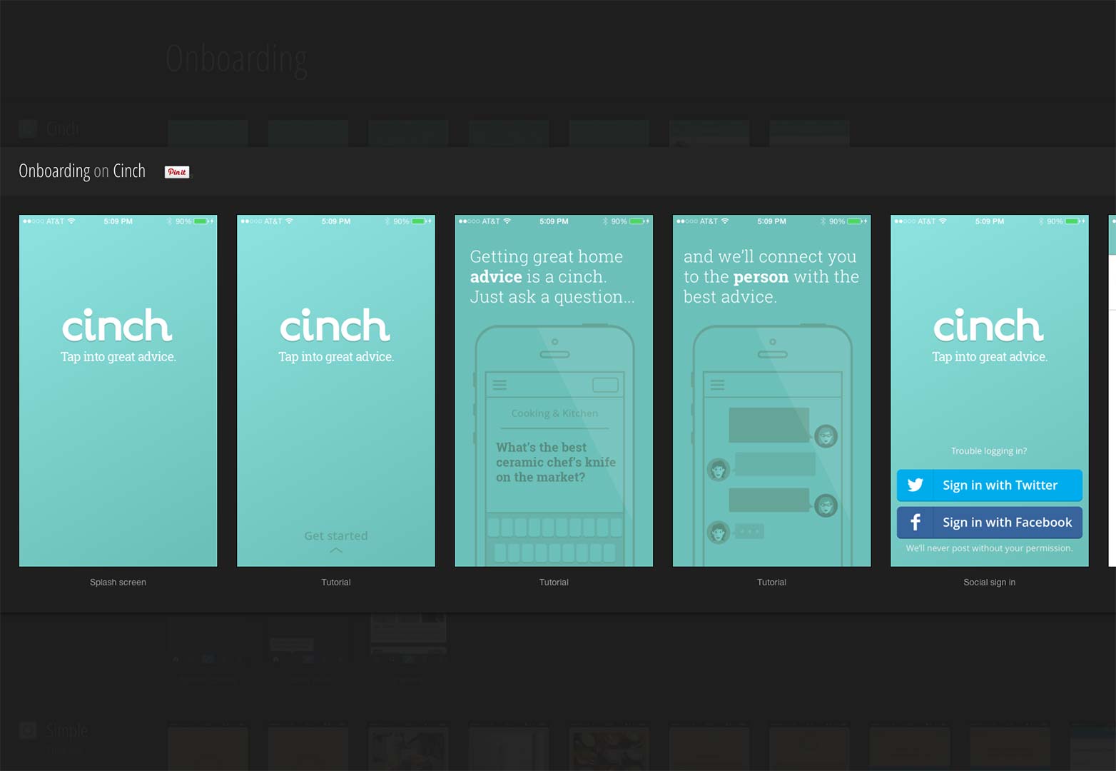
 The developers behind UX Archive want you to build better mobile experiences. To that end, they find and present mobile’s most interesting user flows so you can “compare them, build your point of view, and be inspired.”
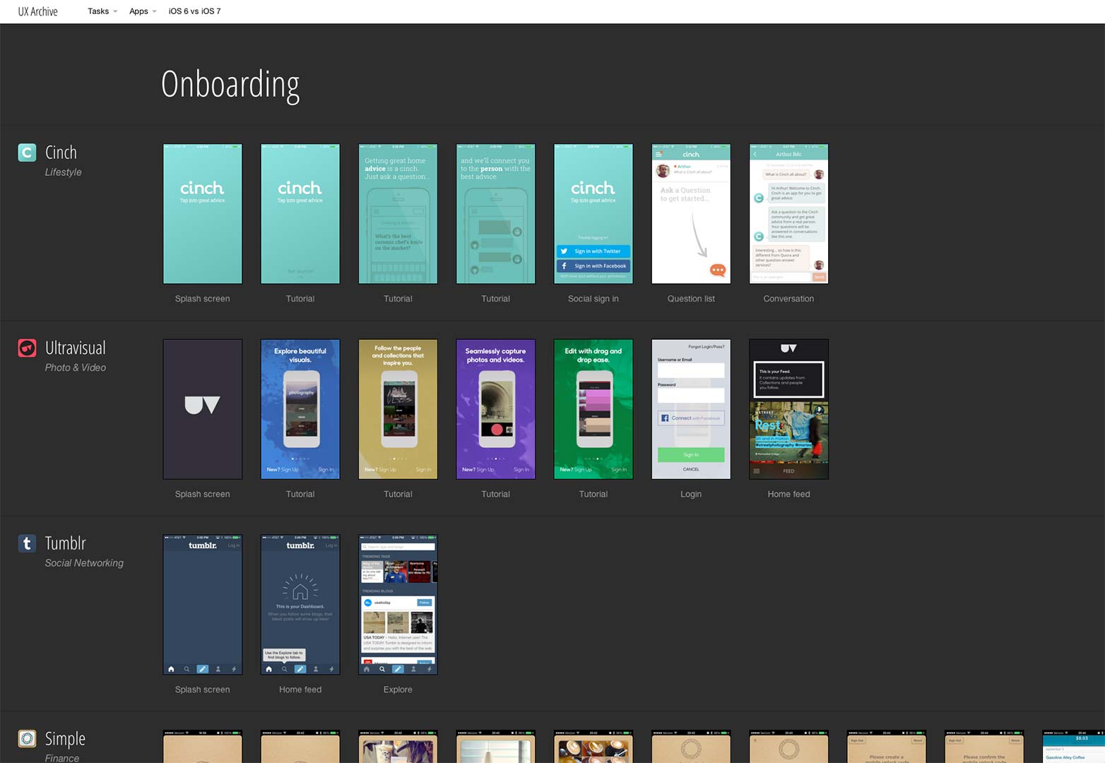
Documenting user flows is probably something many UX designers already do to some degree. Now a great collection is in one place, and wired to grow as new discoveries are added to the archive. Even more useful, the site is set up so you can easily filter user flows based on specific tasks, such as onboarding, purchasing and sharing, and compare just those.
UX Archive recently added a feature that allows you to compare iOS6 vs. iOS7 (for now, user flows are only archived from iPhone 4S and iPhone 5). A dropdown menu allows you to filter apps by name, but there are now so many, the device has become unwieldy. With such a beautifully designed site, it’s likely to be replaced with a better solution soon.
A side project of Feedly co-founder and designer Arthur Bodolec, and developers Chris Polk and Nathan Barraille, UX Archive is a lean, clean site that just does one thing and does it really well. Even the About page introduces the team and explains the site with brevity and zero frills, which is part of its appeal.
Even the most carefully documented user flows aren't meant to replace the experience and insights that come from actually interacting with an app. UX Archive provides AppStore links to all the titles it has indexed (click on the app name at left to see all its documented user flows, as well as links to its seller and AppStore page).
If you know of an app that should be included, you're invited to contact the team and let them know.
What are the keys to good mobile UX? Can app UX inform mobile site design? Let us know your thoughts in the comments.
Featured image/thumbnail, mobile UX image via Shutterstock.


