Using animation to create an emotional connection with your audience

 For many of us, our early days are filled with animation. Cartoons made up a big part of my childhood, and many others whom I have conversed with over the years have shared similar origin stories. The bright colors, and often playful imagery has appeal across a range of ages.
Bringing that touch of whimsy from our youths into the now, to present content in a fun and engaging way, is one of the best ways of establishing an emotional connection with your audience.
So today we have another web design showcase to serve double duty as a source of inspiration to the readers and community, and as a means of highlighting some stellar work from the web design field at large. From examples that reflect the animations of our childhoods to those that more fall in line with the games and shows that have shaped our adulthoods, there is an animated gem or two that should appeal to and inspire everyone.
The styles may have changed, and grown up along with us, but the heart of the animated escapes remains the same as designers take the web to daring and bold new places with their animated works.
Noir Et Renoir
I love the way the Noir Et Renoir site starts black and white and slowly gains color as the lights in the windows come on. The interactive menu viewed through the windshield of the car is unique and adorable, whilst the information itself is presented in such a clean, minimalist way.
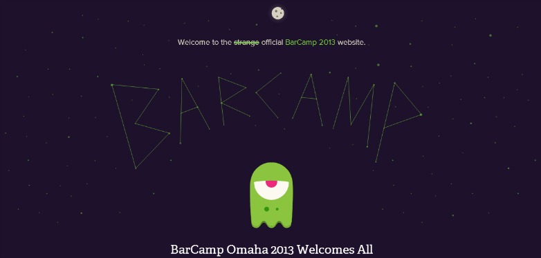
Barcamp Omaha
The Barcamp Omaha site keeps you delightfully entertained with a variety of animated monsters and aliens as you procede through its content, and the title created as a constellation adds a touch of extra whimsy.
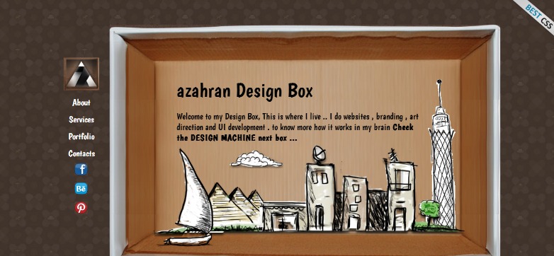
Azahran Design Box
Azahran Design Box does a wonderful job staying true to their branding with sketchy cut out animations presented in cardboard boxes. Even offering a fun little interactive element to show you the services they provide.
Quechua
The Quechua site does a wonderful job of using its animation as a type of call to action. The animated bits direct your eye to the interactive elements of the site, and since these elements are used sparingly, it's totally effective.
Parallax.js
Parallax.js uses its site as an example demonstrating how to use Parallax JavaScript on devices with a gyroscope. The cutout and pieced together look of the images works really well since this is a demo site, letting users know that this is just a fraction of what it can do.
Protect the Football
Protect the Football is a Buffalo Wild Wings sponsored game released to correspond with American Football season. The animated dropping intros set the mood and tone before launching you into the playful brand inspired game.
Goodtwin
Goodtwin uses it's illustrated animation as a unique and quirky way to show how they can make your brand's social profile continually rise.
inTacto 10 Years
inTacto 10 Years does a great job using an animated rocket ship to take us up and through space representing a timeline of technology development over the past 10 years.
Kick My Habits
Kick My Habits makes clever use of animation to create what is essentially a completely interactive, multi-page infographic which shows users the cost of their bad habits and where they fall among the general population.
Polecat
Polecat uses simple and colorful animations to illustrate the whimsical style of their work. The nature of the animations draws to mind those that one might expect from an app on their phone, stylistically tying the web design to the brand.
Octave & Octave
The Octave & Octave recruitment page makes creative use of animation for displaying the job openings they have, helping to make job hunting a little lighter a task than usual.
Milkable
Milkable uses subtle animation to highlight the fun and easy-going style of the team behind this brand, their fluid creativity and, well, as the site says, awesomeness.
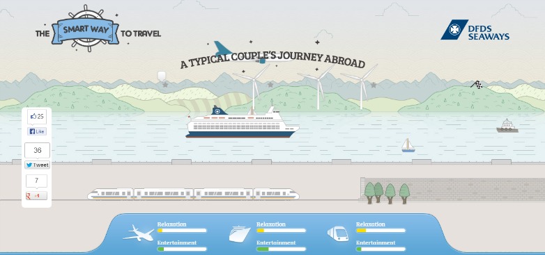
DFDS Seaways
DFDS Seaways' (The Smart Way To Travel) website uses an animated illustration to take you through the different travel options offered as well as compare the experience users will get traveling with them by sea, as opposed to by train or airplane.
Phileas & Fogg
Phileas & Fogg uses the beautiful image of a colorful hot air balloon floating over a vintage map to denote their purpose of flying a group of designers to the Costa Rica rainforests for 80 days.
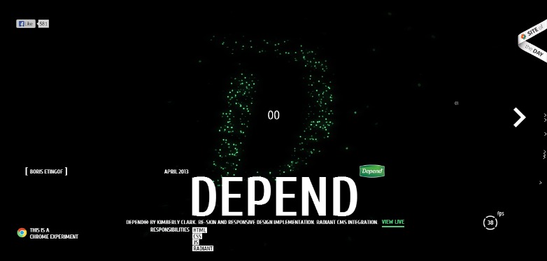
Boris Etingof
Boris Etingof uses animation, among other accents, to give a pulse like touch to the interpretive constellation-esque designs in his experimental portfolio.
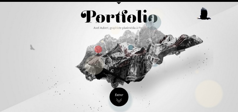
Axel Aubert
Axel Aubert uses both animation and perspective to display the menu of the site in an engaging way. He captures the attention of the user with this creative touch.
Hellohikimori
Hellohikimori uses some intense, and at times macabre, alien-like imagery in their animated background to introduce users to the talent this design agency is packing.
Michelle Lana
Michelle Lana uses animation as an enhancement to show off her illustration skills, keeping users thoroughly engaged as they scroll through her site. The childlike characters transport users back to the days of Saturday mornings in front of the tube.
Have you used animation in your work? Do you have a favourite site we've missed? Let us know in the comments.


