Usability testing doesn’t have to be complicated. There are dozens of options for a design team that wants to remotely test their solutions. To prove that, we’ve redesigned Yelp, with the help of remote usability tests.
We ran remote usability tests because they’re fast and affordable. All of these tests were unmoderated, which means the users ran them in the comfort of their own homes. While this gives us less control, it provides for more natural results. Because their reactions were recorded, we encouraged them to think out loud.
It’s vital to understand that there is no single magic approach. There are a wide selection of tactics ranging from usability lab studies to simple email surveys, and they all have their time and place. We went with a remote usability test because it strikes a nice balance between speed, accuracy, and cost.
In this article we’ll explain why qualitative research matters, explain the insights, and show how they were built into the new design.
How to approach qualitative analysis
When it comes to qualitative analysis, you can’t just ask users to talk about their experiences.
As Jakob Nielsen, Partner at the Nielsen Norman Group, points out, you should never listen only to what users say. The wrong approach would be creating a few designs and then asking users which one they like the most — users haven’t tried the design, so they can only comment on what they see on the surface.
The correct approach is watching what users do and then asking them the bare minimum Single Ease Question, which is: “How easy, or difficult, was the task?” This helps reduce bias and gets to the bottom line of UX analysis: how did the users accomplish their tasks, and how easy or difficult was it? Our screen recording also captured audio (since we encouraged people to think aloud), because otherwise it’s easy to miss why certain behavior occurred.
How we analyzed the user videos
Distinct patterns emerged in the videos of user interactions with the Yelp website. Unsurprisingly, we learned that the search bar was one of the most essential and easy-to-use. Of course, this makes sense because Yelp is essentially a business search engine with some added social features. However, other features weren’t as intuitive, as you’ll see below.
Lesson 1: The search bar was the preferred starting point
All five test participants relied heavily on the search bar, even for tasks that could easily be completed by browsing through the categories instead (like finding a nice restaurant or bar without being given any specific criteria). In fact, four out of the five participants went straight to the search bar to find a restaurant. Only one user started browsing through the categories, and she quickly found them “overwhelming” and ended up falling back on the search bar instead.
It’s important to mention that in our test instructions, we asked users to “find” a restaurant, not to “search for” a restaurant, because we wanted to observe how they would naturally complete this task without biasing them toward a specific function.
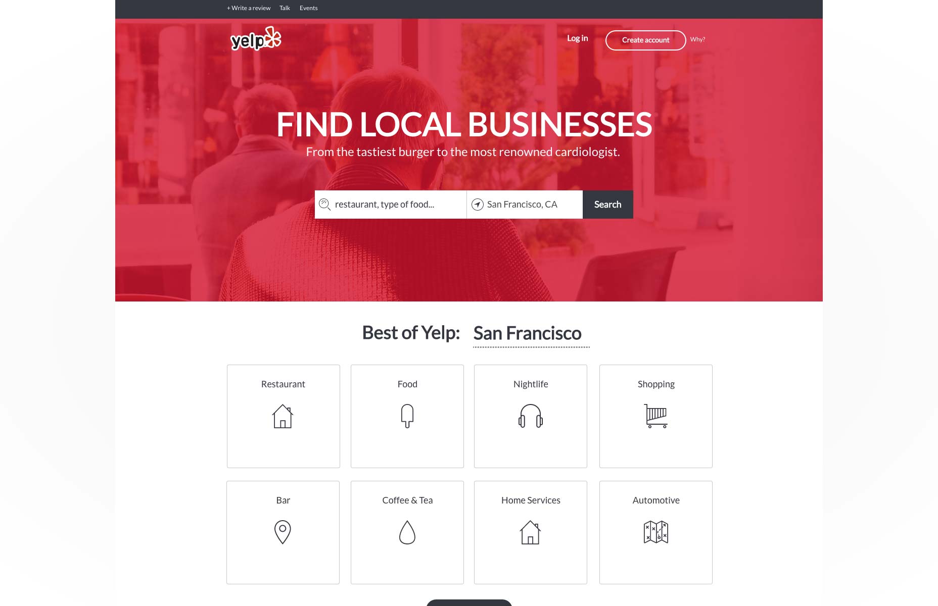
Interestingly, when the users were given specific parameters (like the budget, ambiance, and type of restaurant, or the name of an individual business) they almost always ignored everything on the homepage except for the search bar. In our redesign, we made sure that the search bar was the most visually prominent feature.
Lesson 2: Events aren’t very noticeable
In one task, we asked the two users without Yelp accounts to find an interesting event in their area this weekend. We wanted to learn whether they would use the events tab at the top of the page.
Surprisingly enough, nobody used the events tab. When asked to find an interesting event in their area this weekend, one test participant used the search bar while the other navigated through the arts & entertainment category in the best of Yelp section.
Because holding events is an important part of Yelp’s business, our redesign would pull the events section out from the sidebar and make it part of the primary scroll.
Lesson 3: Bookmarking was confusing, and no one used lists
We were curious to see how users would choose to save locations for later reference. In Yelp, there are two ways to do this: users with existing accounts can either bookmark a location or create a list. We simply asked group 1 (three users with Yelp accounts) to “save” a number of locations to look into later so that our wording wouldn’t mention any features that could bias their actions.
Of the three users who were given this task:
- One saved the businesses using bookmarks but complained that the process took a long time
- One started to save businesses using bookmarks but gave up because it took too long
- One was not able to figure out how to save businesses and gave up on the task
The two users who used bookmarks both remarked that it would be nice to be able to bookmark a business from the search results page, rather than having to go to each business’ page separately.
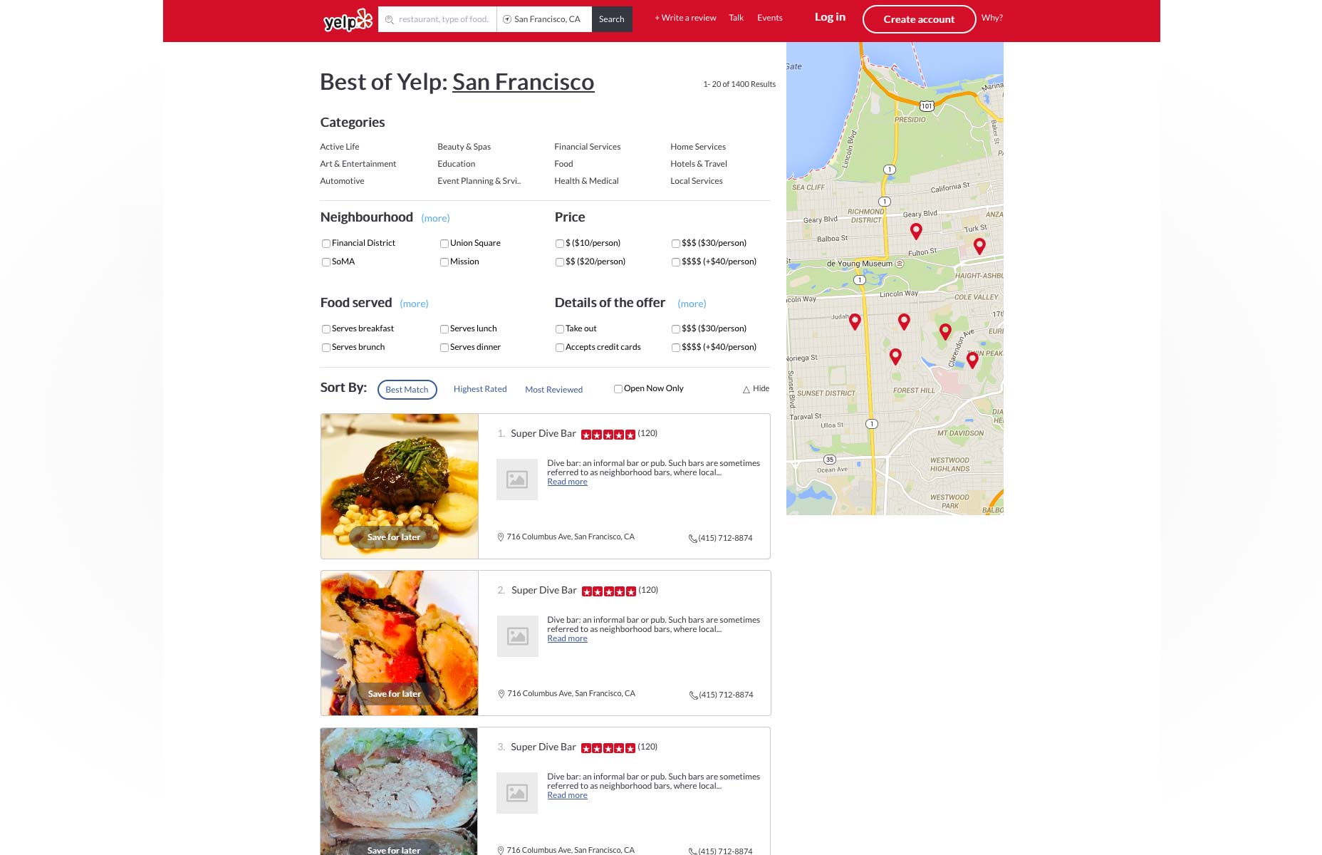
It would be nice to allow users to have an easier and more intuitive method of saving businesses to return to later, so we added a one-click save feature in the redesign. This new feature lets you save a business straight from the results page without diving deeper.
Lesson 4: It’s fast and easy to search for a specific venue
All five users were given a task to find a specific business and find out if it was open at a certain time. They all successfully completed this task, and rated the task as ‘very easy’. As mentioned previously, all five used the search bar to accomplish this task.
Since searching for a specific business is working so well, we decided that the functionality didn’t need any changing.
Lesson 5: Photos are the top choice for determining ambiance
When asked to find a restaurant with a certain ambiance, none of the five users attempted to use the search bar. Instead, three users looked through photos of the restaurant on Yelp, one visited the restaurant’s website, and the last stated that the price symbols ($, $$, $$$, $$$$) was enough to indicate if the restaurant had the right ambiance.
This brought up two insights:
- Photos are an essential part of the Yelp experience, and they are critical for users to choose a business.
- To prevent cluttering the interface, the solution could be as simple as just enlarging the photos when you get to the search results page.
Lesson 6: Users relied on filters, but they need to be revamped
All five users were asked to find a restaurant for a group of 15, three of the five participants used the good for groups filter, while one used the make a reservation feature and scrolled down until she found a restaurant that could seat the group.
At another point, one user attempted to select two categories to filter his results, but one of his choices disappeared when he clicked the other.
While filters are important, we learned that they could be greatly improved. To dig deeper, we decided to to run a card sort on all of Yelp’s current filter options to determine which ones are actually useful to users.
For the redesign, we decided that we would categorize filter categories in groups of four based on how users prioritized them. For example, we learned that “Open Now” and “Accepts Credit Cards” were some of the most important filters, but it can take several clicks to access them.
Lesson 7: Price categories weren’t clear
When users were searching for the restaurant with specific parameters, one of the requirements was to find a restaurant within a $20/person budget. Two of the five users were confused by whether their $20 restaurant budget would fall into the $, $$, or $$$ category. One user stated that she didn’t know what the symbols meant, and another clicked the wrong category. The other three correctly chose the $$ category.
The definition of the symbols does not display when users select filters; it only displays when the user navigates to a particular restaurant’s page. Since price expectations are highly subjective, it was unclear to users which category they should choose.
In the redesign, we solved this by placing the exact values in parentheses next to the symbols. This is especially helpful as you move between categories, since $$ has different meaning if you’re choosing a mechanic or burger joint.
Design driven by usability insights
Once it was time to design, we followed an approach based on the last few steps of the Google Ventures design process. UXPin CEO Marcin Treder started with numerous informal sketches before a team decision helped cull it down to the top 2-3 sketches. To prevent design by committee, Marcin had the final say regarding which sketches would progress into wireframing and prototyping.
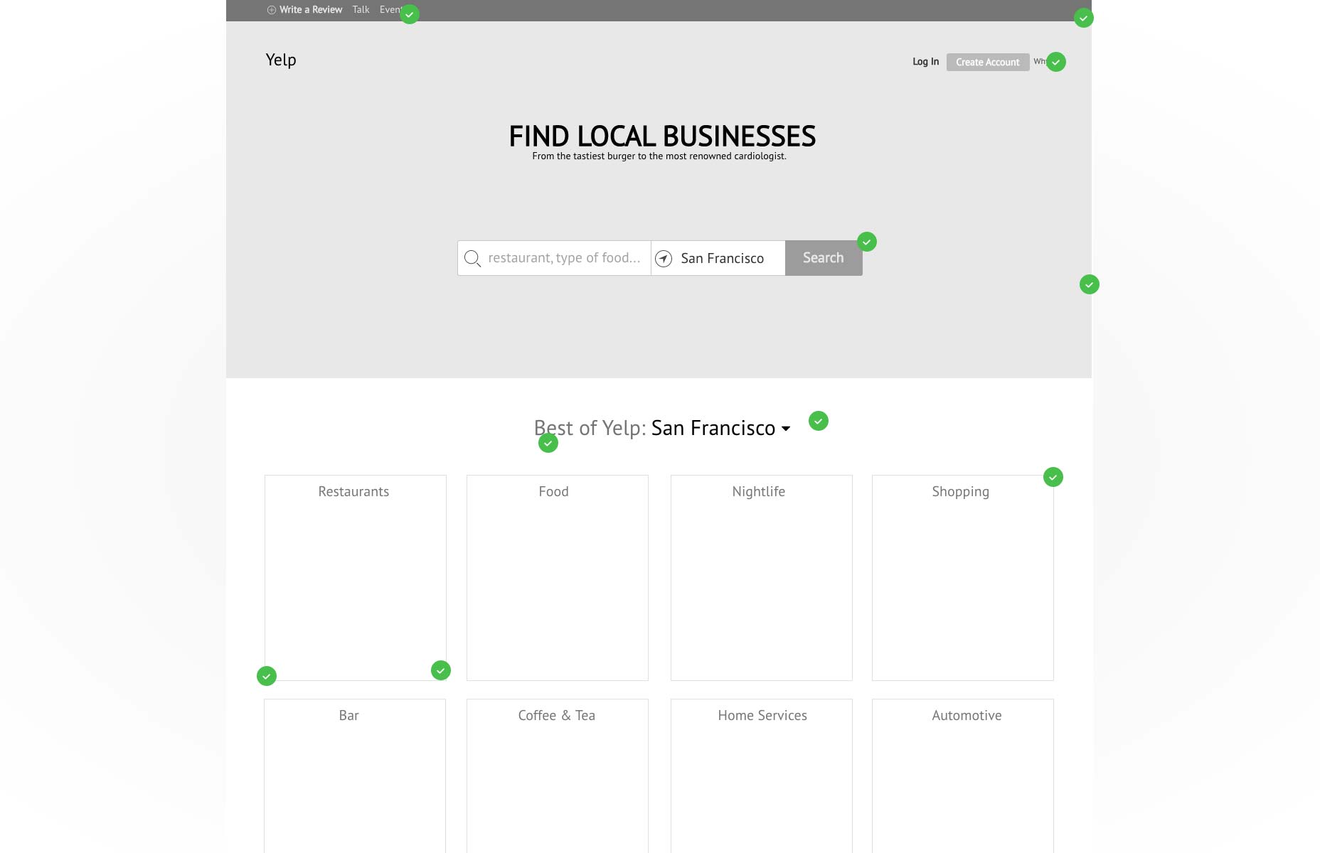
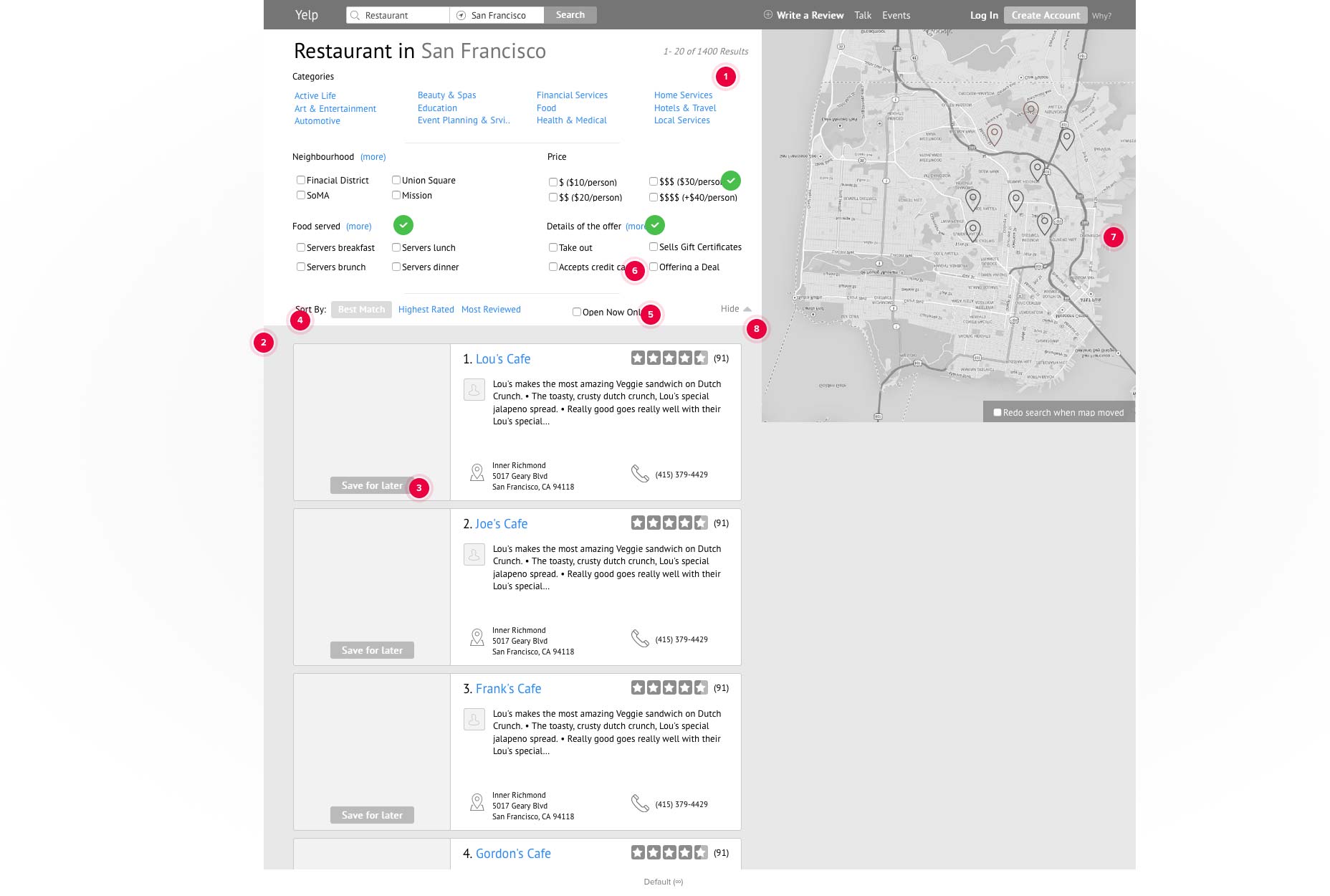
We created a wireframe to incorporate most of the design changes, then added some interactions and animations to turn it into a low-fidelity prototype. Once the animations were smoothed out, we added detail for a high-fidelity prototype.
Low fidelity prototypes


High fidelity prototypes


Determining all dimensions of usability
What users say and what users do should serve as checks and balances during user testing. While you don’t need to necessarily be present during the test, an audiovisual recording is mandatory, otherwise you might miss out on the context of actions. When you combine qualitative analysis with quantitative analysis , you’ll get an even clearer idea of why and how to fix a problem, as well as how many usability problems your design needs to solve.


