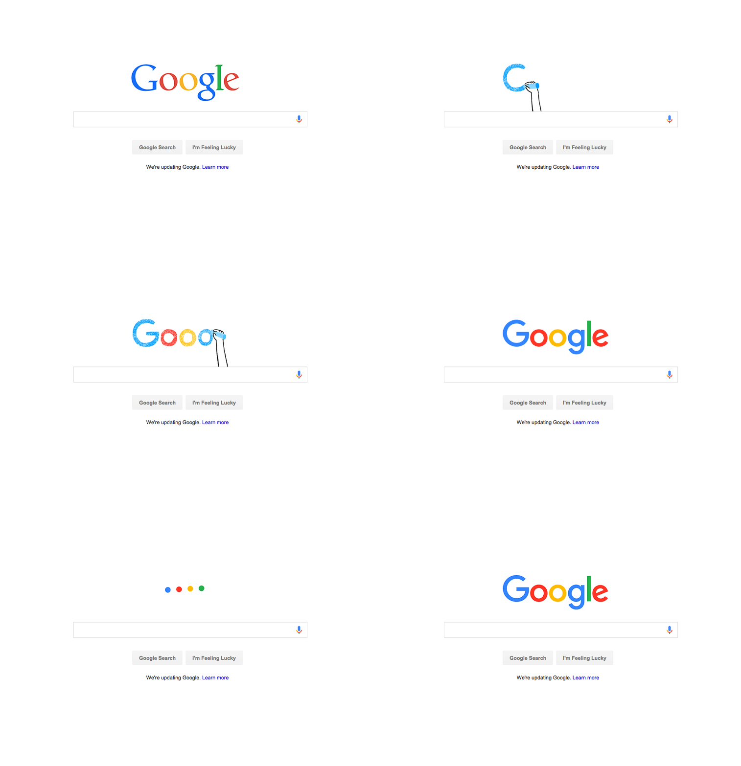
 Google is one of the most recognizable brands in the world, so any kind of redesign will inevitably present a challenge. On this occasion Google has chosen to play it safe, by following Facebook’s recent dumbing down of its own logotype.
According to Google the redesign has been inspired by mobile usage:
So why are we doing this now? Once upon a time, Google was one destination that you reached from one device: a desktop PC…These days, people interact with Google products across many different platforms, apps and devices – sometimes all in a single day.
Considering that Google makes what is arguably the most successful mobile OS, you might think that mobile-friendly branding would have been a priority a few years ago. Speaking about logos, identity supremo Paul Rand once said:
The principal role of a logo is to identify, and simplicity is its means… Its effectiveness depends on distinctiveness, visibility, adaptability, memorability, universality, and timelessness.
These principles were brilliantly laid out by Dave Schools in his simple 7-step logo test based on Rand’s statement. Following his process, I rated the new Google logo a disappointing 41 — 19 points short of avoiding the trashcan — although those scores are subjective, so try it yourself. If Google had chosen to be daring, they might have moved forward with just their sequence of colors. They have their doodles, and with Alphabet Inc. taking over corporate duty, they had the option to be ultra-minimal. Afterall they are one of the few companies ubiquitous enough to do so successfully. What they have delivered, in addition to the logotype, and a hasty uppercase ‘G’ colored in the four (now slightly tweaked) colors, are the new ‘Google Dots’. The Google Dots are four dots, colored blue, red, yellow, and green. They animate, they communicate, they’re playful, versatile, memorable; everything you’d ask for in an identity. The previews we’ve seen so far suggest that they’ll be central to all of Google’s future UI design, providing visual feedback on interactions. All in all, this is a safe corporate rebrand that Google didn’t need to make. The logo is more appealing, but a design that is so on-trend has a limited shelf-life. The Google Dots however, are a great addition that will be built into everything Google do, and will be around for years to come.
Ben Moss
Ben Moss has designed and coded work for award-winning startups, and global names including IBM, UBS, and the FBI. When he’s not in front of a screen he’s probably out trail-running.


