How to design a pitch deck: lessons from a seasoned founder

Rapid fire considerations: dos & don’ts
Don’t:- Exceed 20 words per slide. You get one headline phrase, one sentence caption, and that’s it. Slides aren’t scripts, they’re a visual guide for your audience. Everyone in the room should grasp a slide the moment they glance at it.
If they’re reading, you’re in trouble, because that means they’re not listening to you.Do:
- Use one phrase (headline) per slide, maximum.
- Use one sentence (caption or subheader) to complement your headline, maximum.
- Use one image (visual representation of the headline or caption) per slide, maximum.
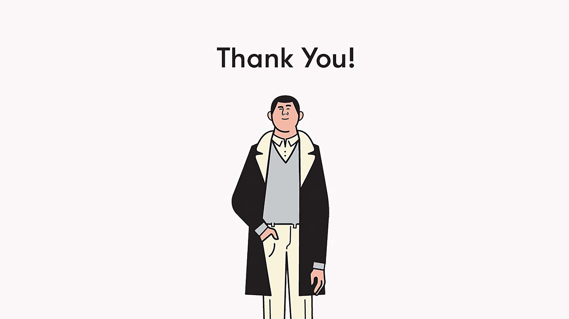
- Source non-licensed images. Especially if you can’t afford a designer or photographer. Keep in mind, this is not a TED Talk. For the most part, you’ll be pitching a few people, and your deck is only going to be seen behind closed doors. (Except in our present case: before we intended to write this post, we borrowed and manipulated a handful of images from one of our favorite illustrators, Rami Niemi.)
Tell a compelling story
Many “How to Develop a Pitch Deck” outlines will detail the 10 slides you need to have in your deck. While certain slides are important, a pitch can fall flat if it’s not framed as a story. You need to play to both the head and the heart — investors make decisions with both.A 3 minute story
The best approach is to weave a compelling, 3 minute story about what’s wrong with the world, what the inevitable solution is, how your product happens to be that solution, and why your company will succeed. Your story should lead to your product being the logical conclusion of whatever problem you identify. As long as it’s compelling and concise, you’re set. Save your more conventional slides for a supplemental deck that you can reference when questions arise organically in your post-pitch conversation. The goal of the first meeting is not to get funded, it’s to secure a second meeting. The goal of your 3 minute pitch isn’t to drag the investor through every last detail of your business, it’s to excite them and engage in a conversation that allows you to move through the remainder of your story and slides organically.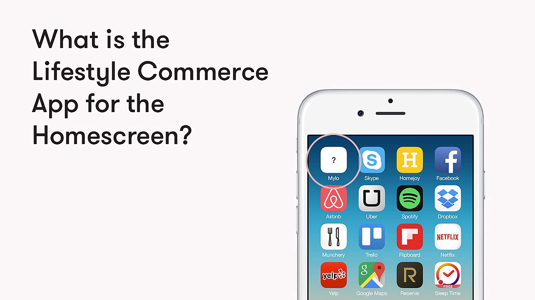
First slide / first impressions
Have you ever been on a first date and immediately decided whether you like or dislike the person you’re about to sit down with? Some dates go so well that you’re fantasizing about marriage by the end. Investors are no different. Ideally, you want them to fantasize about your ability to make them a billion dollars. A strong first slide will tip the scales in that direction. This slide should immediately hook them, and a great way to do that is to explore the problem that your product is going to solve.Problem / solution
Stories thrive on tension. The worst movie ever made would have the protagonist fall in love during the credits, and we’d have to squirm our way through 90 minutes of bliss. 50 First Dates, 500 Days of Summer — these titles suggest long, drawn out processes that play with our attraction to the buildup of tension and the release of resolution. Our pitch does just that: it builds tension slowly, introducing two problem slides before our first solution slide. We follow that up with two more problem slides before proposing our next solution. It’s important to remember that you’ve been thinking about your product for months, and the problem and solution are extremely obvious to you by now. Keep in mind: it’s not obvious to potential investors, and it’s your task to make it so. The best way to do that? Repetition.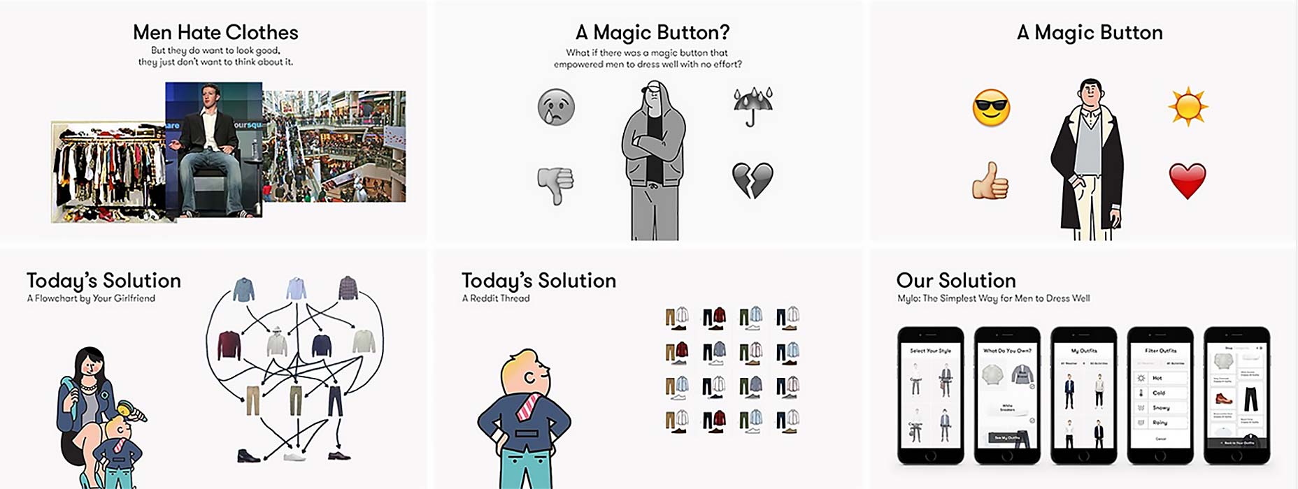
Design tips
“Good Design”
Most people think good design is directly related to beauty. They’re wrong. Good design is about executing a desired outcome through visual communication. Did you notice how ugly our first slide is? This is intentional. We want people to react viscerally to how messy and uncomfortable the problem is. We’ve also used an iconic, relatable image to communicate it. Every investor knows that Mark Zuckerberg is a notoriously poor dresser, so this tiny visual joke helps us develop a rapport in addition to articulating the problem our product is about to solve.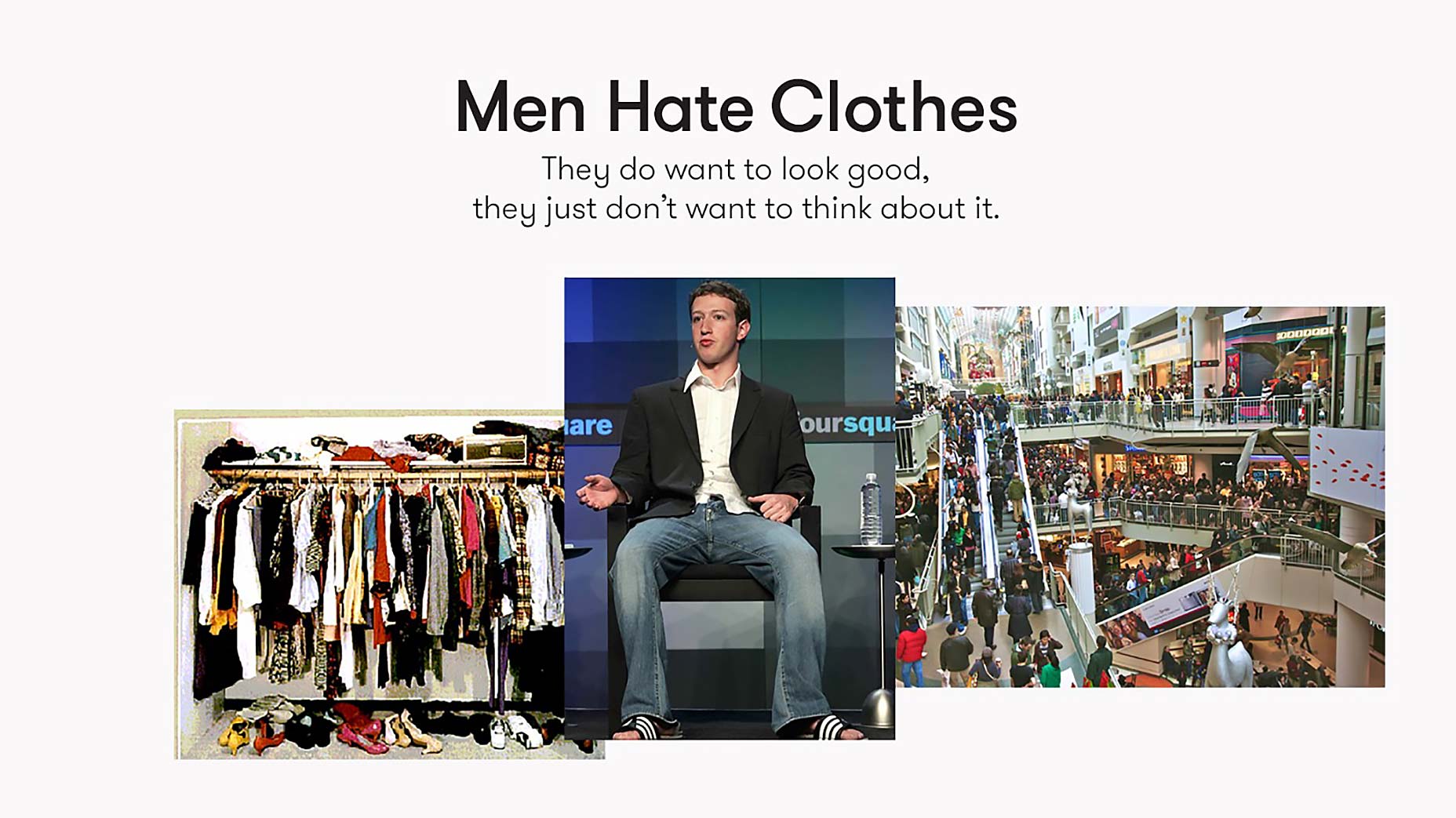
Use transitions
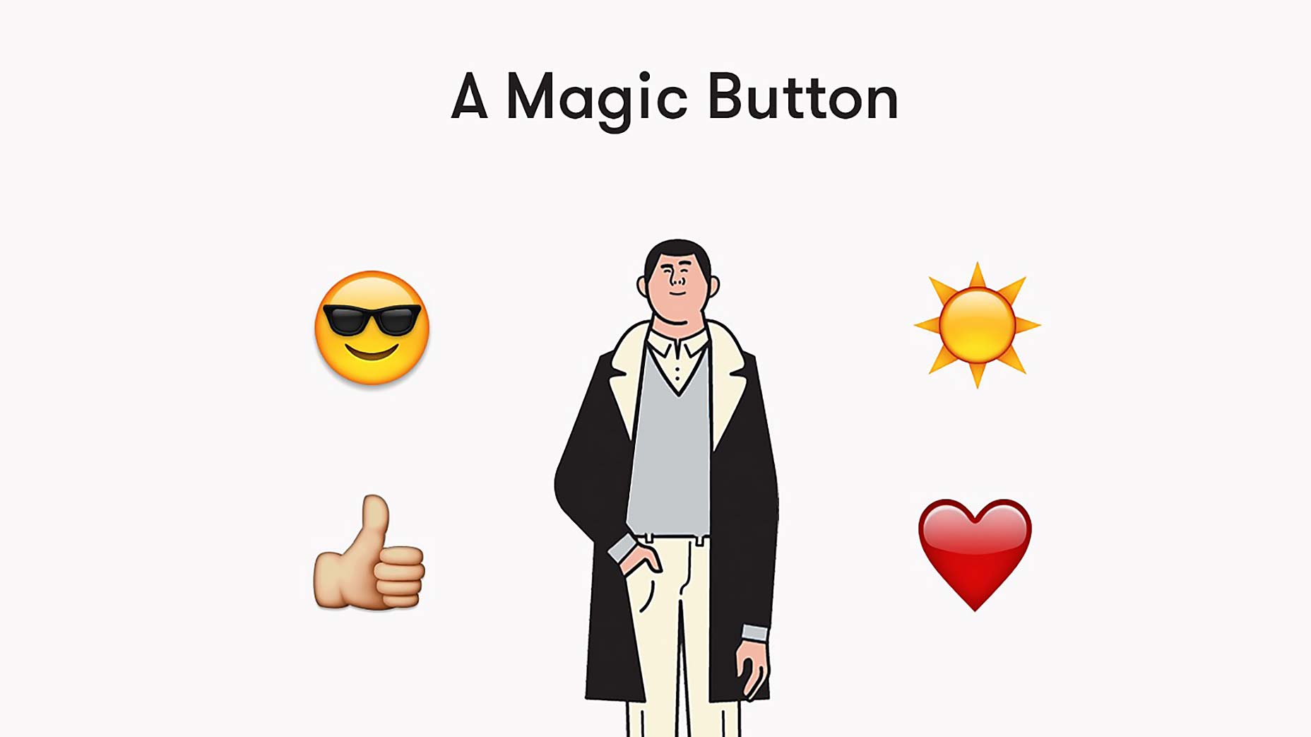
Powerpoint fades and wipes do not apply here. Transitioning in this sense refers to unifying visual cues, be they consistent type or image placement. It’s always wise to anchor your slides with consistently placed images and type, but it also helps to get creative. A great film example would be the iconic shot from 2001: A Space Odyssey. If you can recall, it tracks a bone that’s been thrown into the sky, before transitioning to a matched shot of a rotating space station. Our far less impressive transition features a pair of slides that propose the effect of a magic button (Mylo). The first slide features a frowning, poorly dressed fellow surrounded by distressed emojis. We press the button (which mimics our app’s ability to dress you in a matter of seconds), and voila! Our magic button has transformed depression to happiness, rain to sunshine, and a once poorly dressed man to a snappy dresser: who wouldn’t want that?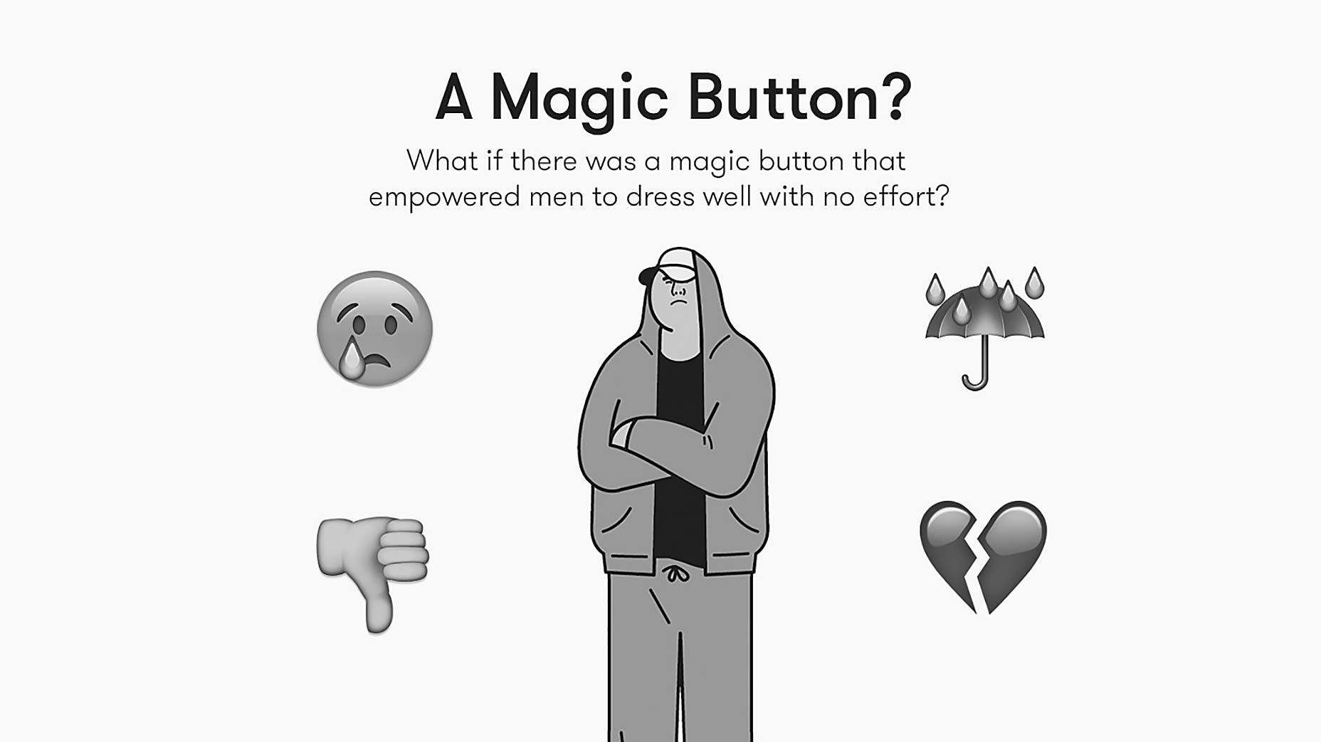
Visualize emotion
Frame your pitch from the perspective of other individuals, ideally your investor. How can they best be reached? The illustrations we’ve used in our deck weren’t chosen exclusively for their superficial qualities. Although they do help us convey a fun, quirky side of Mylo, we were also aware they’d help our audience engage with our story on a deeper level. Illustrations are powerful because they enable a viewer to envision themselves in the scenario you’ve created; something that photography lacks. We readily admit in our deck that there is a solution for men who’d like to dress well: their girlfriends. Besides this being low-tech and messy, there’s another, more subtle connotation: it’s slightly emasculating. We never say this in our copy, or even in our verbal presentation, but by using an image of a man-child, we inject some humor, and more importantly, subtly indicate that today’s solution may even be somewhat embarrassing.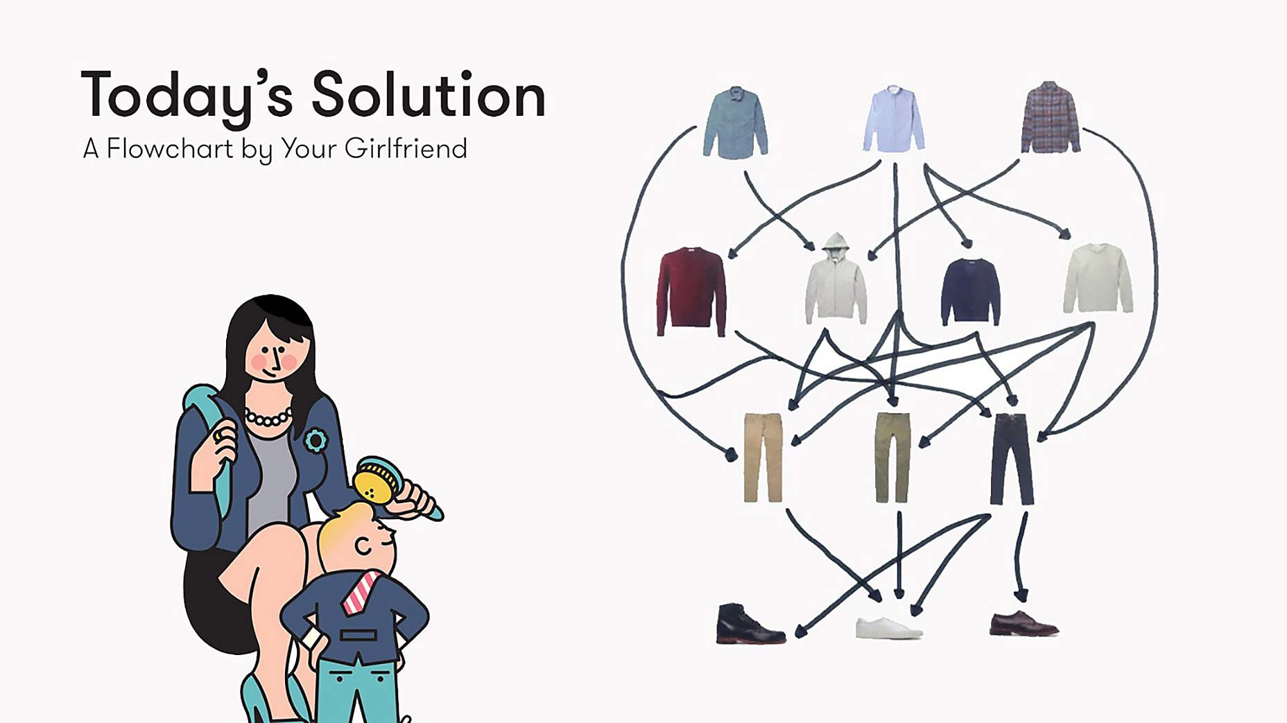
The money shot
Nope, not actual money, because you’re probably not making any yet — we’re talking about your product. Regardless of the story you’ve decided to tell, it’s almost certainly going to include an explanation of what you actually do. You don’t have time to weave a full demo into a 3 minute pitch, so your goal here is to showcase why your solution is at least 10 times better than all of the alternatives you’ve described thus far. In our case, we contrast Mylo with two extremely rudimentary versions of the same thing, and show how our solution is more expansive, beautiful, personalized, user-friendly and high tech.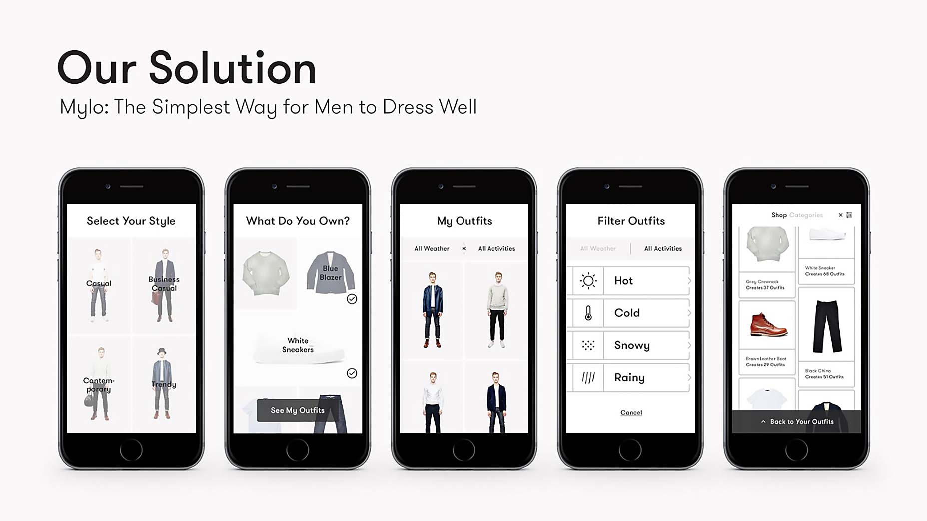
The actual money shot
Again, at this stage any hard figures you present probably won’t be accurate, and stories are more fun than numbers anyways. The idea behind this story is to convince your investors that what you’re creating is the future, and how there’s an enormous (somewhat quantifiable) opportunity ahead of you. In our case, we show the enormous potential of mobile and its undeniable future at the head of commerce. Despite that, our graph shows how little mobile activity there is at the moment, which represents a giant opportunity. Don’t be shy: put your investor in a space suit with floating gold bars and briefcases of money; that’s the point: they’re here to make money, and everyone wants to pretend they’re Elon Musk.
Supplemental slides
You’ve spent three weeks crafting a three minute story, but you’re not quite finished. If you really put in the work, you’ve explored several different narrative paths and have a ton of extra information that you couldn’t include for the sake of brevity.Back pocket stories
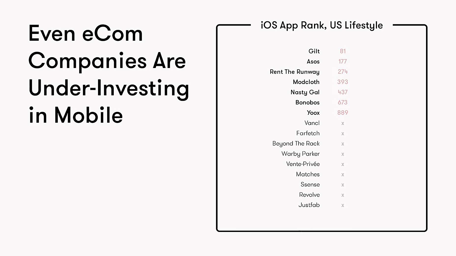
Luckily, these ideas don’t have to go to waste. Once your 3 minute pitch is complete, the investor will likely have several questions about your project. The idea is to anticipate these questions and create supplemental slides that will provide visual support for your answers. If an investor asks about your competition (and they most certainly will), you’ll be prepared to articulate who exists and why you’re unique and superior.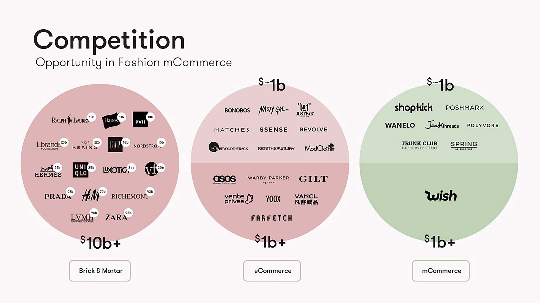 For Mylo, it’s an excellent moment to reiterate the giant opportunity in mobile lifestyle commerce. The supplemental slide we’ve prepared includes a variation on a competitor matrix, which investors are used to seeing and ignoring.
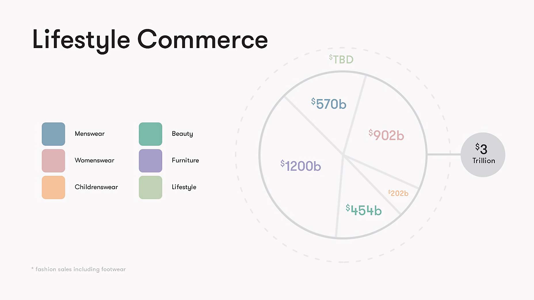
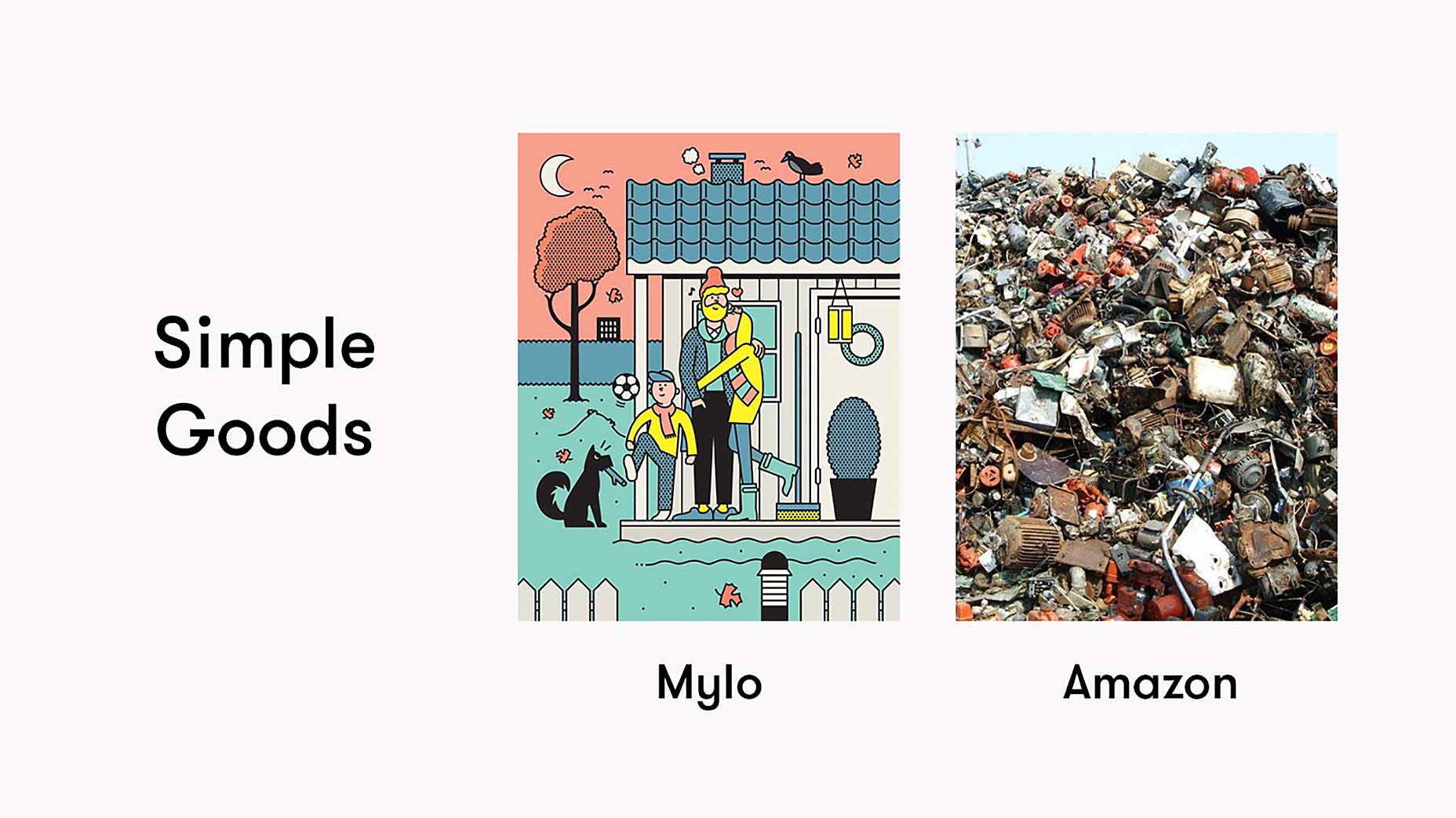
 We’ve also taken the time to think about lifestyle commerce’s TAM, but weren’t able to fit our thoughts into the core pitch. Instead, we transformed our thoughts into a supplemental story slide about our vision to become the leading lifestyle company of the mobile age. We discuss what a Gap + Ikea hybrid might look like if it was created today and how it might compete with Amazon.
Up your word count
Remember the rule that restricted you to 20 words per slide? It’s pretty difficult to abide by. Here’s where you can break it. If you have a slide in your core deck that requires additional explanation, a supplemental version of the slide can be made and used as a cheat that helps you remember all of the key points you weren’t able to condense into your pitch.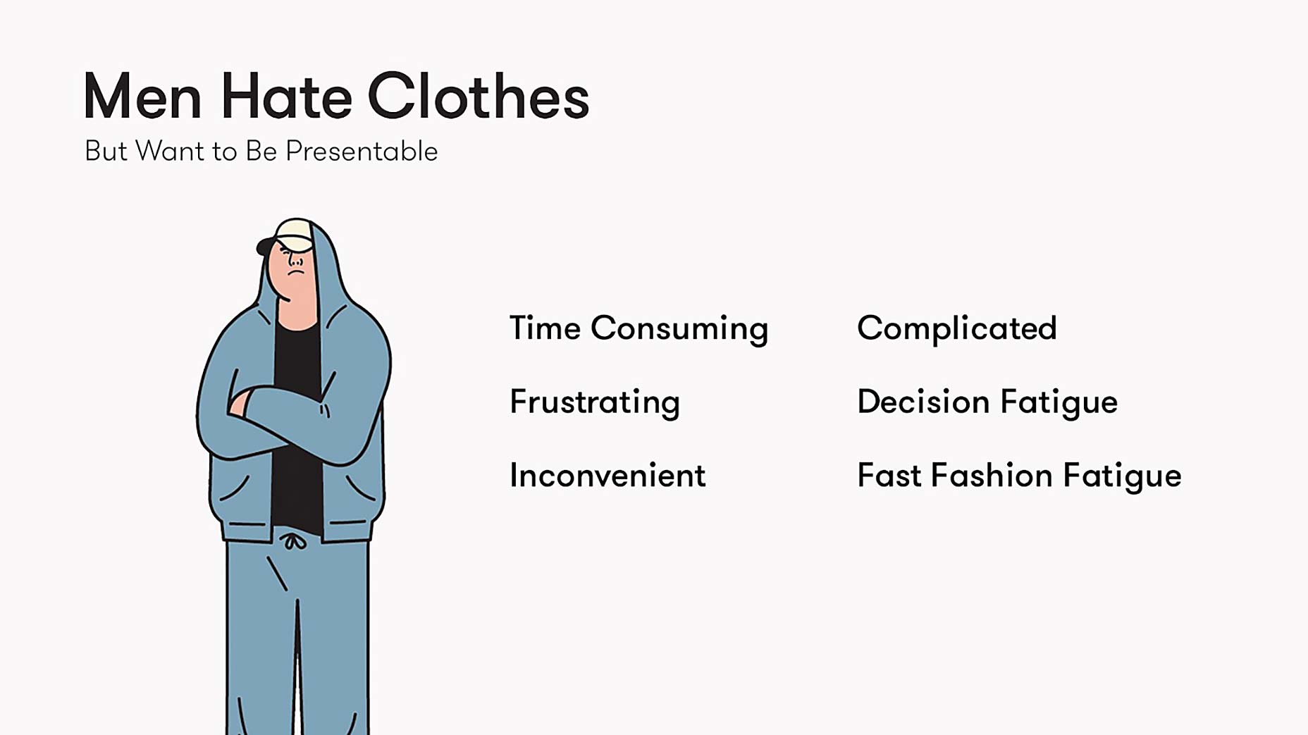
Go generic
Not every slide can be a work of art. Include a generic templatable slide to add information that can’t be clearly articulated in one image or slide. In an ideal world, you’d take the ideas that you’ve lazily merged and break them into original/impressive/beautiful supplementary slides, but you’re a startup and you’re broke, and that’s why you’re putting this together in the first place. You can’t afford to make every slide perfect ;)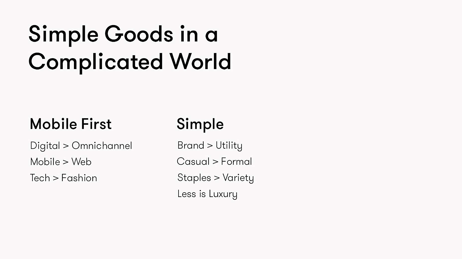
Other resources
Further reading For other great more general reading material on pitch deck development, check out the following links: Want a Better Pitch?, 4 Point Story Structure for Fundraising, VCs Spend an Average of 3 Minutes on Them, Three Slides Then Shut-up, How About Seven?, The Only 10 Slides You Need in Your Pitch, In Defense of the Deck, Pre-Pitch Advice Additional design references If you’d like to check out some well considered non-Mylo decks, check out the following links: Best Pitch Decks, PitchEnvy, Best Startup Pitch Decks Powerpoint template If you’re lost, in a rush, and need something to get you started immediately, try this template from Crowdfunder. This article was originally posted at blog.growth.supply, republished with the author’s permission.Daniel Eckler
Daniel Eckler is the founder of Mylo: The Simplest Way for Men to Dress Well. Mylo helps you get dressed with the items you own and builds your wardrobe with quality staples.
Read Next
3 Essential Design Trends, November 2024
Touchable texture, distinct grids, and two-column designs are some of the most trending website design elements of…
20 Best New Websites, October 2024
Something we’re seeing more and more of is the ‘customizable’ site. Most often, this means a button to swap between…
Exciting New Tools for Designers, October 2024
We’ve got goodies for designers, developers, SEO-ers, content managers, and those of you who wear multiple hats. And,…
15 Best New Fonts, September 2024
Welcome to our roundup of the best new fonts we’ve found on the web in the previous four weeks. In this month’s edition…
By Simon Sterne
3 Essential Design Trends, October 2024
This article is brought to you by Constantino, a renowned company offering premium and affordable website design
You…
A Beginner’s Guide to Using BlueSky for Business Success
In today’s fast-paced digital world, businesses are always on the lookout for new ways to connect with their audience.…
By Louise North
The Importance of Title Tags: Tips and Tricks to Optimize for SEO
When it comes to on-page SEO, there’s one element that plays a pivotal role in both search engine rankings and user…
By Simon Sterne
20 Best New Websites, September 2024
We have a mixed bag for you with both minimalist and maximalist designs, and single pagers alongside much bigger, but…
Exciting New Tools for Designers, September 2024
This time around we are aiming to simplify life, with some light and fast analytics, an all-in-one productivity…
3 Essential Design Trends, September 2024
September's web design trends have a fun, fall feeling ... and we love it. See what's trending in website design this…
Crafting Personalized Experiences with AI
Picture this: You open Netflix, and it’s like the platform just knows what you’re in the mood for. Or maybe you’re…
By Simon Sterne
15 Best New Fonts, August 2024
Welcome to August’s roundup of the best fonts we’ve found over the last few weeks. 2024’s trend for flowing curves and…
By Ben Moss


