
Andrea D. Labarile
This one is all in Italian, but don’t let that scare you off. Heck, the fact that it’s easily navigable in a language that I don’t speak is a testament to the usability of the site. It’s simple, stylish, memorable, and it has great UX. I can’t ask for much more.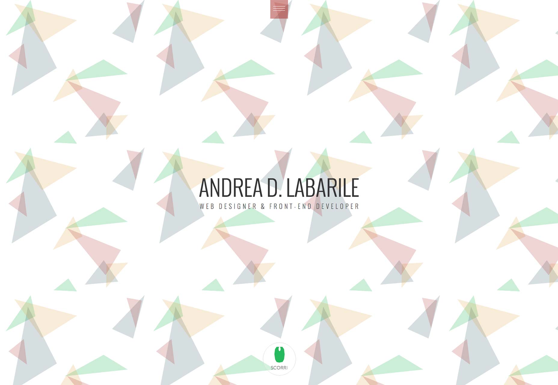
Umwelt
Things that look simple often aren’t. In Umwelt’s case, what looks like a simple, if stunning, series of images is actually subtle portfolio navigation. It is not, however, subtle enough to be confusing. The vertically-centered text that changes based on which project you’re viewing was a fantastic touch, in my opinion. That animated text provides some of the guidance a user needs to navigate the desktop version of the site, and it looks great.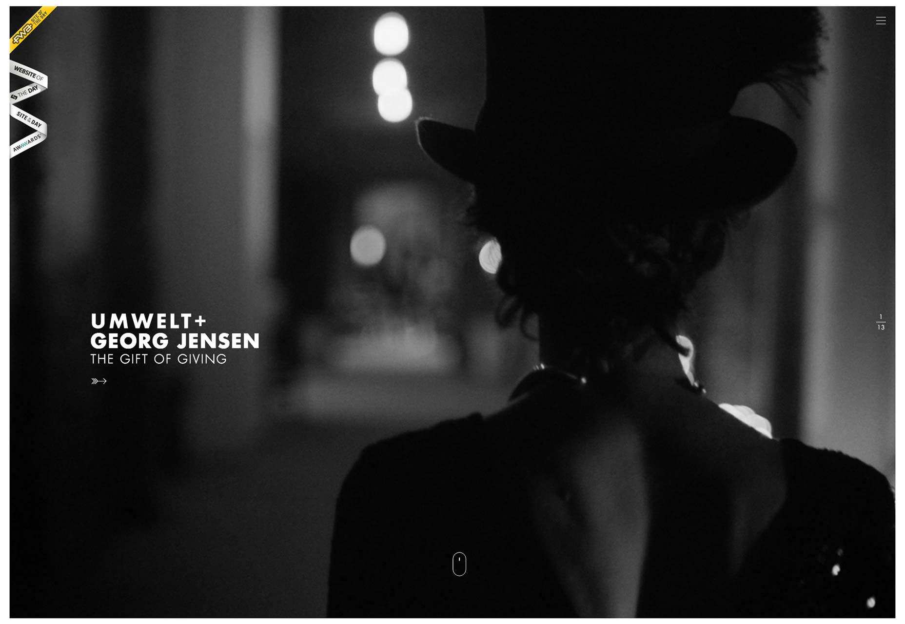
Colin Grist
There are quite a few superb examples of extreme minimalism, and just how pretty it can look on the web. Colin Grist’s portfolio should definitely be added to that list. Its rigidly grid-based layout, combined with lots of white space, lets the designer’s work do all the talking.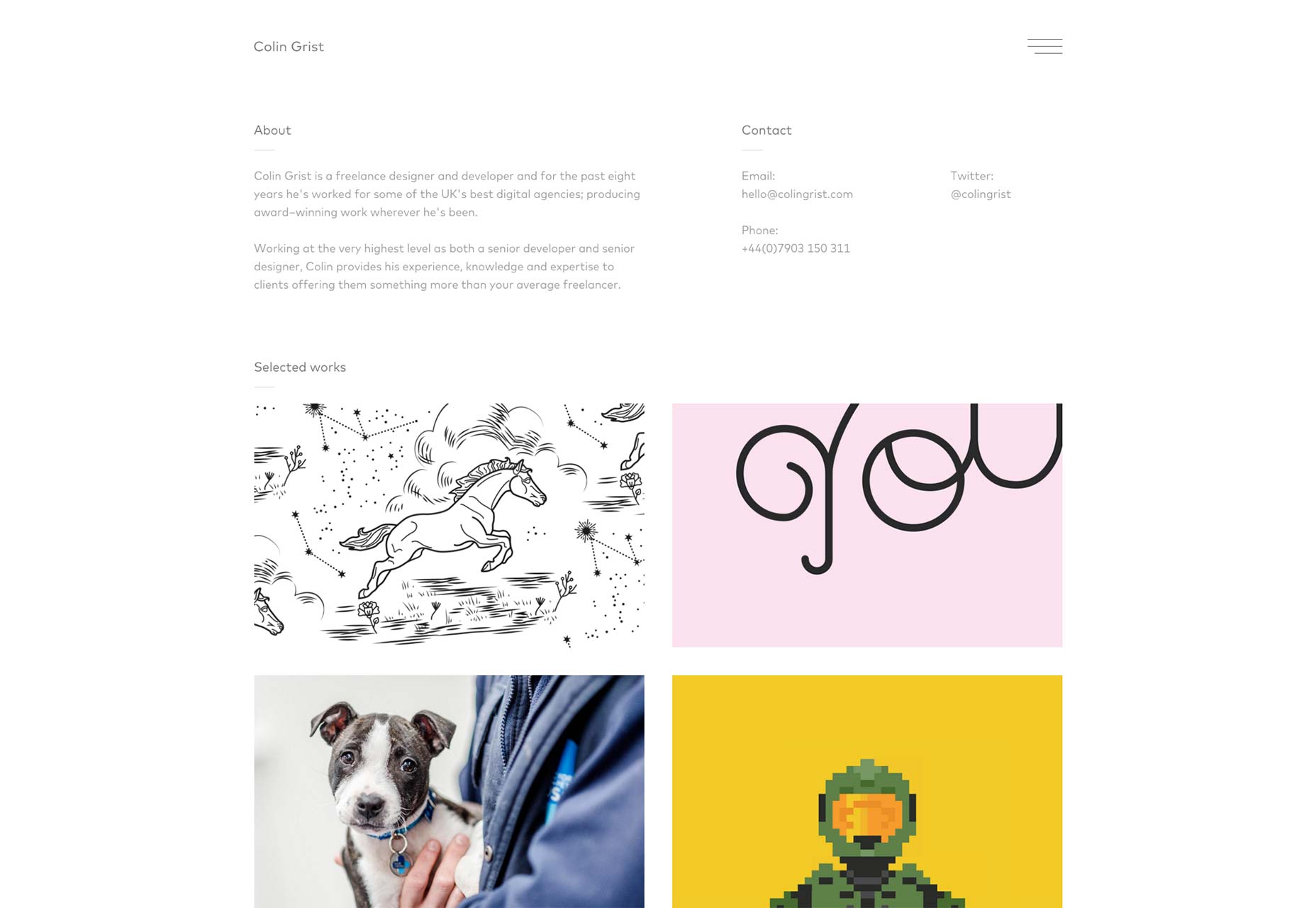
Maria De La Guardia
Maria De La Guardia’s site looks good, works good, a lot like most of the other sites on this list. What made it stand out is the way she mixes blog entries into the portfolio with her visual work. And why shouldn’t she? If you’ve written something you’re proud of (and it’s design-related), maybe you should add it to your portfolio. After all, your portfolio is supposed to demonstrate what you know. There’s no reason not to do that with the written word, as well as imagery.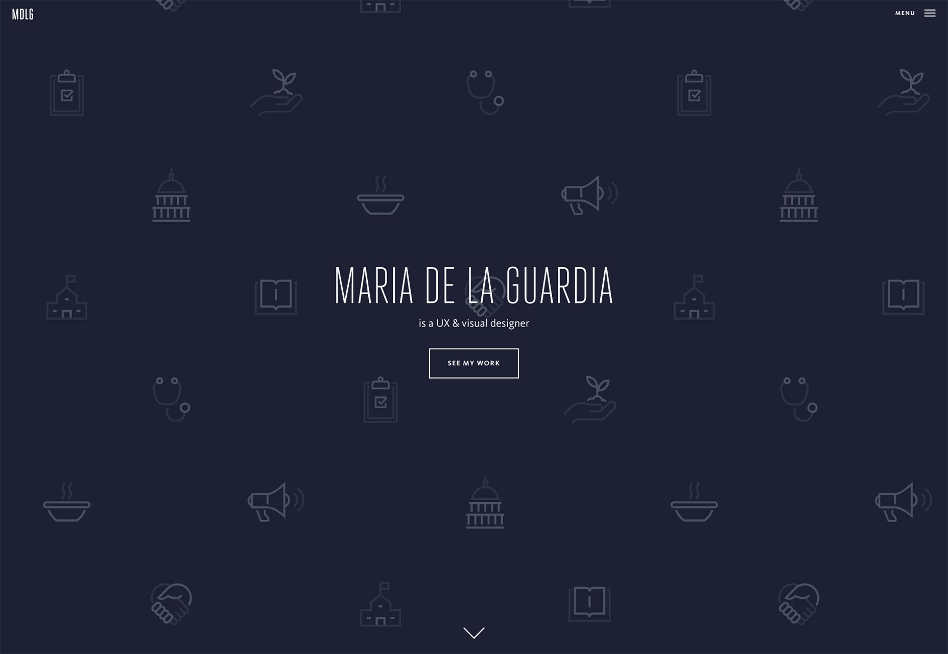
The Charles NYC
The Charles NYC features fantastic typography, a mostly monochromatic theme (their work provides the only color on any given page), smooth animation, and unmistakable style. This one is here just because it’s pretty to look at. Still not a fan of pre-loaders, though.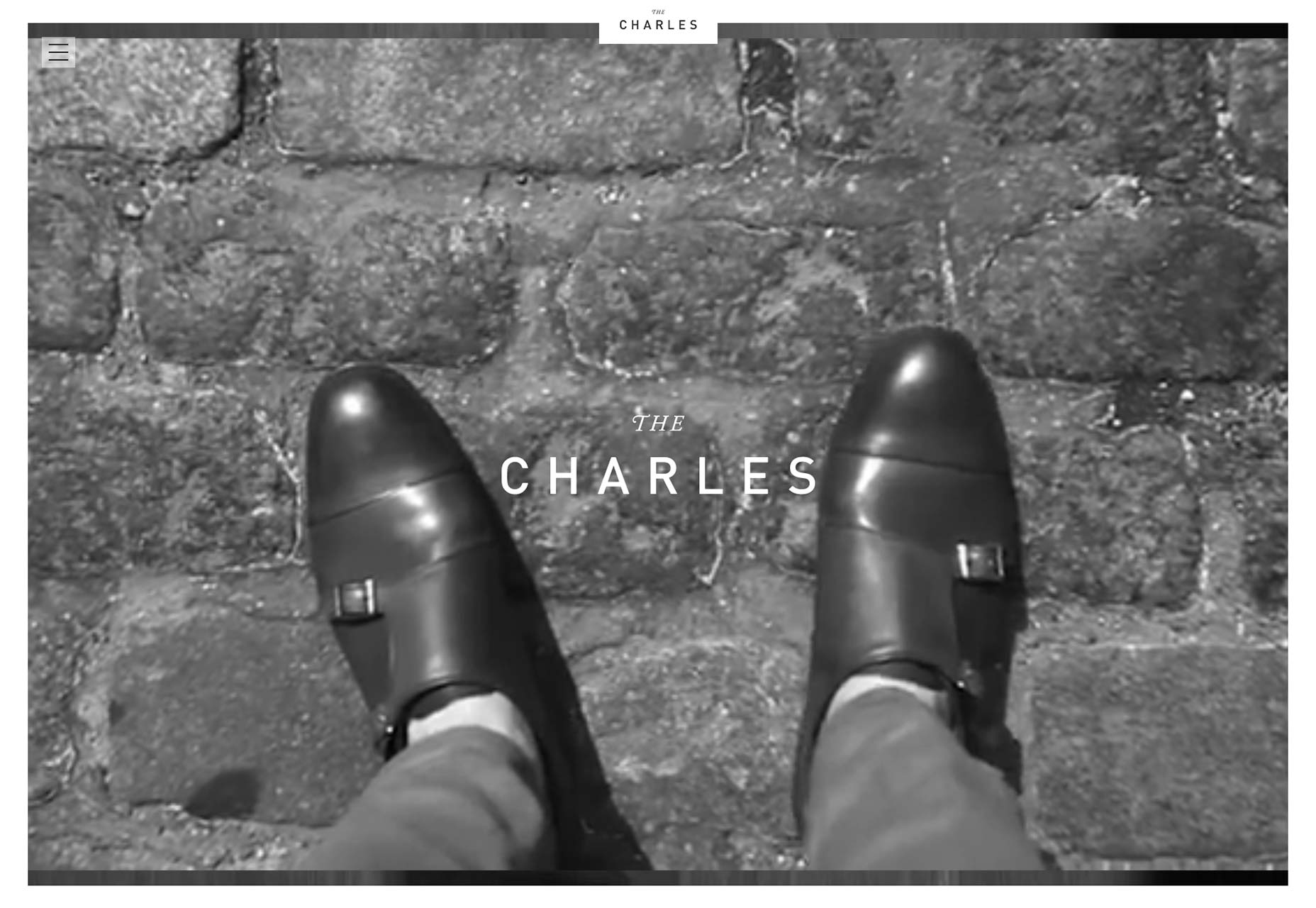
Ostmodern
Ostmodern A lot of people have complained about how flat design always looks “the same”. One reason for that sentiment, I think, is the proliferation of common color schemes. While Ostmodern’s design does use some of the desaturated tones we’ve come to know and love/hate, they’re mixed with the bolder, brighter colors of TV. Ostmodern does a lot of work for TV, so that fits, thematically speaking.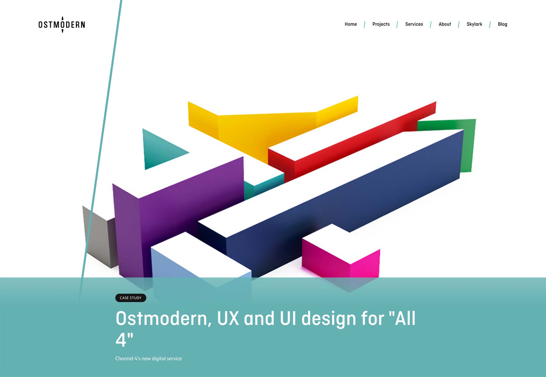
Swallows and Damsons
Swallows and Damsons is the portfolio of a floral arrangement company. I didn’t count, but I doubt there are thirty words in the whole UI and content put together. I don’t see this as a problem. What are you gonna say about flower arrangements? "Uhhh... they’re really, REALLY pretty, so please buy them?" This is one place where letting photos do all the sales work is a great idea, and the designer’s made it work.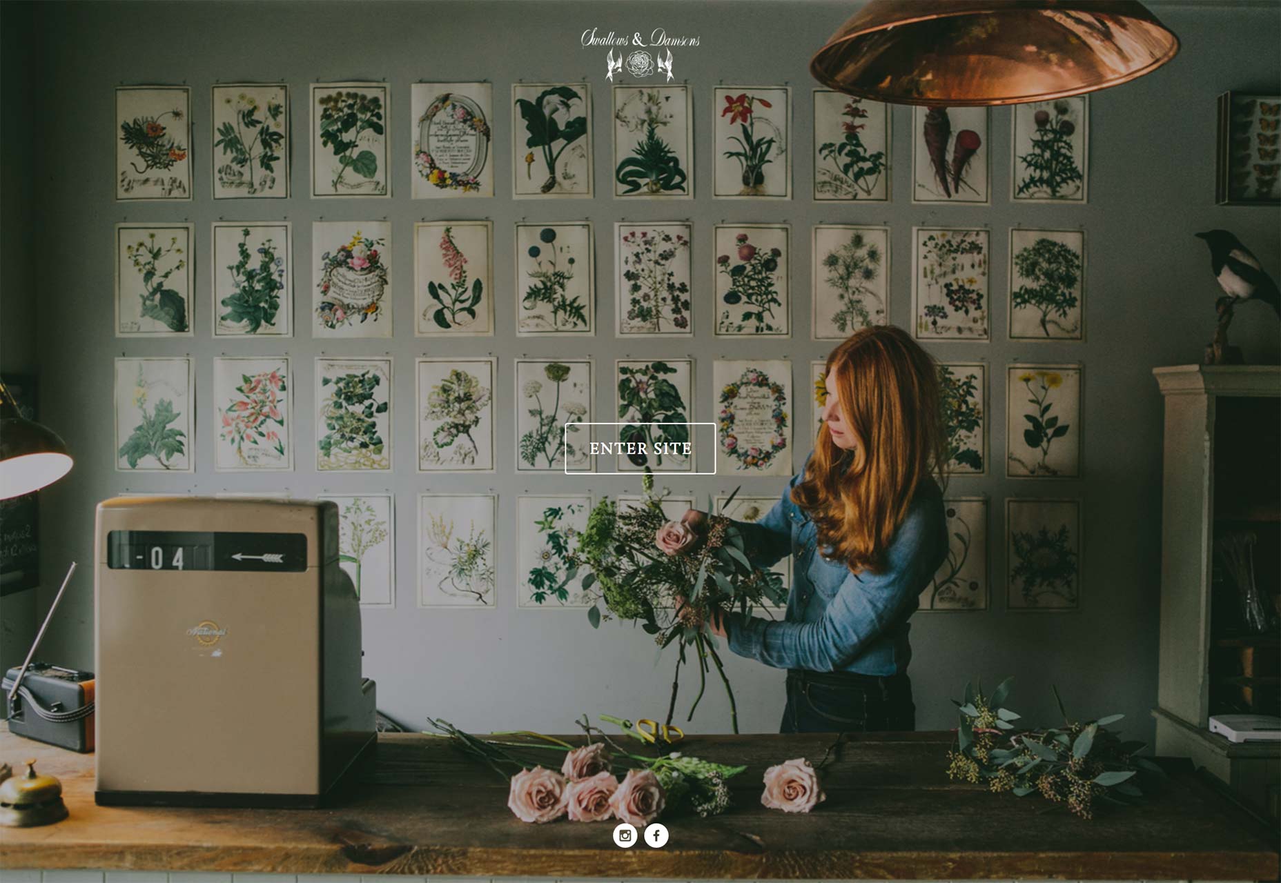
Studio Rodrigo
Studio Rodrigo’s site is one of those that adapts extremely well to large screen sizes as well as small. If you want to learn how to make relatively small amounts of text and information look good on an HD screen, look to these guys for an example. Centered columns are so three years ago... apparently.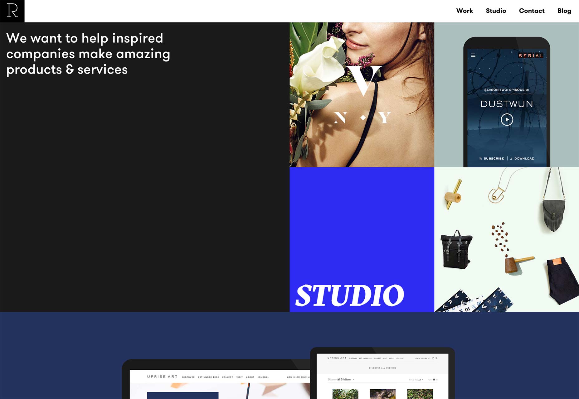
Molamil
Molamil is an interesting case, aesthetically. It combines “fancy” typography with illustrations and photography to create a design that feels both professional, and deeply personal. It gives the sense that members of the agency are smart and social. Their work with the Generous Store and Pass It On would seem to support that idea.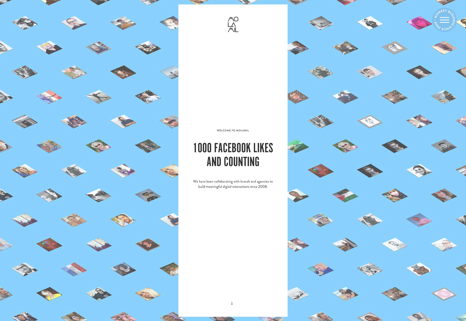
James Tupper
I am always impressed by people who seem to put their personality into a page’s design. After seeing James Tupper’s personal portfolio, I feel like I have some small idea of what it would be like to work with him. And now I wish I had the money/a reason to do just that.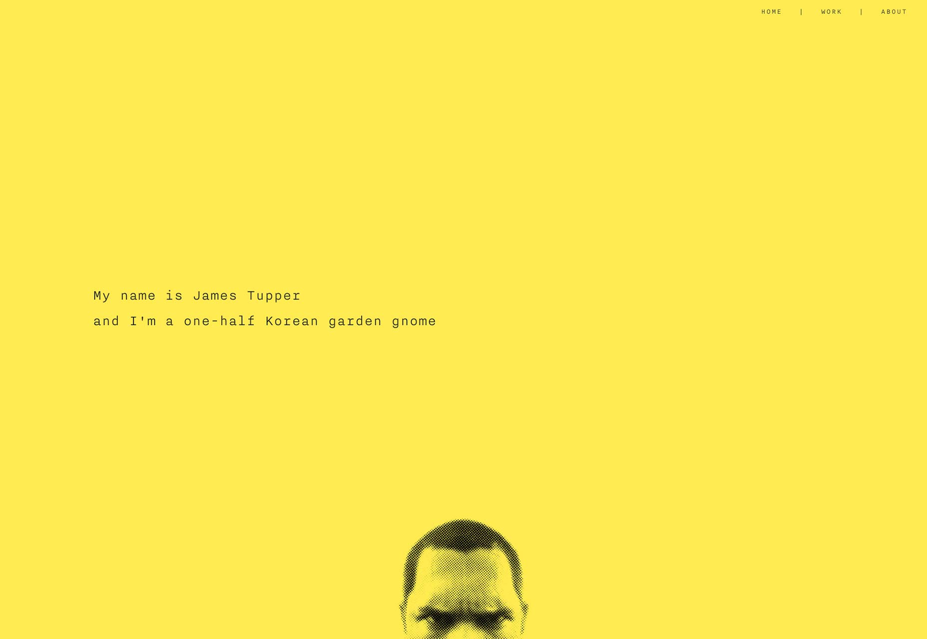
SFCD
SFCD is an agency that specializes in making apps. Instead of relying on a screenshot in a photo of an iPhone (they do have a few of those), they put a ton of effort into their site, and it shows. Take, for example, the smooth, fancy animations that don’t overly distract from the content, great typography, and great work.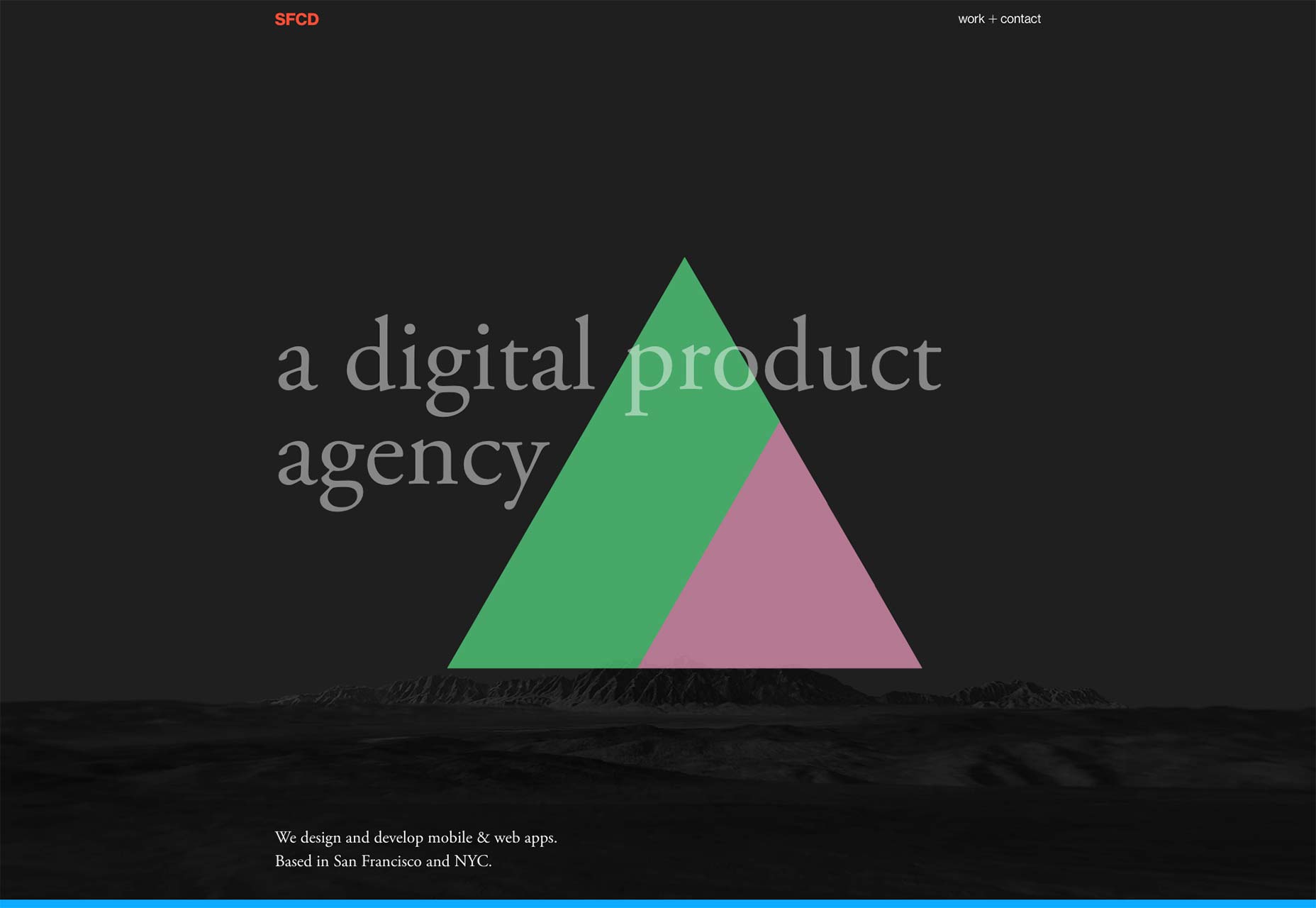
Fable & Co.
Honestly, you should go check out Fable & Co. for the typography alone. Don’t get me wrong, the rest of the design is great too, but the way they designed that text makes me want to read it just because it’s pretty.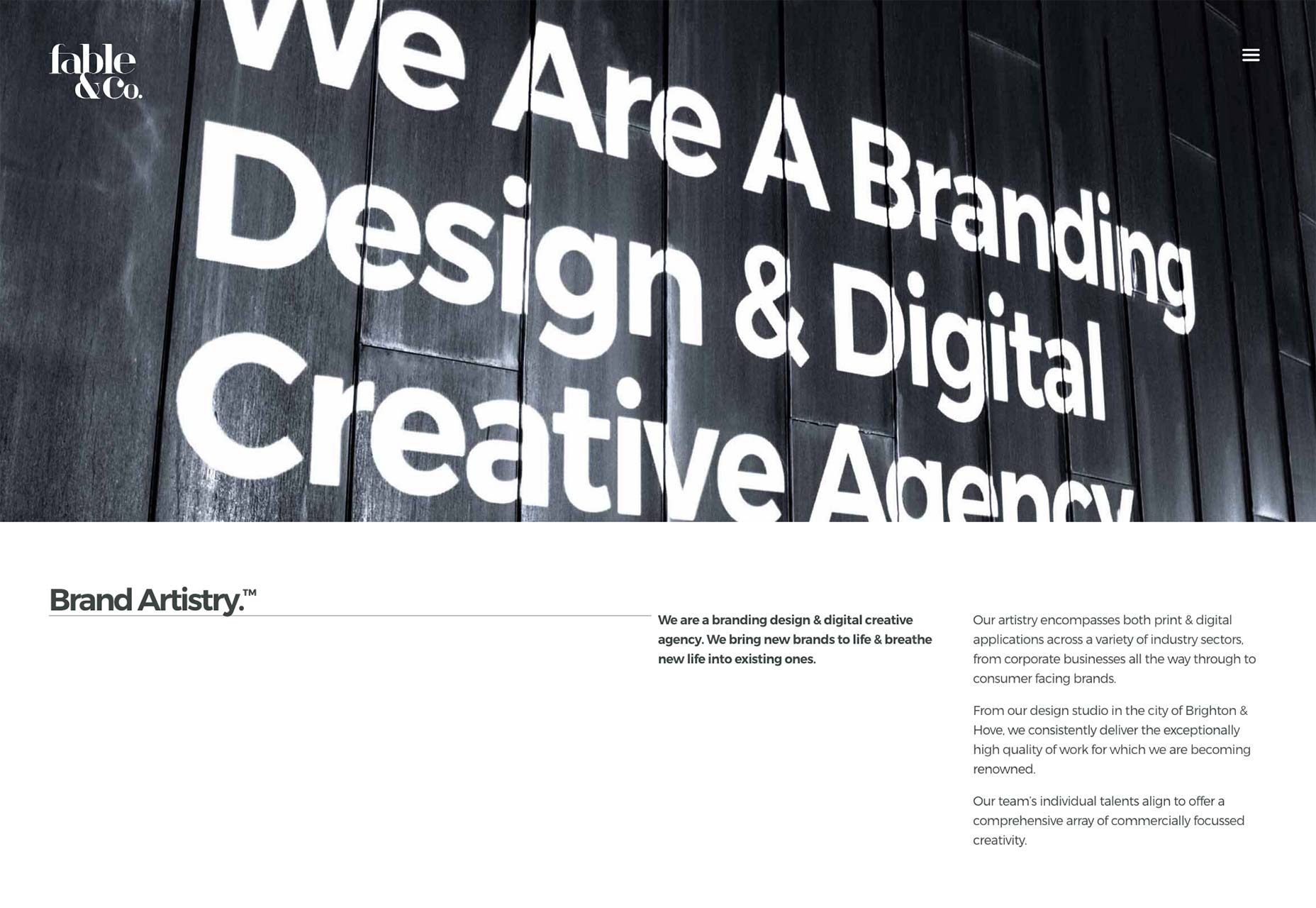
Richards Partners
Richards Partners is another great site for anyone who loves a full-screen layout. Get ready for a lot more of them in the future, because Flexbox is making that sort of thing a lot easier.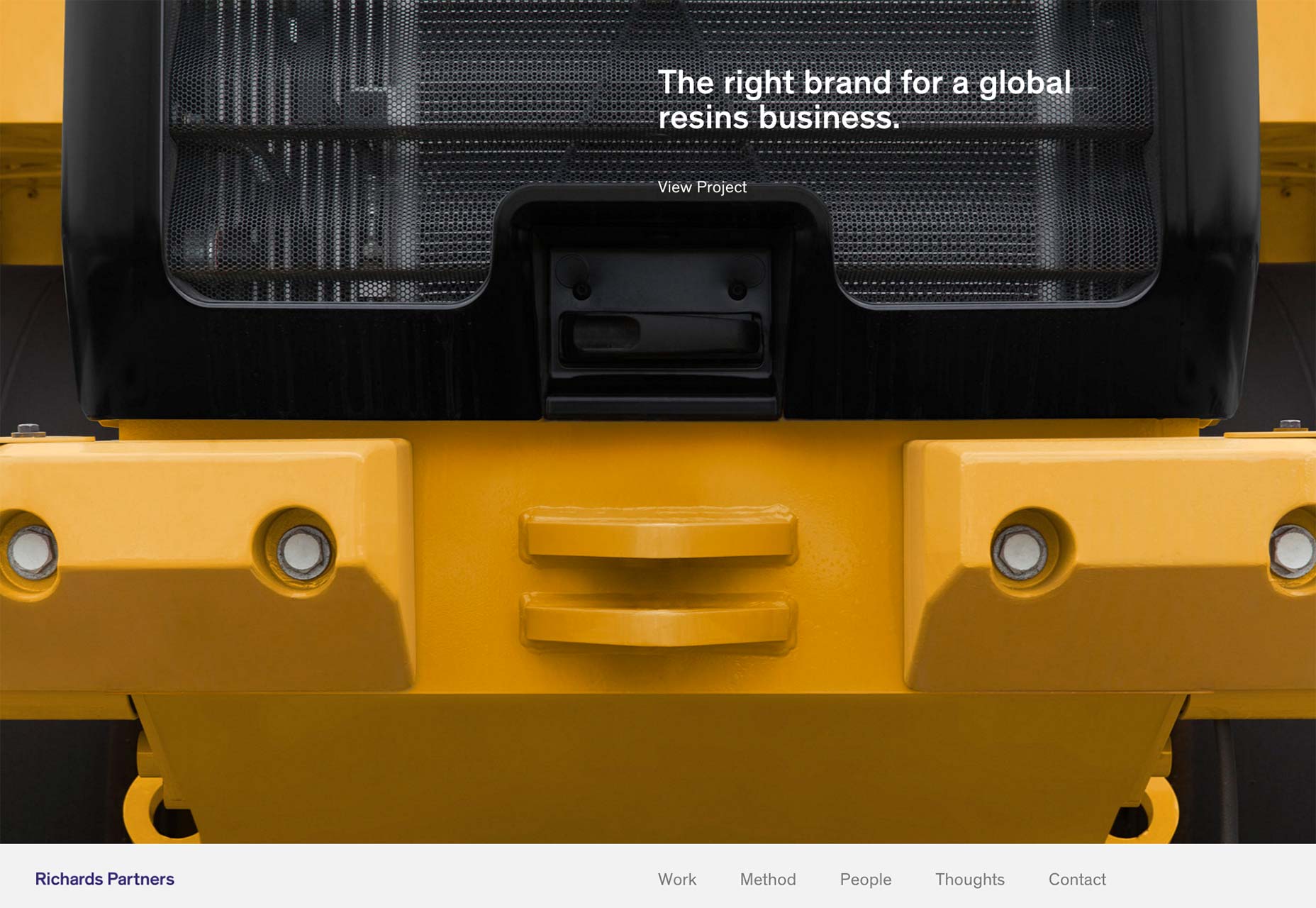
OrangeYouGlad
OrangeYouGlad is exactly as bright and colorful as the name might suggest. A lot of great illustration and digital painting is mixed into the design. Plus, the hamburger-based (the kind with buns, not three lines) layout for the portfolio section is kind of inspired.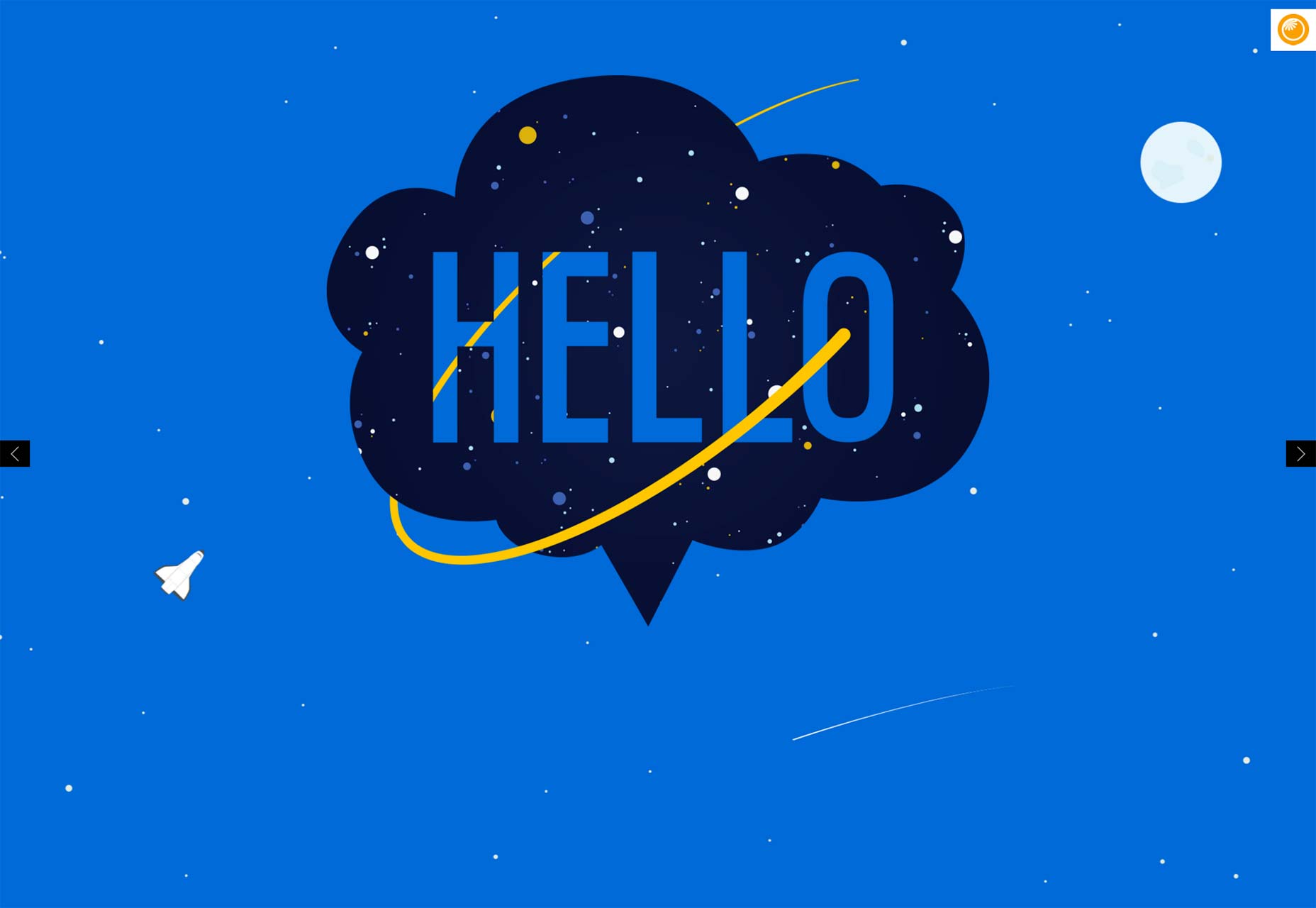
Pat Kay
Pat Kay’s portfolio is a fantastic example of how screen-height page sections can be done. It’s sad that it makes the mistake of hijacking my scroll wheel, like so many other layouts of its kind, but other wise, it’s actually pretty great.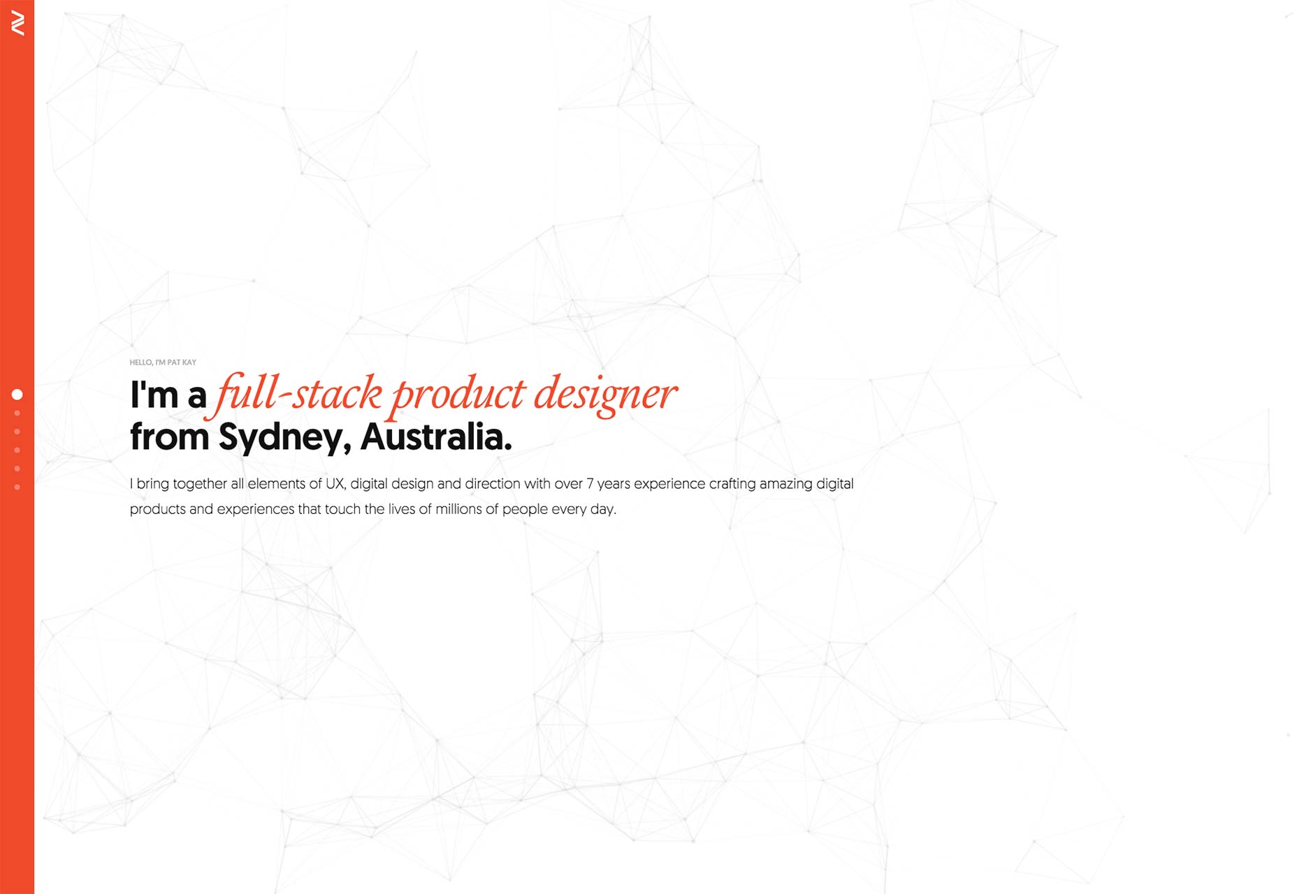
Atulesh Kumar
Atulesh Kumar has taken what would be an otherwise fairly standard layout, and made it look fantastic with careful attention to detail. It’s just plain nice to look at, and that is a quality that otherwise serviceable sites often lack.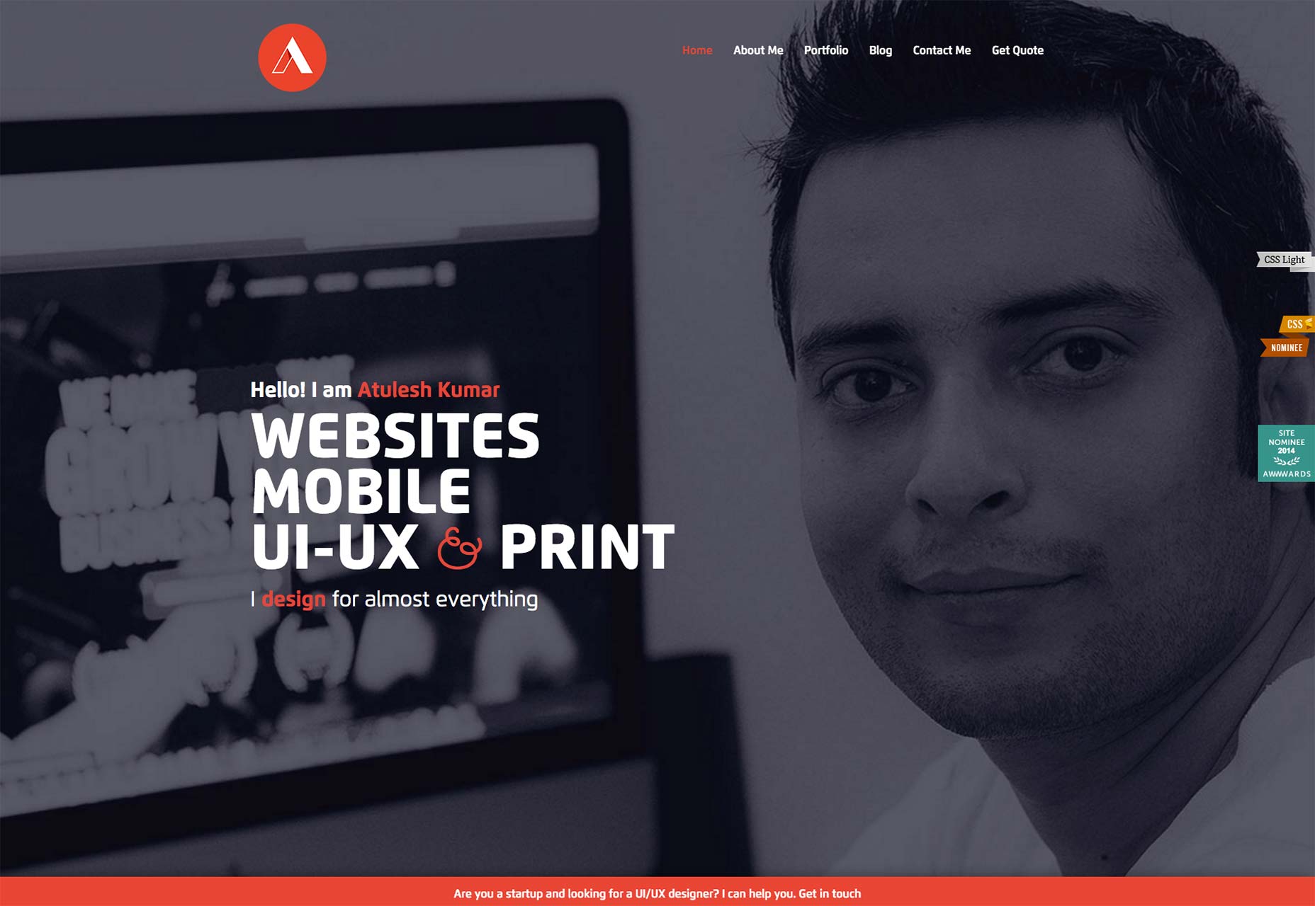
R Style
Something about the aesthetics of this site remind me of the old days, in a good way. Like, this is what we were trying to accomplish with our Photoshop-sliced table layouts, but we didn’t know how, yet. The site uses a variety of modern techniques, like background animation, and yet still retains a sort of old-school futurist feel with the typography, color choices, and that cut-out photo of the designer. It’s like an old website done right, inspiring an odd sense delight in me.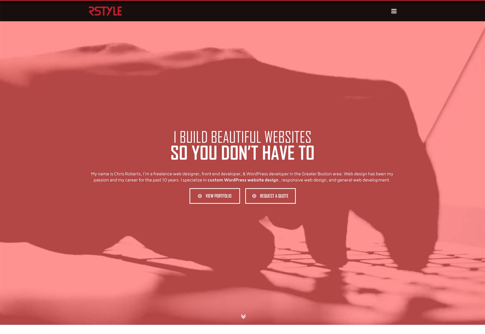
Bakken & Baeck
I suppose it’s official, Monospace fonts are back in fashion, at least to some degree. I’m not complaining. It’s a nice bit of variety. It still takes some work to pull it off without looking like you’re trying too hard, but that’s all just part of the challenge. Bakken & Baeck manages quite well, using monospace fonts for all the text in their portfolio of startups. Yeah. A portfolio... of companies they built or helped to build. My only complaint about this aesthetic is that sometimes it’s too minimal. I mean, there’s an input field on the page, but I had to read some in-page instructions to figure out where it was.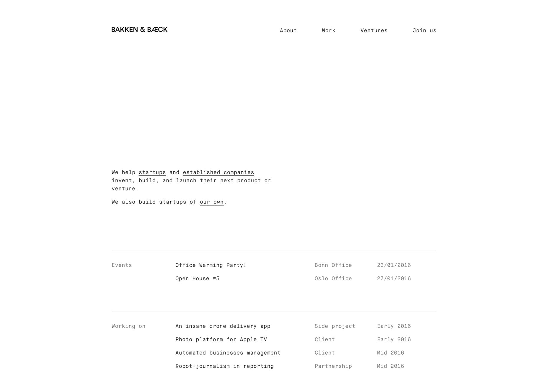
Fakepaper
Those lovely monochromatic, grid-centric designs from the early days of online minimalism haven’t gone anywhere. They’ve just gotten responsive. And prettier. Fakepaper uses this aesthetic beautifully, while keeping it usable. White backgrounds and black lines for everyone!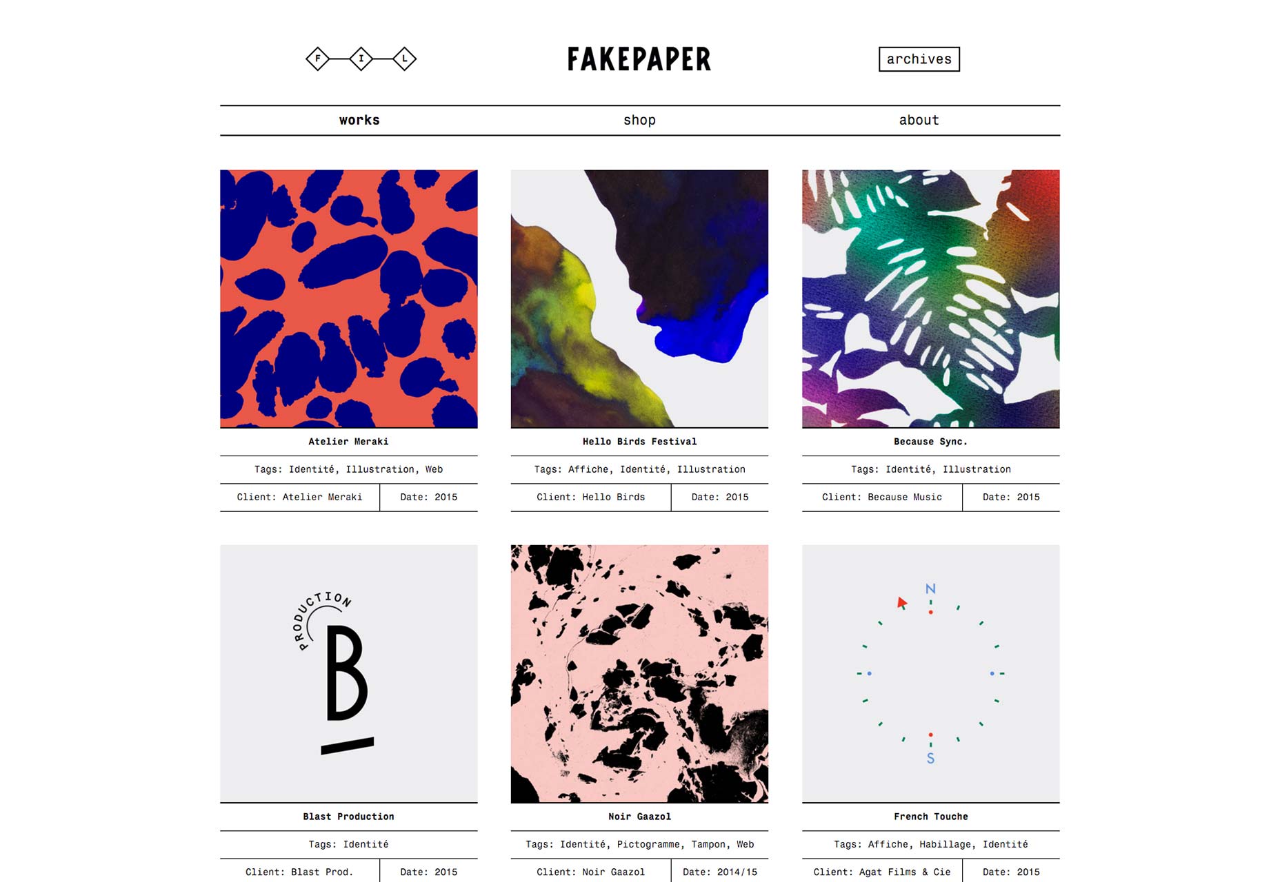
Carl Kleiner
Carl Kleiner, sadly, hides all of his navigation behind a button (like a few other sites on the list). What I like, though, is the approach he took with his portfolio. One image per section, and each image gets its own background color. Since a lot of portfolios don’t even demonstrate that much art direction, it makes this portfolio something of an anomaly.
Armand Biteau
Armand Biteau’s site is simple, modern, aesthetically pleasing. There is the small issue of the fact that, when you land on the home page, you might lose a second or two of time looking for his portfolio. Then you don’t feel so smart when you realize that you’re looking right at it. Still, once you figure out the somewhat brok... ahem unconventional navigation of this site, there’s a lot about its construction to appreciate. It’s reminiscent of a sci-fi computer interface (or game interface) while still looking elegant, and performing well.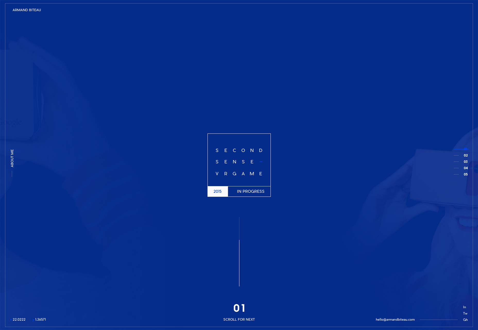
This Also
This Also can be slightly confusing at first, because they’ve put project names right in the main navigation. That’s the only adjustment to make. The rest of the site is pure, Google-inspired minimalism. I feel pretty secure in saying that they’re inspired by Google, because they’ve done a couple of projects for the tech giant.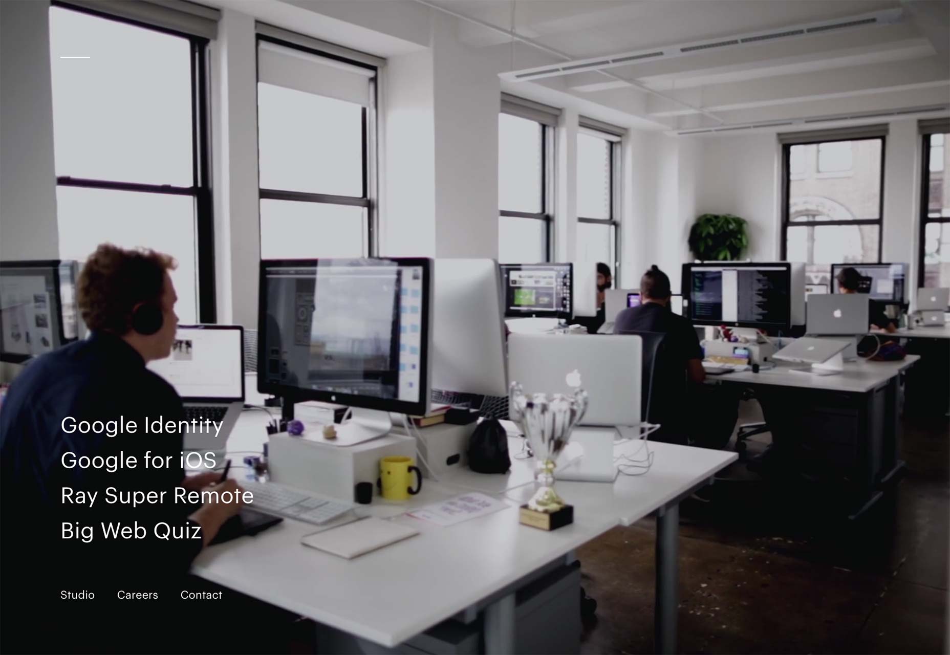
We Are Fellows
We Are Fellows Takes the idea of putting their work on their home page rather seriously. They put it all there. With a lot of relatively small thumbnails. I wouldn’t advocate this approach for everyone, but in their case, it makes a rather striking image. They’ve obviously done a lot of great work, and you can see any of it up close with a click.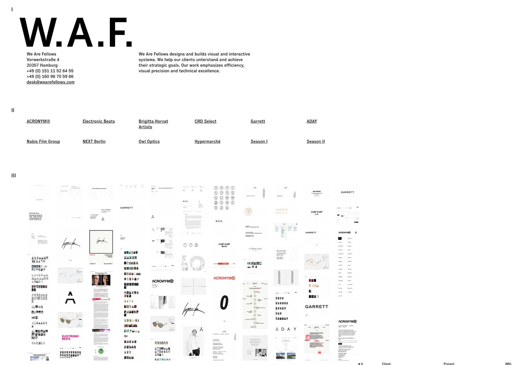
Ezequiel Bruni
Ezequiel Bruni is a web/UX designer, blogger, and aspiring photographer living in Mexico. When he’s not up to his finely-chiselled ears in wire-frames and front-end code, or ranting about the same, he indulges in beer, pizza, fantasy novels, and stand-up comedy.
Read Next
3 Essential Design Trends, November 2024
Touchable texture, distinct grids, and two-column designs are some of the most trending website design elements of…
20 Best New Websites, October 2024
Something we’re seeing more and more of is the ‘customizable’ site. Most often, this means a button to swap between…
Exciting New Tools for Designers, October 2024
We’ve got goodies for designers, developers, SEO-ers, content managers, and those of you who wear multiple hats. And,…
15 Best New Fonts, September 2024
Welcome to our roundup of the best new fonts we’ve found on the web in the previous four weeks. In this month’s edition…
By Simon Sterne
3 Essential Design Trends, October 2024
This article is brought to you by Constantino, a renowned company offering premium and affordable website design
You…
A Beginner’s Guide to Using BlueSky for Business Success
In today’s fast-paced digital world, businesses are always on the lookout for new ways to connect with their audience.…
By Louise North
The Importance of Title Tags: Tips and Tricks to Optimize for SEO
When it comes to on-page SEO, there’s one element that plays a pivotal role in both search engine rankings and user…
By Simon Sterne
20 Best New Websites, September 2024
We have a mixed bag for you with both minimalist and maximalist designs, and single pagers alongside much bigger, but…
Exciting New Tools for Designers, September 2024
This time around we are aiming to simplify life, with some light and fast analytics, an all-in-one productivity…
3 Essential Design Trends, September 2024
September's web design trends have a fun, fall feeling ... and we love it. See what's trending in website design this…
Crafting Personalized Experiences with AI
Picture this: You open Netflix, and it’s like the platform just knows what you’re in the mood for. Or maybe you’re…
By Simon Sterne
15 Best New Fonts, August 2024
Welcome to August’s roundup of the best fonts we’ve found over the last few weeks. 2024’s trend for flowing curves and…
By Ben Moss


