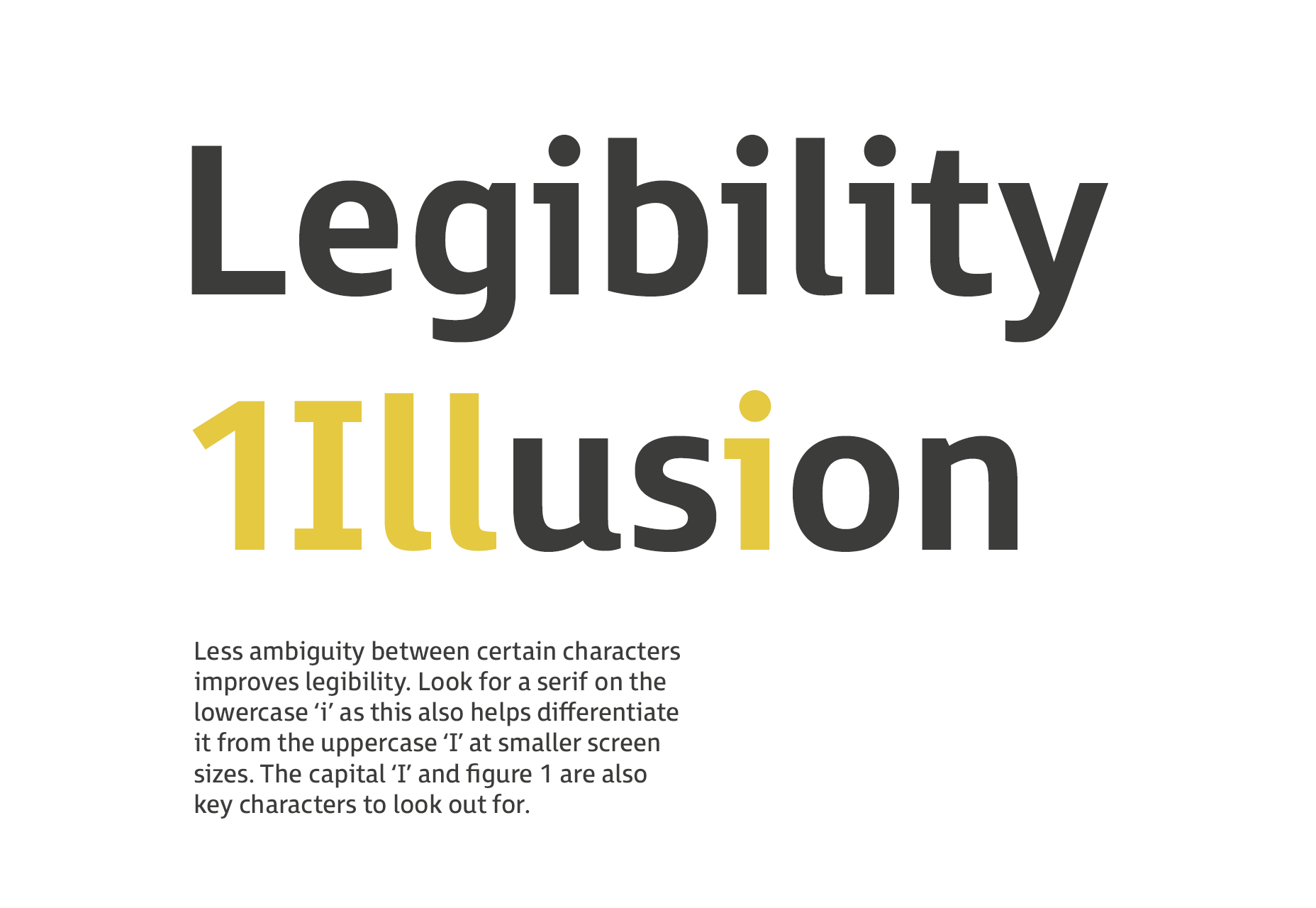
 3: If you’re using small amounts of text at 16pt and above (eg. for headings or captions), then a sans serif with large open counters is considered the most suitable.
4: Look for a typeface with a large x-height (this is important for webfont selection). Extended ascenders and descenders will help to make the letter shapes clearer. Ascenders should be slightly higher than the cap height.
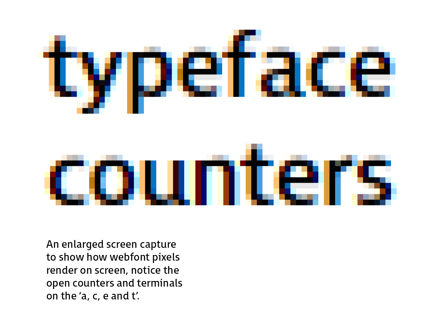
5: Look for open counters and terminals as they aid clarity, if they’re too closed they start to fill in at smaller sizes.
 6: Numbers need to be distinctive, in particular the “0” from the uppercase “O”. The “6” and “9” should also have open terminals.
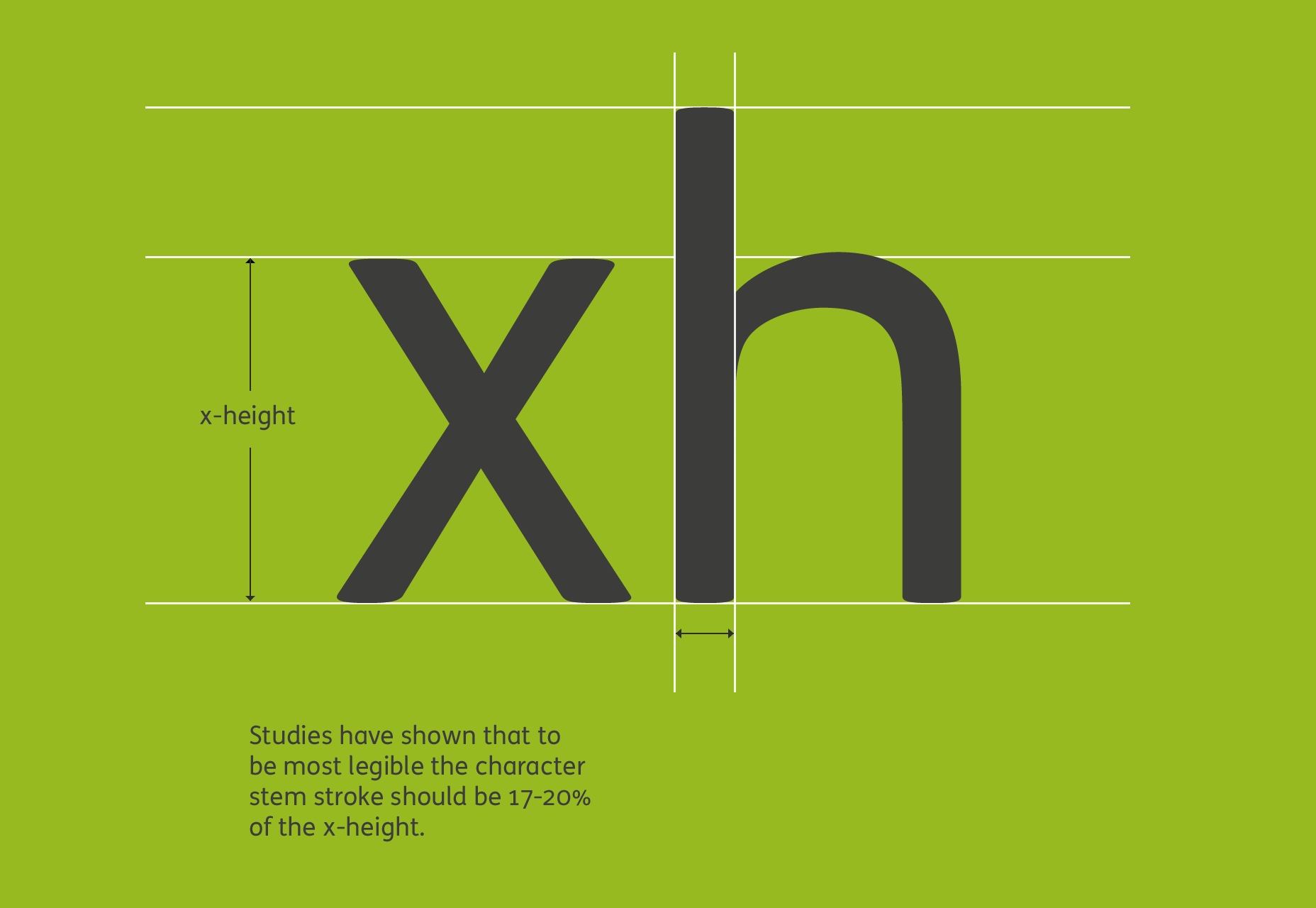
7: There is an optimal ratio between the x-height and the stroke width. To achieve maximum legibility the character stem stroke should be 17-20% of the x-height.
 8: A wider through bar on the lowercase “t” aids definition.
9: A capital “Q” tail that follows through the main bowl enhances legibility.
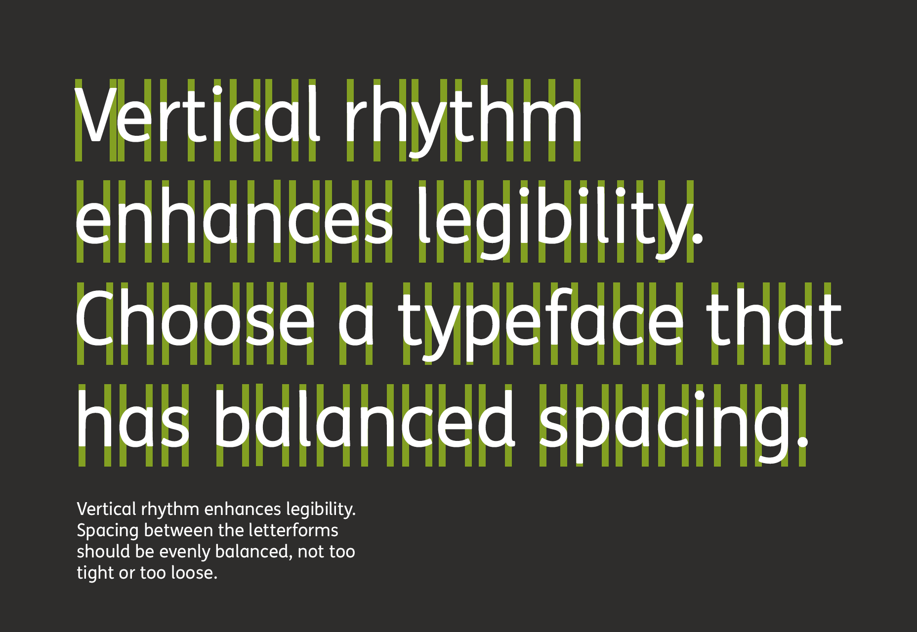
10: Spacing between the letterforms should be evenly balanced and rhythmic to aid character recognition.
 11: Test the typeface on a dark background to check how it performs. Spacing tends to look tighter, letter shapes appear to “glow” making the font seem heavier than it is, so you may need a lighter weight.
12: Choose a typeface that has a wide range of weights; as rendering on different devices will give varying results and a selection of weights can help to achieve the correct feel.
It’s important to remember that inclusive design shouldn’t mean a compromise in elegance or style. A well designed accessible typeface should be elegant and have personality, but at the same time have legibility at its core, in order to include as many end users as possible.
Stuart de Rozario
Stuart de Rozario is an award winning typeface designer and accessibility expert at Boutique type foundry Fontsmith. Their library of typefaces includes FS Me which was designed with Mencap and FS Millbank for wayfinding, both exceed accessibility standards.
Read Next
3 Essential Design Trends, November 2024
Touchable texture, distinct grids, and two-column designs are some of the most trending website design elements of…
20 Best New Websites, October 2024
Something we’re seeing more and more of is the ‘customizable’ site. Most often, this means a button to swap between…
Exciting New Tools for Designers, October 2024
We’ve got goodies for designers, developers, SEO-ers, content managers, and those of you who wear multiple hats. And,…
15 Best New Fonts, September 2024
Welcome to our roundup of the best new fonts we’ve found on the web in the previous four weeks. In this month’s edition…
By Simon Sterne
3 Essential Design Trends, October 2024
This article is brought to you by Constantino, a renowned company offering premium and affordable website design
You…
A Beginner’s Guide to Using BlueSky for Business Success
In today’s fast-paced digital world, businesses are always on the lookout for new ways to connect with their audience.…
By Louise North
The Importance of Title Tags: Tips and Tricks to Optimize for SEO
When it comes to on-page SEO, there’s one element that plays a pivotal role in both search engine rankings and user…
By Simon Sterne
20 Best New Websites, September 2024
We have a mixed bag for you with both minimalist and maximalist designs, and single pagers alongside much bigger, but…
Exciting New Tools for Designers, September 2024
This time around we are aiming to simplify life, with some light and fast analytics, an all-in-one productivity…
3 Essential Design Trends, September 2024
September's web design trends have a fun, fall feeling ... and we love it. See what's trending in website design this…
Crafting Personalized Experiences with AI
Picture this: You open Netflix, and it’s like the platform just knows what you’re in the mood for. Or maybe you’re…
By Simon Sterne
15 Best New Fonts, August 2024
Welcome to August’s roundup of the best fonts we’ve found over the last few weeks. 2024’s trend for flowing curves and…
By Ben Moss


