
Bukwild
We start with one of our more animated entries. Bukwild’s portfolio focuses a lot on their interaction design, so naturally, their site is almost constantly in motion. They don’t just show off the interfaces themselves, they show how users interact with them Combined with their excellent sense of aesthetics, and talent for using white space as a weapons-grade design element, this is one site I would browse just for fun.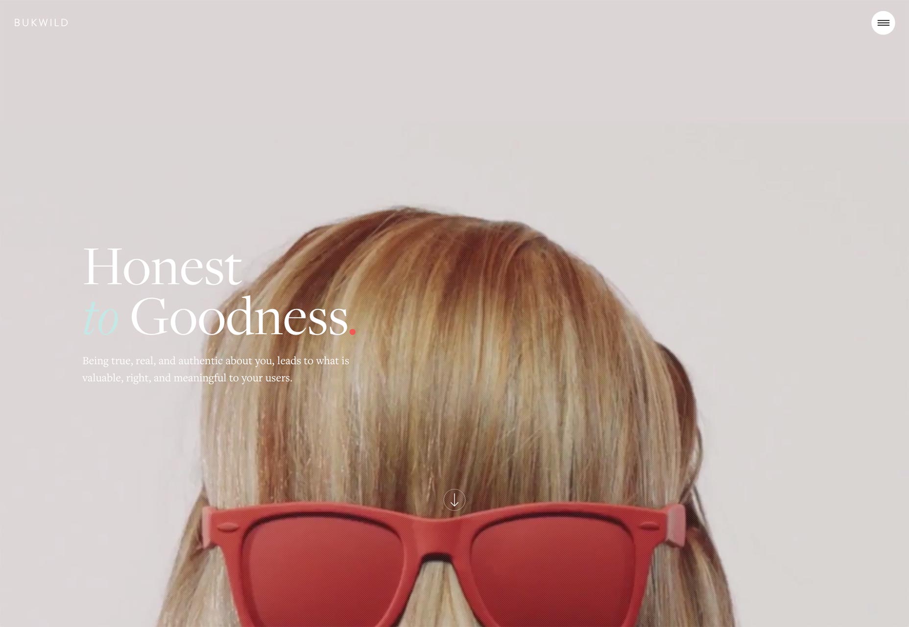
Daniel Benzie
Admittedly, Daniel Benzie’s one-page portfolio just barely makes it into the “portfolio category”, by virtue of a couple of non-linked thumbnails. Still, I’m a sucker for good typography, UX that doesn’t make you think, and minimalism. This site happens to tick all of those boxes.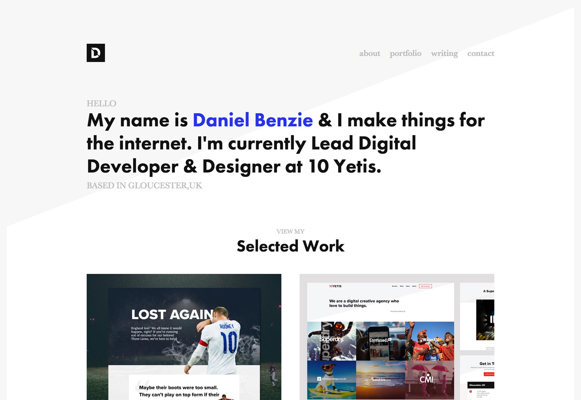
Grace Scuitto
Grace Scuitto’s portfolio is so simple, it would be easy to overlook. It looks nice, and that’s about it, at first glance, until you start scrolling. Now, I’ve seen backgrounds change color before, but look at the way it changes the experience on her site. That one detail, that one effect changes the whole experience somehow.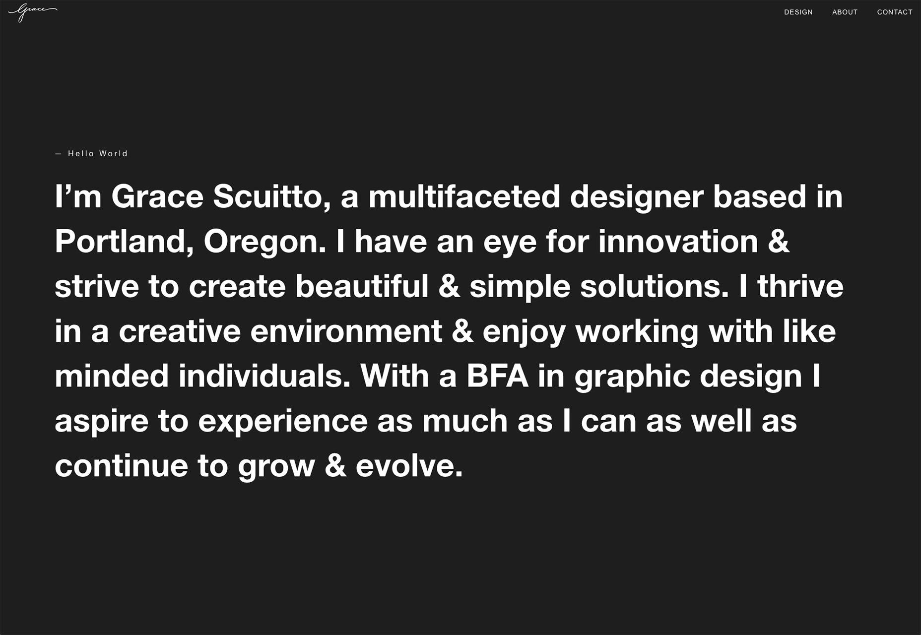
Twenty Nine NYC
Twenty Nine NYC is a media studio that does a variety of things. In order to show off that variety, they’ve taken a somewhat ingenious, if initially confusing approach. Instead of using any conventional layouts they have used desktop windows. Some of these windows just hold images and others show off web sites that they’ve built and you can browse those websites right within those tiny little windows. Now this might not be the most usable approach all things considered. However, it is certainly creative, and it puts their work in a live, usable context.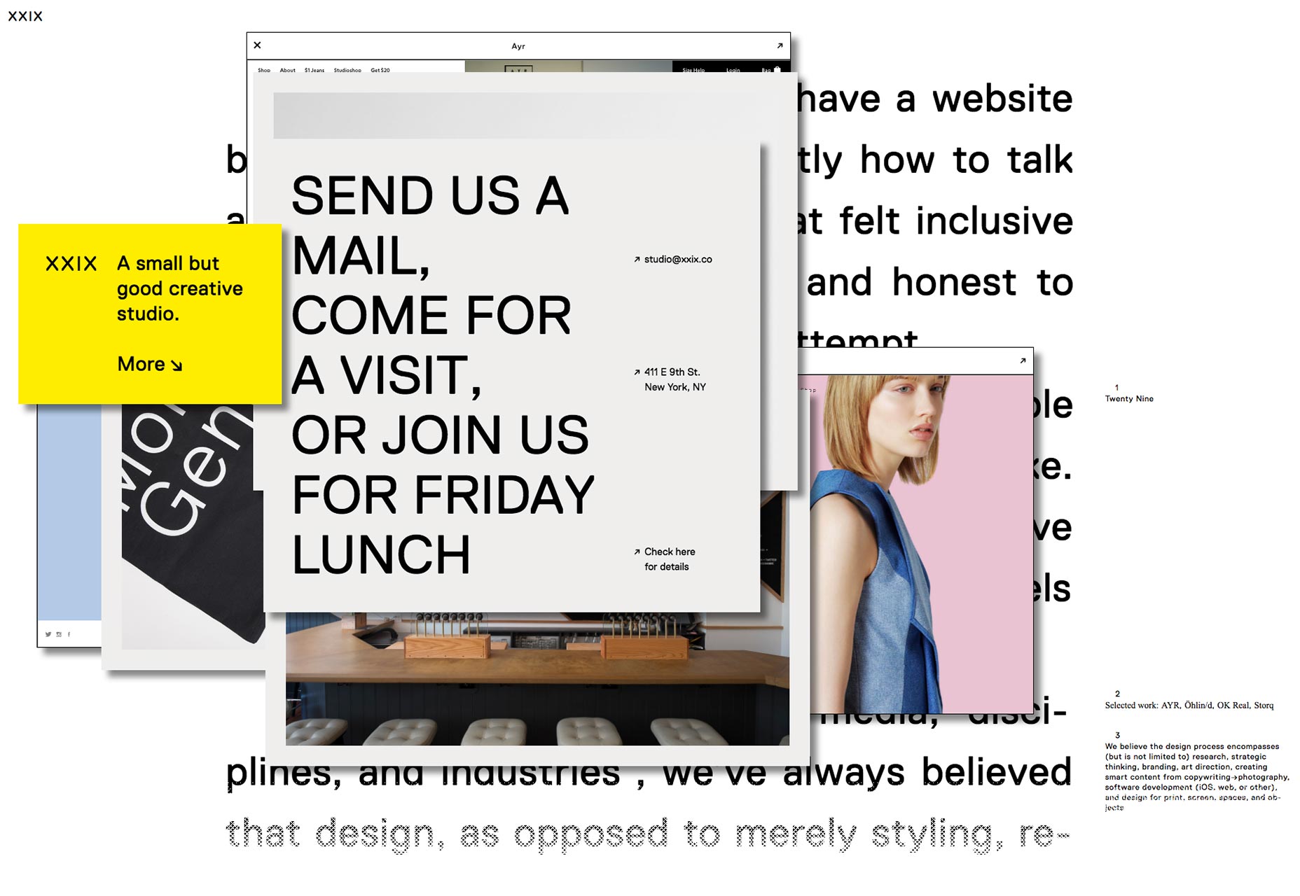
Benjamin Jackson
Benjamin Jackson’s portfolio is one of those sites that, while presenting very different kinds of work, presents it all with the same theme. Besides, I love the use of the Quarto font family here.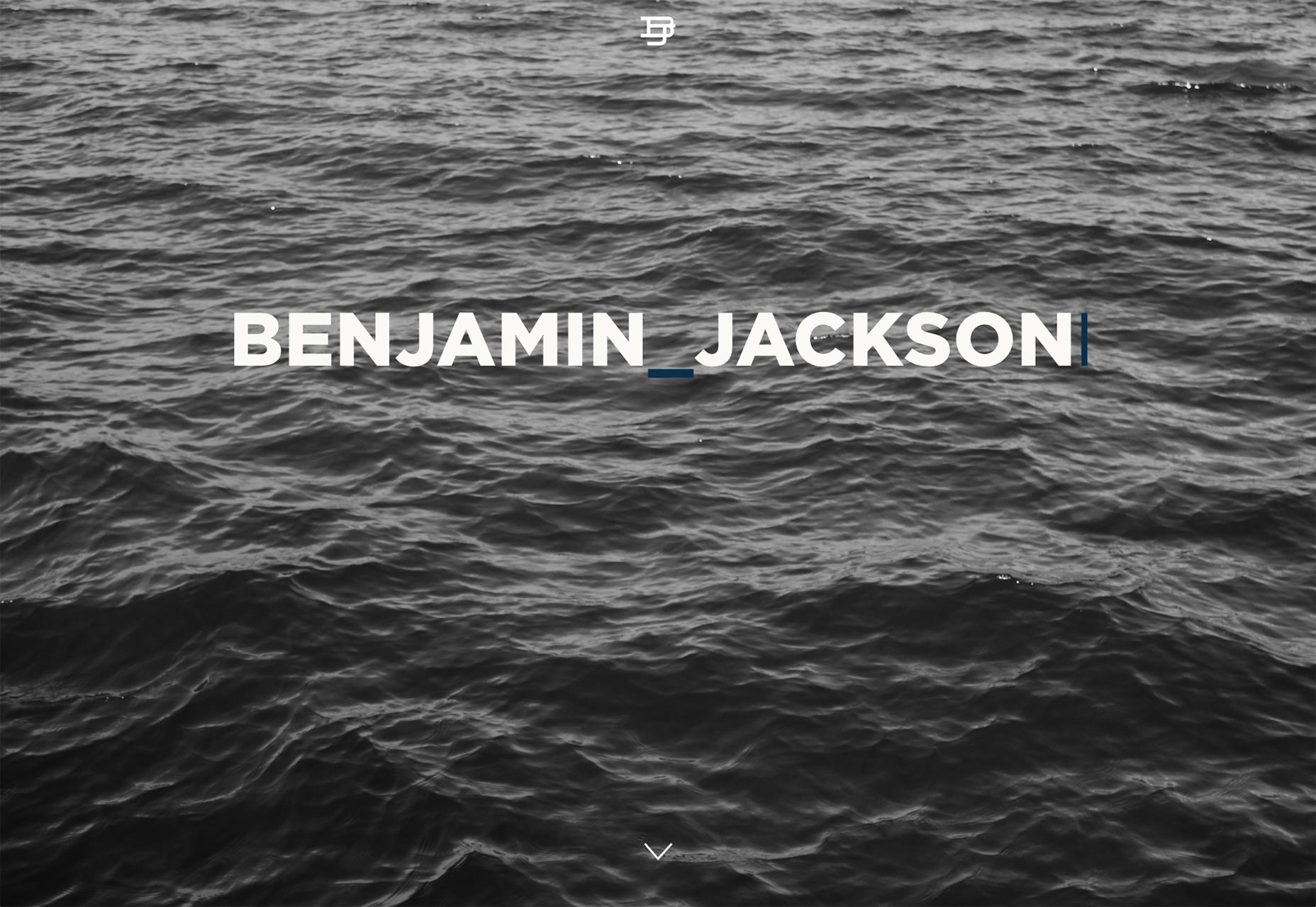
Etienne Ledemay
Etienne Ledemay’s is an excellent example of using the conventions of flat design in an original way. While none of the site’s elements are new, and the layout is nothing complex, the site nonetheless feels new and different to most of what’s out there. Plus, you know, my thing for yellow.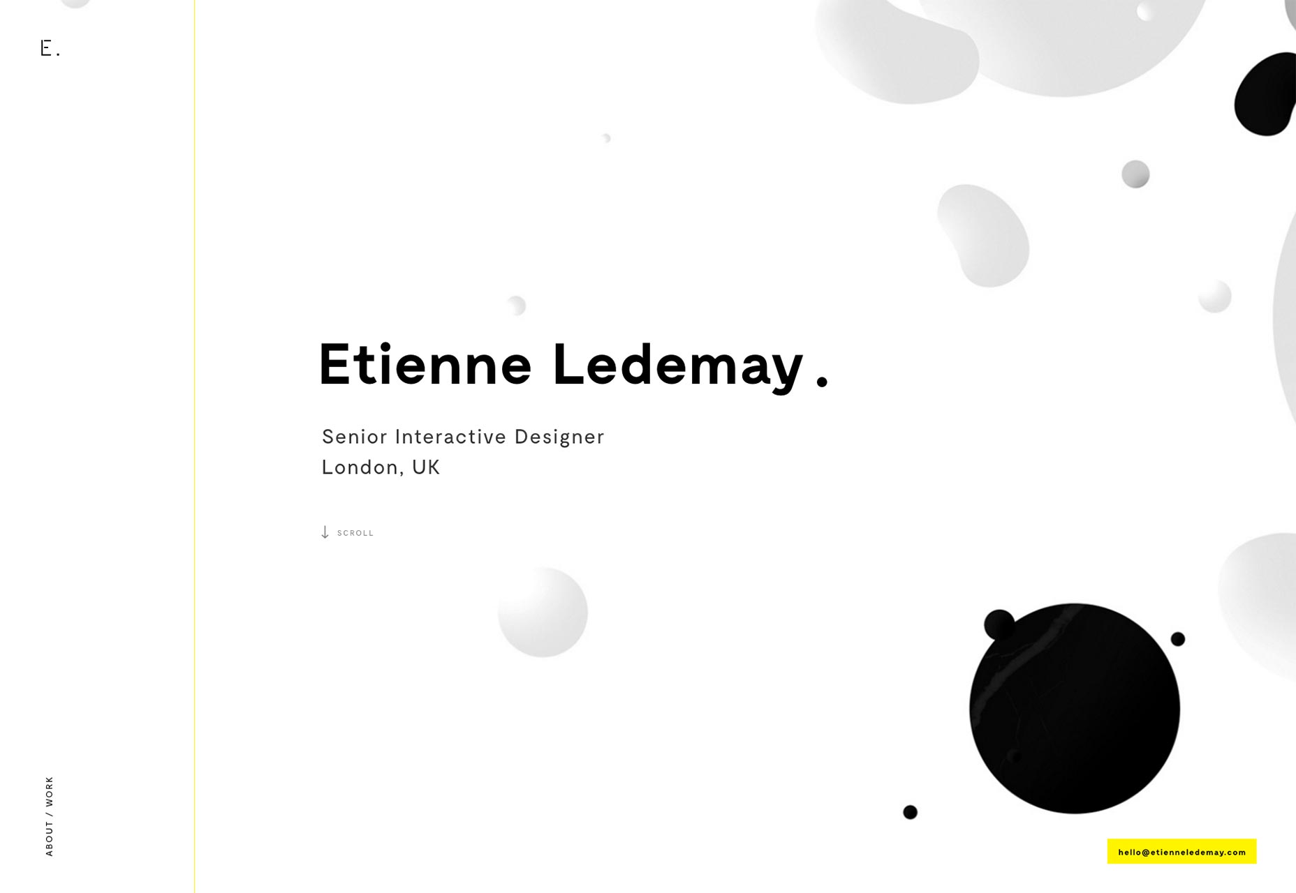
Deckchair
I’ve never seen a complete, if short, story told with just lines before. Deckchair did it, though. Just go to the home page and scroll down. Watch the mess get turned into… something else. I feel like that says more than the text, and the rest of the Material Design-inspired site ever could.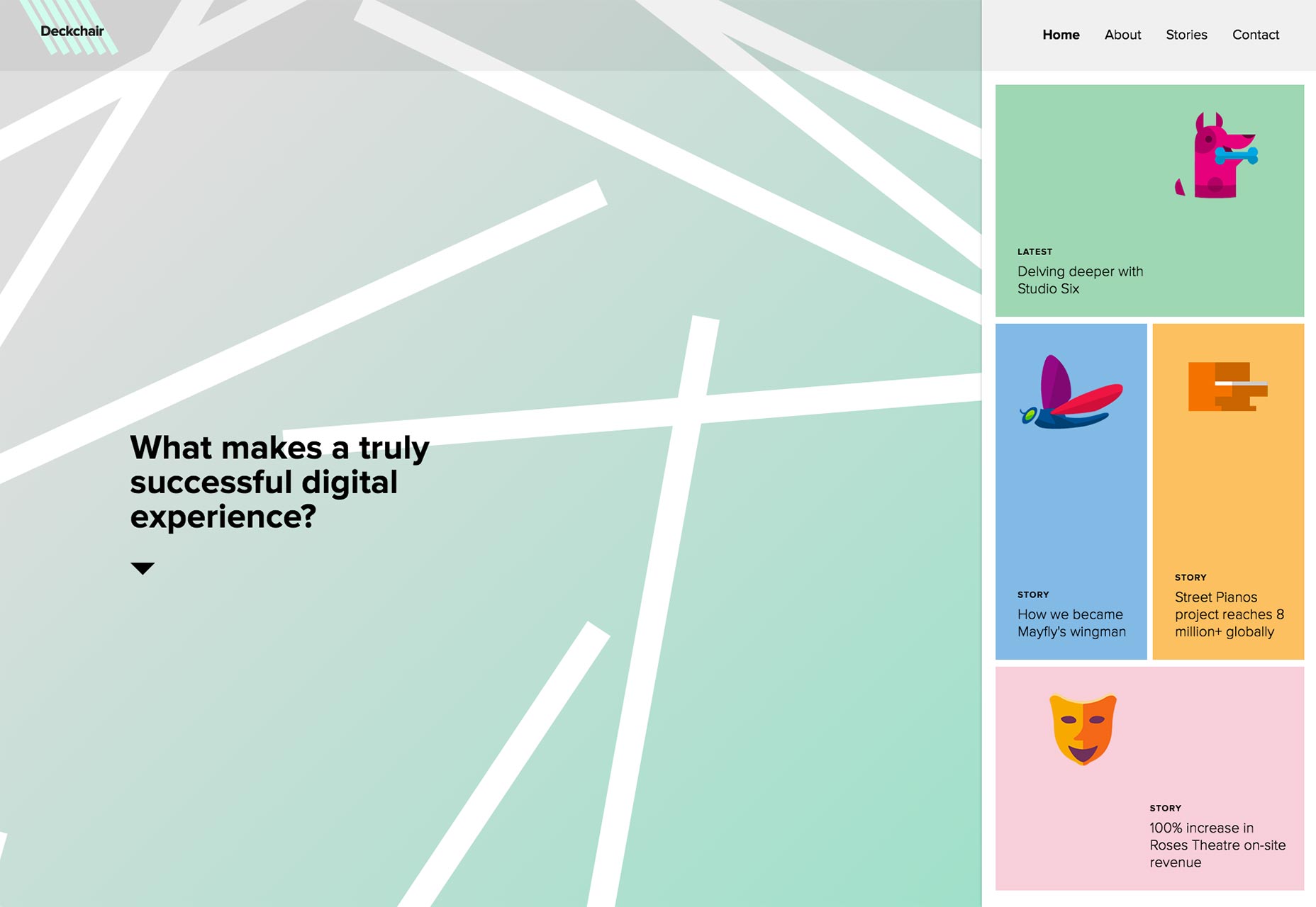
David Arias
David Arias’ portfolio site mixes things up by sort of “cutting things in half”. It’s an aesthetic I’ve never quite pulled off myself. Here, it works because there’s not a lot of content, but there is a lot of space to fill. Besides, if you want to see any full image, all you have to do is hover over it, or tap your way through the link on mobile.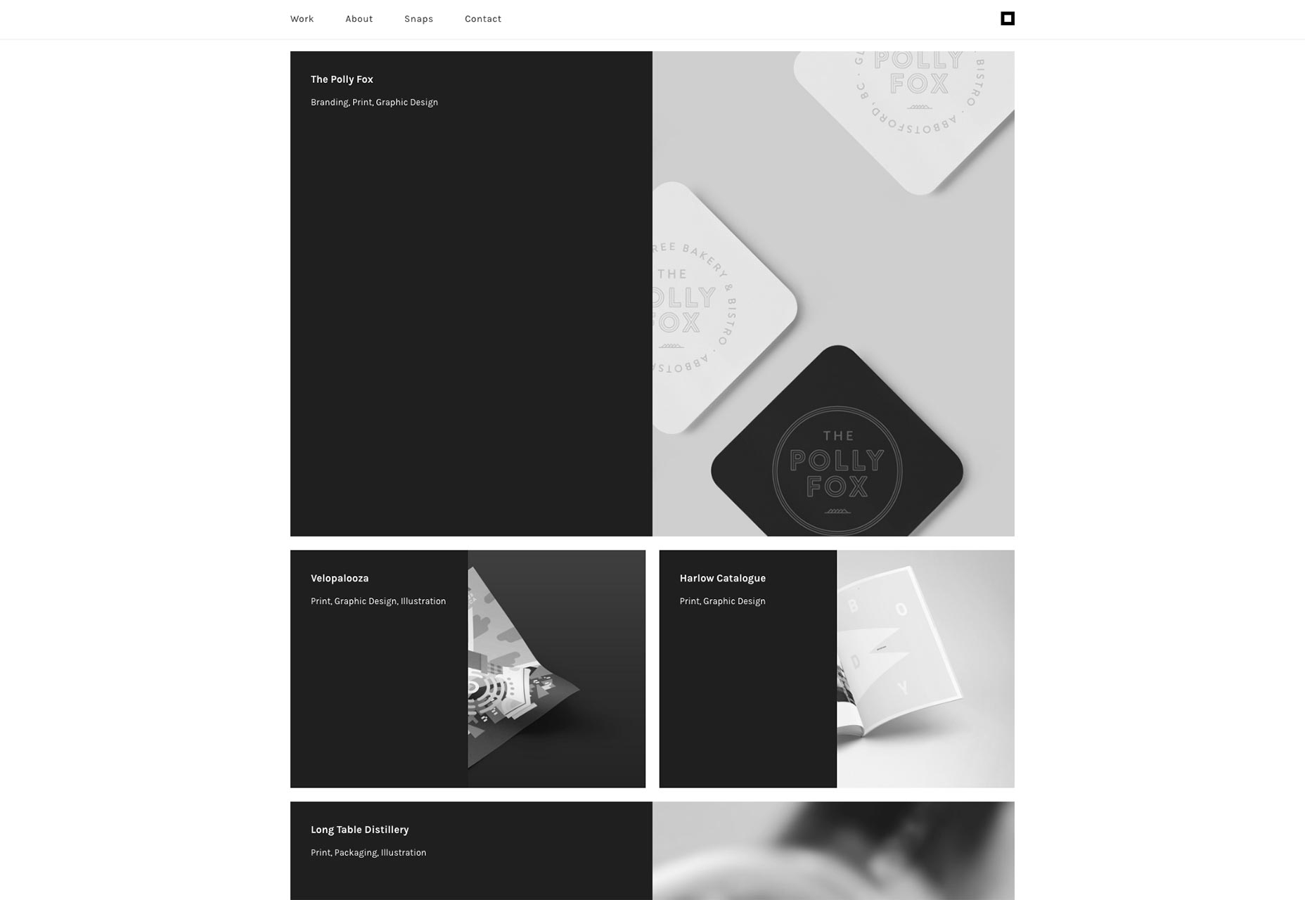
Les Singuliers
Les Singuliers is, according to what little French I can decipher, an art direction, and possibly branding design studio. While I can’t make heads nor tails of exactly what it is that they do, I can see the influence of their work in their website.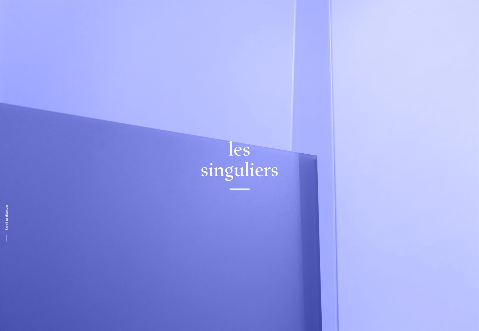
Theis Bothmann
Theis Bothmann’s portfolio is minimalist, simple, and supremely stylish. Ok, when I say stylish, what I mean to say is that I love those diagonal lines. I’m a sucker for people who find simple, subtle ways to break away from the default shape we’re given to work with when building websites. Great use of color, too.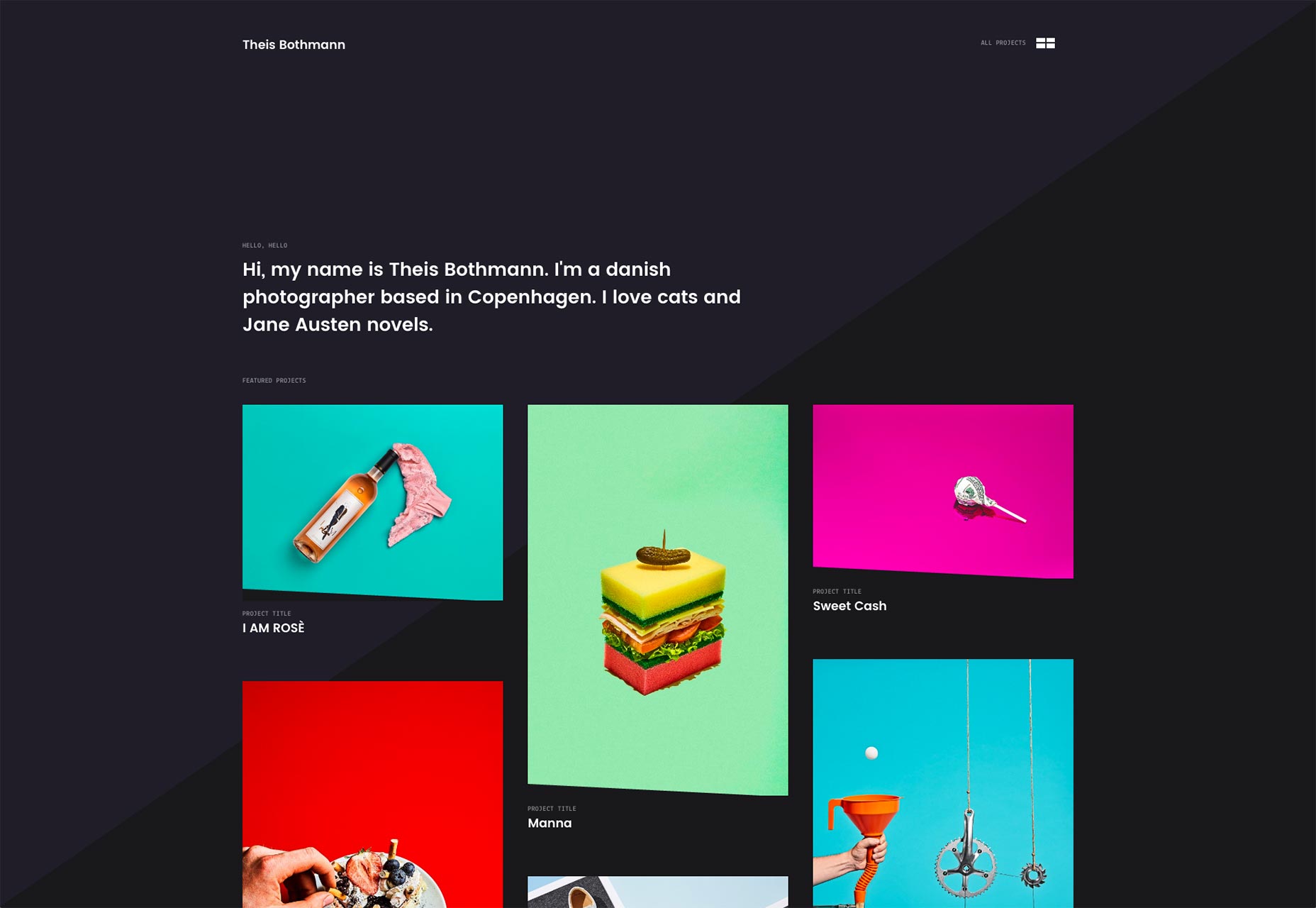
Studio Chevojon
The portfolio site for Studio Chevonjon puts the work front and center. Scrolling down will show you photo after photo of, hotels, restaurants and other such establishments. Naturally, all of the focus is on the imagery. The eye is drawn toward the photos with an asymmetrical layout. Unfortunately, the site does tend to hijack your scroll wheel.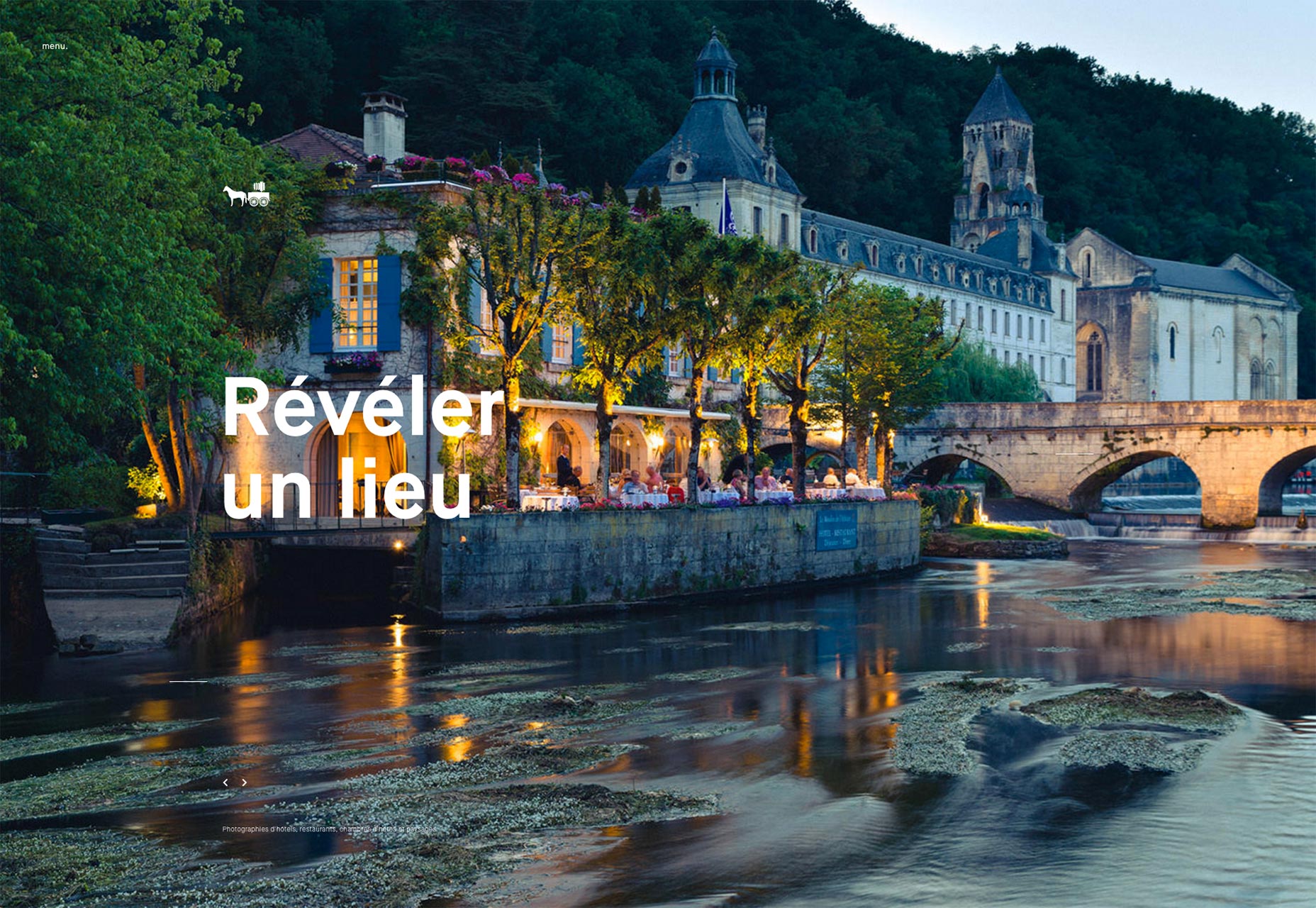
Jürgen Hassler
Jürgen Hassler’s portfolio brings us back to that very minimalist, thin-font-loving aesthetic. The asymmetrical layouts and their love for solid blue is nothing new. However, the site is an excellent example of its class. The animations are smooth, the UI elements look elegant, the execution is just that good.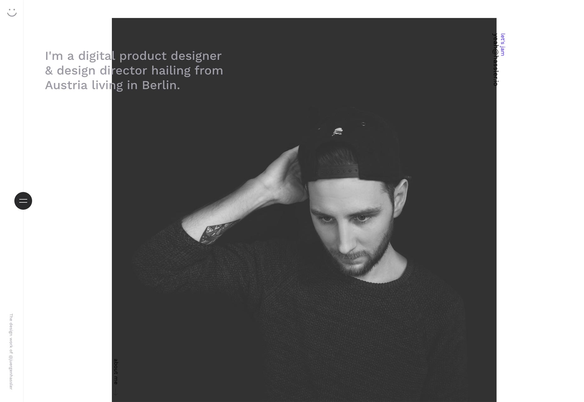
Waaark
Waaark is one of those websites that feels more like a presentation than a web site. The layout is presentation style the animations are dynamic, and fluid, and beautiful and the whole thing is just very pretty. Based on visuals alone, it definitely belongs on this list. However, I still do not understand why anyone would use a preloader screen with JavaScript that blocks the user from seeing the rest of the web site if JavaScript is turned off. That’s just bad UX.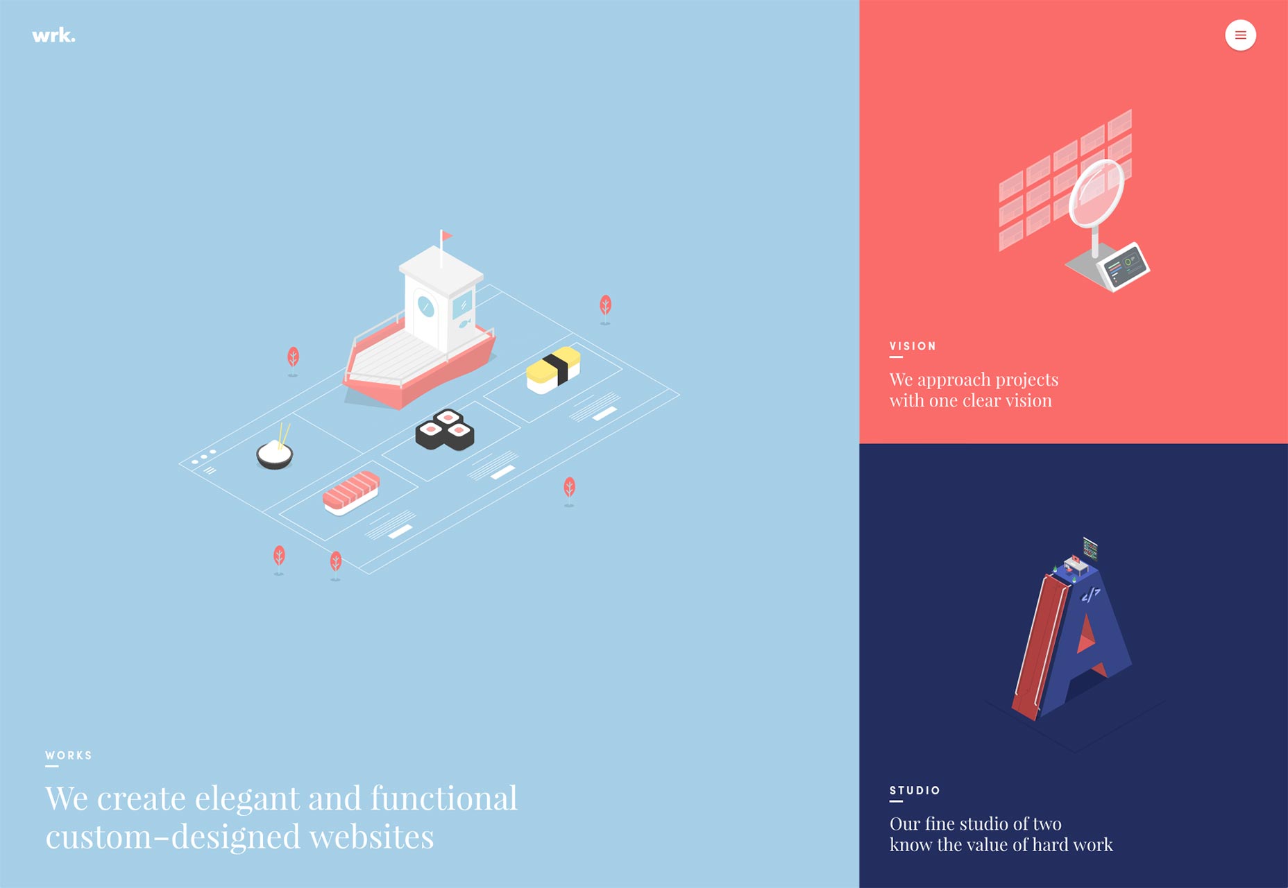
Little
The portfolio site for Little, an ad agency, takes a somewhat different approach. While most portfolio sites start with either their work, or a quick bit of text about themselves, Little starts with social proof. The first thing you’ll see is an award they won. Only after you get past that will you see case studies, and only the case studies for their biggest customers (Microsoft, Lowe’s, Sealy, etc.) It is, as stated, a somewhat unorthodox approach, but if it works for landing pages, maybe it works here.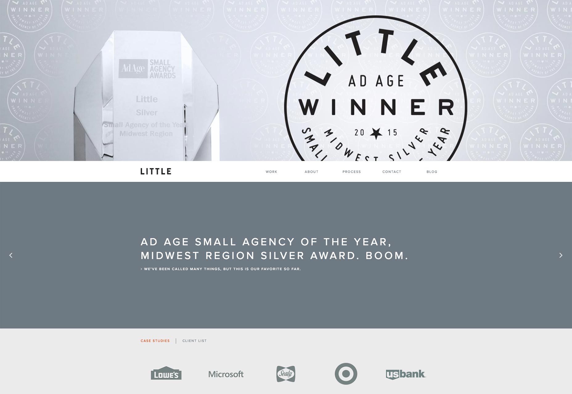
Shorthand
Shorthand Doesn’t do anything spectacular with their layouts. This is just one of those sites where the quality is good enough to be featured in this article, based on execution alone. Decent UX, good typography, and the general sense of professionalism make of this site worth looking at.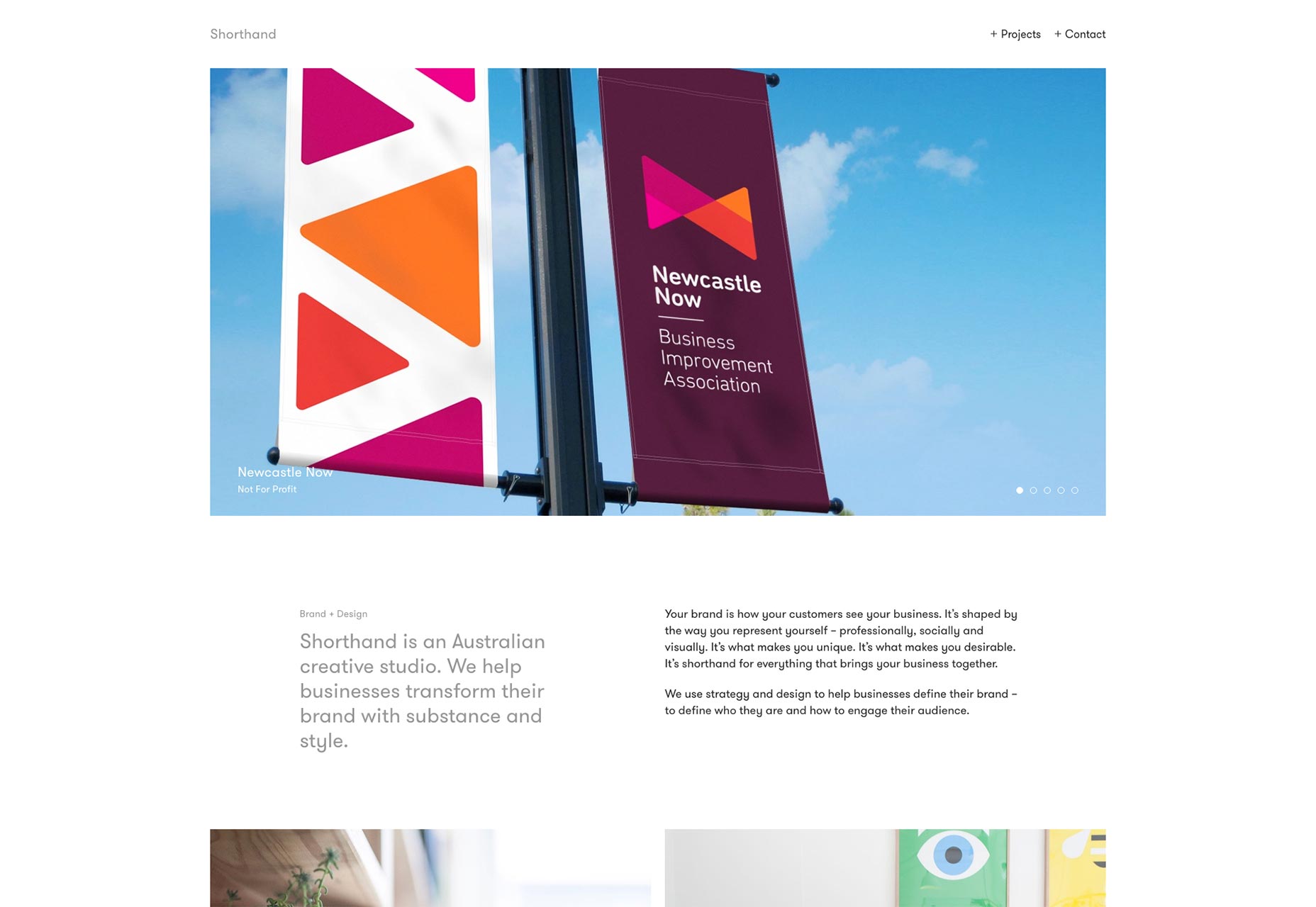
Twistudio
Twistudio features a delightfully monochrome design. Thin fonts, thick borders, it feels like a contract or other legal document, except you can read it. And it has pretty pictures. So like a legal document crossed with a children’s book.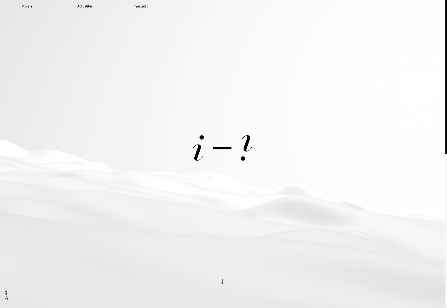
MSDS
MSDS is a studio that does furniture, lighting, and interior design. The website brings us back to that asymmetrical layout, the monospace type, and... pastels? Well, as disappointed as Morticia Addams would be, I think it works.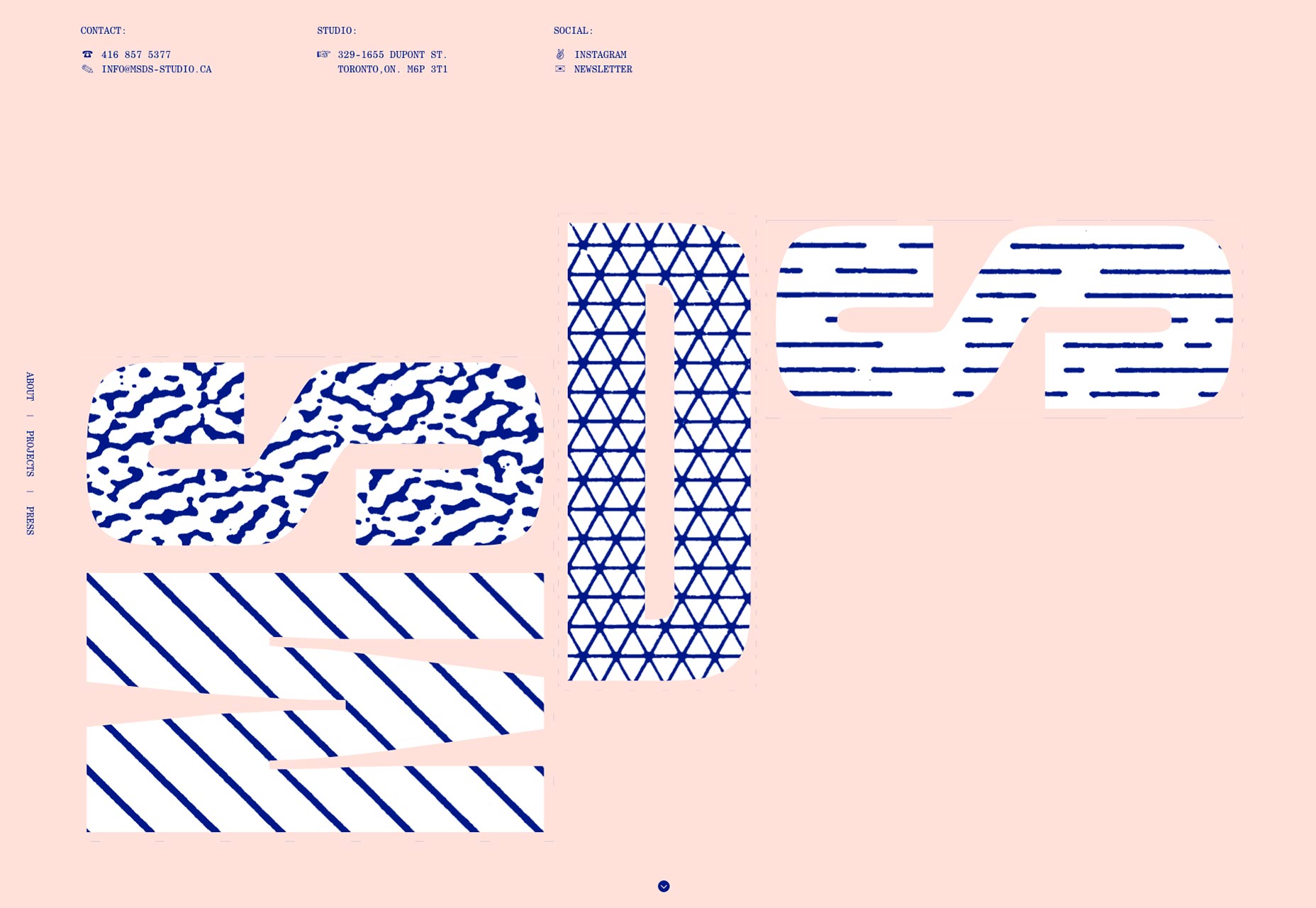
Alessandro Risso
Well, MSDS and I aren’t the only ones who love some good asymmetry and pastels. Alessandro Risso uses a very similar approach on his own portfolio site, and it’s pretty.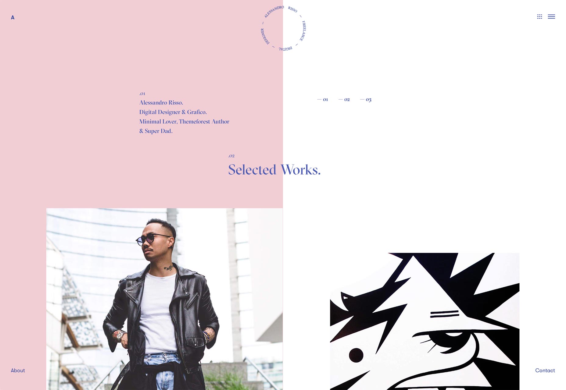
Commando Group
Yep, I’m still in love with those big layouts that stretch right across my HD screen. Commando Group does it right by over-complicating exactly nothing. Little text, big images, as few columns as possible, and a dark background for a bit of variety. I dig it.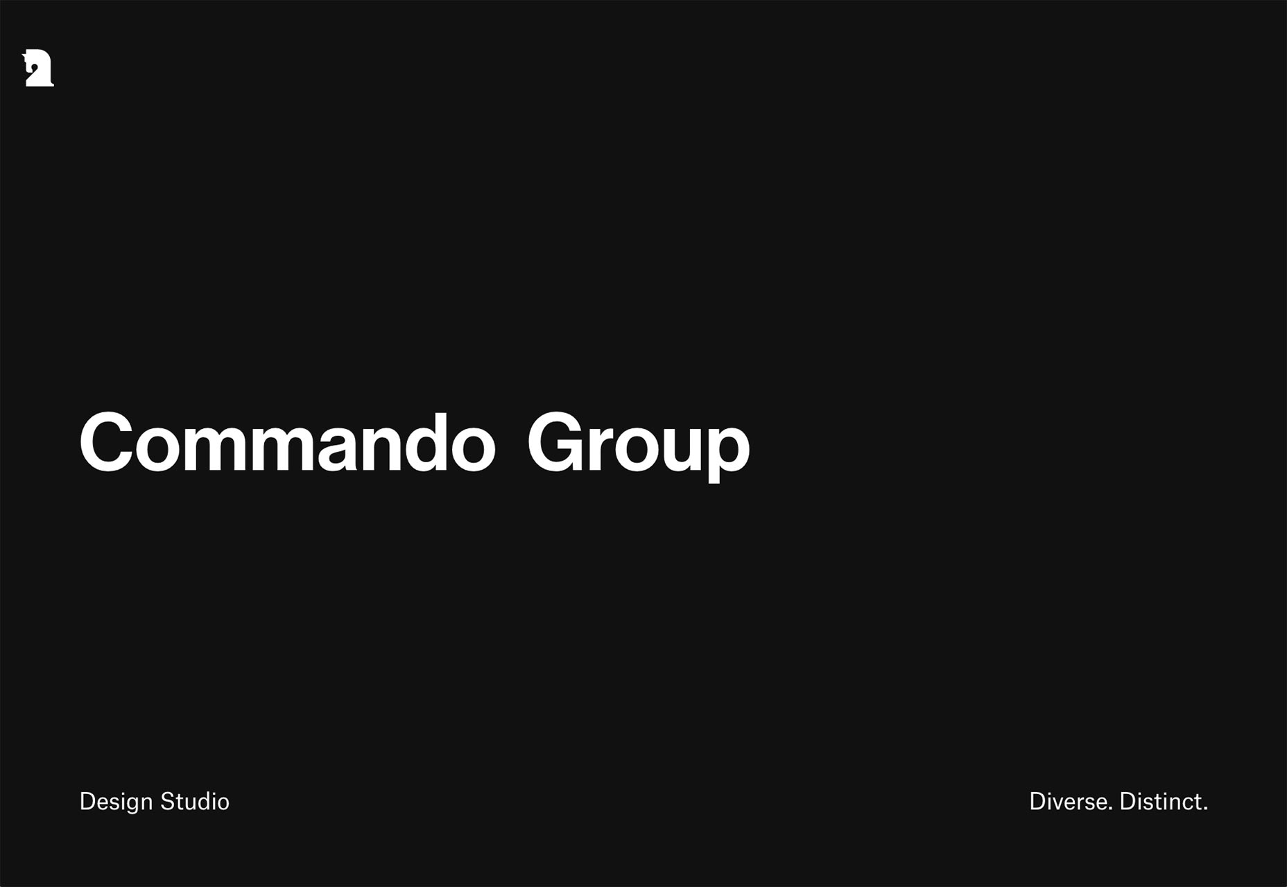
IYA Studio
IYA Studio. It’s simple, it looks good, it runs smooth. The navigation is, as with most of these presentation-style sites, not the most intuitive. But darn, the rest looks pretty.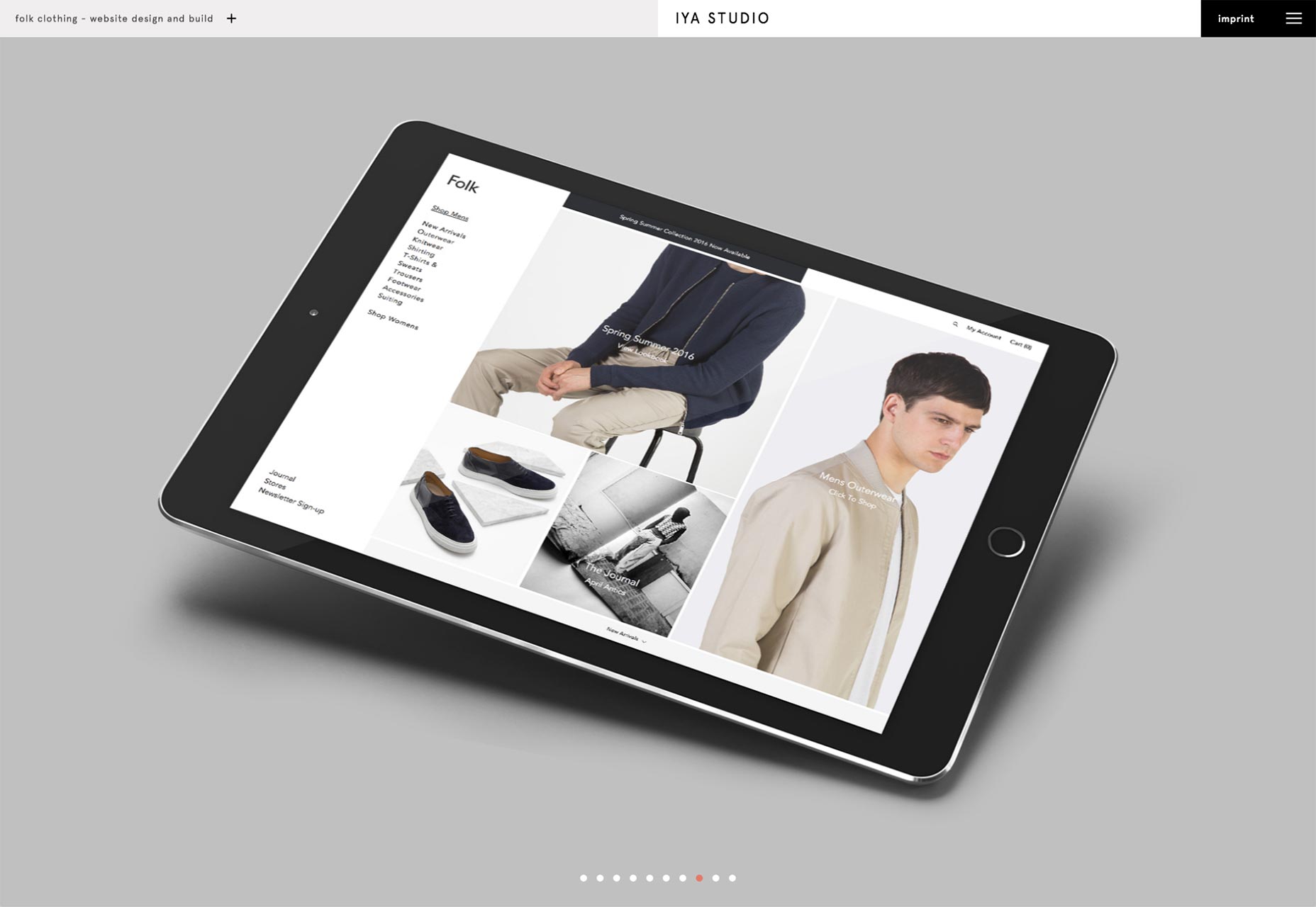
Anthony Goodwin
Anthony Goodwin is an art director and designer in the UK. Using both small graphical details and quick sudden animations he has managed to make his website look sort of digital and glitchy, and since he works primarily in digital media this fits perfectly. The typography and color scheme complete the effect.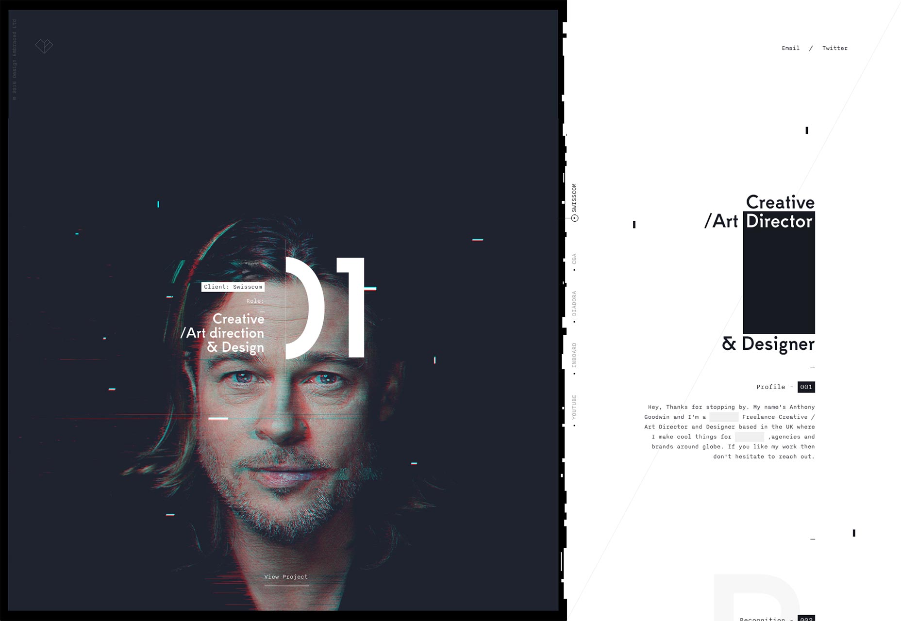
Futura
Futura’s portfolio brings back that minimalist-except-everything-has-a-thin-grey-border look. I’ll be honest, I missed it a little. When done right, as it has been here, it inspires a sense of order and organization. I feel like I can trust the people who made it to be precise. Looking at the rest of their work, I’d say that feeling is well-founded.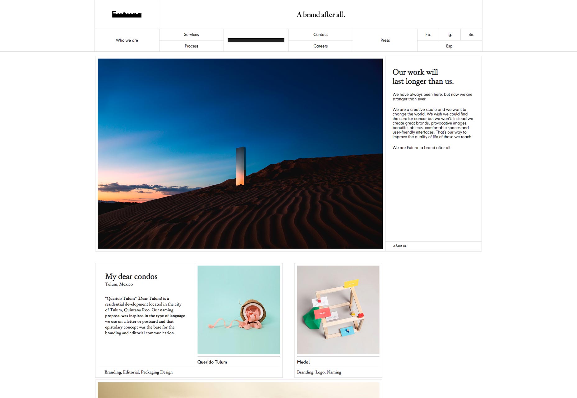
Stinkdigital
Stinkdigital takes an interesting approach to flash design. It makes use of a large number of gradients but the gradients are used primarily in the site’s graphics and not in the interface. This seems to force the graphics to jump out at you in much the same way a button would. Since most of these graphics can be interacted with, it drives the site’s interaction while keeping that elegant flight design feel.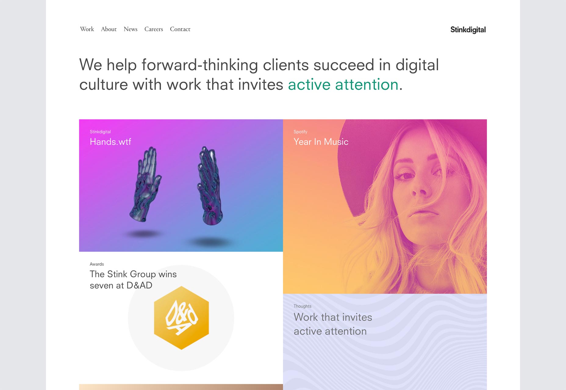
Charlie Isslander
Charlie Isslander’s portfolio changes things up a little by using horizontally scrolling elements. It starts on the home page, where his most recent projects will scroll across the screen. After that, it’s all vertical, except for when there’s an element that deserves special attention. That is, on the case study pages, certain elements (I suspect they are the parts of his projects of which he is most proud) will move a bit from right to left, unerringly drawing the eye. It’s a technique that makes a well-done, but otherwise unoriginal design, feel very different.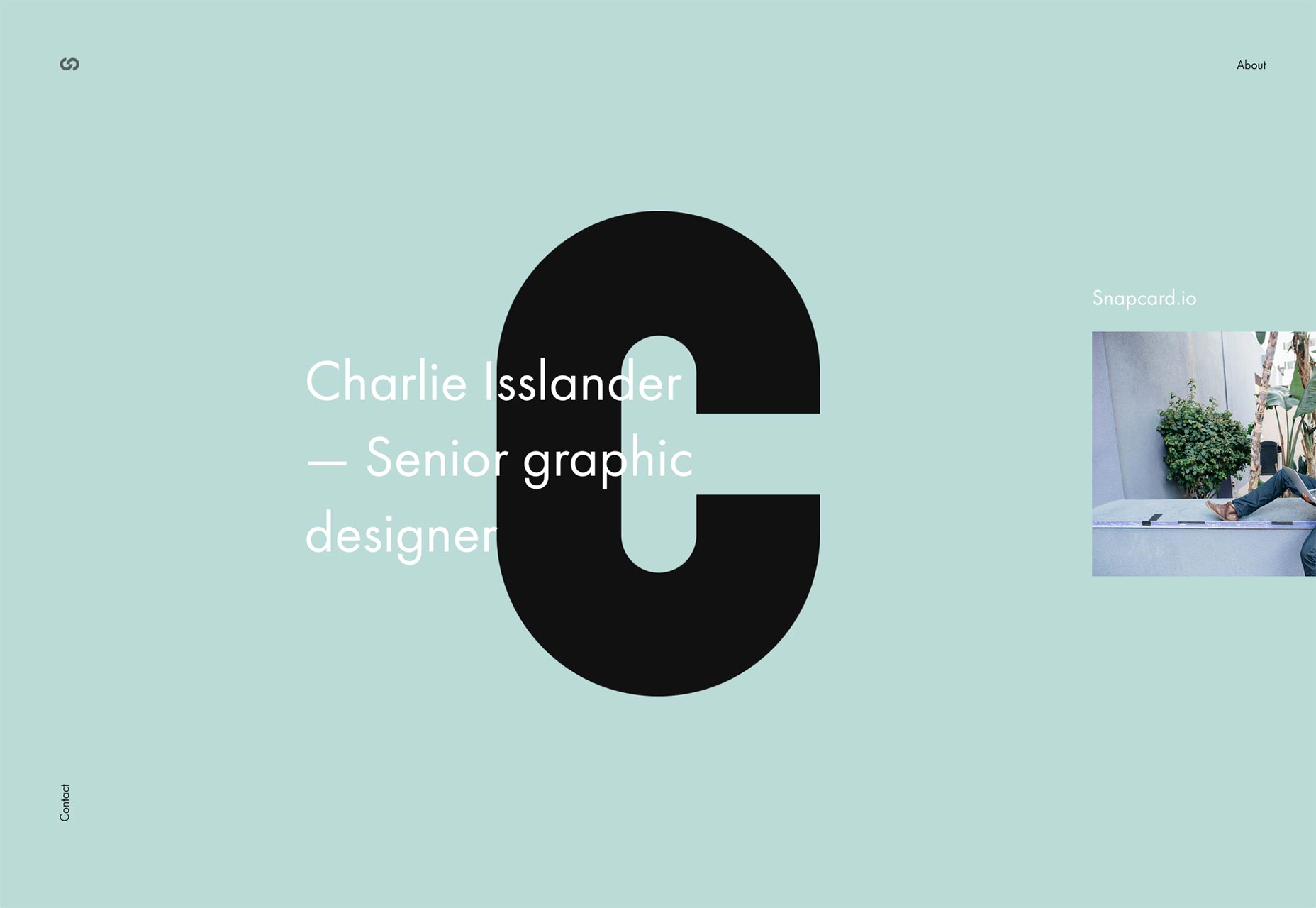
Whirligig
Whirligig is a studio that specializes in animation and illustration. They stick to simple layouts that adapt to large screens as well as small. Like on the sites of many other animation studios, the thumbnails of their projects come to life when you hover over them. There is not a lot of text as they want the work to speak for itself. Given that a picture is worth 1000 words and there are at least 25 frames every second I’d say that’s enough.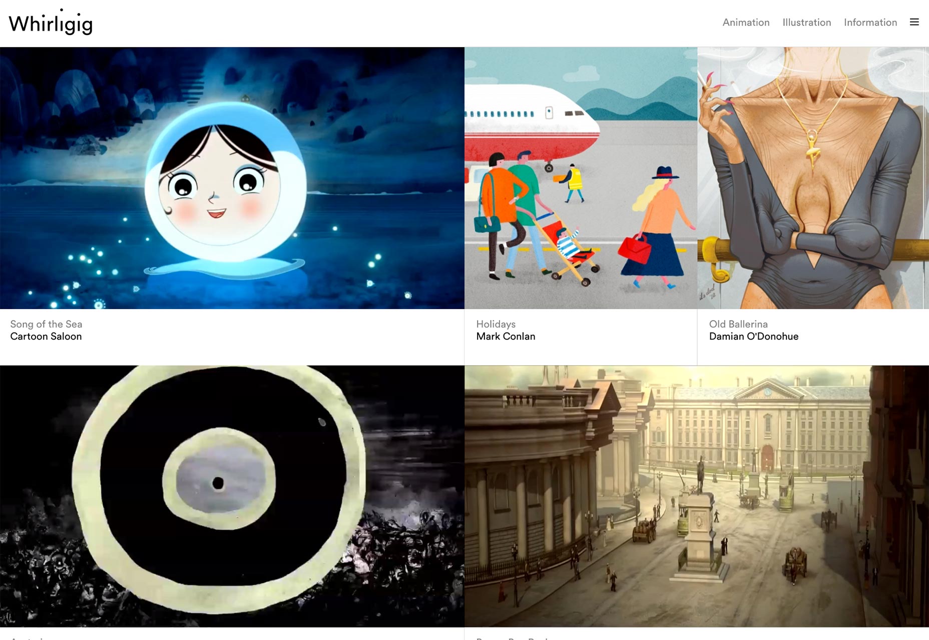
Ezequiel Bruni
Ezequiel Bruni is a web/UX designer, blogger, and aspiring photographer living in Mexico. When he’s not up to his finely-chiselled ears in wire-frames and front-end code, or ranting about the same, he indulges in beer, pizza, fantasy novels, and stand-up comedy.
Read Next
3 Essential Design Trends, November 2024
Touchable texture, distinct grids, and two-column designs are some of the most trending website design elements of…
20 Best New Websites, October 2024
Something we’re seeing more and more of is the ‘customizable’ site. Most often, this means a button to swap between…
Exciting New Tools for Designers, October 2024
We’ve got goodies for designers, developers, SEO-ers, content managers, and those of you who wear multiple hats. And,…
15 Best New Fonts, September 2024
Welcome to our roundup of the best new fonts we’ve found on the web in the previous four weeks. In this month’s edition…
By Simon Sterne
3 Essential Design Trends, October 2024
This article is brought to you by Constantino, a renowned company offering premium and affordable website design
You…
A Beginner’s Guide to Using BlueSky for Business Success
In today’s fast-paced digital world, businesses are always on the lookout for new ways to connect with their audience.…
By Louise North
The Importance of Title Tags: Tips and Tricks to Optimize for SEO
When it comes to on-page SEO, there’s one element that plays a pivotal role in both search engine rankings and user…
By Simon Sterne
20 Best New Websites, September 2024
We have a mixed bag for you with both minimalist and maximalist designs, and single pagers alongside much bigger, but…
Exciting New Tools for Designers, September 2024
This time around we are aiming to simplify life, with some light and fast analytics, an all-in-one productivity…
3 Essential Design Trends, September 2024
September's web design trends have a fun, fall feeling ... and we love it. See what's trending in website design this…
Crafting Personalized Experiences with AI
Picture this: You open Netflix, and it’s like the platform just knows what you’re in the mood for. Or maybe you’re…
By Simon Sterne
15 Best New Fonts, August 2024
Welcome to August’s roundup of the best fonts we’ve found over the last few weeks. 2024’s trend for flowing curves and…
By Ben Moss


