 In the old design, the logo featured interlocking circles that created a venn diagram where the circles overlapped. Here, the red and yellow circles looked like teeth on a zipper as there were bars of red and yellow in the middle. The MasterCard wordmark was imposed on top of the circles, with uppercase and lowercase text in addition to a drop shadow that fell on the circles.
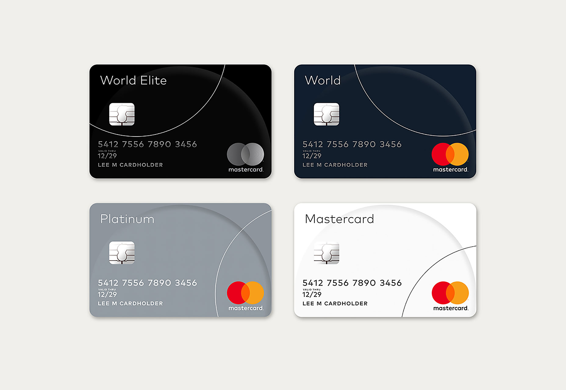
The new logo design espouses smart minimalism by taking all of the old design’s elements and simplifying it that much further to create a logo that has fewer elements for its partner banks (which issue its cards) to use in confusing cross-branding.
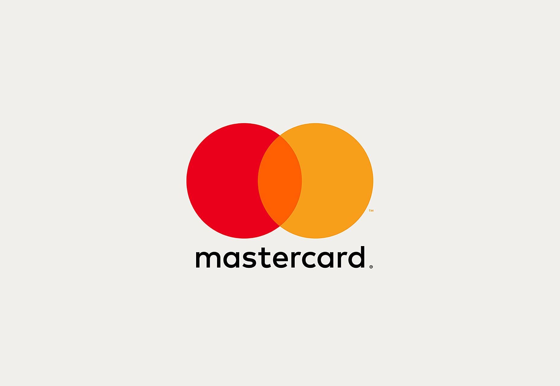
 Instead of the red-and-yellow comb effect in the center of the circles, we know see the true result of red and yellow mixing, which is the color orange. The wordmark “MasterCard” has been entirely kicked out of the circles and now appears underneath them.
The wordmark also features a new typeface, FF Mark. The most notable change is that every letter in the new wordmark is now lowercase while also sporting circular curves that the old wordmark couldn’t accommodate. It’s also gone from white to black.
 The design company that worked on this update, Pentagram, was thankful that it already had much to work with before they began the redesign. The old logo already featured one of the simplest and easiest geometric shapes with which to work, not to mention two of the three primary colors. As a result, Pentagram didn’t really perform a complete overhaul, but, rather, a simple design tweak that updated the logo to today’s branding needs.
The new logo is anything but excessively clever or instantly eye-catching. Instead, it’s a safe and effective transition from a tested design to one that’s complementary to an evolving brand identity.

Marc Schenker
Marc’s a copywriter who covers design news for Web Designer Depot. Find out more about him at thegloriouscompanyltd.com.
Read Next
3 Essential Design Trends, November 2024
Touchable texture, distinct grids, and two-column designs are some of the most trending website design elements of…
20 Best New Websites, October 2024
Something we’re seeing more and more of is the ‘customizable’ site. Most often, this means a button to swap between…
Exciting New Tools for Designers, October 2024
We’ve got goodies for designers, developers, SEO-ers, content managers, and those of you who wear multiple hats. And,…
15 Best New Fonts, September 2024
Welcome to our roundup of the best new fonts we’ve found on the web in the previous four weeks. In this month’s edition…
By Simon Sterne
3 Essential Design Trends, October 2024
This article is brought to you by Constantino, a renowned company offering premium and affordable website design
You…
A Beginner’s Guide to Using BlueSky for Business Success
In today’s fast-paced digital world, businesses are always on the lookout for new ways to connect with their audience.…
By Louise North
The Importance of Title Tags: Tips and Tricks to Optimize for SEO
When it comes to on-page SEO, there’s one element that plays a pivotal role in both search engine rankings and user…
By Simon Sterne
20 Best New Websites, September 2024
We have a mixed bag for you with both minimalist and maximalist designs, and single pagers alongside much bigger, but…
Exciting New Tools for Designers, September 2024
This time around we are aiming to simplify life, with some light and fast analytics, an all-in-one productivity…
3 Essential Design Trends, September 2024
September's web design trends have a fun, fall feeling ... and we love it. See what's trending in website design this…
Crafting Personalized Experiences with AI
Picture this: You open Netflix, and it’s like the platform just knows what you’re in the mood for. Or maybe you’re…
By Simon Sterne
15 Best New Fonts, August 2024
Welcome to August’s roundup of the best fonts we’ve found over the last few weeks. 2024’s trend for flowing curves and…
By Ben Moss


