
Duolingo
One of the things that fascinates me is the number of products that require a user to hand over their email address in order to use the product—get the email so you can harass a user who hasn’t returned in a while! They must have forgotten how much they loved us!—Is this the best experience we can come up with? If a user doesn’t want to come back no amount of email nagging is going to change their mind. Let’s give them an experience to successful that they return on their own.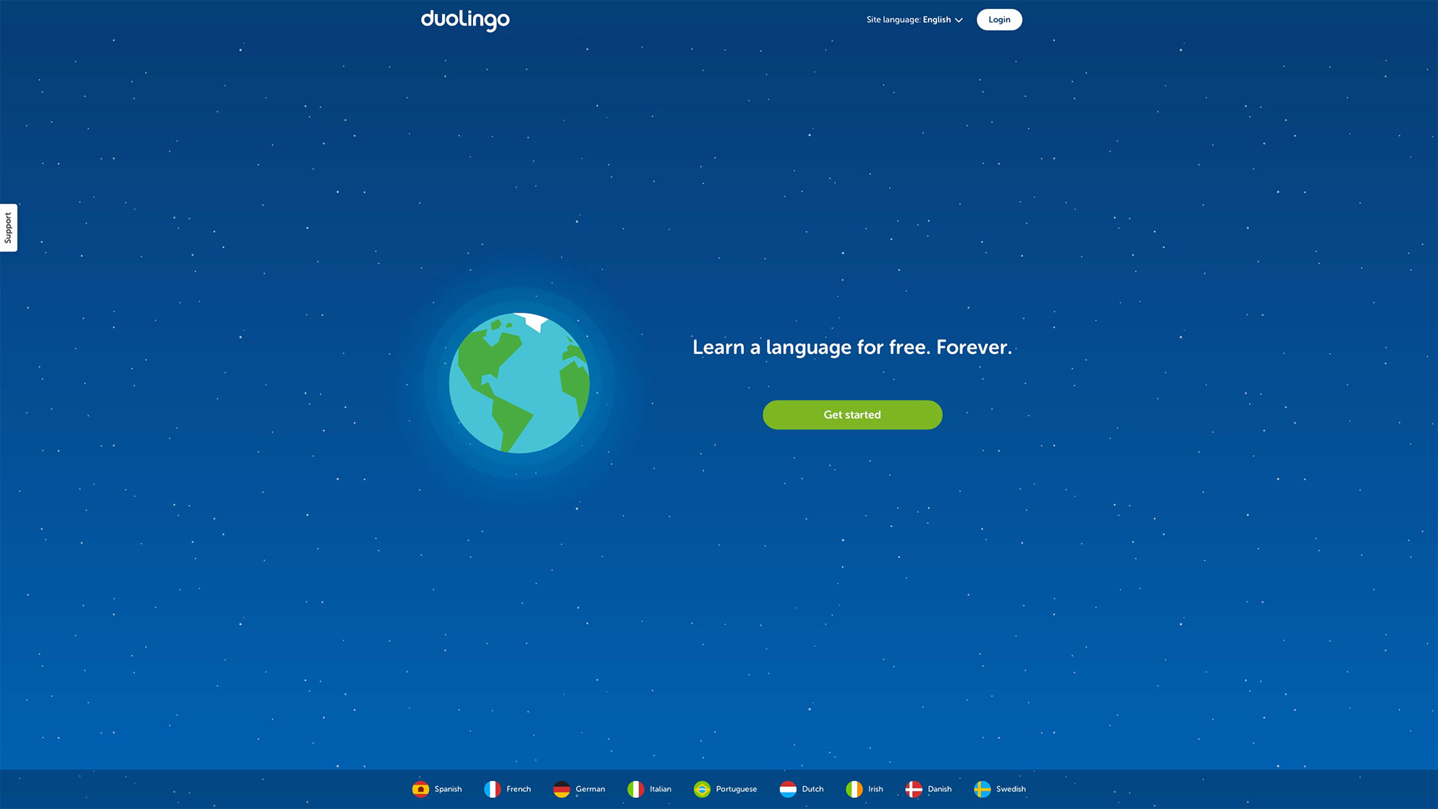 I fell in love with Duolingo’s onboarding, because like many successful onboarding experiences, they allow you to use the app without signing up beforehand. (They recently redesigned, but I like these old designs better.) The experience is all about the user, their wants and needs. After clicking the “Get Started” CTA you’re posed a proposition in first-person language: “I want to learn…”. It’s personal, and it’s relevant.
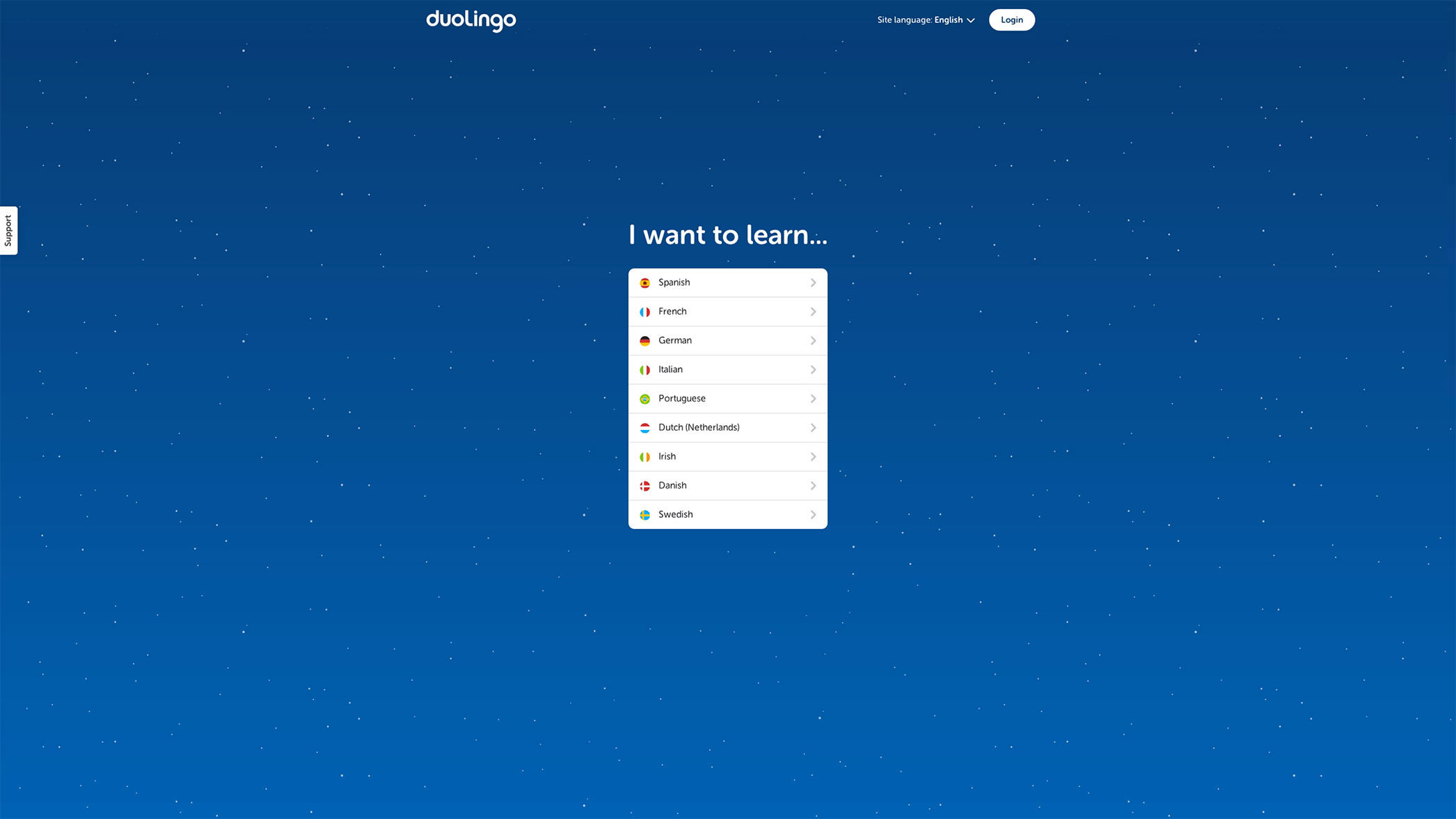 Once a user picks a language they are shown how the app works in four simple steps. While the user is learning about the app there is a lot of positive reinforcement: the progress bars may be short, but they fill up quickly; the bottom of the model turns green with “Good job!” written inside; the continue button is green. Everything is nice and lovely and oh so positive. This may be overkill when you start to analyze it but I don’t see many apps praising me this much for using them. Or going through their walkthrough, for that matter.
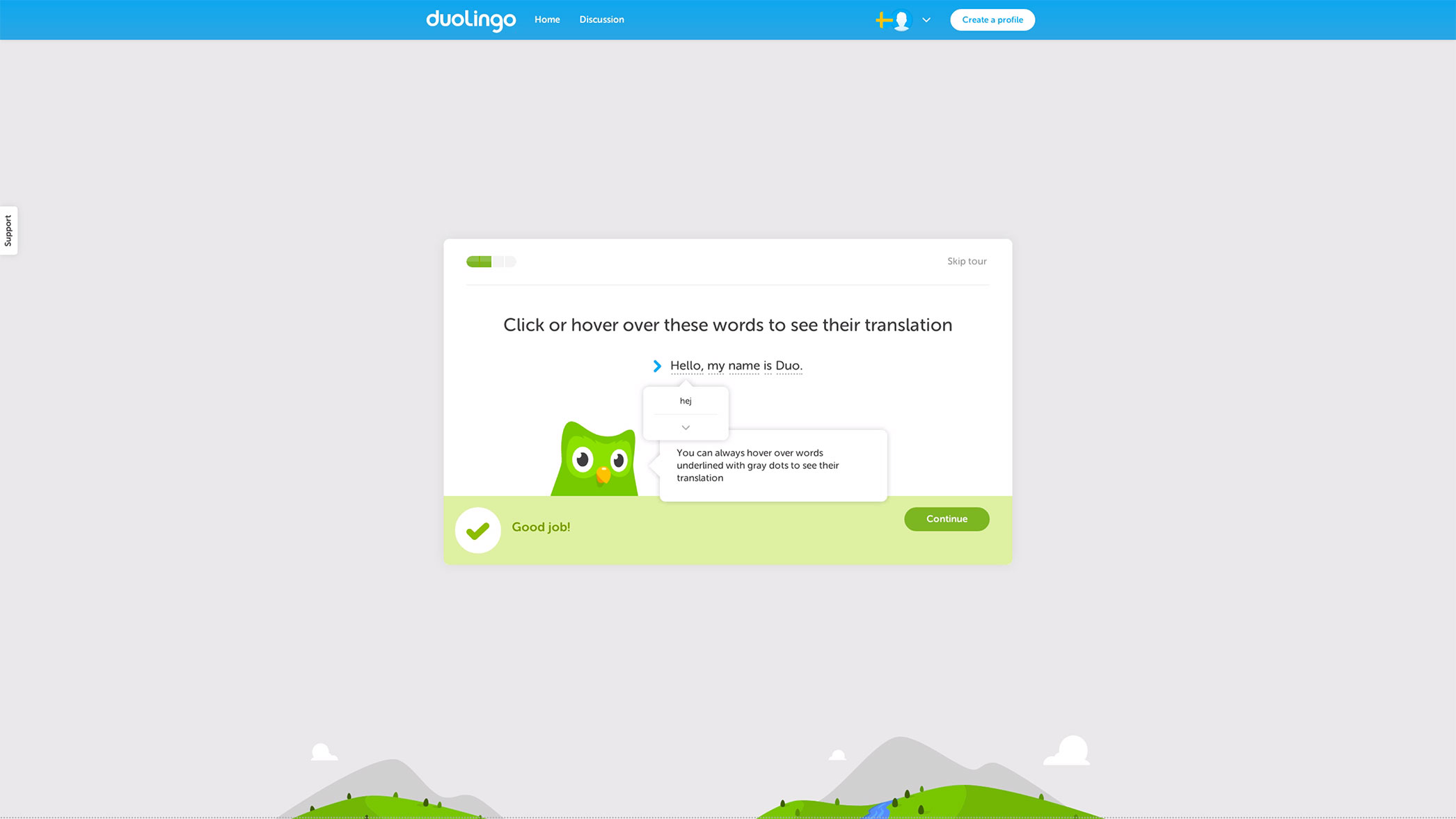
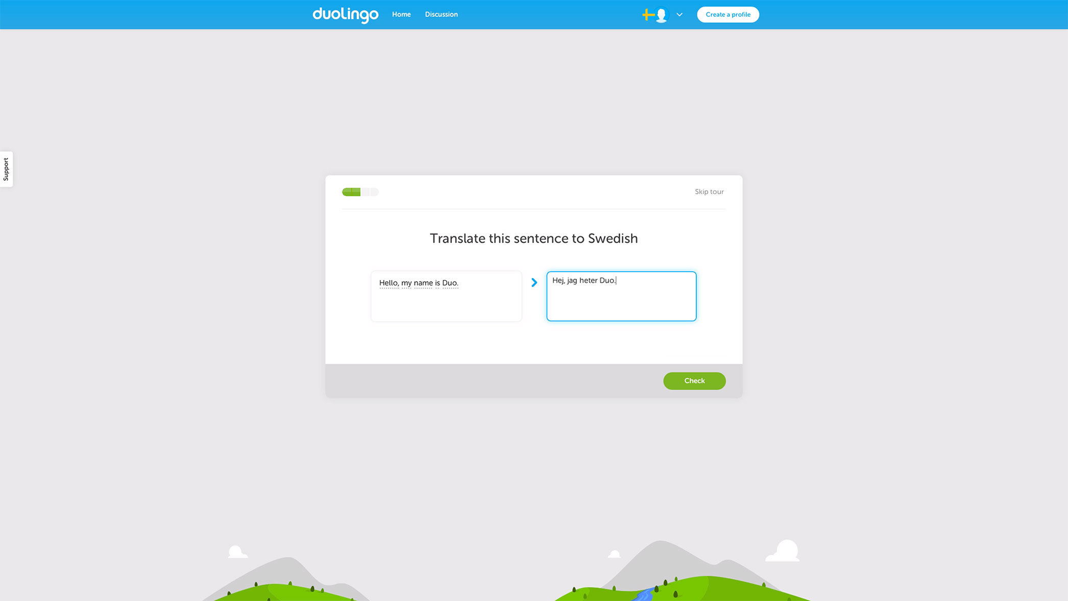 When a user is introduced to the app, they are actually using it. Think about how powerful that is, and how rarely it is used. Instantly a user can be proud of their accomplishment of writing a quick sentence in a foreign language.
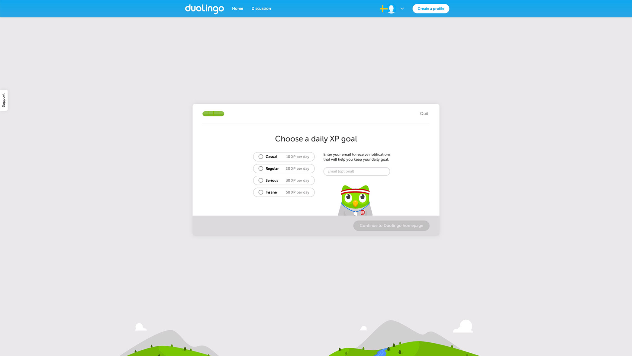
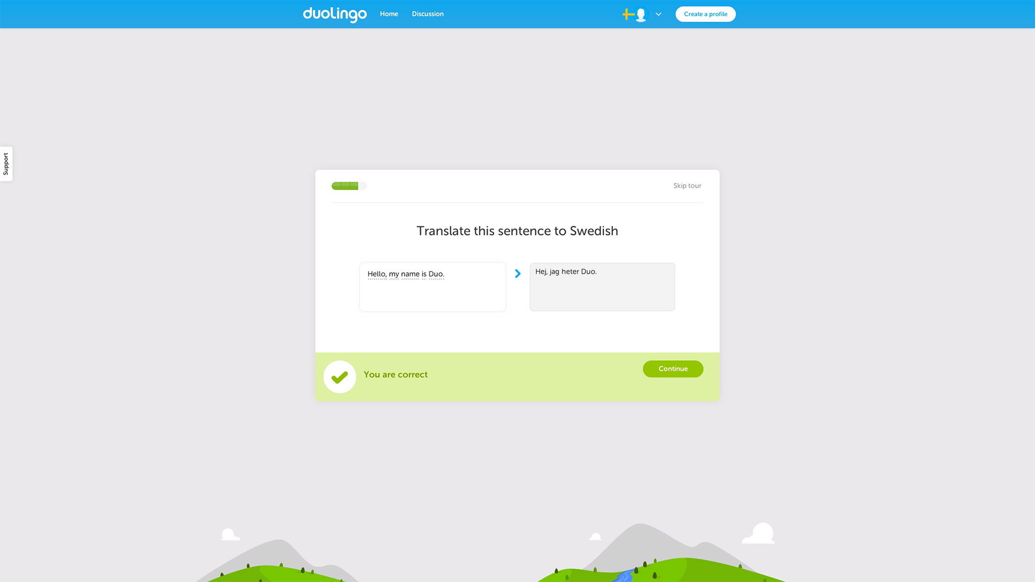 And, once the sentence is submitted there is more positive reinforcement for a job well done: at that point Duolingo knows you either love it or hate it, and if you love it, this is the perfect time to get you started with the app by getting your email. If you don’t care to use Duolingo, no harm done. Having the user pick a commitment is a clever way to get them to commit to learning a new language. Well played Duolingo, well played!
Oscar
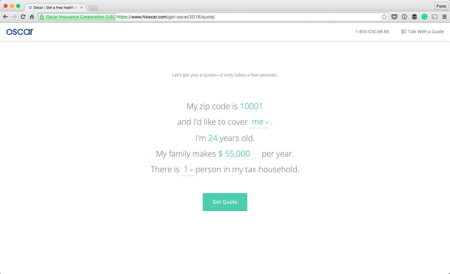
I’d like to walk you through the signup and onboarding process that Oscar Health has. There are a few things about Oscar that I really enjoy. The overall aesthetic of the website is very clean and minimal but it’s still approachable and professional. I think they have a really great onboarding experience with perhaps a little room for improvement.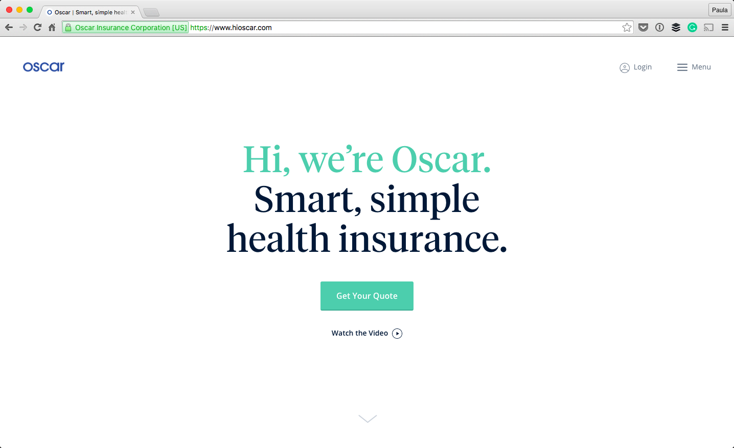 Oscar’s online presentation matters in how serious they are taken by potential customers. Take a look at the form for signing up for a new plan; it doesn’t look like a form. That’s important. You’re answering questions but the inputs are styled so lovingly. It’s natural, as if I was speaking with a person. (Did you notice that Oscar got right to business about me and my needs, instead of asking for my email?)
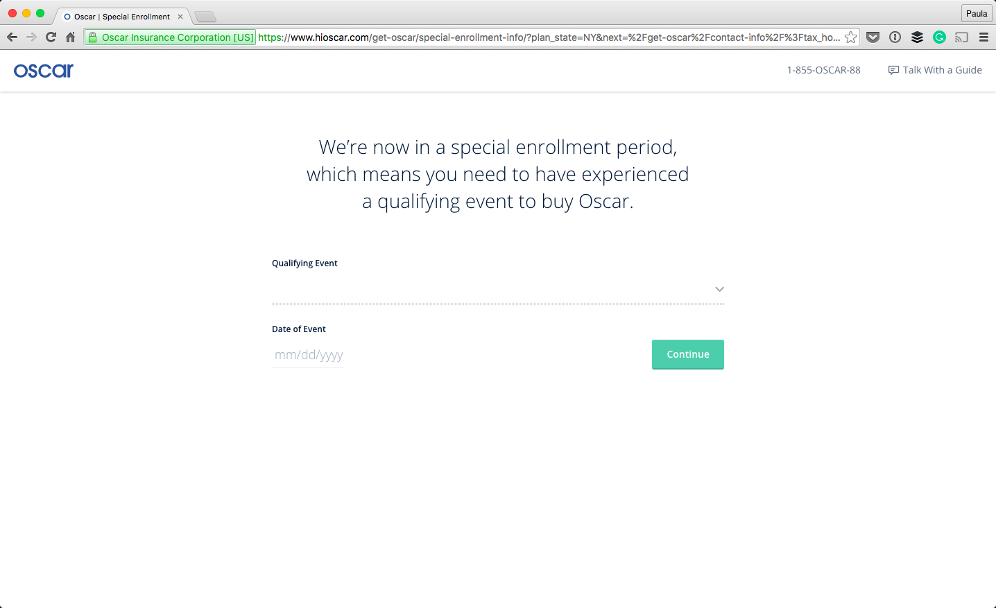
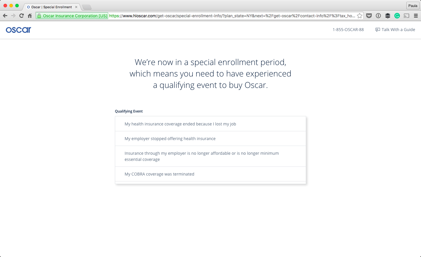
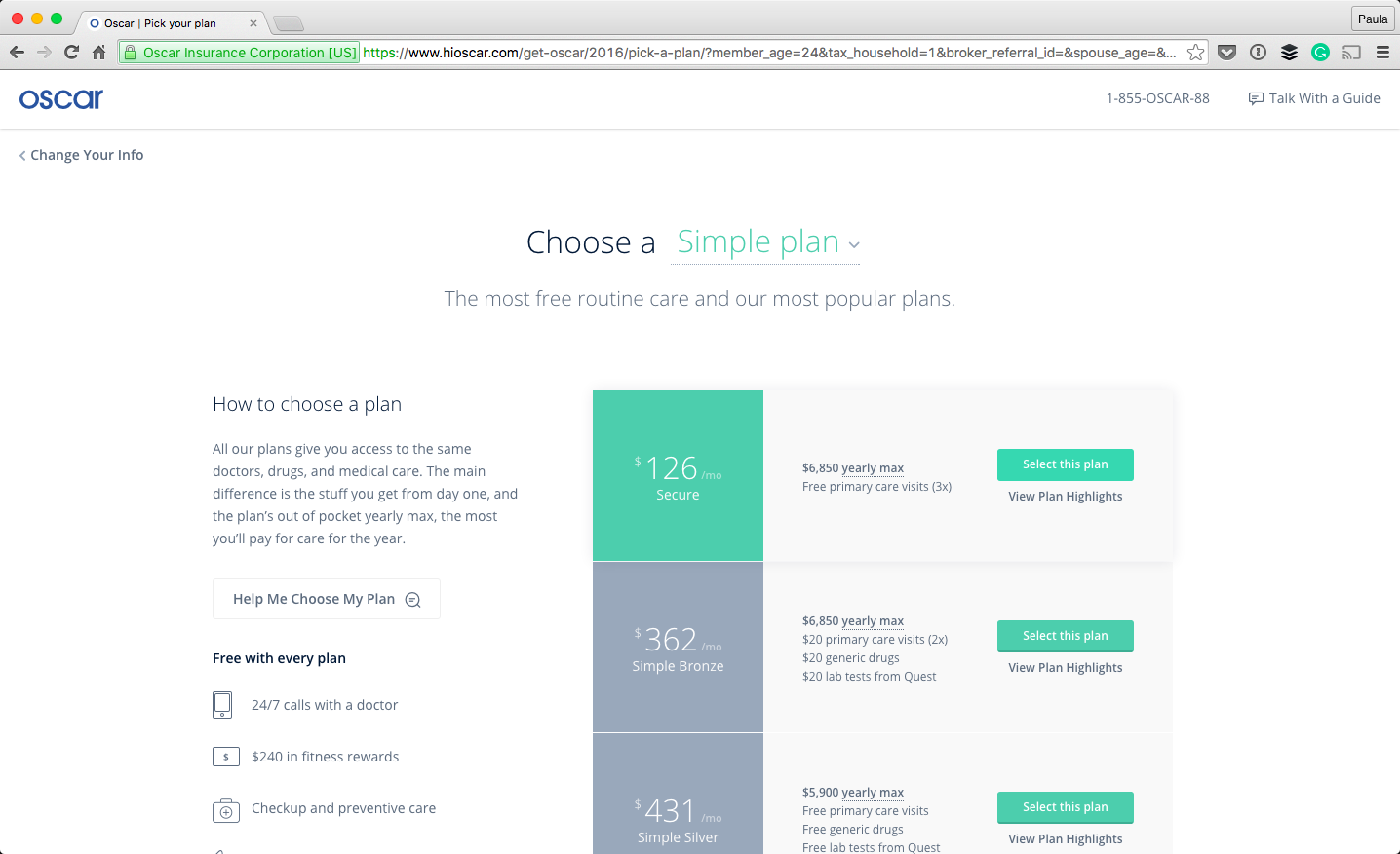 The original CTA is “Get Your Quote” and I was able to do that very quickly and easily without actually signing up for an insurance plan. But, let’s pretend to proceed with a plan anyways: The next step in the onboarding process, the app explains to the user what is happening. Right now, you can only sign up for new health insurance if something happened to your coverage and you have proof of this—something like losing your job and the coverage they provided or losing your COBRA benefits. I think it’s smart to tell the user up front as to why they can and cannot sign up; it takes a lot of guesswork out of the whole process. Let’s pretend we qualify…
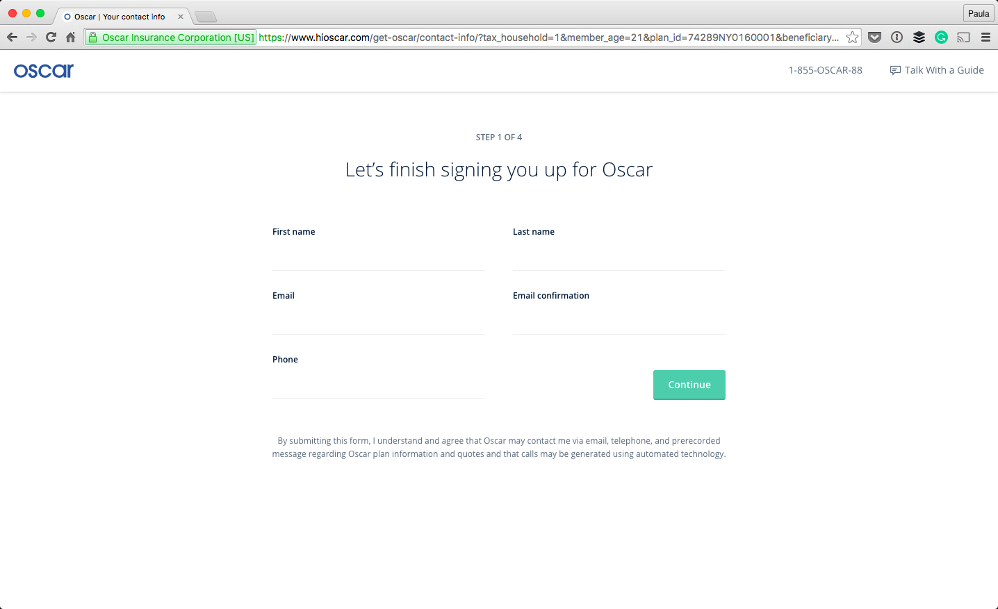
 During the process, the design of the whole thing feels consistent, like I’m still in the same place going after the same thing. The form still doesn’t feel like one as you move along the process. The last thing a user wants to be doing is filling out numerous forms, in any given setting. Styling the interactions not to feel like a form is a great step in making the experience not feel like a bureaucratic formality.
Another thing that’s very important in this sign up process is the fact that the steps are divided up, and you know where in the process you are. This further improves the form filling process.
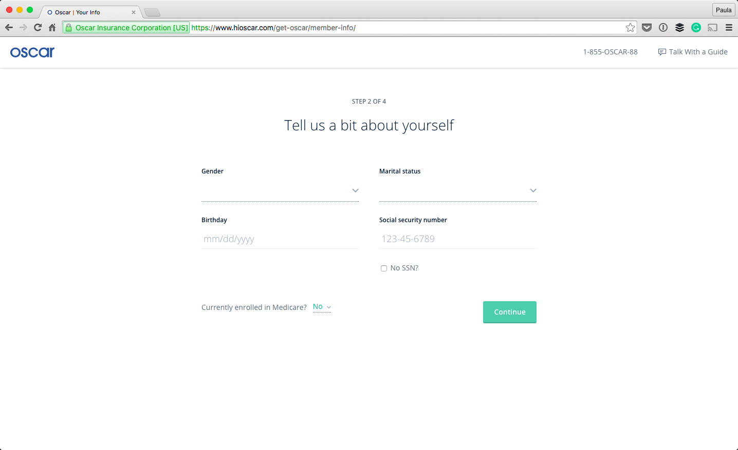 There is one thing I wish the onboarding process did more of and that’s explaining why the information is necessary. They did this in the beginning—they were transparent as to the qualifications for health insurance. But why does my gender, my phone number, or my marital status matter? I know it somehow matters for health insurance because it’s always asked. Is that really necessary? It’s pretty personal information, especially my SSN—it would put the user at ease knowing why they’re being asked for this information.
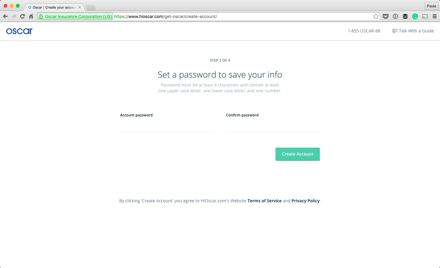
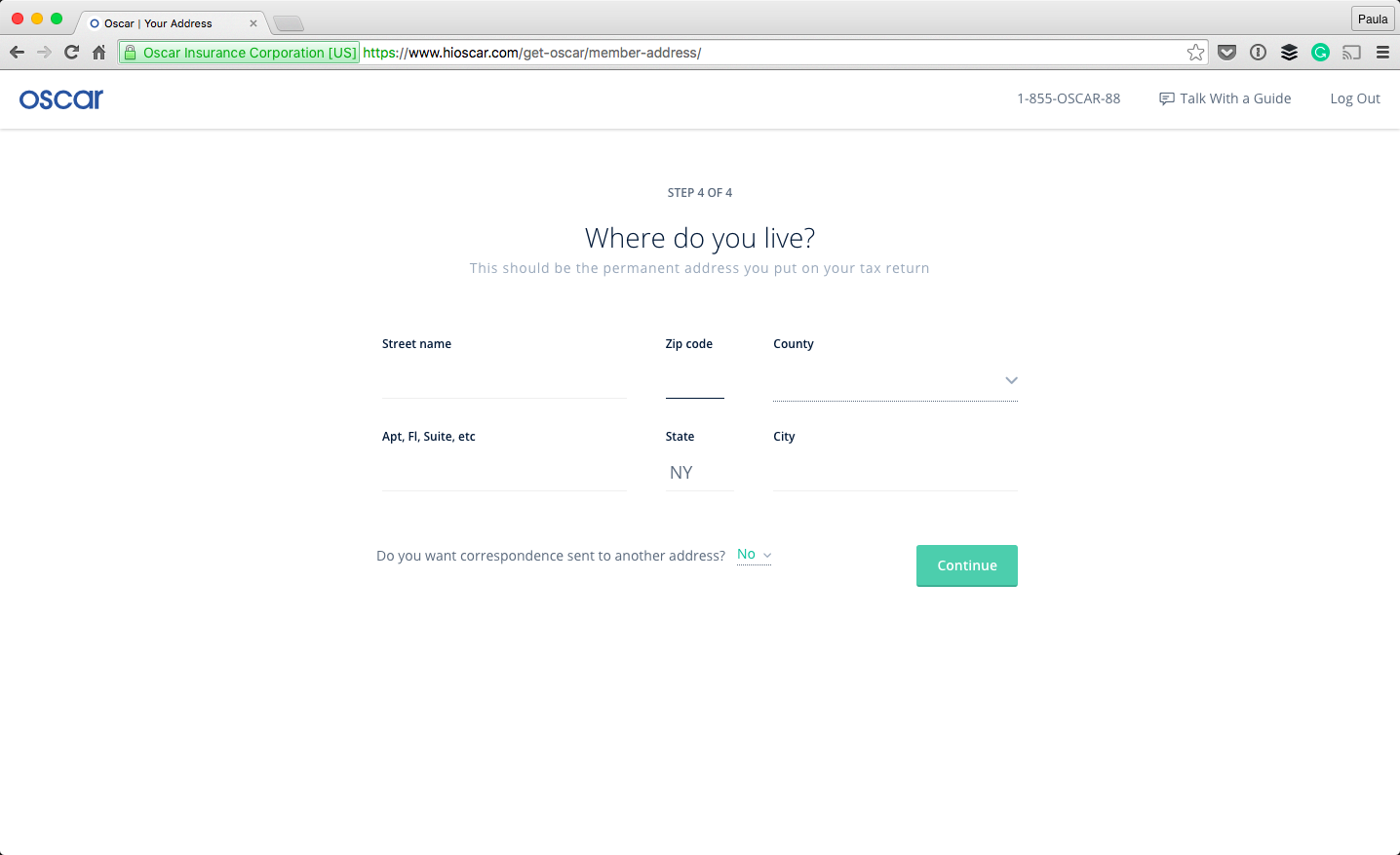 Eventually, I’m asked to provide a password in order to save my information. They even say what their password formatting preferences are! (How rare is that?!) My other confusion is why the user is asked for a password before the address? It seems like the form is a little out of logical order.
Oscar’s onboarding experience is an improvement compared to many, especially when it comes to onboarding in the healthcare industry. It’s obvious they care about their people, just by spending a few minutes going through their onboarding experience.
Paula Borowska
Paula is a freelance web designer who documents her travels with photos and words. She works with small companies to help them create products that change the lives for their customers all in the hopes of gaining more customers and retaining their current ones longer.
Read Next
3 Essential Design Trends, November 2024
Touchable texture, distinct grids, and two-column designs are some of the most trending website design elements of…
20 Best New Websites, October 2024
Something we’re seeing more and more of is the ‘customizable’ site. Most often, this means a button to swap between…
Exciting New Tools for Designers, October 2024
We’ve got goodies for designers, developers, SEO-ers, content managers, and those of you who wear multiple hats. And,…
15 Best New Fonts, September 2024
Welcome to our roundup of the best new fonts we’ve found on the web in the previous four weeks. In this month’s edition…
By Simon Sterne
3 Essential Design Trends, October 2024
This article is brought to you by Constantino, a renowned company offering premium and affordable website design
You…
A Beginner’s Guide to Using BlueSky for Business Success
In today’s fast-paced digital world, businesses are always on the lookout for new ways to connect with their audience.…
By Louise North
The Importance of Title Tags: Tips and Tricks to Optimize for SEO
When it comes to on-page SEO, there’s one element that plays a pivotal role in both search engine rankings and user…
By Simon Sterne
20 Best New Websites, September 2024
We have a mixed bag for you with both minimalist and maximalist designs, and single pagers alongside much bigger, but…
Exciting New Tools for Designers, September 2024
This time around we are aiming to simplify life, with some light and fast analytics, an all-in-one productivity…
3 Essential Design Trends, September 2024
September's web design trends have a fun, fall feeling ... and we love it. See what's trending in website design this…
Crafting Personalized Experiences with AI
Picture this: You open Netflix, and it’s like the platform just knows what you’re in the mood for. Or maybe you’re…
By Simon Sterne
15 Best New Fonts, August 2024
Welcome to August’s roundup of the best fonts we’ve found over the last few weeks. 2024’s trend for flowing curves and…
By Ben Moss


