
Buero Huegel
Buero Hegel is a German agency that focuses on brand management and web design. Their site embraces that brutalist-yet-not-ugly aesthetic known as minimalism, which is still a thing. They combine it with a healthy bit of asymmetry and a thin layout to make a site that, while simple, looks unique amongst the more trendy sites.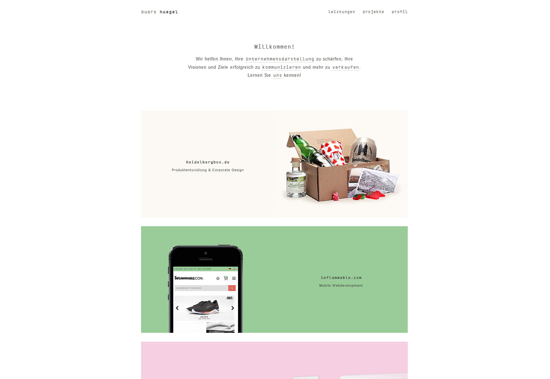
Surinder Thakur
Surinder Thakur cheated (not really) by using diagonal lines, classy and understated drop shadows (They’re back, baby!), and minimal yet informative case-study style presentation.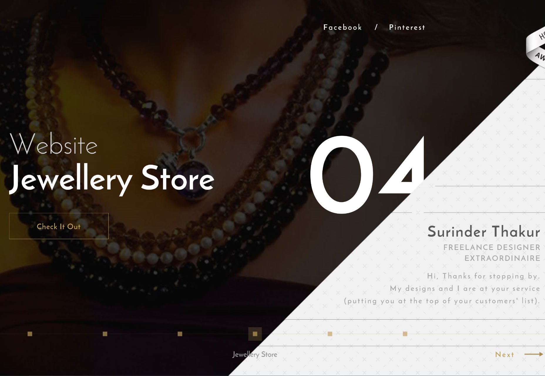
FLOW4
FLOW4 gives us that now-classic full-width sections portfolio look. They spiced things up by adding subtle, playful interactive elements to each of the portfolio pieces on the home page. You can play around with them there, or click through to a much more detailed case study. You’ll need to be able to read German, though.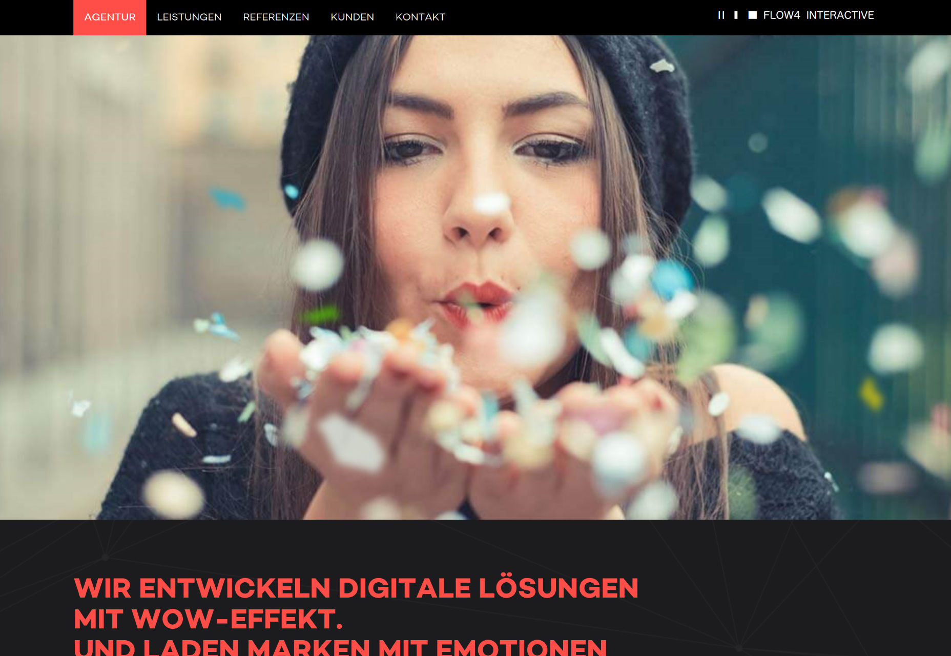
Simone Viola
Simone Viola is a product designer with a distinct focus on simplicity. His website keeps the same tone, with the fantastic use of literal white space, a full-screen layout, and our classic thin sans-serif. It’s a simple site, for a designer of simple products, and it looks good.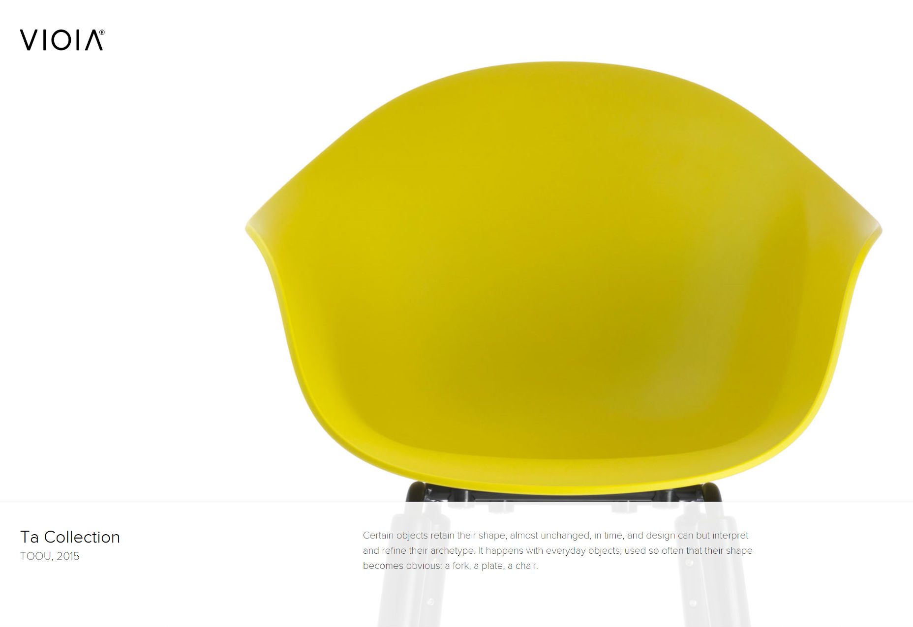
Creative Monarchy
Creative Monarchy is another of those sites that’s not overly-original, but it looks good. It’s worth a look, if you appreciate the classics.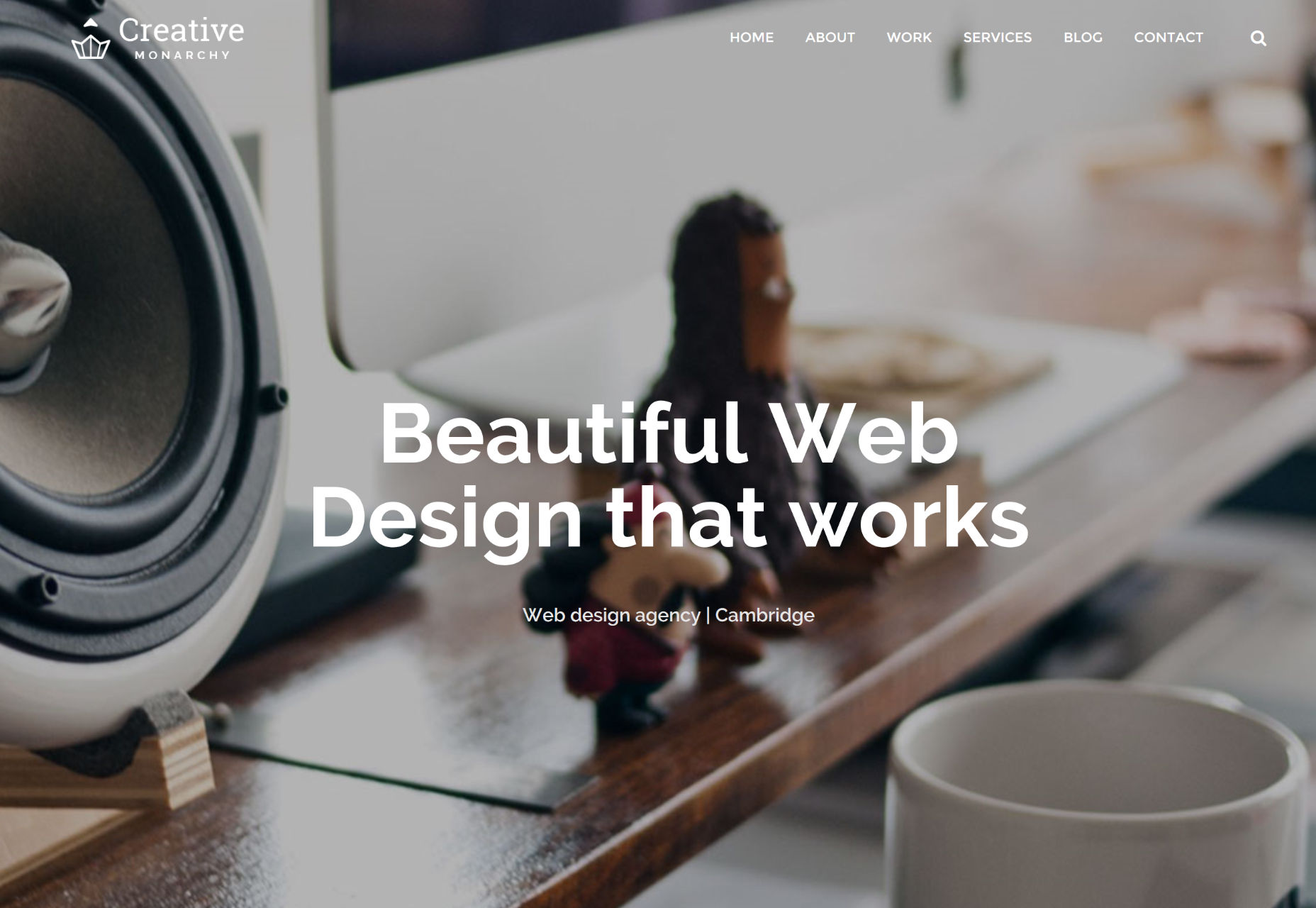
Teo Yu Sheng
Teo Yu Sheng is a UX designer and coder in Singapore. His portfolio keeps things simple with a single column of text, and no images until you open up a portfolio piece. It is basically the definition of minimalism, and it works. The only thing I can’t agree with is the jarring change of brightness when you roll over his “business card” at the top of the page.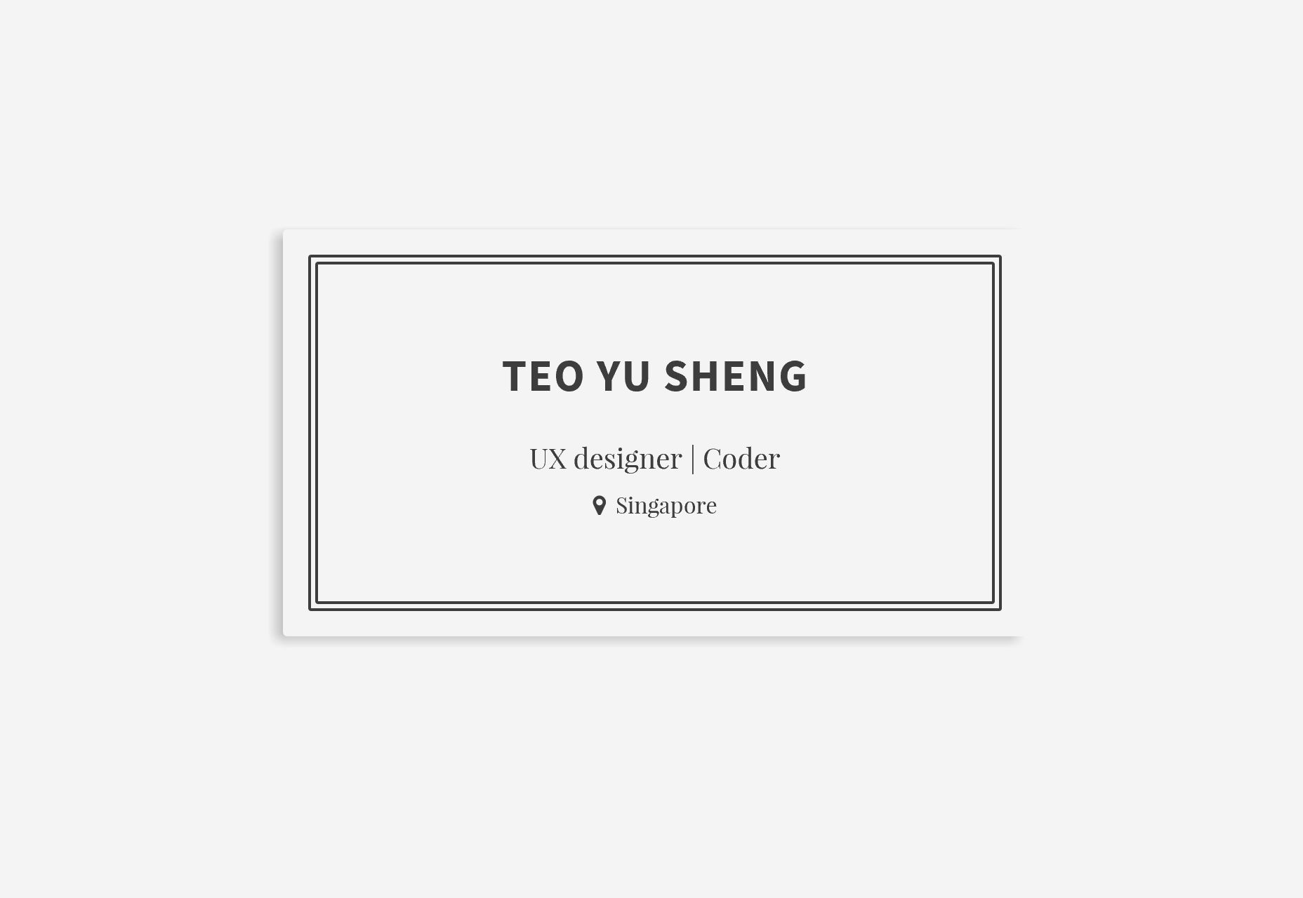
eTecc/Interactive
eTecc/Interactive is what every techy half-orange business site in the '90s aspired to be, but didn’t know how to achieve. It’s a simple, modern, minimalist design spiced up by subtle throwbacks to older tech-related sites. Usability and nostalgia. It’s a winning combination for nerds like me.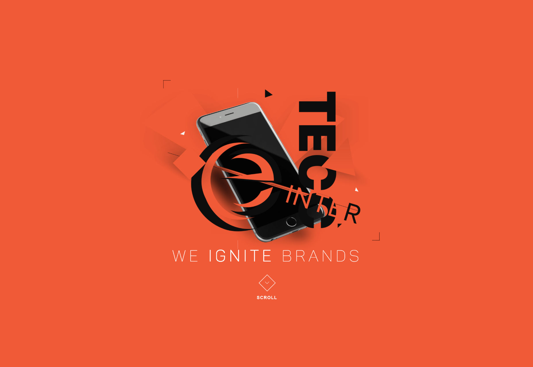
Flow
Lukasz Radwan’s one-pager is one of the more beautiful dark websites I’ve seen in a long time. The contrast is good, the typography is properly spaced for a dark site, and it all just fits together well. I do take some exception to his calling the portfolio section his “Flowcase”, but only because I didn’t come up with that pun first.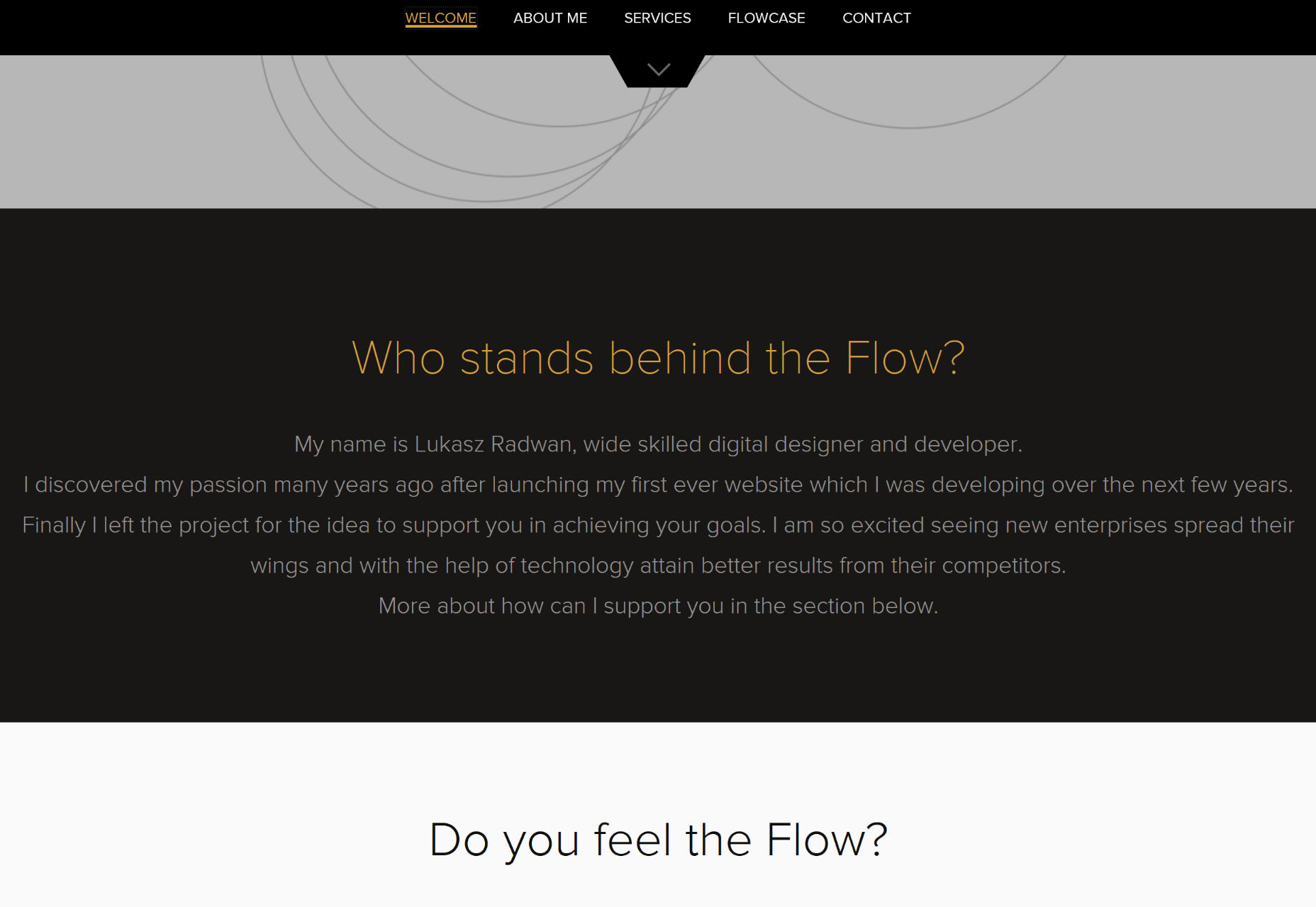
Umeed Emad
Umeed Emad’s portfolio is the second site on this list to drop in a couple of design elements that take me back to the '90s. I mean, the brackets around “Front-End Developer” do fit the theme, here, but remember when everyone used to do that? Nowadays, though, it looks more retro-cool, especially because the rest of the site looks good. It’s a bit of a risk, showing only your client’s logos to start with, and another to link straight to their sites, but otherwise, it’s a pretty — and pretty bright — design.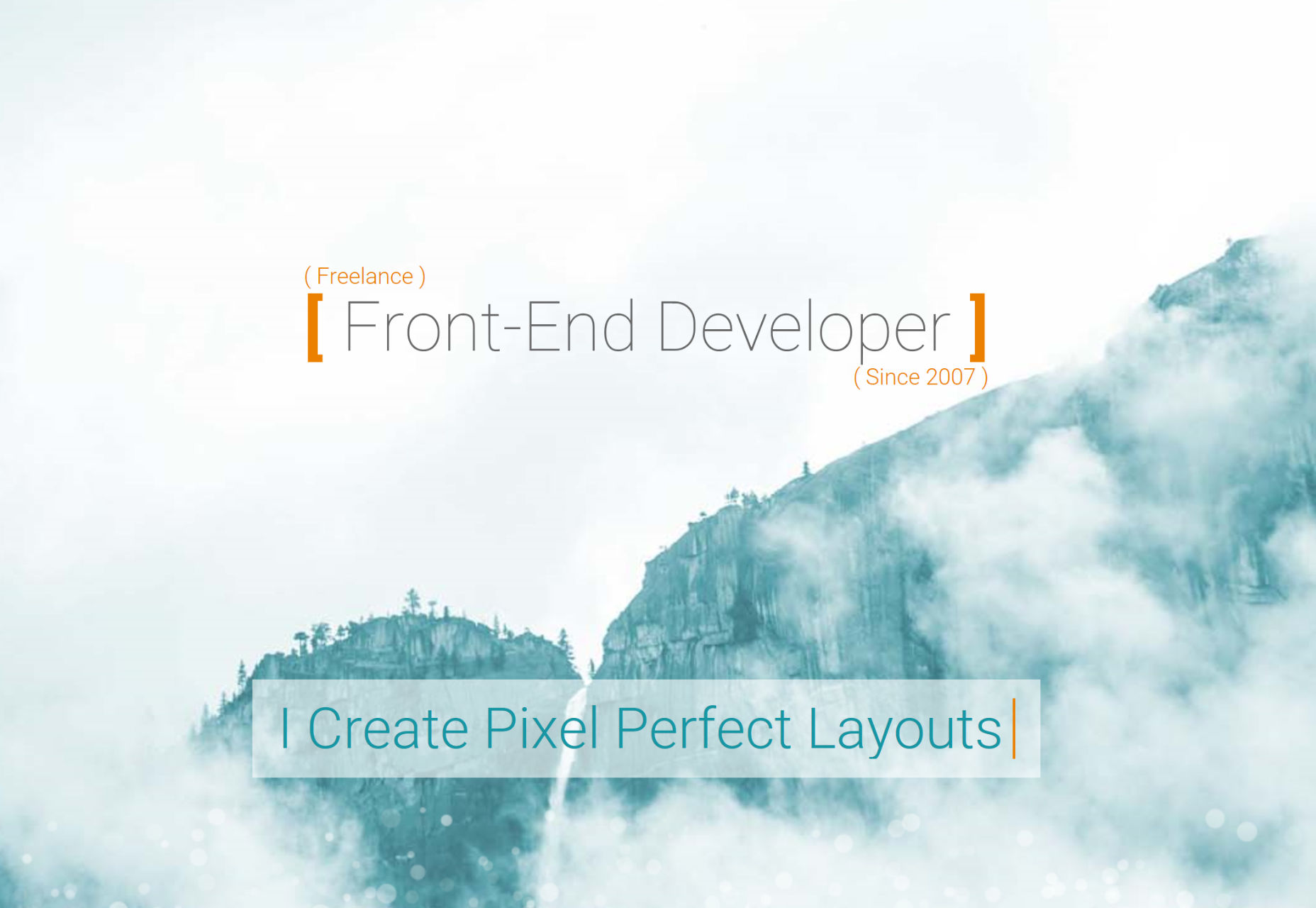
Andrea Pedrina
Andrea Pedrina’s portfolio is one of the few I’d say actually kind of needs a preloader, because there’s a fair amount of video and animated content here along with everything else. Once you get past it, though, you get one of the most lovely monochromatic designs I’ve seen in a while. Oh, interact with it for a bit, and you’ll see colors, sure… but I do love that black and white style, when it’s executed right.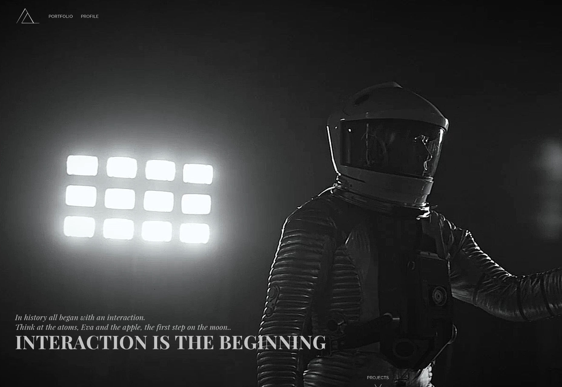
High Contrast
High Contrast combines a fairly conventional layout with some judiciously applied asymmetry. Everything else about the design is largely par for the course.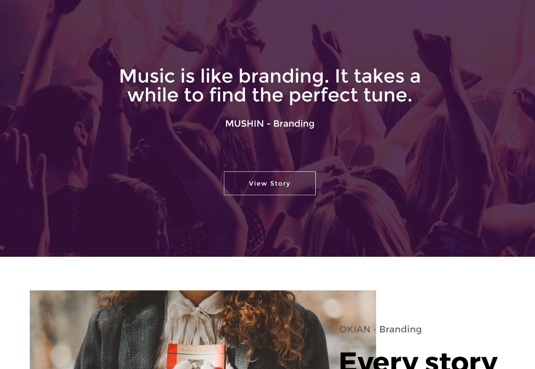
HTML Boutique
HTML Boutique is a lot like the High Contrast site above, mixing conventional layout styles with asymmetry, but it definitely;y has its own distinct personality. Plus, they’re making brown look good, and not at all drab, which is certainly not the easiest thing.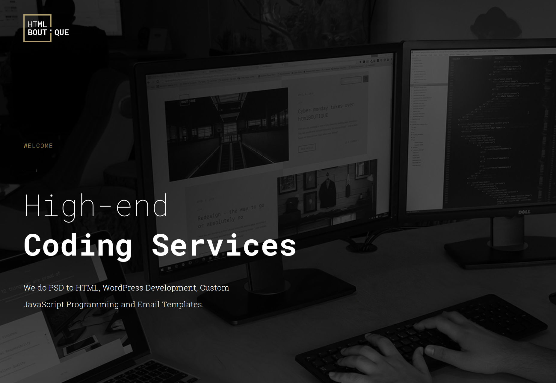
Alaa Mendili
Alaa Mendili uses great typography, tons of subtle and not-so-subtle animation, and bold colors to go all out with his portfolio. The thing that really gets me, though, is the use of those spinning line optical illusion things as section backgrounds. Now, that’s only on the home page, which is good, otherwise it would get way too distracting. As they are, they definitely make the site stand out.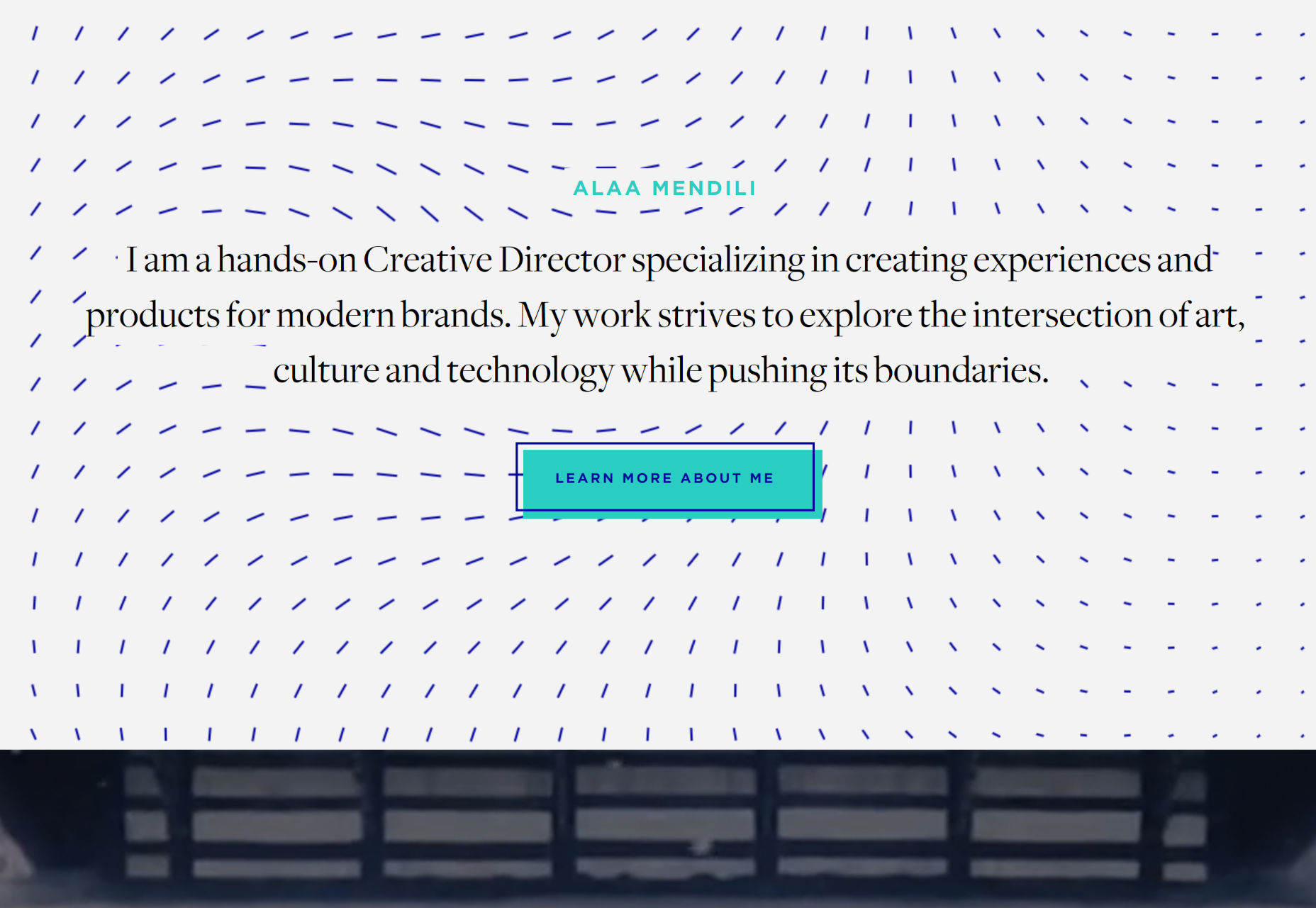
Underscore
Underscore is a branding and design agency. They use a masonry layout to showcase both their work, and articles they’ve written, and it works quite well. I’ve seen this a few times now. I haven’t seen it nearly often enough to make it a trend, but it is catching on. As long as people clearly differentiate which bits take you to their portfolio, and which take you to an article, I think it’s a cool way to show off both of those things together.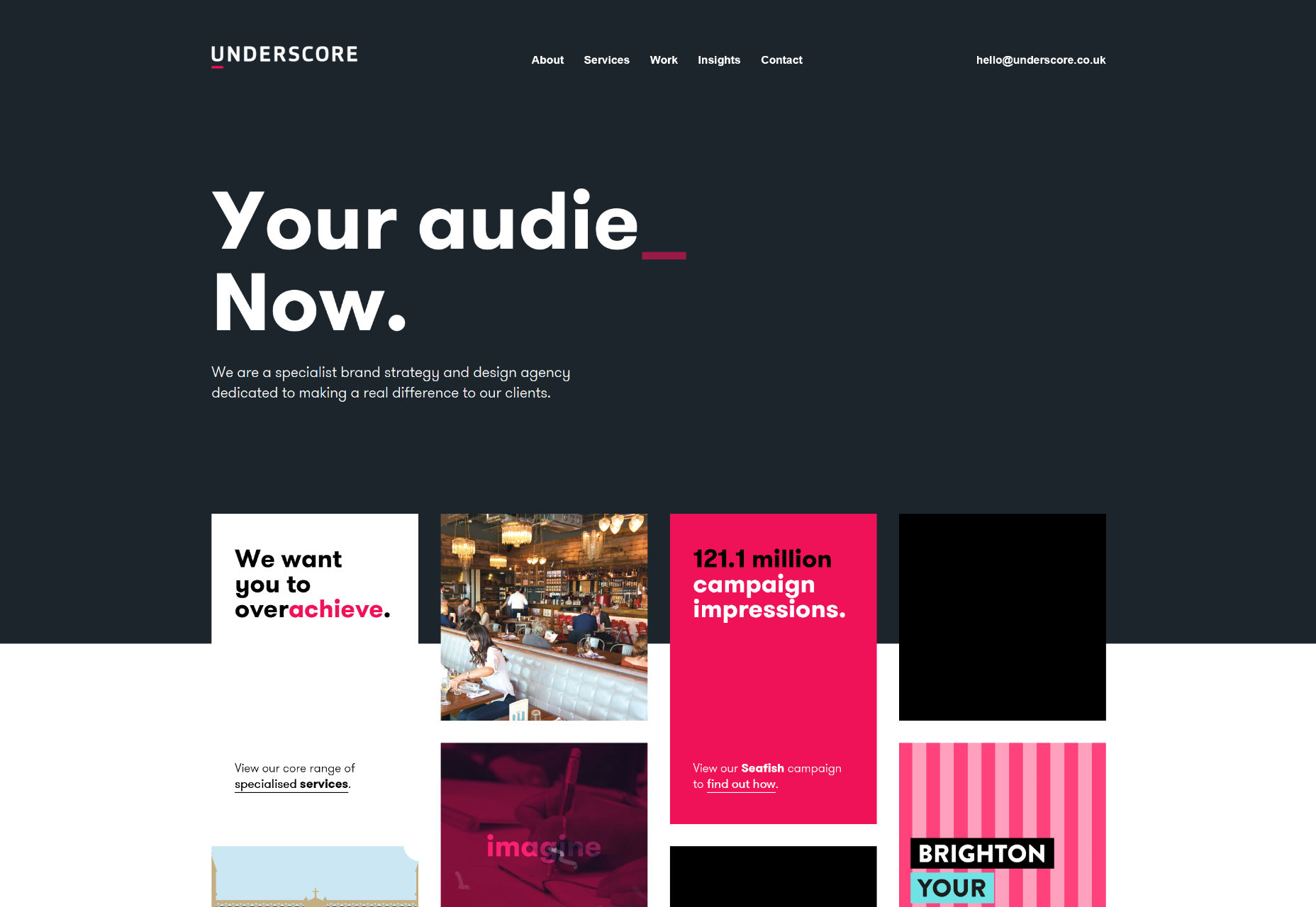
Daniel Hopwood
Websites for interior design studios tend to be minimalist, with interactive elements. Daniel Hopwood isn’t bucking the trend, but rather exemplifying it. If you just have to have a site that is more like a PowerPoint, this is the way to do it.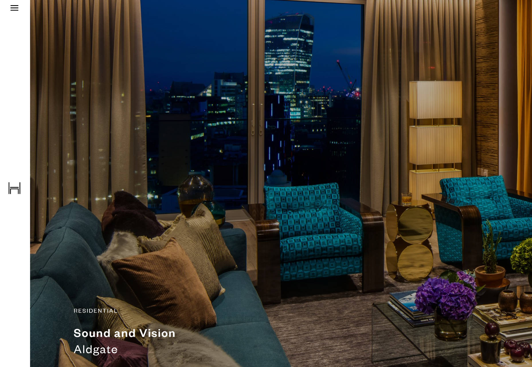
Anna Rosa Krau
Browsing through the website for Anna Rosa Krau, you might get the impression that you’re just supposed to explore her site, and never actually contact her, the way the contact info is hidden. That aside, this site showcase some fantastic minimalist layout possibilities for other sites of its kind. Just maybe make the navigation more obvious when you design your own.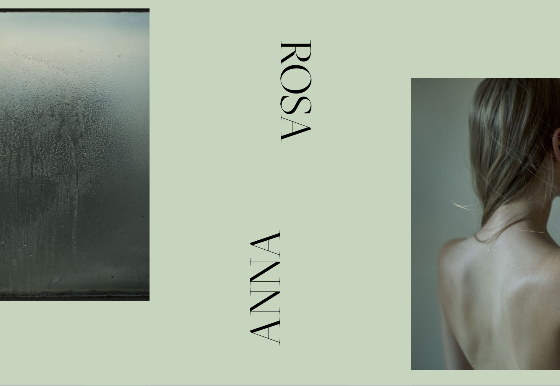
Annie
Here’s something we don’t have on these list every day: shoes! The portfolio site for shoe designer Anni M is all at once modern, artistic, fashionable, and generally just good at showing off shoes. What it lacks in usability, it makes up for in making looking at shoes actually kind of fun. (It normally isn’t, for me.)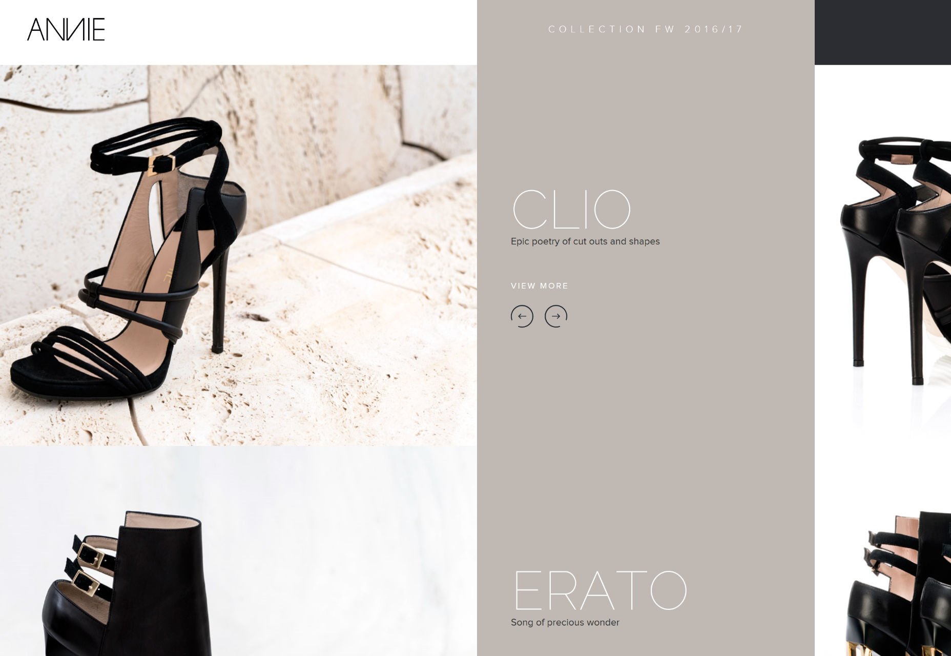
Contemple
Contemple is a Parisian digital agency, that brings us more of that post-modern asymmetrical style that was almost everywhere a couple of months ago. It’s no less creative — and really no more usable — than any other site of its kind. However, it’s bright, it’s bold, and you’re not likely to forget it soon.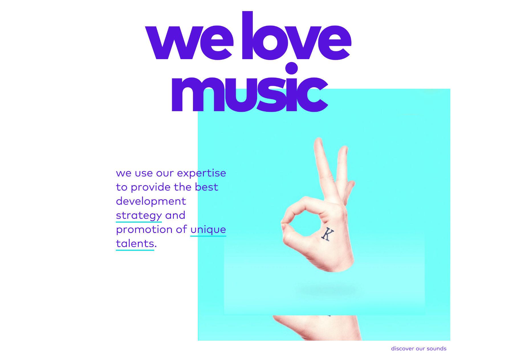
Reda Ibrahim
Reda Ibrahim’s photography portfolio gives us more of that sweet monochromatic goodness, with a side order of horizontal scrolling, and elegant little flourishes. I don’t know how many of you have played ever Fable, but grey really is the prettiest color 1.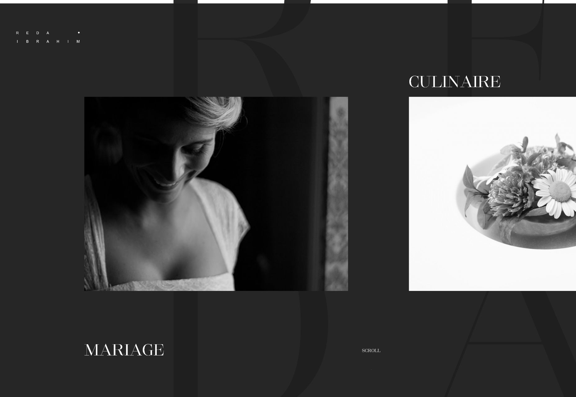
Nightshift
Nightshift is a content creation company specializing in video. This is another one for the somewhat-typical-but-still-well-made list. Have at it!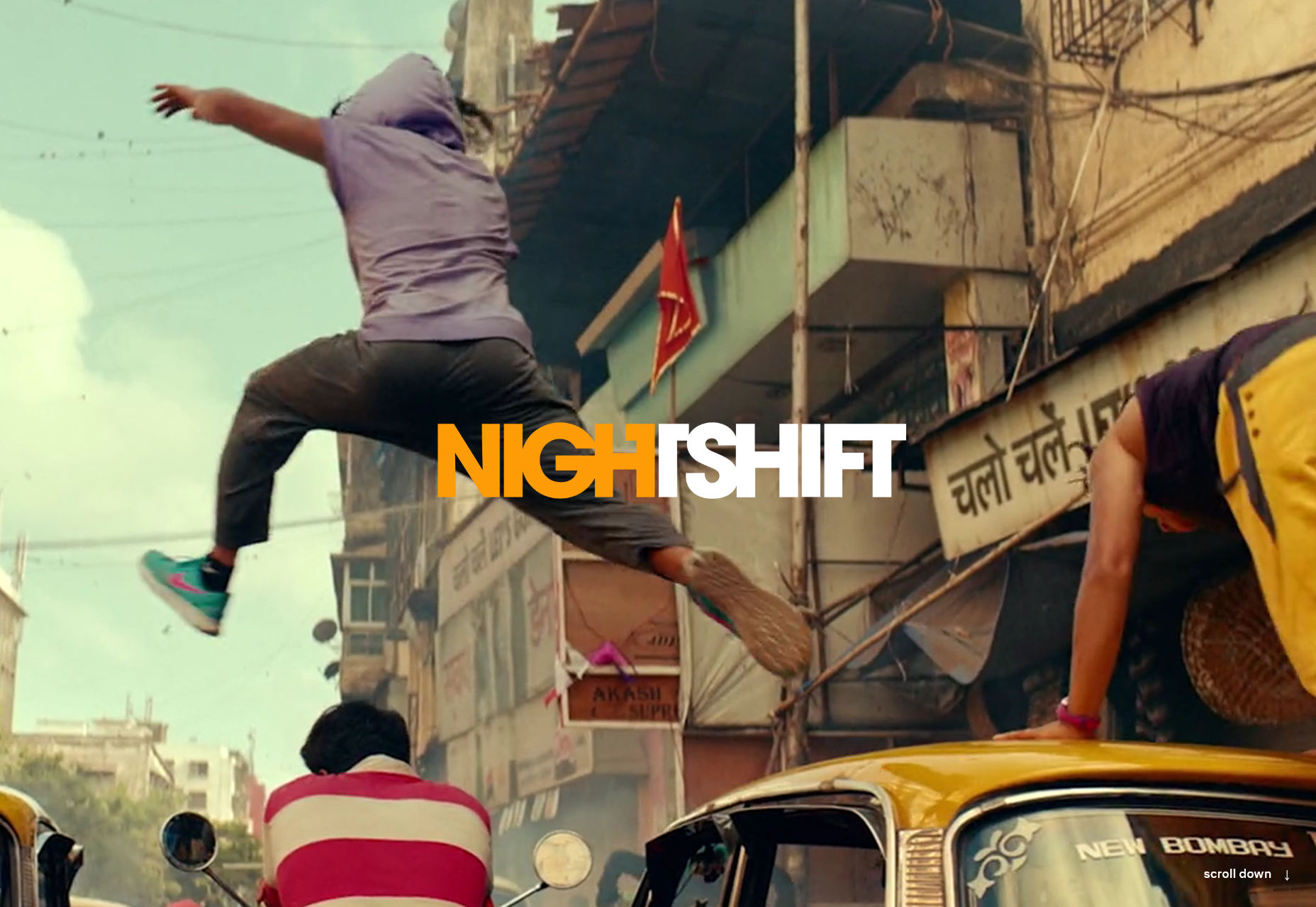 1 Comment if you got that reference.
Ezequiel Bruni
Ezequiel Bruni is a web/UX designer, blogger, and aspiring photographer living in Mexico. When he’s not up to his finely-chiselled ears in wire-frames and front-end code, or ranting about the same, he indulges in beer, pizza, fantasy novels, and stand-up comedy.
Read Next
3 Essential Design Trends, November 2024
Touchable texture, distinct grids, and two-column designs are some of the most trending website design elements of…
20 Best New Websites, October 2024
Something we’re seeing more and more of is the ‘customizable’ site. Most often, this means a button to swap between…
Exciting New Tools for Designers, October 2024
We’ve got goodies for designers, developers, SEO-ers, content managers, and those of you who wear multiple hats. And,…
15 Best New Fonts, September 2024
Welcome to our roundup of the best new fonts we’ve found on the web in the previous four weeks. In this month’s edition…
By Simon Sterne
3 Essential Design Trends, October 2024
This article is brought to you by Constantino, a renowned company offering premium and affordable website design
You…
A Beginner’s Guide to Using BlueSky for Business Success
In today’s fast-paced digital world, businesses are always on the lookout for new ways to connect with their audience.…
By Louise North
The Importance of Title Tags: Tips and Tricks to Optimize for SEO
When it comes to on-page SEO, there’s one element that plays a pivotal role in both search engine rankings and user…
By Simon Sterne
20 Best New Websites, September 2024
We have a mixed bag for you with both minimalist and maximalist designs, and single pagers alongside much bigger, but…
Exciting New Tools for Designers, September 2024
This time around we are aiming to simplify life, with some light and fast analytics, an all-in-one productivity…
3 Essential Design Trends, September 2024
September's web design trends have a fun, fall feeling ... and we love it. See what's trending in website design this…
Crafting Personalized Experiences with AI
Picture this: You open Netflix, and it’s like the platform just knows what you’re in the mood for. Or maybe you’re…
By Simon Sterne
15 Best New Fonts, August 2024
Welcome to August’s roundup of the best fonts we’ve found over the last few weeks. 2024’s trend for flowing curves and…
By Ben Moss


