User interface design is a hot topic these days and for good reason. In a world where digital experiences are such a large part of our lives, the value of a quality user experience is higher than ever. Not only is it important now, but the quality of user interfaces is bound to be even more important in the future given the tremendous growth of mobile, digital, and the Internet of Things.
From web sites, to displays in our cars, to thermostat controls in our homes, user interfaces of all types make up much of our daily experience. Taking into account that users are becoming more experienced with digital displays and are expecting better experiences than they were willing to put up with just a few short years ago, it is imperative that businesses carefully consider the quality of the experience they create for their customers.
But what makes a quality user interface?
1) Simplicity
Great user interfaces tend to be nearly invisible. They are not made up of gaudy adornments or unnecessary elements. A quality user interface is made up of necessary elements that are logical and concise. While you are working on the design of your interface, ask yourself “Does the user really need this to compete their task?” before adding features and content. Limit your interface to the items that are essential for the user. Don’t add items just to feed your ego, but rather, focus on the quality of the user experience.
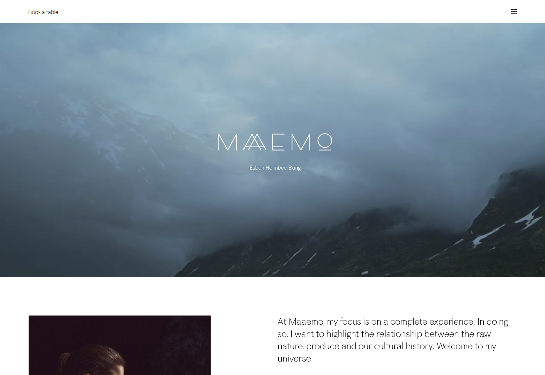
One company that does a great job with this concept is Maaemo. On this Norwegian restaurant’s website the very first thing you see is the option to book a table, other options are hidden behind a hamburger menu to avoid clutter. No time is wasted scanning through complicated navigation trying to figure out where to go to book a table.
2) Clarity
Clarity is one of the most important attributes of any user interface. Keep in mind that your user interface exists for the sole purpose of facilitating users interacting with your system. To do this it must clearly communicate with users. If users can’t figure out how to use your interface easily they will become frustrated and abandon the experience.
To help improve clarity, create clear and concise labels for buttons and actions. You want to keep your messaging simple to improve the experience as well. The easier your labels, navigation and content is to read, the easier it is for users to understand what to do.
Remember though that the first attribute was simplicity; you want to keep that in mind with your labels, definitions and explanations. Avoid cluttering up your interface with lengthy explanations. Your users will not read or appreciate them and they will only get in the way of the user experience.
It is better if you can explain a feature in one word instead of two. Save your users the reading time and cognitive strain by keeping your labels and messages concise. While keeping text both clear and concise may require some effort, it is well worth it to improve the user experience of your user interface.
3) Consistency
With your user interface, you will want to maintain consistency throughout the entire experience. Consistent interfaces will allow your users to rely on and develop usage patterns that will improve the experience. People crave consistency and you should give your users the opportunity to be proven correct when they rely on it.
They want an experience where if they learn to do something, they will be able to rely on it working the same way on other screens. Maintain language, layout and design throughout your interface. By doing so you make it easier on your users to understand how things will work, increase their efficiency and improve the user experience.
4) Familiarity
One of the goals of UX design is to make an interface intuitive for users. Let’s consider what intuitive means when it comes to user interfaces, if your interface is intuitive, it can be naturally understood by users. To do this, it is important that you leverage familiarity in your design.
Your interface will feel familiar if users don’t have to think how to use it because they already understand it. When users are familiar with something, they know what to expect and don’t have to think about what to do. Because of this, work to identify areas of your design where you can leverage familiarity to make interacting with your system easier for your users. A current example of this would be the hamburger icon seen on so many apps these days. Any time you see this icon you instantly know where the menu is and you don’t have to stop and look for the menu and think about what you are supposed to do. It comes naturally because you are familiar with this icon.
The Born Shoes web site helps illustrate this concept. Familiar icons are placed in a familiar position making it easy for visitors to know what to do.
5) Visual Hierarchy
One attribute that is often overlooked but is important to a quality UI is designing your interface so that it allows users to focus on what is important. If you try to make everything look important you just create information overload and reduce the quality of the user experience. The contrast between the different sizes, colors and placements of elements should work together to give a clear understanding of your interface and what a user should do. A well designed visual hierarchy reduces the appearance of complexity and helps users accomplish their tasks.
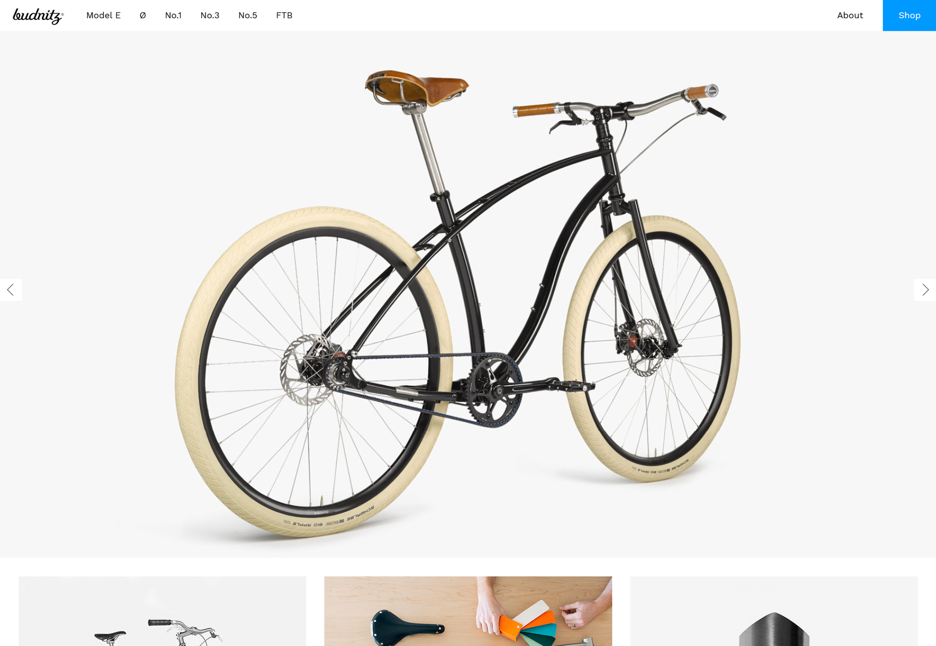
The Budnitz Bicycles website shows how the use of color can help create a visual hierarchy that draws users to a particular section of their web site. Here their shop button stands out and guides visitors.
6) Efficiency
Your user interface is how a user will get to where they want to go and do what they want to do. A quality user interface allows users to perform tasks with speed and ease, in other words, it operates with efficiency. One of the best ways to improve the efficiency of your interface is through task analysis.
To perform a task analysis, consider the activities and tasks users are most likely to perform and then streamline the process to make each as quick and easy as possible for users. Consider carefully what functions it needs and what goals users are trying to achieve. Rather than just creating a list of where users can navigate, consider what your users are going to want to do and help facilitate those activities through your design.
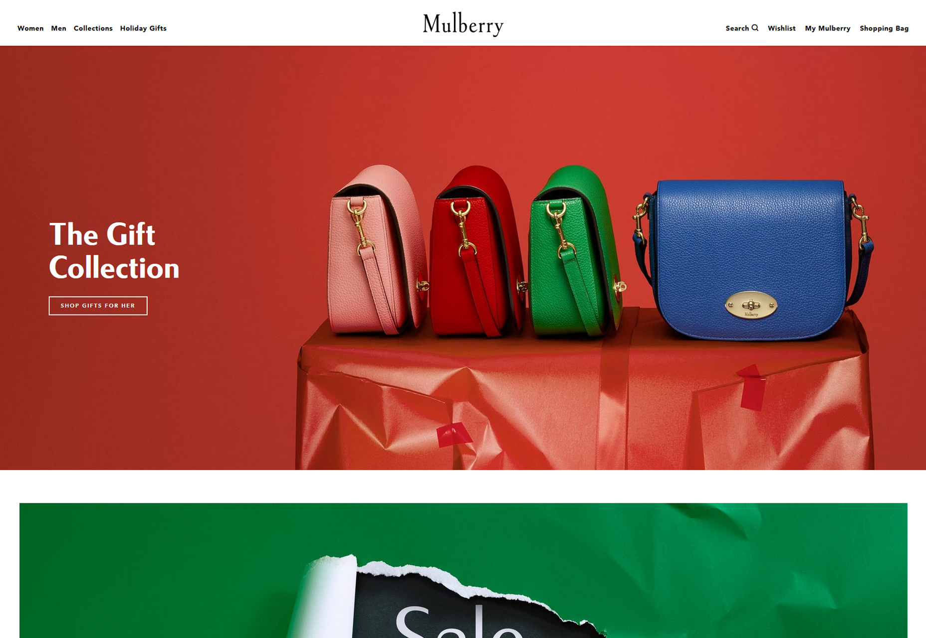
Mulberry provides an excellent example of this with their website over the holidays. Anticipating visitors looking for holiday gifts they allow users to shop for gifts without having to work to do so.
7) Responsiveness
When it comes to the responsiveness of an interface, you should consider a couple different forms of responsiveness. To begin with, a responsive interface is fast. You want your interface, and the system behind it, to work fast. Users easily become frustrated having to wait for a web site to load for instance.
In fact, these days if your web site hasn’t loaded in three seconds you will start losing visitors quickly as they just start hitting the back arrow on their browser. According to Kissmetrics, 40% of people will abandon a website that takes more than 3 seconds to load and as more time passes even more users will hit the back arrow. Mobile apps and web sites that load and operate quickly improve the user experience.
Additionally, when you think about responsiveness you should also think about your interface responding to users. Your user interface should provide feedback to the users. Let your users know what is happening and that their effort to engage with the interface has been understood. For instance, create a response to let them know they have pushed a button successfully or create a progress bar to let users know the next screen is loading so they don’t assume it is stuck. These types of feedback improve the user experience and reduce errors.


