- Enabling users to find information
- Enabling users to read that information
- Enabling users to understand where to click and where the destination is
A lack of clarity
One of the most stubborn errors designers continue to make on websites is not sympathizing with the need of users to clearly and easily understand what the site or its elements is about. The study identified these mistakes surrounding a lack of clarity:- Unexpected locations for content
- Competing links and categories
- Hidden fees and prices

UX problems
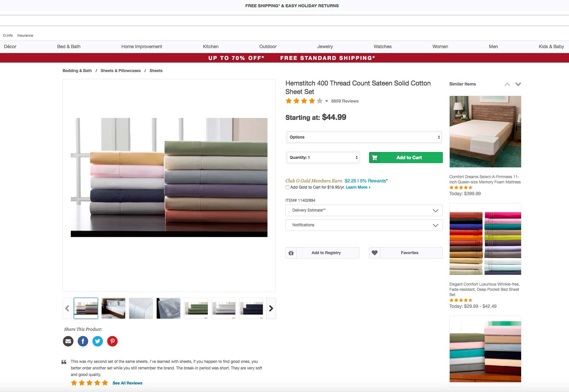
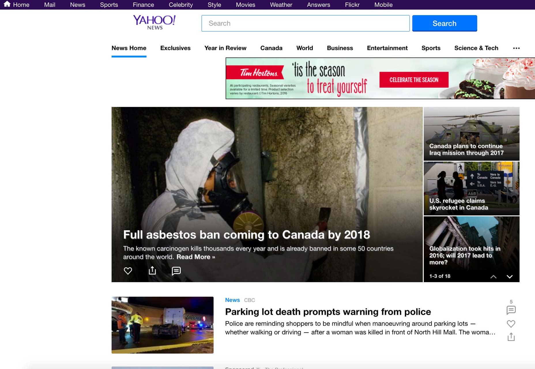
How easy your site visitors find that it is to actually use your site is integral to whether or not your site has good UX or not. The NN Group’s study found these UX-related design mistakes that just won’t go away:- Islands of information
- Link repetition
- Stranding users on microsites
- Inadequate search results
- Flawed filters and facets
 On the issue of search, unfortunately, a lot of sites still either fail to search the entire site for search terms or return results that fail to even match users’ search terms in the first place.
And while filters and facets (essentially filters for various attributes of objects in a set of content) are well-intentioned, they’re much of the time either tagged incorrectly or are insufficient, thereby creating confusion.
Information architecture foul-ups
Information architecture should, in many ways, be the heart and soul of good design. Essentially, it’s what helps users understand your site environment and content quickly, so they find what they want. It involves labeling, organizing and structuring your content in the clearest way possible. The usability study again found stubborn, repeated mistakes designers still make in this area, just as they did 20 years ago. These include:- Overwhelming users with excessive information
- Presenting users with hidden links
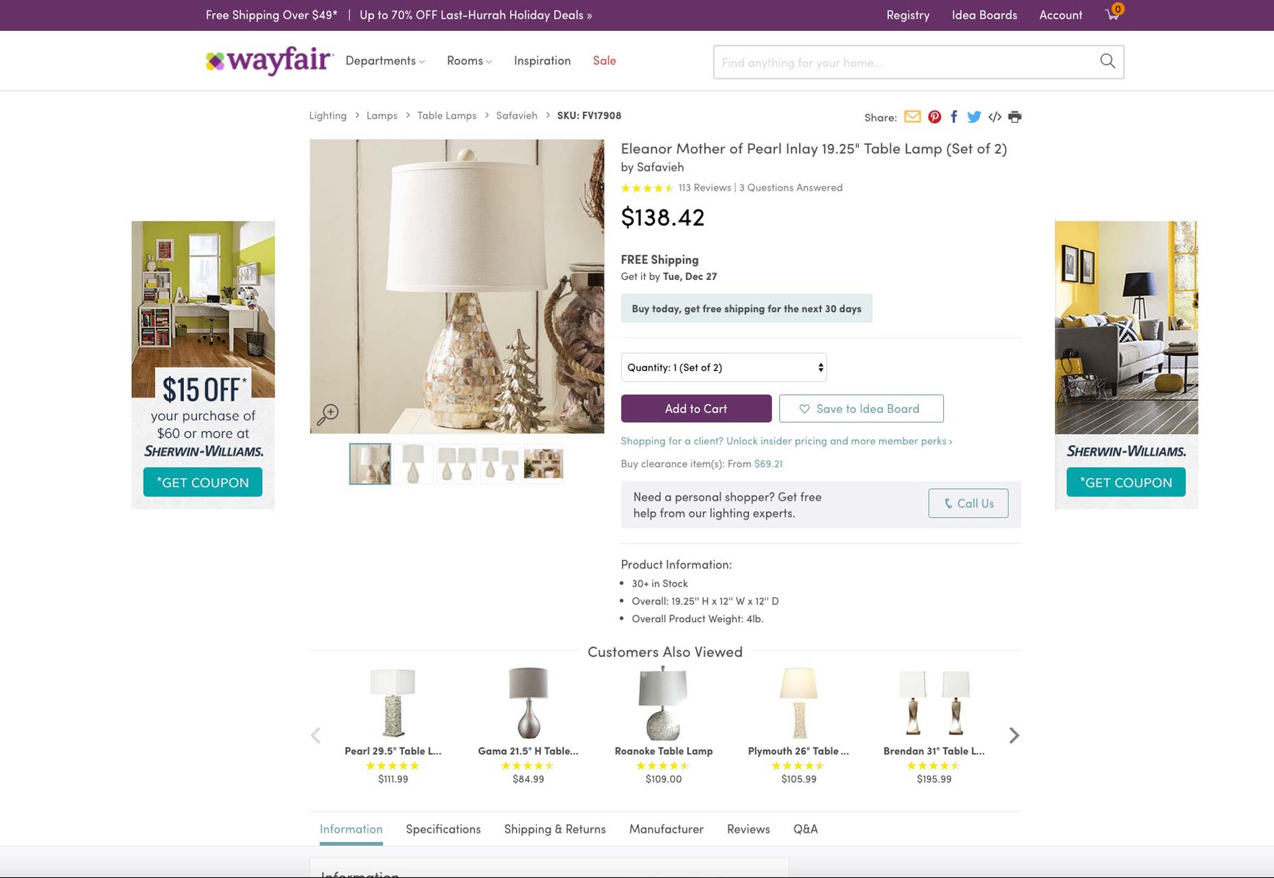
Wayfair.com is a case in point for how to present information to visitors. Note how its content is easily digestible, as it’s efficiently broken up.
 On the problem of hidden links, you’d be surprised at how many times designers hide links to relevant site content—for example, the menu of a restaurant—in the same column as ads leading to external links. The long and short of it is that most users won’t be able to find such relevant links amidst all the ads, which makes considering the placement of relevant links extremely vital to design.
Will it get better soon?
Part of the problem is that many designers just aren’t usability experts, but that’s no excuse. When you’re designing, you have to be obsessed with providing your users with a superb UX. Otherwise, your site’s usability, conversions, on-page time, and sales simply drop—and no client will tolerate that. It will be interesting to see if, in another 20 years, we still see studies like these, talking about how design errors from decades ago are still haunting our web-design community.Marc Schenker
Marc’s a copywriter who covers design news for Web Designer Depot. Find out more about him at thegloriouscompanyltd.com.
Read Next
3 Essential Design Trends, November 2024
Touchable texture, distinct grids, and two-column designs are some of the most trending website design elements of…
20 Best New Websites, October 2024
Something we’re seeing more and more of is the ‘customizable’ site. Most often, this means a button to swap between…
Exciting New Tools for Designers, October 2024
We’ve got goodies for designers, developers, SEO-ers, content managers, and those of you who wear multiple hats. And,…
15 Best New Fonts, September 2024
Welcome to our roundup of the best new fonts we’ve found on the web in the previous four weeks. In this month’s edition…
By Simon Sterne
3 Essential Design Trends, October 2024
This article is brought to you by Constantino, a renowned company offering premium and affordable website design
You…
A Beginner’s Guide to Using BlueSky for Business Success
In today’s fast-paced digital world, businesses are always on the lookout for new ways to connect with their audience.…
By Louise North
The Importance of Title Tags: Tips and Tricks to Optimize for SEO
When it comes to on-page SEO, there’s one element that plays a pivotal role in both search engine rankings and user…
By Simon Sterne
20 Best New Websites, September 2024
We have a mixed bag for you with both minimalist and maximalist designs, and single pagers alongside much bigger, but…
Exciting New Tools for Designers, September 2024
This time around we are aiming to simplify life, with some light and fast analytics, an all-in-one productivity…
3 Essential Design Trends, September 2024
September's web design trends have a fun, fall feeling ... and we love it. See what's trending in website design this…
Crafting Personalized Experiences with AI
Picture this: You open Netflix, and it’s like the platform just knows what you’re in the mood for. Or maybe you’re…
By Simon Sterne
15 Best New Fonts, August 2024
Welcome to August’s roundup of the best fonts we’ve found over the last few weeks. 2024’s trend for flowing curves and…
By Ben Moss


