50 creative card UI designs

Paddi Macdonnell.
January 19, 2017
50 creative card UI designs.
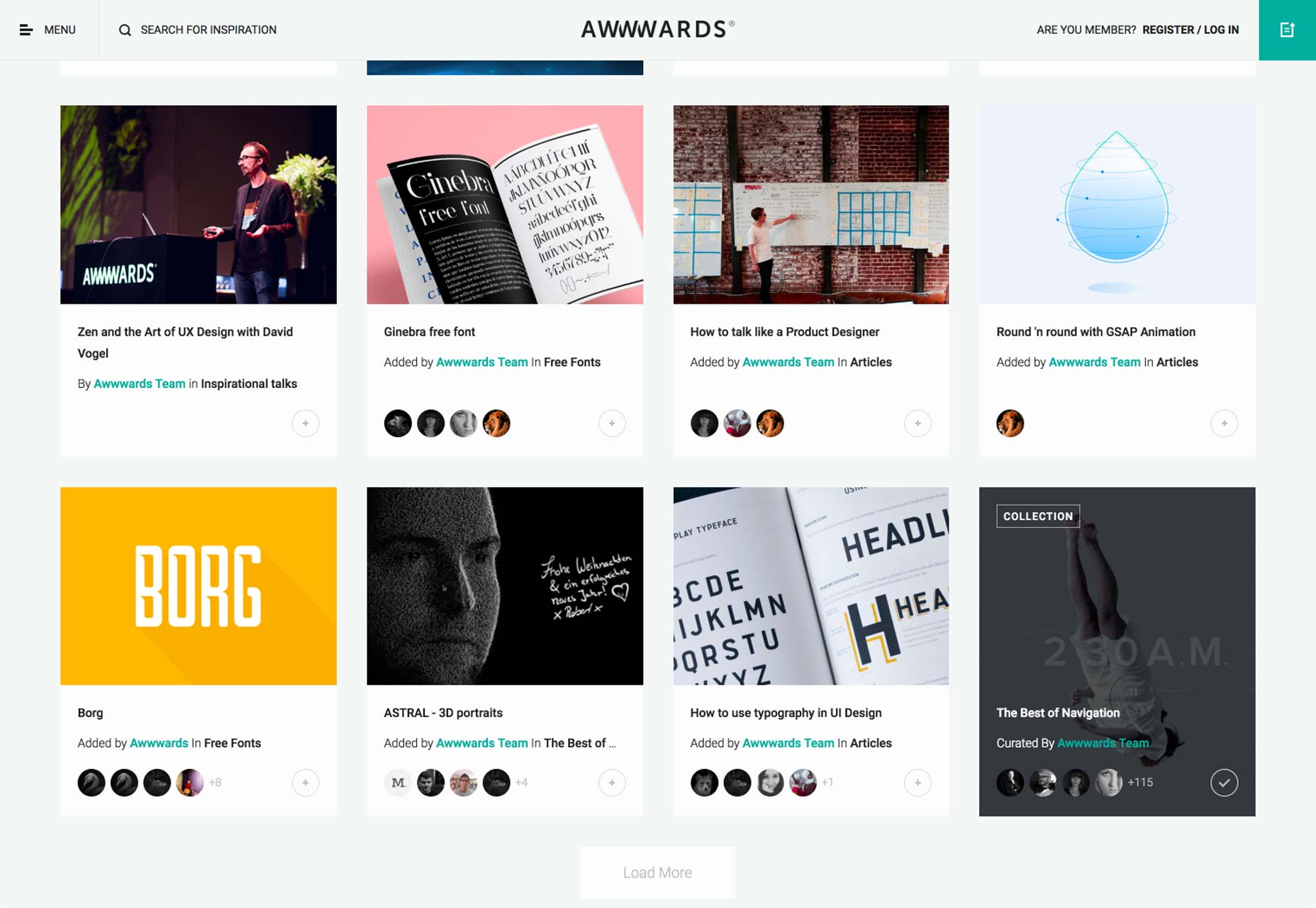
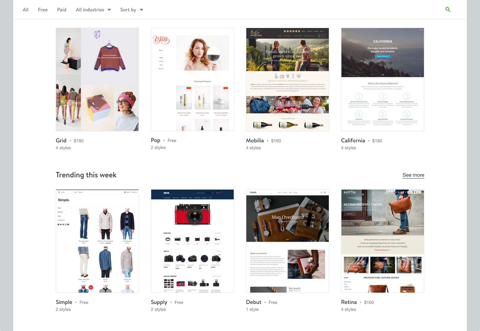
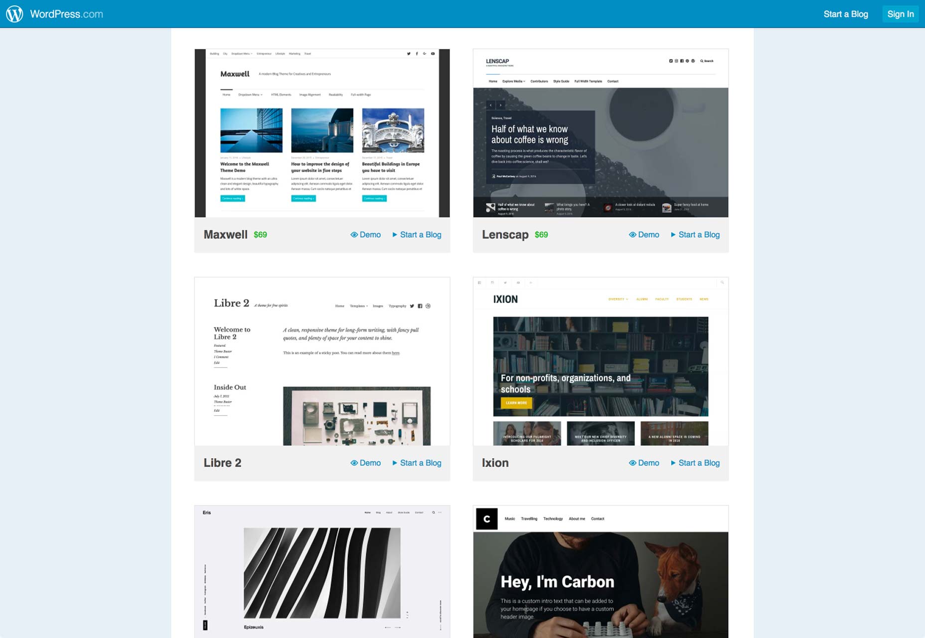
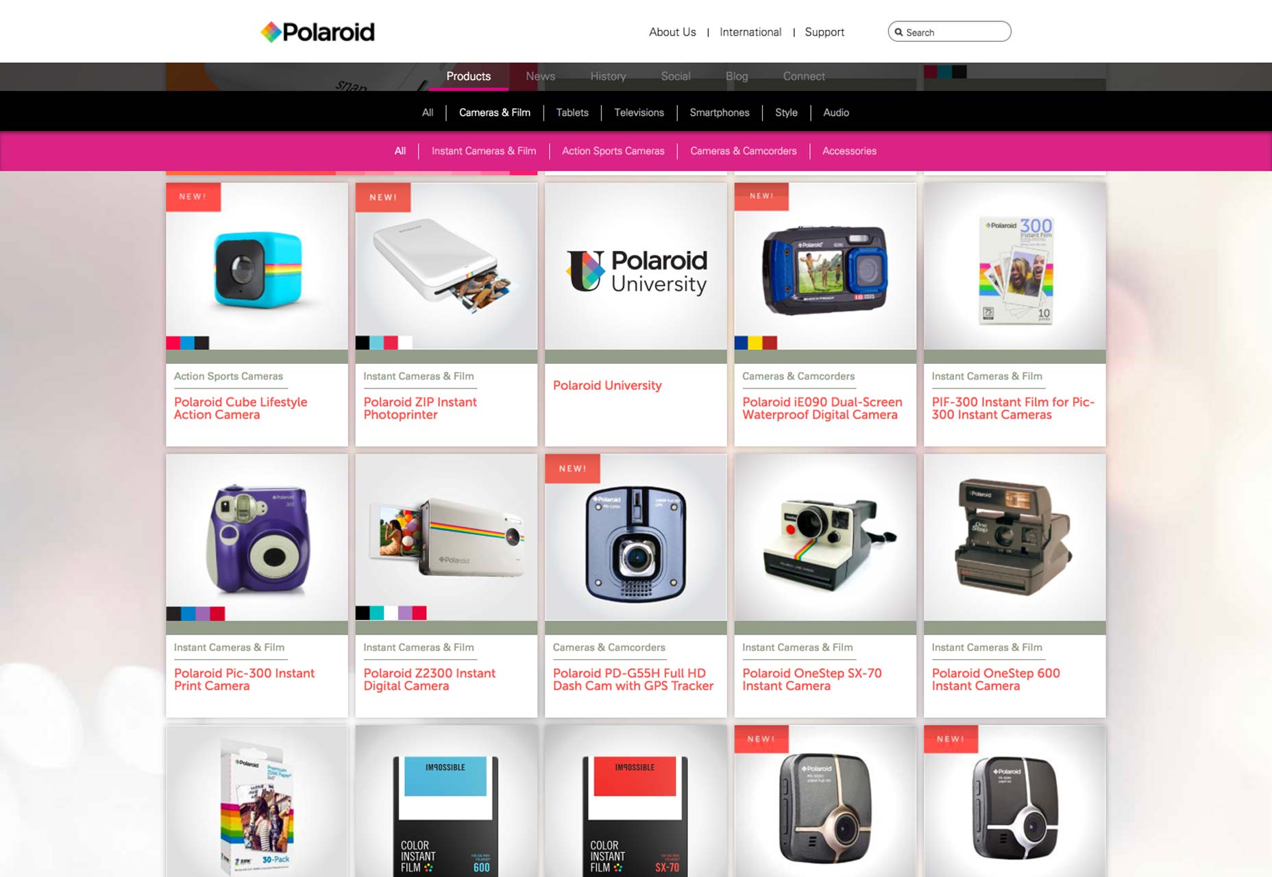
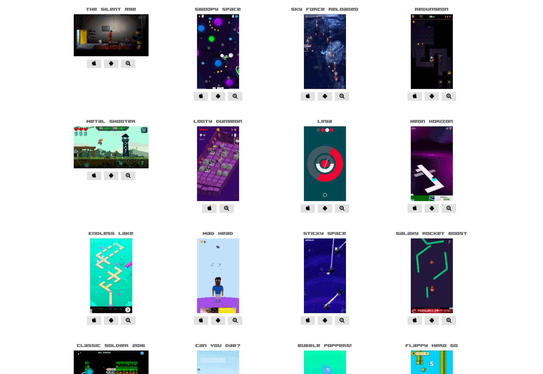
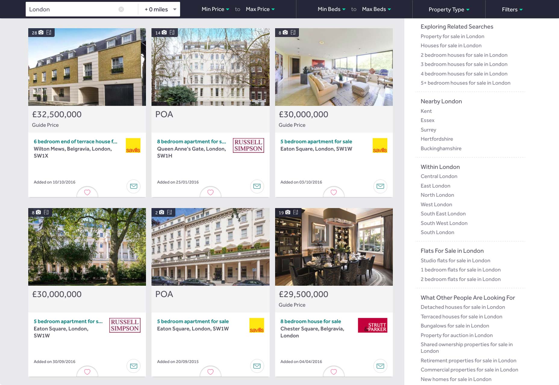
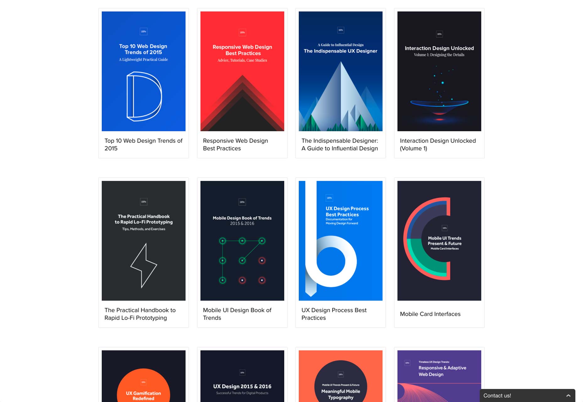
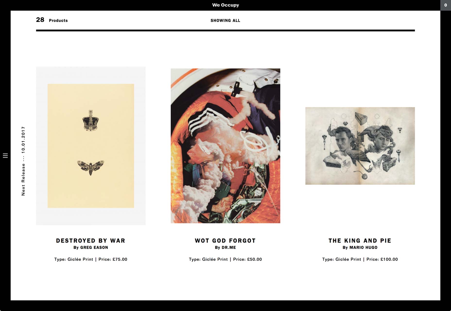
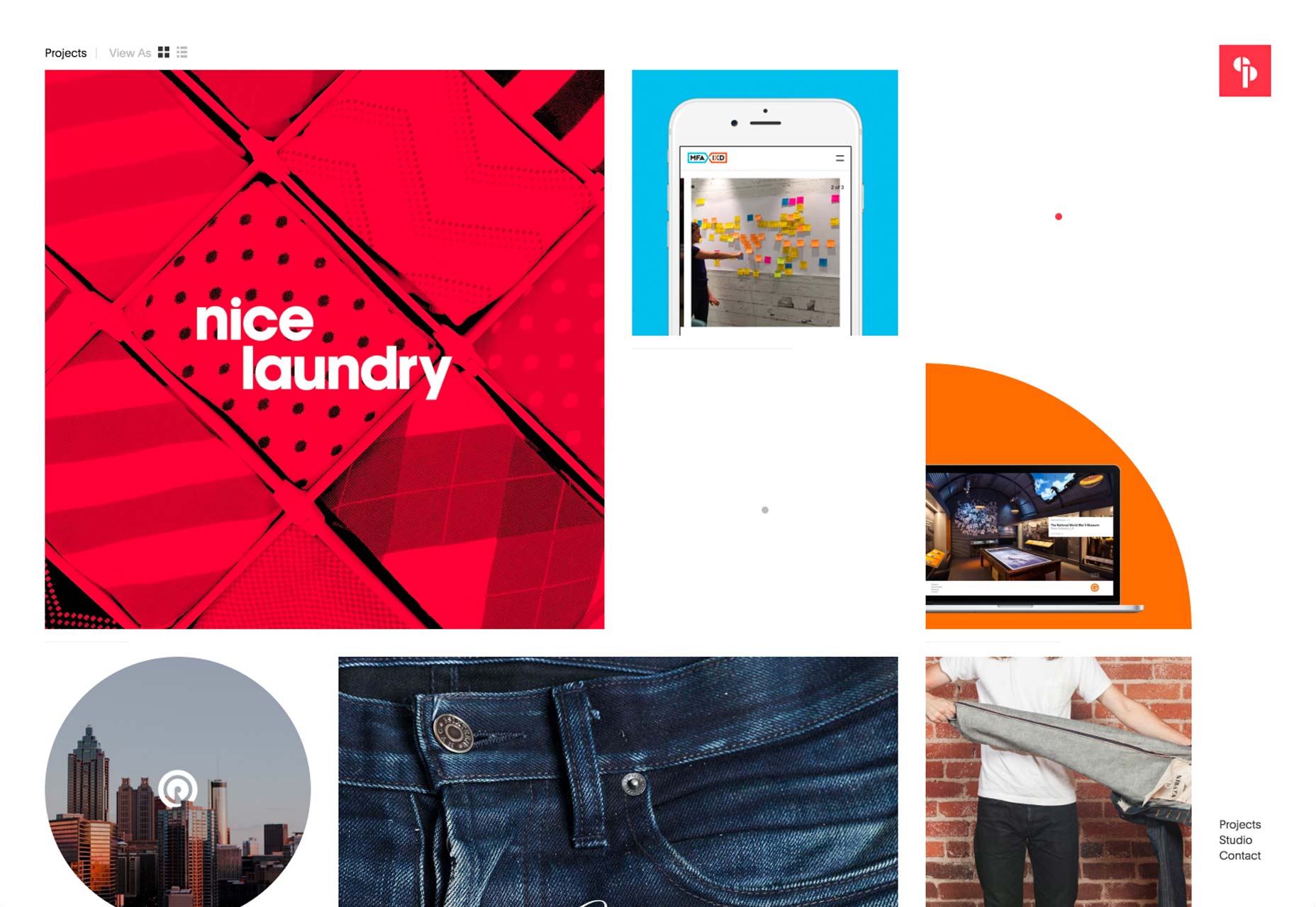
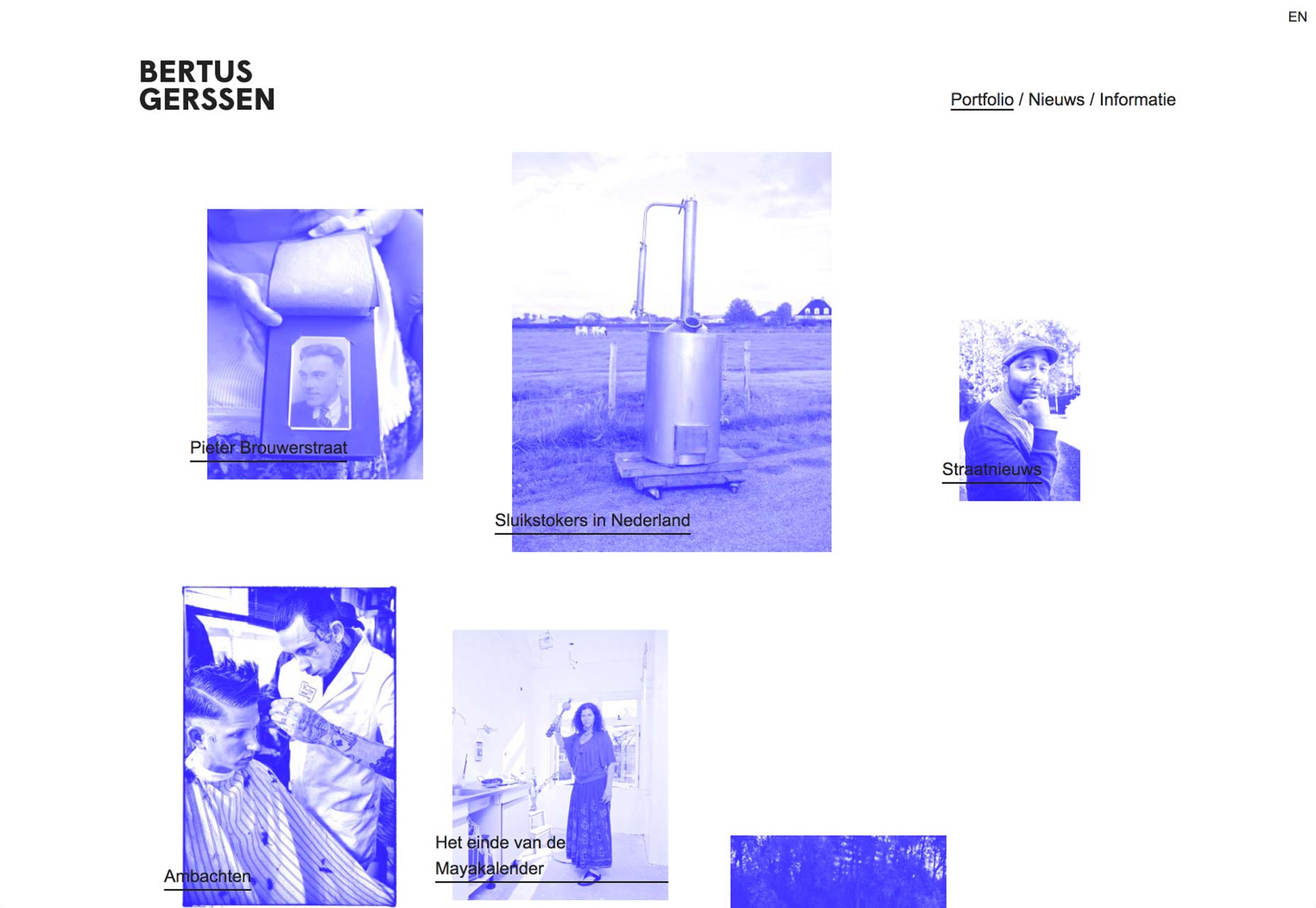
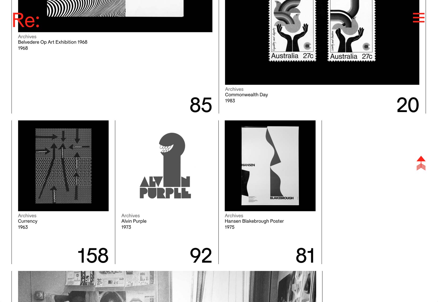
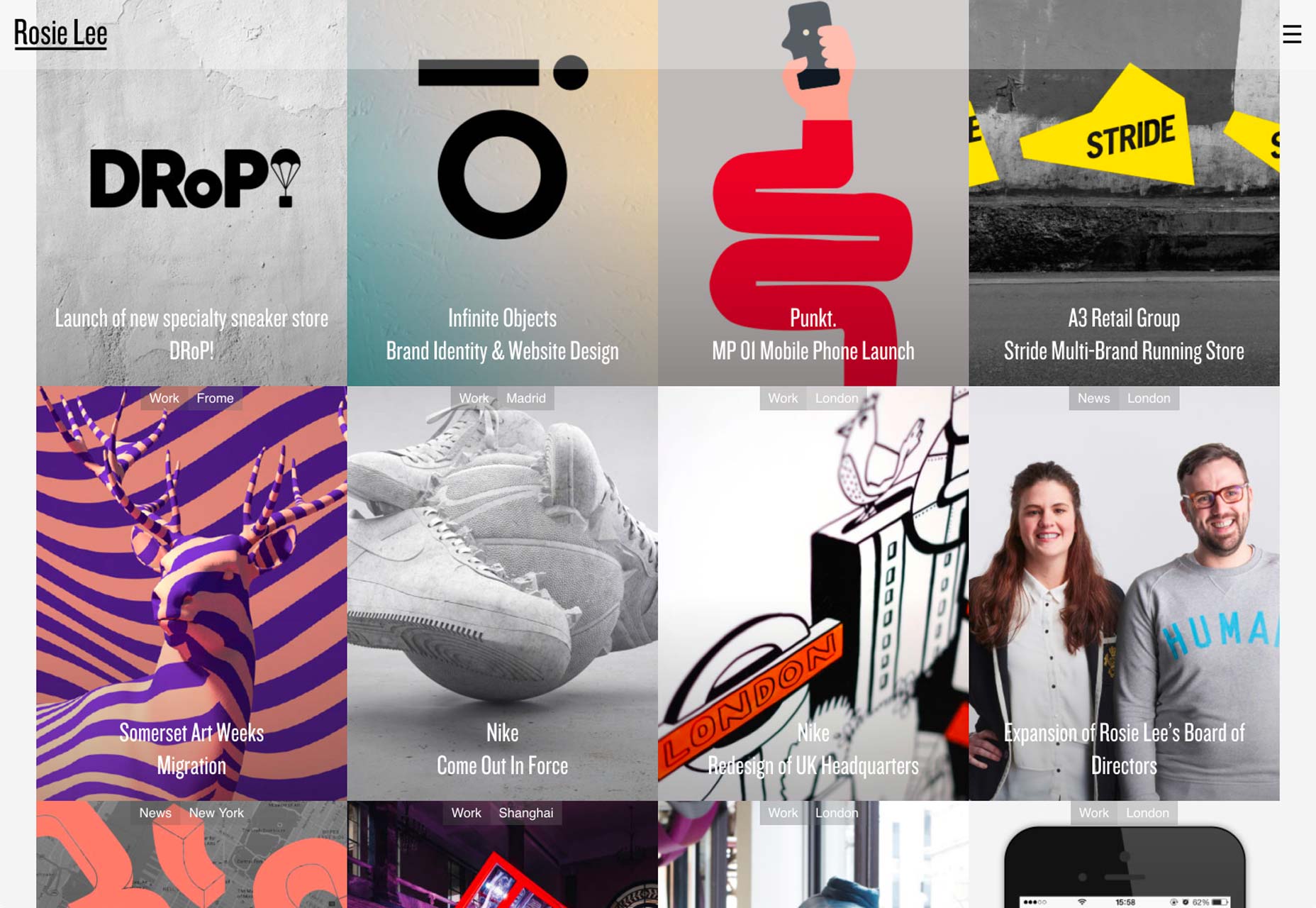
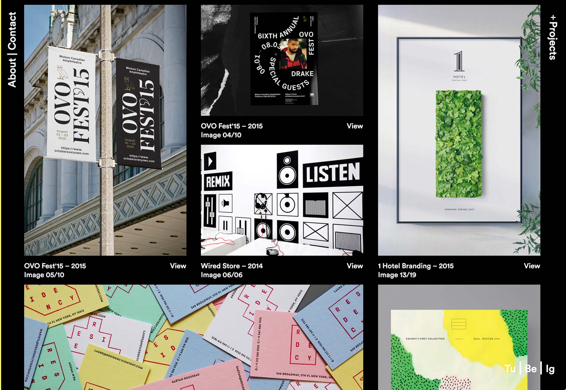
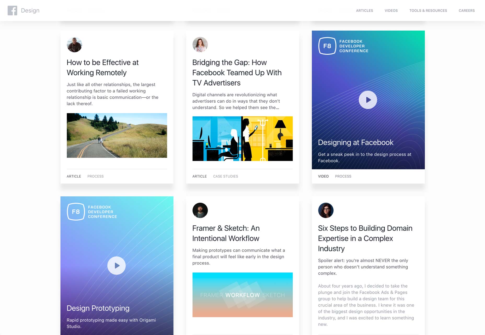
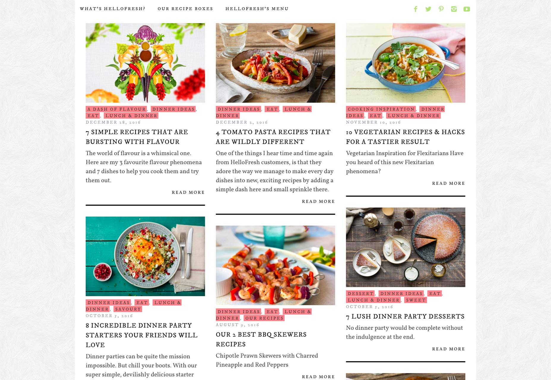
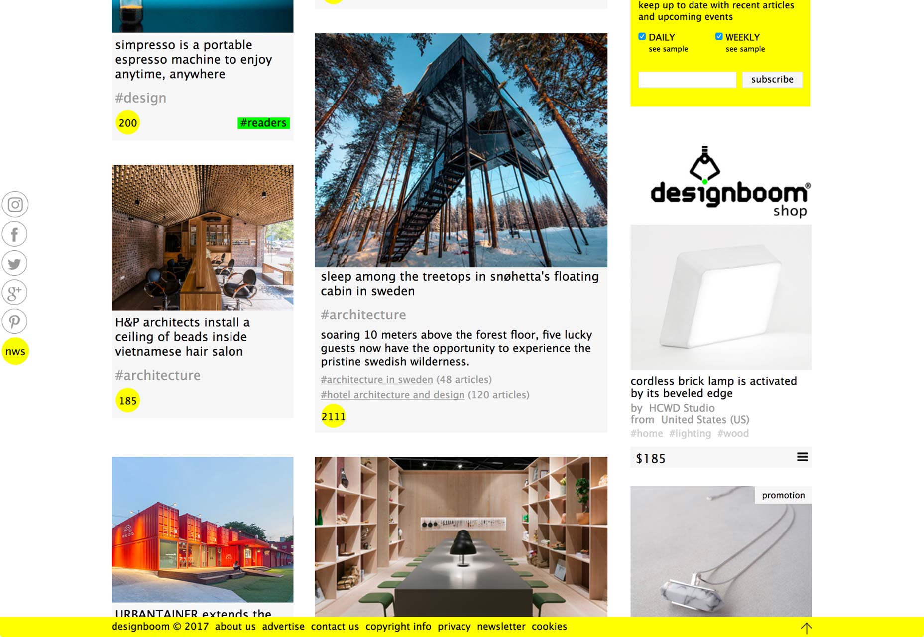
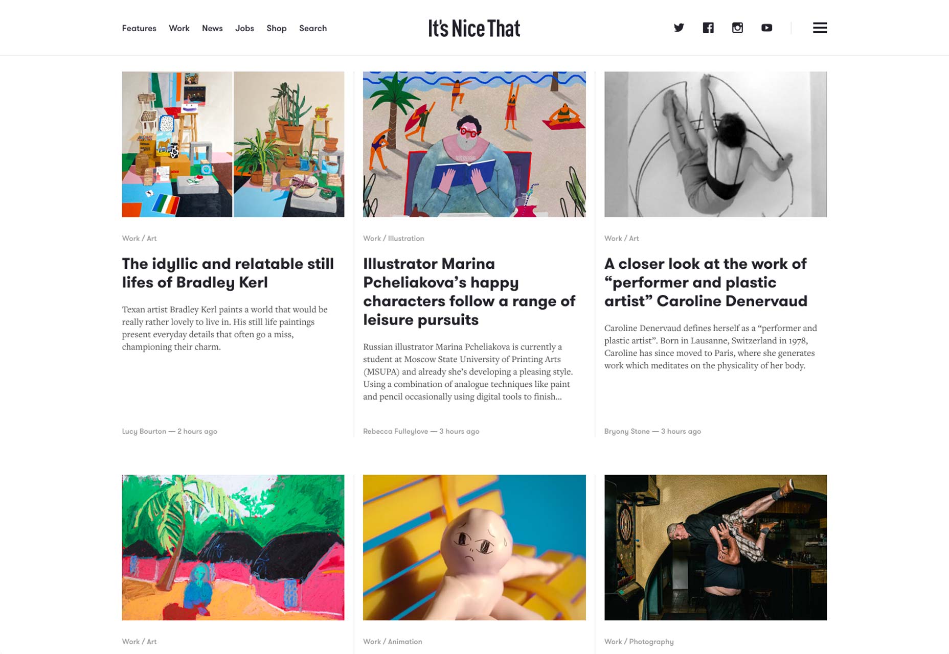
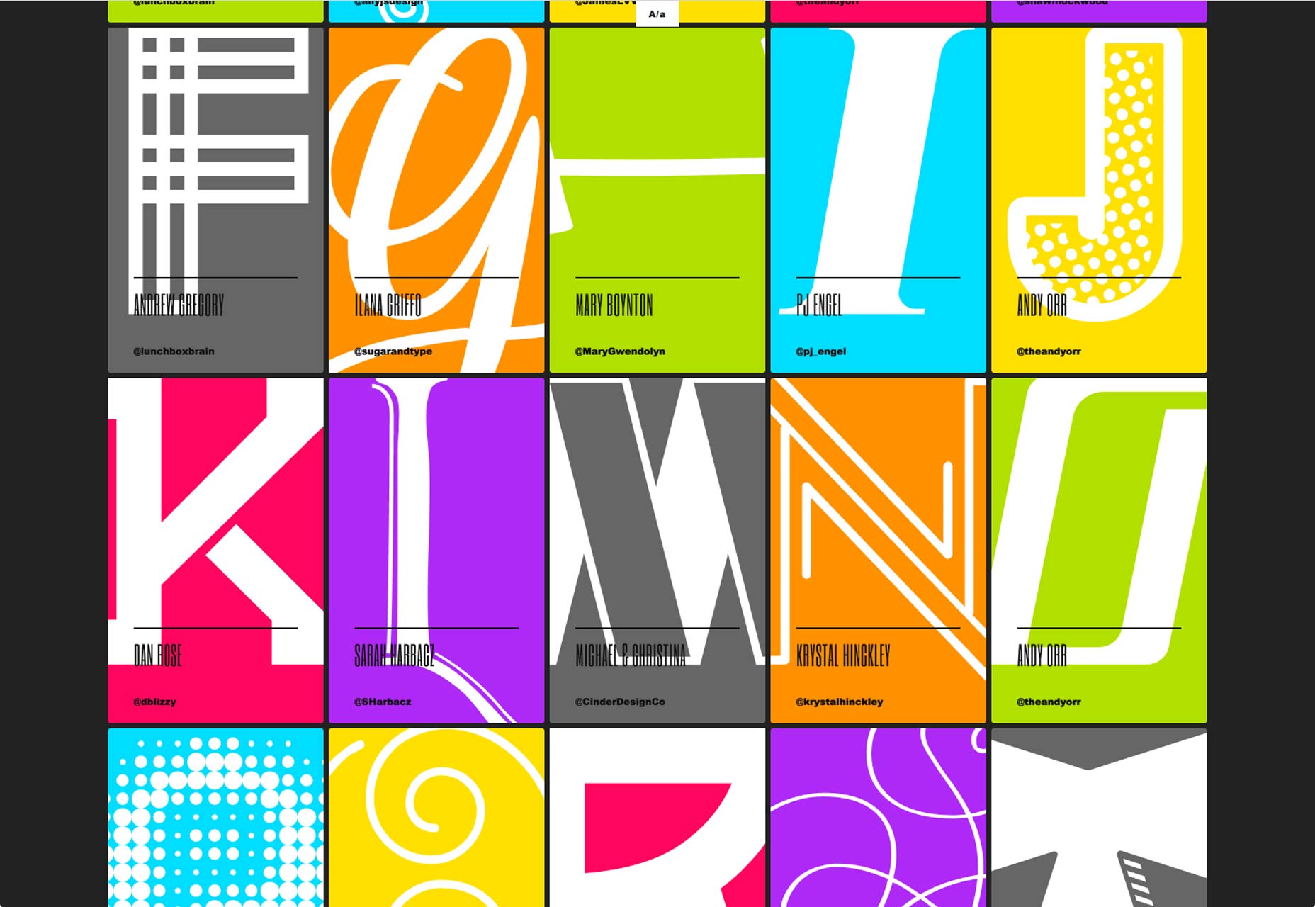
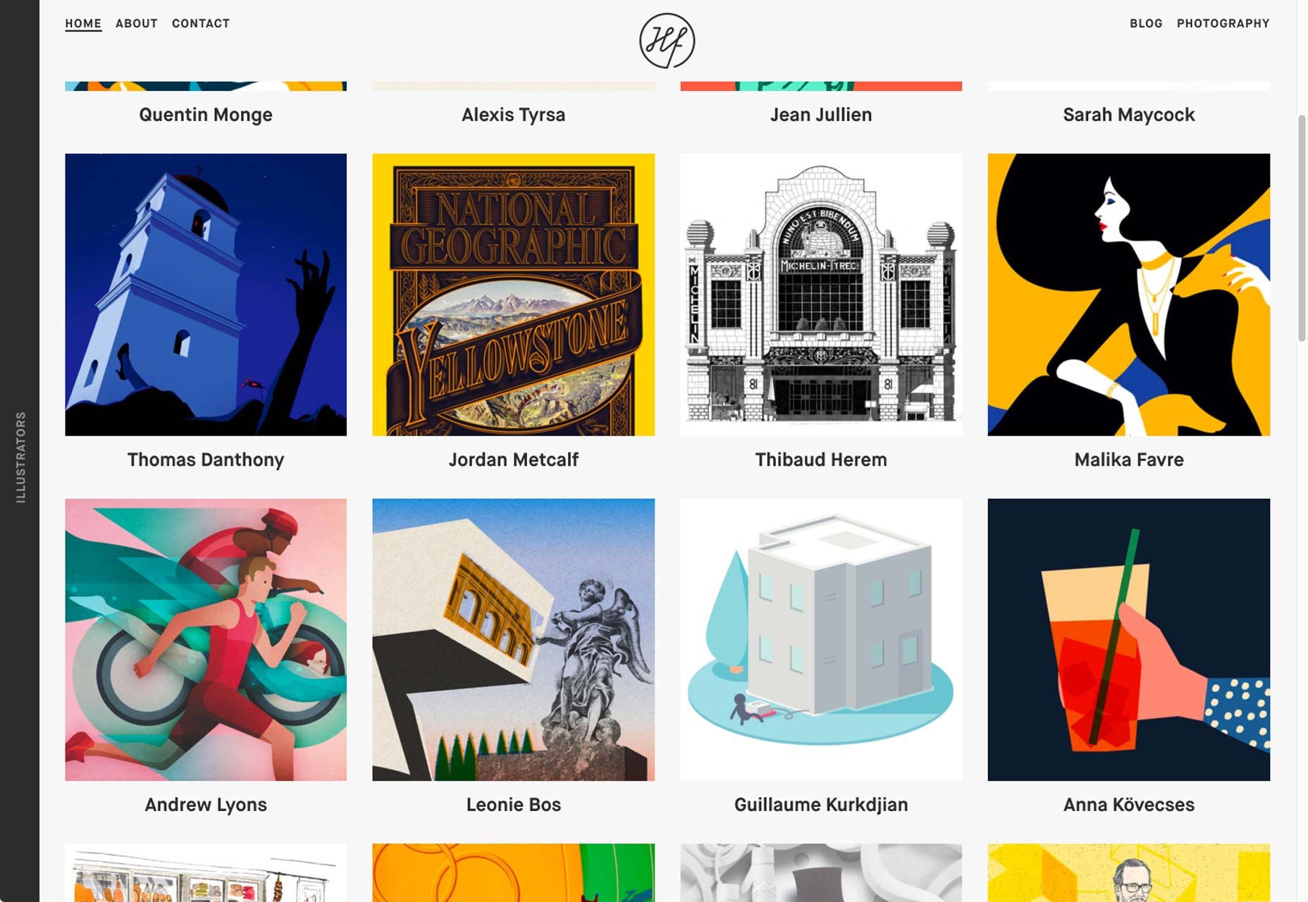
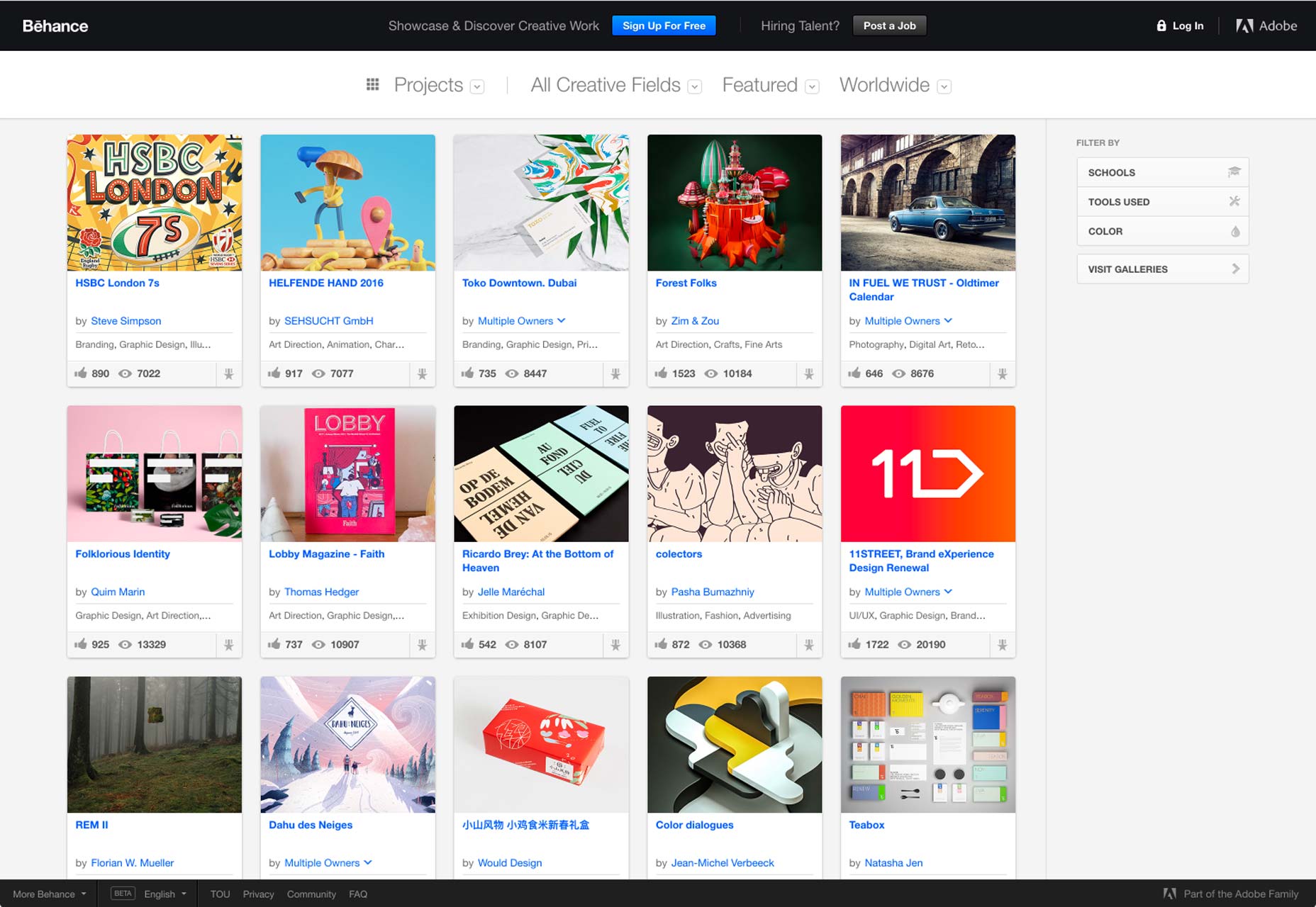
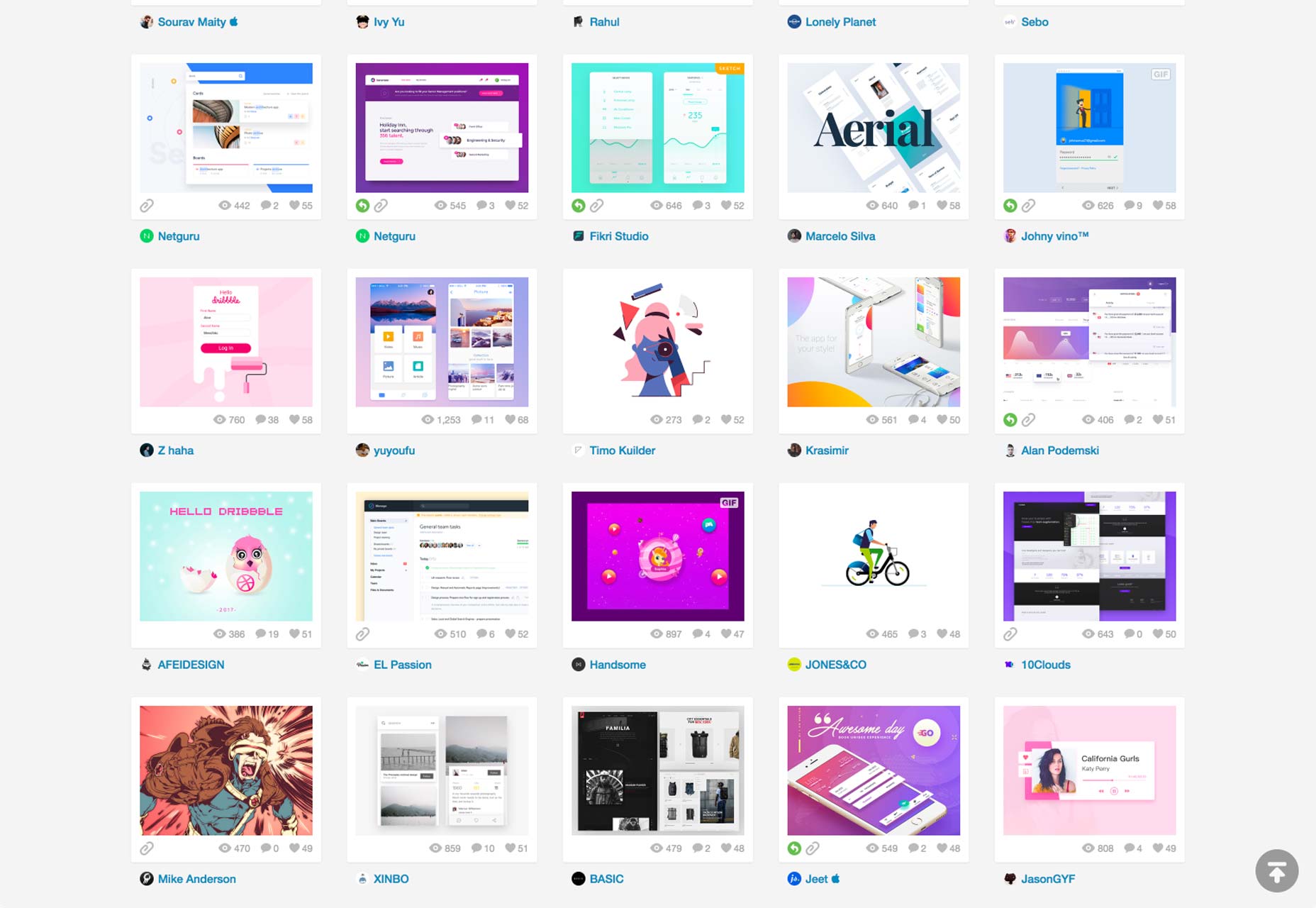
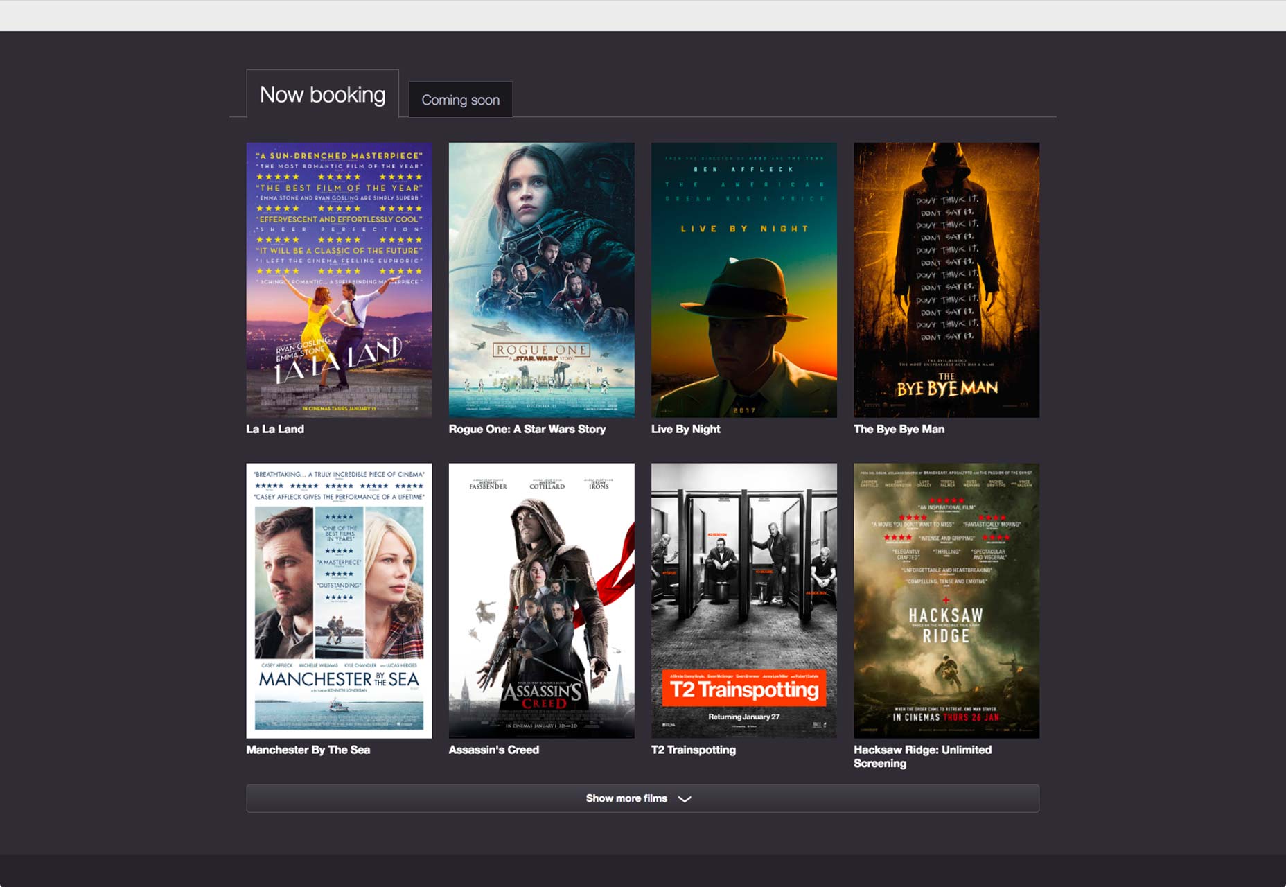
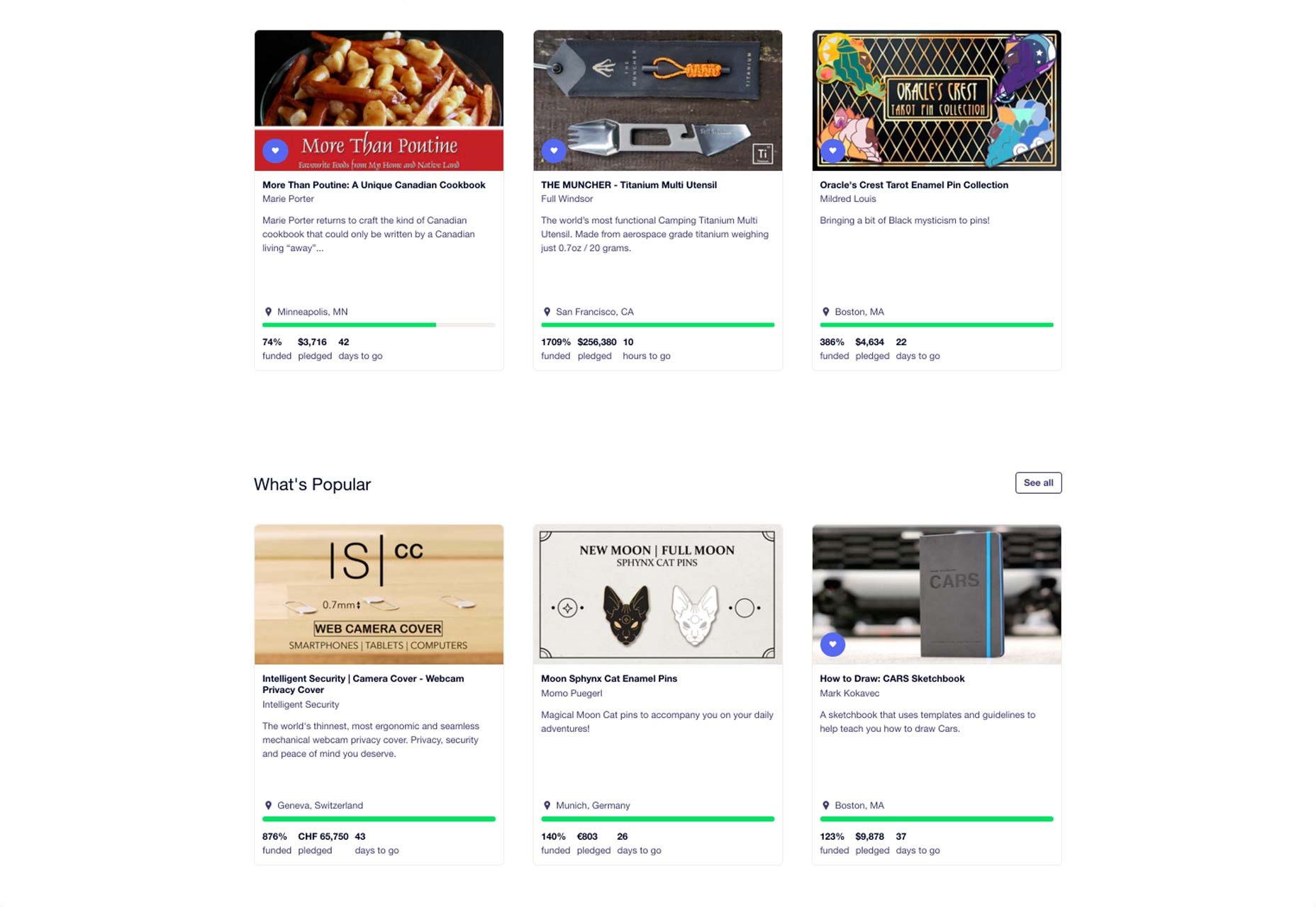
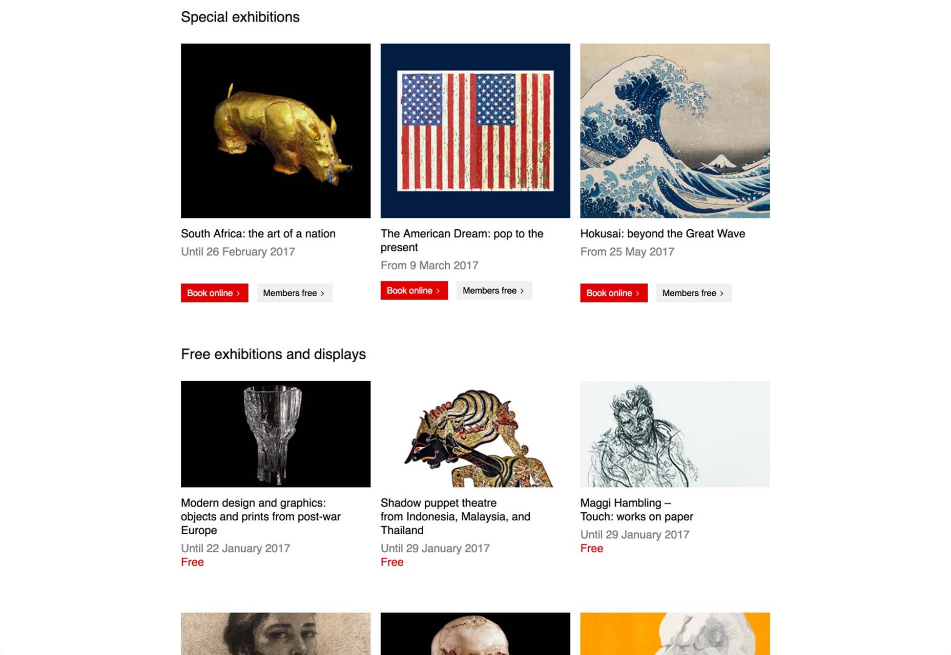
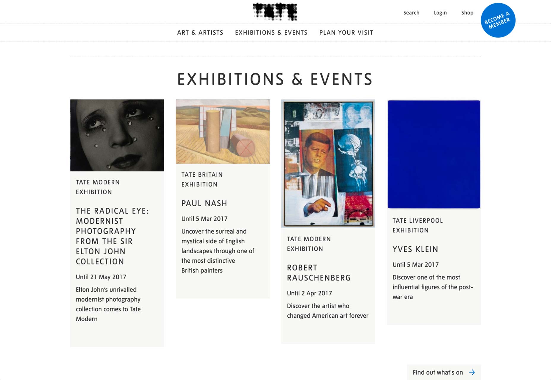
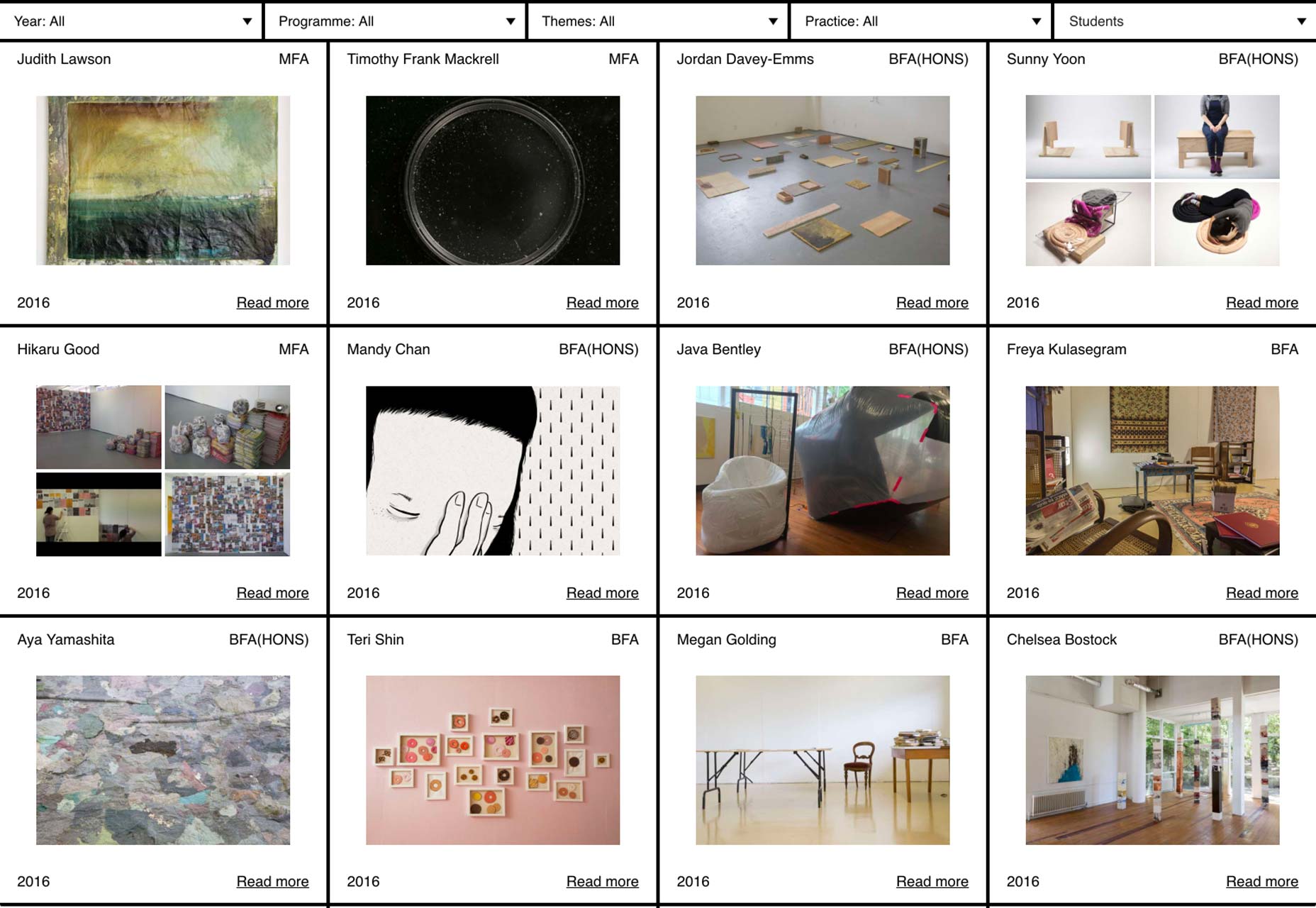
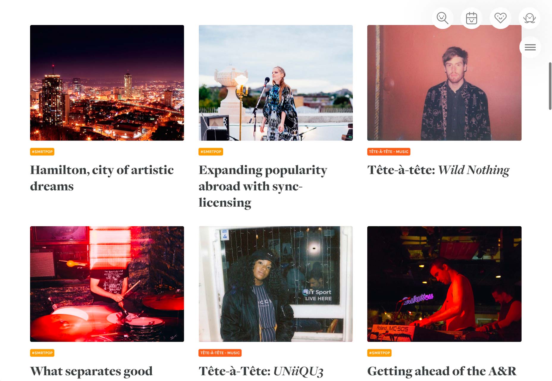
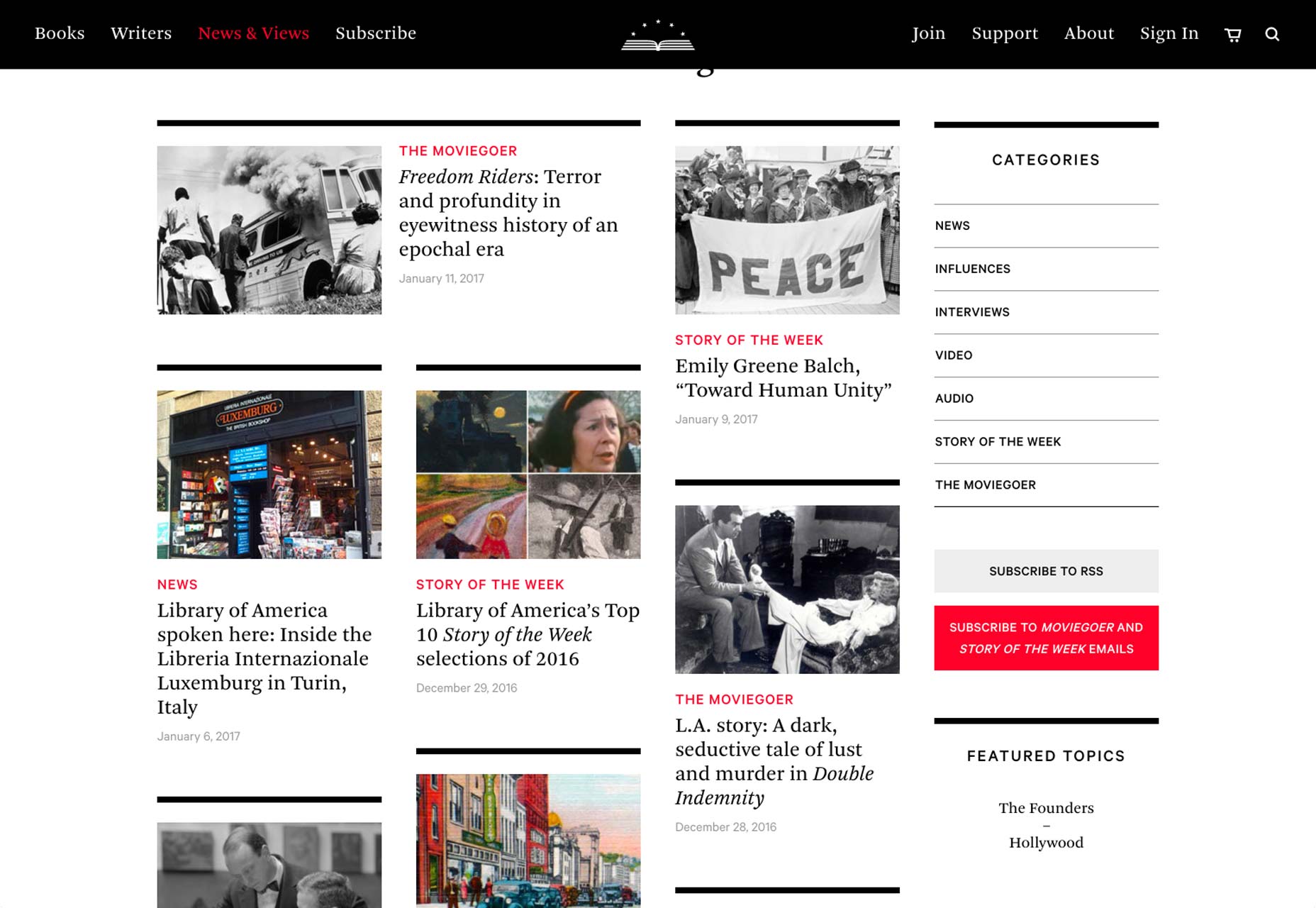
When I was a kid I was desperate for a Polaroid camera: to be able to take a photo and see it—almost—right away was fantastic to me. With ‘normal’ cameras, you had to wait until you finished the whole film, then you had to take it to get developed, and that could take a week. So, quite often, by the time you got to see your photos, the connection to them was a little more distant. With polaroids, it was there and then. Not only that, the format of the classic polaroid included the white frame with the space at the bottom where you could write something: the date, where it was, who you were with, what you were doing—whatever you wanted to say about the picture or the moment. [pullquote]the classic polaroid included the white frame with the space at the bottom where you could write something…Sound familiar?[/pullquote] Sound familiar? So much of social media takes it’s visual cue from the classic polaroid—80 years old this year. The influence can be seen in Facebook posts, Instagram, Twitter, and, of course, Pinterest. This in turn has had a knock on effect on website design generally. It is an interface style that users have become comfortable with through social media. It is based on a grid, but the items, or cards, are compartmentalized in such a way that they feel like separate entities. (Rather like a bunch of polaroids pinned on a wall.) Card layout is an integral part of material design. The separation is often achieved by using shadows, which gives the illusion of depth, or a slight color difference. It is a popular choice for news websites, magazine sites and blogs, all of which are presenting the user with ‘snapshots’ of stories that they may then choose to click on to read more. It is also popular for portfolios as it allows a lot of different content to be presented simultaneously, but clearly. As this card layout style has become more popular it has evolved as designers play around with it, finding ways to create card layouts that feel fresh and interesting. Some use asymmetry to great effect, some put lots of space between cards, others put none at all. Most card layouts use images, but there are a few that just use text, at least on some of the ‘cards’. Some have the image and text visible on the ‘front’, others display their text only on interaction. What is great to see is this functional, practical layout style being adapted and shaped by different creative approaches, so that it does not become stale.

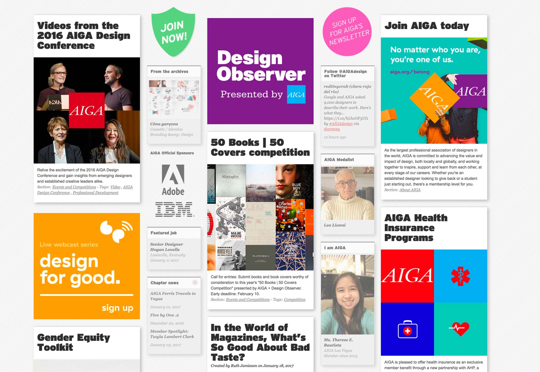
AIGA

aiga

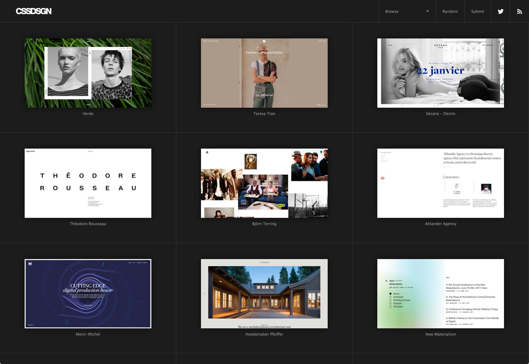
cssdsgn

cssdsgn

Awwwards

awwwards

Shopify Themes

shopifythemes

Wordpress.com Themes

wordpressthemes

Polaroid

polaroid

Casual start

casualstart

Rightmove

rightmove

UXPin

uxpin

We Occupy

weoccupy

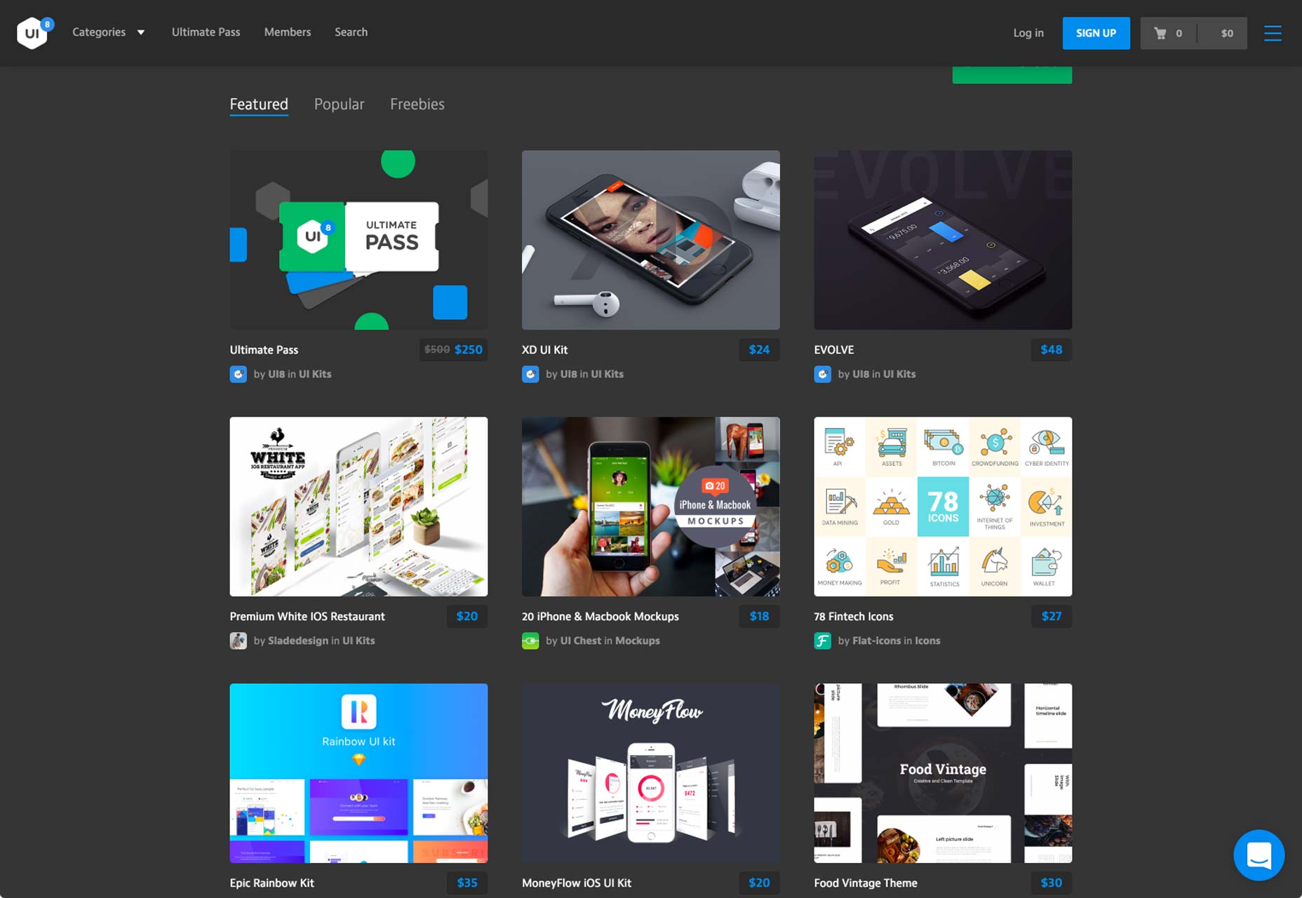
UI8

ui8

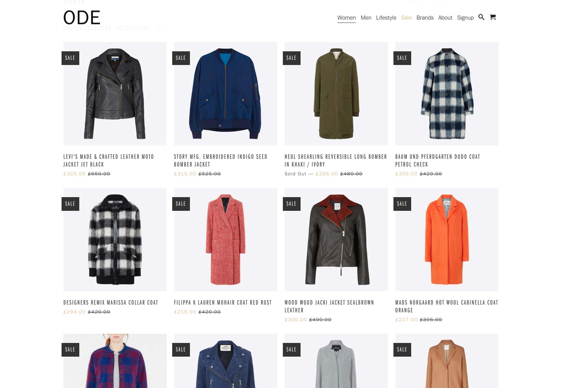
Our Daily Edit

ode

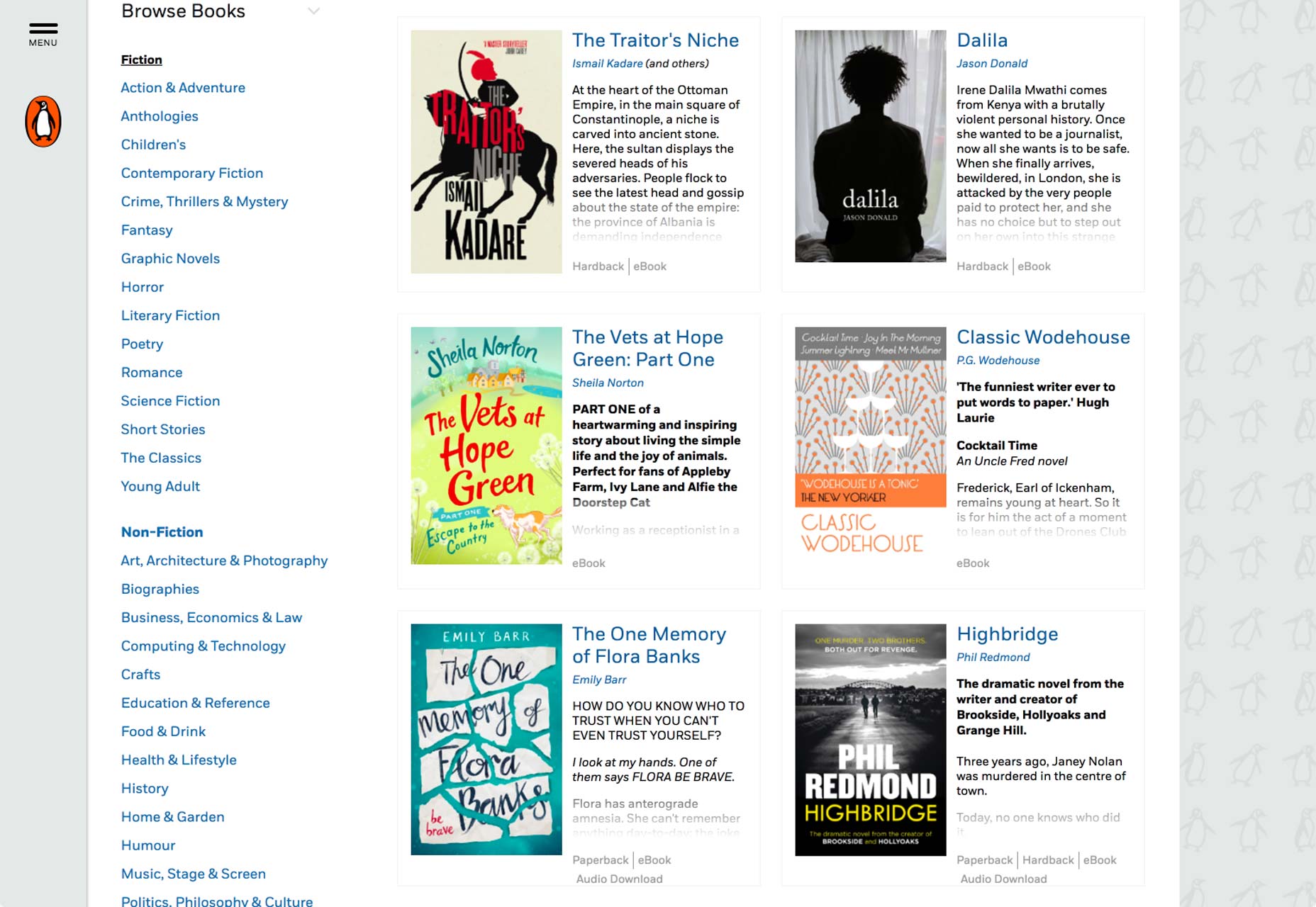
Penguin

penguin

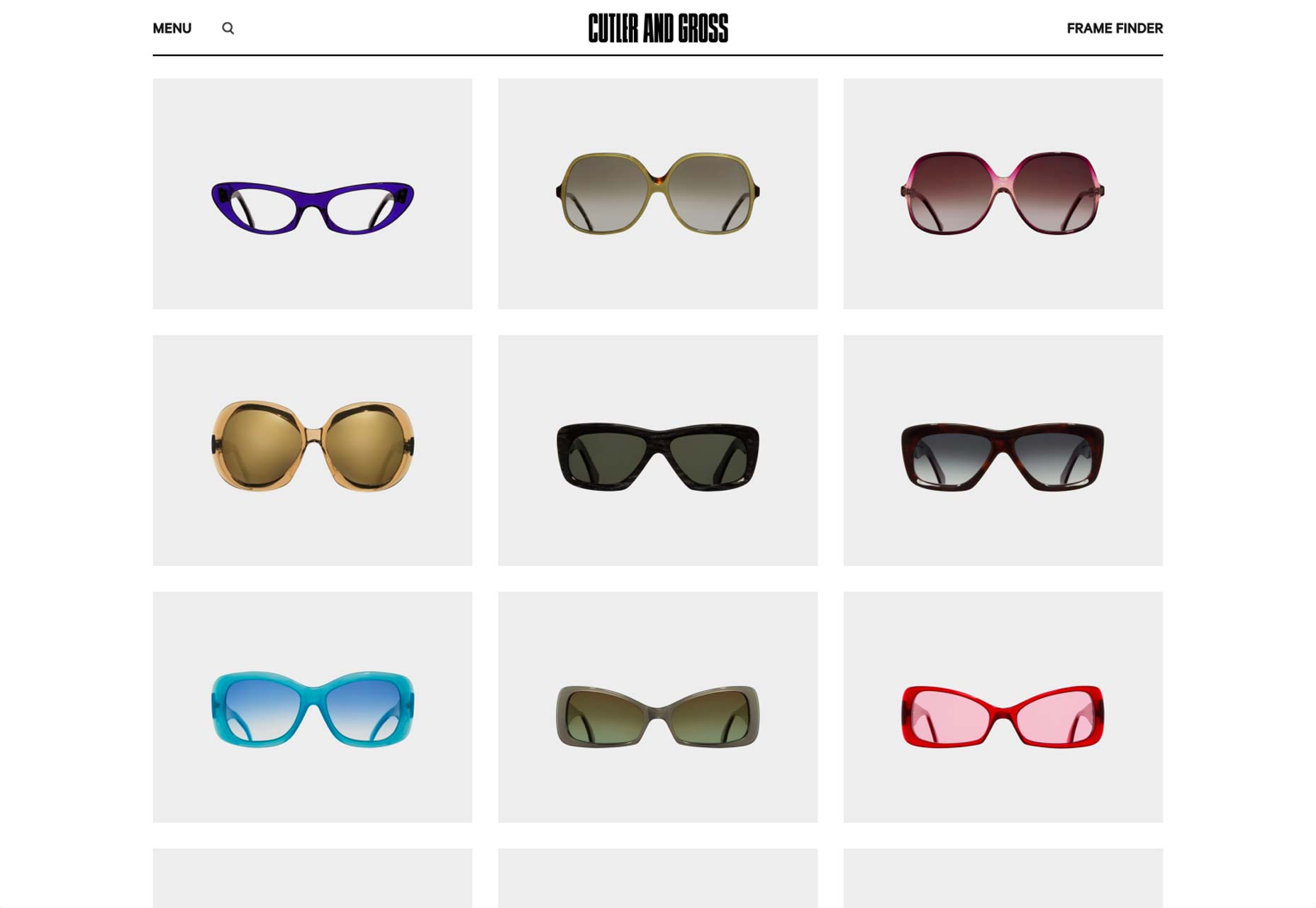
Cutler and Gross

cutlerandgross

Extended Play

extendedplay

Bertus Gerssen

bertusgerssen

Rogers Stirk Harbour and Partners
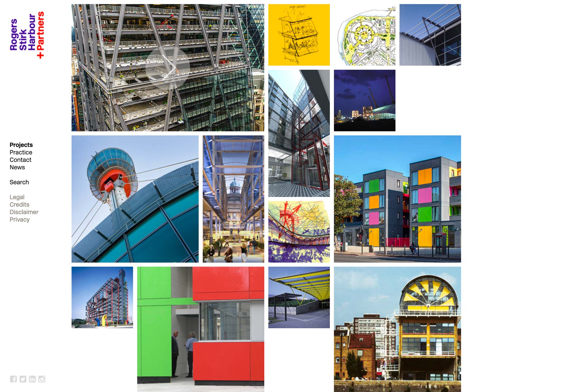
rsh-p

Re:collection

recollection

Rosie Lee

rosielee

Jules Tardy

julestardy

Facebook Design

facebookdesign

HelloFresh Blog

hellofresh

designboom

designboom

It’s Nice That

itsnicethat

Excelsiorama

excelsiorama

Handsome Frank

handsomefrank

Behance

behance

Dribbble

dribbble

The Vinyl Factory

vinylfactory

Cineworld

cineworld

Kickstarter

kickstarter

The British Museum

britishmuseum

The Tate

tate

Elam Artists

elamartists

POP Montreal

popmontreal

Library of America

loa

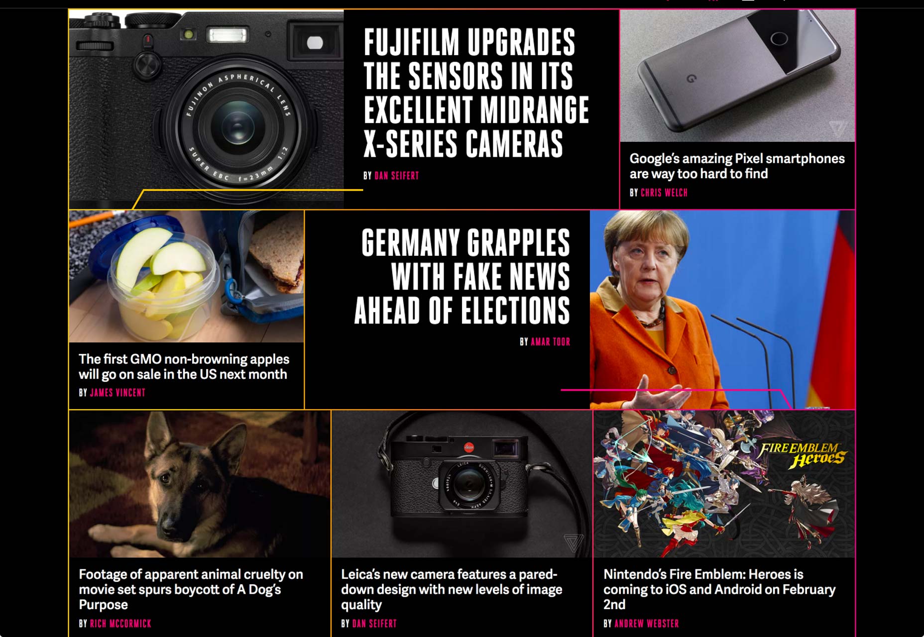
The Verge

verge

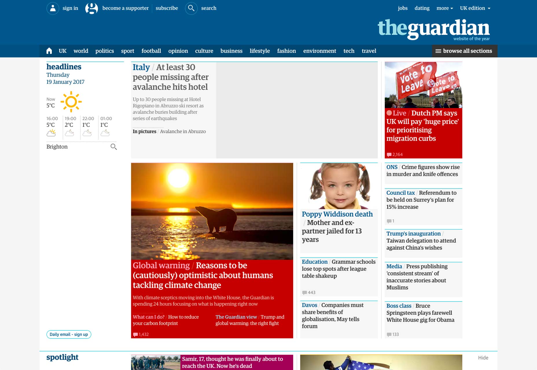
The Guardian

guardian

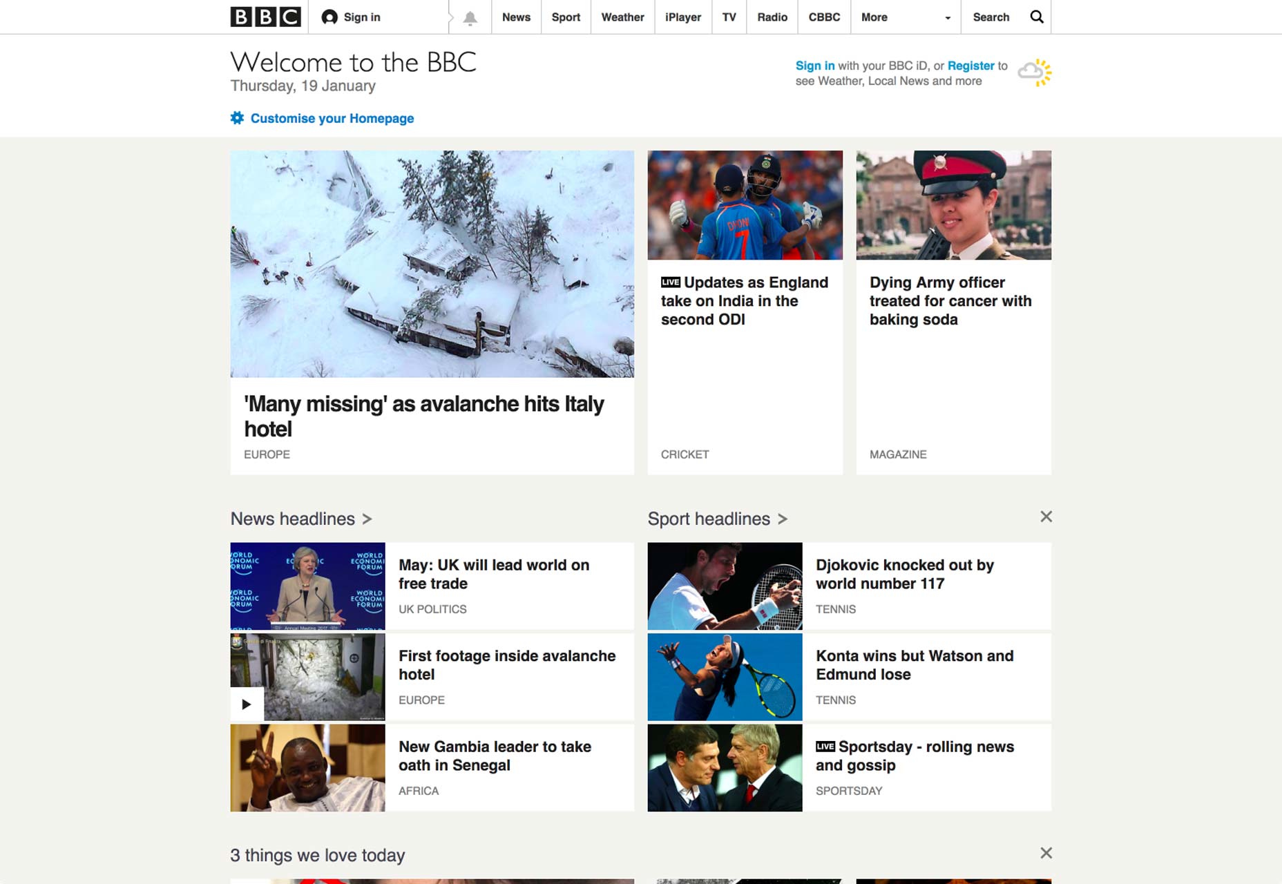
The BBC

bbc

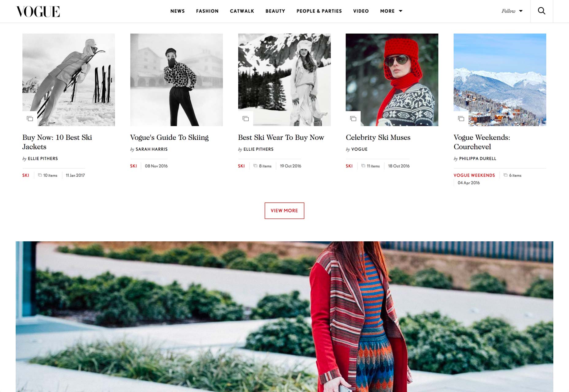
Vogue

vogue

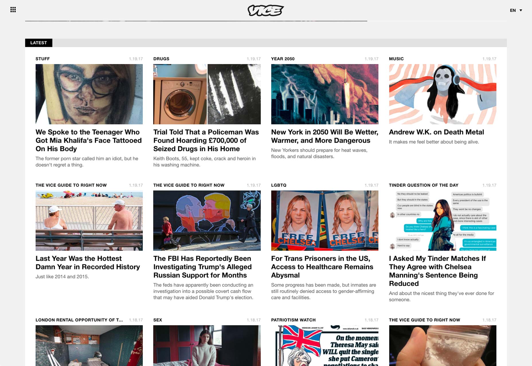
Vice

vice

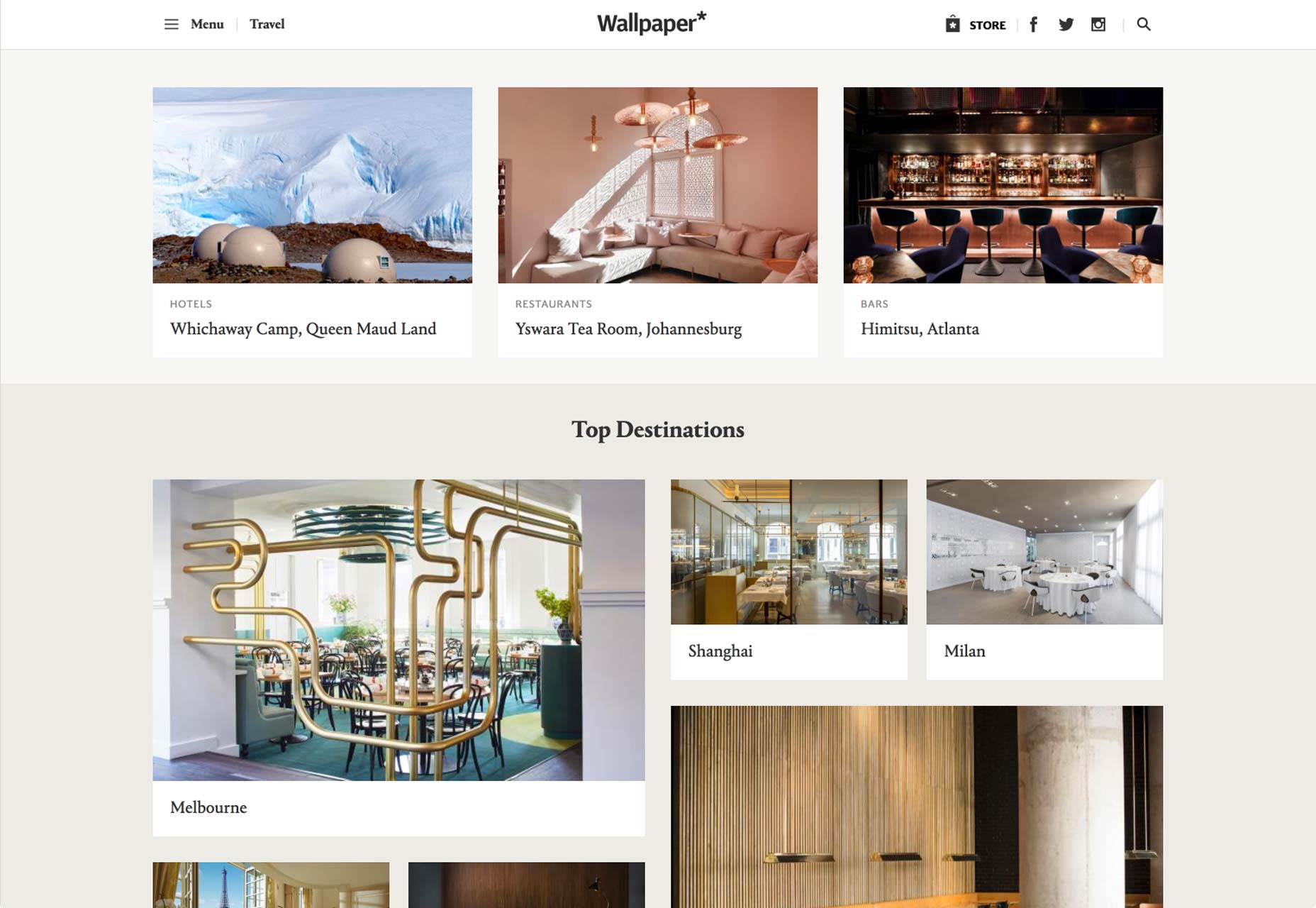
Wallpaper

wallpaper

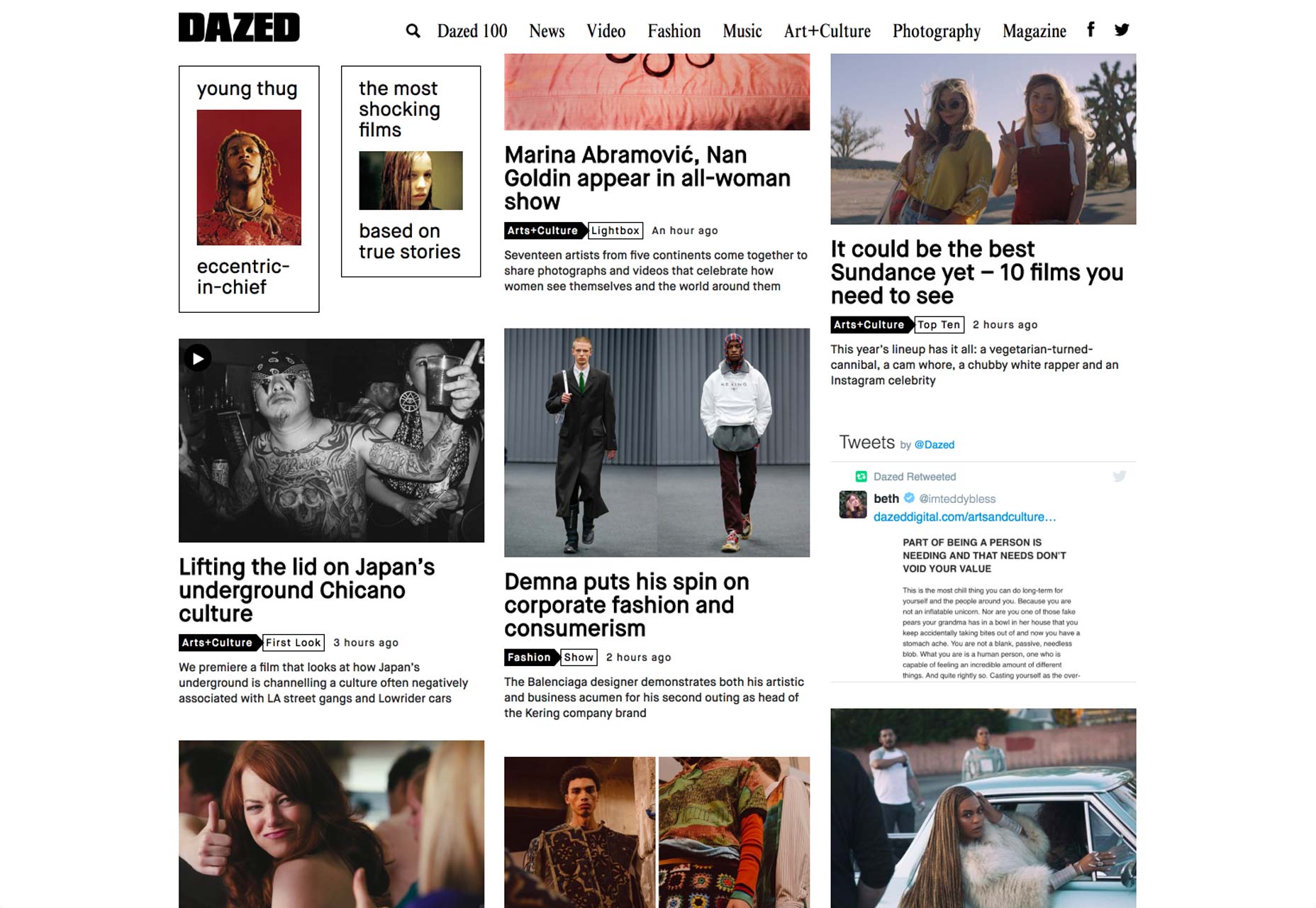
Dazed

dazed

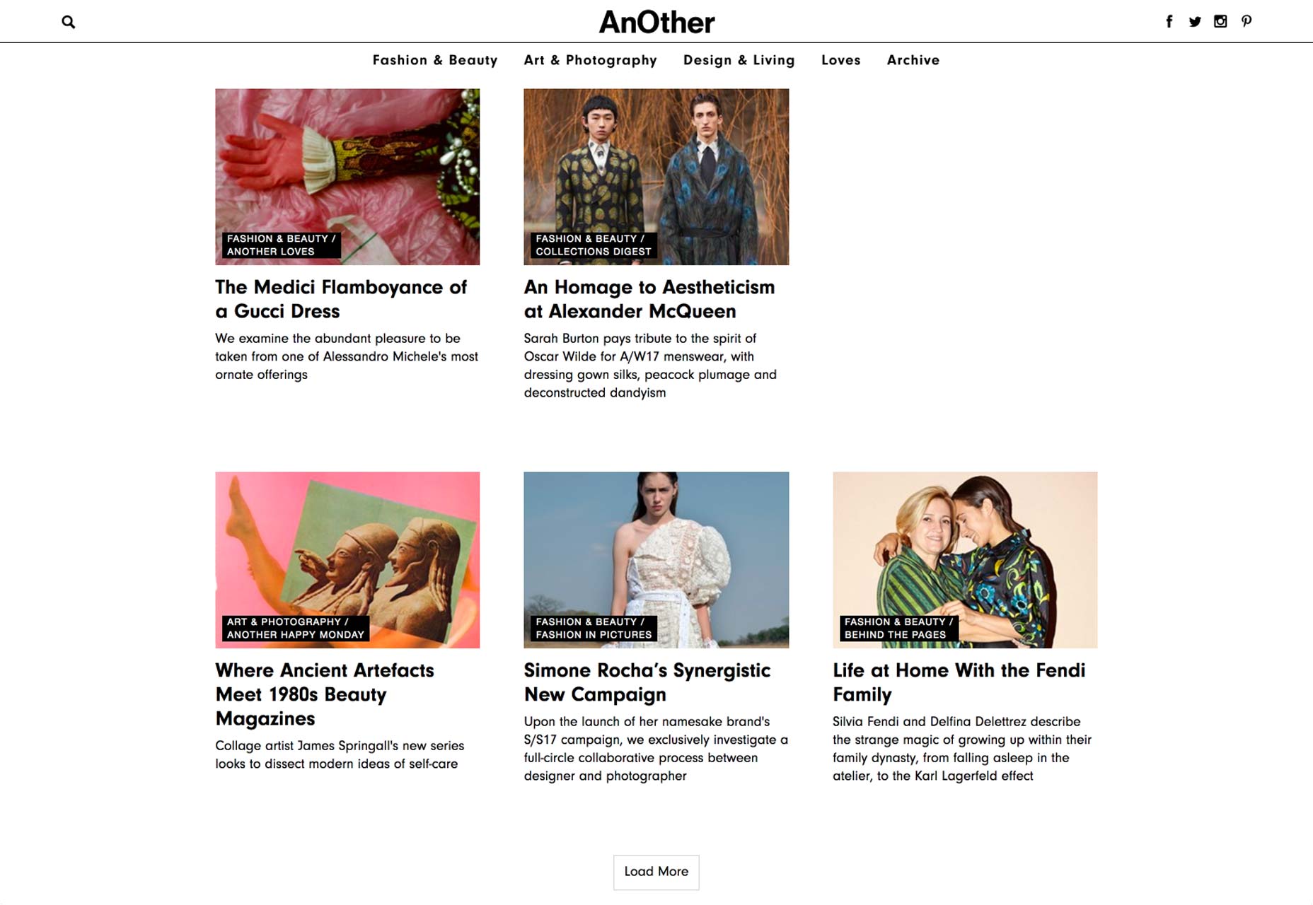
AnOther

another

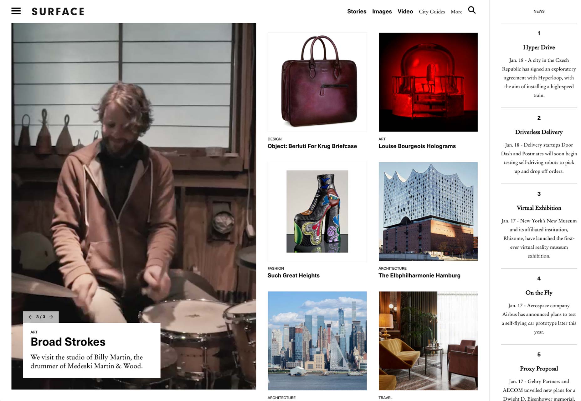
Surface

surface

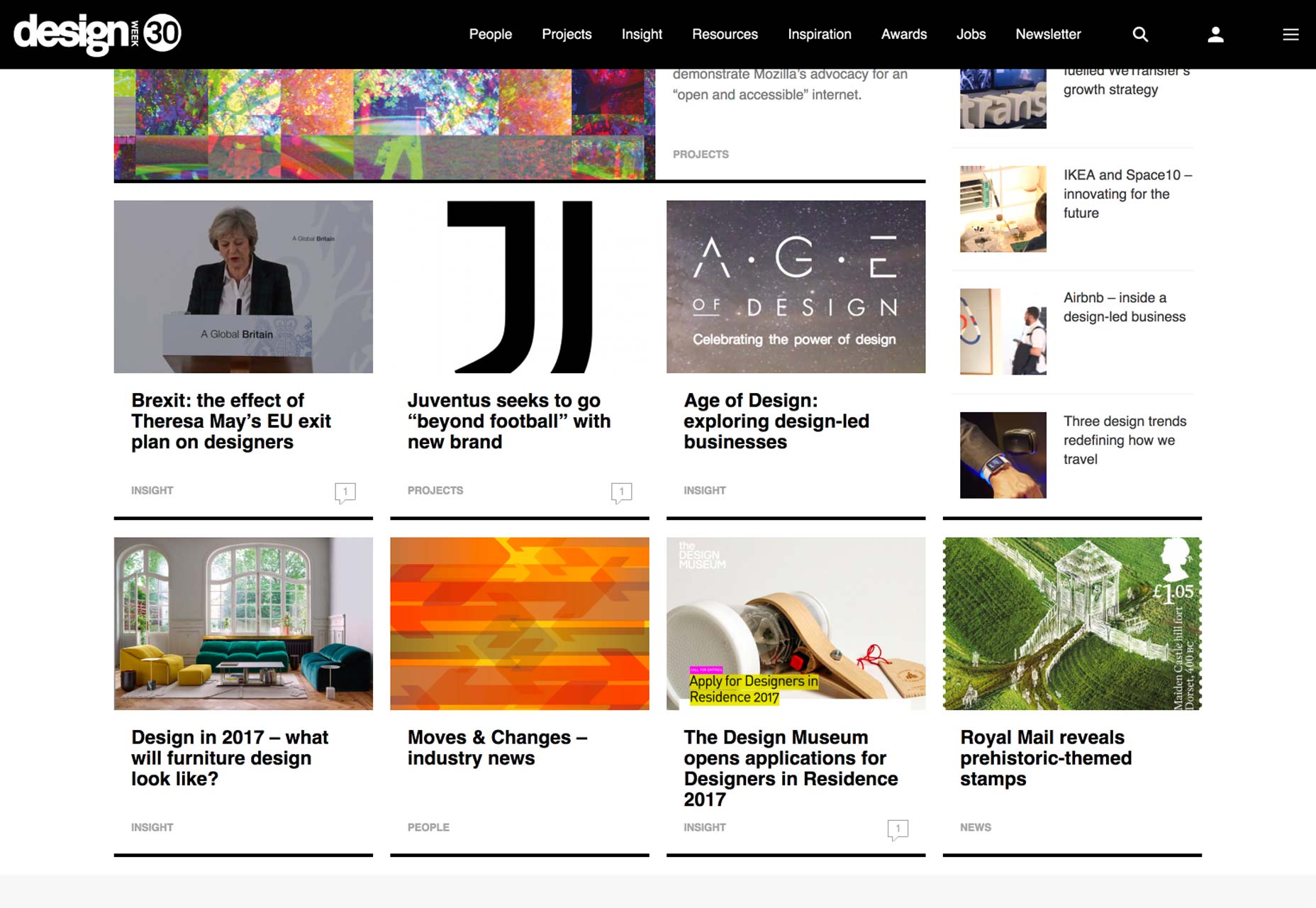
Design Week

designweek

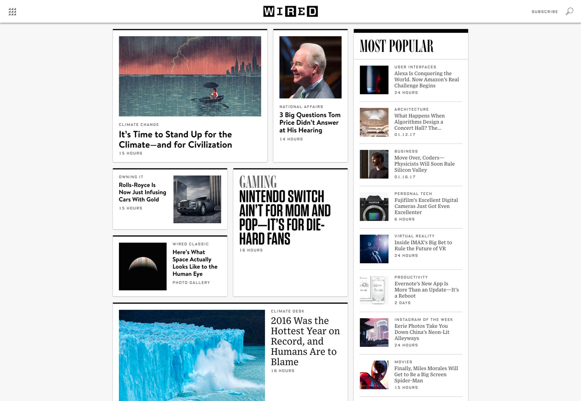
Wired

wired

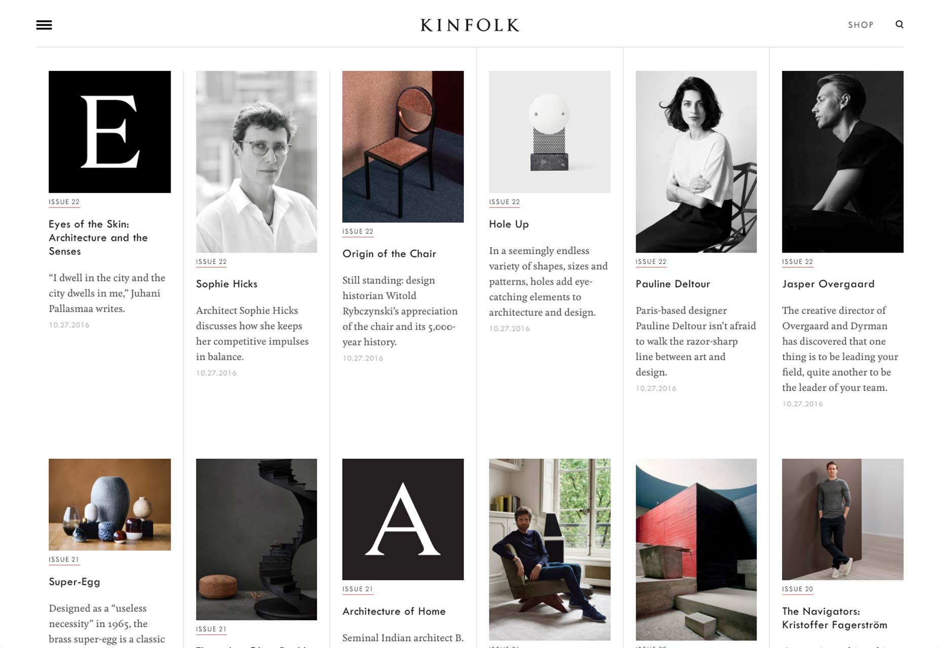
Kinfolk

kinfolk

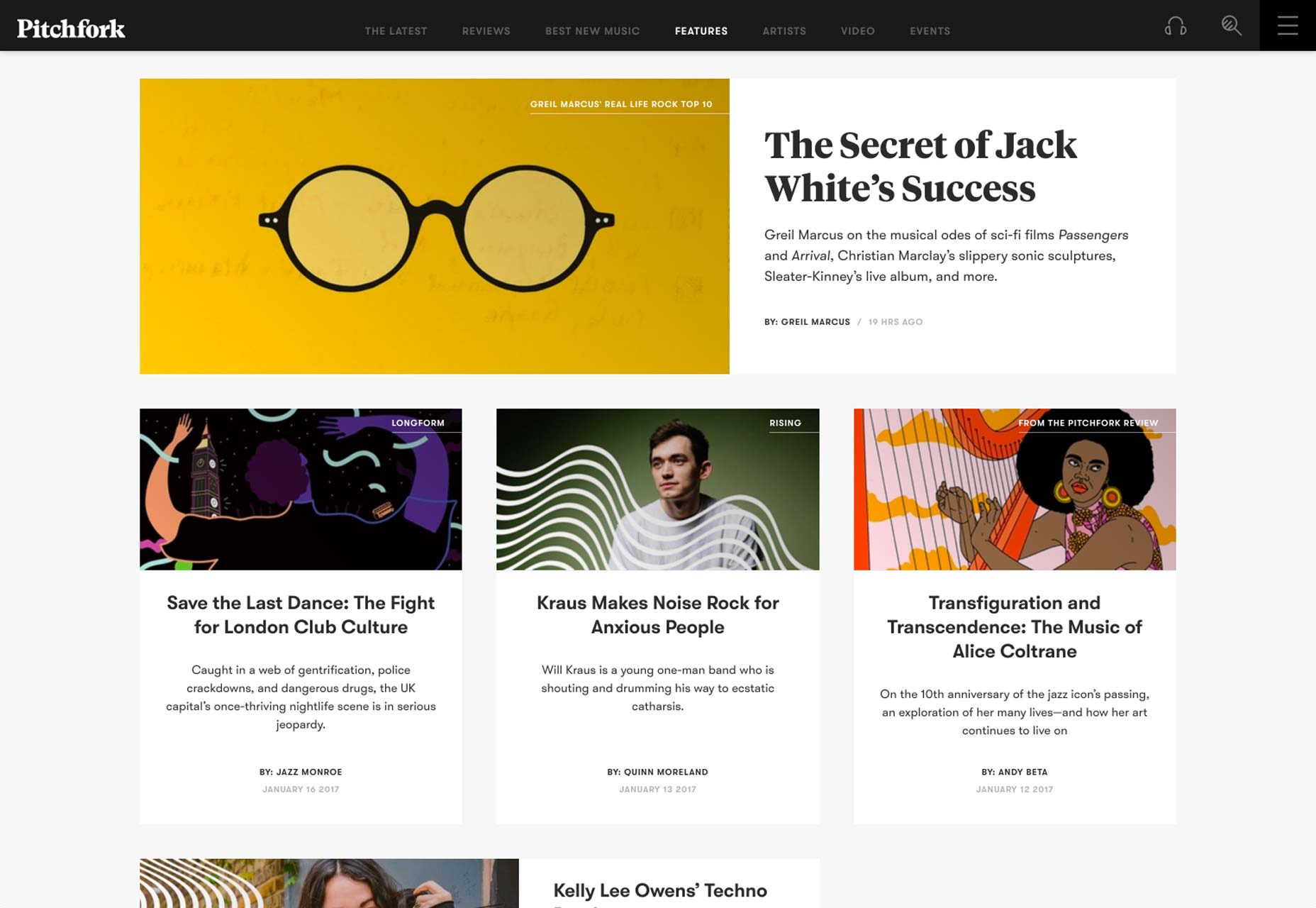
Pitchfork

pitchfork

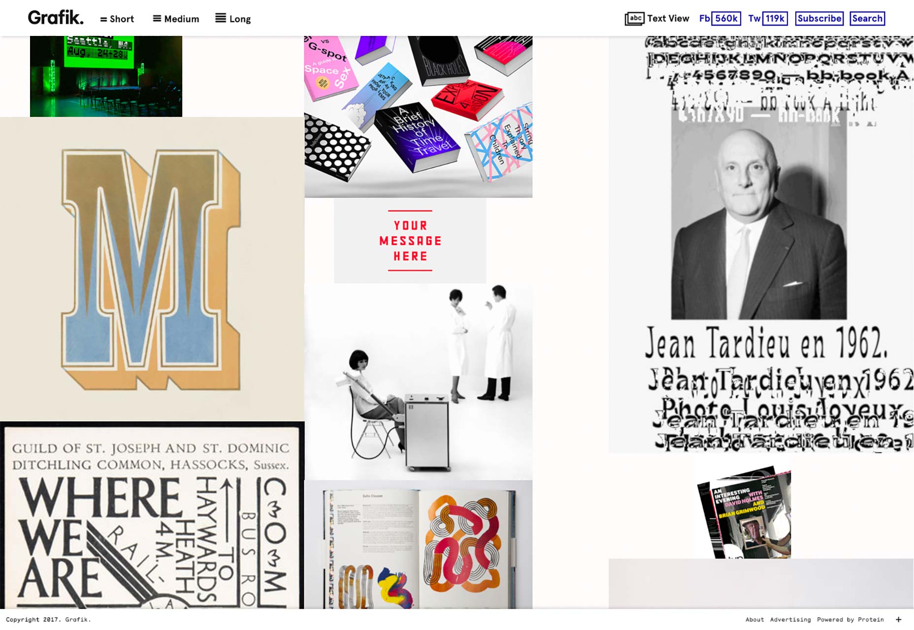
Grafik

grafik

Paddi MacDonnell

Paddi MacDonnell is a designer and entrepreneur from Northern Ireland, follow her on Twitter.

Read Next

3 Essential Design Trends, November 2024

Touchable texture, distinct grids, and two-column designs are some of the most trending website design elements of…

20 Best New Websites, October 2024

Something we’re seeing more and more of is the ‘customizable’ site. Most often, this means a button to swap between…

Exciting New Tools for Designers, October 2024

We’ve got goodies for designers, developers, SEO-ers, content managers, and those of you who wear multiple hats. And,…

15 Best New Fonts, September 2024

Welcome to our roundup of the best new fonts we’ve found on the web in the previous four weeks. In this month’s edition…

3 Essential Design Trends, October 2024

This article is brought to you by Constantino, a renowned company offering premium and affordable website design You…

A Beginner’s Guide to Using BlueSky for Business Success

In today’s fast-paced digital world, businesses are always on the lookout for new ways to connect with their audience.…

The Importance of Title Tags: Tips and Tricks to Optimize for SEO

When it comes to on-page SEO, there’s one element that plays a pivotal role in both search engine rankings and user…

20 Best New Websites, September 2024

We have a mixed bag for you with both minimalist and maximalist designs, and single pagers alongside much bigger, but…

Exciting New Tools for Designers, September 2024

This time around we are aiming to simplify life, with some light and fast analytics, an all-in-one productivity…

3 Essential Design Trends, September 2024

September's web design trends have a fun, fall feeling ... and we love it. See what's trending in website design this…

Crafting Personalized Experiences with AI

Picture this: You open Netflix, and it’s like the platform just knows what you’re in the mood for. Or maybe you’re…

15 Best New Fonts, August 2024

Welcome to August’s roundup of the best fonts we’ve found over the last few weeks. 2024’s trend for flowing curves and…