
Prolog
Prolog’s website is simple and bold It’s black and white except for the pictures, and it’s very in-your-face about it. If it’s simplicity you’re looking for—and let’s face it, that’s what we all want—then this is a design you’ll want to pay attention too. It’s hard to pull off a site this simple.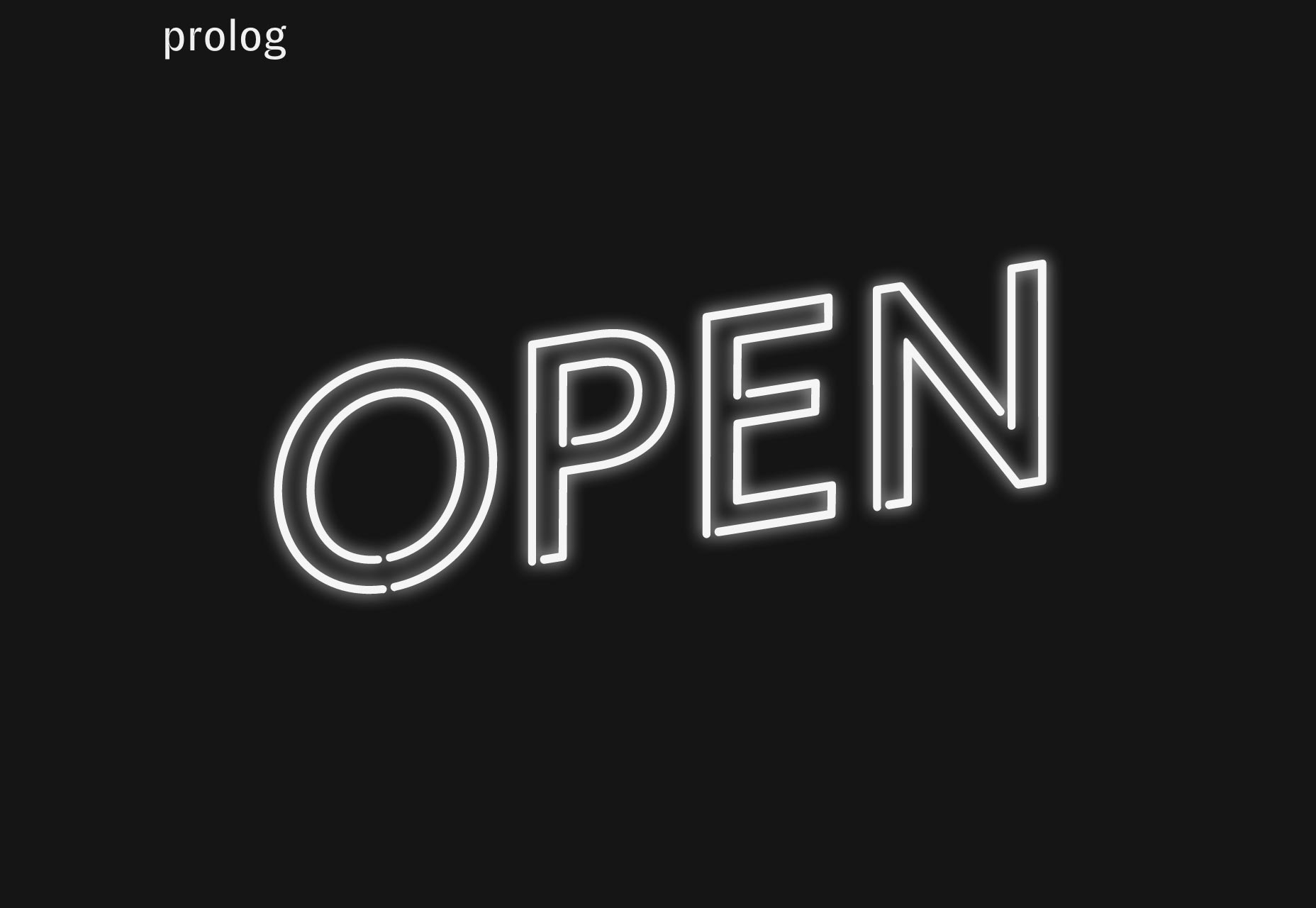
Studio Ultra
Stuidio Ultra takes that simplicity even further by making their portfolio just a list of project names. Oh, and you get to see some images on hover. That’s a thing a lot of people are doing now, and this site does it quite well.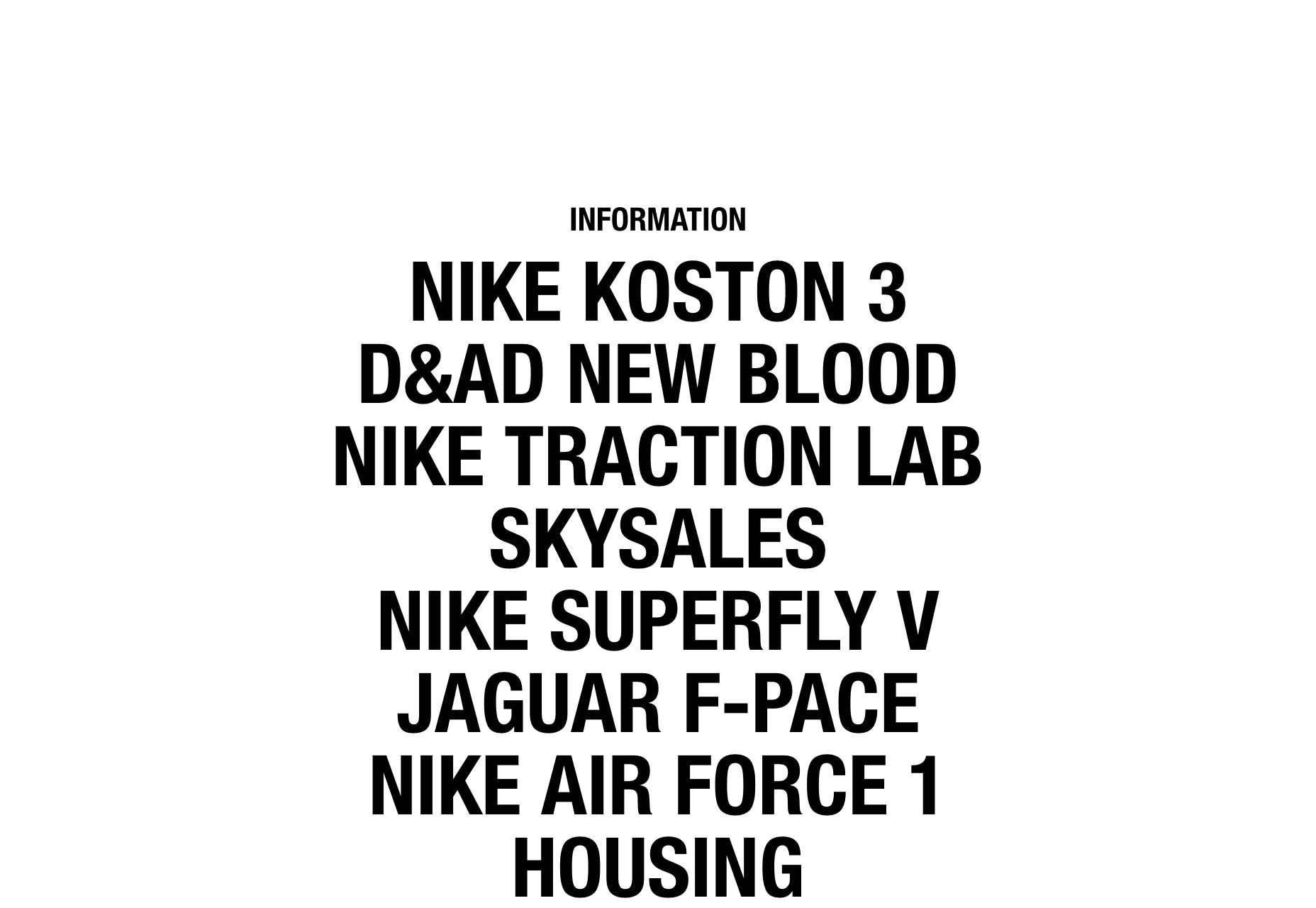
North2
North2 breaks the mold a bit by taking classic corporate style minimalism, and giving it an actual personality. This is made possible with some simple changes to the layout, and a heavy dose of animation. Plus, there’s this little thing with bubbles (sort of) on the About page… just go play with it. It’s not the most intuitive way to show off your staff, but it’s fun once you figure it out. The message is simple: these are obviously professionals, but they’re not cookie cutter professionals.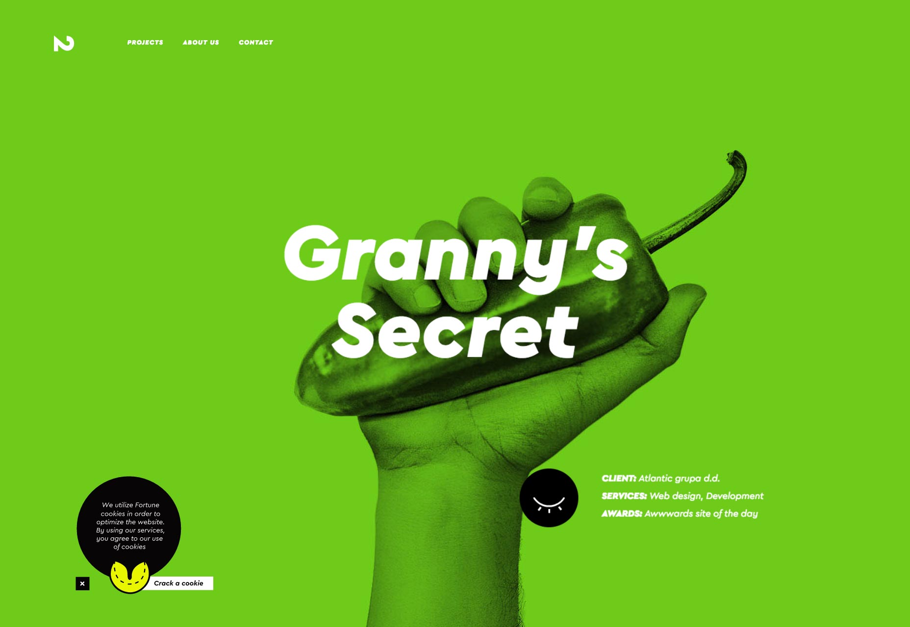
Caava Design
Caava Design brings us some of that retro-flavored flat design that was everywhere for a while. By combining illustration with soft colors and that classic coffee-brand typoraphy (they do tend to work with coffee brands, so the messaging is on-point) browsing through this site is a simple, pleasant experience.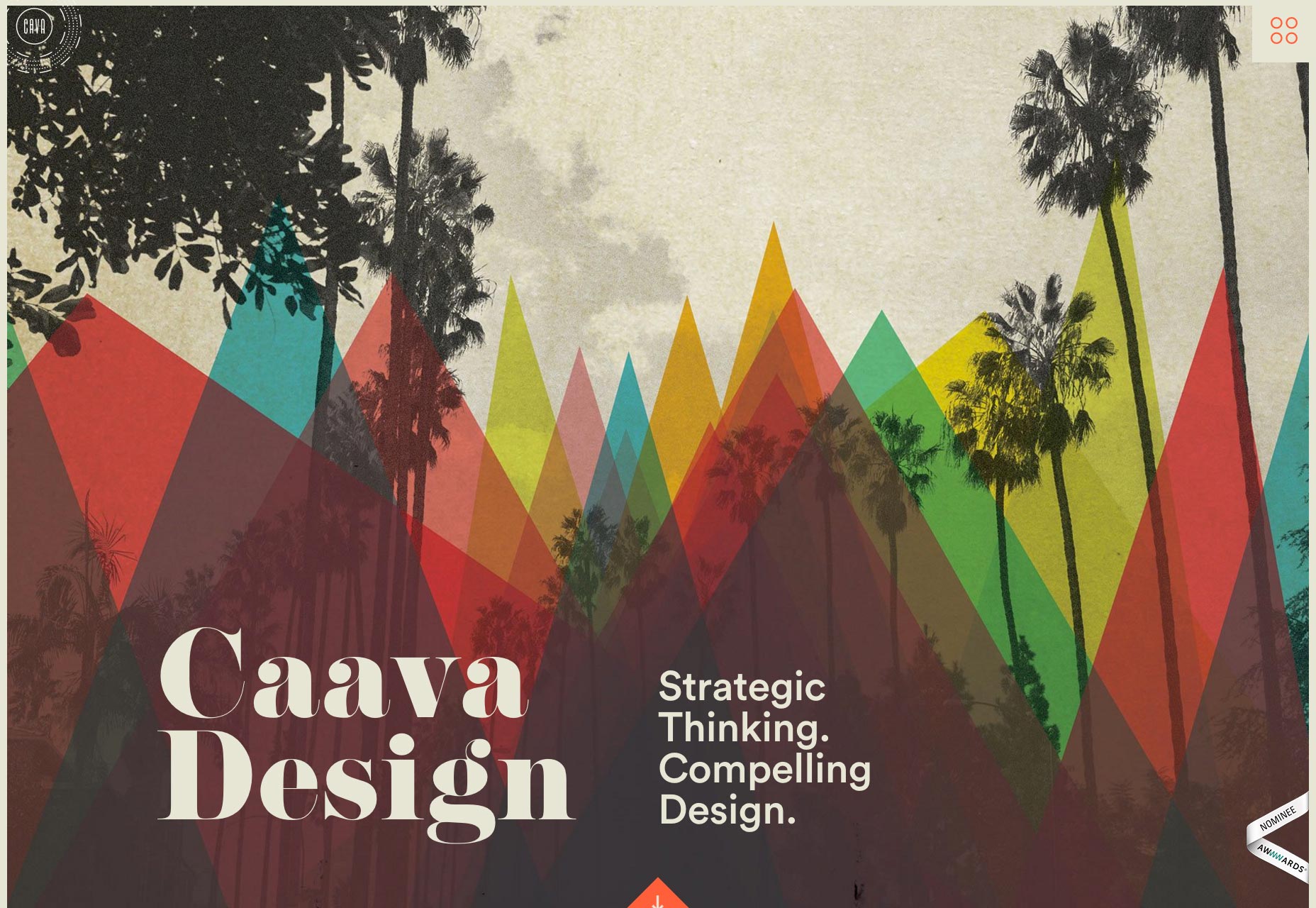
Avex
Avex’s website won’t stand out as the most creative site on this list, but it looks good, works well, and gets the point across. It’s almost a stereotype of good design. It’s also one of the few sites I’ve seen recently to take full advantage of newer techniques for vertically aligning text. I mean, it’s there. Might as well.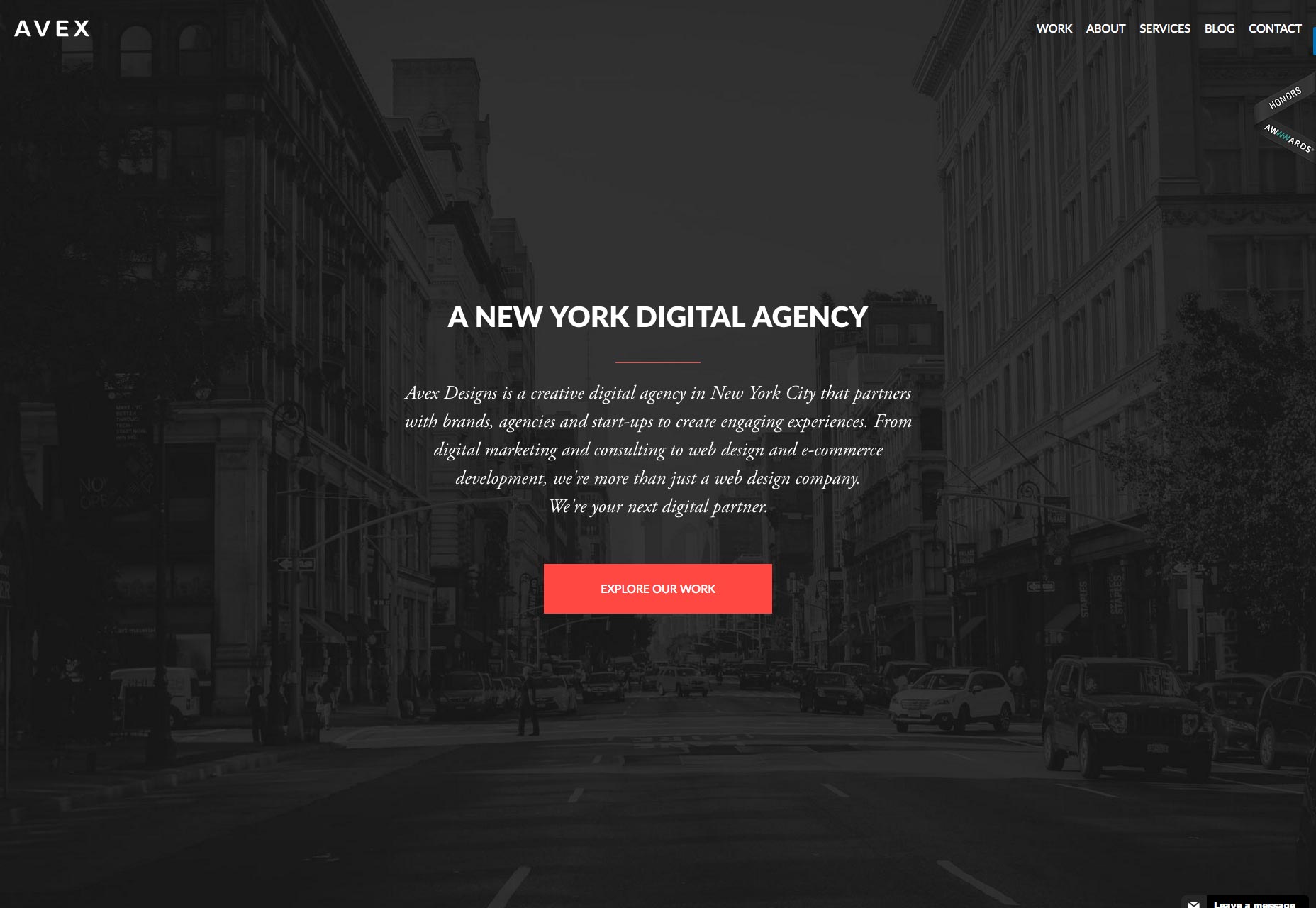
Verde
Verde looks like your standard portfolio site at first. Slideshow at the top, fairly standard portfolio layout below. What shakes things up in this case, is that slideshow back at the top. Go look at it again. Those aren’t images. Those are the lives sites, shrunk down and placed in an iFrame. You can view and navigate them right there in the slideshow. It’s a bold choice, to say the least. But hey, they really stuck with the idea of showing off their work.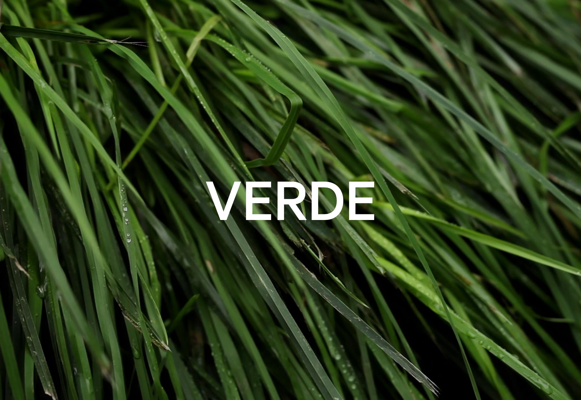
Shape
Shape’s portfolio looks a bit like an eCommerce site in terms of overall style and feel. Mind you, this agency specializes in eCommerce sites, so really, what do you expect. It’s a quality site on its own, but it’s also an excellent example of the way design styles can be translated between different kinds of sites. These people are all about sales, and you can see it right from the first glance. If that’s not good design, I don’t know what is.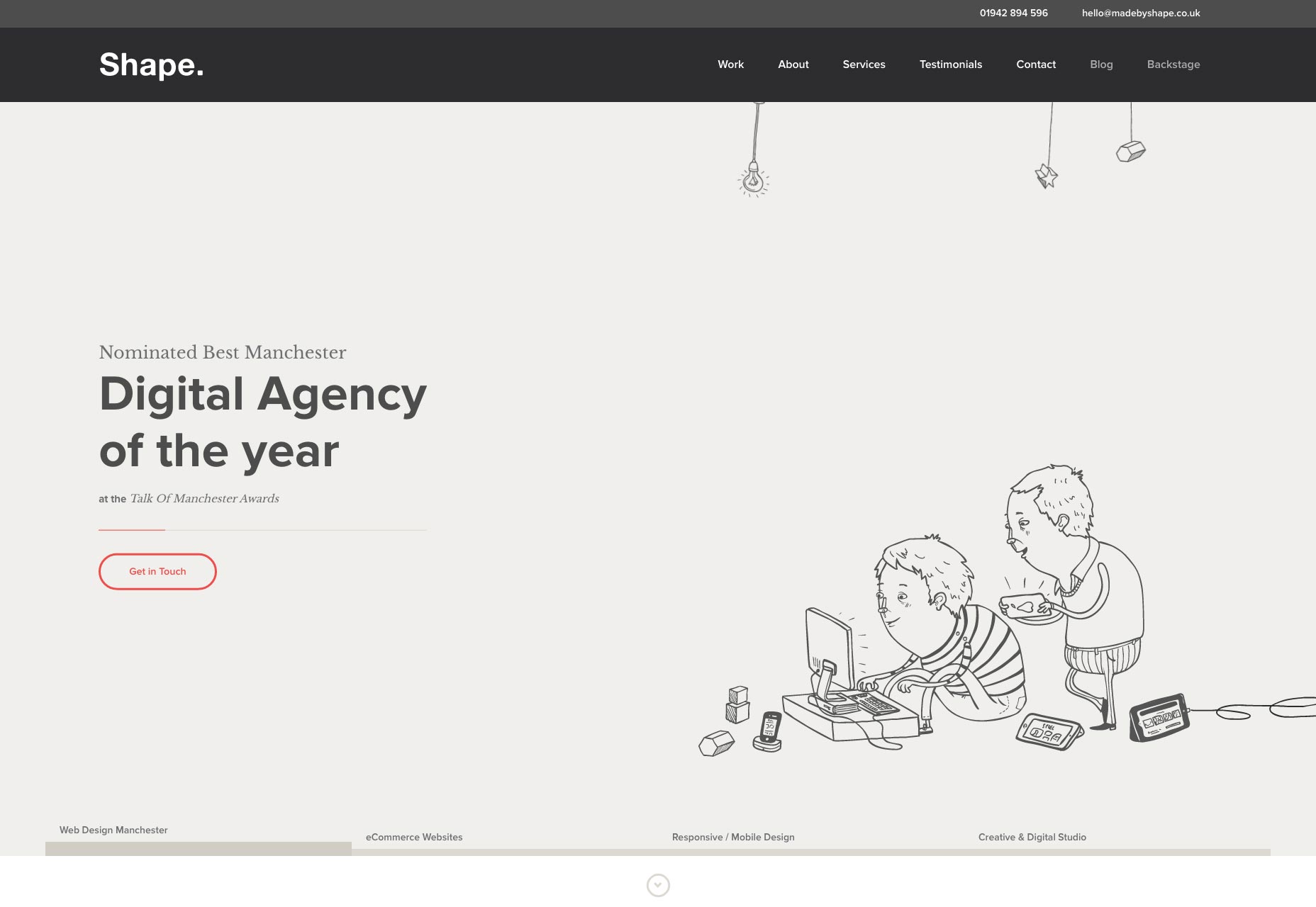
Huemor
Huemor’s website states that their work is no joke. That just doesn’t seem right to me. If you’re going to pick that name, I mean… you could at least work for comedians. Their site looks great though. The graphic styles vary from page to page, tied together by consistent, and consistently beautiful, typography.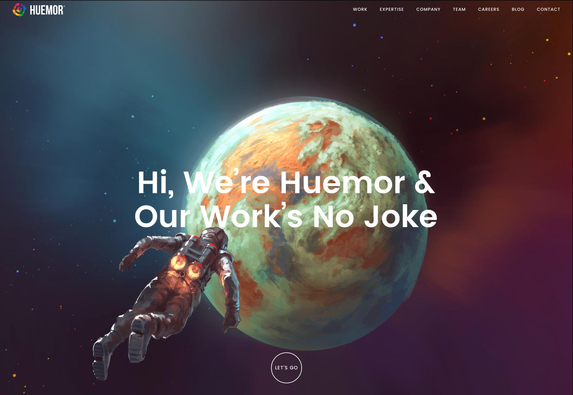
Gridonic
Gridonic takes us once again into that beautiful world of the overlapping everything. They take it a step further by utilizing 2.5D techniques… by which I mean they added some drop shadows—it disturbs me how easily I came up with a corporate-style way to say that. Also, browsing through a site in a language I can’t read gives me a new appreciation for good typography. If it’s nice to look at even when I don’t know what they’re saying, that’s good work.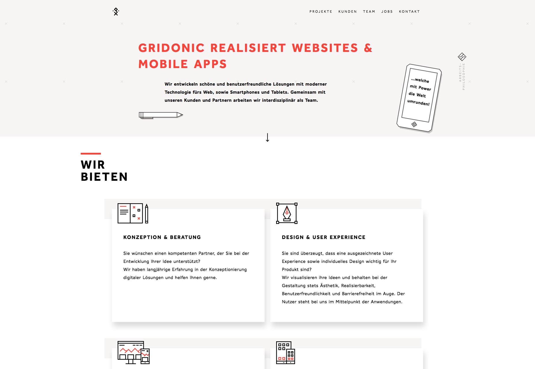
Momento
Gather 'round dear Readers, and check out Momento to see a well-done horizontal layout. On top of that, the layout handles high resolutions really well. With a solid sense of style in every other respect, the creative layout shakes things up just enough to be interesting without getting in the way.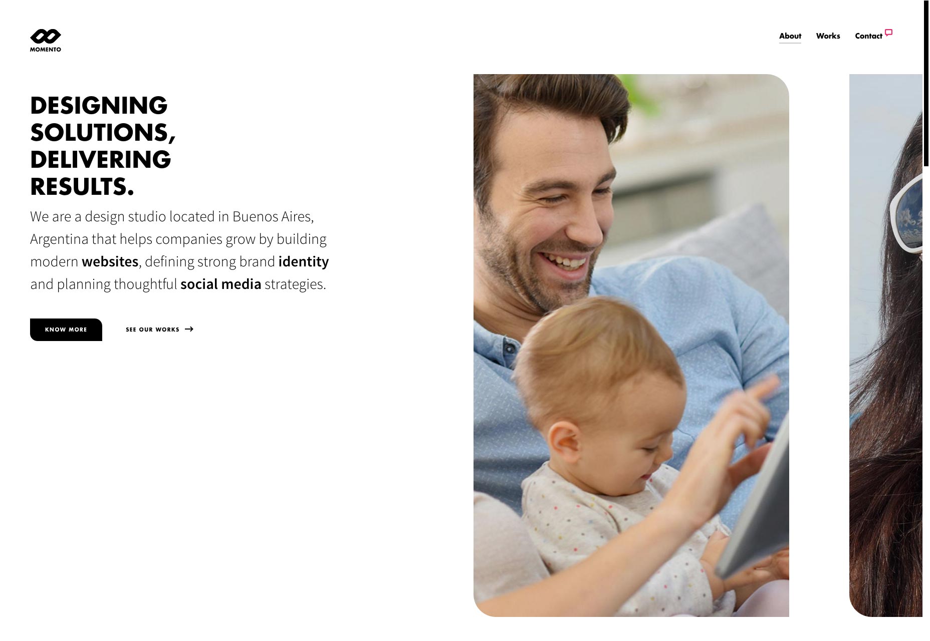
Wokine
Wokine’s website is minimalist, animated, and has great typography. Sure, we’ve seen a lot of that these days, but this is just really pretty too. And as I just mentioned, I love a site that can stretch to high resolutions and look great doing it.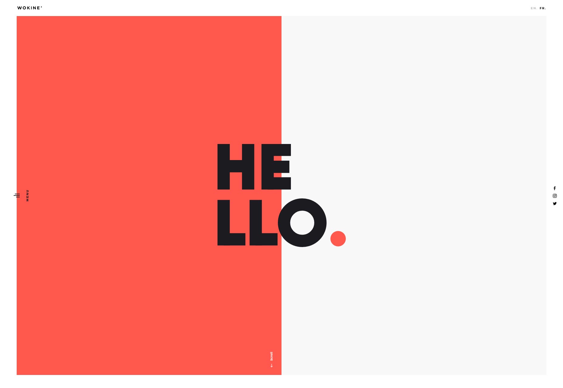
the Workshop
The article “the” in the Workshop is intentionally left with no capital letters, because that’s how they do it. The site clearly adhere’s to the Swiss school of design, from the minimalist layout, to the striking use of imagery blended with the layout, to the vertical navigation on the side, and, of course, the text at the top that says “Geneva - Switzerland”. You’ll rarely find a better example of this sort of bold minimalism, and it’s a pleasure to scroll through.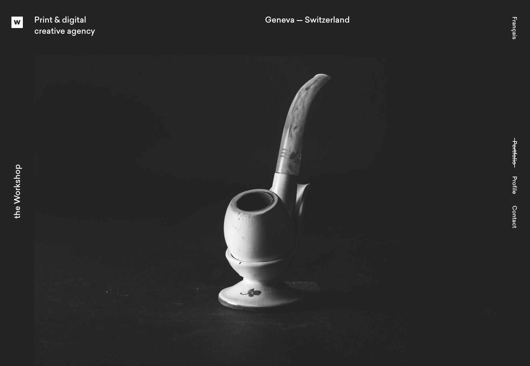
Thaddé Méneur
Thaddé Méneur’s website is heavily influenced by the same style as the last one, but it taps in to the visceral human desire to read less text and see more pretty pictures. It’s a bit heavy on the JS frankly, but it looks great. Go, look, bask in the text that overlaps onto other things.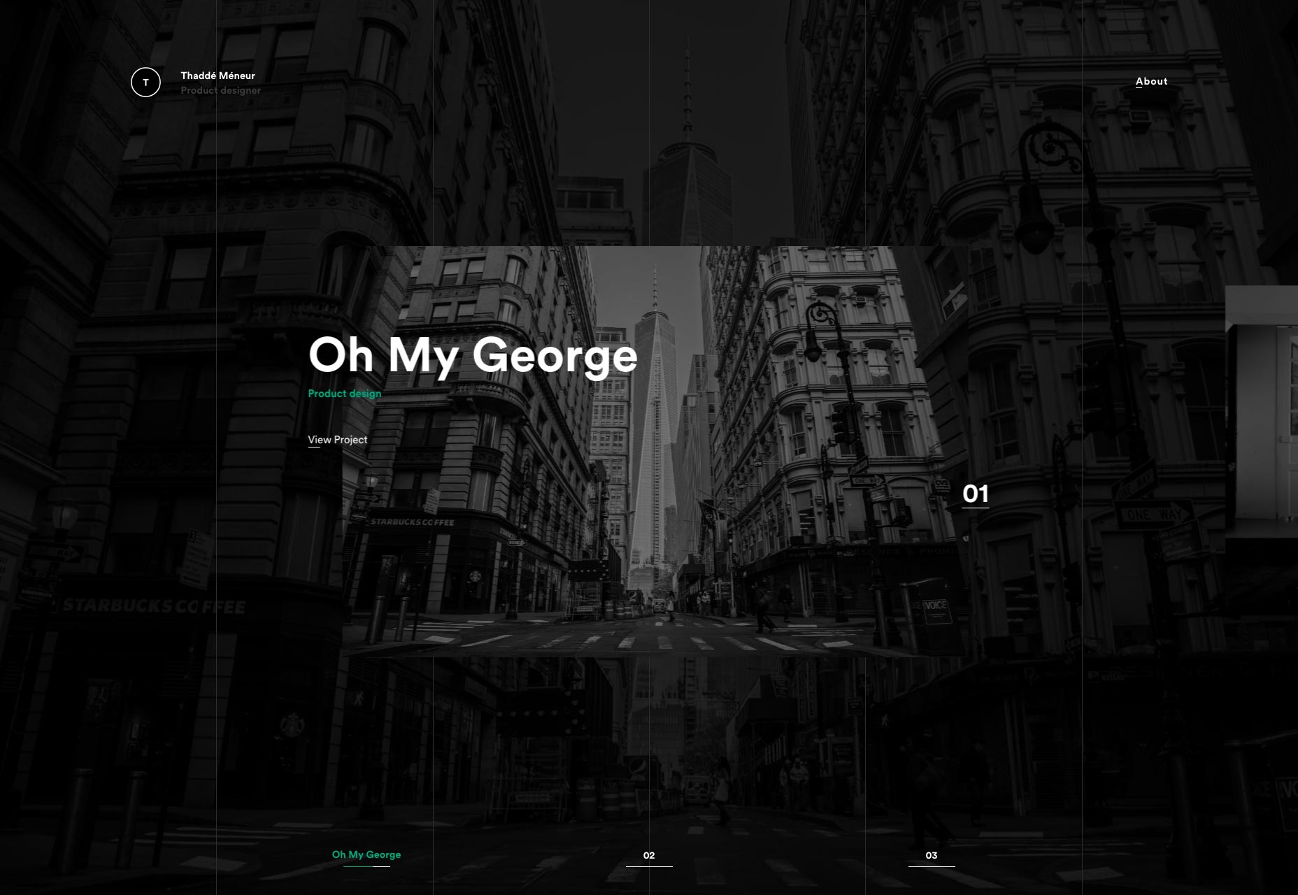
Will Sanders
Will Sanders’ portfolio adopts the now quite popular trend of collage-style photography portfolios. What makes this one stand out is that it doesn’t depend on the photography for all of its color. And that color isn’t solid blue! It’s… well it’s solid red, but it’s definitely eye-catching. Mind you, I probably would not have gone with the rotated navigation like that. I have a headache as I write this, and the eye strain involved in reading text like that is a bit of a pain. Were I healthy, it wouldn’t be so much of an issue. Nothing like a bad cold to make you see UX issues differently.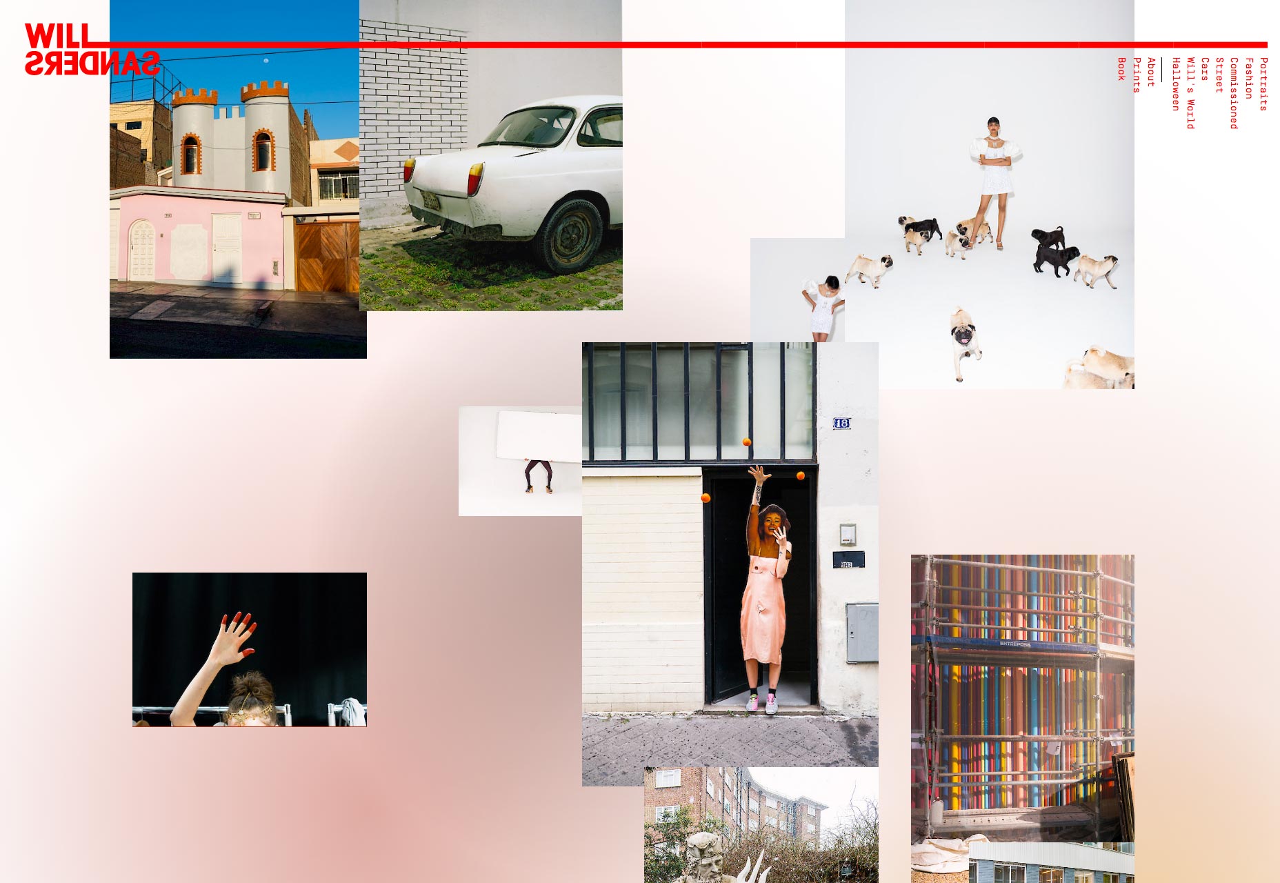
Nobody
Nobody’s site depends almost entirely on the strength of its typography, and it works. There’s no imagery at all until you start hovering over project names. As with all sites of its kind, this is a bit of a gamble, but I think it works.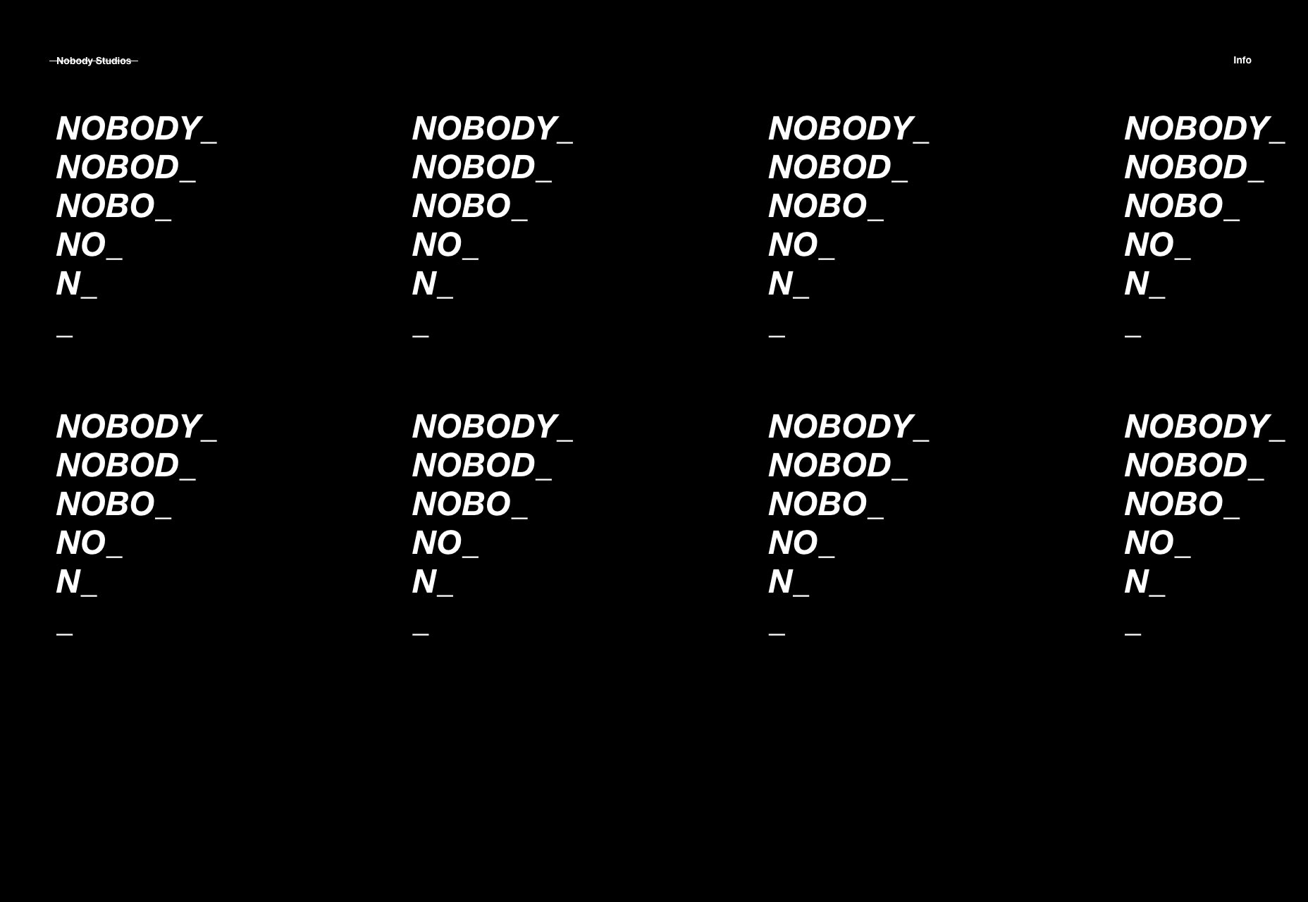
Glamuzina Architechts
Forget typography-based sites for a moment, because Glamuzina Architect’s stie is practically an abstract work of art with a bit of type thrown in. Okay, that may be a small exaggeration, but these guys have truly embraced the post-modern feel. As a visual experiment, I love it. I would love it more, except for the highly unintuitive navigation. When you’re forced to hover over every bit of text you can find and hope it might be a link, that’s less than ideal.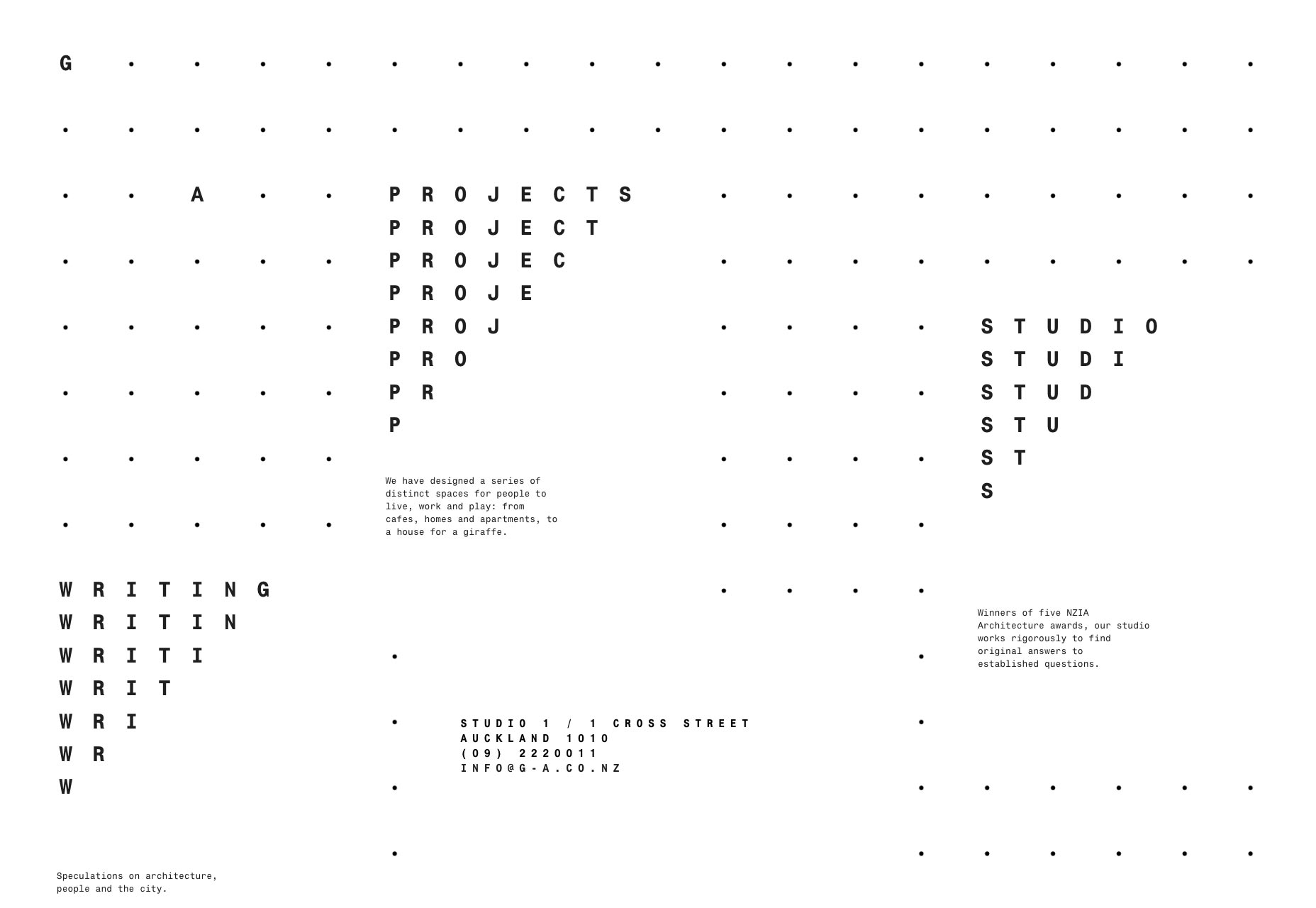
Yummygum
Yummygum is one of my personal favorites on this month’s list. And what’s not to love? Diagonal lines, fantastic use of white space, great type, great contrast… I’m definitely biased, but this site just happens to hit all of my personal check boxes.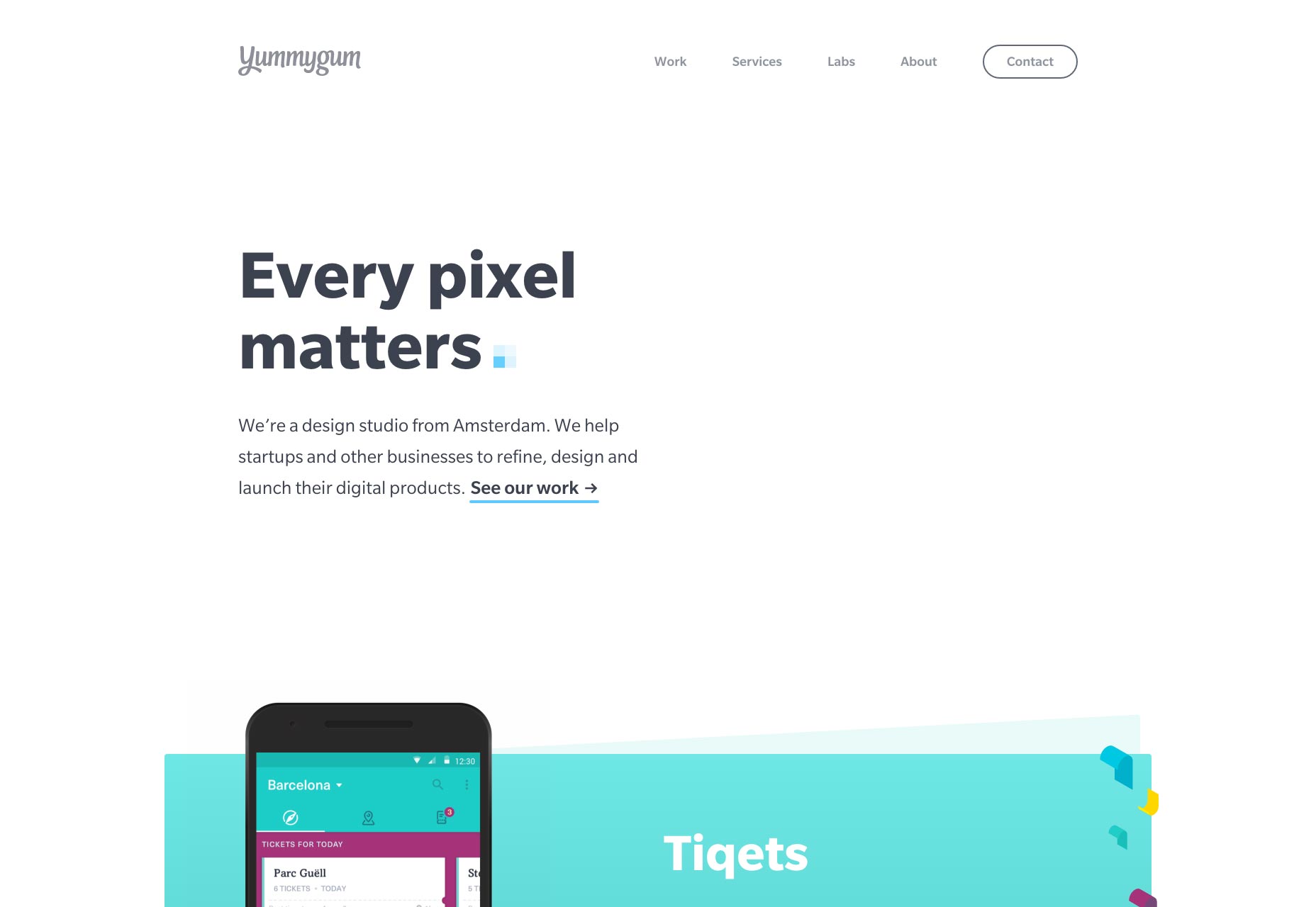
Diane Martel
Diane Martel’s photography portfolio is something else entirely. It’s a mix of collage, slideshow, presentation… and the images change when you hover over the names of her projects. It’s like they decided to go for everything. You could almost call it tacky, but it doesn’t quite cross that line. In fact, considering the subject matter of the photos, it seems kind of perfect.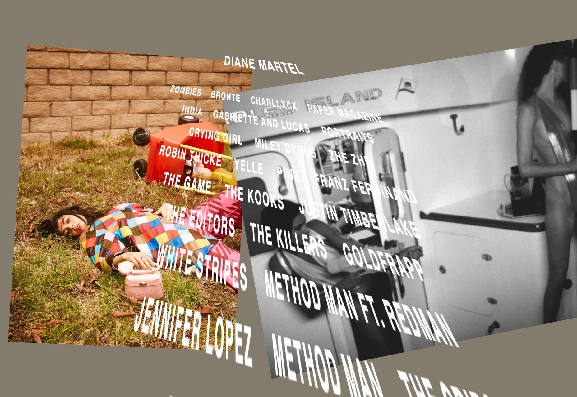
Rival
If Rival’s website looks a bit like a premium Magento theme, that’s because they specialize in Magento-based eCommerce sites. Like Shape, mentioned above, the work that Rival does is clearly reflected in their own site, and it works.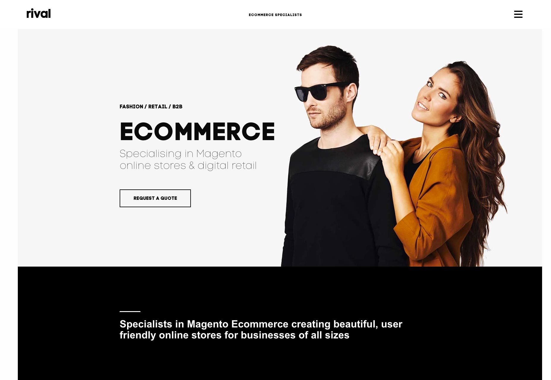
Peter Komierowski
Peter Komierowski’s portfolio shows off his logo and branding work in what is, perhaps, thew best way possible: with no distractions whatsoever. See the logos, click on them to find out more, and that’s it. Minimalism in what is perhaps its purest form.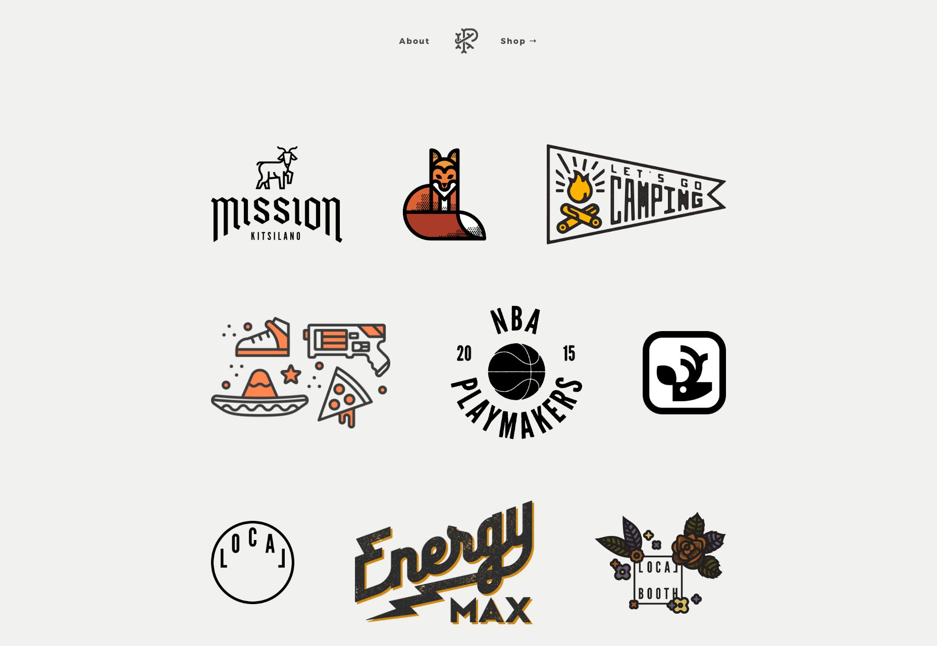
Ezequiel Bruni
Ezequiel Bruni is a web/UX designer, blogger, and aspiring photographer living in Mexico. When he’s not up to his finely-chiselled ears in wire-frames and front-end code, or ranting about the same, he indulges in beer, pizza, fantasy novels, and stand-up comedy.
Read Next
3 Essential Design Trends, November 2024
Touchable texture, distinct grids, and two-column designs are some of the most trending website design elements of…
20 Best New Websites, October 2024
Something we’re seeing more and more of is the ‘customizable’ site. Most often, this means a button to swap between…
Exciting New Tools for Designers, October 2024
We’ve got goodies for designers, developers, SEO-ers, content managers, and those of you who wear multiple hats. And,…
15 Best New Fonts, September 2024
Welcome to our roundup of the best new fonts we’ve found on the web in the previous four weeks. In this month’s edition…
By Simon Sterne
3 Essential Design Trends, October 2024
This article is brought to you by Constantino, a renowned company offering premium and affordable website design
You…
A Beginner’s Guide to Using BlueSky for Business Success
In today’s fast-paced digital world, businesses are always on the lookout for new ways to connect with their audience.…
By Louise North
The Importance of Title Tags: Tips and Tricks to Optimize for SEO
When it comes to on-page SEO, there’s one element that plays a pivotal role in both search engine rankings and user…
By Simon Sterne
20 Best New Websites, September 2024
We have a mixed bag for you with both minimalist and maximalist designs, and single pagers alongside much bigger, but…
Exciting New Tools for Designers, September 2024
This time around we are aiming to simplify life, with some light and fast analytics, an all-in-one productivity…
3 Essential Design Trends, September 2024
September's web design trends have a fun, fall feeling ... and we love it. See what's trending in website design this…
Crafting Personalized Experiences with AI
Picture this: You open Netflix, and it’s like the platform just knows what you’re in the mood for. Or maybe you’re…
By Simon Sterne
15 Best New Fonts, August 2024
Welcome to August’s roundup of the best fonts we’ve found over the last few weeks. 2024’s trend for flowing curves and…
By Ben Moss


