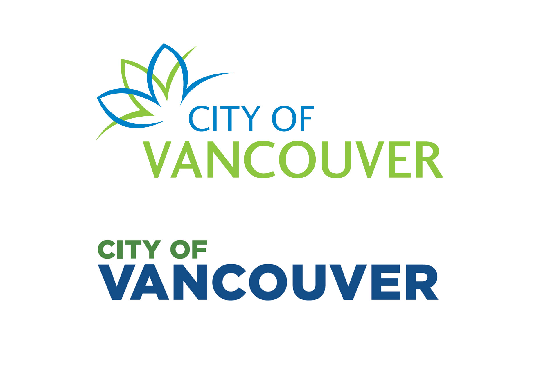
 Above: the original Vancouver logo. Below: the revised wordmark.
The new logo has been simplified, perhaps over-simplified, by moving exclusively to a workmark; the choice of Gotham block letter font has been the main target of the criticism.
The use of such a heavy, corporate font is viewed by the detractors as not in keeping with the city’s modern, more liberal sensibilities. In addition, Gotham is rather ubiquitous and so isn’t a sound choice for a city trying to position itself as unique. In other words, the font is simply too commonplace for it to be useful or meaningful in city branding.
While the redesigned logo sports blue and green—perhaps to symbolize rain and the city’s green sensibilities—it has prompted some to write it off as an alternate version of the Vancouver Canuck’s colors (blue and green feature prominently on the team’s uniforms).
The mayor has claimed that one of the reasons the unpopular logo was approved was to help those in Vancouver who don’t speak English as a first language to better understand the new logo. That begs the question, of course, as to why the city went ahead and still chose English words in the wordmark instead of going with a purely iconic or symbolic logo. Vancouver is, after all, home to many immigrants whose first language is something other than English.
Overall, this row over the botched redesign illustrates the pitfalls of going with the lowest bidder for something as important as a city’s logo, which ties into the even more important aspect of branding. Further, the failure of the mayor and the city council to also engage with and take feedback from the local design community during the logo redesign is another huge factor in this brouhaha.
Marc Schenker
Marc’s a copywriter who covers design news for Web Designer Depot. Find out more about him at thegloriouscompanyltd.com.
Read Next
3 Essential Design Trends, November 2024
Touchable texture, distinct grids, and two-column designs are some of the most trending website design elements of…
20 Best New Websites, October 2024
Something we’re seeing more and more of is the ‘customizable’ site. Most often, this means a button to swap between…
Exciting New Tools for Designers, October 2024
We’ve got goodies for designers, developers, SEO-ers, content managers, and those of you who wear multiple hats. And,…
15 Best New Fonts, September 2024
Welcome to our roundup of the best new fonts we’ve found on the web in the previous four weeks. In this month’s edition…
By Simon Sterne
3 Essential Design Trends, October 2024
This article is brought to you by Constantino, a renowned company offering premium and affordable website design
You…
A Beginner’s Guide to Using BlueSky for Business Success
In today’s fast-paced digital world, businesses are always on the lookout for new ways to connect with their audience.…
By Louise North
The Importance of Title Tags: Tips and Tricks to Optimize for SEO
When it comes to on-page SEO, there’s one element that plays a pivotal role in both search engine rankings and user…
By Simon Sterne
20 Best New Websites, September 2024
We have a mixed bag for you with both minimalist and maximalist designs, and single pagers alongside much bigger, but…
Exciting New Tools for Designers, September 2024
This time around we are aiming to simplify life, with some light and fast analytics, an all-in-one productivity…
3 Essential Design Trends, September 2024
September's web design trends have a fun, fall feeling ... and we love it. See what's trending in website design this…
Crafting Personalized Experiences with AI
Picture this: You open Netflix, and it’s like the platform just knows what you’re in the mood for. Or maybe you’re…
By Simon Sterne
15 Best New Fonts, August 2024
Welcome to August’s roundup of the best fonts we’ve found over the last few weeks. 2024’s trend for flowing curves and…
By Ben Moss


