
1. Engage with Imagery
The design should visually engage the user. Start with clean, clear visuals. Stellar photos, interesting illustrations or videos that wow will help grab attention and make a first impression. But the concept of “show, don’t tell” doesn’t stop there. The story should be filled with imagery, both visually through design techniques and with the words on the screen. Develop a color palette that speaks to the story you are telling, with elements that drive users to completing a goal or task in the design. A good story will help lead users along the way. The design should be an obvious visual match.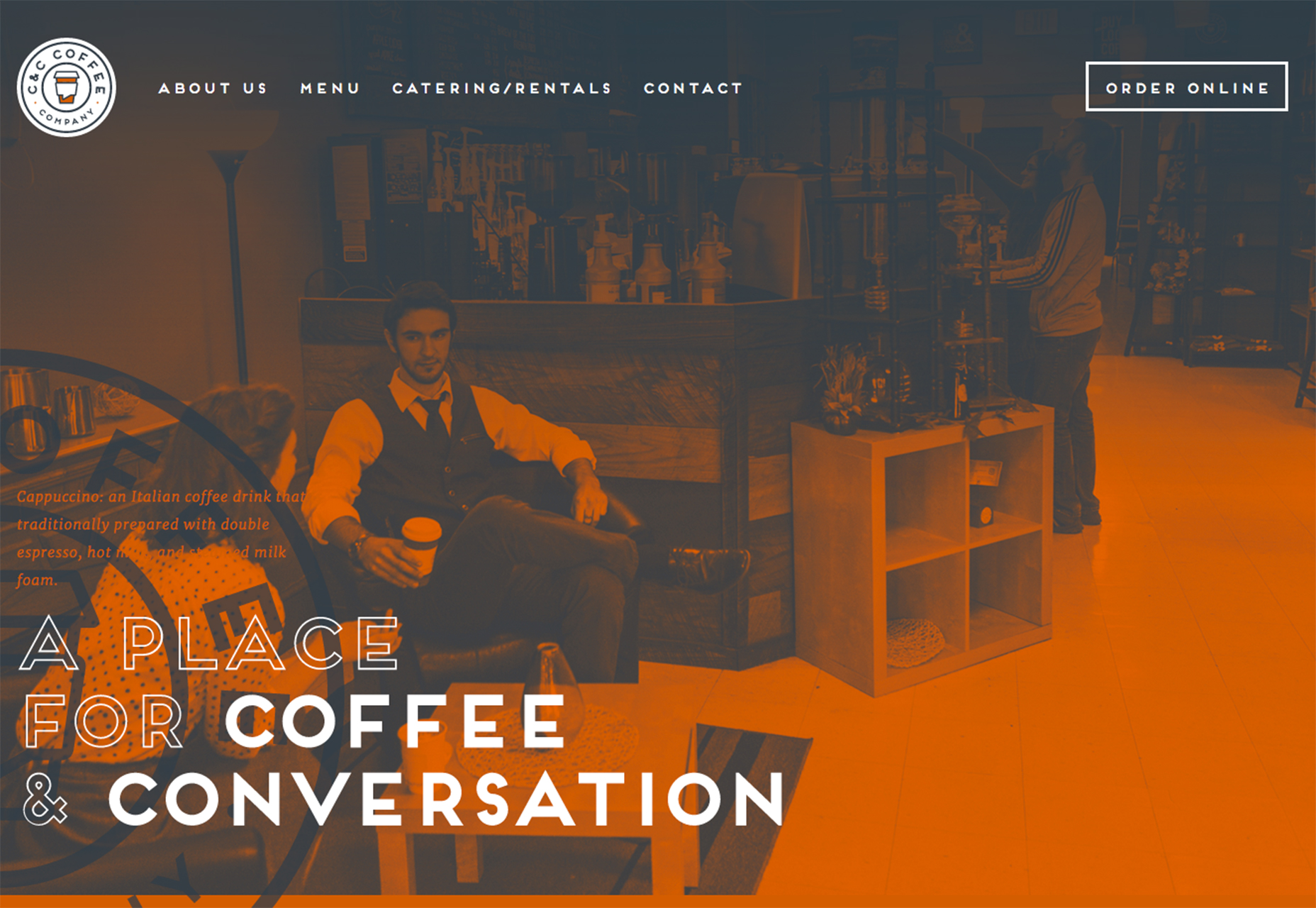
2. Develop a Character
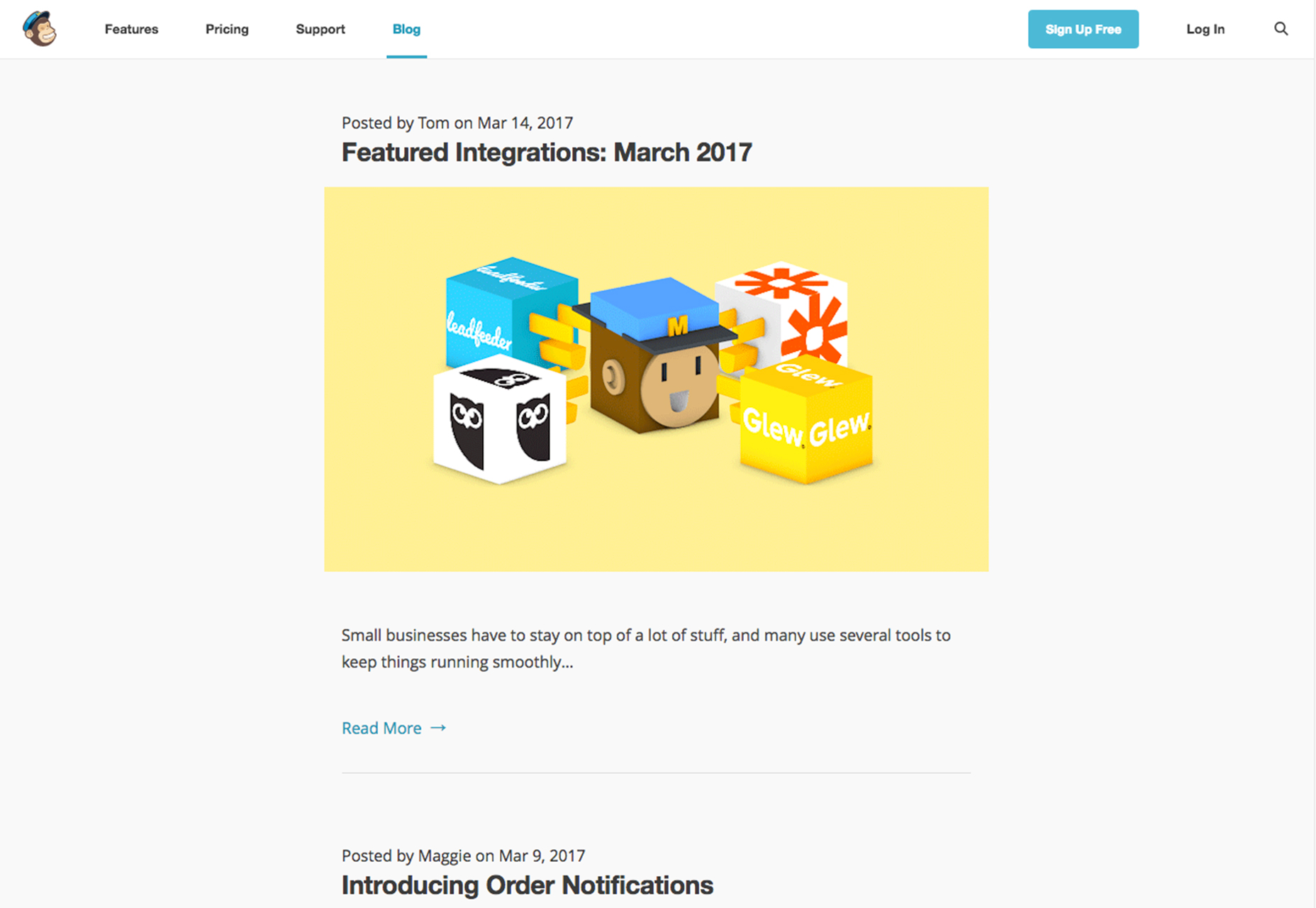
In website design, we talk about user personas a lot. It’s a key part of the development process. Take it to then next level with a character in your story that users can identify and identify with. The character can be real and travel throughout the design, or can be perceived as a voice in the content. A great example of character development is from email platform, MailChimp. Freddie, the company’s cartoon mascot and logo pops up throughout the design, in the blog and in promotions. The character does a few things for the company:- First, the character helps clarify the company name. As mimicked in a widespread ad campaign, there was some confusion about “MailChimp.” Seeing a chimp next to the words can make it clearer.
- The character helps showcase the fun nature that the company portrays. The tone and visuals are light and simple.
- Freddie provides the company with a story when they don’t have a lot of other things to talk about in promotional aspects. How did the chimp come to be? where did his name come from? and so on. The character helps keep the company story fresh and moving forward.
3. Invite Participation
Add value to the design with interactive elements paired with common actions. Add touches of animation to buttons that users need to notice or help drive the eye to certain elements with directional cues such as arrows or images that “lean” toward that an interactive element. Consider other effects that can keep users engaged with the story. Parallax scrolling, for example, is a highly engaging way to help encourage movement on the screen. That’s one of the reasons this technique is so popular. A good story doesn’t have to be complex. Humaan advances their story with simple hover animations paired with team photos to help you meet the people behind the company. It’s simple and effective. (Note the staff photography as well. Fun poses and facial expressions let the character of each team member shine through.)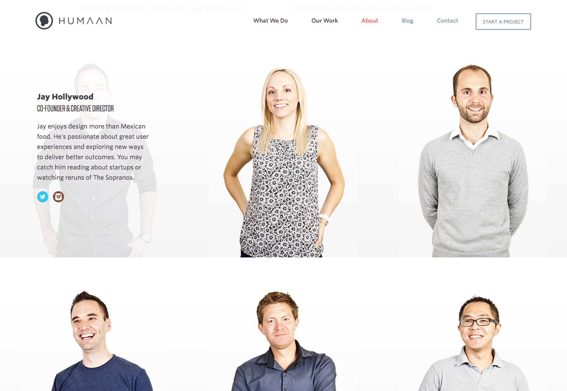
4. Design a Game
One of the hardest parts of telling a story is actually developing it. If you don’t know where to start, a simple game can help you focus and even provide a fun avenue for users. The trick to adding a game to the design is to keep it simple, short and provide some type of reward for the effort, such as a coupon code or virtual badge. It doesn’t have to be the Pokemon style game you are probably thinking about. Consider Dropbox. Getting extra space in your cloud storage account is the goal for many users. Inviting others to use Dropbox, logging in from multiple devices and connecting email accounts are among the gamification tools the company uses to give users more storage. The game is simple, there are rewards for success and it has helped create a crew of loyal Dropbox users. For users that don’t want to play the game or can complete enough tasks, Dropbox offers a paid plan to skip ahead and win immediately. (That’s the other trick to a game-style story; users must be able to win.)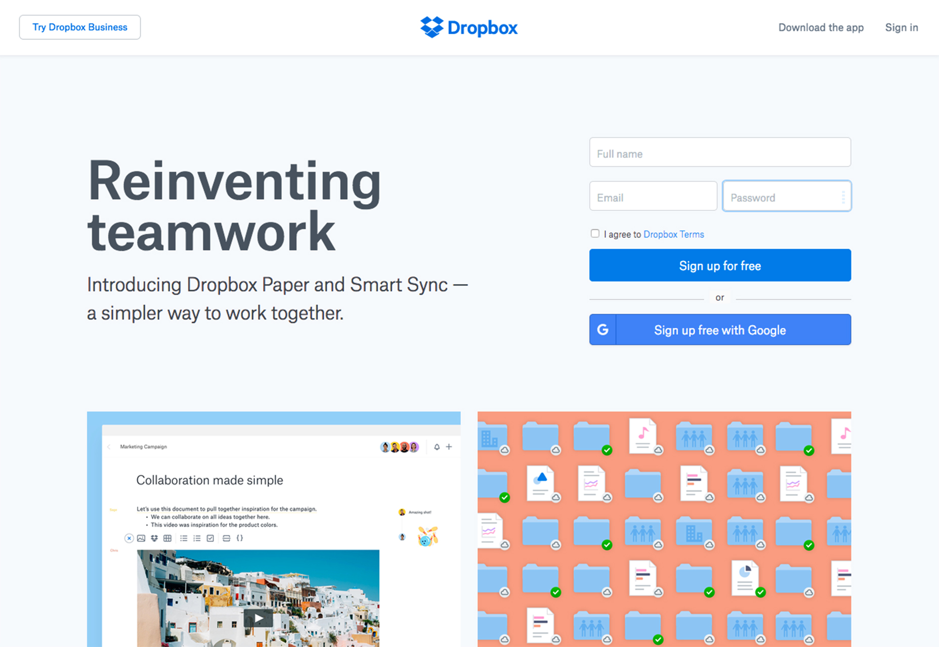
5. Make Microinteractions Meaningful
Think about the tiny elements in the design that users will interact with. Social media websites in particular drive so much engagement because they create simple experiences with microinteractions. As a refresher, microinteractions are tiny moments when a user engages with a design. Every time you change a setting, send a message, log in or like a status you’ve witnessed a microinteraction. From clicking the Instagram heart (and watching it turn red) to tapping to retweet, these feedback loops are what keep users coming back. Meaningful microinteractions create a demand for the design. It adds a level of function for users that makes the overall experience worthwhile. Microinteractions also make a design helpful or desired. Connect these moments to the key goals of your website. It can be anything from allowing users to share a product they just purchased to adding something to a wishlist to signing up for an alert.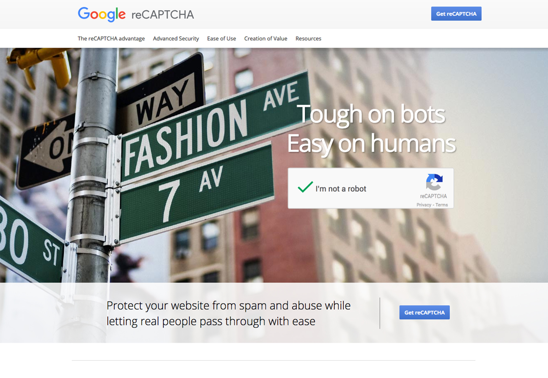
6. Create a Narrative
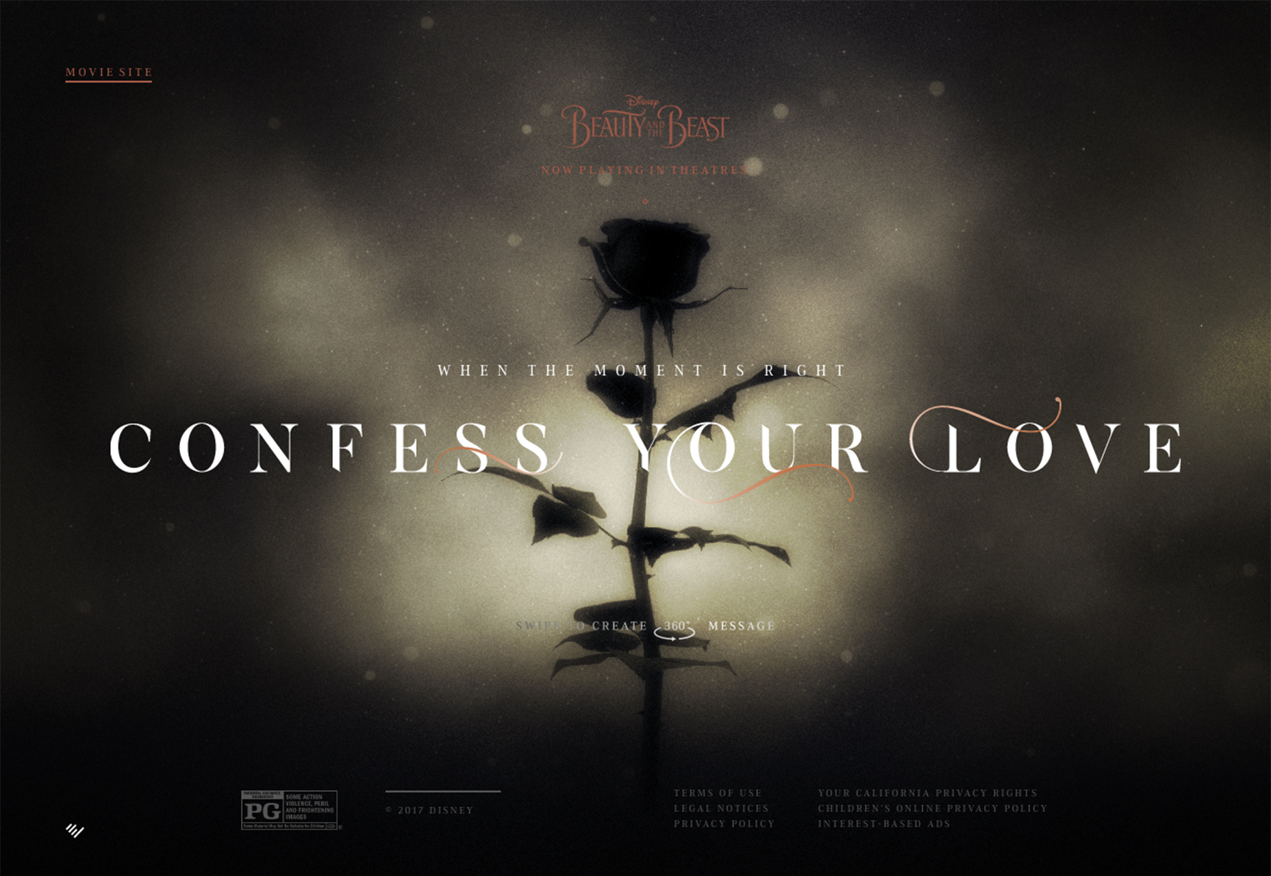
Every story has a beginning, middle and end. If your website design doesn’t represent this story flow, users can get confused or lost. Here’s the simplest of formulas:- Beginning: Logo and headline. Let users know who you are and why they are on your website.
- Middle: All of the supporting narrative that makes you special. What can you do for people who are on your site? What should they expect?
- End: An obvious call to action such as a form, ability to make a purchase or link to something else.
7. Keep the Storyline Simple
This might sound counter to the advice in No. 6, but the story needs to be simple. This isn’t a 1,500 page volume. A simple storyline is one that you could explain in 5 seconds or less. The story should grab users right away, leave an impression and make them want to return. Yes, you can do this with a beginning, middle and end. Upstream does this all on the homepage – users can scroll for more of the “middle” of the story, but there’s a glimpse of all three parts on the home page. The visuals and text tell a story of need and helping people with Upstream there to help. There’s a “get involved” button on the screen and the visual is so striking that you want to help. The story is simple and effective. Users are more likely to remember it … and you.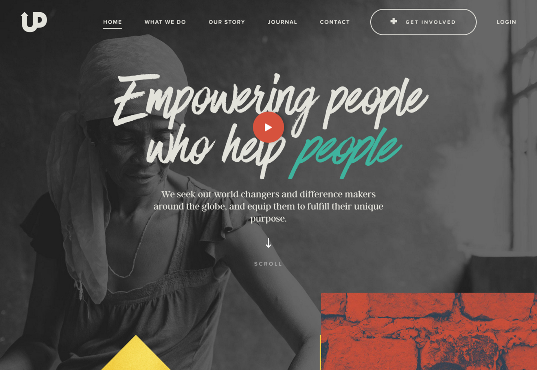
Conclusion
When you are designing a story, the most important thing to remember is that your story should be yours. Don’t try to be something you are not. Users are more likely to connect with authenticity than a made up narrative.Carrie Cousins
Carrie Cousins is a freelance writer with more than 10 years of experience in the communications industry, including writing for print and online publications, and design and editing. You can connect with Carrie on Twitter @carriecousins.
Read Next
3 Essential Design Trends, November 2024
Touchable texture, distinct grids, and two-column designs are some of the most trending website design elements of…
20 Best New Websites, October 2024
Something we’re seeing more and more of is the ‘customizable’ site. Most often, this means a button to swap between…
Exciting New Tools for Designers, October 2024
We’ve got goodies for designers, developers, SEO-ers, content managers, and those of you who wear multiple hats. And,…
15 Best New Fonts, September 2024
Welcome to our roundup of the best new fonts we’ve found on the web in the previous four weeks. In this month’s edition…
By Simon Sterne
3 Essential Design Trends, October 2024
This article is brought to you by Constantino, a renowned company offering premium and affordable website design
You…
A Beginner’s Guide to Using BlueSky for Business Success
In today’s fast-paced digital world, businesses are always on the lookout for new ways to connect with their audience.…
By Louise North
The Importance of Title Tags: Tips and Tricks to Optimize for SEO
When it comes to on-page SEO, there’s one element that plays a pivotal role in both search engine rankings and user…
By Simon Sterne
20 Best New Websites, September 2024
We have a mixed bag for you with both minimalist and maximalist designs, and single pagers alongside much bigger, but…
Exciting New Tools for Designers, September 2024
This time around we are aiming to simplify life, with some light and fast analytics, an all-in-one productivity…
3 Essential Design Trends, September 2024
September's web design trends have a fun, fall feeling ... and we love it. See what's trending in website design this…
Crafting Personalized Experiences with AI
Picture this: You open Netflix, and it’s like the platform just knows what you’re in the mood for. Or maybe you’re…
By Simon Sterne
15 Best New Fonts, August 2024
Welcome to August’s roundup of the best fonts we’ve found over the last few weeks. 2024’s trend for flowing curves and…
By Ben Moss


