
Art direction is a filter for making judgments; you pass every design choice through it. Start by determining the overall emotion. All the copy, photography, UI elements, buttons, and the kitchen sink should be pinged against this ideal. I like to think of it as the Magic Kaleidoscope Looking Glass. It helps to determine which path I need to take when struggling with design decisions. — Christopher Cashdollar, Creative Director, Happy CogArt direction also plays a vital role in the world of web design. Designers and developers create responsive designs that involve a lot of imagery. In the realm of responsive design, the role of art direction can’t be over-emphasized; from the flow of content on web pages, to placement of ad banners, to the way images are displayed at different resolutions.
Design is the how. It’s the foundation of all communication, the process and production of typography, color, scale and placement. Art direction is the why. It’s the concept and decisions that wrap itself around the entire product. — Jarrod Riddle, Senior Art Director, Big Spaceship
Art Direction in Ads
Let’s look at some examples of art direction in ads. Below are some ads with astonishing art direction.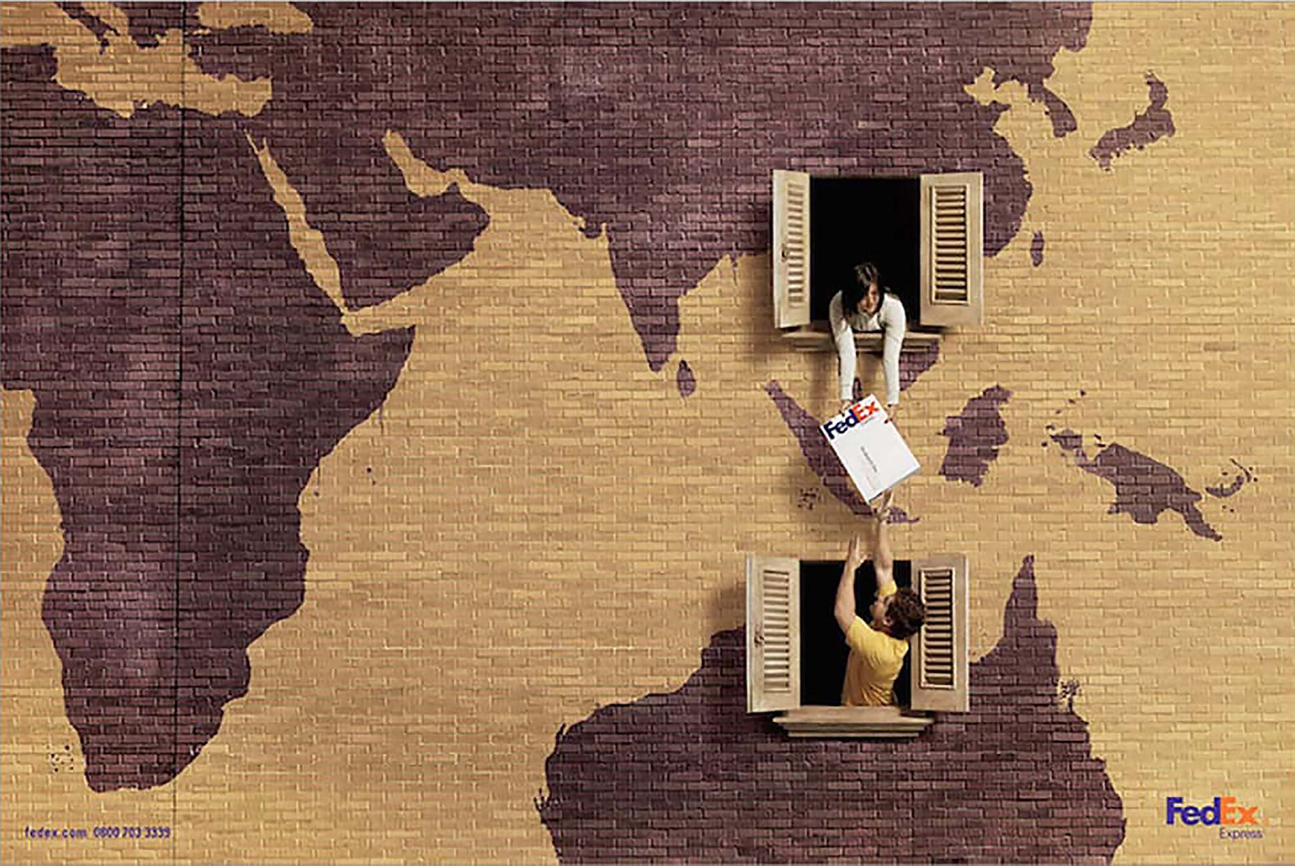 Fedex: China - Australia
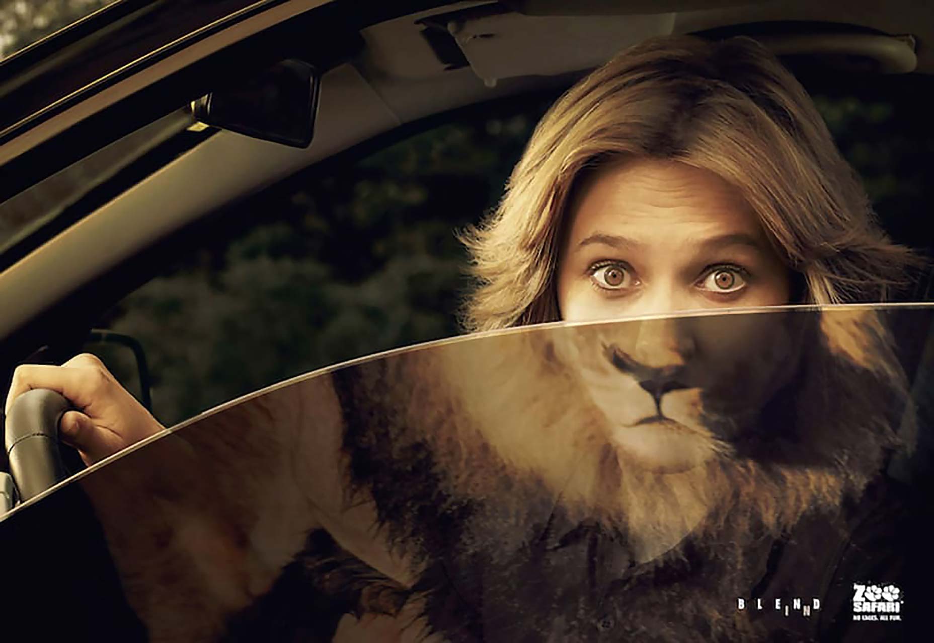 Zoo Safari: Lion
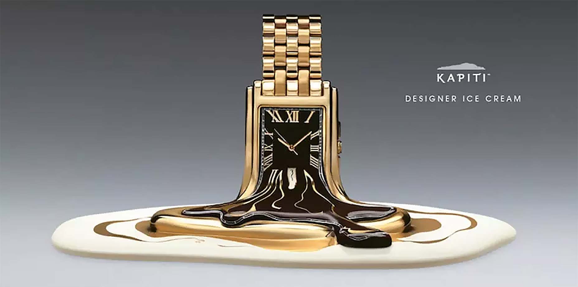 Kapiti: Designer Ice Cream
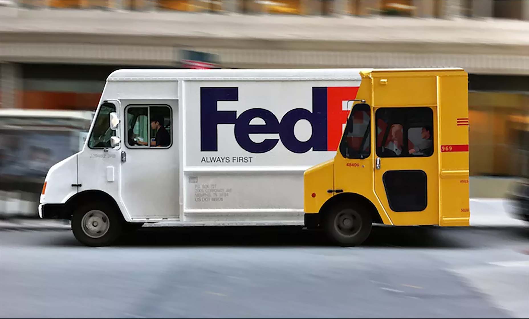 Fedex: Always First Truck
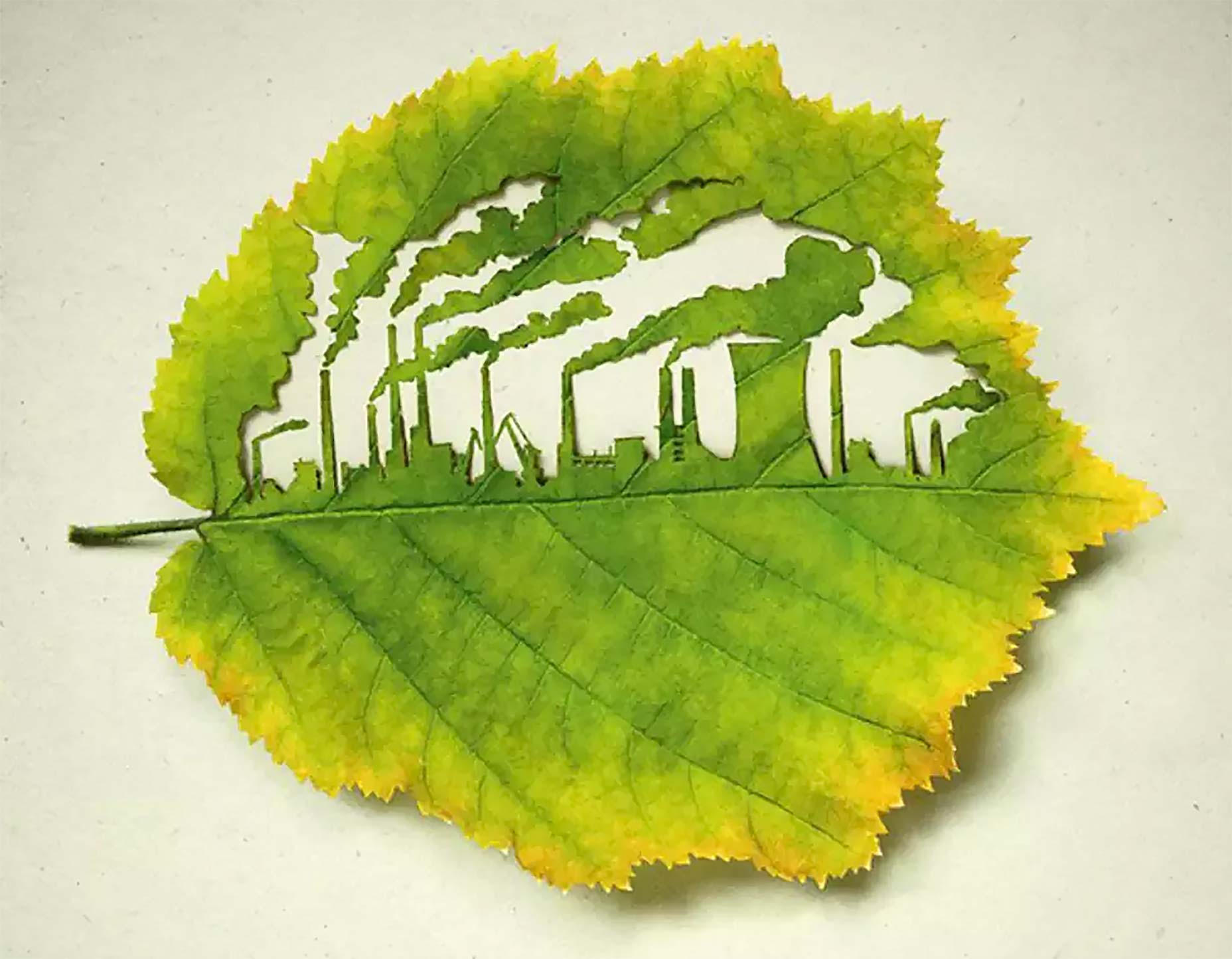 Plant for the Planet: Factory
Looking at these ad banners creates an emotional connection and evokes an experience that I’ll not soon forget. Yes, that’s the power of art direction!
What is Art Direction in Responsive Web Design?
While these are great examples of art design in advertising, our focus is on delivering impactful images in responsive web design. So, what is art direction in this regard and how does it affect responsive images on your web platforms? Art direction is a technique for drawing attention to the most important parts, or targeting specific features of an image, even when it’s viewed on different devices or platforms. Consider this example: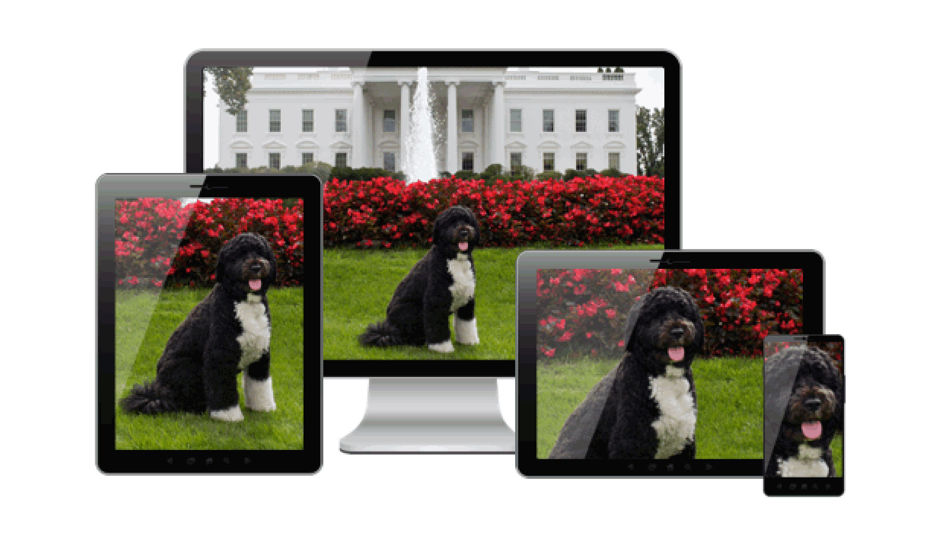 Source: ResponsiveImages.org
The full image can be seen on a wide display, 2560 x 1600 for example. But when viewed on an iPad or an iPhone, the dog is is the central focus. For this image, the art director — such as the designer, developer or a visual director, wants the viewers to see more of the dog than any other object in that image.
Let’s take a look at another example in action. It is an art-directed front page created by Eric Portis.
http://res.cloudinary.com/eeeps/video/upload/w_770/hero-flow.mp4
You can check it out here : https://ericportis.com/etc/cloudinary/
So, right now you might be thinking, “Wow, this is cool” or “This is awesome.” and wondering how you might implement this yourself and give viewers a captivating art-directed page?
Crafting Art-Directed Responsive Images
Doing so doesn’t need to be complicated. To achieve this on your own, you would have to manually crop individual images to fit them on various resolutions. Another alternative is to go the route of cropping all images to focus on the center of the image. And as you might be aware already, important content can be lost trying to use the “one size fits all” approach. One of the easiest ways to go about is to take advantage of Cloudinary’s face detection, cropping, resizing and optimization capabilities to provide art-directed images. Let’s start with this image below: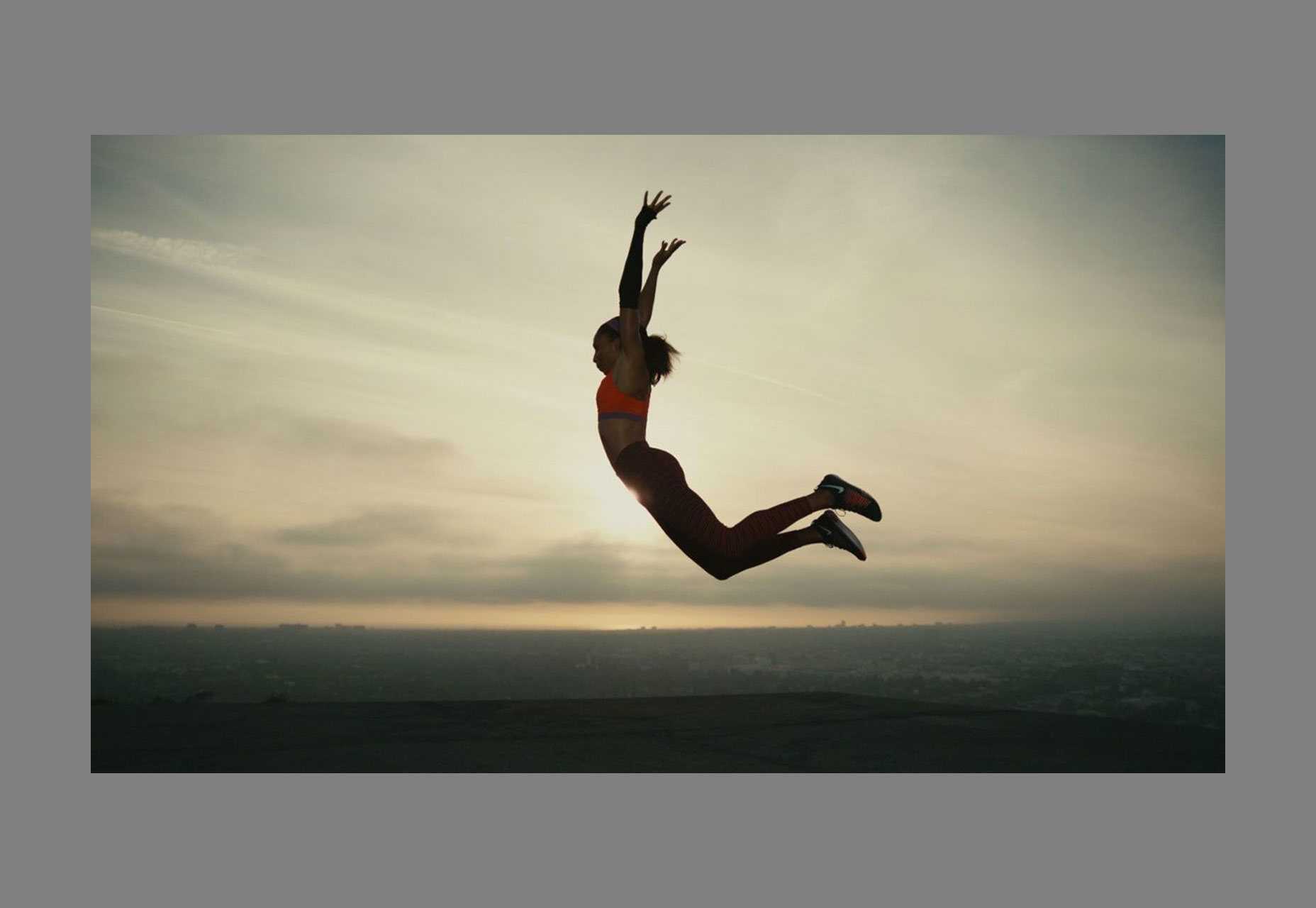 Serena Williams is centered in this image (1600 x 700)
We will apply various properties to this image and see the results, before putting it together using a <picture> and <source> to see the full impact of art direction. New to the <picture> element? Check out this excellent post on how the <picture> element works.
Cloudinary enables us to supply a certain aspect ratio like so:
 Source: http://res.cloudinary.com/unicodeveloper/image/upload/ar_16:9,w_600/4739297-free-images_mostdh.jpg
Let’s crop the image by using the c_fill parameter that Cloudinary provides. It works like background-fit: cover in CSS. You’ll discover that the image will be stretched to fit the width. Notice the difference?
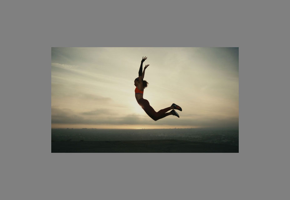 Source: http://res.cloudinary.com/unicodeveloper/image/upload/c_fill,ar_16:9,w_600/4739297-free-images_mostdh.jpg
When cropping, Cloudinary focuses on an image’s center by default. Now, focusing on the center doesn’t always work like I mentioned earlier. An example would illustrate my point better.
Check this cute cat below:
We applied the “c_fill” filter and it yanked out a greater part of the cat image and left us with the background. Is this what we want? Definitely not!
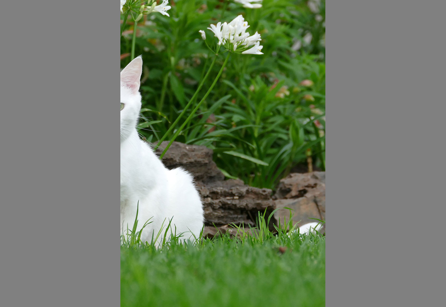 Source: http://res.cloudinary.com/demo/image/upload/c_fill,ar_4:6/white_cat.jpg
Cropping it on another point using the gravity property such as g_auto gives us our desired output like so:
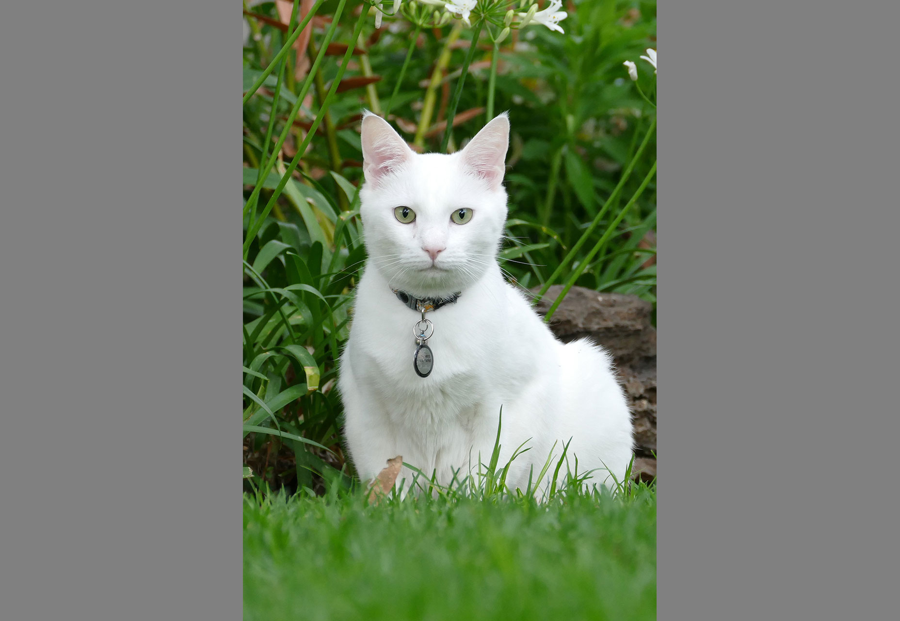 Source: http://res.cloudinary.com/demo/image/upload/c_fill,ar_4:6,g_auto/white_cat.jpg
That’s what I’m talking about. Whoop! Whoop!
Now back to our original example, let’s crop in on another point using the gravity property like so:
Using g_south, you can see how it shows the bottom part of the image and crops off the head
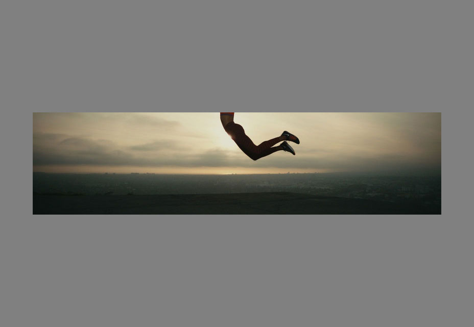 Source: http://res.cloudinary.com/unicodeveloper/image/upload/c_fill,ar_4:1,w_800,g_south/4739297-free-images_mostdh.jpg
Using g_north, you can see how it shows the top part and crops off the bottom.
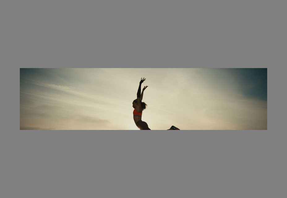 Source: http://res.cloudinary.com/unicodeveloper/image/upload/c_fill,ar_4:1,w_800,g_north/4739297-free-images_mostdh.jpg
But by default, we can see a more focused image.
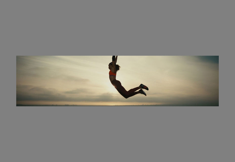 Source: http://res.cloudinary.com/unicodeveloper/image/upload/c_fill,ar_4:1,w_800/4739297-free-images_mostdh.jpg
On very small devices, we can take advantage of the Cloudinary c_thumb parameter that tries to focus on in on the image with an aspect ration of 1:1 like so:
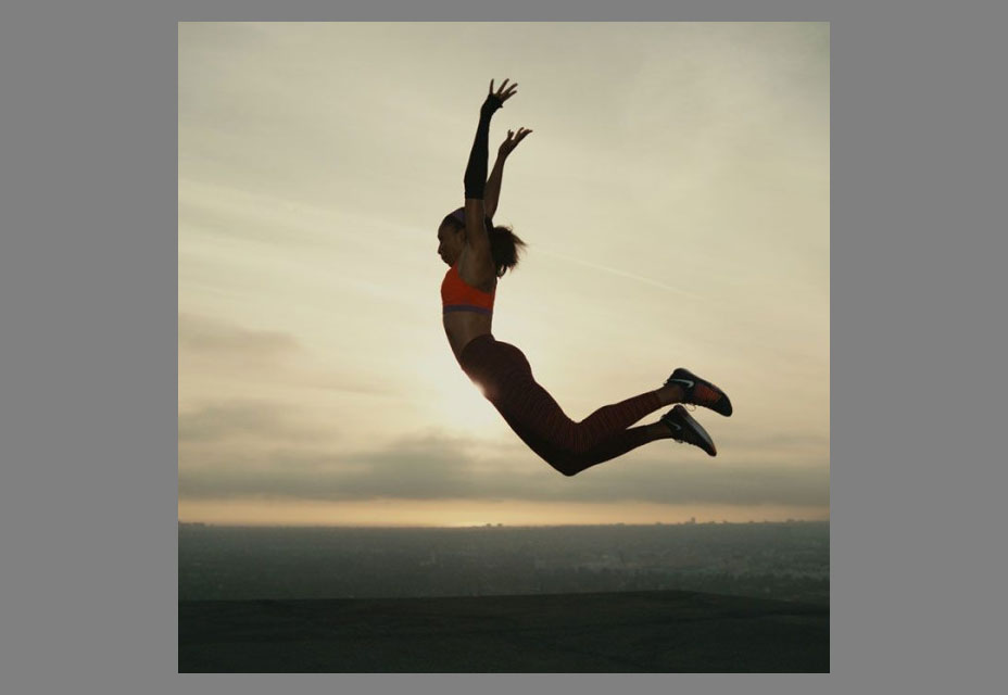 Source: http://res.cloudinary.com/unicodeveloper/image/upload/c_thumb,ar_1:1,w_600/4739297-free-images_mostdh.jpg
Visible Art Direction
Now, let’s see how this works in a web page. Create an `index.html` file and insert this code in it like so:<!DOCTYPE html> <html lang="en"> <head> <meta charset="UTF-8"> <title>Art Direction</title> </head> <body> <picture> <!-- wide crop --> <source media="(min-width: 600px)" srcset="https://res.cloudinary.com/unicodeveloper/image/upload/c_fill,ar_2:1,g_face,f_auto,q_70,w_800/4739297-free-images_mostdh.jpg 800w, http://res.cloudinary.com/unicodeveloper/image/upload/c_fill,ar_2:1,g_face,f_auto,q_70,w_1600/4739297-free-images_mostdh.jpg 1600w" sizes="100vw" /> <!-- standard crop --> <img srcset="https://res.cloudinary.com/unicodeveloper/image/upload/f_auto,q_70,w_800/4739297-free-images_mostdh.jpg 800w, http://res.cloudinary.com/unicodeveloper/image/upload/f_auto,q_70,w_1600/4739297-free-images_mostdh.jpg 1600w" src="https://res.cloudinary.com/unicodeveloper/image/upload/f_auto,q_70,w_800/4739297-free-images_mostdh.jpg" alt="Serena Williams Jumping" sizes="100vw" /> </picture> </body> </html>Browsers will use the srcset to select the image to load based on the viewport size and display density. We have already defined the breakpoint in the source tag. Once the browser is opened on larger screens, the image visually adapts for a larger viewport. Check out the flow in your browser.
Conclusion
A combination of the <picture> and <source> tags helped us craft art-directed responsive images. Art direction brings out the best in your ad and web platforms, it establishes a connection between the user and the website or ad banner. With Cloudinary you can easily integrate art direction in your process flow. [-- This is an advertorial on behalf of Cloudinary --]WDD Staff
WDD staff are proud to be able to bring you this daily blog about web design and development. If there's something you think we should be talking about let us know @DesignerDepot.
Read Next
3 Essential Design Trends, November 2024
Touchable texture, distinct grids, and two-column designs are some of the most trending website design elements of…
20 Best New Websites, October 2024
Something we’re seeing more and more of is the ‘customizable’ site. Most often, this means a button to swap between…
Exciting New Tools for Designers, October 2024
We’ve got goodies for designers, developers, SEO-ers, content managers, and those of you who wear multiple hats. And,…
15 Best New Fonts, September 2024
Welcome to our roundup of the best new fonts we’ve found on the web in the previous four weeks. In this month’s edition…
By Simon Sterne
3 Essential Design Trends, October 2024
This article is brought to you by Constantino, a renowned company offering premium and affordable website design
You…
A Beginner’s Guide to Using BlueSky for Business Success
In today’s fast-paced digital world, businesses are always on the lookout for new ways to connect with their audience.…
By Louise North
The Importance of Title Tags: Tips and Tricks to Optimize for SEO
When it comes to on-page SEO, there’s one element that plays a pivotal role in both search engine rankings and user…
By Simon Sterne
20 Best New Websites, September 2024
We have a mixed bag for you with both minimalist and maximalist designs, and single pagers alongside much bigger, but…
Exciting New Tools for Designers, September 2024
This time around we are aiming to simplify life, with some light and fast analytics, an all-in-one productivity…
3 Essential Design Trends, September 2024
September's web design trends have a fun, fall feeling ... and we love it. See what's trending in website design this…
Crafting Personalized Experiences with AI
Picture this: You open Netflix, and it’s like the platform just knows what you’re in the mood for. Or maybe you’re…
By Simon Sterne
15 Best New Fonts, August 2024
Welcome to August’s roundup of the best fonts we’ve found over the last few weeks. 2024’s trend for flowing curves and…
By Ben Moss


