
What is Onboarding?
Before digging into useful onboarding examples, let’s break down exactly what we mean by ‘user onboarding experiences’. In its most basic form, onboarding is a process built into a software that increases a user’s chances of using that software successfully. It’s automated and usually takes place at the beginning of a user’s journey with a product, although experienced users can also be ‘onboarded’ when new features are introduced. An onboarding process can take several forms—a quick slide tour of main functionalities, a product tour, an account creation process, and more. The aim is to tell users what they need to know to make the most of your product, and to encourage them to come back for more. Successful onboarding makes for happy, engaged and loyal users; unsuccessful onboarding can leave people feeling confused after they download software, and disinclined to re-engage.What Makes a Good User Onboarding Experience?
It’s obvious that user onboarding is the lynchpin of a successful product engagement strategy. But how do you know when you’ve designed a good user onboarding experience, and when you’ve fluffed it? First off, there’s no one-size-fits-all user onboarding process. Sorry about that. An appropriate onboarding flow for one website might be a disaster for another. The same onboarding flow won’t work for all users across the board. Onboarding processes with excellent UX take time, research and iteration. There are, however, some onboarding best practices that can be used to guide the onboarding process. UX Designer and founder of UserOnboard.com Samuel Hulick outlines these principles:Onboarding Processes Should Be:
- “Action-oriented, not instructive: Rather than throwing up a bunch of tooltips that I have to remember later, have me learn by doing.
- Informed, not reactionary: Are the things you’re having me do highly correlated with me getting value out of the product, or are you just offloading busywork because your design is broken?
- Evolving, not fixed: Onboarding isn’t a “feature” but it’s often treated that way. Are you treating it like a quality of your overall experience that evolves along with your product and market, or is it something you ship every couple years?
- Holistic, not one-off: Onboarding can take the form of knowledge center docs, blog posts, invitations from a friend, lifecycle emails, a well-timed phone call, etc. Are you focusing on the interface and leaving the rest on the table?”
10 Great User Onboarding Experiences
1. Basecamp
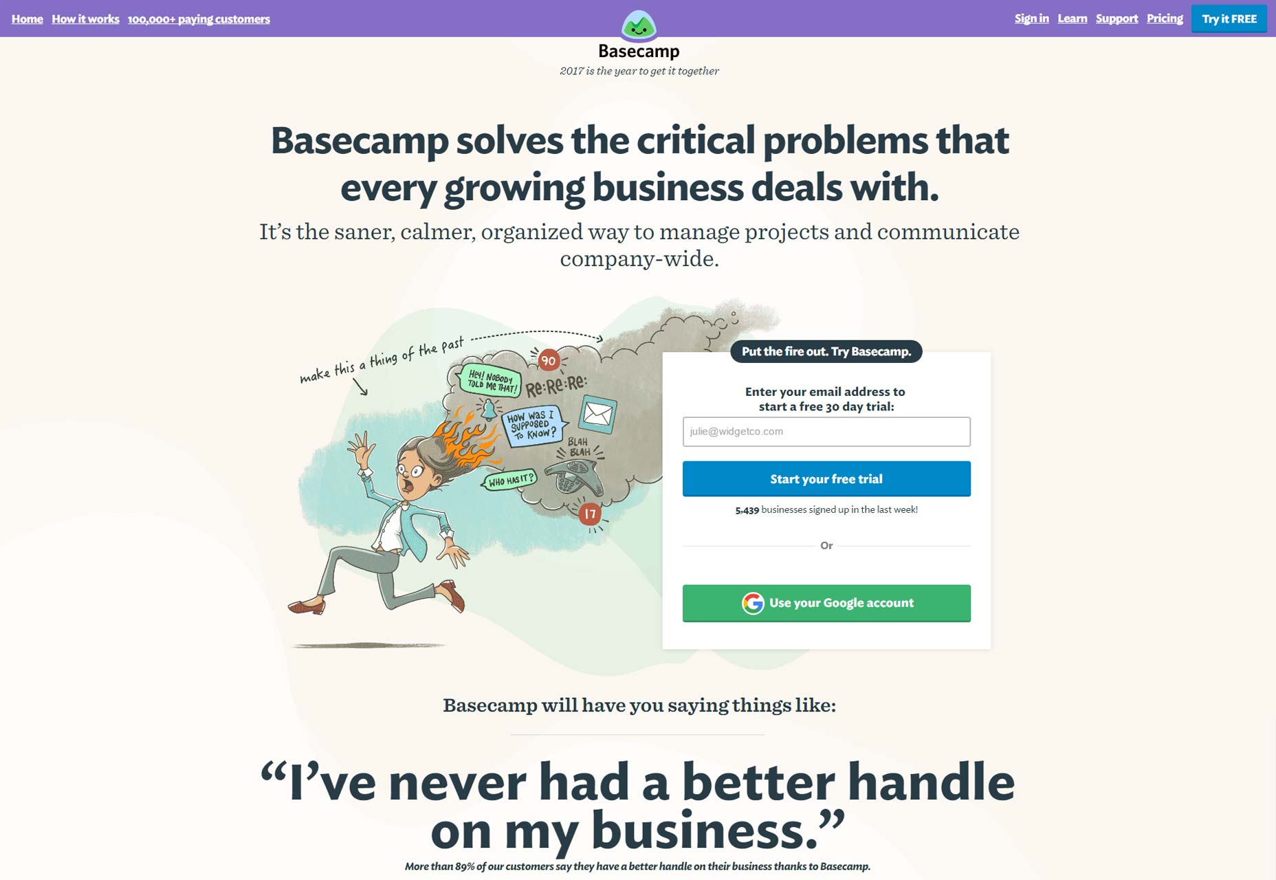
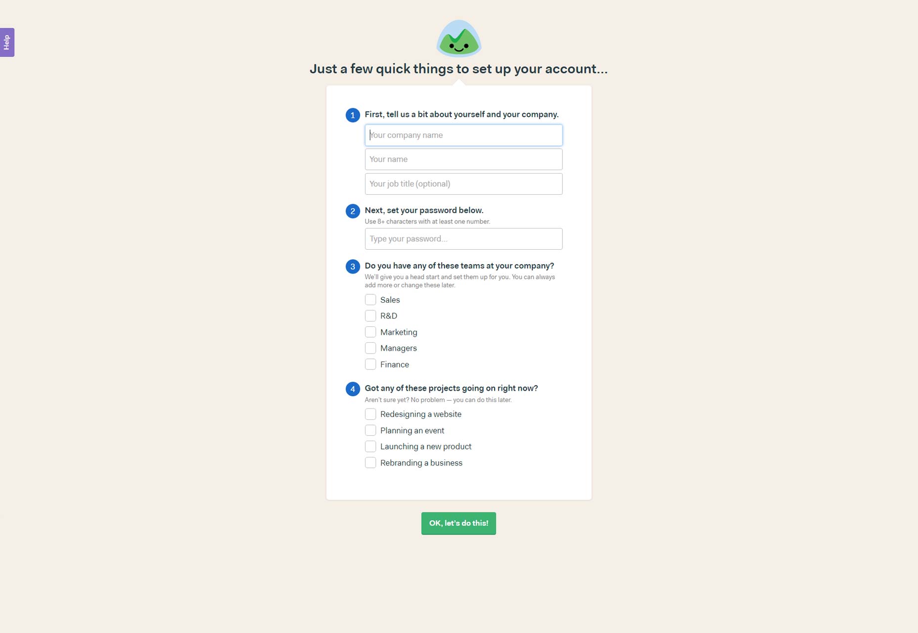
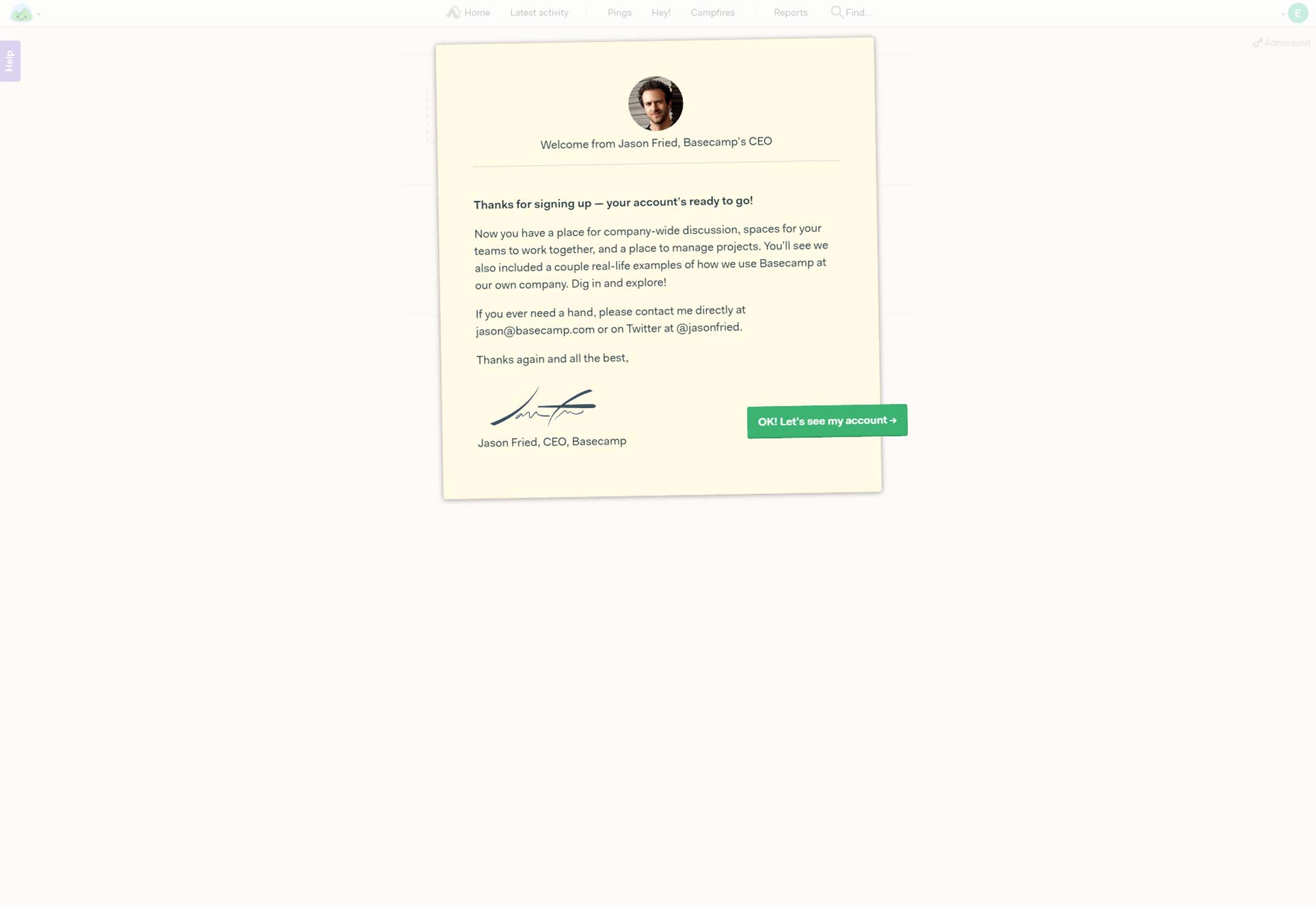
Project management software Basecamp has a really great onboarding experience that makes joining up an enjoyable experience. The kind of homey design style of the account creation page assuages new users fears about this being a big, expensive enterprise software. On top of that, the CEO says hello personally. The value proposition (VP) of Basecamp is that it promote team collaboration: having the boss say hi as you onboard reaffirms that VP. Users are then walked through the creation of a project, in an effective ‘learn-by-doing’ style onboarding process. Before you’ve even realized it you’ve set up a project in 3 quick steps, and been introduced to a key feature of Basecamp—their handy project templates.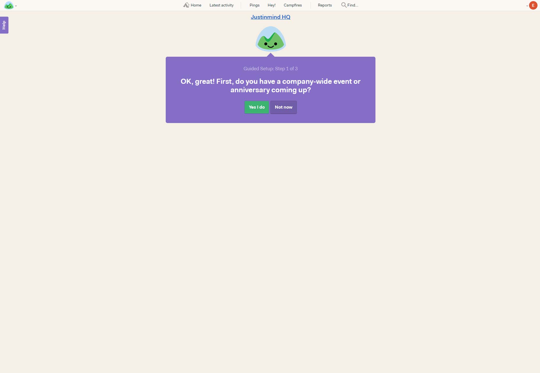
2. Dropbox
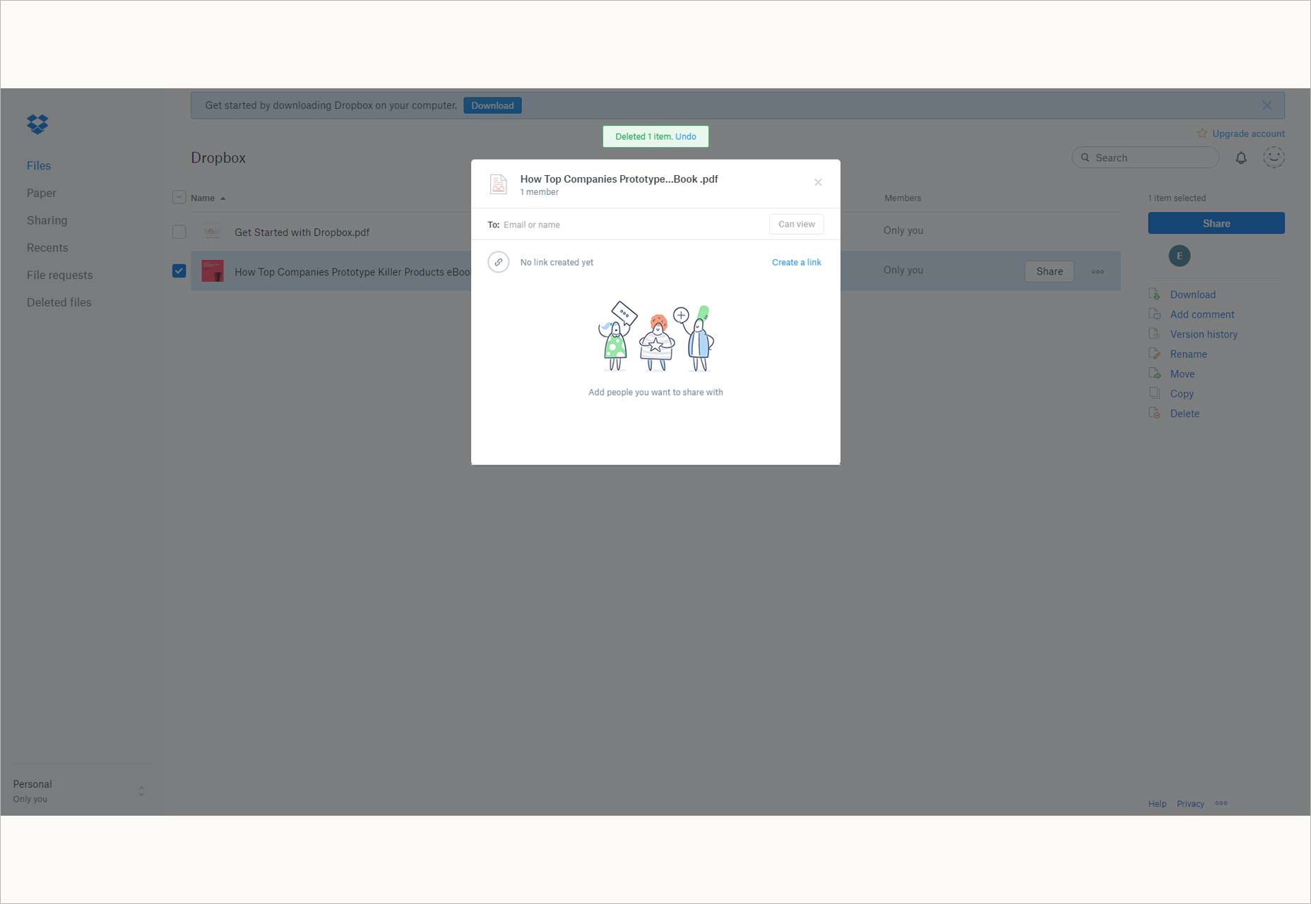
Dropbox combines the learn-by-doing approach with quick walk-through of the Cloud storage product’s main features. New users are guided through 7 key steps, from user verification to sharing documentation, through clear and neutral microcopy. Dropbox doesn’t let the branding opportunity slip by altogether though—instead of branded copy they go for cute illustrations that capture Dropbox’s efficient yet informal vibe.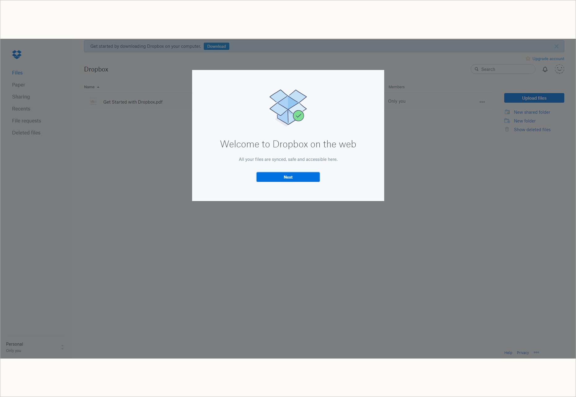
3. Slack
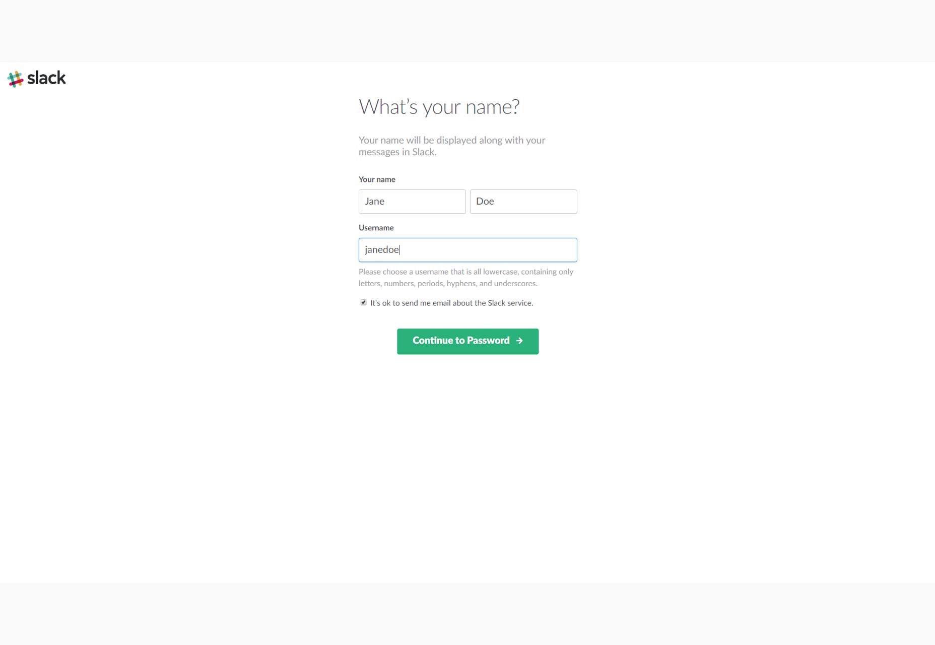
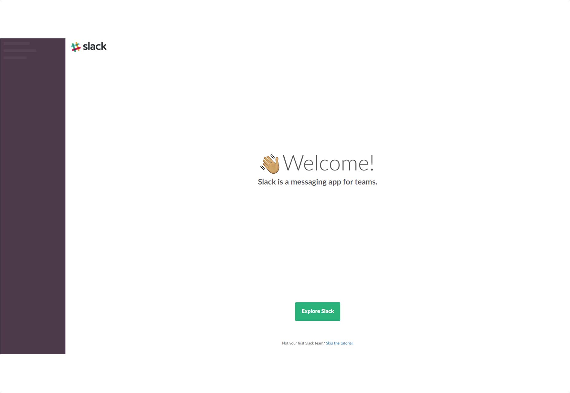
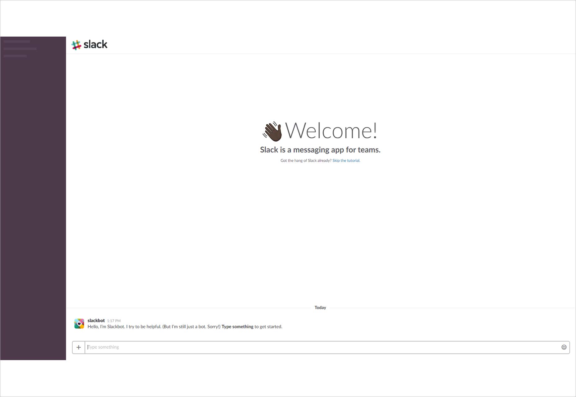
Slack’s onboarding is slick and intuitive. From the homepage you’re asked to ‘Create a new team’ just adding your email address, although you’re asked for more details on the following screen. You then go through a 3 step account set-up and you’re in to the interface. This is where Slack really stands out. They use a bot to onboard you. This is great because Slack is, after all, all about chatting. So you’re already being introduced to the software’s main functionality, and the microcopy is disarming too. You’re then taken on a tooltip tour with just 3 tips, and you’re free to go enjoy Slack.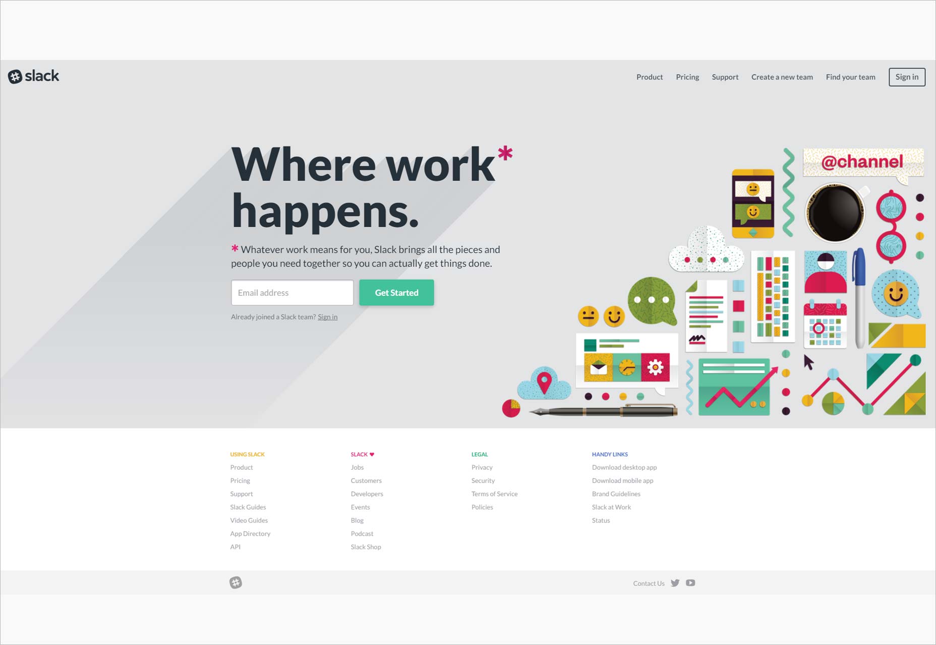
4. Canva
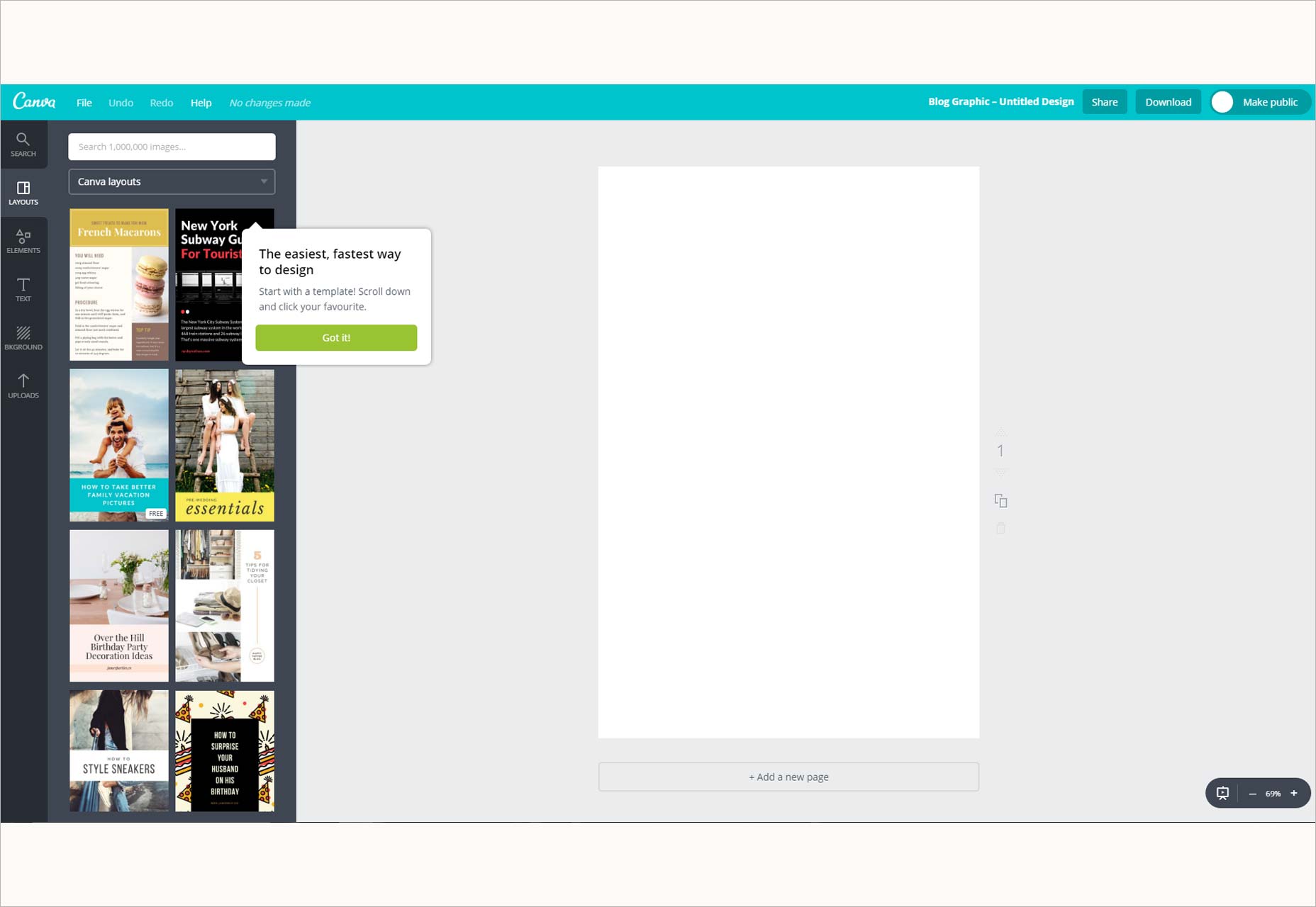
Graphic design software Canva asks users to get signed up right from the homepage, and uses some fun microcopy to assuage the anxiety of signing up for something new so fast. As soon as you’re in to the interface, you start designing through an interactive tutorial. It’s fun, incredibly quick, and leaves users keen to come back for more.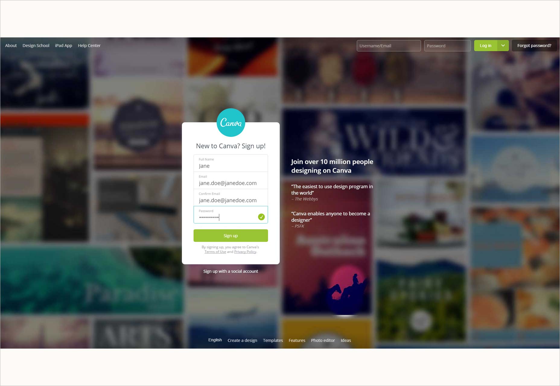
5. Justinmind
Justinmind personalizes the onboarding experience by catering to experienced prototyping tool users and newbies in two separate onboarding flows. When users download the prototyping tool they choose between two modes: Full or Beginner. Confident prototypers selecting Full mode are taken straight to the full tool interface, whereas users who select Beginner are given a tool-tip tour round a restricted ‘getting started’ interface. The interactive tooltips link to YouTube video tutorials, and once users feel they know enough they can switch to Full mode.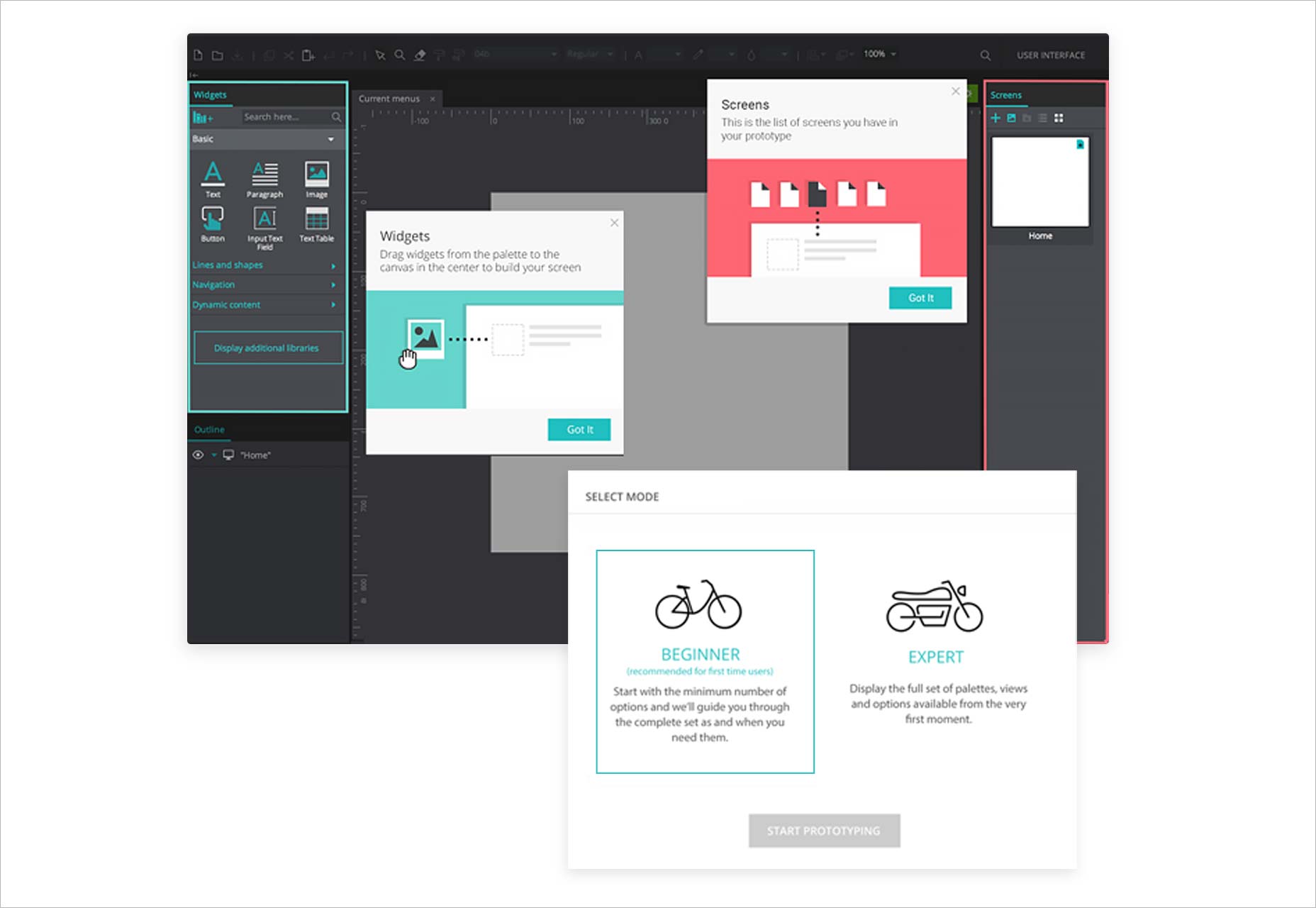
6. Pinterest
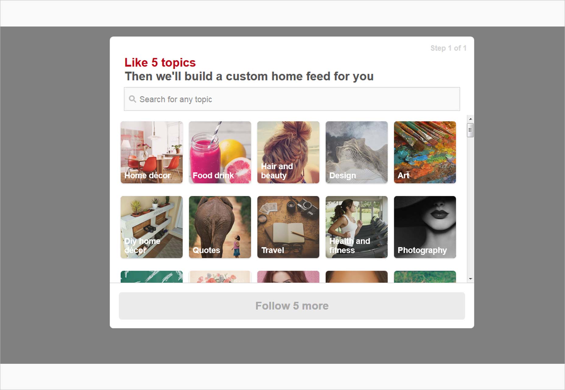
While Pinterest’s homepage fails to present us with a strong value proposition (“the world’s catalog of ideas”? Why would anyone want to have that?), it does a great job of making users engage with the app from the get-go. To proceed with onboarding you have to pick 5 topics that interest you. And that’s more or less it. The card layout mirrors the entire Pinterest interface, there’s only one Call To Action once you’re on the home-feed, and that’s Save. From there you’re guided to creating a board. It’s painless and mirrors the guileless simplicity of Pinterest itself.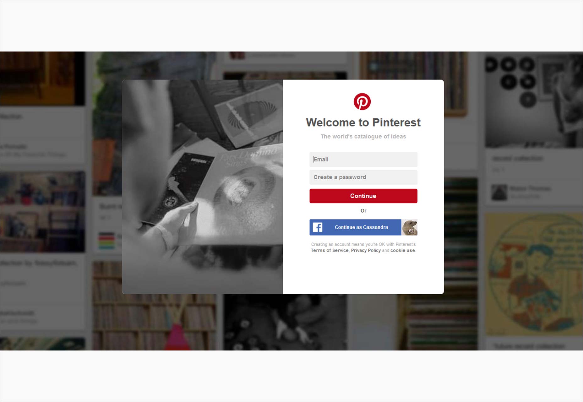
7. Duolingo
Language app Duolingo uses psychology to onboard its users and keep them engaged. Right from the start users are asked to select the language they want to learn and their goal. Way to create commitment in a user. In less than 10 taps, users are learning their chosen language and simultaneously being walked through the app with spotlight modals. Users are taken right to core functionality and made to feel successful from the first.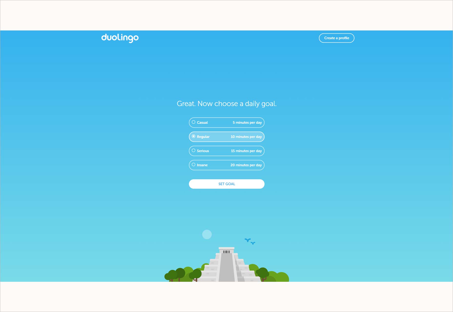
8. Squarespace
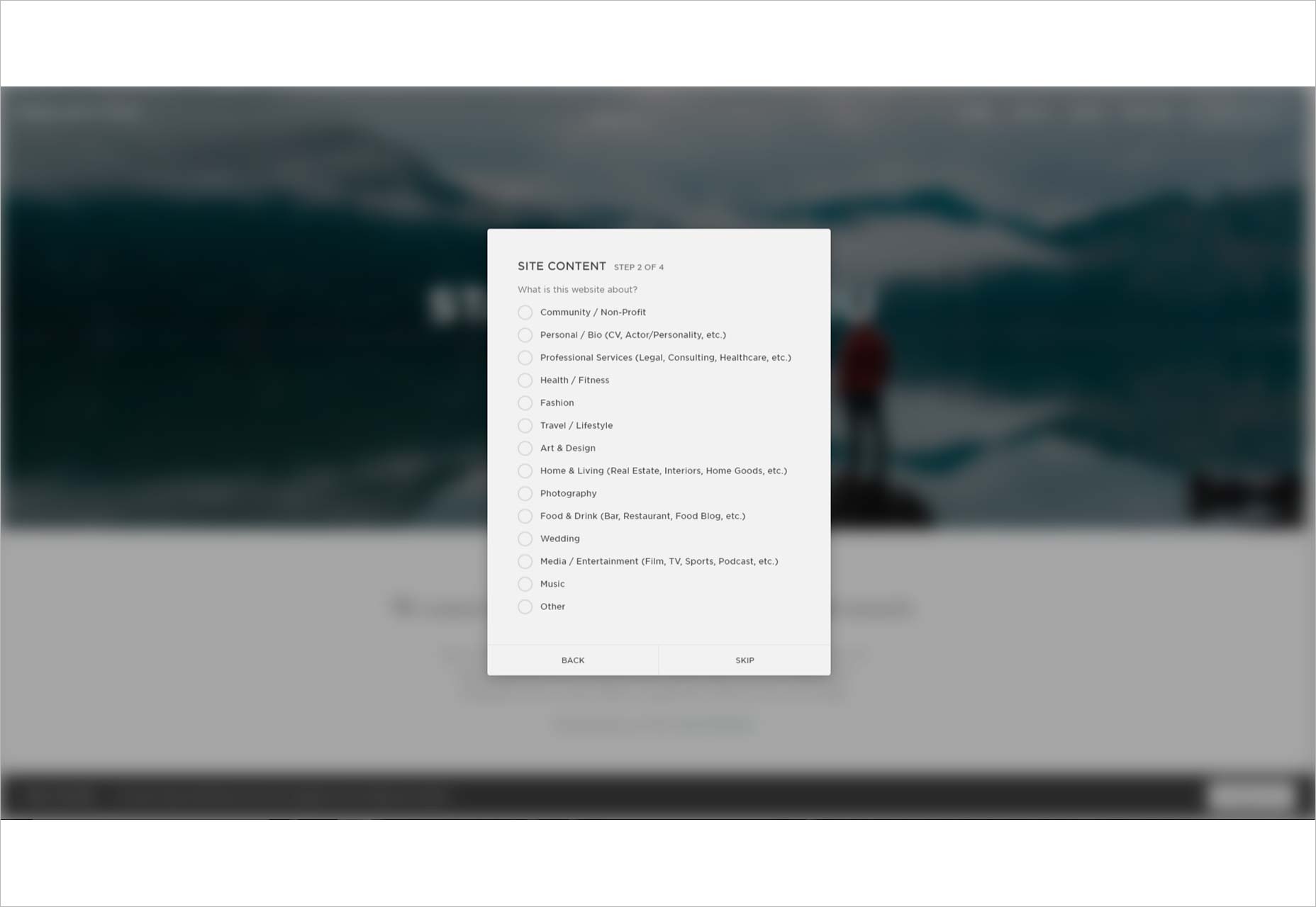
Squarespace lets prospective users see their huge range of web templates to tempt them into signing up. Once a template is selected there’s a brief account creation step before you’re left to play around with the template. Now and then tooltips crop up with clear microcopy, and GIFs guide your way.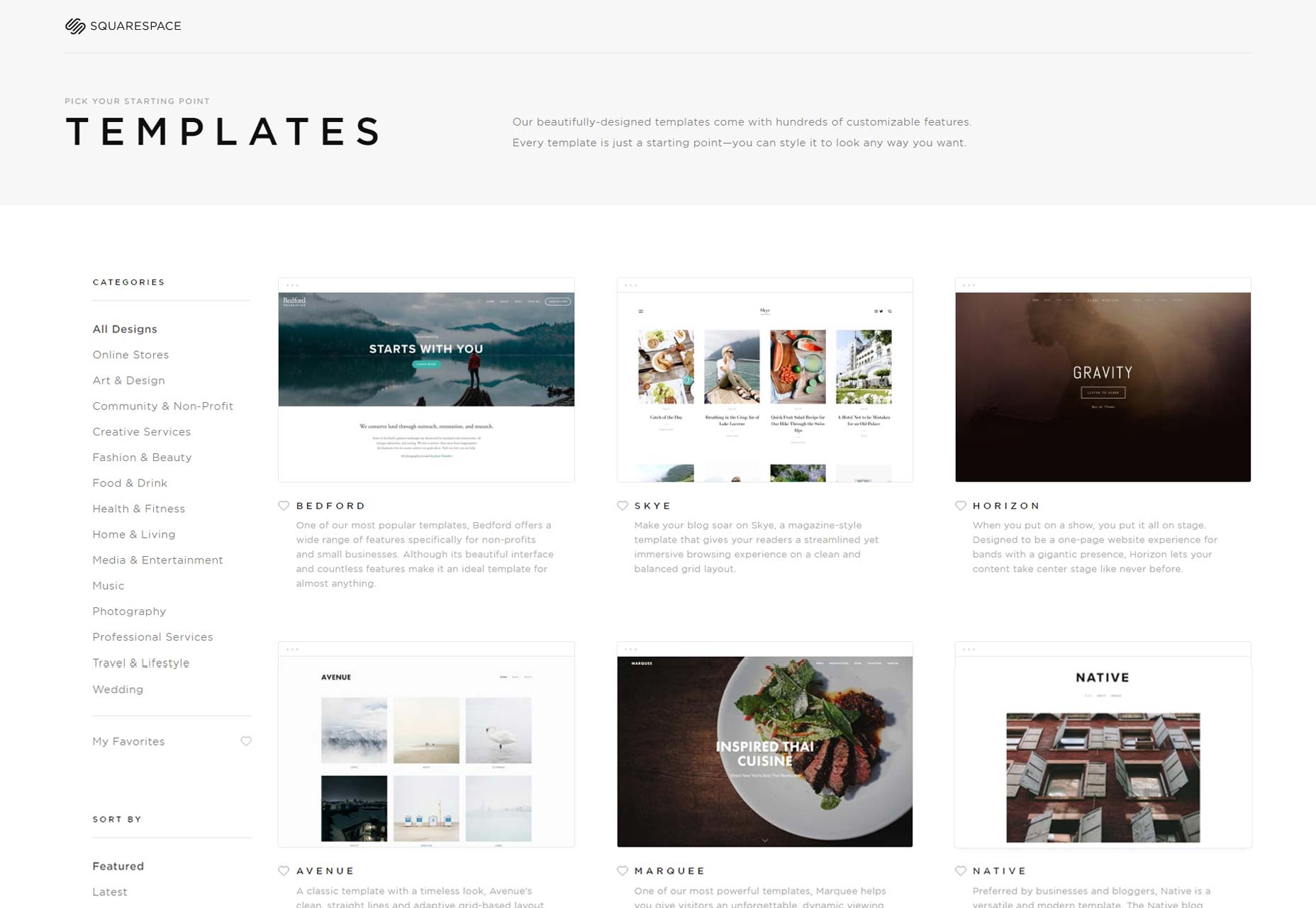
9. Evernote
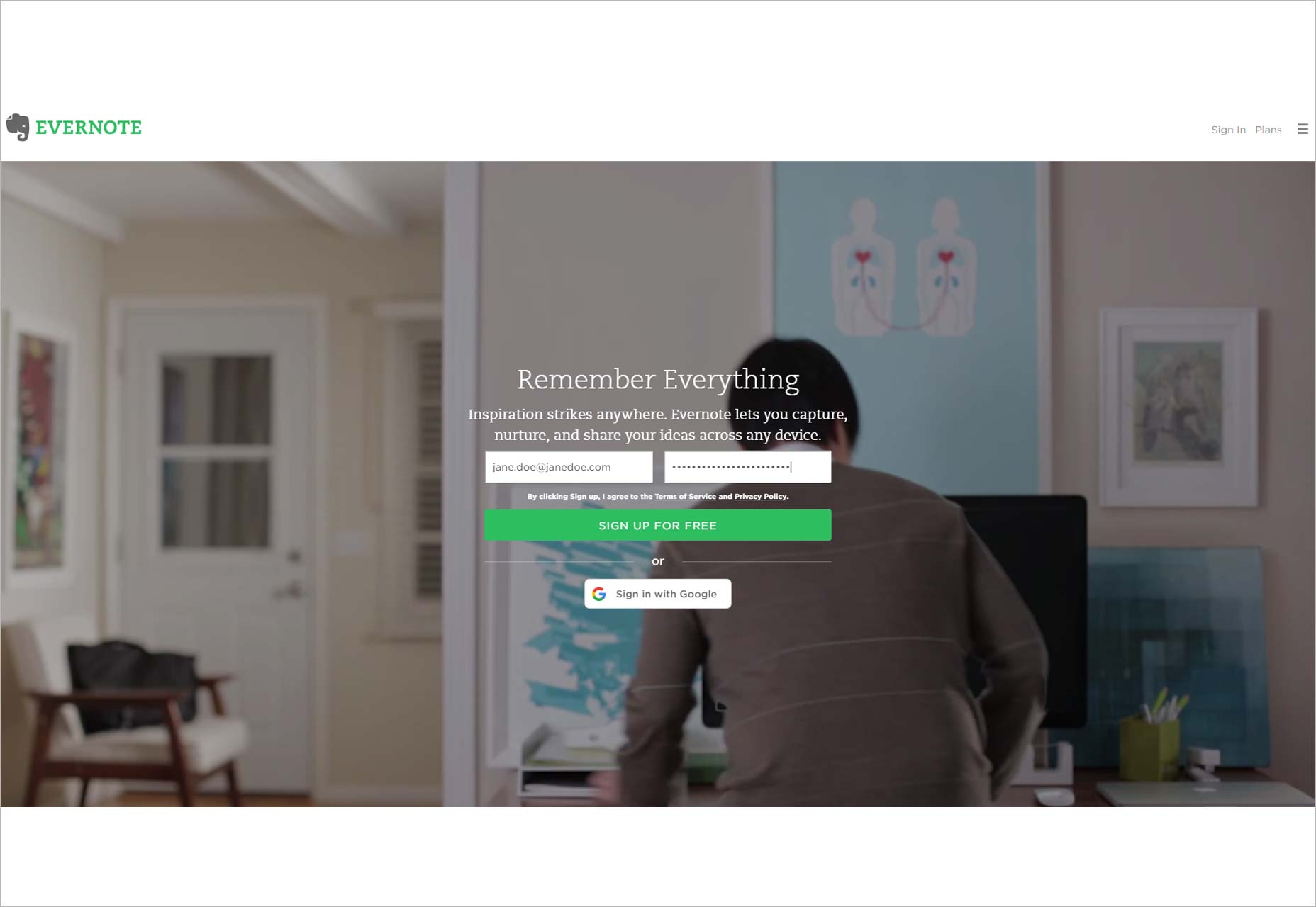
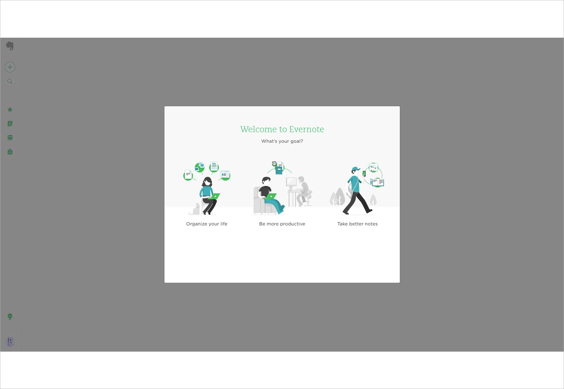
Evernote uses their CTA button to make a big deal of the fact you can sign up for free, thereby assuaging any anxieties about payment down the line. On the next screen they encapsulate Evernote’s 3 main functionalities with illustrations that are disarming but not saccharine and then take you to the interface that best suits your needs. They 4 step interface tour includes a handy progress bar that shows users just how painless the onboarding experience is. The vibe fits perfectly with Evernote’s userbase: people who want to make notes easily and quickly, as if they were writing in a notebook.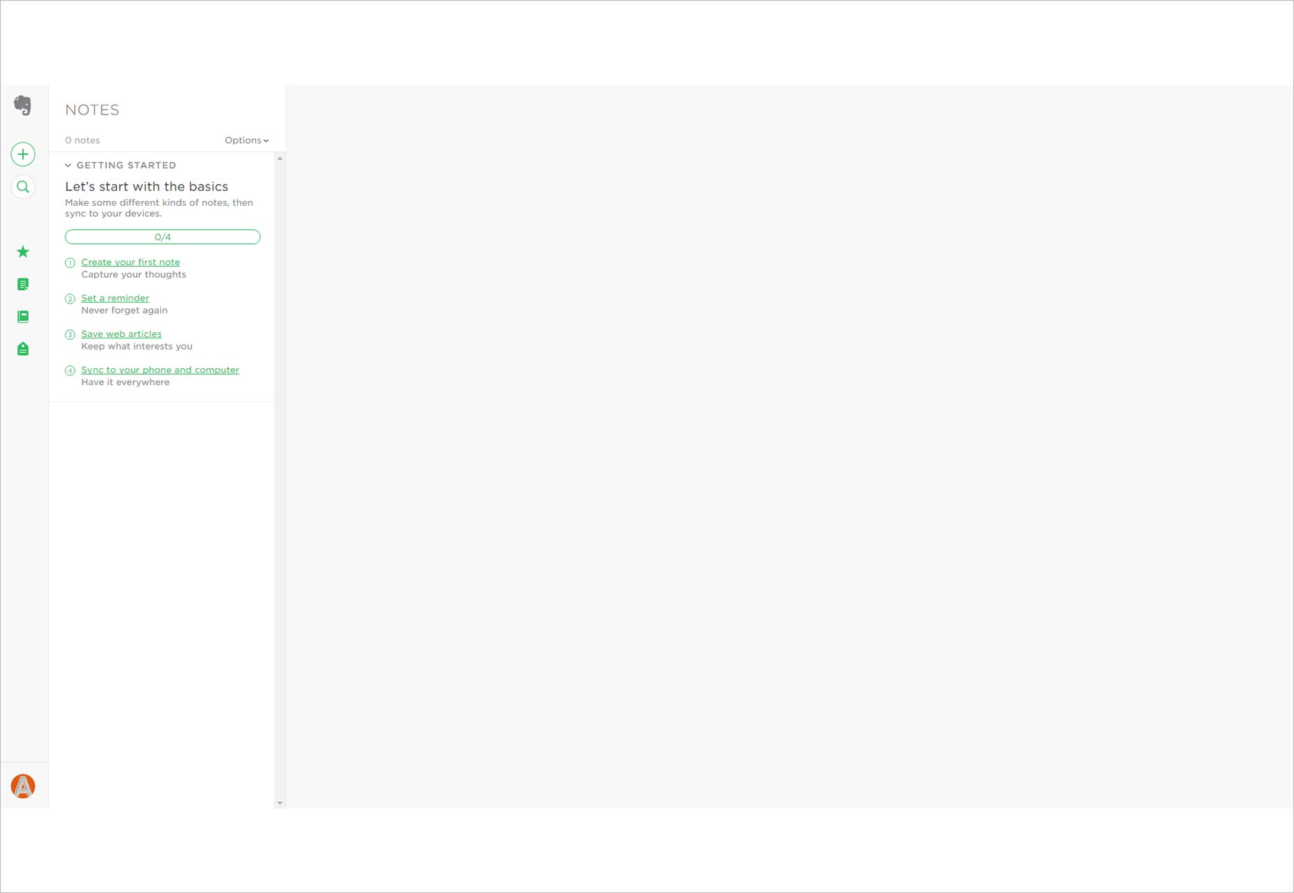
10. Mailchimp
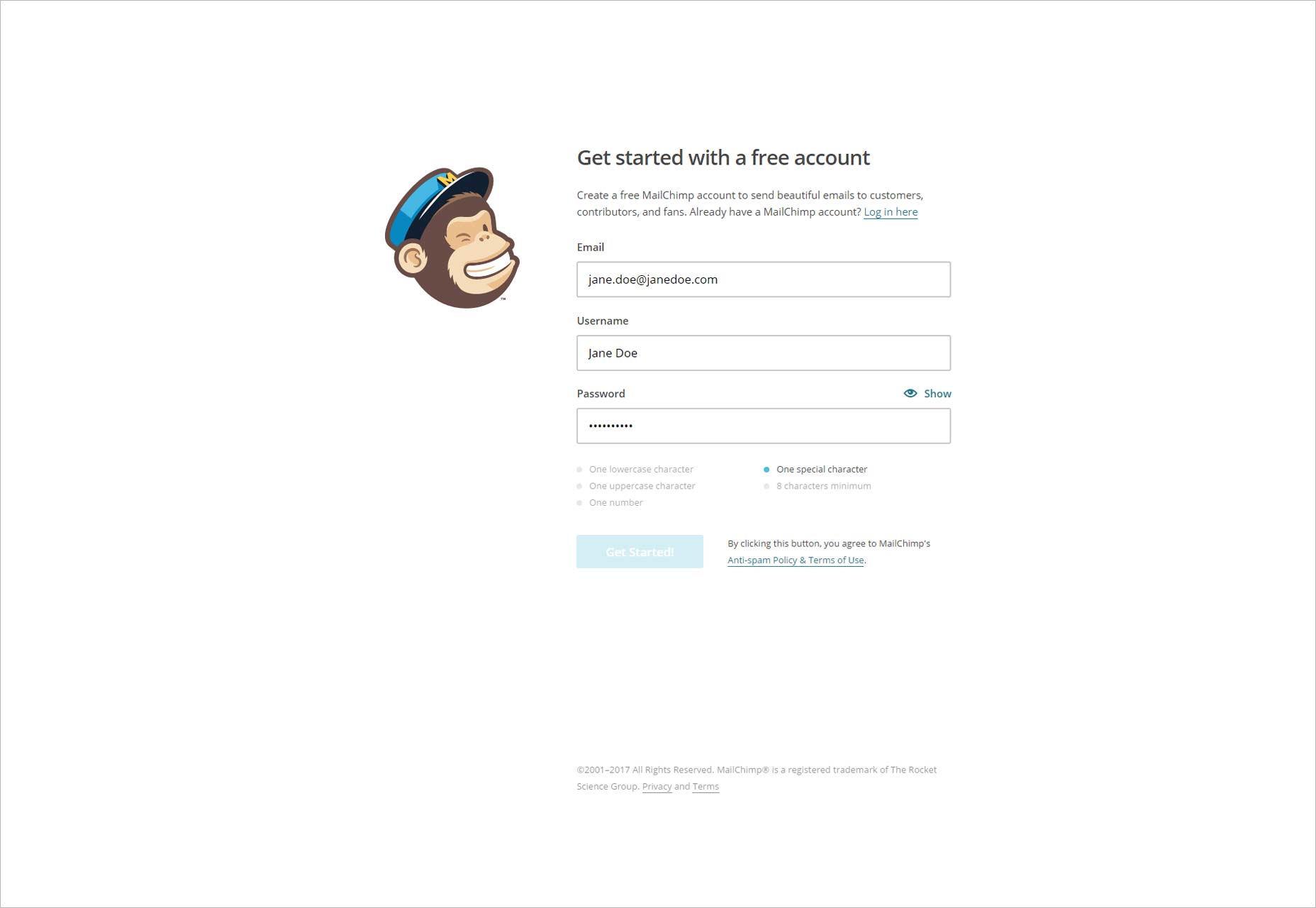
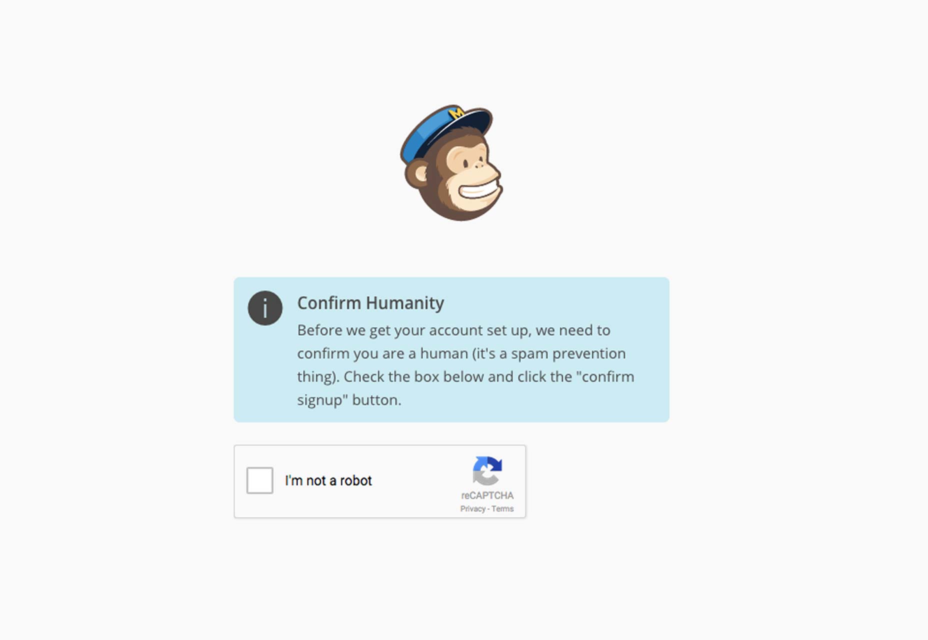
Mailchimp’s onboarding starts with an incredibly strong value proposition. “Send better email. Sell more stuff”. They’ve nailed what Mailchimp users want. They also have an intuitive password creation system that greys out password requirements as you comply with them. You go through a 5 step process in which the why of every step is explained. And then you’re on your own. It’s simple and beautiful. Plus their microcopy is awesome.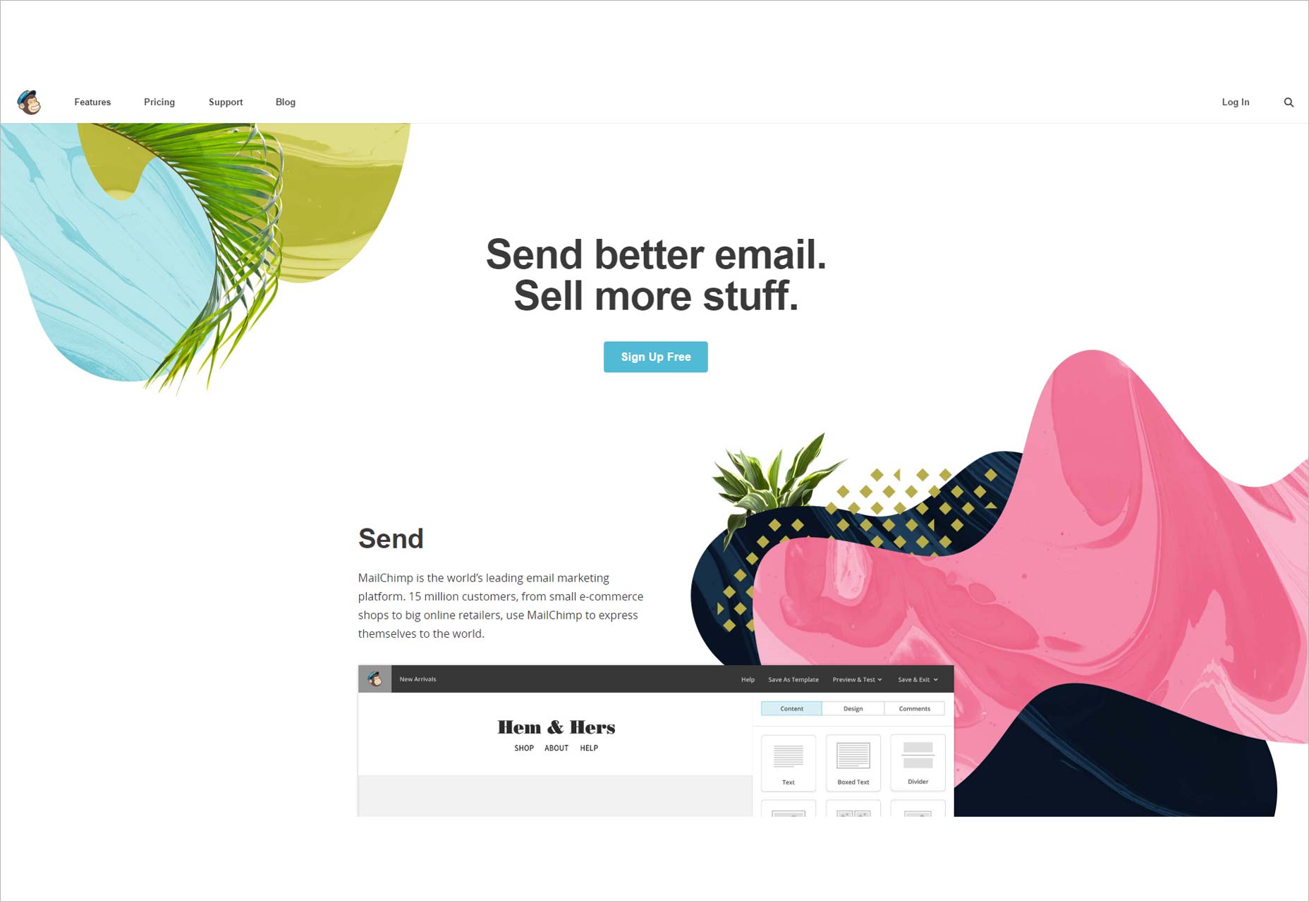
User Onboarding Design Workflow
Establishing a systematic design workflow will help your onboarding project get off the ground. Run through the following steps with the UX and design team members to hone the onboarding flow before starting to program it out.Define Your Product’s Value Proposition
What is it that your product or service offers and how is it better than others? You need to figure this out from the get-go, because it will define not only your onboarding strategy but your wider product strategy. The VP doesn’t have to be complicated—take Spotify, which has a VP as simple as ‘users get instant, legal access to any song they want’. Simple. So define the problem you’re out to solve and how your product solves it. Forbes has some good, clear advice on how to get started on defining a digital product’s VP.Research the Competition
Let’s face it, versions of your application probably exist out there already. They might be very successful already. You need to know what they offer and, most importantly, how they onboard users. Sign up for the competition, scrutinize their onboarding experiences and learn from their errors as well as their successes.User Research
As with any UX project, user research is vital. You not only need to know their pain points and unfulfilled needs, you also need to be aware when they will use your product and how. An onboarding flow designed to be seen in an office is going to be different to one that will be seen by on-the-go mobile device users.Onboarding Strategy
Decide what kind of onboarding strategy you’re going to trial. This could be anything from a walk-through to gamification and social account linking.Wireframe Out the Navigation Flow
Build a click-through onboarding flow with a wireframing tool. Keep it simple and static, and use the moment to map out information architecture and content categorization. You can test these fundamentals with a select group of user testers using just a basic wireframe.Iterate Up to an Interactive Prototype
Based on discoveries from user tests on wireframes, build the onboarding process into a high fidelity prototype. Adding animations, real data, transitions and, in the case of mobile onboarding flows, gestures, will give you an accurate understanding of the eventual onboarding process. Test, iterate and tweak.Don’t Stop Testing
Monitor the performance of the onboarding flow continually. Is there a particular step where users give up and go home? Are they interacting with all the features you introduce them to? A good onboarding experience is a work forever in progressConclusion
Good user onboarding is tailored not solely to the company but also to the target user group. It’s an ongoing design process that benefits from constant tweaking, creative thinking and a willingness to test and test again. While copying these 10 companies’ user onboarding experiences won’t automatically result in a jump in conversions or engagement, using them as inspiration will help you build better user onboarding flows and reap the rewards of keeping users happy.Cassandra Naji
Cassandra Naji is Marketing Content Editor at Justinmind, a prototyping tool that allows you to prototype web and mobile apps so you can visualize and test your software solution before writing a single line of code. Before she was a techie, Cassandra was an old-fashioned journalist and communications professional in Cambodia and Taiwan.
Read Next
3 Essential Design Trends, November 2024
Touchable texture, distinct grids, and two-column designs are some of the most trending website design elements of…
20 Best New Websites, October 2024
Something we’re seeing more and more of is the ‘customizable’ site. Most often, this means a button to swap between…
Exciting New Tools for Designers, October 2024
We’ve got goodies for designers, developers, SEO-ers, content managers, and those of you who wear multiple hats. And,…
15 Best New Fonts, September 2024
Welcome to our roundup of the best new fonts we’ve found on the web in the previous four weeks. In this month’s edition…
By Simon Sterne
3 Essential Design Trends, October 2024
This article is brought to you by Constantino, a renowned company offering premium and affordable website design
You…
A Beginner’s Guide to Using BlueSky for Business Success
In today’s fast-paced digital world, businesses are always on the lookout for new ways to connect with their audience.…
By Louise North
The Importance of Title Tags: Tips and Tricks to Optimize for SEO
When it comes to on-page SEO, there’s one element that plays a pivotal role in both search engine rankings and user…
By Simon Sterne
20 Best New Websites, September 2024
We have a mixed bag for you with both minimalist and maximalist designs, and single pagers alongside much bigger, but…
Exciting New Tools for Designers, September 2024
This time around we are aiming to simplify life, with some light and fast analytics, an all-in-one productivity…
3 Essential Design Trends, September 2024
September's web design trends have a fun, fall feeling ... and we love it. See what's trending in website design this…
Crafting Personalized Experiences with AI
Picture this: You open Netflix, and it’s like the platform just knows what you’re in the mood for. Or maybe you’re…
By Simon Sterne
15 Best New Fonts, August 2024
Welcome to August’s roundup of the best fonts we’ve found over the last few weeks. 2024’s trend for flowing curves and…
By Ben Moss


