
1. Unwanted Modals
The general concept of a modal window is actually very clever. It lets developers add content over the page without using JavaScript to pop open a new tab. But modal windows are not the problem. Unwanted modals are the problem and they always drag down the user experience. I’d say there are three different types of “unwanted” modal popups:- Exit intents which open when the user’s mouse leaves the page body, usually hovering the browser tab;
- Timed modals that open after a set amount of seconds;
- Scroll modals that open after the user scrolls a certain distance down the page.
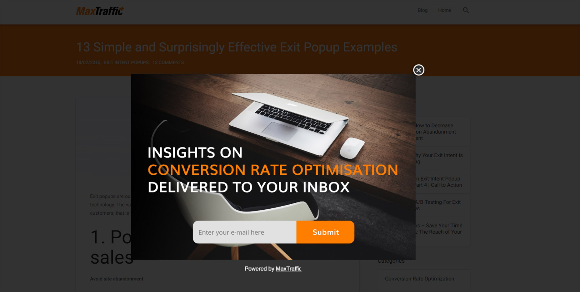 As much as I’d like to chastise this practice I do understand this from a marketer’s standpoint: it works.
The question isn’t why exit intent/opt-in modals exist. The question is whether you think it’s worth adding an unwanted modal popup to your website.
Is it worth potentially annoying most of your users just for a higher conversion rate?
If you’re more interested in a great user experience then the answer is obvious. Especially with Google now penalizing sites that use annoying interstitials/modals without user interaction.
But these unwanted messages also give modals a bad name, which is tough because they serve a real purpose in UI design. These can be used wisely, like with modal signup fields or information-based modals triggered from a user’s mouse click.
Or they can be annoying marketing messages that just appear seemingly out of nowhere. And don’t get me started on modals that won’t close even when clicking the background.
I really can’t fault marketers for using these modals because they convert well. But they’re also ruining the user experience for everyone else on the web.
2. Guilt in Copywriting
I recognized this trend years ago but I couldn’t put it into words until I read this article by Katie Notopoulos. She uses plenty of great examples to show how guilt-based copywriting annoys users and increase signups. This writing style appears in those annoying modals I just covered. But this writing can also appear in sidebar fields or in-content opt-in forms. One example from Good Housekeeping is just terrible (hover the browser tab to trigger).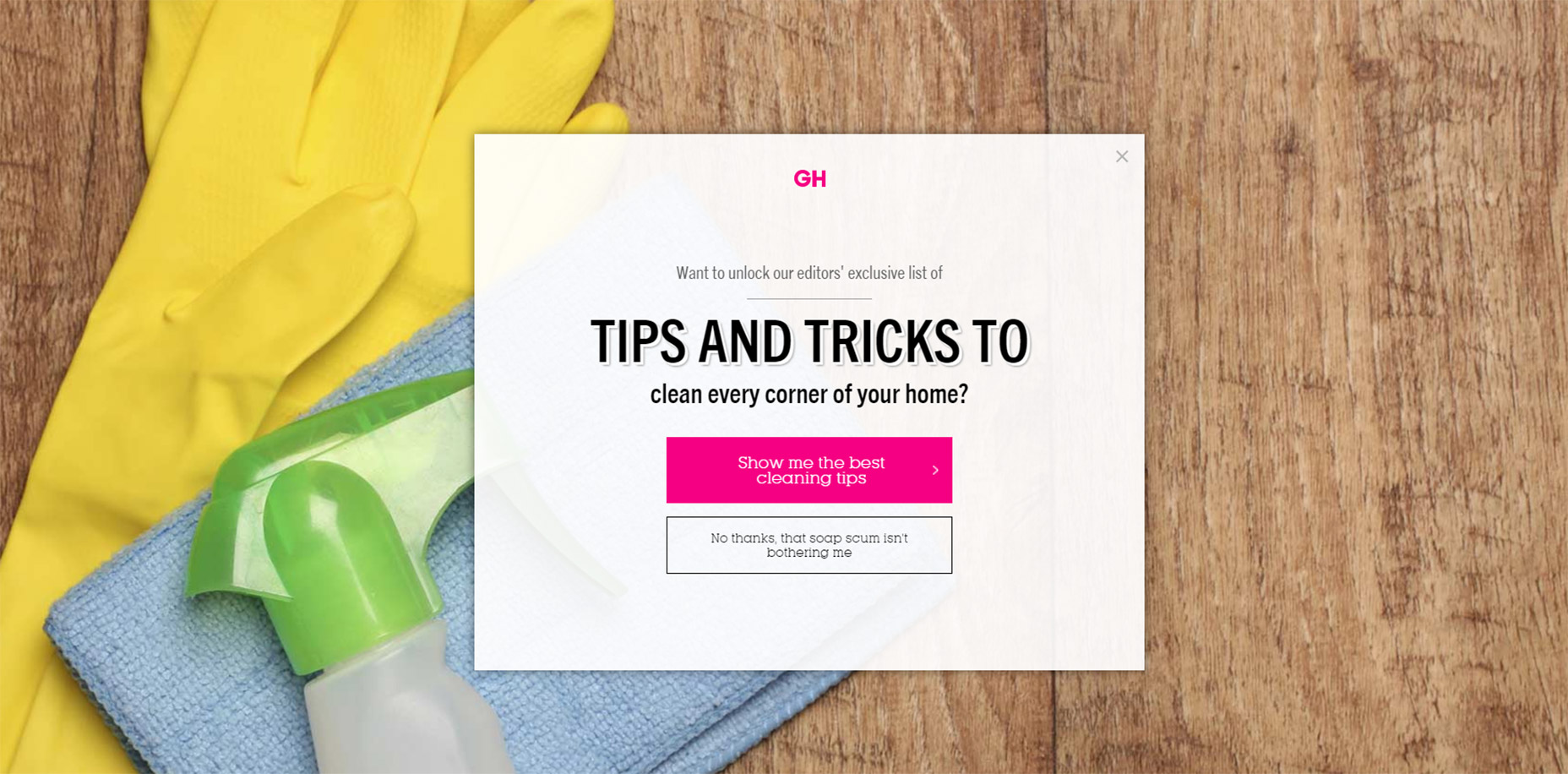 The goal with this guilt-ridden copywriting is to make the user feel so bad that they second guess their choice to close the window. It usually follows a formula that forces the user to click a nonsensical statement that’s unrelated to closing the window.
For example, a modal might offer you a free ebook on web design. The subscribe button might be simple but the cancel button might read “No thanks, I like sucking at design”. There’s actually a whole Tumblr site devoted to this shaming copywriting.
This is another example of a technique that works from a marketer’s standpoint, but certainly holds little value from a UX standpoint.
3. Fullscreen Interstitials
It should go without saying that completely taking over the screen with an opt-in or squeeze offer is just plain obnoxious. This trend is like the unwanted modal window on steroids. These interstitials take over the entire screen and block the page unless you close the window. And sometimes it’s almost impossible to close these windows!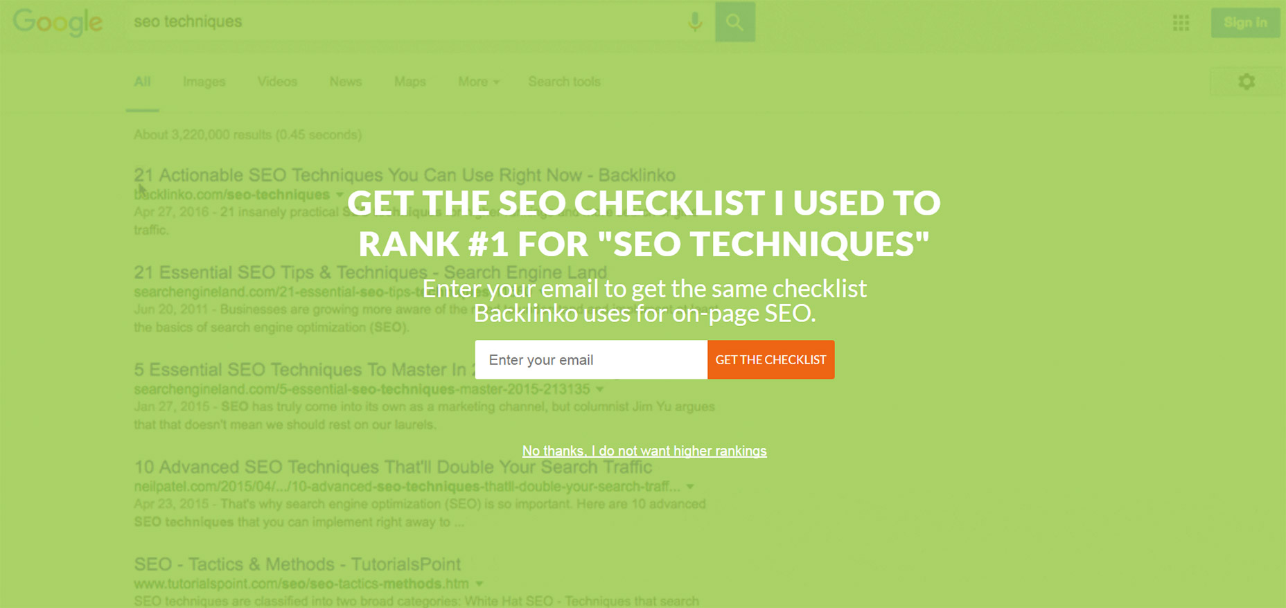 Backlinko is a fantastic site for SEO tips, but horrible with the pushy marketing.
First time visitors are always greeted with the same fullscreen modal that takes over the entire page. The background uses a video of Google SERPS which is both confusing and ugly.
It places a very tiny X icon in the top right corner and the “no thanks” link is much smaller than the other text, not to mention harder to read. This thing is a usability nightmare on mobile and it’s just one example of a trend that really needs to go.
4. Slide-in Ads/offers
Sometimes you’ll be scrolling down a homepage and see a small box slide into view from the side. This might be a feedback box for user testing, or it might be social sharing links or even a discount/promotion. I can deal with these every so often. If they stay out of the way and aren’t too obnoxious then, whatever. But on sites like AccessPress you can find at least 2 different slide-in boxes on either side of the page, and sometimes even a 3rd!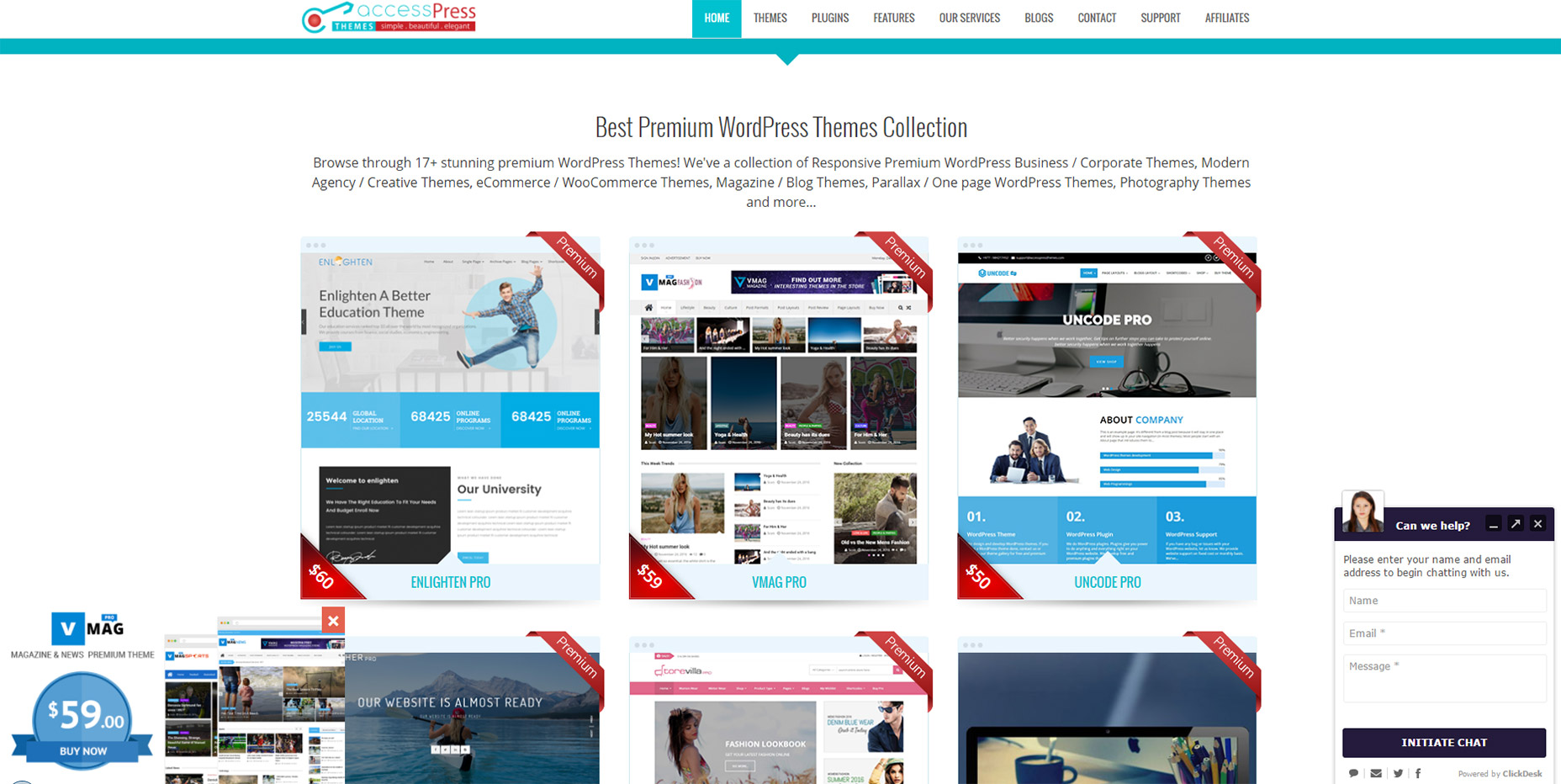 This isn’t meant to shame AccessPress or any other sites in this list. I’m just using this as an example to show how poor UX trends can go too far.
If you have a client who wants this slide-in feature try to make it subtle. No ding noises, no flashing graphics, and preferably no wacky animations. If a user wants to learn more they’ll take the time to read it.
5. Custom Scrolling
Most trends in this post have been marketing-oriented because, as Gary V says, marketers ruin everything. But custom scrolling can’t be blamed on anyone. It’s just a trend that’s been around for far too long and feels like a remnant of an older web. Nowadays browsers like Chrome have their own custom scroll features that users can enable/disable on a whim. But websites like Click and Grow still have these annoying JS-based scroll features that turn navigating the site into a chore. Usually these custom scroll animations have one of two effects. Either the scroll goes too fast beyond where you wanted to rest the page, or it goes too slow and you have to whip your mouse wheel just to move. Why would any designer think these two options are better than the default? Tied into custom scrolling is a newer trend I’ve seen on single page layouts. They have fullscreen page “sections” where your scroll wheel only moves down one section at a time. Gladly has this trend on their homepage.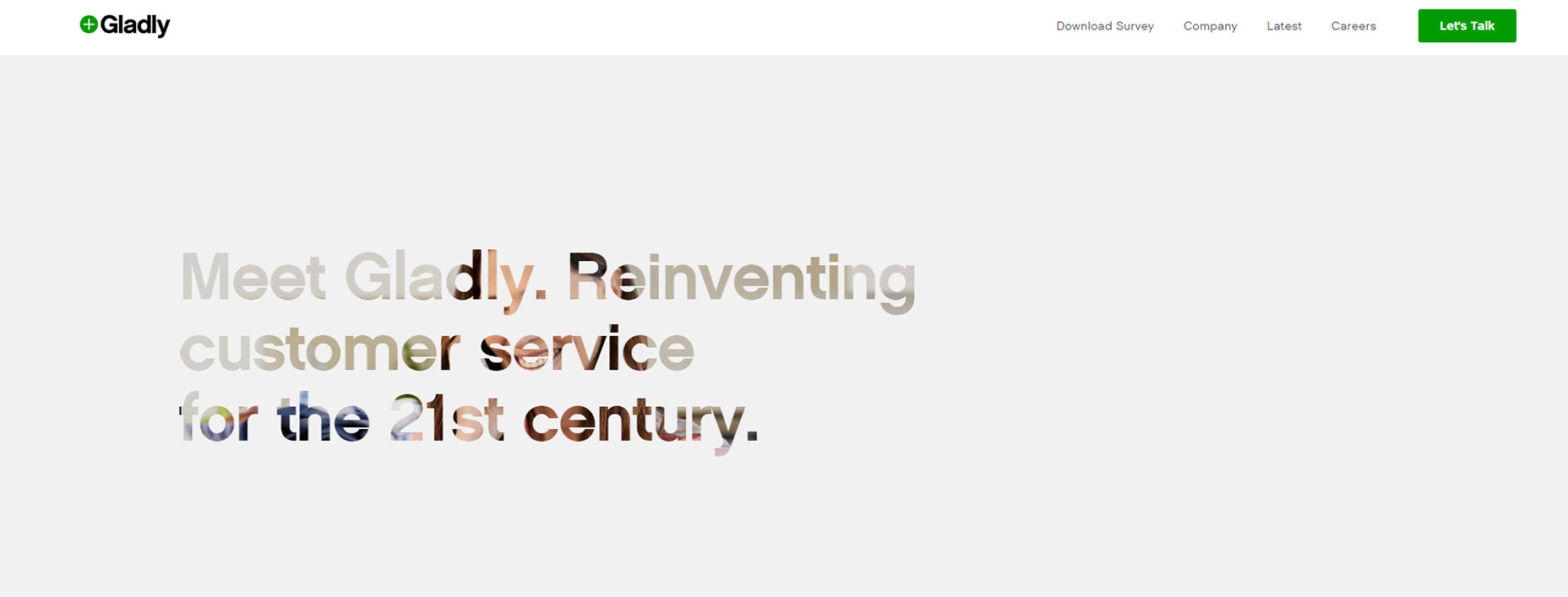 My problem here is the same with fixed scrolling. It takes power away from the user.
The Gladly section animations take way too long to complete. The Internet moves fast and Internet users always want it a little faster. So any type of custom scrolling that ultimately slows down the experience is just bad UX.
6. Nav Menus Without Padding
This is a tough trend to explain but you know it when you see it. Every site has a navigation menu and most links have padding around them. But sometimes the padding isn’t clickable, so to navigate you need to click on the exact block area of the text itself. This drives me crazy! It takes maybe 30 seconds to move CSS padding from a link’s container element to the link itself. The navigation menu looks the same, but now users can click the link and the space around the link. So much easier! Take a look at Tilde's navigation for a live example. The craziest thing about their site is that their mobile responsive navigation actually does have clickable padding. Only their desktop nav is plagued by the text-only click area. On the flip side you’ll find many sites that understand the importance of this very subtle yet crucial detail. One example is Think With Google where you can actually see the full link size while hovering: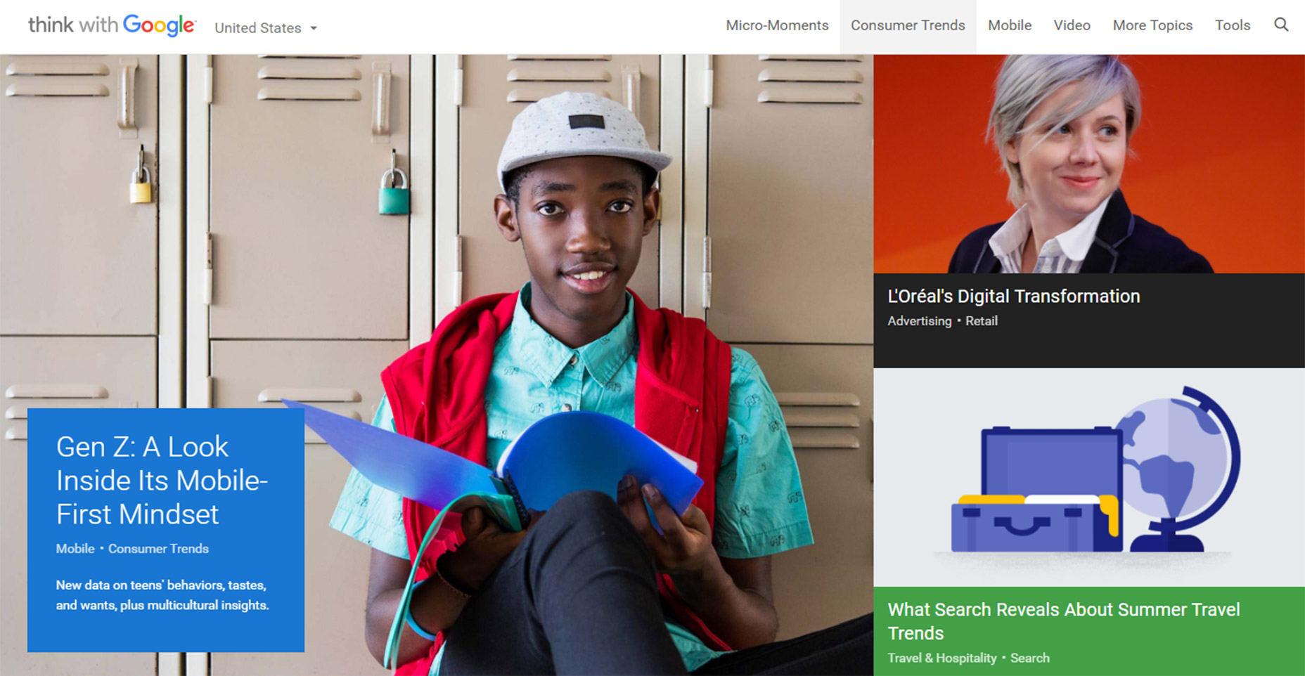 Just keep this in mind going forward because it’s a very simple alteration that can have a huge impact on usability.
7. Paginated Listicles
Last but not least I’m poking a bit of fun at blogs that design their content into one-item-per-page listicles. I cannot imagine that any person enjoys constantly clicking the “next” button to read through a clickbait post. You’ll find tons of these on many different websites and none of them consider the user’s experience. This trend is mostly about pageviews and ad revenue more than anything else. And while it’s not really in the designer’s control to fix this, it does relate to the user experience and webmasters/designers should do all they can to avoid these multi-paged articles.
I can only imagine how many other trends are out there annoying users on a daily basis. But I hope by sharing these ideas more designers will work towards eliminating these dark trends and reducing their presence on the web.
Jake Rocheleau
Jake is a writer and user experience designer on the web. He publishes articles discussing HTML5/CSS3 and jQuery coding techniques. Find out more on his website or you can follow his updates on Twitter @jakerocheleau
Read Next
3 Essential Design Trends, November 2024
Touchable texture, distinct grids, and two-column designs are some of the most trending website design elements of…
20 Best New Websites, October 2024
Something we’re seeing more and more of is the ‘customizable’ site. Most often, this means a button to swap between…
Exciting New Tools for Designers, October 2024
We’ve got goodies for designers, developers, SEO-ers, content managers, and those of you who wear multiple hats. And,…
15 Best New Fonts, September 2024
Welcome to our roundup of the best new fonts we’ve found on the web in the previous four weeks. In this month’s edition…
By Simon Sterne
3 Essential Design Trends, October 2024
This article is brought to you by Constantino, a renowned company offering premium and affordable website design
You…
A Beginner’s Guide to Using BlueSky for Business Success
In today’s fast-paced digital world, businesses are always on the lookout for new ways to connect with their audience.…
By Louise North
The Importance of Title Tags: Tips and Tricks to Optimize for SEO
When it comes to on-page SEO, there’s one element that plays a pivotal role in both search engine rankings and user…
By Simon Sterne
20 Best New Websites, September 2024
We have a mixed bag for you with both minimalist and maximalist designs, and single pagers alongside much bigger, but…
Exciting New Tools for Designers, September 2024
This time around we are aiming to simplify life, with some light and fast analytics, an all-in-one productivity…
3 Essential Design Trends, September 2024
September's web design trends have a fun, fall feeling ... and we love it. See what's trending in website design this…
Crafting Personalized Experiences with AI
Picture this: You open Netflix, and it’s like the platform just knows what you’re in the mood for. Or maybe you’re…
By Simon Sterne
15 Best New Fonts, August 2024
Welcome to August’s roundup of the best fonts we’ve found over the last few weeks. 2024’s trend for flowing curves and…
By Ben Moss


