1. Sierra
The Sierra framework is touted as one of the lightest and smallest SCSS frameworks on the market. Currently in v2.0 it weighs a total of 37KB. This may not be literally the smallest option out there, but even the minified Bootstrap stylesheet totals ~120KB so Sierra is pretty light. It’s also well organized with separate files for mixins, buttons, tables, typography, and other common page elements. This file separation is standard for Sass development and it makes your job much easier when customizing the framework. You’ll find a complete live demo with all the main elements on Sierra's main page along with setup documentation on GitHub. I’d rate this in the top three of all Sass frameworks so it’s definitely worth a look if you’re curious.
2. Scooter
The team at Dropbox put together their own frontend framework called Scooter. This one is a lot simpler than most since it was created for frontend prototyping. Dropbox actually has a lot of open source stuff on GitHub which includes their own style guide for formatting CSS/SCSS code. This little resource can prove incredibly useful if you wanna dive into Scooter and tinker with the default source. Most of the Scooter styles actually borrow ideas from Dropbox like their buttons on the components page. This offers a cool way to prototype your own webapps in Sass while using a tried & tested UI style.
3. Kickoff
For something a little more detailed you might try the Kickoff library. This runs on a Sass base and has its own naming scheme for adding new variables. But Kickoff mixes a little bit of everything from CSS grids to more complex JS components all delivered & maintained through Gulp.js. If you don’t already use Gulp then this framework has a bit of a learning curve. But the entire codebase is very future-centric with a focus on ES2016 and flexbox. This is exceptionally lean with a CSS stylesheet of only 8.6KB and a measly 2KB of JavaScript. Kickoff is meant as a boilerplate where it’s merely a starting point, so you can build out something as slim or detailed as necessary for any project. Take a peek at their online demo to see how this looks in the browser.
4. Materialize
Everyone knows about Google’s material design and how fast it spread across the web. This led to many developers creating their own stylesheets to mimic Google’s guidelines and some of those stylesheets are online for free. Materialize is one example of a CSS/Sass framework built specifically on Google’s guidelines. The framework is still technically in beta version 0.9 as of this writing. But I’d argue it’s complete enough for production websites and there’s a Sass option right on the intro page. So you can either download the basic CSS/JS files or get the CSS+Sass for further development. This is so popular that it’s available on CDNs so you don’t even need to download the CSS locally. Anyone conforming to Google’s material styles should absolutely start with the Materialize library. You’ll find complete documentation on the website along with a showcase of websites running Materialize.
5. Hocus-Pocus
The Hocus-Pocus framework doesn’t consider itself a framework, but rather a starter’s kit for designing new projects. This UI kit restyles all the default HTML elements on a webpage and it comes with a nice responsive grid to align those elements. Naturally the whole thing relies on Sass which makes the dev process a lot simpler. Hocus Pocus feels more like the antithesis to Bootstrap. You wouldn’t use this directly on a live website. But you would use this as a starting point to prototype and build ideas quickly. Although it can work well as a base too since it runs on Normalize. From pre-styled tables to buttons and custom form elements, Hocus Pocus adds a minimalist touch to all default browser styles.
6. Gridle
The Gridle framework is one of the most customizable SCSS grid frameworks you’ll find. It’s powered by Sass and it comes with dozens of custom mixins and functions made specifically for this grid system. You’ll find a live preview on the demo page here hosted for free on GitHub. There’s also a complete setup guide on the main repo that covers how to define grids from very simple to more complex. Note that Gridle does require some existing knowledge of grid systems and it’s certainly not a magic bullet. But it’ll save you hours of time hand-crafting a grid from scratch, not to mention it’s reusable for pretty much any project you design.
7. iotaCSS
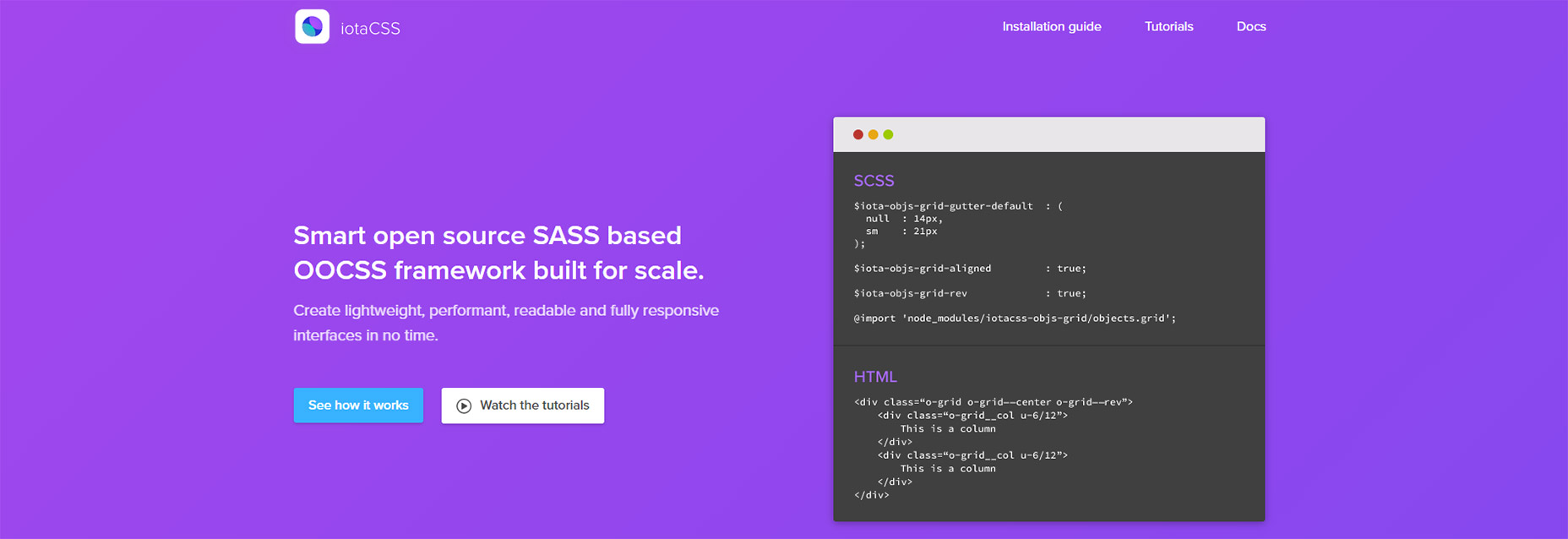
One of the best methods for structuring CSS is the OOCSS style. This follows an object structure where you design for more classes & relationships rather than nested specificity. iotaCSS is one of the few OOCSS frameworks and it’s real easy to use. You can browse through a mini preview of the source code to see naming conventions and how this uses BEM/OOCSS syntax. One unique difference about iota is that it’s not specifically a UI kit. Instead it’s a framework to help you create a UI kit solely through Sass. This means it’s not a plug & play solution, but it also offers far more customization. The online documentation is phenomenal so this is a fantastic framework to build out your own Sass-powered stylesheet from scratch.
8. Bulma
Modern CSS is moving towards a modular and flexible structure with flexbox. This seems to be the new normal and Bulma is leading the charge. This free Sass framework lets you work solely with flexbox to create fully responsive grid systems from scratch. This means easy vertical + horizontal centering, fixed-height grid boxes, and a whole bunch of default styles. You can find live demos on the main page along with install instructions on GitHub. By default Bulma is just a CSS file and it’s even hosted on CDNs for free. But developers are encouraged to download the Sass files and work with variables to add your own features.
9. Susy
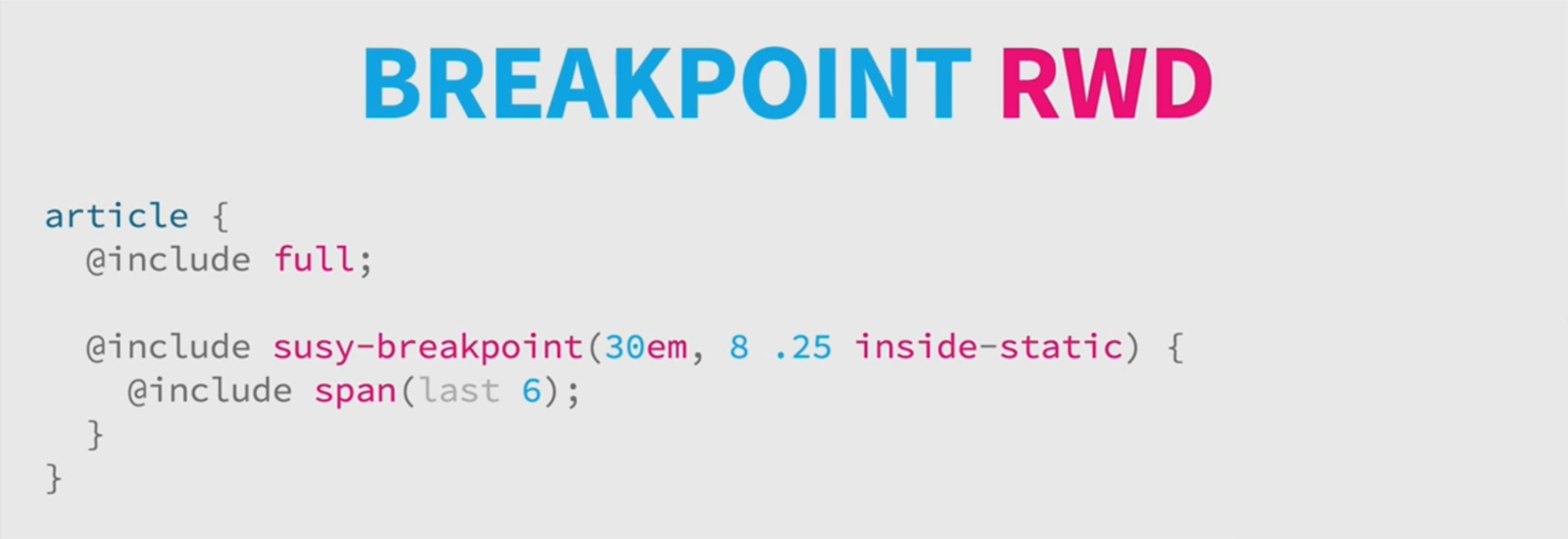
Susy is a responsive Sass toolkit for building layouts from scratch. It’s a unique library because it doesn’t come with a default grid setup or a stylesheet ready to launch. Instead Susy offers a series of tools with tutorials that you can follow to create your own grid layouts. These various tools let you define variables for custom breakpoints, custom grid/gutter settings, and toss in a variety of mixins for good measure. You can style nested elements quickly and target very specific page elements with just a few lines of code. Since this doesn’t come with a default stylesheet it’s not a ready-to-go solution. But if you’re a Sass developer looking to save time then skim through Susy's docs and see what you think.
Jake Rocheleau
Jake is a writer and user experience designer on the web. He publishes articles discussing HTML5/CSS3 and jQuery coding techniques. Find out more on his website or you can follow his updates on Twitter @jakerocheleau
Read Next
3 Essential Design Trends, November 2024
Touchable texture, distinct grids, and two-column designs are some of the most trending website design elements of…
20 Best New Websites, October 2024
Something we’re seeing more and more of is the ‘customizable’ site. Most often, this means a button to swap between…
Exciting New Tools for Designers, October 2024
We’ve got goodies for designers, developers, SEO-ers, content managers, and those of you who wear multiple hats. And,…
15 Best New Fonts, September 2024
Welcome to our roundup of the best new fonts we’ve found on the web in the previous four weeks. In this month’s edition…
By Simon Sterne
3 Essential Design Trends, October 2024
This article is brought to you by Constantino, a renowned company offering premium and affordable website design
You…
A Beginner’s Guide to Using BlueSky for Business Success
In today’s fast-paced digital world, businesses are always on the lookout for new ways to connect with their audience.…
By Louise North
The Importance of Title Tags: Tips and Tricks to Optimize for SEO
When it comes to on-page SEO, there’s one element that plays a pivotal role in both search engine rankings and user…
By Simon Sterne
20 Best New Websites, September 2024
We have a mixed bag for you with both minimalist and maximalist designs, and single pagers alongside much bigger, but…
Exciting New Tools for Designers, September 2024
This time around we are aiming to simplify life, with some light and fast analytics, an all-in-one productivity…
3 Essential Design Trends, September 2024
September's web design trends have a fun, fall feeling ... and we love it. See what's trending in website design this…
Crafting Personalized Experiences with AI
Picture this: You open Netflix, and it’s like the platform just knows what you’re in the mood for. Or maybe you’re…
By Simon Sterne
15 Best New Fonts, August 2024
Welcome to August’s roundup of the best fonts we’ve found over the last few weeks. 2024’s trend for flowing curves and…
By Ben Moss


