
1. Layout and Structure
Okay, this is perhaps one of the more obvious ways to differentiate your site from the rest. It’s also the most difficult. On the pro side, using a fancy layout or site structure that no one has ever seen before is instantly memorable. It can also be a lot of fun. After creating your fifty-second three-column site, mixing up the layout provides a challenge for your visual design skills and your front-end dev skills that can’t be beat. The cons: There are only so many ways that information can be organized before you start to lose accessibility and usability points. The development time is often increased, as you end up working to solve problems few have encountered before. The really crazy layouts often depend heavily on JavaScript. Layout should ideally not depend on JavaScript.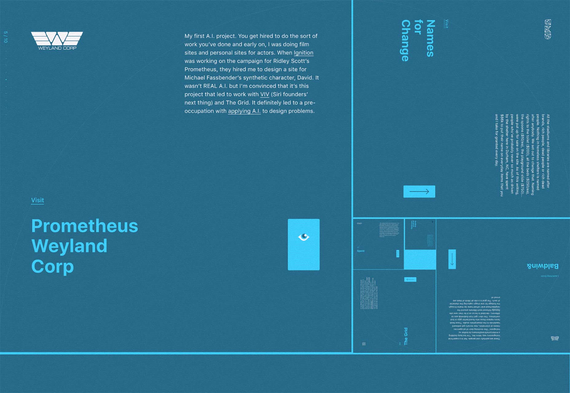
2. Branding
Branding is the other really obvious way to make your site stand out. And it’s easy. Just find out what your client’s branding guidelines are, and stick to them. Embrace them. Make your client sick of seeing their own logo and colors. Then maybe tone it down a little, and you’re good to go. The cons: This approach only works if your client has highly original branding. If their brand style guide consists of Helvetica and not much else, you are at a severe disadvantage.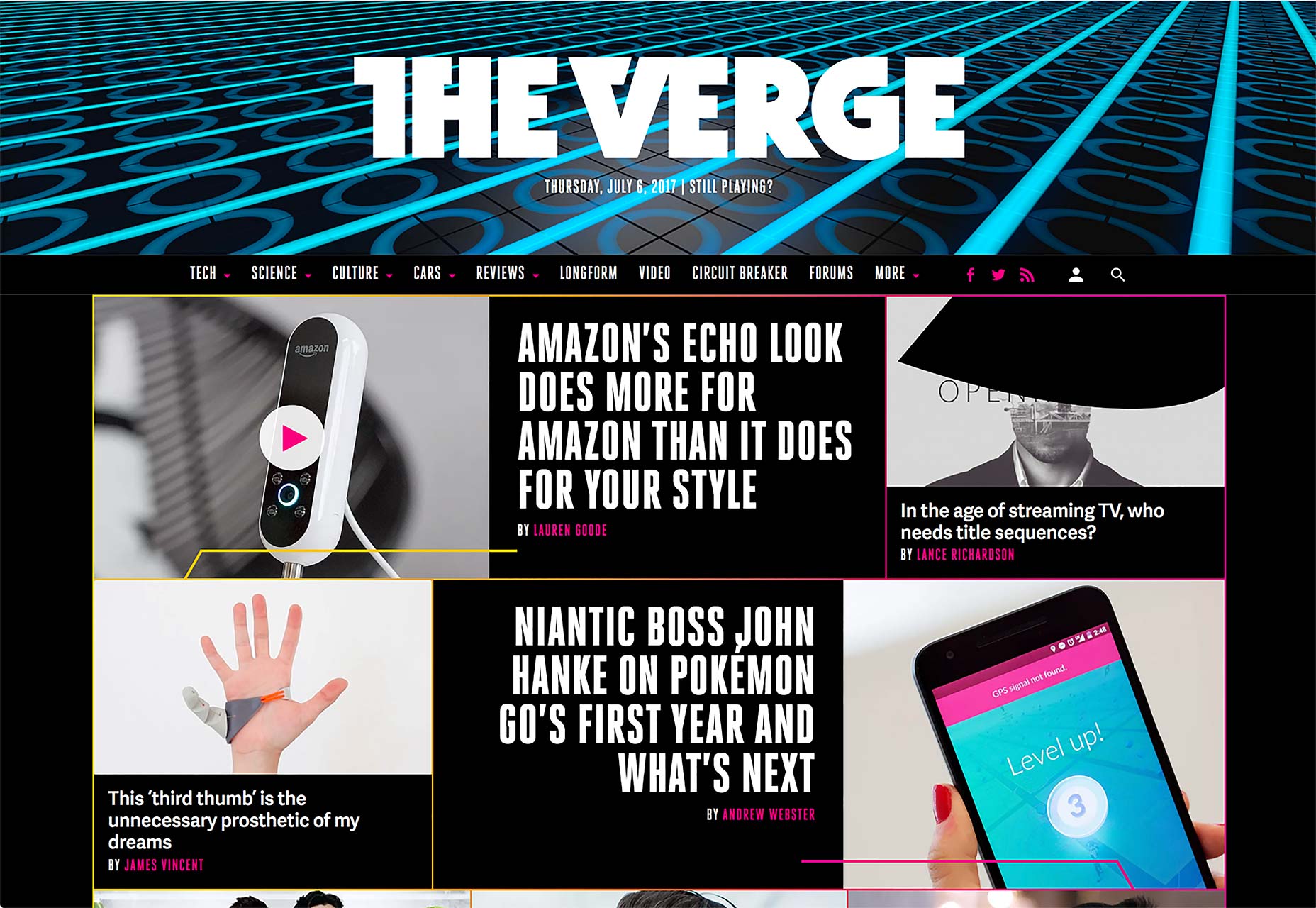
3. Graphics and Imagery
If the branding isn’t enough, you can use graphics and/or photos on your site to establish a distinct visual style. Sites with big images do tend to convert more, after all. People are visual creatures, so visual stimuli can make it easier for users to connect with you on an emotional level. Plus, the stylistic options are just about endless, which makes it easier to create an original-feeling design. The cons: Graphics and photos that look original are expensive, because they pretty much have to be custom made. Using stock images will likely kill the distinction that you’re going for.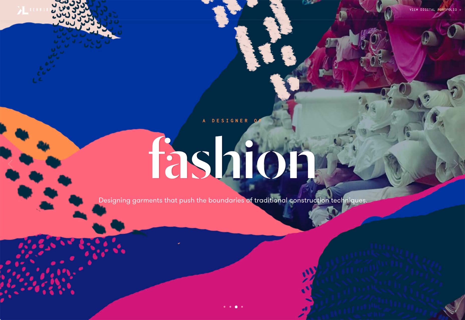
4. Text and Content
This is probably the most important—and sometimes the most difficult—way you can set yourself apart. What is said on any site can and should be a reflection of the client’s personality and/or company culture, while still being clear. You can use copy, microcopy, and even things like video to communicate personality in a way that sets you apart. The cons: Ok, first you have to get any text at all from your client. Heh. And then you have to get copy that actually feels like a human wrote it. Most marketing copy has a very specific tone that seems to transcend borders and cultures. Getting the reader to see past the obvious desire to sell them things is the trick, and it’s a tough one. I mentioned microcopy before, but it really makes a difference. Users expect sales copy when reading up on a product or service. But if the rest of your site, especially the interactive bits like forms, treat the user as human rather than as a mere customer, this will make your site stand out in big ways.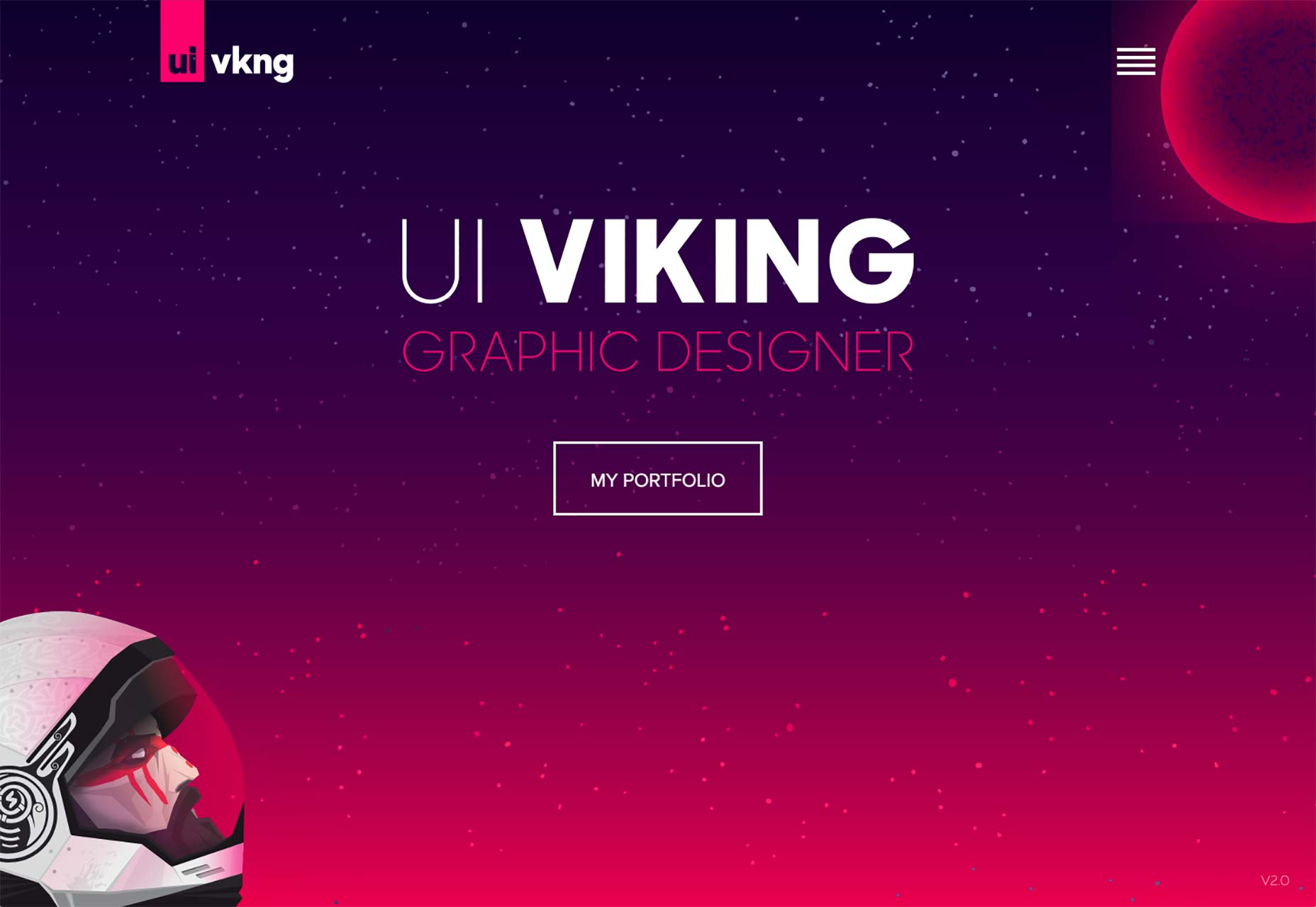
5. Animation
Animation is a huge deal right now, and for good reason. When done right, it can take a pretty good experience and make it unforgettable. While I’m glad splash screens went the way of the dodo, I can still remember some of the animated web experiences I saw during the ’90s. Did I say before that humans were visual creatures? Well make those pictures start moving, and you can start a new industry in California. The cons: I saved animation for last because it’s very effective, but also very hard to get right. I mean, everyone and their dog is animating their sites now. That means that if you want your animation to stand out from everyone else’s animation, you’ll have to step up your game. Bouncing buttons ain’t gonna cut it. Animation that’s badly done can also cause usability problems, performance problems, etc.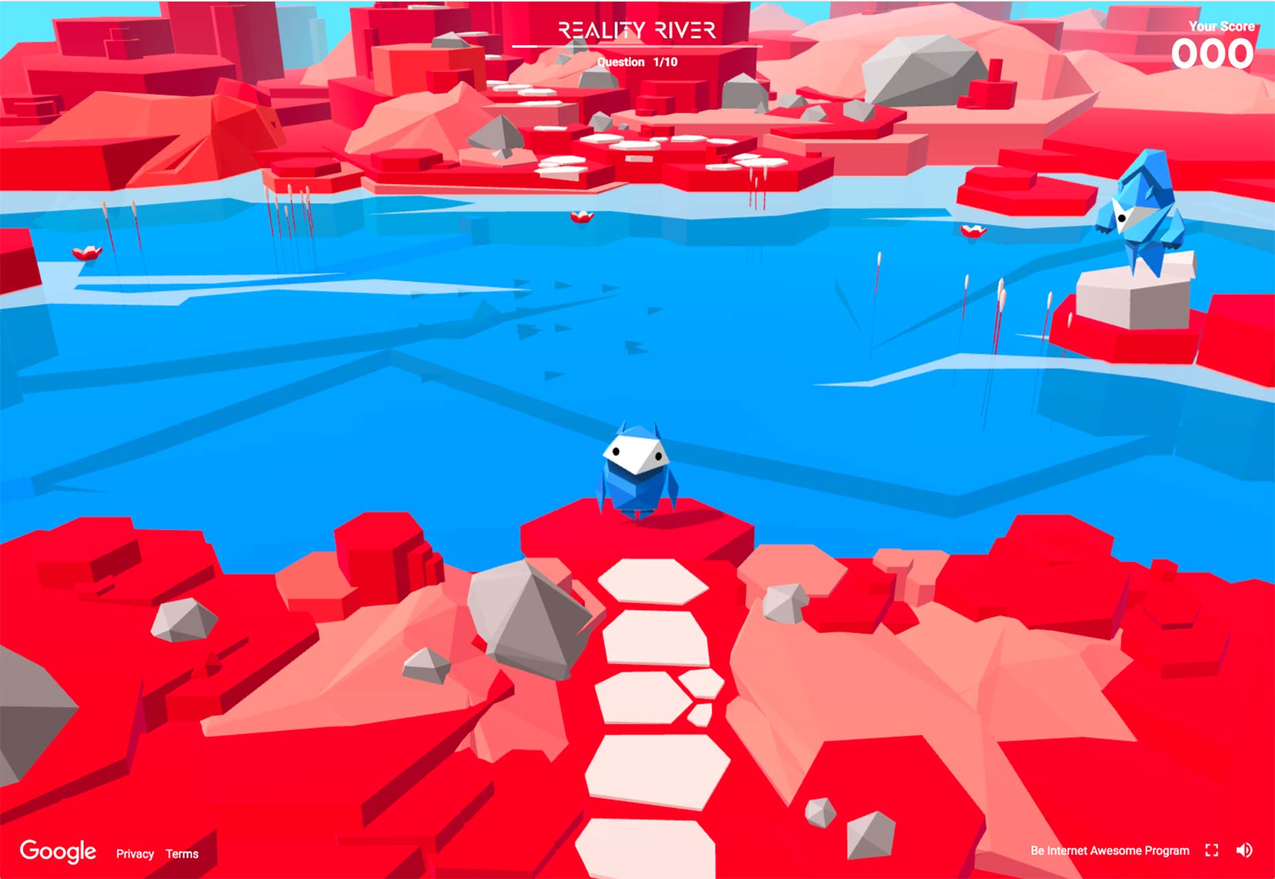
Conclusion
Look around on the internet and you’ll notice that it’s very rare for any of these approaches to be used alone. It’s fairly common for people to even try to combine all five. As usual, however, it’s best not to split your focus too much. Ask yourself where your strengths lie. Are you a good writer and illustrator? Focus on text and imagery. Are you a great brand designer and animator? Make that logo blow people’s minds. And most of all, remember to have fun while you’re making something new.Ezequiel Bruni
Ezequiel Bruni is a web/UX designer, blogger, and aspiring photographer living in Mexico. When he’s not up to his finely-chiselled ears in wire-frames and front-end code, or ranting about the same, he indulges in beer, pizza, fantasy novels, and stand-up comedy.
Read Next
3 Essential Design Trends, November 2024
Touchable texture, distinct grids, and two-column designs are some of the most trending website design elements of…
20 Best New Websites, October 2024
Something we’re seeing more and more of is the ‘customizable’ site. Most often, this means a button to swap between…
Exciting New Tools for Designers, October 2024
We’ve got goodies for designers, developers, SEO-ers, content managers, and those of you who wear multiple hats. And,…
15 Best New Fonts, September 2024
Welcome to our roundup of the best new fonts we’ve found on the web in the previous four weeks. In this month’s edition…
By Simon Sterne
3 Essential Design Trends, October 2024
This article is brought to you by Constantino, a renowned company offering premium and affordable website design
You…
A Beginner’s Guide to Using BlueSky for Business Success
In today’s fast-paced digital world, businesses are always on the lookout for new ways to connect with their audience.…
By Louise North
The Importance of Title Tags: Tips and Tricks to Optimize for SEO
When it comes to on-page SEO, there’s one element that plays a pivotal role in both search engine rankings and user…
By Simon Sterne
20 Best New Websites, September 2024
We have a mixed bag for you with both minimalist and maximalist designs, and single pagers alongside much bigger, but…
Exciting New Tools for Designers, September 2024
This time around we are aiming to simplify life, with some light and fast analytics, an all-in-one productivity…
3 Essential Design Trends, September 2024
September's web design trends have a fun, fall feeling ... and we love it. See what's trending in website design this…
Crafting Personalized Experiences with AI
Picture this: You open Netflix, and it’s like the platform just knows what you’re in the mood for. Or maybe you’re…
By Simon Sterne
15 Best New Fonts, August 2024
Welcome to August’s roundup of the best fonts we’ve found over the last few weeks. 2024’s trend for flowing curves and…
By Ben Moss


