
- Margins, paddings, and gutters
- Space around images and graphic objects
- Line-spacing and letter-spacing within text content
Whitespace is to be regarded as an active element, not a passive backgroundAll good user interfaces incorporate proper whitespace values into all page elements from top to bottom. The whitespace on a page can be every bit as important as the space occupied by UI elements because text, buttons, logos and other objects need room to breathe. In this article, you’ll find how to use whitespace in your designs to give it a clean, uncluttered feel:
1. Improve Text Readability
Whitespace is able to make reading much easier by reducing the amount of text visitors see all at once. The lack of whitespace (cluttered page) doesn’t make users want to read the content. On the other hand, properly used whitespace has been proven to increase text comprehension up to 20%, as pointed out by Dmitry Fadeyev. Two important things to keep in mind when optimising your text content are paragraph margins and line spacing (the space between each line in your text). The latter can drastically improve the legibility of a body of text. Generally, the larger the spacing, the better experience the user will have whilst reading (although too much line spacing can make the lines disconnected).2. Clarifying Relationships
The whole layout arises from the sum of its parts and content relationships are defined by surrounding whitespace. The Law of Proximity states that objects near to each other appear similar. The whitespace acts as a visual cue in this case. Take a look at the image below: The laws of Gestalt dictate that objects in close proximity will appear as one “unit”; the white space acts as a visual cue.
Almost everyone who sees this image notices two groups of circles, rather than simply 12 circles. The circles are all identical and the only difference between them is the amount of whitespace that separates them.
It’s possible to group items together by decreasing the space between them and increasing the space between them and other elements on the page.
For user interfaces, this means that objects in close proximity will appear as one “unit.” For example, in the context of web forms, it’s a good idea to place labels close to the relevant fields to create an object. When labels are placed closer to the fields this makes the relationship between them much clear for users.
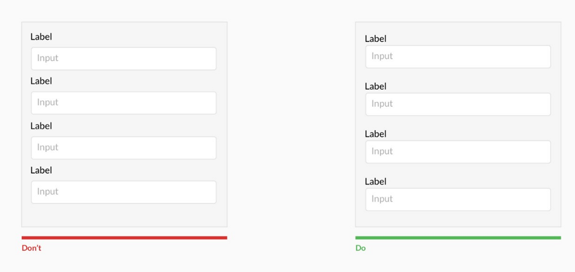 Information is communicated far more clearly when labels are placed closer to the fields they relate to.
3. Attracting Attention
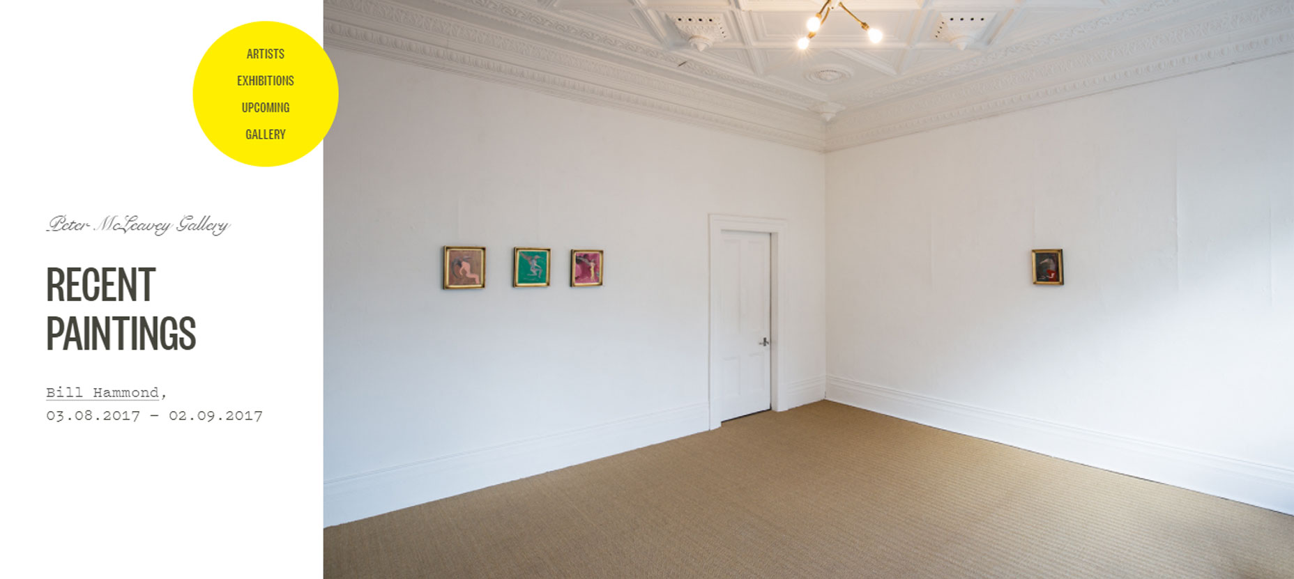
Designers can use whitespace to communicate what’s most important at a glance. There’s a relationship between a distance and attention; larger distance forces attention. The lack of other elements will only make existing elements stand out more. It’s possible to use a whitespace for your advantage—to draw wandering eyes onto certain page elements. Extra padding around a particular segment of content forces users’ attention onto that area simply because there’s nothing else on the screen to draw attention. Thus, the more whitespace around an object, the more the eye is drawn to it.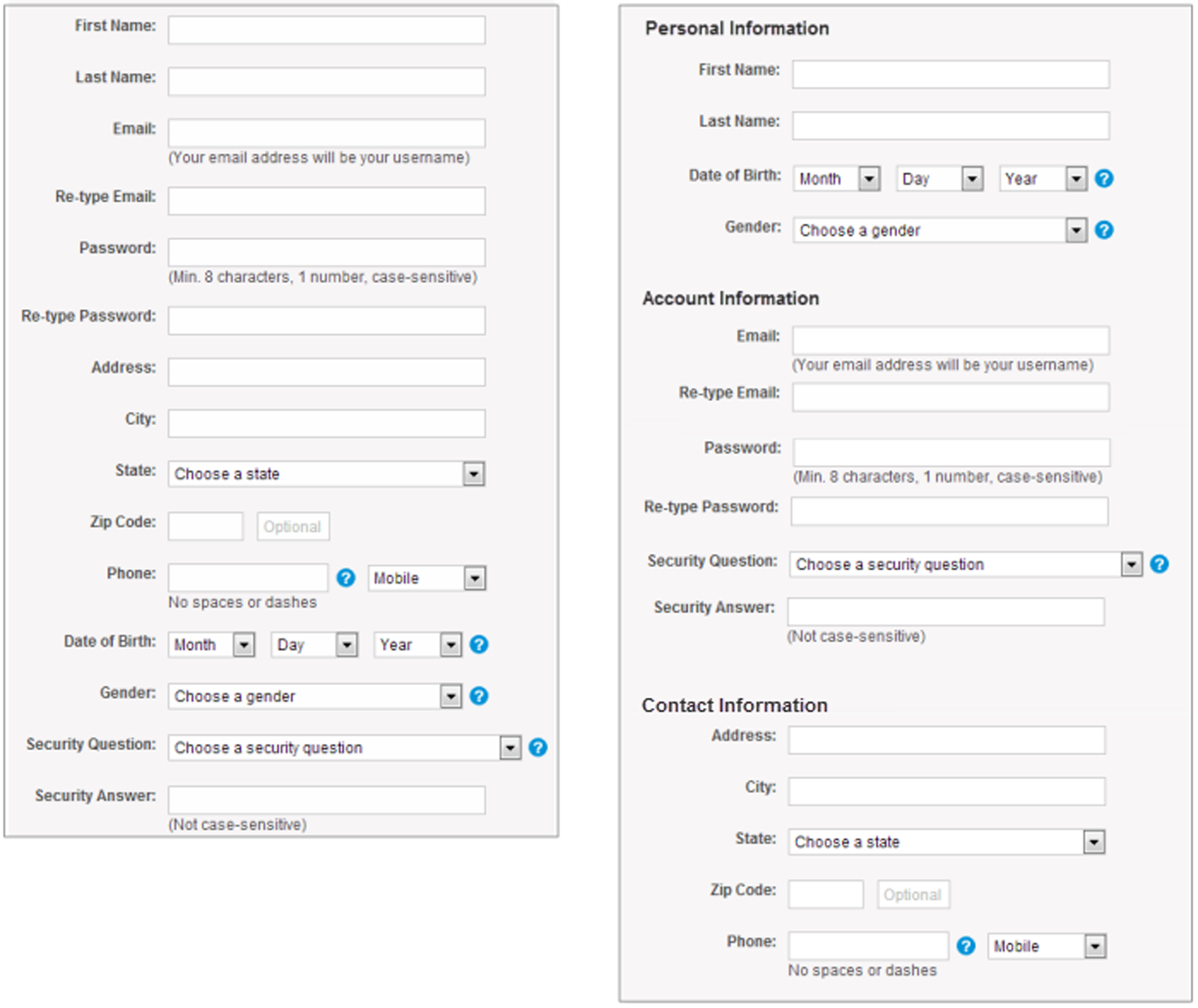
4. Create Visual Hierarchy
When whitespace is used appropriately, it allows a page to create a general flow and balance, which in turn helps communicate the intent of the design. Whitespace can support the overall hierarchy. It produces either symmetry or asymmetry. Symmetry creates memory and harmony: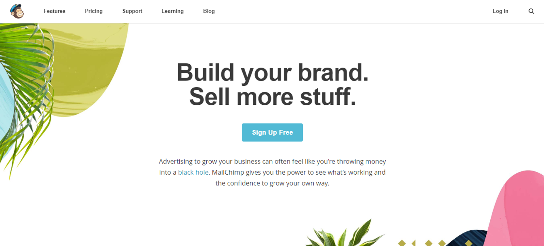 Mailchimp, as you can see, is a big advocate of white space in their designs. When visitors scan the homepage, the “Sign Up Free” button draws their attention almost immediately. Using symmetry it’s possible to create a balanced layout with equally important right and left parts.
While asymmetry draws attention:
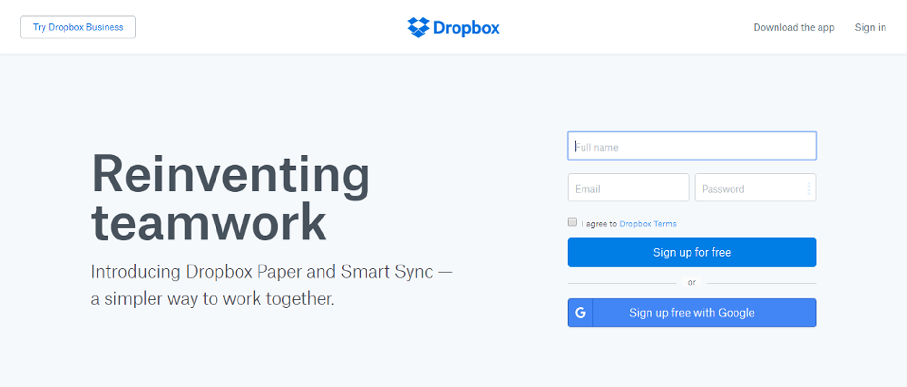 Asymmetry is great for bringing attention to a particular area of the page.
 When an element uses asymmetrical space, it stands out against other surrounding elements.
Conclusion
Whitespace isn’t a wasted space, it’s a powerful design tool. It can be every bit as important as the space occupied by imagery, text or other user interfaces object because even empty space serves a purpose and supports the visual integrity of a layout. Although it seems a simple topic, whitespace can be hard to master because the application of whitespace is both art and science. Truly understanding how much whitespace should be used to create a good layout requires practice.Nick Babich
Fireart Studio is a design studio passionate about creating beautiful design for startups & leading brands. We pay special attention to nuances all the time to create professional while cool products that will not only meet all expectations, but exceed them.
Read Next
3 Essential Design Trends, November 2024
Touchable texture, distinct grids, and two-column designs are some of the most trending website design elements of…
20 Best New Websites, October 2024
Something we’re seeing more and more of is the ‘customizable’ site. Most often, this means a button to swap between…
Exciting New Tools for Designers, October 2024
We’ve got goodies for designers, developers, SEO-ers, content managers, and those of you who wear multiple hats. And,…
15 Best New Fonts, September 2024
Welcome to our roundup of the best new fonts we’ve found on the web in the previous four weeks. In this month’s edition…
By Simon Sterne
3 Essential Design Trends, October 2024
This article is brought to you by Constantino, a renowned company offering premium and affordable website design
You…
A Beginner’s Guide to Using BlueSky for Business Success
In today’s fast-paced digital world, businesses are always on the lookout for new ways to connect with their audience.…
By Louise North
The Importance of Title Tags: Tips and Tricks to Optimize for SEO
When it comes to on-page SEO, there’s one element that plays a pivotal role in both search engine rankings and user…
By Simon Sterne
20 Best New Websites, September 2024
We have a mixed bag for you with both minimalist and maximalist designs, and single pagers alongside much bigger, but…
Exciting New Tools for Designers, September 2024
This time around we are aiming to simplify life, with some light and fast analytics, an all-in-one productivity…
3 Essential Design Trends, September 2024
September's web design trends have a fun, fall feeling ... and we love it. See what's trending in website design this…
Crafting Personalized Experiences with AI
Picture this: You open Netflix, and it’s like the platform just knows what you’re in the mood for. Or maybe you’re…
By Simon Sterne
15 Best New Fonts, August 2024
Welcome to August’s roundup of the best fonts we’ve found over the last few weeks. 2024’s trend for flowing curves and…
By Ben Moss


