
1. Just Type Above the Scroll
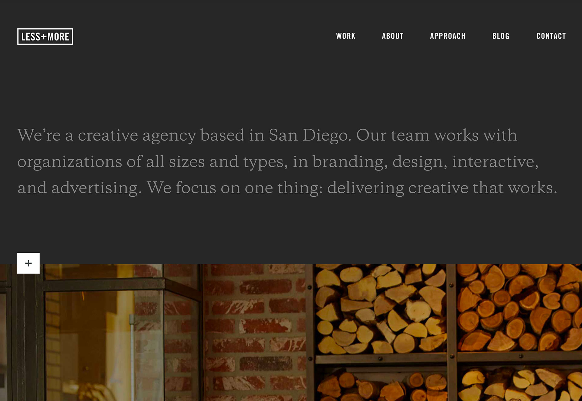
While a great image can help draw users into a design, sometimes the right words and space are the ticket. The key to making the most of this design trend is to refine your message. The words need to be simple, say something meaningful and create value for the user. So how do you do it?- Start with a key phrase. It can be your mission or a value proposition for users. Tell users what you bring to the table and why your website will be important to them.
- Pick a simple typeface that has the same mood as the messaging for longer copy blocks.
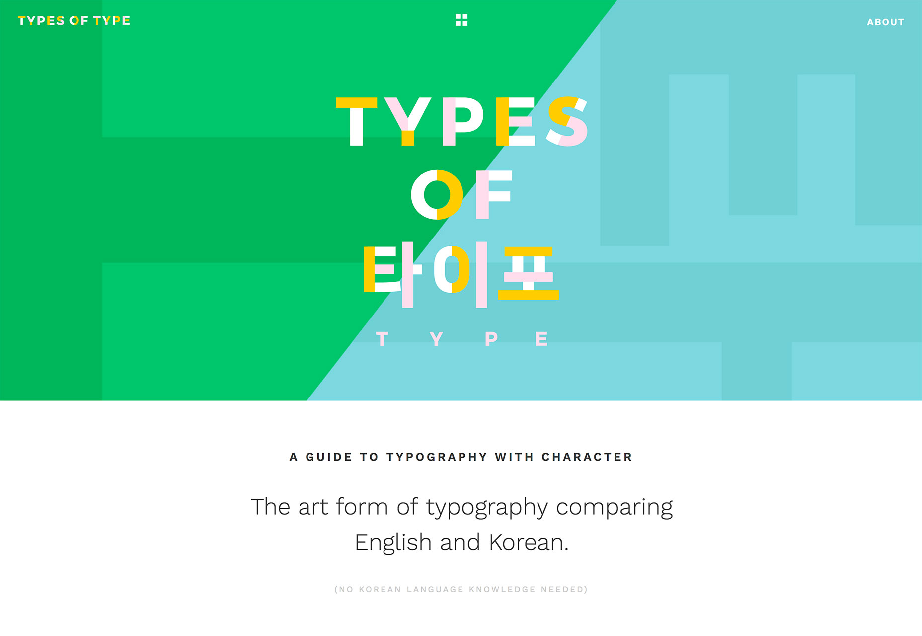
- If the text block is short, such as with Types of Type, consider a funkier type option to draw users in.
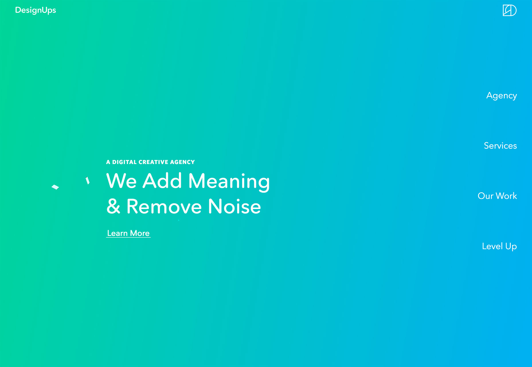
- Make the most of space. Note that in each of the examples below, text has plenty of room to breathe, making it easier to read at a glance. Space can also help draw the eye to text, and can balance text elements if you don’t want to center them on the screen, such as Design Ups.
- Use color to help add visual interest. Bright, trendy hues can help draw users into the design. Color can also help set a mood that correlates to messaging.
2. Text in White Boxes
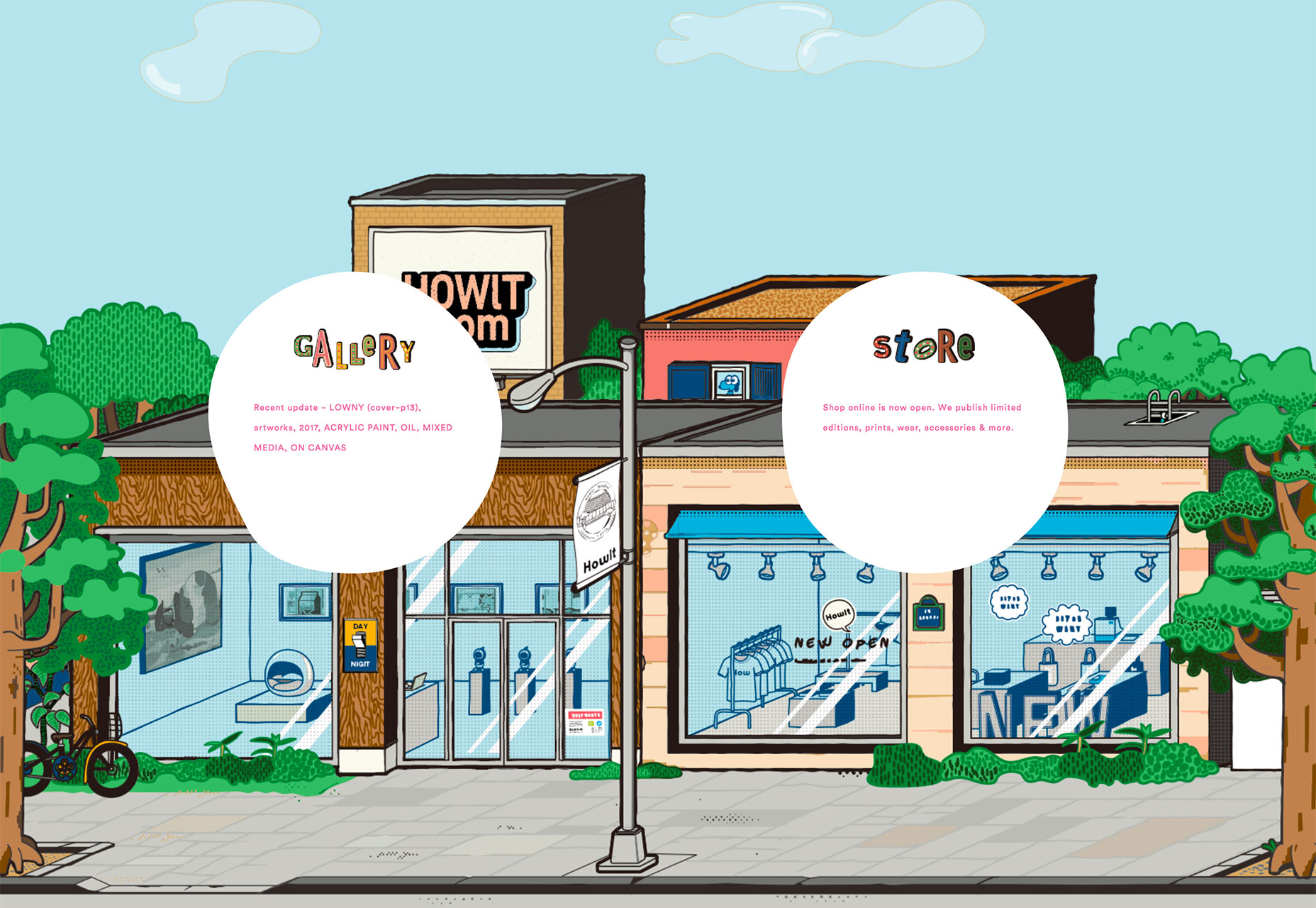
With so many bold visual elements in website design projects—and so many responsive breakpoints to deal with—white boxes are re-emerging as a container element for text. White boxes with dark text inside can ensure readability when it comes to messaging on top of photos, video or illustration where there is color variance. And while this trend might sound a little, well…sloppy or lazy, it actually looks great when done well. You can’t just slap a box anywhere on an image and hope for the best. White boxes need to be placed strategically so that they don’t cover important parts of the image and so that users do move to them in the course of looking at the design. White boxes need to be big enough to contain a reasonable amount of text and you should have a plan for this element on smaller screens, such as allowing everything in the text box to drop below the main image. Don’t try to put a text box over an image on smaller screens because you’ll end up with a box of text that’s too small to read or the box will cover most of the image itself. If you pot for the white box treatment, have fun. Each of the examples below use white boxes in completely different ways. Do Space cuts a white box into the bottom corner of the image so that most of the image is visible. The white box bleeds into the white space below so that it almost looks like it comes up out of the panel below. This technique helps connect the main slider to the content below (and can even encourage scrolling).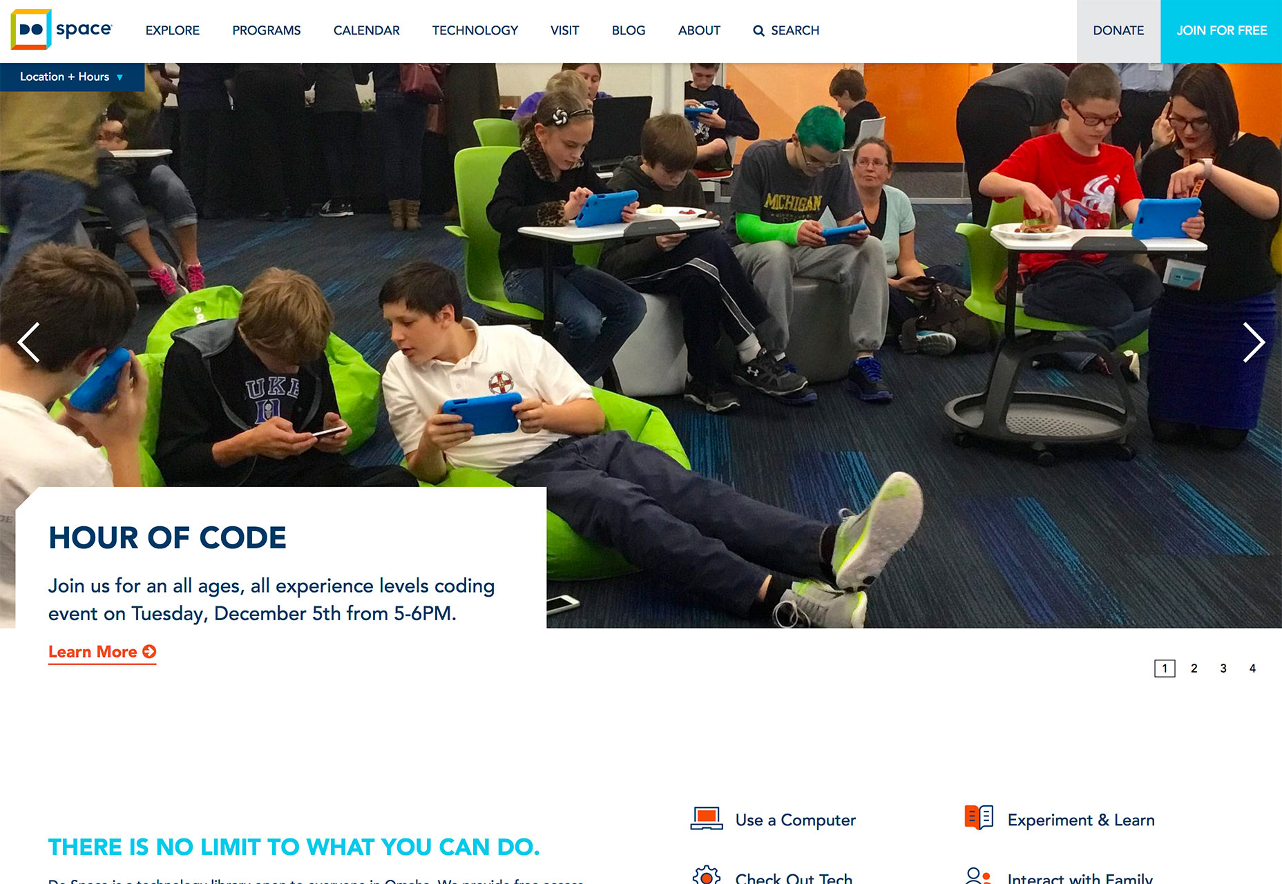 HowIt uses circular blobs so that the white text boxes better match the tone of the background illustration. This subtle shift in shape, so that the boxes appear more fluid helps connect the elements so that the boxes and background have a consistent feel. You don’t want white boxes for text to feel like they are haphazardly placed on the background. (That doesn’t work and won’t help create a cohesive feel for users.)
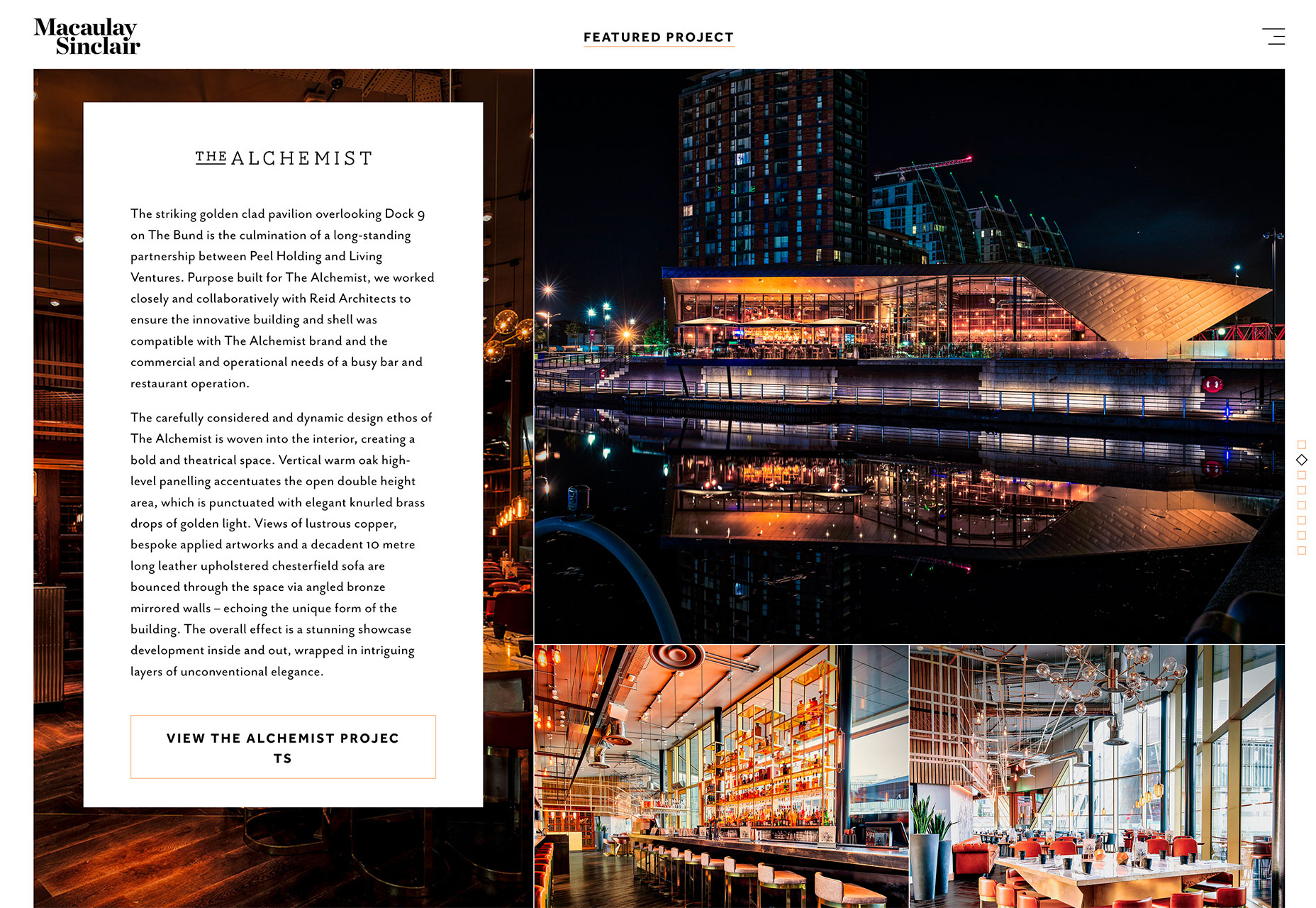
 Macaulay Sinclair has more text than the other examples using one part of an image-panel grid to hold the text element. Here, the image behind the white box serves no information value. It has a color and movement scheme that looks similar to other images and mostly serves to create cohesion between the text element and rest of the design.
3. Typography Cutouts
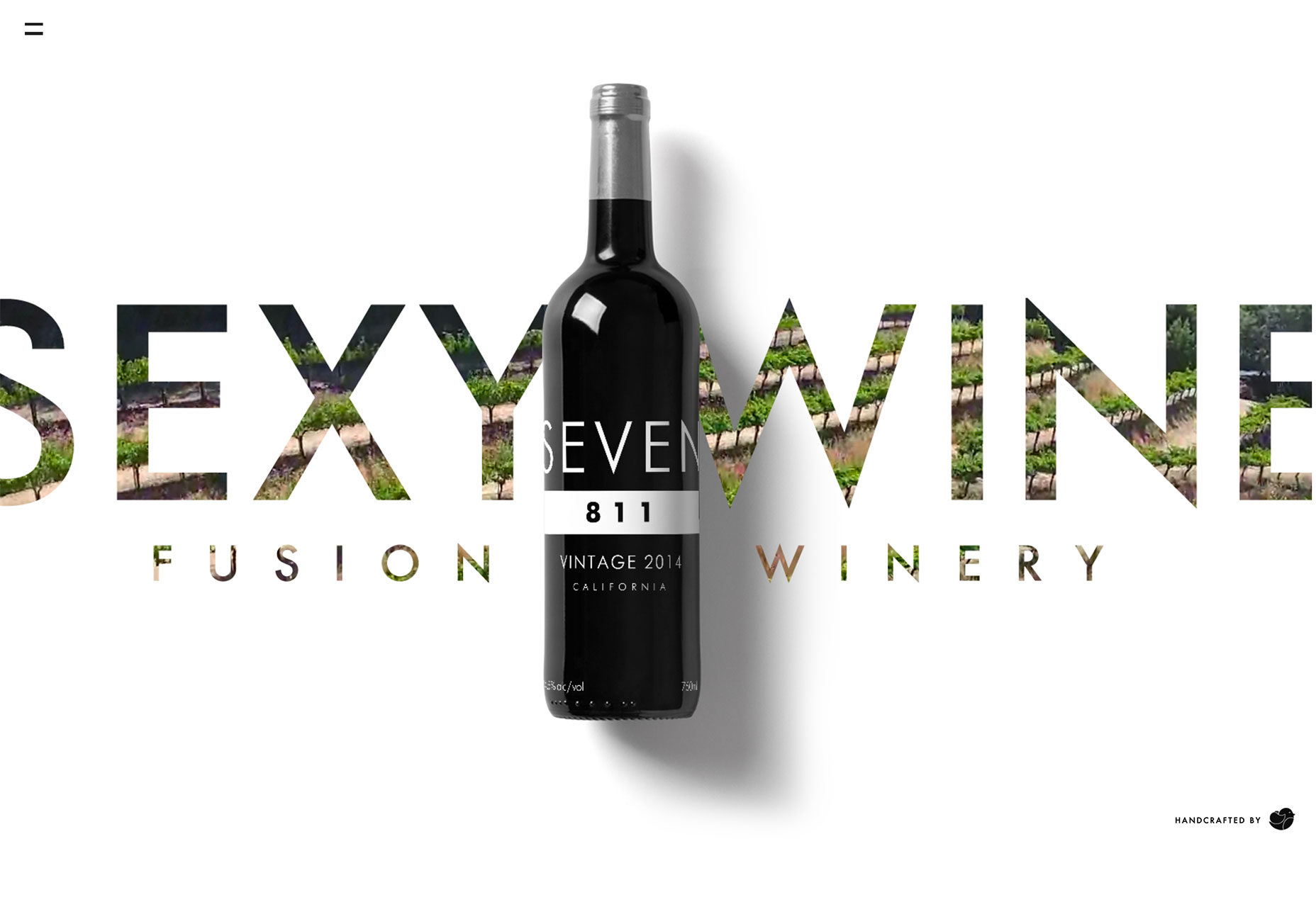
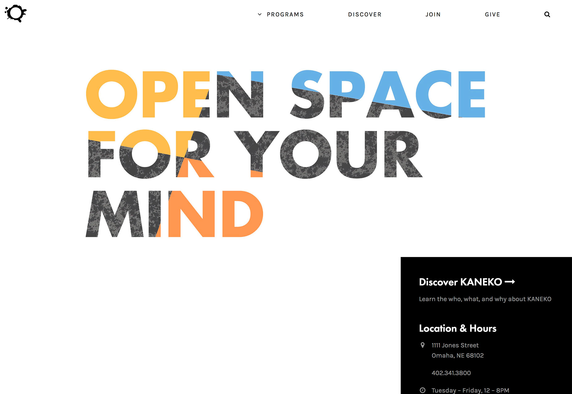
No one ever said that text has to be a series of solid filled letters. More designers are opting for typography cutouts that feature a color block over an image so that the image comes through clear lettering. This technique can work with still or moving images and with full screen overlays so that only a small amount of information comes through letters (almost to create a texture) or with more of a block-over-image-style with more of the background image visible. The trick to making this work is the right typeface. Letters have to have thick enough strokes so that the image or texture in the background is visible. You can’t do this with a thin or condensed font with any consistent success. This technique also works best if the number of words and letters is fairly limited. Stick to one to three words with 10 or fewer letters or use very common words that users will know at a glance. Danbury uses a bright text cutout as a draw to encourage users to engage with the video call to action. The entire orange box is just a giant button.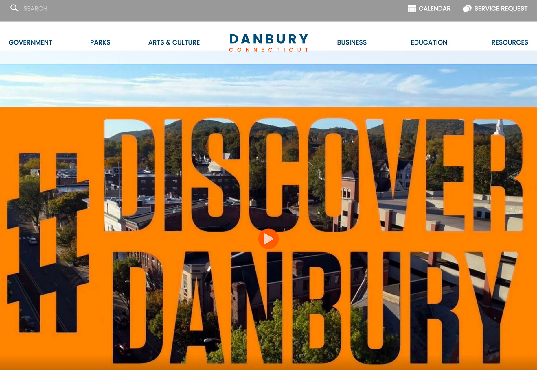 Fusion Winery uses a background video of a vineyard in the lettering. What’s great about this design is the triple layer effect: Video background below white text cutout below a product image.
 The Kaneko uses an unidentifiable image as the fill for letters. If you opt for this style, keep this background simple as done with this design. There’s just a touch of color and texture that draws the eye to the text on the stark canvas.
Conclusion
The collection provides inspiration for those projects that might not have a great image or video, so that you can still find a way to create something that users will respond to. Don’t be afraid to use text as a visual and informational element in this design. What trends are you loving (or hating) right now? I’d love to see some of the websites that you are fascinated with. Drop me a link on Twitter; I’d love to hear from you.Carrie Cousins
Carrie Cousins is a freelance writer with more than 10 years of experience in the communications industry, including writing for print and online publications, and design and editing. You can connect with Carrie on Twitter @carriecousins.
Read Next
3 Essential Design Trends, November 2024
Touchable texture, distinct grids, and two-column designs are some of the most trending website design elements of…
20 Best New Websites, October 2024
Something we’re seeing more and more of is the ‘customizable’ site. Most often, this means a button to swap between…
Exciting New Tools for Designers, October 2024
We’ve got goodies for designers, developers, SEO-ers, content managers, and those of you who wear multiple hats. And,…
15 Best New Fonts, September 2024
Welcome to our roundup of the best new fonts we’ve found on the web in the previous four weeks. In this month’s edition…
By Simon Sterne
3 Essential Design Trends, October 2024
This article is brought to you by Constantino, a renowned company offering premium and affordable website design
You…
A Beginner’s Guide to Using BlueSky for Business Success
In today’s fast-paced digital world, businesses are always on the lookout for new ways to connect with their audience.…
By Louise North
The Importance of Title Tags: Tips and Tricks to Optimize for SEO
When it comes to on-page SEO, there’s one element that plays a pivotal role in both search engine rankings and user…
By Simon Sterne
20 Best New Websites, September 2024
We have a mixed bag for you with both minimalist and maximalist designs, and single pagers alongside much bigger, but…
Exciting New Tools for Designers, September 2024
This time around we are aiming to simplify life, with some light and fast analytics, an all-in-one productivity…
3 Essential Design Trends, September 2024
September's web design trends have a fun, fall feeling ... and we love it. See what's trending in website design this…
Crafting Personalized Experiences with AI
Picture this: You open Netflix, and it’s like the platform just knows what you’re in the mood for. Or maybe you’re…
By Simon Sterne
15 Best New Fonts, August 2024
Welcome to August’s roundup of the best fonts we’ve found over the last few weeks. 2024’s trend for flowing curves and…
By Ben Moss


