6 Things to Put in Your Design Guide Right Now

A design guide is more than just a document that comes with a new website or brand identity. A good design guide is a work of art in itself and has practical application in everyday design work. It showcases what your project is and aspires to be. It should bring elements of design, voice and even code together in a way that’s manageable, usable and easy to understand.
It starts with these six design guide elements that need to be in your documentation. (If they are not, revise your guide right away!)
1. Brand Identity Examples
Your design guide should showcase your brand identity in a visual format that’s representative of the way you want design materials to look. That’s a class example of show, don’t tell. (Although there is some telling in the guide to go with the visual examples.)
The best examples are real-case uses that exemplify exactly what the design standards are intended to portray.
Use screenshots from your website homepage, mobile homepage, app or any other place when the design is at its best.
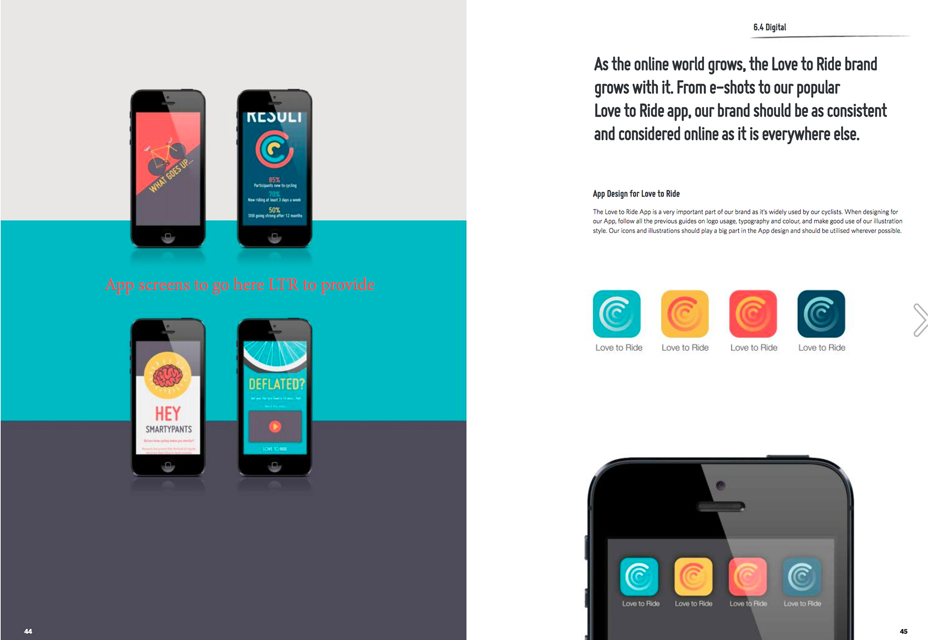
What’s nice about the Love to Ride design guide is that every page in the booklet looks like the website, creating brand consistency. The guide even brings small elements of the design into focus, such as the correct style for apps icons in an accurate display.
The best part about using real examples in a design guide is that you don’t have to create extra work to showcase visual elements; you already have them in hand. Plus, team members will know that the written guideline work in actual practice because there’s visual proof.
2. Design Guidelines
Everything from color swatches to typography palettes, to shapes and use of design elements should be outlined clearly.
Why does the design look and function in a certain way? What’s the philosophy behind it?
Explaining these things can help users apply the design style more accurately and consistently across mediums. When it comes to website design, it is a good idea to include elements that might be different from print branding counterparts and how they relate. For example, many designers opt for a different typography palette online that mimics printed branding to maximize use of Google Fonts to Typekit for ease of use.
Make sure to note which typefaces are substitution if this is part of your design strategy.
When outlining design guidelines be specific when it matters—H1 tags are always 88 points or thumbnail images are always 200 by 200 pixels—but don’t over-communicate unnecessary details. You want team members to see information at a glance and use it, not get weighed down trying to find something in a sea of specifications.
3. Voice and Personality
Writing style guidelines aren’t as fun to think about as other visual elements of a design guide, but they are just as important.
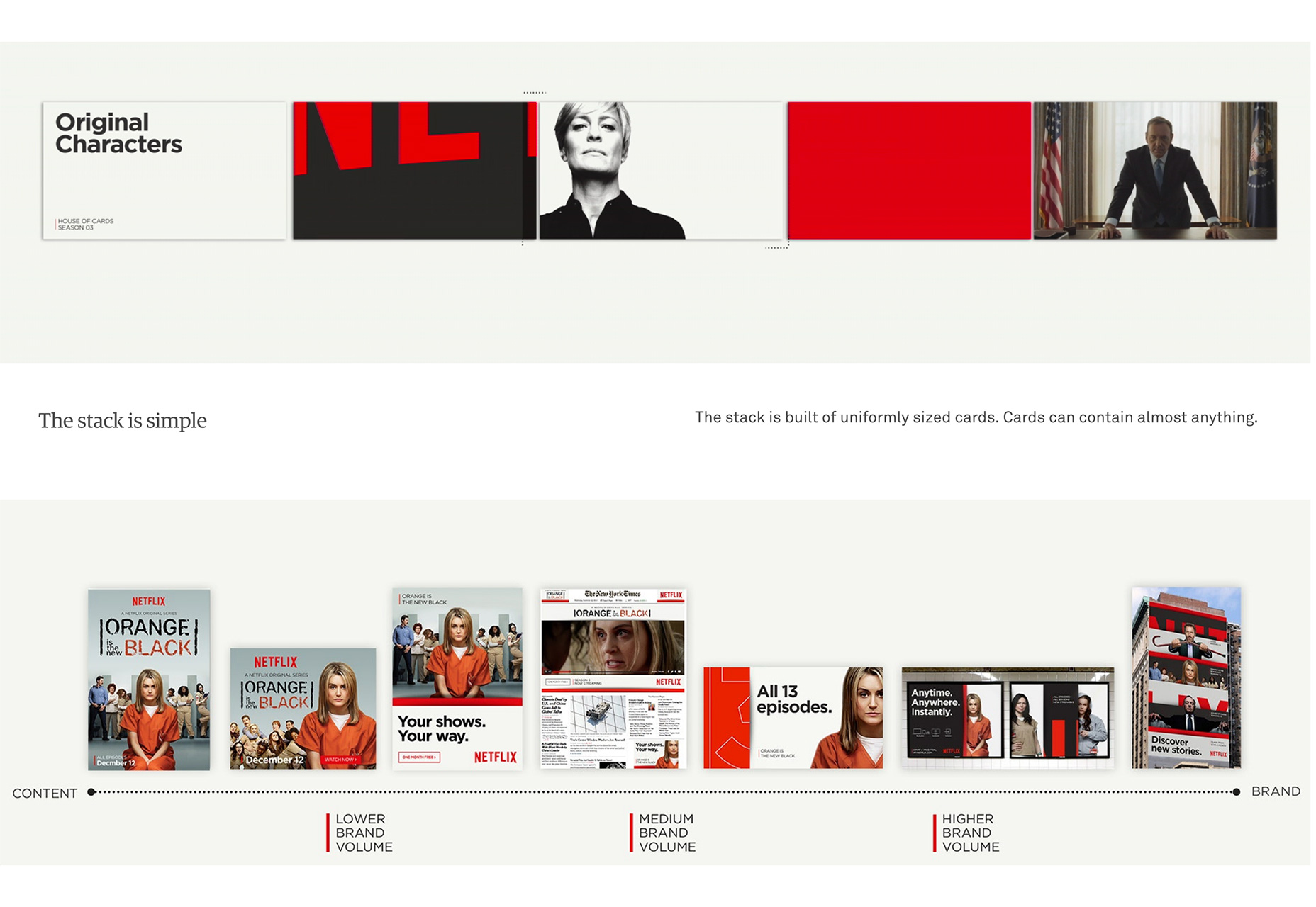
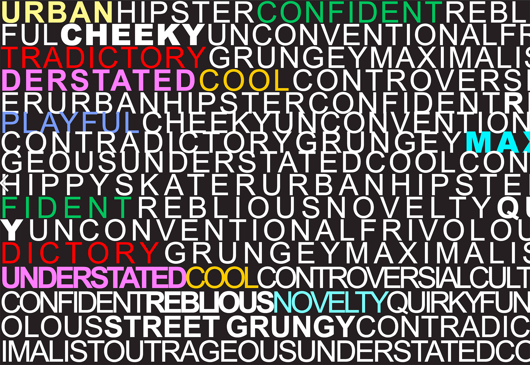
A descriptive writing style for copy can also impact the visuals. It contributes to the type of imagery you choose to use and even elements such as color and type. All of these items go together to create an overall personality for the brand.
It how the outside world will identify you.
What’s more is that a strong voice and personality becomes part of the visual identity as well. A good personality shows in design elements because users can almost identify design elements even outside the content of the rest of the brand. (Think Coca-Cola red or Disney’s signature typeface.)
4. SEO Keywords
Search engine optimization might be one of the most-talked about and least fun parts of website design. Think about keywords early and often.
Include them in the way you speak about the brand, in descriptive language about the design and put a list of the top keywords in the design guide itself.
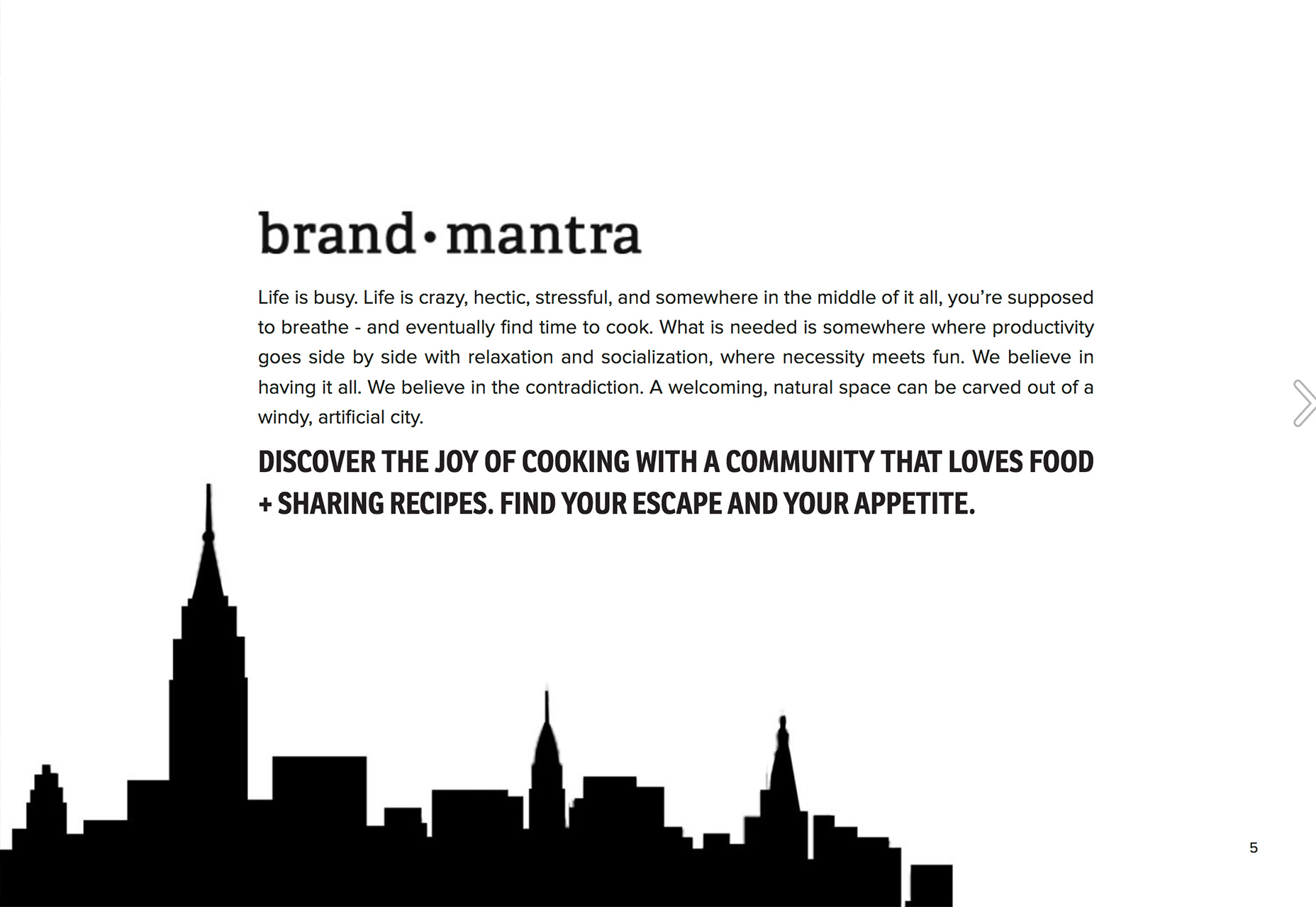
Urban Outfitters has a well-designed (and fun) keyword list in its brand guide. While the clothing brand uses plenty of different keywords the most important words are highlight by color so that you see them right away.
A keyword list such as this brings the words you want to say to top of mind, every time you see them. Most people who write copy will tell you that once you see or think about a word in a certain context it gets stuck in your head. That’s exactly what the SEO keyword list is supposed to do.
Design elements should correlate to these keywords at all times to that content is related throughout the website design.
5. Pattern and Element Styles
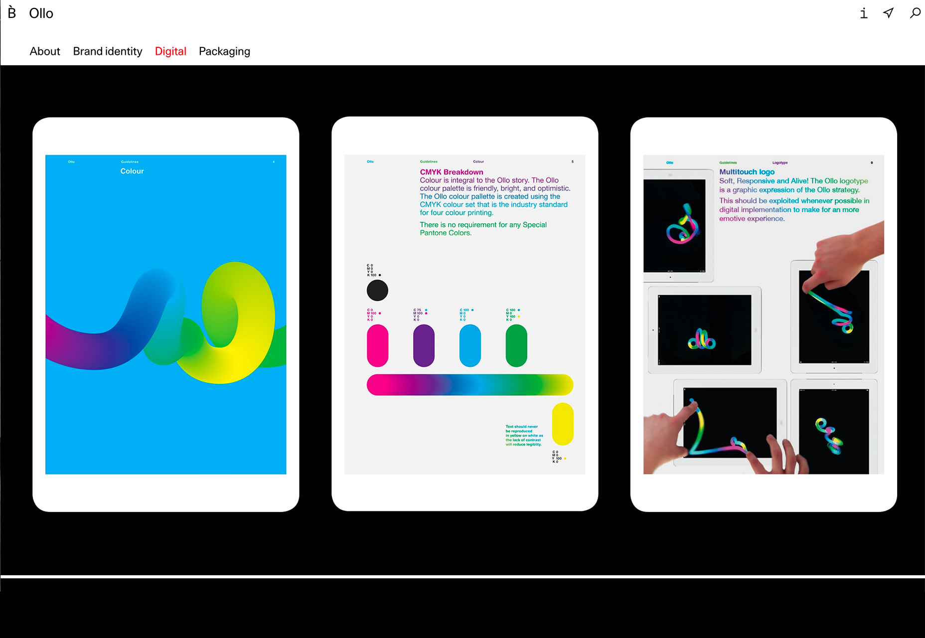
With so many different mediums online (not to mention companies that also design printed elements), it’s important to have guides for all possible uses.
This applies to still and animated versions of logos, color palettes, patterns and even design elements such as form fields and navigation.
Your design book should have a section dedicated to these elements. And if you want the team to really love you, create a pattern and element style guide in an online location so that users can just copy and paste elements for quick use.
6. Code Snippets
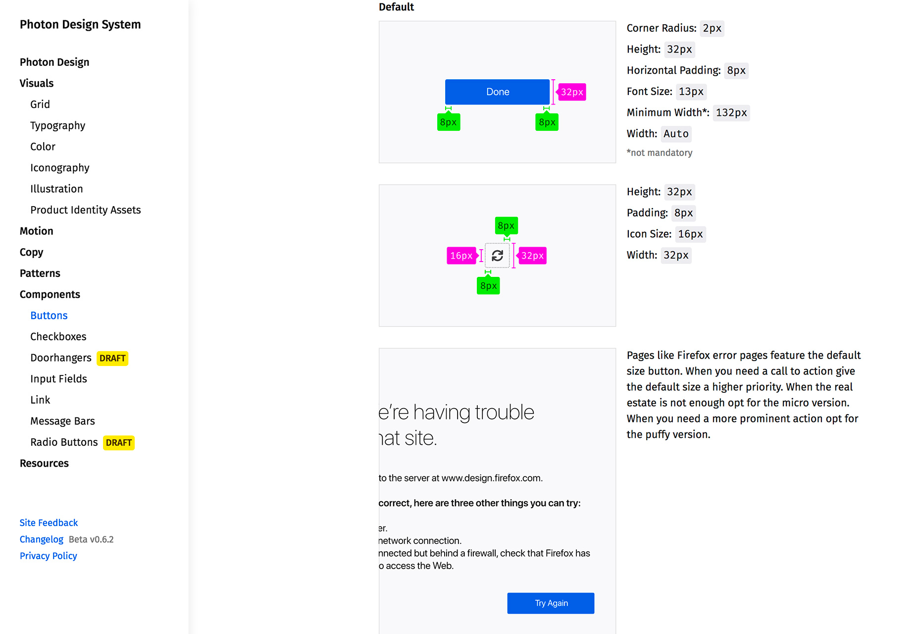
Every website design guide needs to include plenty of commonly used code snippets. From buttons to small animations to slider effects, these little bits of code add hours to your daily workflow by eliminating the need to manually enter specs with every new element.
This works for everything from blog posts—add a code block for images that bloggers can just copy and paste for the right size and crop—to more elaborate UI effects.
Firefox includes design component information in its design guide for the recently revised branding and logo usage. Even if you don’t provide a full library of code snippets, remember to include some base information such as where to use H1 through H4 on pages within the website design and how to style buttons and images.
Conclusion
The best part about a design guide is that it doesn’t have to be a static document. It can grow and change as your brand and visual identity do the same thing.
Most designers—website designers, in particular—are opting for online versions of a design guide so that making changes and grabbing code and color snippets are quick and easy. Consider adding a style guide page to your website, and remember to refer to it (and update it) frequently.


