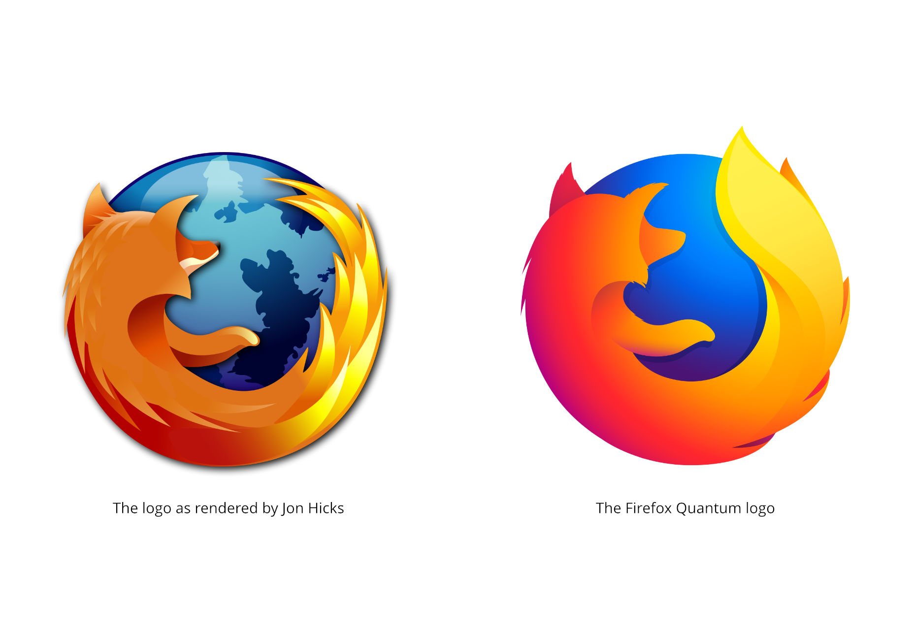
 Since a product family needs to more or less match, visually speaking, Firefox’s logo needs to change to allow more flexibility. It needs to be adaptable to other software. To this end, the branding team at Mozilla has come up with two different branding systems, and is looking for feedback on them.
To have your say, leave them a comment on the blog post linked above.
Note that neither of these systems are anywhere close to finalized. Mozilla even refers to them as “a work of fiction” at this point, which should tell you about how close they are to being implemented. Every icon has yet to undergo quite a bit of iteration before any decisions are made.
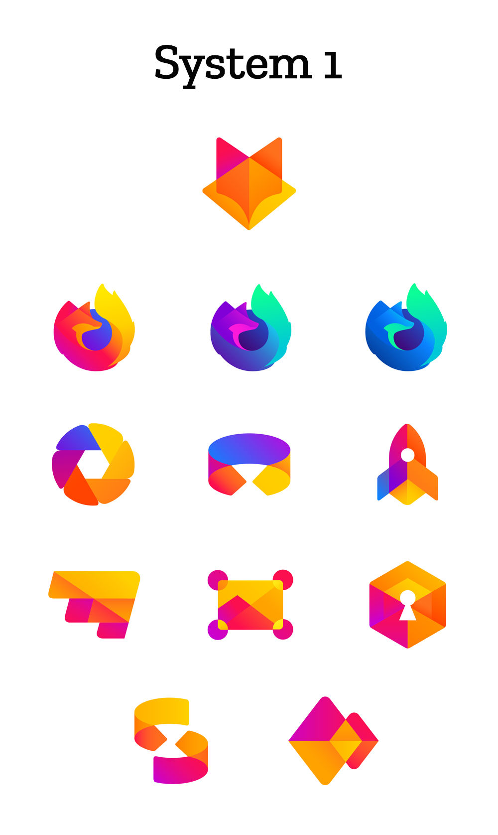
System 1
This first system emphasizes thick geometric shapes, and a strongly yellow-to-red palette, though there is some variation in the color. Of the two, this almost feels a bit more “classic Firefox”.
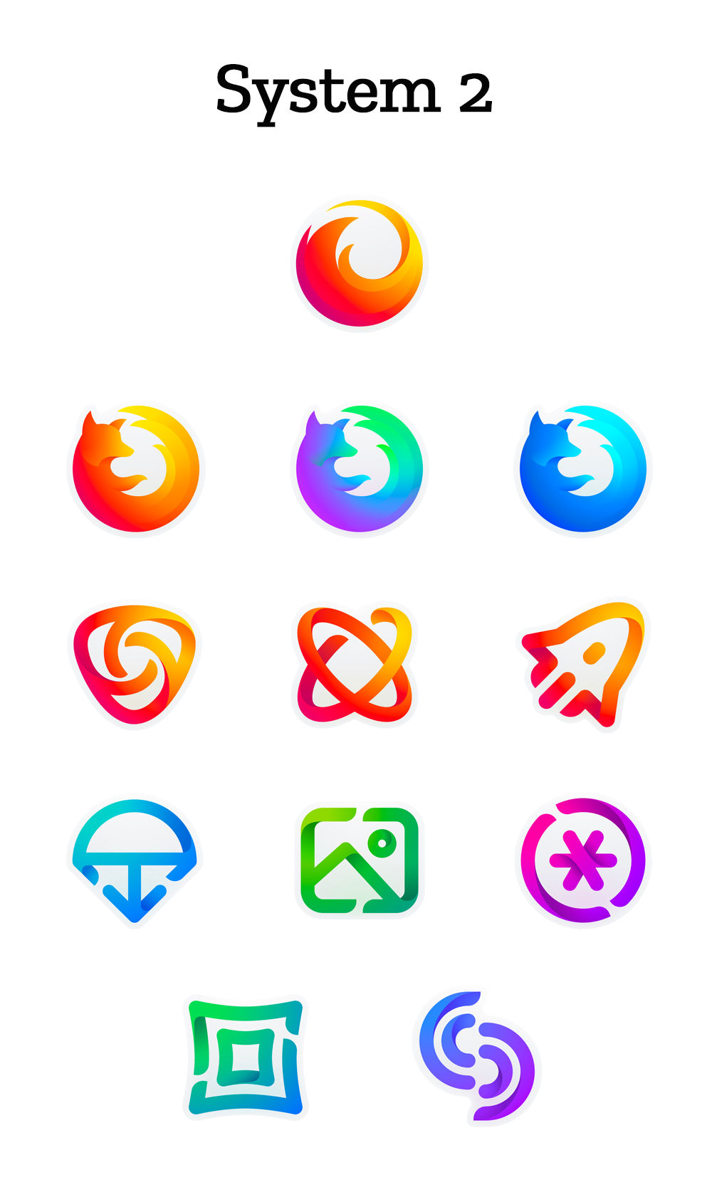
System 2
The second system introduces a bit more color variation, with thinner lines.
My Opinion
These design systems both seem very, very corporate, which I suppose is appropriate, now. I do not think, however, that they are devoid of personality or history like some other recent logo redesigns have been. This is an actual evolution of the brand, rather than a surgical removal of everything fun and/or dated. Like many in the comment section of the original post on Mozilla’s blog, I think the Firefox icons from System 2 should be combined with the other icons from System 1. It just seems to fit better that way. The only thing that worries me a little is this quote at the end: “With your input, we’ll have a final system that will make a Firefox product recognizable out in the world even if a fox is nowhere in sight.” I don’t think they actually have any plans to remove the fox imagery; but if that question ever comes up, here’s my community feedback: Keep the damn fox, mmmkay?Ezequiel Bruni
Ezequiel Bruni is a web/UX designer, blogger, and aspiring photographer living in Mexico. When he’s not up to his finely-chiselled ears in wire-frames and front-end code, or ranting about the same, he indulges in beer, pizza, fantasy novels, and stand-up comedy.
Read Next
3 Essential Design Trends, November 2024
Touchable texture, distinct grids, and two-column designs are some of the most trending website design elements of…
20 Best New Websites, October 2024
Something we’re seeing more and more of is the ‘customizable’ site. Most often, this means a button to swap between…
Exciting New Tools for Designers, October 2024
We’ve got goodies for designers, developers, SEO-ers, content managers, and those of you who wear multiple hats. And,…
15 Best New Fonts, September 2024
Welcome to our roundup of the best new fonts we’ve found on the web in the previous four weeks. In this month’s edition…
By Simon Sterne
3 Essential Design Trends, October 2024
This article is brought to you by Constantino, a renowned company offering premium and affordable website design
You…
A Beginner’s Guide to Using BlueSky for Business Success
In today’s fast-paced digital world, businesses are always on the lookout for new ways to connect with their audience.…
By Louise North
The Importance of Title Tags: Tips and Tricks to Optimize for SEO
When it comes to on-page SEO, there’s one element that plays a pivotal role in both search engine rankings and user…
By Simon Sterne
20 Best New Websites, September 2024
We have a mixed bag for you with both minimalist and maximalist designs, and single pagers alongside much bigger, but…
Exciting New Tools for Designers, September 2024
This time around we are aiming to simplify life, with some light and fast analytics, an all-in-one productivity…
3 Essential Design Trends, September 2024
September's web design trends have a fun, fall feeling ... and we love it. See what's trending in website design this…
Crafting Personalized Experiences with AI
Picture this: You open Netflix, and it’s like the platform just knows what you’re in the mood for. Or maybe you’re…
By Simon Sterne
15 Best New Fonts, August 2024
Welcome to August’s roundup of the best fonts we’ve found over the last few weeks. 2024’s trend for flowing curves and…
By Ben Moss


